Posts Tagged ‘Comics Time’
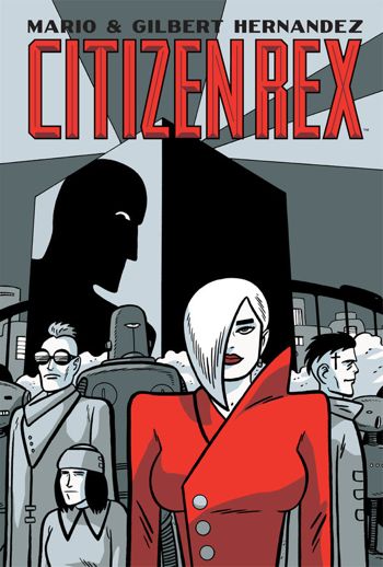
Comics Time: Citizen Rex
July 26, 2011Citizen Rex
Mario Hernandez, writer
Gilbert Hernandez, artist
Dark Horse, June 2011
144 pages, hardcover
$19.99
Buy it from Amazon.com
For today’s Comics Time review, please visit The Comics Journal.
Comics Time: Celluloid
July 20, 2011Celluloid
Dave McKean, writer/artist
Fantagraphics, June 2011
282 pages, hardcover
$35
Buy it from Fantagraphics
Buy it from Amazon.com
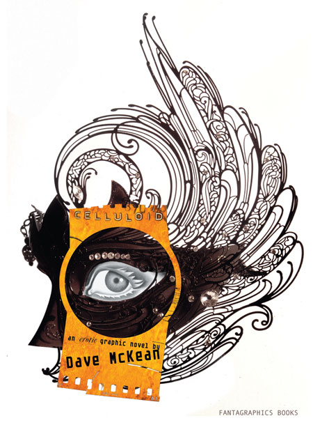
From a reviewer’s perspective, the nice thing about erotica is that, as with humor, there’s a clear threshold of physical response a work must cross to be judged successful. With humor comics, the key question (there are others, but this is the sina qua non) is “Did it make me laugh?” With erotic comics, it’s…well, let’s just say it ain’t laughter we’re after. And on that basic measurable (ahem) level, Celluloid comes up short (ahem ahem). McKean’s art is as otherworldly as ever, bathed in luminous gold, and until the final section it manages to avoid the “Hey, wanna watch some Sandman covers fuck?” photo gimmickry I was afraid of. But isn’t it kind of odd that of all the palettes McKean could choose to convey the film-projection-as-mystical-sexual-gateway metaphor that is at the heart of our nameless, speechless female protagonist’s “strange erotic journey” (to coin a phrase), he chose gold? Is that what you think of when you think of the shaft of light beaming from the projection booth to the screen, or the light the screen bathes you in in turn? Maybe if you’re Gordon Willis, but not if you’re me. The book is filled with weird little just-off details like that, from our young-ish heroine’s weirdly craggy body and her nose that seems to grow to Cyrano proportions at random depending on the angle McKean’s drawing her at, to the deeply unsexy choice to make our heroine’s foil in a lesbian sequence wear a garland of grapes that’s echoed by her (count ’em) fourteen breasts, leaving me to wonder if one of them was gonna get plucked off and eaten throughout their tryst. Working mostly with full splash pages and spreads, McKean is able to pull off striking isolated images here and there — off the top of my head I remember our heroine’s shocked face as she discovers a plaza full of copulating couples, a dramatic first kiss between our heroine and the grape goddess staged at a scale that makes it look like the sky is tenderly kissing the earth, and (one of the few actually hot moments in the book) her (non-sexual) removal of her top to take a bath right near the beginning of the book. But with the exception of the stunning black, white, and red sequence in which the protagonist sucks a demon’s totemic red dick until it ejaculates milky semen through the void like a spaceship floating by in 2001, isolated images are all they are. They get lost in a melange of homages to Picasso, Ernst, and “Soft Construction with Boiled Beans”-era Dalí, combined with McKean’s usual soft-focus multimedia wizardry and angular cartooning. What’s more, the whole affair has a didactic feel to it, as “let’s prove a point about the artistic legitimacy of erotica”-type comics often do. We’re clearly supposed to be proud of the protagonist’s journey of self-discovery, but all we have to go on to know such a journey is even required is a quick phone call at the beginning with her boyfriend — it’s an unhappy-seeming call, sure, but the impression it gives is that they’ve simply had a rough day at work, not that there’s some sexual void in their shared life that she’s filling in on her own, and certainly not to the point where the events of her magical journey into the sexy celluloid world make sense as a gauntlet to be thrown before the dude, as they are at the book’s end. That final sequence begins when the boyfriend returns home and turns on the mysterious projector that kicked off the woman’s journey. But by the time I closed the book, unfortunately, that projector was the only thing turned on. And that’s the heart, and other organs, of the matter, isn’t it?
Comics Time: The Wolf
July 19, 2011The Wolf
Tom Neely, writer/artist
I Will Destroy You, July 2011
228 pages
$25
Buy it from Tom Neely
See some preview pages and read my interview with Neely at Robot 6
One thing you’ll never get from online previews and PDFs of The Wolf, which were the only ways I’d experienced the book when I first read it and liked it enough to give it an effusive PR blurb, is its impact as a physical object. I’ve actually put off writing this review because I felt inadequate to the task of conveying what a smack in the face the thing feels like. It’s big and thick and square, with a wordless and cryptic cover that evokes albums of huge mystical mystery like In the Court of the Crimson King or Led Zeppelin IV. Inside, the one-per-page or per-spread images frequently go full-bleed, which isn’t the most uncommon thing in the comics world to be sure — but the square pages make it feel like you’re seeing a single panel blown up to brobdgnagian size. It’s a strange-making effect, taking the familiar “bigness” of a splash page or double-page spread, filtering it through a frame you’re not accustomed to, and making you feel the impact of size and scale like a new, fresh thing.
The images themselves are torn from an obviously deeply personal vocabulary of monsters, injecting the sexualized surrealism back into werewolves and zombies that have been stripped of their primal power by the conventions of genre. Spectacle, meanwhile, is here derived not just from violence or vistas but from sex: The battle between the title character and a multi-limbed red skeleton, a full moon that appears like a cigarette burn in a grey-blue night sky, and a series of abstract washes of hair-like blacks and fleshy pink-reds and seminal yellow-whites that appears in the middle of graphically depicted intercourse between the wolf and his pale, raven-haired bride all have equal knockout force behind them. You can tease an emotional narrative out of the proceedings easily enough — past callousness, cruelty, and self-destruction in the context of a relationship are overcome, atoned for, and healed through sexual connection, and a transcendent future is discovered, a natural world untouched by the taint of the bitter past. But it’s the way each individual stage of that journey is depicted with symbols, colors, and creatures that capture and embody it perfectly, their lush brushtrokes fraying and spattering and bleeding emotional intensity on every page, that gives the book its power. Every turn of the page is an encounter with raw feeling, made physical by cartooning. That’s great comics.
Comics Time: Black Eye
July 13, 2011Black Eye #1
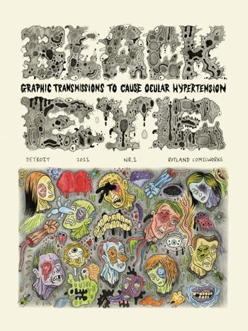
Wouter Vanhalemeesch, Al Columbia, Ian Huebert, Mark Newgarden, Onsmith, David Paleo, Roland Topor, Olivier Deprez, Olivier Schrauwen, Brecht Evens, Ivan Brunetti, Andy Gabrysiak, Michael Kupperman, Gnot Guedin, Tom Neely, Dav Guedin, Danny Hellman, Bob Levin, Brecht Vandenbroucke, Stephen Schudlich, Martin Rowson, Kaz, Max Clotfelter, Robert Goodin, Ryan Standfest, Jon Vermilyea, Mats!?, Nikki DeSautelle, Stéphane Blanquet, R. Sikoryak, Ludovic Debeurme, Emelie Östergren, Fanny Michaëlis, Lilli Carré, James Moore, Jeet Heer, Paul Nudd, Glenn Head, Paul Hornschemeier, Ken Parille, Paul Paetzel, writers/artists
Ryan Standfest, editor
Rotland Press + Comic Works, May 2011
112 pages
$14.95
Buy it from Ryan Standfest
For today’s Comics Time review, please visit The Comics Journal.
Comics Time: Our Love Is Real
July 8, 2011Our Love Is Real
Sam Humphries, writer
Steven Sanders, art
self-published, June 2011
24 pages
$3.99
Buy it at OurLoveIsRealComic.com
In the war to discomfit the reader, science fiction has an extra weapon in its arsenal: It can be set in a society whose underlying assumptions are disturbingly alien from our own. Depending on whether the differences happen to hit your buttons, this can be real put-the-book-down-and-squint-your-eyes-shut stuff in the right hands. The last thing I read to have that effect on me was “The People of Sand and Slag” by Paolo Baciagalupi in Wastelands, an anthology of post-apocalyptic short fiction. Baciagalupi created a world where genetically and biomechanically modified human beings presided over an empire of debris, feeling no pain, virtually indestructible, able to consume junk and rocks…and eminently unqualified to care the few vulnerable living creatures unfortunate enough to cross paths with them. It wasn’t a particularly gory or “disturbing” story, yet something about its protagonists, the fact that they were recognizably human yet utterly devoid of the qualities and vulnerabilities that we think of as characteristic of humanity, literally made me feel sick to my stomach. I still haven’t finished reading the anthology.
Our Love Is Real, it seems to me, is aiming to have the same effect. It’s set “five years after the AIDS vaccine,” in a world policed by hulking brutes in Iron Man/mecha exo-suits and characterized by sexual divisions not between genders or orientations, but between vegisexuals, mineralsexuals, and zoosexuals — people who have sex with custom-grown plants, the auras of crystals, and dogs respectively. But I think that previous sentence contains the problem with the project. The sex stuff that’s the story’s bread and butter is indeed rewardingly bizarre and blackly funny — I mean, look at that propaganda poster on the cover, it’s hilarious. But the world surrounding the sex is standard Dark Horse Legends sf-action material, instantly recognizable to anyone who’s read Hard Boiled or Martha Washington, or who’s seen the way Geof Darrow or Chris Burnham draw faces being smashed to flying splattering pieces. The character designs in particular are deeply indebted to Tony Moore, squarejawed men and snotnosed women who behave basically the way characters rooted in such designs can be expected to behave. When the genre visuals and action are that familiar, it’s tough to see how we get there from here with regards to the stuff that’s much further out. I mean, I get that the zoosexual cops hounding (no pun intended) the vegisexuals and mineralsexuals are analagous to heteronormativity and fag-bashing, but there’s not really an allowance made for the idea that people who have sex with dogs might build a sci-fi society that looks different from all the ones we’ve seen that were built in-story by plain-vanilla straight dudes. Starting with that lacuna, the book’s ideas never really congeal. It winds up feeling more like several neat ideas than one great one. I want it to go further.
But ultimately, the best compliment I could pay Our Love Is Real is that while its weakest points belong to other comics, its strongest points are all its own. The world depicted by Sanders and the characters that inhabit it may be overly familiar, but the climactic fight scene has real oomph and, weirdly, real grace. And while the characters’ behavior is traditional in a way that doesn’t mesh with the book’s bizarre animating ideas, those ideas are quite something, and are presented by Humphries in a way that’s straightforward but not smug self-congratulatory, the way knowingly out-there indie science-fiction comics by smart-and-they-know-it writers can be. Humphries’ is a new voice in a crowded field, saying truly strange and challenging things while speaking the language of mainstream action comics. With any luck that accent will thin, and future stories will have the fluency to forge a new dialect as singular as the ideas they’re designed to express.
Comics Time: SF Supplementary File #1
July 7, 2011SF Supplementary File #1
Ryan Cecil Smith, writer/artist
Closed Caption Comics, June 2011
12 pages
Read it for free at RyanCecilSmith.com
Buy it for $2 from Ryan Cecil Smith
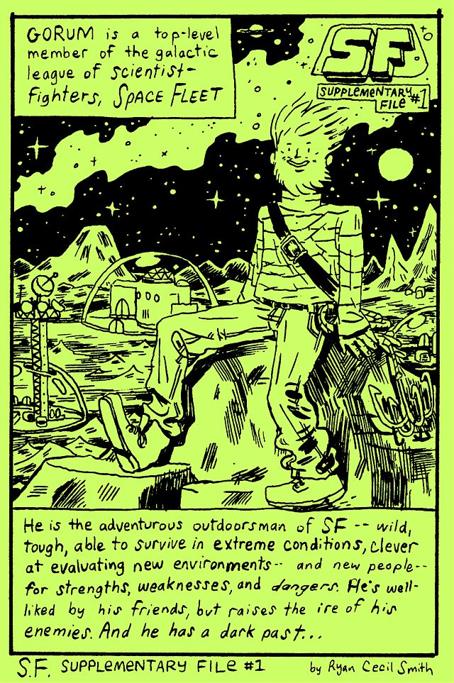
What if ’80s SFF action-figure franchises really took on the central role in our collective mythmaking and storytelling that their hardcore devotees (myself included, let’s be honest) seem to think they deserve? The children’s books, fairy tales, and fables such a would would create for itself might look a lot like SF Supplementary File #1, a spinoff from Ryan Cecil Smith’s fine alt-genre actioner SF that provides the origin story for one of the Space Fleet Scientific Foundation Special Forces’ memorable members, Gorum. In his “once upon a time”-style story of hidden paradises and pillaged resources, mad royalty and noble scientists, slain parents and vowed vengeance, I hear echoes of everything from Superman and Batman to Eternia and Shangri-La to freaking Spaceballs, shot through with a childlike funneling of nuclear anxiety directly into terror over the potential loss of Mommy and Daddy. Smith’s art here is winningly crude, as befits drawings that can be captioned with sentences like “Gorum attacked every ship going IN or OUT of the Planet of Dunes with VOLCANO CANNONS” — yet it’s flexible, equally able to pull off sophisticated visual tricks like juxtaposing the explosions that destroy a world, the ship that escapes that destruction, and multiple representations of the teary eyes of that ship’s pilot as he views the horror like some kind of Futurist Axe Cop. It’s fun to see something so lightweight be so solid.
Comics Time: L.A. Diary
June 29, 2011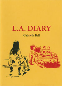 L.A. Diary
Gabrielle Bell, writer/artist
Uncivilized Books, October 2009
20 pages
$4
Buy it from Uncivilized Books
He doesn’t go quite this far himself, but it’s easy to interpret cartoonist and Uncivilized Books publisher Tom Kaczynski’s introduction to this minicomic collection of diary strips and sketchbook pages from Gabrielle Bell as a claim that her lack of transgression is itself transgressive. “Bell is not possessed by demons,” he writes by way of comparing Bell’s work to the autobiographical comics tradition established by Justin Green and Robert Crumb, going on to compare her work to the very root of the diaristic impulse in Western culture: maintaining a daily account of the world to better understand one’s place in it. And indeed, Bell’s understanding of her place in the world, as expressed through these comics, leaves little room for iconoclasm and taboo violation: The climactic strip in the collection focuses on her inability to hug people without dissociating. But Bell never translates her discomforts into reverse-exhibitionistic cris de coeur of loneliness, either — from the cover of the comic on down, she may be quietly separating herself from the friends with which she is constantly surrounded, but, well, she’s constantly surrounded by friends. Like the yoga poses she holds in a class designed to cultivate inner peace but which in Bell’s case simply give her one more opportunity for her mind to recursively burrow inside itself, her self-presentation in these comics is a painstakingly struck balance, neither woe-is-me nor look-at-me.
So no, we will never see a “Minnie’s 3rd Love” or “My Sex History” from Gabrielle Bell. But in this light, the smudgy swatches of black that dot her square panels seemingly at random and had me baffled for years could perhaps be seen as a deliberate act of obscurantism, breaking the plane of the art as if to interrupt our ability to take it in vérité-style, a way to say “No, this isn’t real, this is just a drawing.” Kaczynski suggests that that act of drawing is a “declaration of fidelity to the Great Work”; the diary form it takes, then, is simply a way for Bell to lash herself to the yoke of making art on a consistent basis. If he’s right, then Bell’s program has served her well, enabling her to produce a substantial body of work with nary a demon to drive her. Thus if there is a shocking revelation to be found in L.A. Diary, it’s the book’s final third, which reproduces the pages in her spiral-bound notebook where the preceding strips first took shape. Replete with spelling errors, cruder and at times almost childlike linework, broader and blunter story beats, and more direct navel-gazing (an abandoned storyline about starting a blog, a self-portrait in the locker-room shower that gets a bit toned-down and covered-up in the final version), it feels almost breathlessly unrefined compared to the finished product. It’s not Binky Brown Meets the Holy Virgin Mary, but in context, the exhibitionism is just as raw.
Comics Time: WunderKammer No. 1
June 27, 2011WunderKammer No. 1
Nicholas Di Genova, writer/artist
Koyama Press, 2009
24 pages
$8
Read about it at Koyama
Theoretically you can buy it at Nicholas Di Genova’s website but I can’t get it to load
Buy it from Atomic Books
Visit Nicholas Di Genova’s blog
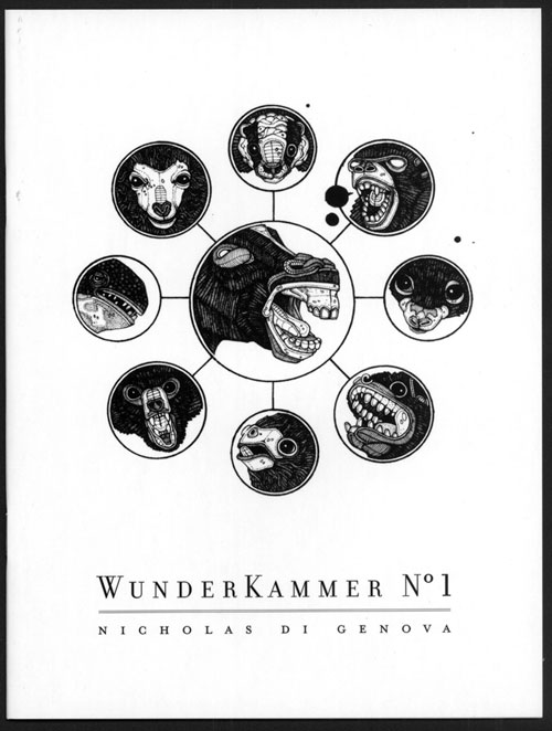
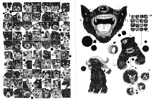
In googling for images and purchase links for this compendium of animal drawings by Nicholas Di Genova (of whom I was previously aware as a fellow resident of Partyka‘s periphery), I came across a post on a New York City art blog that took a faint-praise approach to Di Genova’s art but was really impressed by this so-crazy-it-just-might-work innovation he’d had of printing his pieces in a cheap, floppy book. Imagine that! So god knows what the fine art world (I feel like that should be in scare caps — The Fine Art World) makes of this stuff, and this way of presenting it. To me it’s a comic book, and a stunner. Di Genova specializes in drawing braying, barking, growling, blank-pupiled animals of all shapes and sizes and species, including many that don’t actually exist, in a riot of accrued maximalist detail. Each of his dogs, bears, rams, wolves with ram horns, bears with bird heads, two-headed turtles, tyrannosaurus rexes with zebra coloration and manes, three-eyed gorilla/bat hybrids and so on appear to have been constructed by carefully gluing little rectangles and circles and lines together, the way chainmail is constructed one link at a time. Only here the construction doesn’t necessarily seem chained together, so you’re left half tempted to shake the book like a snowglobe to see if the constituent parts resettle in new shapes to create a new bestiary. Di Genova repeats this dizzying effect in macro via pages that consist of massive grids of animal heads, one breed/species after another, one head per borderless panel — dogs, birds, and frogs each get their own page here, but there are plenty of smaller grids featuring turtles, bears, bats, rodents, and god knows what else. I found my eye zipping back and forth from line to line in an S-shape a la Brian Chippendale, the better to take each incredibly detailed head in without missing a beat. The pages featuring the smaller grids often come across like some sort of alternate-universe Chris Ware suffering from Audubon-inspired monomania: A large portrait of an animal will be connected to a grid of tiny ones with a diagrammatic line, or encircled and radiating off smaller drawings like the spokes of a wheel. A relationship, even a narrative, is implied through these devices; the fun is figuring out what the hell they could be. And while we’re on the subject of the visual language of comics, Di Genova comes up with the best technique for depicting the non-verbal vocalizations of animals I’ve seen maybe ever: tiny word balloons completely colored black. Whether it’s a bark, a tweet, a ribbit, or…whatever sound turtles make, it works.
The book’s centerpiece, literally and metaphorically, is the spread where Di Genova’s project is at its most basic and blunt: 702 butterflies, each as unique as a snowflake, in a 27 x 26 butterfly grid bleeding right off the top and bottom of the centerfold spread. The effect is at once overwhelming and inviting: I was dazzled by the variety present in nature and intimidated, almost horrified, by the artificial reproduction of that natural variety. At the same time, I simultaneously resigned myself to never really being able to take in the whole of the image and diving right into the spread to soak up as much as I could…and I distrust pat “as above, so below” interpretations, but what the hey: There you have it.
Comics Time: Night Animals
June 24, 2011Night Animals
Brecht Evens, writer/artist
Top Shelf, January 2011
48 pages
$7.95
Read a preview and buy it from Top Shelf
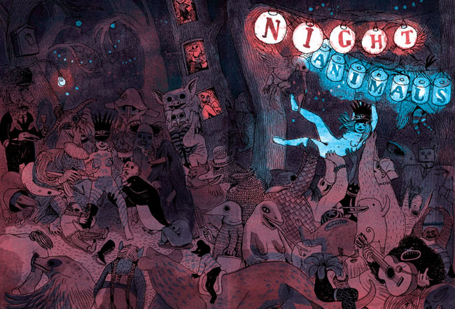
Dare I say that this is even better than The Wrong Place? I think I dare! Created before that book but published in English after it, Night Animals is a more traditionally drawn affair from author Brecht Evens in that it is, in fact, drawn. The Wrong Place‘s paint-only art was its distinctive selling point and, via clever coloring, its primary storytelling mechanism, but as it turns out this innovation meant Evens abandoned a really lovely line — thick, ropy, tactile, full of motion, fun. It gives the art more immediate pop, and gives Evens’s really vibrant colors (look at that cover; now imagine a whole book like that) the day off, as it were, freeing them from the burden of telling the story themselves and allowing them to comment on and enhance the action, and of course simply delight the eye.
Said action consists of two separate stories in which the protagonists’ sexuality is passed through a gauntlet of children’s-story-style creatures of the wild. The first, in which a balding businessman and apparent tyro furry goes down a literal rabbit hole and braves an increasingly terrifying series of beasts on his way to the “Blind Date” that gives the story its title, has a happy ending: A grinning, recumbent woman in rabbit ears, probably a little plain under normal circumstances with her hornrimmed glasses and mole and pointy schnoz but bomb-ass hot as she’s presented at the end of this journey, with a promising white arrow directing her bunny-suited suitor straight to her crotch. After the painstakingly delineated labyrinth we’ve followed to get here, including a pair of stunning spreads filled with seemingly every sea monster and forest creature Evens could think of, this punchline image elicited a good-natured “haw!” from me; if I’d been there, I’d have high-fived both the guy and the girl before leaving them to get it on. Indeed, the very last image, a Wrong Place-style painted silhouette of the two characters in floppy-eared flagrante delicto, gives the impression of the artist quietly backing away and closing the door behind himself, letting our hero and heroine do their stuff in peace. Evens really nails the simple satisfaction sex sometimes provides — life can be filled with storm and stress, but every now and then it’s nothing that a special someone’s smile and genitals can’t fix.
The scarred side of the Night Animals coin is the second and concluding story, “Bad Friends.” (“So it’s not just a clever name.”—Wayne’s World) It starts, and indeed continues, innocuously enough, as a sort of distaff Where the Wild Things Are/Aesopian cover version of Stephen King’s Carrie, in which puberty rather than petulance is what enables our young protagonist to heed the call of the wild, and in which the rapid locker-room onset of menstruation leads not to a telekinetic killing spree but a visit from the Great God Pan, a trip on the back of a giant bird, and a rockin’ party with various critters in the woods. Our heroine whoops it up, enjoying the nakedness her newfound friends have reduced her to — complete with body-paint heart drawn around her pudenda — so much so that she doesn’t notice the darkness in their eyes as they close in to devour her. This story ends not with a clinch, but an empty bloodstained bed, worried parents, an ineffectual search of the now-empty forest, a single flower wilting on the ground. Evens’s trademark red goes from a spot-color stain on the girl’s underwear, to the alluring light of an illicit night out, to a symbol of sexual abandon, to the color of violence and death. It’s quite a performance, sexy and creepy at precisely the moments Evens wishes it to be one or the other, and a direct contrast with the earthy lightheartedness of the opening story. It’s awfully easy for sex comics to get didactic in their rah-rah positivity; Evens gives us the flipside, counting on us to be grown up enough to weigh the pros and cons ourselves. Good for him and good for this comic. It’s a blast.
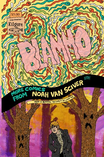
Comics Time: Blammo #7
June 22, 2011Blammo #7
Noah Van Sciver, writer/artist
Kilgore Books & Comics, February 2011
40 pages
$5
Buy it from Kilgore
The multiple times Noah Van Sciver uses fake ads and author’s notes to remind us of this notwithstanding, Blammo‘s throwback status as a ’90s-style solo-anthology floppy-format black-and-white “alternative comic book that is introspective and drawn by a hopelessly poor twentysomething with seasonal affective disorder” is one of the least interesting things about Blammo #7. It doesn’t hold a candle to the way he draws the darkness of a Halloween night spent trick-or-treating with a sky full of simple horizontal lines in “Because I Have To,” or to his po-faced, actually rather creepy retellings of a couple of Scary Stories to Tell in the Dark-style serial-killer urban legends in “Don’t Turn On the Light” and “This Is the Last One I’m Sending You Today.” It’s not as noteworthy as the way he tends to cheat his characters toward the viewer, the better to emphasize the big ears and big noses and worried brows and frowning mouths of his characters’ faces, or the way the whole of those faces is constructed so solidly that they remind me of a handwritten cursive letter more than a face. It doesn’t account for his slice-of-life fiction’s endearingly loose and rambling narratives — the way “Who Are You, Jesus?” piles up ironies in such a way as to emphasize its main character’s simultaneous shittiness and sympathetic nature with each turn, or the way the “Foreword/Because I Have To/Afterword” suite tells the story of a guy’s emotionally fraught Halloween evening in three sections wherein each thing that happens to him is weirdly disconnected from the others in precisely the way life tends to work. It doesn’t cover the way his broad funny-animal Chick tract parody complements his totally straightforward account of Joseph Smith and the origin of the Mormon faith, the way a biting fuck-you and a lingering respect tend to mingle in the lapsed. No, the mere fact that this is a defiantly anachronistic and un-hip alternative comic book doesn’t speak to the most important thing about it: It’s a very good one.
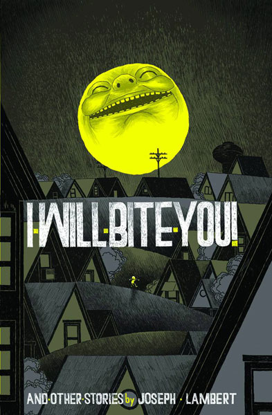
Comics Time: I Will Bite You! and Other Stories
June 20, 2011I Will Bite You! and Other Stories
Joseph Lambert, writer/artist
Secret Acres, April 2011
128 pages
$14
Buy it from Secret Acres
Buy it from Amazon.com
You want to see artists riding their personal visual vocabulary past the realm of utility and into Idiosyncracy Land. From Kirby crackle and Ditko hands to Jim Woodring’s fungoids and Al Columbia’s erasures, signature tropes are frequently a sign that something not so much practical as alchemical is going on in that artist’s brain when he puts lines on paper. Judging from this splash-making debut book from Joseph Lambert, a collection of work previously published in various anthologies and minicomics, Lambert has several such obsessions: Big grinning suns with devious intentions, fumingly angry and violent little children, and using the perspectivally flattening effect of two-dimensional line art to make people and things interact in unexpected ways — characters grabbing their word balloons to use as weapons, people in the foreground jumping onto objects that in “reality” are miles away or literally in outer space. The problem is that none of these visual tricks say much of anything to me. Watching an angry little kid leap into the air and assault the onlooking sun makes for a clever visual, but not a particularly communicative one. Children’s stories have used this kind of device to convey the naivete of their protagonists, and the matter-of-fact wonders of the world when seen through a child’s eyes; mythology uses it to bring a huge and frightening world down to our level, to grant us a degree of control. For Lambert, I think there’s an exploration of rage and frustration under here someplace, but it’s diluted from overuse. If that many characters are angry enough to threaten the sun, then how angry are any of them, really? It’s as though Lambert held his thumb out and blotted out the sun and thought “Wouldn’t it be neat to draw something that did that literally?” And yes, it’s neat, but after a while it’s not much more than that. Too many of the visuals presented here — word-balloon weapons, dancin’ on the ceiling perspective shifts, characters swallowing other characters whole and unharmed — have that feeling. “Why not?” is a terrific question for an artist to ask himself; “why?” is sometimes a better one.
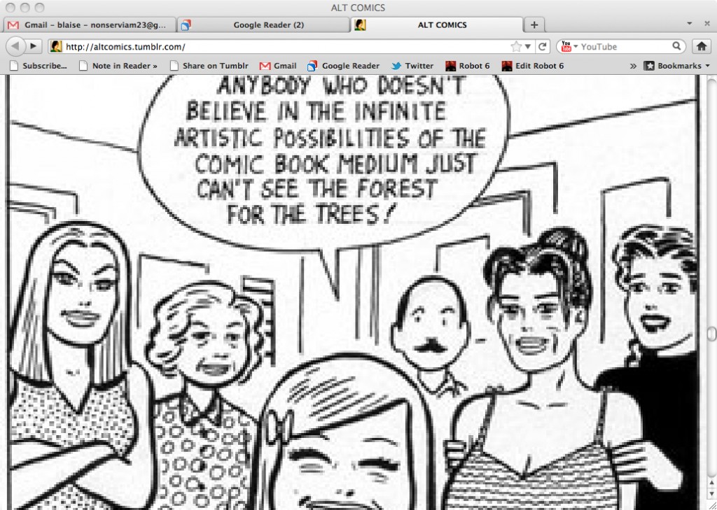
Comics Time: ALT COMICS
June 17, 2011ALT COMICS
Editor unknown, to me at least, but it sure seems like a Comets Comets production
May 2010-present
Read it at altcomics.tumblr.com
“Comics is any art you can read.”—Sean T. Collins
Seen through an RSS reader, the Tumblr dashboard, or the crisply laid out collection of thumbnails that is its Tumblr archive, ALT COMICS is like any other image-based tumblelog. Viewed at its own address? It’s a black hole. Hold down the spacebar and you’ll rapidly scroll through literally thousands of images, frequently but by no means entirely of the “alt comics” persuasion, with the many many images that aren’t sort of averaging out in that direction. But they’re not meant to be sampled as eye candy, or as proof of the blogger’s excellent taste. Each one is blown up to the same massive screen-spanning size regardless of its original size, scale, or resolution. The result digitally distorts many of the images, makes most of them far too big to take in all at once, and erases any of the tumblr artifacts — permalinks, note counts, tags, sources — that tell you where one post ends and the other begins. The result? Pure images, pure juxtaposition, stripped of almost any context other than what’s immediately visible on the screen at the moment, and the cumulative effect of the accumulation of those moments. Taking that endless scroll to the blog’s all but unreachable bottom is a journey into the sheer pleasure of seeing lines on paper (or “paper”), seeing words mixed up with art, seeing styles collide and fracture and explode and detourne and corrode. It also invites you to deduce a method to the madness. Are the giant photos of James Kochalka, Jeffrey Brown, Matt Madden & Jessica Abel, and the Harkham/Crane/Ryan/Hernandez/Regé/Santoro L.A. comics crew intended as the equivalent of Johnny Rotten’s “I HATE PINK FLOYD” shirt? Which does the author of the blog like more: Jonny Negron or Goodnight Moon, Chris Ware or some poorly photoshopped internet-age visual noise, Scott Pilgrim or Harold Gray, a Devo album cover or the cast of Daria, Scott McCloud or Dr. Manhattan or Olivier Schrauwen or page after page of Blaise Larmee or or or or or…? Pure images isn’t even the right term for it — presented without comment or context, one size fits all, a digital haze rendering craft more or less moot as a reference point, you’re looking at the idea of images more than images themselves. That’s telling. It’s also telling that this project of re-presenting other people’s image-ideas is perhaps the strongest work I’ve seen from the Co-Mix crew so far.
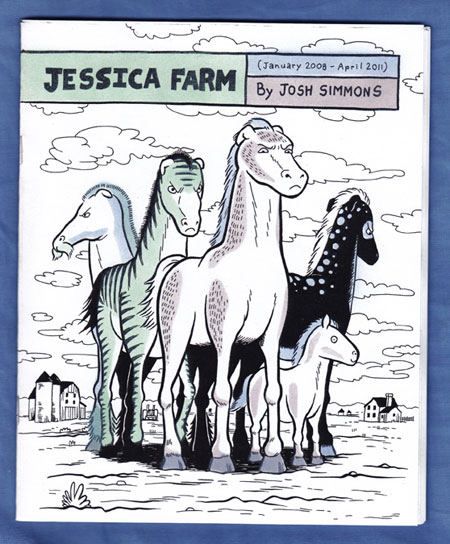
Comics Time: Jessica Farm (January 2008-April 2011)
June 15, 2011Jessica Farm (January 2008-April 2011)
Josh Simmons, writer/artist
self-published, June 2011
40 pages
$8 (including shipping)
Buy it from Josh Simmons
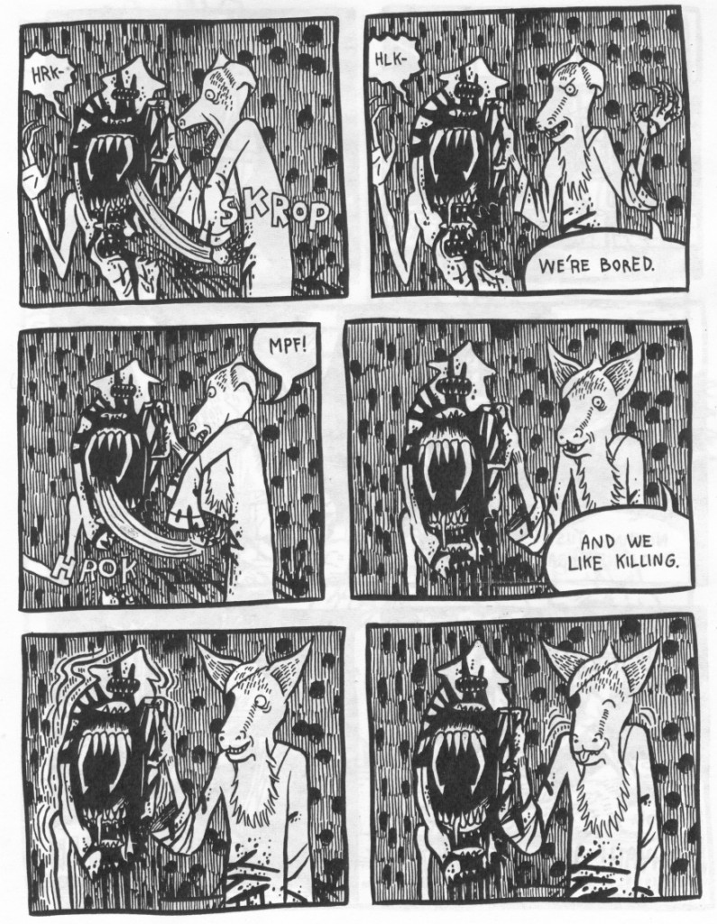
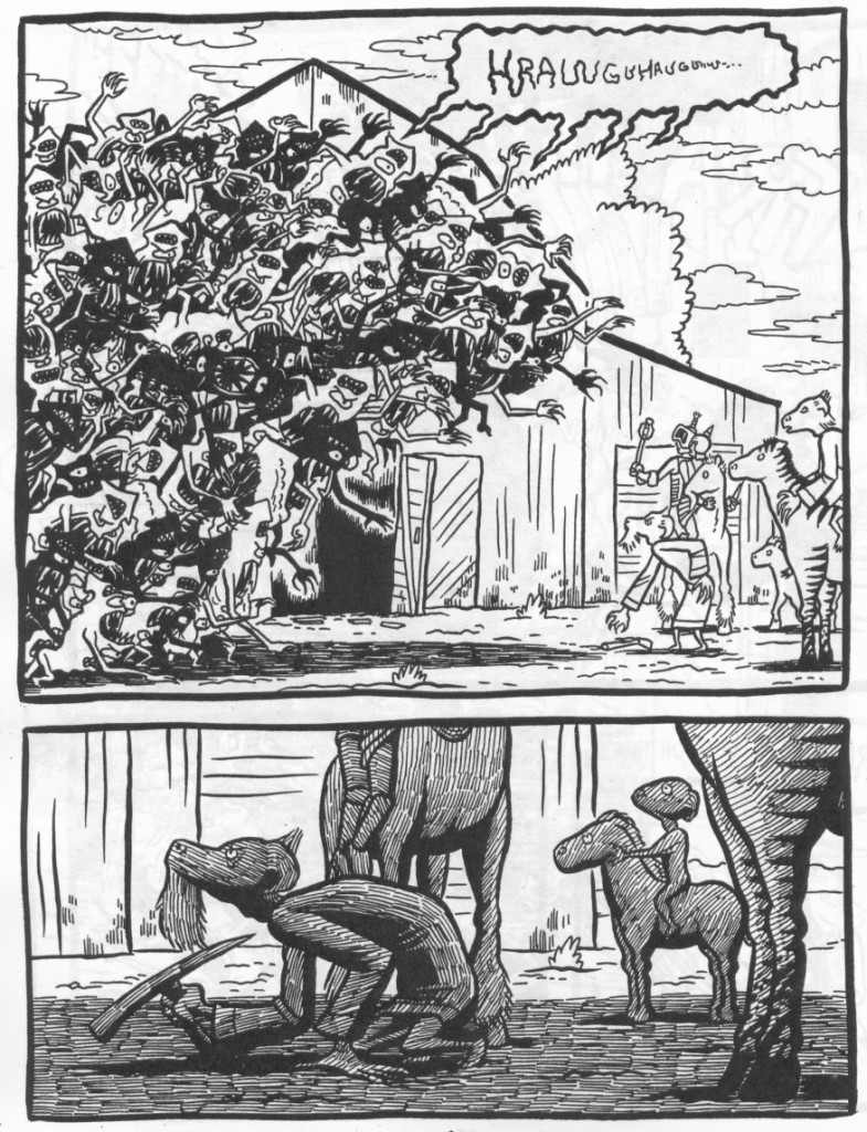
If there’s a cartoonist working today who more reliably, ruthlessly, and relentlessly exploits his own strengths with each new release than Josh Simmons, I’ve yet to encounter him. Witness this self-published slice of Jessica Farm, a 600-page graphic novel Simmons is drawing one page a month for a projected fifty years. Volume One was published by Fantagraphics in April 2008, (the back cover of this minicomic installment reads “Volume 2 coming 2016”), and already the contrast with the involving but formless original is striking. Instead of taking us on sort of “It’s a Small World” ride through various disconnected images of dreamlike horror and weirdness, Simmons here uses his rubric of a teenage girl meeting strange invaders and residents on the sprawling family estate to keep us rooted to the same two places: a bare room where a trio of goat-people called the Smiths are brutalizing a boogeyman akin to the one that Jessica encountered in Vol. 1, and the field outside where they eventually do battle with an army of the creatures. The book feels much more focused for the lack of literal wandering. Moreover, within these established confines, Simmons can get much more mileage out of his astutely choreographed action sequences. In the first half of the book, two dramatic attacks are dependent on our feel for how large the room is and how long it takes characters to get from one side to the other, and Simmons crafts that space so well that you can practically hear the scrambling footfalls. A later sequence involves charging horses and bounding beasts, depicted in a succession of widescreen panels that keep the action dead center in each one, a restrained presentation of very visceral material.
And I don’t know how it’s possible, but the pacing is remarkable for a book drawn with thirty days between each page. It’s reversal after reversal: These Smiths are scary, no wait, they’re friendly; they’ve got the upper hand on their captive, no wait, it’s got the upper hand on them, no wait, I was right the first time; they’re attacking a couple of monsters, no wait, they’re outnumbered a hundred to one, so what, they’re still going to win. It has a propulsive feel to it that Vol. 1 lacked.
Simmons’s usual talents are in evidence here as well. From the title creatures in “Night of the Jibblers” and “Jesus Christ” to the witches and ogres of “Cockbone” to the Godzilla-sized pink slug in The White Rhinoceros, he’s developing one of the best bestiaries in comics, and the “skrats” at the center of this story fit right into that menagerie. They come in black and white varieties here, and in great numbers by book’s end, allowing Simmons’s ever smoother inks (reproduced beautifully here, by the way) to evoke everything from Spy vs. Spy to David B. to that Escher drawing with the fish and the birds. And like most of Simmons’s monsters, they’re a discomfiting combination of flesh and fangs that makes you feel that being attacked by one of them would be not just deadly but grotesquely intimate, like being mauled by a giant scrotum studded with razor blades. The characters we meet are similarly creepy, using Simmons’s standard and still unnerving combination of over-the-top aw-shucks friendliness and violent, obscene threats and exclamations, like a beloved uncle you suddenly realize you don’t want to be alone with anymore. Lovely cartooning, icky horror, and a battle scene that’ll likely top anything else you see this year, for eight dollars total? No way you should wait till 2016.
Comics Time: Cindy and Biscuit
June 13, 2011 Cindy and Biscuit
Dan White, writer/artist
Milk the Cat, 2011
24 pages
£2.50
Buy it from Milk the Cat
What a pleasant surprise this turned out to be. Created by Dan White, aka The Beast Must Die from the Mindless Ones blog, Cindy and Biscuit has a look that at first glance might tempt you into thinking it’s one of those try-too-hard “bang! pow! comics aren’t just for grown-ups anymore!” all-ages things that grown-ups on the Internet really like — but only at the very first and most cursory glance. Take a closer look at that cover: It’s not just a spunky-lookin’ little girl and her plucky canine companion, it’s also a mountain of skulls and a board with a nail through it. Things never get quite that grim inside, but it still comes as something as a shock when our dynamic duo spots an alien landing crew and, instead of having some zany spooky adventure, Cindy leaps through the air and brings her board down on an alien’s head with full force, shattering the helmet into tiny safety-glass fragments and smashing the head to a pancake with a KKRUNNT! (Great sound effect, by the way.) That’s the moment where it becomes apparent that White will be bringing to the surface all of the unpleasantly unrestrained id lurking beneath fondly remembered all-ages entertainments from Calvin & Hobbes to Bone. In addition to going Game of Thrones on those aliens, the three stories collected here see Cindy stumbling across a savage, slavering werewolf only to be patted on the head by the beast, who’s seemingly acknowledging a kindred spirit, and recounting a dream in which she floats to the Moon and tosses a rock at the Earth, blowing it up. White realizes that the danger we crave as kids is a projection of the dangerous sensations called up by our own anger and frustration with a world we’re quickly learning is unfair. The best thing about Cindy and Biscuit, though, is that it really could be an all-ages comic, and an excellent one at that. White’s thick line has a candy-like quality to it, wavy and chunky and almost chewy, and which gives his rather impeccable action shots real heft and momentum. He draws Cindy as a bounding presence whose feet stay a solid foot and a half in the air when she runs, but she doesn’t come across as weightless or effortless, but rather as a physical thing that’s got so much energy behind her she’s propelling herself off the ground. Biscuit’s a good design too, like an arrow in dog form. It’s solid enough in terms of figurework and depiction of action to put me in mind of a less claustrophobic Brian Ralph, while the use of a genuinely fun adventure-comic look and tone to say something melancholy about youth is reminiscent of sweet-and-sour “new action” books from Street Angel to Cold Heat. It’s easy to imagine a big color collection of these with a few more uncompromising little stories added in really knocking people for a loop. It’s well worth a look as is — an intriguing array of visuals and ideas from a talented off-the-radar cartoonist.
Comics Time: Prison for Bitches
June 10, 2011Prison for Bitches
Ryan Sands, Hellen Jo, Calivn Wong, Anthony Ha, Makkinoso, Gea, Sophia Foster-Dimino, Chris Kuzma, Johnny Ryan, Sophie Yanow, Chris “Elio” Eliopoulos, Michael Kupperman, Adam Bronson, An Nguyen, Mickey Zacchilli, Lisa Hanawalt, Anthony Wu, Evan Hadyen, Leslie Predy, Monika Uchiyama, y16o, Ryan Germick, Saicoink, Angie Wang, Tony Tulathimutte, Andre Syzmanowicz, Raymond Sohn, Michael DeForge, Mia Shwartz, Patrick Kyle, Derek Yu, Jordyn Bochon, Seibei, Ginette Lapalme, Nick Gazin, Harvey James, Zejian Shen, Robert Dayton, Aaron Mew, writers/artists
Ryan Sands and Michael DeForge, editors
self-published, 2010
64 pages
$12
Buy it and see an extensive preview at PrisonForBitches.com
The wonderful thing about recruiting a galaxy of underground comics and illustration stars to make a Lady Gaga fanzine is that no matter what kind of extravagant weirdness they concoct, there’s a better-than-even chance that at any moment the Lady herself could come along and comfortably out-weird them all. Nearly to a piece, the art, comics, photography, interviews, and essays assembled here by the Thickness team of Ryan Sands and Michael DeForge appear to have been created with a healthy appreciation for their own potential obsolescence in mind, and admiration and awe for the relentlessly and exuberantly creative young woman who’d make it happen. How else to explain the number of contributions that portray Gaga as godlike? In the hands of the Prison for Bitches team, Gaga is a queen seated on a giant telephone throwing trinkets to the huddled masses (Foster-Dimino); a vision appearing in dreams to espouse Anarcho-Gagaism to her supplicants (Yanow); a Big Brother-style disembodied head whose kohl-rimmed eyes stare at the viewer with a totalitarian sex-death gaze like something out of Metropolis (Kupperman); a She-Ra/ELA-esque figure riding through space atop a crystalline Battle-cat (Hayden); a Ray-Ban-wearing Baphomet (Predy); a giant sea goddess towering over the bodies of the drowned (Wang); an empress who lives to be 110 years old (DeForge); a severed head whose tongue, hair, and blood vessels are Cthulhoid tentacles (Aaron Mew). She is seen as supernatural, both a Delphic oracle of fabulousness and a Ring-claiming Galadriel proclaiming “All shall love me and despair.”
On the “love me” point, only a handful of the contributors work with the fact that she’s a very attractive person, but they’re among my favorites: André Syzmanowicz lovingly depicts the curves of her stomach, her breasts, her armpits, even as a werewolf creature gropes her from behind; a strip from Robert Dayton sees an ostensible fan complain about her mediocre music and ripped-off style, finally responding to the question “What do you like about her then?” with “Her navel—I want to lick her navel”; and right between the staples in the centerfold spread that anchors the book’s central full-color section, Mickey Zacchilli sticks the singer’s famously fit rear end.
Still other contributors take advantage of Gaga’s graphic potential for maximum maximalist imagemaking — artist after artist (Jo, Wang, Gazin, Yu, Bochon, Foster-Dimino) have a ton of fun with her hair, culminating in a spectacular caricature of her Coke-can curlers from the “Telephone” video by Harvey James. An Nguyen and the team of Hellen Jo & Calvin Wong provide concert reportage, the former with photos of her cosplaying fans, the latter with comics about the on- and off-stage spectacle of the concert experience.
A trio of prose pieces appear in what seems like ascending order of skepticism; in descending order, Adam Bronson has a funny piece that uses Deleuze and Hegel to analyze the relative potential of Gaga’s “Let’s Dance” and Frank Sinatra’s “My Way” to provoke violence in Filipino karaoke bars; Anthony Ha interviews Vanessa Grigoriadis, author of New York magazine’s seminal profile of Gaga’s origins and rise to fame, that’s best summed up by its title – “I’m a Total Fan of Hers, I Just Am Not a Huge Fan of Her Music”; editor Sands kicks the whole thing off with an utterly sincere and descriptively, persuasively argued “UNDISPUTED TOP 5 LADY GAGA SONGS,” featuring genuine gems like “[‘Alejandro’] sounds like ABBA’s ‘Fernando’ rubbing lotion all over Ace of Base’s ‘Don’t Turn Around’ while bathing nude on ‘La Isla Bonita'” and “[‘So Happy I Could Die’ is] really just a simple song about being convinced you are the hottest and most desirable person on the earth, and that this can be the best of all possible worlds if we allow ourselves the pleasure.” Taken in tandem, they’re like a debate between different modes of Gaga fandom, from arch irony to measured respect for a pop-culture needle-mover to downright love for someone who makes awesome songs to dance to.
The whole zine works like this, basically. Whatever it is you get out of Gaga — a pop-art deity, a gorgeous girl, an eye-inspiring spectacle, a thinkpiece generator, a hitmaker — by all means share that fun with a world that doesn’t have enough of it. This book is a snapshot of the Gaga conversation, post-“Telephone” video 2010; it’s a testament to the contributors and their subject alike that even now that the specifics of that conversation have now been rendered moot by an album full of pinball music and Clarence Clemons sax solos with a cover that reads “BORN THIS WAY” over a picture of the artist as a motorcycle with a human head, I’d love to hear them have it all over again. Prison for Bitches is a Little Monster must-have for any Gaga fan.
Comics Time: Thickness #1
June 8, 2011Thickness #1
Katie Skelly, Jonny Negron, Zejian Shen, Derek Ballard, True Chubbo, writers/artists
Ryan Sands and Michael DeForge, editors
self-published, May 2011
48 pages
$12
Buy it from the Thickness website
The great altcomix fuckfest continues! Of the recent releases I’ve read that pass smut through the same art-comics filter that science fiction, fantasy, action, and horror have all recently traversed, Thickness is the book that seems most concerned with creating out-and-out pornography. Chalk that up primarily to the anthology’s centerpiece and unquestionable standout, “Grandaddy Purple, Erotic Gameshow,” by cover artist Jonny Negron. “Dreamlike” is an adjective that gets tossed around a lot, by me not least of all, but that’s absolutely the right way to describe the plot of this thing, which starts with two sinister gangster-type figures falling victim to a rooftop assassination, then follows the assassin as he’s rewarded with a Let’s Make a Deal selection of prizes hidden behind three numbered doors, then shows him claiming his prize — a beautiful woman — in explicit detail, and ends with his post-climax black-widow murder. Negron can’t seem to contain his glee during the sex scene: The woman shouts out no-fuckin’-around, let’s-have-fun-with-our-bathing-suit-area exclamations like “Mmm, let’s see how much I can fit in my mouth!” and “Fuck! We’re goin’ to have fun with this cock!”, while Negron frequently breaks down his large panels into sub-grids of as many as nine, 10, or 11 panels, using the layout language of Acme Novelty Library to cram in as many of the deliciously dirty details of the characters’ liaison as possible before running out of room on the page. To quote Maude Lebowski, sex in Negron’s hands is a zesty enterprise. But it’s just one of the arrows in his quiver: His story also features angular artificial environments and M.U.S.C.L.E.S.-style character designs that, when combined with his women’s King magazine physiques and his bad guys’ skinny-suit-and-shades-sporting comportment, makes him come across like a happy marriage of Yuichi Yokoyama and Benjamin Marra. His depiction of action is really a marvel, too: It can be dynamically staged as all get-out, but then he does something off-kilter, like showing a falling man’s impact with the floor and his subsequent post-mortem prostration in a fashion that totally flattens the moment, calls attention to its ludicrousness, and yet somehow makes it feel all the more brutal and unpleasant for that. Ditto the final image, which I won’t spoil.
By comparison the other contributions can’t help but feel slight. Katie Skelly’s “cute-sexy floppy-eared lady has sex with plants in a sci-fi paradise that suggests Vaughan Bode mated with Georgia O’Keefe” entry “Breeding Season” is covering well-worn territory for SF erotica, though her thick rounded inks are nice to look at and she has a knack for capturing certain visual details that entice, like the gap between the fabric of the heroine’s suspender-like bathing suit and her breast and torso when viewed from the side. Zejian Shen’s “Pearl Divers” wrings an amusing dual joke out of its title’s double entendre by anthorpomorphizing both the oysters captured by the titular fisherwomen and their clitorises as they celebrate their catch with some beachside tribadism. Derek Ballard’s “Trap Shadez” is another sci-fi story whose sexual content is actually relatively minimal; for my taste it overelies on angular ’80s-tinged figurework and design that can’t quite overcome storytelling that’s deliberately but still unsuccessfully unclear. The True Chubbo comic that closes out the collection is a solid example of that strip’s unusual charm (it’s more charming than funny), wherein the love between creators Ray Sohn and his anonymous wife comes through all the clearer the worse their ridiculously violent sexual violations of one another get. Sands and DeForge’s high-quality production, including risograph printing that gives each story a fitting primary color ink, certainly elevates each contributor — the murky purple selected for Negron makes that particular freakout even seedier, somehow. He’s worth the price of admission all by himself, and hey, a home run after four singles still puts a lot of runs on the scoreboard.
Comics Time: Too Dark to See
June 3, 2011Too Dark to See
Julia Gfrörer, writer/artist
Thuban Press, May 2011
32 pages
$5
Buy it from Julia Gfrörer
Buy it from Sparkplug
“I just need your cum. Give it to me and I’ll go away.” Well, hello, sailor! In the vanguard of a burgeoning mini-movement of alternative comics dealing frankly and explicitly with/in sex, Too Dark to See centers on a liaison between a sleepy (or possibly sleeping) young man and a spectral shadow woman, the bluntly transactional nature of which is no doubt hot to some, cold to others. It’s tough to figure out how to feel about it, actually, and that’s what makes it a fine catalyst for the story, which is primarily about the real live human couple of which the guy is a part. His girlfriend, our protagonist through the bulk of the story, is introduced to us as either she or he (it’s not clear who; I’m not sure it matters) says “No one has ever loved anyone more than I love you” as they embrace in bed, but before long she’s being cuckolded by a shadow creature. We next see her sitting on the toilet, naked from the waist down, awkwardly asking the guy if he remembers jerking off in his sleep. She’s at a disadvantage throughout: She thinks her boyfriend might be cheating on her and her suspicion is greeted with angry dismissal, she fails to pick up on cues he thinks are screamingly obvious and interrupts him as he works on writing “the first good idea I’ve had in ages,” she suspects a customer at the coffee shop where she works of coming in solely to judge her, she’s worried about a black spot that could be an STD but which we can gather from our experience with the shadow person is likely something far more sinister, she self-mutilates, she struggles to even be heard at one point while lying under the covers when her boyfriend returns after storming off, and even supernatural entities make fun of her. Factor in Gfrörer’s shaky, wiry line, really perfect for capturing both the undermployed bohemian demimonde and the veal-calf physicality of young skinny naked people, and the feeling that emerges is one of almost overwhelming vulnerability — a woman who feels at the mercy of love, sex, money, class, and her own body, to the point where the addition of dark forces from beyond feels not just appropriate but almost inevitable. It’s an ugly feeling, and it takes a special sort of beauty to capture it as well as this disarming little comic does.
Comics Time: Open Country #1
June 1, 2011Open Country #1
Michael DeForge, writer/artist
self-published, May 2011
16 pages
Read some preview pages, and buy it eventually, I’d imagine, at Michael DeForge’s website
I think there’s a greatest-hits compilation called A Young Person’s Guide to King Crimson? That’s sort of what this is for Michael DeForge. Nearly all his themes can be heard here: deadpan slice-of-life dialogue juxtaposed with extravagantly odd SFF concepts; deconstructed, dismantled, dismembered, disfigured human bodies and faces, like cubism reimagined as body horror; friendship depicted primarily as a venue for venting ideas and concerns at one another rather than real emotional interaction; uncomfortably accurate and funny lampooning of the disconnect between lofty art-school philosophizing and post-graduation economic reality; visually spectacular treatment of altered states shared by two people; creepy horror slowly oozing out of and eventually overwhelming previously established ideas. Conspicuously absent are the full-fledged rubble-strewn wastelands of the sort seen in Lose #3, but in their place there’s a conversation about such post-apocalyptic landscapes. It comes in the context of an interview with the visual artist whose work is the catalyst for the comic. She works in the medium of psychic projection, said by our leading man to be the province of the educated and access-granted elite: “Sometimes I wish I had actually stayed in art school so I could have learned how to do that sort of thing. There are so many techinques that I don’t have the time or resources to learn on my own…psychic projection, silkscreening, linocuts, darkroom photography–all that stuff.” Our hero tries to bone up on the form by watching an interview with the artist (whom we first see as she projects an avatar of herself that’s gigantic, nude, impaled in a field of debris, and begging for help) on YouTube: “[Do you] really believe that? That there’s ‘nothing left to build on?'” asks her interviewer. “Your imagery is so preoccupied with debris, clutter, refuse…'” This might as well be an interview with DeForge himself. And like a good interview, Open Country #1 is a great thing to hand someone who wants to see what’s up with the artist in question.
Comics Time: SF #1
May 30, 2011SF #1
Ryan Cecil Smith, writer/artist
Closed Caption Comics, May 2011
36 pages
$5
Buy it from Ryan Cecil Smith
I know, I know, “Physician, heal thyself,” but I was skeptical of the need for another altcomix take on space opera. Closed Caption Comics member Ryan Cecil Smith is at his best when he’s riding his preoccupations into uncharted territory, be it his high-camp horror-manga riff Two Eyes of the Beautiful or his wild “bicycling action as you like it!” adventure “Koshien: Impossible.” But anthorpomorphic alien races, laser guns, intergalactic law enforcement agencies, worldbuilding, and knowingly arch dialogue are a commonplace even in revisionist circles. Would Smith bring enough new ingredients to the table to get me to eat it? I needn’t have worried. Taking advantage of a larger trim size and pretty high quality printing for a minicomic, SF gives Smith an expansive canvas on which to deploy a take on sci-fi swashbuckling that’s…quietly silly, if that’s even possible. His line feels light and frothy here, a fluid thing that flows along with the propulsive action sequences (a shootout in a hospital is particularly bombastically staged) and the charming character designs (aliens variously evoke the creature-people of Lewis Trondheim, James Kochalka, and Chris Wright, while our hero Ace of the Space Fleet Scientific Foundation Special Forces has a giant mountain of hair that wouldn’t look out of place in Dragonball-Z, a demeanor akin to one of Naoki Urasawa’s indefatigable ultra-awesome do-gooder detectives, and a laser gun that would give that dude from Berserk and his sword a run for their collective money on any Freudian analyst’s couch.) Zipatone-style shading gives the art dimension while obviating the need for Smith to vary his lineweight overmuch and thus lose some of its elegance. And as simplistic as it is, the story even manages to be engaging, with its tale of a boy orphaned by terrorist space pirates and taken under the wing of the galaxy’s greatest gang of good guys — if I didn’t have this exact fantasy while in grade school, I had one so similar that it hardly makes a difference. Surely the mark of a successful exercise in genre is that whatever pleasure the reader derives from seeing generic tropes exploited or subverted places second behind simply wanting to see what happens next. That’s where I’m at with this one.
Comics Time: Mister Wonderful
May 27, 2011Mister Wonderful
Daniel Clowes, writer/artist
Pantheon, April 2011
80 pages, hardcover
$19.95
Buy it from Amazon.com
Oddly enough for a book that numbers among his most accessible — brief, funny, light, with an ending that doesn’t make you want to throw yourself out a window — Mister Wonderful really works best if you’ve read enough Daniel Clowes to realize just how different it is. When you’ve met Andy the Death-Ray and Wilson, our main character Marshall seems like a pussycat even at his most judgmental or self-lacerating. When you’ve experienced the bleak, paranoid claustrophobia of Like a Velvet Glove Cast in Iron or David Boring, or for that matter the misanthropic rant-based humor of “Sports” or “Art School Confidential,” a rom-com/comedy of discomfort mash-up feels all the more sunny and breezy even at its blackest. When you’ve read comics assembled from individual strips drawn in a multiplicity of styles like Ice Haven or The Death-Ray or Wilson, both Mister Wonderful‘s original “Tune in next week, same Clowes-time, same Clowes-channel!” incarnation as a serialized strip in The New York Times Magazine and its re-cut, re-edited, expanded, much less punchline and cliffhanger dependent reincarnation here come across like a study in stylistic and storytelling economy. When you’ve seen how much mileage Clowes gets out of the cramped feel of his pages and the studied ugliness of their contents — even at their prettiest his comics have the uncomfortable, slightly awkward feeling of wearing a suit that’s a size or two too small — watching him blow out images to sprawl across both pages of a loooooong horizontal spread is a glorious thing indeed, infusing the images so selected with emotional power, whatever emotion it happens to be at the time. And when you’ve seen Ghost World‘s seemingly optimistic yet decidedly ambiguous ending, Mister Wonderful‘s denouement becomes all the more notable, both for its similarities (a bench figures prominently in both) and its differences (Ghost World‘s bench is empty, Mister Wonderful occupied and shared). It’s the differences that make all the difference.
Click here for an interview I conducted with Clowes about the book.

