Posts Tagged ‘comics reviews’
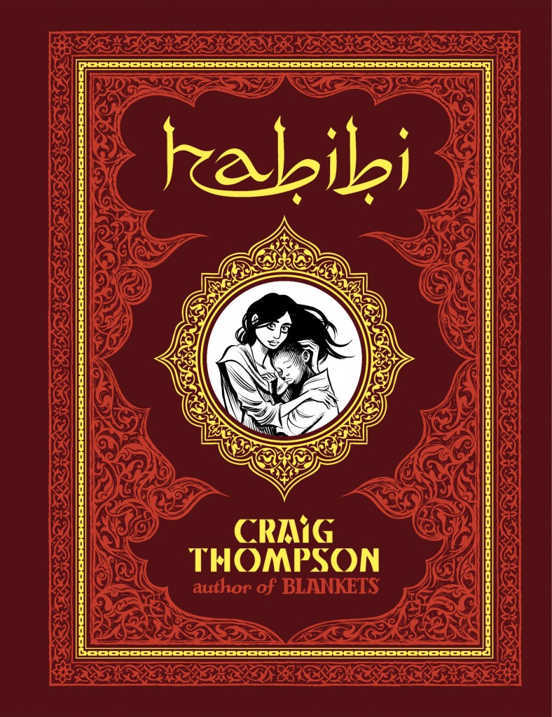
Comics Time: Habibi
September 20, 2011Habibi
Craig Thompson, writer/artist
Pantheon, September 2011
672 pages, hardcover
$35
Buy it from Amazon.com
Fifteen observations about Craig Thompson’s Habibi:
1. This is not a book about Islam. It’s not about any varieties of Islam — contemporary, ancient, fundamentalist, militant, or otherwise. It’s a book infused with Islamic art, culture, thought, and religious beliefs, certainly, but it’s not about Islam. This is another way of saying it’s not about 9/11, al Qaeda, Iraq, Afghanistan, Palestine, Iran, any specific Muslim countries, Muslims in America, uniquely Muslim varieties of misogyny, the Arab Spring, or any other contemporary news-story topic. I first talked to Thompson about his plans for Habibi in the summer of 2003, and in that context and over the course of many of the years to follow it was tough to think about the book without thinking of it one or more of these ways, but no, that’s not what it’s about.
2. This is a book that uses Islam to do other things. On a visual level, it gives Thompson a set of design elements, from calligraphy to ornamentation to architecture to dress to geometrical art, from which he can build a coherent visual world for his vaguely fantastical/post-apocalyptic/dystopian story. Not coincidentally these elements dovetail with his preexisting preoccupations as an artist, from swooping fabrics to obsessive-compulsive design filigrees to religious iconography.
3. It follows that the book is consciously, knowingly Orientalist, as you’d expect and hope of a book that’s using actual Islamic art as bricks in a fantasy world-building project. It’s got an Arabian Nights vibe. Thompson’s invoked Edward Said on this score and everything. To the extent that potentially problematic caricatures of Arab and African race are involved, and they are, they are at least consciously evoked.
4. Islam also provides Thompson with a back door into talking about religion and God — even recognizably Christian elements thereof, thanks to the presence in Islam of Jesus, Solomon, Abraham et al — without needing to rely on the brand of American evangelical Christianity in which he was immersed growing up and which he’s already explored in Blankets. At times the commonality between the issues he discusses in the two books is quite striking. For example, there’s a plotline here about how the bifurcation of Islam and Judaism/Christianity can be traced back to which son you believe Abraham was supposed to sacrifice, Isaac or Ishmael, that’s basically just Blankets‘ bit on scriptural malleability (“The Kingdom of God is within or around you”) blown up to world-historical scale. The impact of religious belief on the development of adolescent sexuality is a centerpiece of both books as well.
5. This is a book about sex. Even if there’s nothing in it that would earn the book anything more than an ‘R’ rating, it works through some violently ambiguous and conflicted feelings about sex in relatively explicit fashion. It took my wife reminding me that Craig first described the book as starring “a eunuch and a prostitute” to help me crystallize that, but there it is. And it makes sense, given the play-it-to-the-balcony tone of Thompson’s previous book, Blankets, and its autobiographical protagonist’s all-or-nothing approach to falling in love and making art, that this book would coalesce around those two poles as well. It is very frankly about the liberating and destructive power of both desire and the denial of desire. (To hearken back to the Arabian Nights element, here’s a tell: Instead of delighting the king with her stories for night after night under penalty of death, the central female character must delight him with sex.)
6. This is a book about many other issues that overlap with or orbit around sex in the popular imagination. They’re not sex, but they’re talked about in the same breath more often than not. They include rape, molestation, prostitution, pregnancy and childbirth, gender, misogyny, a panoply of queer identities, self-injury, puberty, motherhood, male-female friendships, sex and race, sex and organized religion, sex and spirituality, sacrifying sex/orientation/gender, masculinity and femininity…
7. The emotional and physical stakes for the characters are much higher than they are in any of Thompson’s previous works. This is established within the first few pages, in which a child is raped. A bloody sheet is held up to the child and the audience, the blood of her vagina on the blank white fabric equated with the letter-writing in Chunky Rice; the footprints on snow and drawings on paper of Blankets; the act of Creation itself — “From the Divine Pen fell the first drop of ink.” Violence and abuse are the lifeblood of the story.
8. Thompson’s art is much, much denser here than I’ve ever seen it before. It’s still lush and lovely on a surface level, his line still swoops and curves in a fashion he’s explicitly compared to handwriting, but there are more panels on the page, more black in the panels, few of the vast fields of white Blankets was known for, and few of its splash pages too. Decorative patterns of intricate detail are copied from Islamic texts by hand, and drawn repeatedly until they cover almost all the available space on a given page, also by hand. It’s a much tougher book for your eyes to breeze through.
9. Maybe the best way to symbolize that is in the new panorama Thompson has added to his repertoire. He’s said, and promotional art for the book has made use of the fact, that Good-Bye, Chunky Rice had the ocean, Blankets had the snow, and Habibi has the desert. That’s true, but Habibi heavily features vistas of another sprawling, enveloping sea: a man-made sea of garbage. It’s as dense and detailed and chaotic as the water, snow, and sand are unified and simplified.
10. The book is designed. Designed in the Watchmen symmetrical-issue sense. Each of its nine chapters corresponds to a box in the Islamic religious/mathematical talisman known as a magic square — a sort of spiritual sudoku — and its corresponding letter of the alphabet. Each corresponds to a specific topic, and a specific prophet of Islam used to illuminate that topic. But unlike Alan Moore, Thompson doesn’t foreground his machinations. This stuff is present, but in its way it’s beside the point. I didn’t even notice.
11. In much the same way that light, electricity, and information functioned as the stuff of life in Grant Morrison’s Final Crisis, fluid is the stuff of life here. Water is crucial to the various societal strata’s survival within the drought-stricken world of the story. Blood is crucial to nearly all of the book’s depictions of both sex and violence, the fuel of human physicality. Ink is crucial to the characters’ understanding of the nature of God and the world via holy texts and art, and to the author’s understanding of what the hell he’s been doing for the past eight years. There’s less semen or vaginal secretion than you’d think, but otherwise it’s a book about fluids, and fluidity. The greatest sin is staunching the flow, which is done in various ways — a metaphor that extends from environmentalism to art to, of course, spirituality and sexuality.
12. The relative lack of emphasis on sexual fluids is a leading indicator of where the book ultimately pulls an important punch. There’s a revelation, an exposure, toward the end of the book that we readers do not get to see. Since the book confronted virtually everything else it tackled so head-on, since it was so in-your-face about violence and sexuality, you really feel this revelation’s visual absence. Which is maybe appropriate, given what’s being revealed, I dunno. But it left me wondering “Why didn’t he show that?”, in a way that suggests it’s a misstep.
13. The book contains two of the toughest depictions of mental illness I’ve come across in comics. One in particular involved postpartum depression and was deeply sad to me. The other comes hot on the heels of the book’s single most unpleasant depiction of the cruel fate of children in this world. Actually, nearly everything involving children is rough stuff here. There’s not a lot of time for innocence.
14. The book contains two pretty rollicking action sequences. If you’ve read as many lousy action comics as I have, it ought to be a pretty great pleasure for you to watch an artist with Thompson’s attention to environment, layout, movement, and pacing choreograph chase scenes and fight scenes. It definitely was for me. And these sequences had the secondary function of release valve for the dense and emotionally oppressive material they helped break up.
15. Actually, the more I think about it, the more I think Habibi is a book of sequences. Maybe this is reinforced by Thompson’s non-linear storytelling, with his male and female leads’ stories shifting backward and forward in time independent of one another, a technique that emphasizes discreet sequences over the overall flow of the larger narrative. But the bathtub sequence (very successful), the dam sequence (this is perhaps the book’s climax, and I’m not sure it’s successful), the garbage man sequence, the childbirth sequence, the eunuchs sequence, the conflicting stories of Abraham’s aborted sacrifice — these are what stick out to me, embedded in the bigger picture. They’re what will draw me back into the book, moving backward and forward through the work of a cartoonist working out his personal obsessions on the grandest canvas imaginable.
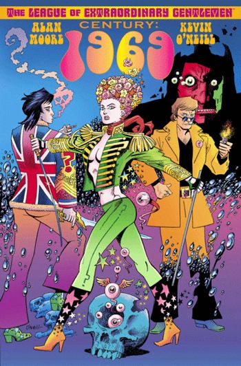
Comics Time: The League of Extraordinary Gentlemen: Century: 1969
September 14, 2011The League of Extraordinary Gentlemen Vol. 3: Century #2: 1969
Alan Moore, writer
Kevin O’Neill, artist
Top Shelf, August 2011
80 pages
$9.95
Buy it from Top Shelf
Buy it from Amazon.com
For today’s Comics Time review, please visit The Comics Journal.
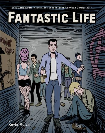
Comics Time: Fantastic Life
August 26, 2011Fantastic Life
Kevin Mutch, writer/artist
Self-published, August 2011
128 pages
No price listed
Read the first chapter at Kevin Mutch’s website
For today’s Comics Time review, please visit The Comics Journal.
Have a Comics Time all the time
August 16, 2011I’m pleased to announce that the Comics Reviews section of the sidebar is now fully up to date. All of my recent Comics Time reviews have been added, and all the links lead to the relevant review here at seantcollins.com rather than at my old site. That’s in the neighborhood of 500 reviews. Please browse and enjoy.
Comics Time: Tales Designed to Thrizzle #5
August 16, 2011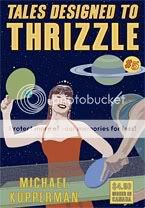 Tales Designed to Thrizzle #5
Michael Kupperman, writer/artist
Fantagraphics, 2009
32 pages
$4.50
Buy it from Fantagraphics
(Originally posted at this blog’s previous location on May 26, 2009; I am reposting it because it does not seem to have made the move to the current site.)
By now I’ve written about how Kupperman’s humor works at some length, so you’d think it would have occurred to me by now that his humor is an entirely different animal from the vast majority of humor comics. Which it is, insofar as it’s funny and most humor comics aren’t. But it wasn’t until this (ironically) prose-heavy issue that I realized he’s not doing gag comics at all. The only four-panel punchline-driven strip in this entire book, “Ever-Approaching Grandpa,” basically exists to give lie to the notion of the four-panel punchline-driven strip (and is own title). He’s not content with using just the words and the visuals. I think what Kupperman’s doing–with his long, digressive “stories,” with his riffs on old-fashioned comic-book covers, and so on–is using the stuff of comics itself as a locus of the comedy. A grid of panels implies continuity of action, so he uses that to present an increasingly bizarre and disjointed Twain & Einstein adventure with barely any internal cohesion whatsoever. We assume that captions or word balloons will comment on the visuals against which they are juxtaposed, so he creates a how-to arts-and-crafts strip that for no apparent reason is also a brutal noir (“How to Pattern Print with a Potato, Johnny”). We’ve come to accept certain visual cues as meaning a certain thing, so he literalizes them so that they mean something entirely different–a phone in the extreme foreground actually turns out to be a just-plain gigantic phone; a mother’s wagging finger radiates motion lines that turn out to be “super-vibrations.” In his way, Kupperman’s just as concerned with making comics’ formal aspects work for him as Chris Ware. In his way he’s every bit as effective. Goddammit this book is funny.
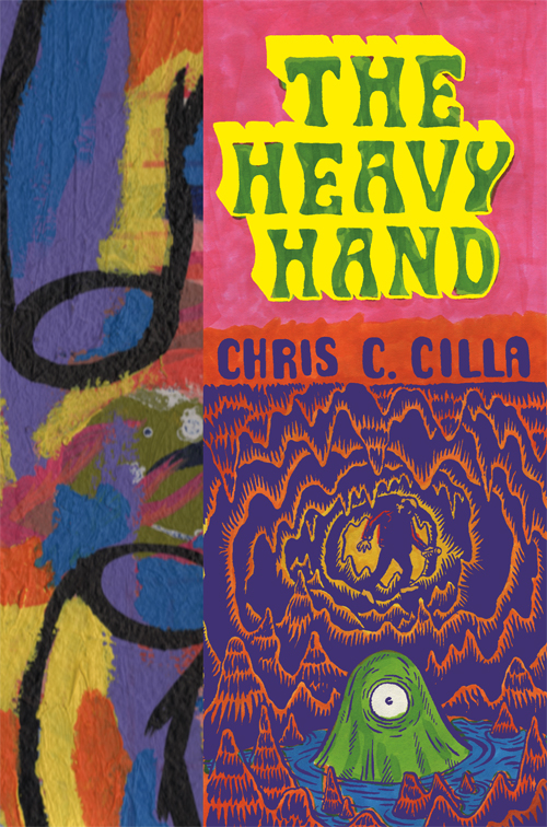
Comics Time: The Heavy Hand
August 10, 2011The Heavy Hand
Chris C. Cilla, writer/artist
Sparkplug, 2010
108 pages
$14.99
Buy it from Sparkplug
Buy it from Amazon.com
Fascinating book, this. It combines the textural, noise-based visual aesthetic of caves and monsters and melty stuff that you may have seen from many of Chris Cilla’s fellow contributors to the Paper Rodeo and Kramers Ergot anthologies with the down’n’out beer-swillin’ shit-talkin’ big-schnozzed characters of ’90s altcomix (big noses are to alternative what big feet were to the underground), so right off the top it’s doing something unexpected. And in the same way that the art is both densely intense and breezily funny, the story somehow coheres from jokey banter, grand-guignol monster attacks, and surreal non sequitur splash pages into an utterly convincing world. The Heavy Hand is basically the tale of Alvin Crabshack, somewhat feckless young guy who picks up stakes and moves from the city to a remote research site in hopes of bluffing his way into the employ of a scientist he admires, at which point he is drawn into a crescendoing series of bizarre science-fictional events — and it works great on both sides of that descriptive sentence’s comma.
Regarding the first half, Cilla’s command of the details of a young life not particularly well lived is substantial. Just for example, look at the way he differentiates between the two women Alvin is (duplicituously) dating by how he dresses both their rooms and themselves — the first has a neat haircut and sits in bed reading one book among many well-ordered shelves, candles and wine glasses strewn here and there; the second we meet as she cracks open a beer and picks a cassette tape off a table sporting a used ashtray and half-eaten dishes, all while bare-ass naked — while giving both sequences a sordid, stiff-nippled sexiness, a squalid heat that comes from lying to someone you know intimately and resent at least as much as you enjoy.
Of course, the second woman has a duck’s beak instead of a nose, which leads us to the strangeness. Obviously this wouldn’t be the first time an alternative comic featured unexplained anthropomorphism in an otherwise realistic setting, so I didn’t pay it much attention — nor the weird, wordless opening sequence in which some kind of ghostly scientist fixes both a machine and a cup of coffee by pissing all over them. But as Alvin’s journey progresses, we come to learn that not only is he basically lying his way into working with his academic idol, but the work he’ll be doing is considerably more odd and dangerous than the book’s opening makes it sound. Rival grant-sponsored teams plumb a system of caverns and underground rivers for giant eggs that contain dead reptiles, while huge and deadly one-eyed protoplasmic creatures devour their pack donkeys…which in turn hearkens back to tall tale about a curse on a nearby town that led to its affliction with these strange animals…which we suddenly realize relates to the odd interstitial splashes and spreads depicting a mustachioed man and giant spiders and so on…which we eventually learn aren’t the non-narrative interruptions they appear to be but an integral part of the story at hand…which culminates in a tour-de-force party sequence where the romantic entanglements and awkward interpersonal interactions of the beginning of the book come back into play. These competing, seemingly clashing narrative and visual threads slowly enmesh and intertwine so organically that you hardly notice, until suddenly you realize they’ve sewn up a structure so sturdy you could spend hours climbing around inside it.
My only complaint is that you don’t get that kind of time. As fun as that party scene is — I really love the way all of the dialogue is disconnected, with never more than two word balloons actually commenting on one another; it’s a great way to convey feeling out of place in an inebriated crowd — it eats up a huge amount of space relative to the densely plotted rest of the book, and rockets everything to its explosive conclusion way too fast. The Lynchian epilogue is as engrossing as anything else in the book, but it made me pine for a nonexistent much longer version, one that didn’t cut itself off right when it became apparent how rich and compelling it was. But since so much of the plot is driven by an anecdote about an inventor whose life basically had to blow up before he could do what would make him rich for the rest of his life, it’s hard for me to get too upset that the book itself follows suit. Wanting more is surely a sign that this smart, biting work of literary science-fiction comics did something right.
Comics Time: Love and Rockets: New Stories #4
August 1, 2011Love and Rockets: New Stories #4
Gilbert Hernandez, Jaime Hernandez, writers/artists
Fantagraphics, August 2011
104 pages
$14.99
Buy it from Fantagraphics
Buy it from Amazon.com
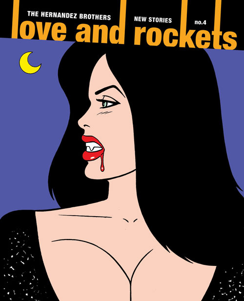
Love and Rockets: New Stories #4 will turn any fan of Los Bros Hernandez into the host of The Chris Farley Show. “Remember? That time? When you drew Calvin’s plaid shirt? So that the plaid was always facing in the same direction? No matter how much Calvin moved?…That was awesome.” I am seriously finding it difficult, if not impossible, to review this comic without simply hitting the bullets-and-numbering button and whipping up a list of everything in it that amazed me. It would be a long list, too. But I’m abstaining as much as I can — to challenge myself for starters, and to avoid spoiling the comic for those of you who haven’t yet read it (which is probably most of you since it’s not out yet) for the most part. But I’m also holding off on that listicle because I think it’s a cheat. The fact of the matter is that while reading this book I discovered that I’m at least as attached to Ray Dominguez and Fritz Martinez, the protagonists of Jaime and Gilbert’s contributions respectively, as I am to a decent number of real people in my life. So sure, I could rattle off the ways in which Xaime and Beto continually prove themselves to be among the most graphically inventive and entertaining cartoonists alive some three decades into their careers — the crosshatching on Ray’s shirt and Maggie’s sofa; Gilbert’s use of wavy, puddle-shaped, impenetrable fields of black in his vampire story; the impact of the just-this-side-of-parallel lines of Angel’s body as she bends her leg to put on a high heel; the upside-down lava-lamp shape of Fritz’s legs in a skirt, used as an anchor for panel after panel of her simply walking around town with her agent ex; dredging up a long-ago, possibly long-forgotten character, drawing him as a late-middle-aged man in a way that makes him unrecognizable until you realize just how recognizable he is; the smashed-skull-as-cubist-masterpiece in Gilbert’s customary burst of horrifying ultraviolence; the holy shit moment when you realize the visual structure to that montage spread from Jaime’s story; Gilbert storming the ramparts of the vampire story and launching sex and violence back into it like payloads from a trebuchet; Jaime serving up a story whose snapshot style echoes comparable material from “Wigwam Bam” in significant and story-relevant ways; tracing the similarities and differences between Killer and Fritz via the characters they play, the use of their amazing bodies fraught with story information. And hey, look at that, I did rattle them off! But in the end, how it looks pales in insignificance next to what happens, because making it look that good is a means to the end of imparting just how much what happens matters. Ray’s shirt and Fritz’s legs, the shadow of the vampire and the structure of the montage — they’re just landmarks to remind you where you were when you found out if Ray and Fritz and Maggie were going to get happy endings, or not. It’s the easiest thing in the world to understand, and it’s the hardest thing in the world to do, and it’s magic, pure magic, to do it this well.
Comics Time: Congress of the Animals
July 27, 2011Congress of the Animals
Jim Woodring, writer/artist
Fantagraphics, June 2011
104 pages, hardcover
$19.99
Buy it and read a preview at Fantagraphics.com
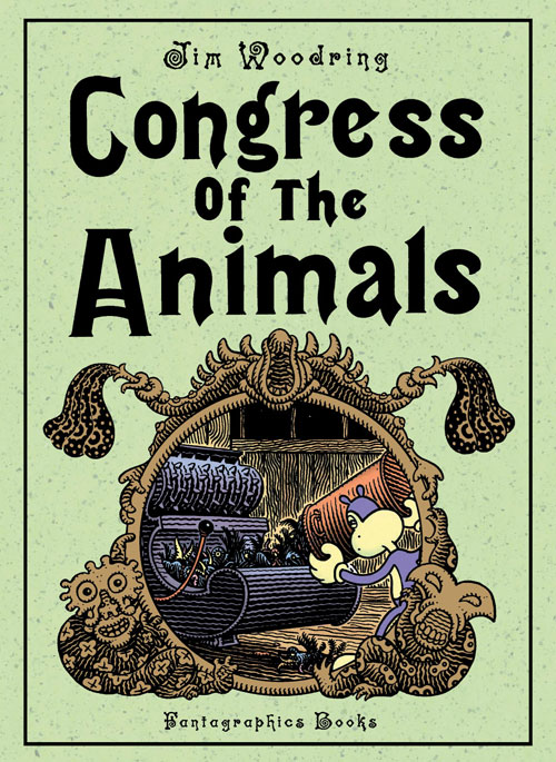
Perhaps I should have seen it coming after the palpable (if fleeting) triumph of good over evil that comprised the climax of Weathercraft, Jim Woodring’s previous standalone graphic novel set in the world of his funny-animal avatar Frank. Regardless, I’ll admit it: I did not expect to read a Frank book whose final panel made me go “Awwww!”
It’s true that in Weathercraft, Frank’s hapless antagonist Manhog achieves enlightenment that for a short while allows him to become an elemental force of kindness, justice, and the security of a fundamentally benevolent order to the universe. But it’s only for a short while — the equilibrium restores itself, and he, the insouciant Frank, and the jauntily predatory Whim go back to their old ways. According to Woodring’s typically dense and hilarious jacket copy, we have the Unifactor, the familiar world of bulbous buildings and shoggoth-like plant deities in which Frank and his cohorts dwell, to thank for this state of affairs. Woodring calls the Unifactor “the closed system of moral algebra into which Frank was born, where “in the end, nothing really changes,” and where “Frank is kept in a state of total ineducability by the unseen forces which control that haunted realm.”
The difference here — and I’m not 100% convinced this would have been clear if Woodring hadn’t said so straight out on the jacket, but be that as it may — is that this time around, Frank leaves the Unifactor. Woodring’s customary Rube Goldbergian plot contrivances force Frank into a state of indentured servitude that ends with him on the lam. The journey positions Frank in the midst of various grown-up concerns, such as home ownership, property loss, commerce, employment, amusement, leisure, sex (in the form of what appears to be an angelic anthropomorphic vagina guarded by the giant disembodied head of a Dr. Seuss character), and religion (in the form of nude, beefy men with gaping chasms where their faces are supposed to be, whose ability to expose their guts at will and induce others to do so literally knocks poor Frank out with its disgustingness and is perhaps Woodring’s most troubling sequence since Manhog flayed his own leg); in other words, it’s a bit like Pippin. Normally we’d expect nothing to come of all this, save for an opportunity to marvel at Woodring’s buzzy, vibrating line, proficiency with creature design, and ability to distill unpleasant shit into slightly sinister slapstick adventures for his dog-cat-bear-mouse-thing hero. But the journey takes Frank so far afield that at some point (probably when he gets lost at sea and washes up on some distant shore) he ends up outside the Unifactor’s confines. New information can now enter his world, in the form of a female Frank-like character who lives in a house shaped like Frank. And at that point all hell breaks loose…which in a Frank comic is to say it doesn’t break loose at all.
Somehow, Frank has gained the ability to interact with another being without immediately sizing up the best way to have fun with, or at the expense of, that being, consequences be damned. They chat. They laugh at the bullying creatures who attacked him earlier, and blush at both having got such a kick out of it. (See, he hasn’t been brushed totally clean of his sins — as we see here and elsewhere, both he and his new pal still have a bit of an empathy deficit.) She protects him from the siren song of that angelic vagina-thing. She helps him return home, to the delight of his pets Pupshaw and Pushpaw, who seem overjoyed to find that their master has found his other half. But what really moved me is their simple physical interaction: They hug. I’m “awwww!”ing just thinking about it. That physical act is an act of grace on Woodring’s part, an escape from the mere hedonism or fight-or-flight responses that have been the sole custom of Frank’s world before now. It’s a new, rewarding emotion, embodied. And despite the break it marks from the world of Frank as we knew it, it fits, since isn’t embodying emotion what Frank stories have always been all about?
Comics Time: Citizen Rex
July 26, 2011Citizen Rex
Mario Hernandez, writer
Gilbert Hernandez, artist
Dark Horse, June 2011
144 pages, hardcover
$19.99
Buy it from Amazon.com
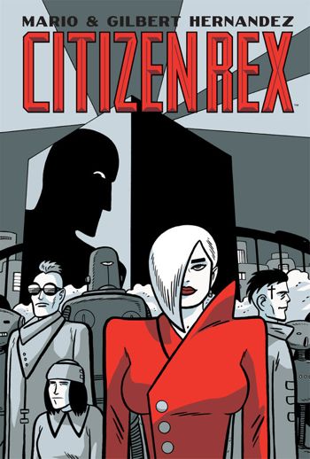
For today’s Comics Time review, please visit The Comics Journal.
Comics Time: Celluloid
July 20, 2011Celluloid
Dave McKean, writer/artist
Fantagraphics, June 2011
282 pages, hardcover
$35
Buy it from Fantagraphics
Buy it from Amazon.com
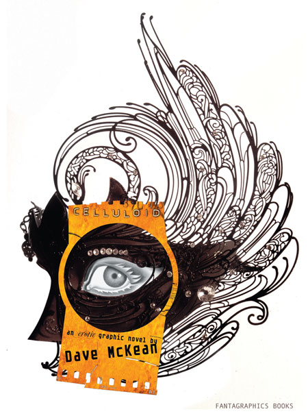
From a reviewer’s perspective, the nice thing about erotica is that, as with humor, there’s a clear threshold of physical response a work must cross to be judged successful. With humor comics, the key question (there are others, but this is the sina qua non) is “Did it make me laugh?” With erotic comics, it’s…well, let’s just say it ain’t laughter we’re after. And on that basic measurable (ahem) level, Celluloid comes up short (ahem ahem). McKean’s art is as otherworldly as ever, bathed in luminous gold, and until the final section it manages to avoid the “Hey, wanna watch some Sandman covers fuck?” photo gimmickry I was afraid of. But isn’t it kind of odd that of all the palettes McKean could choose to convey the film-projection-as-mystical-sexual-gateway metaphor that is at the heart of our nameless, speechless female protagonist’s “strange erotic journey” (to coin a phrase), he chose gold? Is that what you think of when you think of the shaft of light beaming from the projection booth to the screen, or the light the screen bathes you in in turn? Maybe if you’re Gordon Willis, but not if you’re me. The book is filled with weird little just-off details like that, from our young-ish heroine’s weirdly craggy body and her nose that seems to grow to Cyrano proportions at random depending on the angle McKean’s drawing her at, to the deeply unsexy choice to make our heroine’s foil in a lesbian sequence wear a garland of grapes that’s echoed by her (count ’em) fourteen breasts, leaving me to wonder if one of them was gonna get plucked off and eaten throughout their tryst. Working mostly with full splash pages and spreads, McKean is able to pull off striking isolated images here and there — off the top of my head I remember our heroine’s shocked face as she discovers a plaza full of copulating couples, a dramatic first kiss between our heroine and the grape goddess staged at a scale that makes it look like the sky is tenderly kissing the earth, and (one of the few actually hot moments in the book) her (non-sexual) removal of her top to take a bath right near the beginning of the book. But with the exception of the stunning black, white, and red sequence in which the protagonist sucks a demon’s totemic red dick until it ejaculates milky semen through the void like a spaceship floating by in 2001, isolated images are all they are. They get lost in a melange of homages to Picasso, Ernst, and “Soft Construction with Boiled Beans”-era Dalí, combined with McKean’s usual soft-focus multimedia wizardry and angular cartooning. What’s more, the whole affair has a didactic feel to it, as “let’s prove a point about the artistic legitimacy of erotica”-type comics often do. We’re clearly supposed to be proud of the protagonist’s journey of self-discovery, but all we have to go on to know such a journey is even required is a quick phone call at the beginning with her boyfriend — it’s an unhappy-seeming call, sure, but the impression it gives is that they’ve simply had a rough day at work, not that there’s some sexual void in their shared life that she’s filling in on her own, and certainly not to the point where the events of her magical journey into the sexy celluloid world make sense as a gauntlet to be thrown before the dude, as they are at the book’s end. That final sequence begins when the boyfriend returns home and turns on the mysterious projector that kicked off the woman’s journey. But by the time I closed the book, unfortunately, that projector was the only thing turned on. And that’s the heart, and other organs, of the matter, isn’t it?
Comics Time: The Wolf
July 19, 2011The Wolf
Tom Neely, writer/artist
I Will Destroy You, July 2011
228 pages
$25
Buy it from Tom Neely
See some preview pages and read my interview with Neely at Robot 6
One thing you’ll never get from online previews and PDFs of The Wolf, which were the only ways I’d experienced the book when I first read it and liked it enough to give it an effusive PR blurb, is its impact as a physical object. I’ve actually put off writing this review because I felt inadequate to the task of conveying what a smack in the face the thing feels like. It’s big and thick and square, with a wordless and cryptic cover that evokes albums of huge mystical mystery like In the Court of the Crimson King or Led Zeppelin IV. Inside, the one-per-page or per-spread images frequently go full-bleed, which isn’t the most uncommon thing in the comics world to be sure — but the square pages make it feel like you’re seeing a single panel blown up to brobdgnagian size. It’s a strange-making effect, taking the familiar “bigness” of a splash page or double-page spread, filtering it through a frame you’re not accustomed to, and making you feel the impact of size and scale like a new, fresh thing.
The images themselves are torn from an obviously deeply personal vocabulary of monsters, injecting the sexualized surrealism back into werewolves and zombies that have been stripped of their primal power by the conventions of genre. Spectacle, meanwhile, is here derived not just from violence or vistas but from sex: The battle between the title character and a multi-limbed red skeleton, a full moon that appears like a cigarette burn in a grey-blue night sky, and a series of abstract washes of hair-like blacks and fleshy pink-reds and seminal yellow-whites that appears in the middle of graphically depicted intercourse between the wolf and his pale, raven-haired bride all have equal knockout force behind them. You can tease an emotional narrative out of the proceedings easily enough — past callousness, cruelty, and self-destruction in the context of a relationship are overcome, atoned for, and healed through sexual connection, and a transcendent future is discovered, a natural world untouched by the taint of the bitter past. But it’s the way each individual stage of that journey is depicted with symbols, colors, and creatures that capture and embody it perfectly, their lush brushtrokes fraying and spattering and bleeding emotional intensity on every page, that gives the book its power. Every turn of the page is an encounter with raw feeling, made physical by cartooning. That’s great comics.
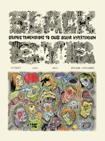
Comics Time: Black Eye
July 13, 2011Black Eye #1
Wouter Vanhalemeesch, Al Columbia, Ian Huebert, Mark Newgarden, Onsmith, David Paleo, Roland Topor, Olivier Deprez, Olivier Schrauwen, Brecht Evens, Ivan Brunetti, Andy Gabrysiak, Michael Kupperman, Gnot Guedin, Tom Neely, Dav Guedin, Danny Hellman, Bob Levin, Brecht Vandenbroucke, Stephen Schudlich, Martin Rowson, Kaz, Max Clotfelter, Robert Goodin, Ryan Standfest, Jon Vermilyea, Mats!?, Nikki DeSautelle, Stéphane Blanquet, R. Sikoryak, Ludovic Debeurme, Emelie Östergren, Fanny Michaëlis, Lilli Carré, James Moore, Jeet Heer, Paul Nudd, Glenn Head, Paul Hornschemeier, Ken Parille, Paul Paetzel, writers/artists
Ryan Standfest, editor
Rotland Press + Comic Works, May 2011
112 pages
$14.95
Buy it from Ryan Standfest
For today’s Comics Time review, please visit The Comics Journal.
Comics Time: Our Love Is Real
July 8, 2011Our Love Is Real
Sam Humphries, writer
Steven Sanders, art
self-published, June 2011
24 pages
$3.99
Buy it at OurLoveIsRealComic.com
In the war to discomfit the reader, science fiction has an extra weapon in its arsenal: It can be set in a society whose underlying assumptions are disturbingly alien from our own. Depending on whether the differences happen to hit your buttons, this can be real put-the-book-down-and-squint-your-eyes-shut stuff in the right hands. The last thing I read to have that effect on me was “The People of Sand and Slag” by Paolo Baciagalupi in Wastelands, an anthology of post-apocalyptic short fiction. Baciagalupi created a world where genetically and biomechanically modified human beings presided over an empire of debris, feeling no pain, virtually indestructible, able to consume junk and rocks…and eminently unqualified to care the few vulnerable living creatures unfortunate enough to cross paths with them. It wasn’t a particularly gory or “disturbing” story, yet something about its protagonists, the fact that they were recognizably human yet utterly devoid of the qualities and vulnerabilities that we think of as characteristic of humanity, literally made me feel sick to my stomach. I still haven’t finished reading the anthology.
Our Love Is Real, it seems to me, is aiming to have the same effect. It’s set “five years after the AIDS vaccine,” in a world policed by hulking brutes in Iron Man/mecha exo-suits and characterized by sexual divisions not between genders or orientations, but between vegisexuals, mineralsexuals, and zoosexuals — people who have sex with custom-grown plants, the auras of crystals, and dogs respectively. But I think that previous sentence contains the problem with the project. The sex stuff that’s the story’s bread and butter is indeed rewardingly bizarre and blackly funny — I mean, look at that propaganda poster on the cover, it’s hilarious. But the world surrounding the sex is standard Dark Horse Legends sf-action material, instantly recognizable to anyone who’s read Hard Boiled or Martha Washington, or who’s seen the way Geof Darrow or Chris Burnham draw faces being smashed to flying splattering pieces. The character designs in particular are deeply indebted to Tony Moore, squarejawed men and snotnosed women who behave basically the way characters rooted in such designs can be expected to behave. When the genre visuals and action are that familiar, it’s tough to see how we get there from here with regards to the stuff that’s much further out. I mean, I get that the zoosexual cops hounding (no pun intended) the vegisexuals and mineralsexuals are analagous to heteronormativity and fag-bashing, but there’s not really an allowance made for the idea that people who have sex with dogs might build a sci-fi society that looks different from all the ones we’ve seen that were built in-story by plain-vanilla straight dudes. Starting with that lacuna, the book’s ideas never really congeal. It winds up feeling more like several neat ideas than one great one. I want it to go further.
But ultimately, the best compliment I could pay Our Love Is Real is that while its weakest points belong to other comics, its strongest points are all its own. The world depicted by Sanders and the characters that inhabit it may be overly familiar, but the climactic fight scene has real oomph and, weirdly, real grace. And while the characters’ behavior is traditional in a way that doesn’t mesh with the book’s bizarre animating ideas, those ideas are quite something, and are presented by Humphries in a way that’s straightforward but not smug self-congratulatory, the way knowingly out-there indie science-fiction comics by smart-and-they-know-it writers can be. Humphries’ is a new voice in a crowded field, saying truly strange and challenging things while speaking the language of mainstream action comics. With any luck that accent will thin, and future stories will have the fluency to forge a new dialect as singular as the ideas they’re designed to express.
Comics Time: SF Supplementary File #1
July 7, 2011SF Supplementary File #1
Ryan Cecil Smith, writer/artist
Closed Caption Comics, June 2011
12 pages
Read it for free at RyanCecilSmith.com
Buy it for $2 from Ryan Cecil Smith
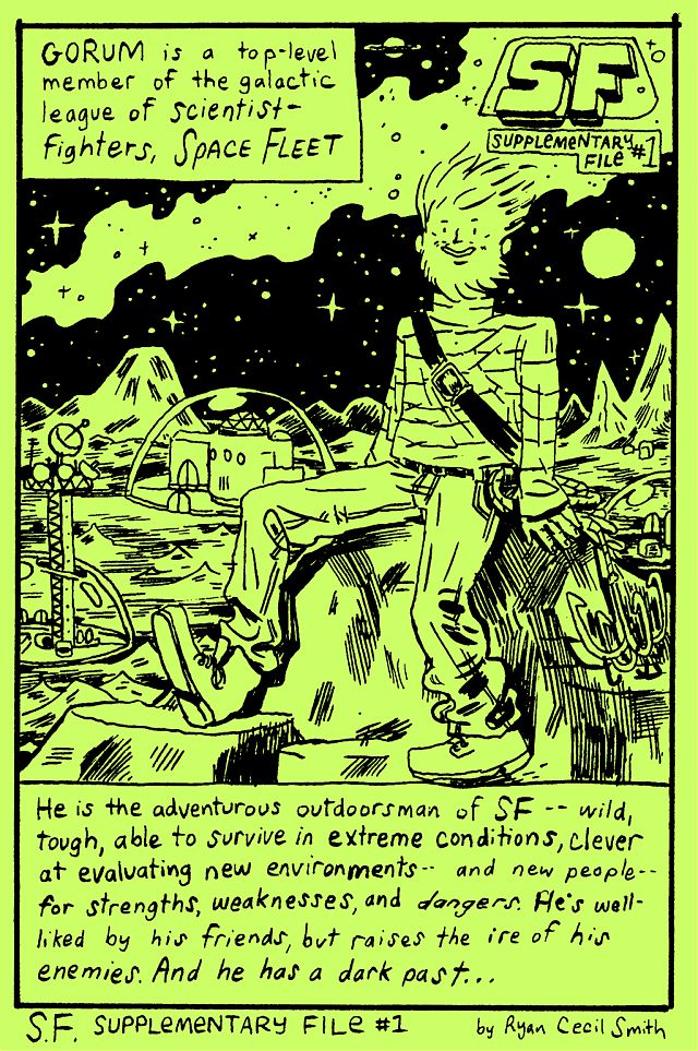
What if ’80s SFF action-figure franchises really took on the central role in our collective mythmaking and storytelling that their hardcore devotees (myself included, let’s be honest) seem to think they deserve? The children’s books, fairy tales, and fables such a would would create for itself might look a lot like SF Supplementary File #1, a spinoff from Ryan Cecil Smith’s fine alt-genre actioner SF that provides the origin story for one of the Space Fleet Scientific Foundation Special Forces’ memorable members, Gorum. In his “once upon a time”-style story of hidden paradises and pillaged resources, mad royalty and noble scientists, slain parents and vowed vengeance, I hear echoes of everything from Superman and Batman to Eternia and Shangri-La to freaking Spaceballs, shot through with a childlike funneling of nuclear anxiety directly into terror over the potential loss of Mommy and Daddy. Smith’s art here is winningly crude, as befits drawings that can be captioned with sentences like “Gorum attacked every ship going IN or OUT of the Planet of Dunes with VOLCANO CANNONS” — yet it’s flexible, equally able to pull off sophisticated visual tricks like juxtaposing the explosions that destroy a world, the ship that escapes that destruction, and multiple representations of the teary eyes of that ship’s pilot as he views the horror like some kind of Futurist Axe Cop. It’s fun to see something so lightweight be so solid.
Comics Time: L.A. Diary
June 29, 2011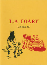 L.A. Diary
Gabrielle Bell, writer/artist
Uncivilized Books, October 2009
20 pages
$4
Buy it from Uncivilized Books
He doesn’t go quite this far himself, but it’s easy to interpret cartoonist and Uncivilized Books publisher Tom Kaczynski’s introduction to this minicomic collection of diary strips and sketchbook pages from Gabrielle Bell as a claim that her lack of transgression is itself transgressive. “Bell is not possessed by demons,” he writes by way of comparing Bell’s work to the autobiographical comics tradition established by Justin Green and Robert Crumb, going on to compare her work to the very root of the diaristic impulse in Western culture: maintaining a daily account of the world to better understand one’s place in it. And indeed, Bell’s understanding of her place in the world, as expressed through these comics, leaves little room for iconoclasm and taboo violation: The climactic strip in the collection focuses on her inability to hug people without dissociating. But Bell never translates her discomforts into reverse-exhibitionistic cris de coeur of loneliness, either — from the cover of the comic on down, she may be quietly separating herself from the friends with which she is constantly surrounded, but, well, she’s constantly surrounded by friends. Like the yoga poses she holds in a class designed to cultivate inner peace but which in Bell’s case simply give her one more opportunity for her mind to recursively burrow inside itself, her self-presentation in these comics is a painstakingly struck balance, neither woe-is-me nor look-at-me.
So no, we will never see a “Minnie’s 3rd Love” or “My Sex History” from Gabrielle Bell. But in this light, the smudgy swatches of black that dot her square panels seemingly at random and had me baffled for years could perhaps be seen as a deliberate act of obscurantism, breaking the plane of the art as if to interrupt our ability to take it in vérité-style, a way to say “No, this isn’t real, this is just a drawing.” Kaczynski suggests that that act of drawing is a “declaration of fidelity to the Great Work”; the diary form it takes, then, is simply a way for Bell to lash herself to the yoke of making art on a consistent basis. If he’s right, then Bell’s program has served her well, enabling her to produce a substantial body of work with nary a demon to drive her. Thus if there is a shocking revelation to be found in L.A. Diary, it’s the book’s final third, which reproduces the pages in her spiral-bound notebook where the preceding strips first took shape. Replete with spelling errors, cruder and at times almost childlike linework, broader and blunter story beats, and more direct navel-gazing (an abandoned storyline about starting a blog, a self-portrait in the locker-room shower that gets a bit toned-down and covered-up in the final version), it feels almost breathlessly unrefined compared to the finished product. It’s not Binky Brown Meets the Holy Virgin Mary, but in context, the exhibitionism is just as raw.
Comics Time: WunderKammer No. 1
June 27, 2011WunderKammer No. 1
Nicholas Di Genova, writer/artist
Koyama Press, 2009
24 pages
$8
Read about it at Koyama
Theoretically you can buy it at Nicholas Di Genova’s website but I can’t get it to load
Buy it from Atomic Books
Visit Nicholas Di Genova’s blog
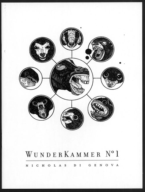
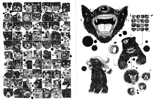
In googling for images and purchase links for this compendium of animal drawings by Nicholas Di Genova (of whom I was previously aware as a fellow resident of Partyka‘s periphery), I came across a post on a New York City art blog that took a faint-praise approach to Di Genova’s art but was really impressed by this so-crazy-it-just-might-work innovation he’d had of printing his pieces in a cheap, floppy book. Imagine that! So god knows what the fine art world (I feel like that should be in scare caps — The Fine Art World) makes of this stuff, and this way of presenting it. To me it’s a comic book, and a stunner. Di Genova specializes in drawing braying, barking, growling, blank-pupiled animals of all shapes and sizes and species, including many that don’t actually exist, in a riot of accrued maximalist detail. Each of his dogs, bears, rams, wolves with ram horns, bears with bird heads, two-headed turtles, tyrannosaurus rexes with zebra coloration and manes, three-eyed gorilla/bat hybrids and so on appear to have been constructed by carefully gluing little rectangles and circles and lines together, the way chainmail is constructed one link at a time. Only here the construction doesn’t necessarily seem chained together, so you’re left half tempted to shake the book like a snowglobe to see if the constituent parts resettle in new shapes to create a new bestiary. Di Genova repeats this dizzying effect in macro via pages that consist of massive grids of animal heads, one breed/species after another, one head per borderless panel — dogs, birds, and frogs each get their own page here, but there are plenty of smaller grids featuring turtles, bears, bats, rodents, and god knows what else. I found my eye zipping back and forth from line to line in an S-shape a la Brian Chippendale, the better to take each incredibly detailed head in without missing a beat. The pages featuring the smaller grids often come across like some sort of alternate-universe Chris Ware suffering from Audubon-inspired monomania: A large portrait of an animal will be connected to a grid of tiny ones with a diagrammatic line, or encircled and radiating off smaller drawings like the spokes of a wheel. A relationship, even a narrative, is implied through these devices; the fun is figuring out what the hell they could be. And while we’re on the subject of the visual language of comics, Di Genova comes up with the best technique for depicting the non-verbal vocalizations of animals I’ve seen maybe ever: tiny word balloons completely colored black. Whether it’s a bark, a tweet, a ribbit, or…whatever sound turtles make, it works.
The book’s centerpiece, literally and metaphorically, is the spread where Di Genova’s project is at its most basic and blunt: 702 butterflies, each as unique as a snowflake, in a 27 x 26 butterfly grid bleeding right off the top and bottom of the centerfold spread. The effect is at once overwhelming and inviting: I was dazzled by the variety present in nature and intimidated, almost horrified, by the artificial reproduction of that natural variety. At the same time, I simultaneously resigned myself to never really being able to take in the whole of the image and diving right into the spread to soak up as much as I could…and I distrust pat “as above, so below” interpretations, but what the hey: There you have it.
Comics Time: Night Animals
June 24, 2011Night Animals
Brecht Evens, writer/artist
Top Shelf, January 2011
48 pages
$7.95
Read a preview and buy it from Top Shelf
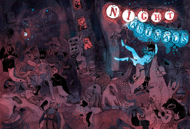
Dare I say that this is even better than The Wrong Place? I think I dare! Created before that book but published in English after it, Night Animals is a more traditionally drawn affair from author Brecht Evens in that it is, in fact, drawn. The Wrong Place‘s paint-only art was its distinctive selling point and, via clever coloring, its primary storytelling mechanism, but as it turns out this innovation meant Evens abandoned a really lovely line — thick, ropy, tactile, full of motion, fun. It gives the art more immediate pop, and gives Evens’s really vibrant colors (look at that cover; now imagine a whole book like that) the day off, as it were, freeing them from the burden of telling the story themselves and allowing them to comment on and enhance the action, and of course simply delight the eye.
Said action consists of two separate stories in which the protagonists’ sexuality is passed through a gauntlet of children’s-story-style creatures of the wild. The first, in which a balding businessman and apparent tyro furry goes down a literal rabbit hole and braves an increasingly terrifying series of beasts on his way to the “Blind Date” that gives the story its title, has a happy ending: A grinning, recumbent woman in rabbit ears, probably a little plain under normal circumstances with her hornrimmed glasses and mole and pointy schnoz but bomb-ass hot as she’s presented at the end of this journey, with a promising white arrow directing her bunny-suited suitor straight to her crotch. After the painstakingly delineated labyrinth we’ve followed to get here, including a pair of stunning spreads filled with seemingly every sea monster and forest creature Evens could think of, this punchline image elicited a good-natured “haw!” from me; if I’d been there, I’d have high-fived both the guy and the girl before leaving them to get it on. Indeed, the very last image, a Wrong Place-style painted silhouette of the two characters in floppy-eared flagrante delicto, gives the impression of the artist quietly backing away and closing the door behind himself, letting our hero and heroine do their stuff in peace. Evens really nails the simple satisfaction sex sometimes provides — life can be filled with storm and stress, but every now and then it’s nothing that a special someone’s smile and genitals can’t fix.
The scarred side of the Night Animals coin is the second and concluding story, “Bad Friends.” (“So it’s not just a clever name.”—Wayne’s World) It starts, and indeed continues, innocuously enough, as a sort of distaff Where the Wild Things Are/Aesopian cover version of Stephen King’s Carrie, in which puberty rather than petulance is what enables our young protagonist to heed the call of the wild, and in which the rapid locker-room onset of menstruation leads not to a telekinetic killing spree but a visit from the Great God Pan, a trip on the back of a giant bird, and a rockin’ party with various critters in the woods. Our heroine whoops it up, enjoying the nakedness her newfound friends have reduced her to — complete with body-paint heart drawn around her pudenda — so much so that she doesn’t notice the darkness in their eyes as they close in to devour her. This story ends not with a clinch, but an empty bloodstained bed, worried parents, an ineffectual search of the now-empty forest, a single flower wilting on the ground. Evens’s trademark red goes from a spot-color stain on the girl’s underwear, to the alluring light of an illicit night out, to a symbol of sexual abandon, to the color of violence and death. It’s quite a performance, sexy and creepy at precisely the moments Evens wishes it to be one or the other, and a direct contrast with the earthy lightheartedness of the opening story. It’s awfully easy for sex comics to get didactic in their rah-rah positivity; Evens gives us the flipside, counting on us to be grown up enough to weigh the pros and cons ourselves. Good for him and good for this comic. It’s a blast.
Comics Time: Blammo #7
June 22, 2011Blammo #7
Noah Van Sciver, writer/artist
Kilgore Books & Comics, February 2011
40 pages
$5
Buy it from Kilgore
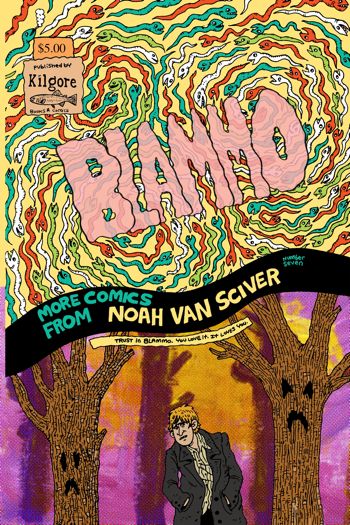
The multiple times Noah Van Sciver uses fake ads and author’s notes to remind us of this notwithstanding, Blammo‘s throwback status as a ’90s-style solo-anthology floppy-format black-and-white “alternative comic book that is introspective and drawn by a hopelessly poor twentysomething with seasonal affective disorder” is one of the least interesting things about Blammo #7. It doesn’t hold a candle to the way he draws the darkness of a Halloween night spent trick-or-treating with a sky full of simple horizontal lines in “Because I Have To,” or to his po-faced, actually rather creepy retellings of a couple of Scary Stories to Tell in the Dark-style serial-killer urban legends in “Don’t Turn On the Light” and “This Is the Last One I’m Sending You Today.” It’s not as noteworthy as the way he tends to cheat his characters toward the viewer, the better to emphasize the big ears and big noses and worried brows and frowning mouths of his characters’ faces, or the way the whole of those faces is constructed so solidly that they remind me of a handwritten cursive letter more than a face. It doesn’t account for his slice-of-life fiction’s endearingly loose and rambling narratives — the way “Who Are You, Jesus?” piles up ironies in such a way as to emphasize its main character’s simultaneous shittiness and sympathetic nature with each turn, or the way the “Foreword/Because I Have To/Afterword” suite tells the story of a guy’s emotionally fraught Halloween evening in three sections wherein each thing that happens to him is weirdly disconnected from the others in precisely the way life tends to work. It doesn’t cover the way his broad funny-animal Chick tract parody complements his totally straightforward account of Joseph Smith and the origin of the Mormon faith, the way a biting fuck-you and a lingering respect tend to mingle in the lapsed. No, the mere fact that this is a defiantly anachronistic and un-hip alternative comic book doesn’t speak to the most important thing about it: It’s a very good one.
Comics Time: I Will Bite You! and Other Stories
June 20, 2011I Will Bite You! and Other Stories
Joseph Lambert, writer/artist
Secret Acres, April 2011
128 pages
$14
Buy it from Secret Acres
Buy it from Amazon.com
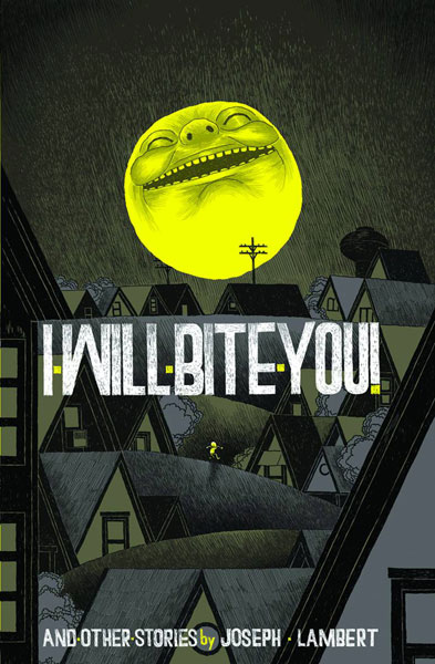
You want to see artists riding their personal visual vocabulary past the realm of utility and into Idiosyncracy Land. From Kirby crackle and Ditko hands to Jim Woodring’s fungoids and Al Columbia’s erasures, signature tropes are frequently a sign that something not so much practical as alchemical is going on in that artist’s brain when he puts lines on paper. Judging from this splash-making debut book from Joseph Lambert, a collection of work previously published in various anthologies and minicomics, Lambert has several such obsessions: Big grinning suns with devious intentions, fumingly angry and violent little children, and using the perspectivally flattening effect of two-dimensional line art to make people and things interact in unexpected ways — characters grabbing their word balloons to use as weapons, people in the foreground jumping onto objects that in “reality” are miles away or literally in outer space. The problem is that none of these visual tricks say much of anything to me. Watching an angry little kid leap into the air and assault the onlooking sun makes for a clever visual, but not a particularly communicative one. Children’s stories have used this kind of device to convey the naivete of their protagonists, and the matter-of-fact wonders of the world when seen through a child’s eyes; mythology uses it to bring a huge and frightening world down to our level, to grant us a degree of control. For Lambert, I think there’s an exploration of rage and frustration under here someplace, but it’s diluted from overuse. If that many characters are angry enough to threaten the sun, then how angry are any of them, really? It’s as though Lambert held his thumb out and blotted out the sun and thought “Wouldn’t it be neat to draw something that did that literally?” And yes, it’s neat, but after a while it’s not much more than that. Too many of the visuals presented here — word-balloon weapons, dancin’ on the ceiling perspective shifts, characters swallowing other characters whole and unharmed — have that feeling. “Why not?” is a terrific question for an artist to ask himself; “why?” is sometimes a better one.
Comics Time: ALT COMICS
June 17, 2011ALT COMICS
Editor unknown, to me at least, but it sure seems like a Comets Comets production
May 2010-present
Read it at altcomics.tumblr.com
“Comics is any art you can read.”—Sean T. Collins
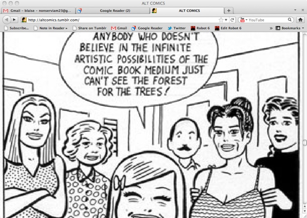
Seen through an RSS reader, the Tumblr dashboard, or the crisply laid out collection of thumbnails that is its Tumblr archive, ALT COMICS is like any other image-based tumblelog. Viewed at its own address? It’s a black hole. Hold down the spacebar and you’ll rapidly scroll through literally thousands of images, frequently but by no means entirely of the “alt comics” persuasion, with the many many images that aren’t sort of averaging out in that direction. But they’re not meant to be sampled as eye candy, or as proof of the blogger’s excellent taste. Each one is blown up to the same massive screen-spanning size regardless of its original size, scale, or resolution. The result digitally distorts many of the images, makes most of them far too big to take in all at once, and erases any of the tumblr artifacts — permalinks, note counts, tags, sources — that tell you where one post ends and the other begins. The result? Pure images, pure juxtaposition, stripped of almost any context other than what’s immediately visible on the screen at the moment, and the cumulative effect of the accumulation of those moments. Taking that endless scroll to the blog’s all but unreachable bottom is a journey into the sheer pleasure of seeing lines on paper (or “paper”), seeing words mixed up with art, seeing styles collide and fracture and explode and detourne and corrode. It also invites you to deduce a method to the madness. Are the giant photos of James Kochalka, Jeffrey Brown, Matt Madden & Jessica Abel, and the Harkham/Crane/Ryan/Hernandez/Regé/Santoro L.A. comics crew intended as the equivalent of Johnny Rotten’s “I HATE PINK FLOYD” shirt? Which does the author of the blog like more: Jonny Negron or Goodnight Moon, Chris Ware or some poorly photoshopped internet-age visual noise, Scott Pilgrim or Harold Gray, a Devo album cover or the cast of Daria, Scott McCloud or Dr. Manhattan or Olivier Schrauwen or page after page of Blaise Larmee or or or or or…? Pure images isn’t even the right term for it — presented without comment or context, one size fits all, a digital haze rendering craft more or less moot as a reference point, you’re looking at the idea of images more than images themselves. That’s telling. It’s also telling that this project of re-presenting other people’s image-ideas is perhaps the strongest work I’ve seen from the Co-Mix crew so far.

