Posts Tagged ‘comics reviews’
Your Love and Rockets 30th Anniversary thought of the day
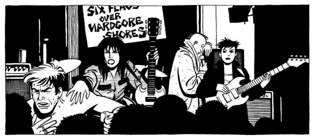
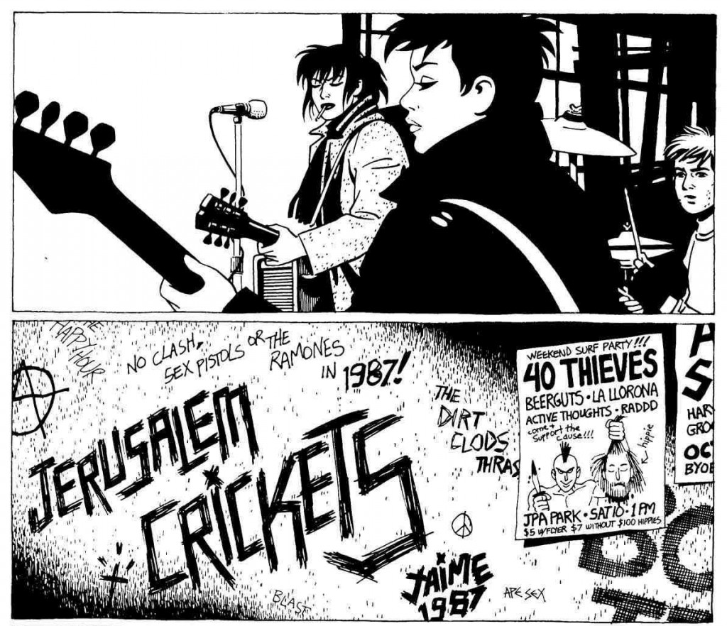
July 9, 2012No cartoonist has ever captured the spirit of rock and roll — listening to it, watching it, performing it, defining your life with it — like Jaime Hernandez. Vanishingly few have even come close; most attempts are cringeworthy. Jaime not only nailed the style, and the intensity, and the specific idiom of his punk milieu (the graffito “NO CLASH, SEX PISTOLS OR THE RAMONES IN 1987!” in the panels below is worth more than entire critics’ bodies of work), and the nuts-and-bolts stuff like the body language of people playing music on stage, he also chronicled the lives of the characters involved long enough to be basically the only cartoonist ever to explicitly examine what it’s like when you grow up and grow older and discover that you no longer look and act and think like someone in the pit at your favorite band’s show.
Love and Rockets, the great serial comic by Gilbert, Jaime, and sometimes Mario Hernandez, is celebrating its 30th anniversary at the San Diego Comic-Con International this week. Inspired by Tom Spurgeon, this week-long, daily series of posts will highlight some of my favorite things about Los Bros Hernandez and their comics. For more information, click here.
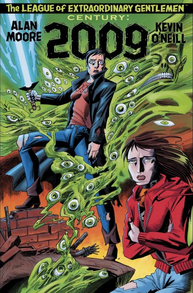
Comics Time: The League of Extraordinary Gentlemen Vol. III: Century #3: 2009
July 2, 2012The League of Extraordinary Gentlemen Vol. III: Century #3: 2009
Alan Moore, writer
Kevin O’Neill, artist
Top Shelf/Knockabout, June 2012
80 pages
$9.95
Buy it from Top Shelf
Buy it from Amazon.com
For today’s Comics Time review, please visit The Comics Journal.
Comics Time: Interiorae
June 28, 2012Interiorae
Gabriella Giandelli, writer/artist
Fantagraphics, 2012
144 pages
$19.99
Buy it from Fantagraphics
Buy it from Amazon.com
For today’s Comics Time review, please visit The Comics Journal.
Comics Time: Annie Sullivan and the Trials of Helen Keller
June 22, 2012Annie Sullivan and the Trials of Helen Keller
Joseph Lambert, writer/artist
The Center for Cartoon Studies/Disney/Hyperion, March 2012
pages, hardcover
$17.99
Buy it from CCS neighbor the Norwich Bookstore
Buy it from Amazon.com
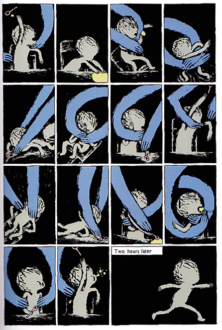
A dual biography of deaf-blind Helen Keller and her teacher, mentor, guardian, and lifelong companion Annie Sullivan — whose own coming-of-age tale of overcoming near-blindness, abject poverty, orphanhood, loss, lack of education, and a generally piss-poor attitude is depicted in parallel with Annie’s better-known story — Annie Sullivan and the Trials of Helen Keller is the best comics biography since Chester Brown’s Louis Riel. Like Riel, it succeeds, it innovates, as comics as much as it does as biography. It does so with none of the repetitive tics that marred cartoonist Joseph Lambert’s earlier work, here supplanted by the intensity of the story’s central challenge and Lambert’s own clarity of purpose in meeting it. And more than Riel, it’s a work of immense and intimate emotional power, deeply touching and profoundly moving without ever growing maudlin or manipulative.
The key visual conceit is Annie’s world: black, comprising her sketchy self-image, objects she encounters rendered in a dull brown, things with which she has any kind of emotionally charged interaction (from her family to food) colored in sidewalk-chalk primaries. Spend more than two seconds thinking about experiencing life like this and it’s harrowing, even horrifying, but Lambert holds back on depicting it as some existential hell, since after all, this is the only life Helen really knows. (She went blind at 19 months of age, and neither she nor her caretakers are sure what, if anything, her brain remembers from its sighted experiences.) Annie’s quest is to get Helen to understand that the hand gestures she forces her to perform when touching new objects or requesting familiar ones aren’t just a game to play, but a way to label these objects, and thus to understand them and their relationships to one another.
Though Lambert’s access via cartooning to Helen’s inner world is unique among depictions of this well-worn story, it’s only through juxtaposition with the more traditionally told tale — the literal wrestling matches bas Annie tries to physically force Helen to learn — that the magnitude of Helen’s struggle becomes clear. Without seeing Helen in all her painfully adorable and vulnerable and angry tousle-haired glory, throwing plates and running into walls and knocking Annie’s teeth out and leaving both teacher and student in (magnificently well-drawn) prostrate exhaustion amid debris-strewn rooms, her famous eureka moment at the well, which we see alternating back and forth between Annie and Helen’s perspectives, would not have the power it does. When big block-lettered NAMES finally emerge into Helen’s mental void, it’s not just WATER or HANDLE or PITCHER or even TEACHER that get their names, it’s the inchoate fury that’s plagued her like an infection all her young life. In this case the diagnosis is the cure. Lambert’s depiction of her almost unbearable excitement at finally getting it, frantically touching and signing out the names of everything at the pump until she reaches “TEACHER” and collapses into an embrace of the woman who effectively gave her a voice and saved her from insanity, is easily the most emotionally moving sequence of comics I’ve read all year. I’m crying just writing about it.
The visual language Lambert develops for Helen’s own developing language isn’t the sum total of his artistic strengths here. Now, for the life of me I’ll never understand how dully acidic, Exorcist-vomit green became the default background color for comics imprints with mainstream aspirations, from Vertigo to First Second, and in this Disney-Hyperion release Lambert overuses that lamentable hue. But it’s more than offset by the stunning Mentos-variety-pack skyscapes and lush green fields and trees of the Keller homestead; the subtle and astute interplay of trademark colors for the two women in Helen’s life, blue Annie and pink Mother; the use of various muted grays, blues, pinks, and yellows to differentiate spacial and temporal settings within Lambert’s not-an-inch-wasted sixteen-panel grids; brief but memorable uses of bright red or high-contrast black and white; and of course the very direct but still very effective depiction of the pre-speech Helen’s world as a black and gray-brown void into which new sensations intrude in synesthetic terror and splendor.
The book culminates in scandal — a minor one in the context of the Sullivan/Keller legend lo these many decades later, but a catastrophic upheaval in the lives of Annie, Helen, and their benefactors at the Perkins Institution for the Blind at the time. The climactic interrogation sequence, in which the school’s instructors grill Helen for hours about a potentially dubious achievement she’s alleged to have made, stands firmly in the grand (inquisitor) tradition ranging from O’Brien and Smith in Ninteen Eighty-Four to the real-life questioning of the West Memphis Three in Paradise Lost. It’s a hugely upsetting and dispiriting scene, one which literally reduces Helen to the sketchy, spectral brown shape running around in the darkness that she was before Annie illuminated her world.
The real trap of it is that it’s precisely that act of illumination that damns Helen in her interrogator’s eyes, and partially in her own. When her life is one great string of discoveries, her joy is unstoppable; when she’s forced to confront how those discoveries were all filtered through one other person, she can no longer trust her own ability to determine where she ends and Teacher begins. Is she the water, or just the pitcher into which someone else’s water was poured? Moreover, the trap is twofold: . Lambert’s third-hand revelation of Annie’s potential deceit is deftly done, and breathtaking in the way it takes what we’d come to see as virtues in “Miss Spitfire” and unveils them as potential faults. Based on everything we’ve seen of her — her desire to get the full credit she deserves, no less but also no more — it’s highly unlikely that she consciously committed the crime of which she stands accused. But also based on everything we’ve seen of her — her defiance, her refusal to be cowed, her sneakiness, her confidence that she’s the smartest person in any given room — her role in the cover-up is all too believable. For Lambert to prove himself capable of character work this subtle and rigorous, character work that complicates and enriches the character rather than reducing them to mere angels or martyrs, in a book that moves from strength to strength visually as well, is almost unfair.
Every year there’s a comic that makes me end my review with the sigh of awestruck resignation: the exclamation “What a comic.” This is my “What a comic” comic of the year to date. It’s stunning. Don’t miss it.
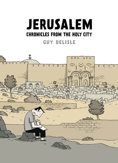
Comics Time: Jerusalem
June 18, 2012Jerusalem
Guy Delisle
Drawn and Quarterly, 2012
320 pages
$24.95
Buy it from D&Q
Buy it from Amazon.com
For today’s Comics Time review, please visit The Comics Journal.
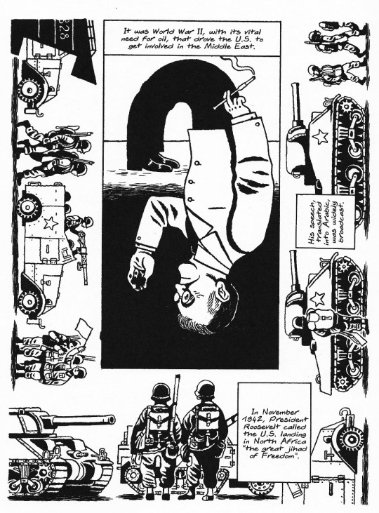
Comics Time: Best of Enemies: A History of US and Middle East Relations – Part One: 1783-1953
June 12, 2012Best of Enemies: A History of US and Middle East Relations – Part One: 1783-1953
Jean-Pierre Filiu, writer
David B., artist
SelfMadeHero, 2012
120 pages
$24.95
Buy it from SelfMadeHero
Buy it from Amazon.com
For today’s Comics Time review, please visit The Comics Journal.
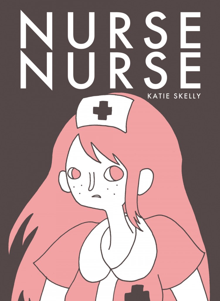
Comics Time: Nurse Nurse
June 4, 2012Nurse Nurse
Katie Skelly, writer/artist
Sparkplug, 2012
160 pages
$15
Buy it from Sparkplug
For today’s Comics Time review, please visit The Comics Journal.
Comics Time: Difficult Loves
May 23, 2012Difficult Loves
Molly Colleen O’Connell, writer/artist
Domino Books, May 2012
24 pages, 2 poster inserts
$6
Buy it from Domino
For today’s Comics Time review, please visit The Comics Journal.
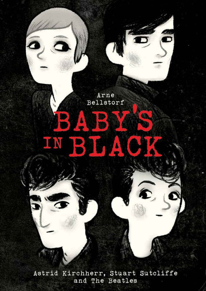
Comics Time: Baby’s in Black
May 9, 2012Baby’s in Black
Arne Bellstorf, writer/artist
First Second, May 2012
208 pages, hardcover
$24.99
Buy it from Macmillan
Buy it from Amazon.com
For today’s Comics Time review, please visit The Comics Journal.
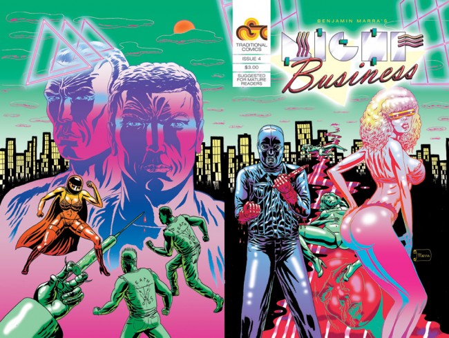
Comics Time: Night Business #4
May 2, 2012Night Business #4
Benjamin Marra, writer/artist
Traditional Comics, 2011
24 pages
$3
Buy it from Traditional Comics
For today’s Comics Time review, please visit The Comics Journal.
Comics Time: Cyclical, Stale N Mate, Let’s Fucking Party, and Cheek Up’s
April 19, 2012Cyclical, Stale N Mate, Let’s Fucking Party, and Cheek Up’s
Shia LaBeouf, writer/artist
The Campaign Book, 2012
various page counts
Cyclical, Stale N Mate, Let’s Fucking Party: $10 print/$5 ebook
Cheek Up’s: free ongoing webcomic series
Buy them and/or read them for free online at The Campaign Book
For today’s Comics Time review, please visit The Comics Journal.
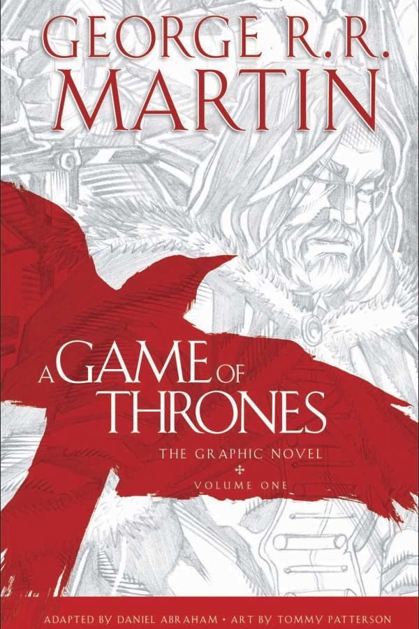
Comics Time: A Game of Thrones: The Graphic Novel: Volume One
April 9, 2012A Game of Thrones: The Graphic Novel: Volume One
Daniel Abraham, writer
Tommy Patterson, artist
adapted from the novel by George R.R. Martin
240 pages
$25
Buy it from Amazon.com
For today’s Comics Time review, please visit The Comics Journal.
Comics Time: Esperanza
April 4, 2012Esperanza
Love and Rockets Library: Locas, Book Five
Jaime Hernandez, writer/artist
248 pages
$18.99
Fantagraphics, 2011
Buy it from Fantagraphics
Buy it from Amazon.com
For today’s Comics Time review, please visit The Comics Journal.
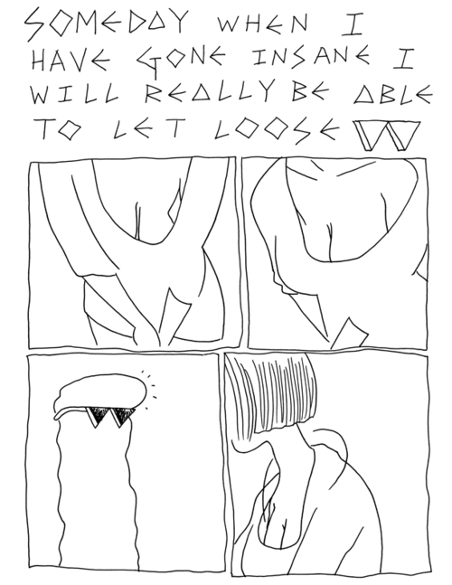
Comics Time: q v i e t
March 28, 2012q v i e t
Andy Burkholder, writer/artist
ongoing webcomic, May 2011-present
Read it at qviet.tumblr.com
For today’s Comics Time review, please visit The Comics Journal.
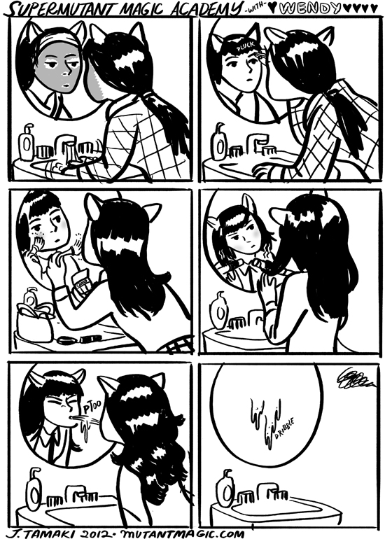
Comics Time: SuperMutant Magic Academy
March 22, 2012SuperMutant Magic Academy
Jillian Tamaki, writer/artist
Ongoing webcomic, December 2010-present
Read it at MutantMagic.com
For today’s Comics Time review, please visit The Comics Journal.
Comics Time: Pope Hats #1-2
March 13, 2012Pope Hats #1-2
Ethan Rilly, writer/artist
#1: self-published, 2009
32 pages
$4
Buy it from AdHouse
#2: AdHouse, 2011
40 pages
$6.95
Buy it and read a preview at AdHouse
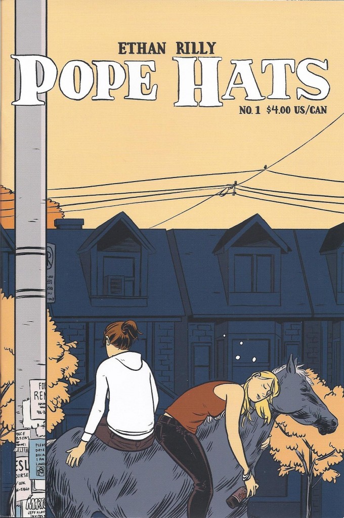
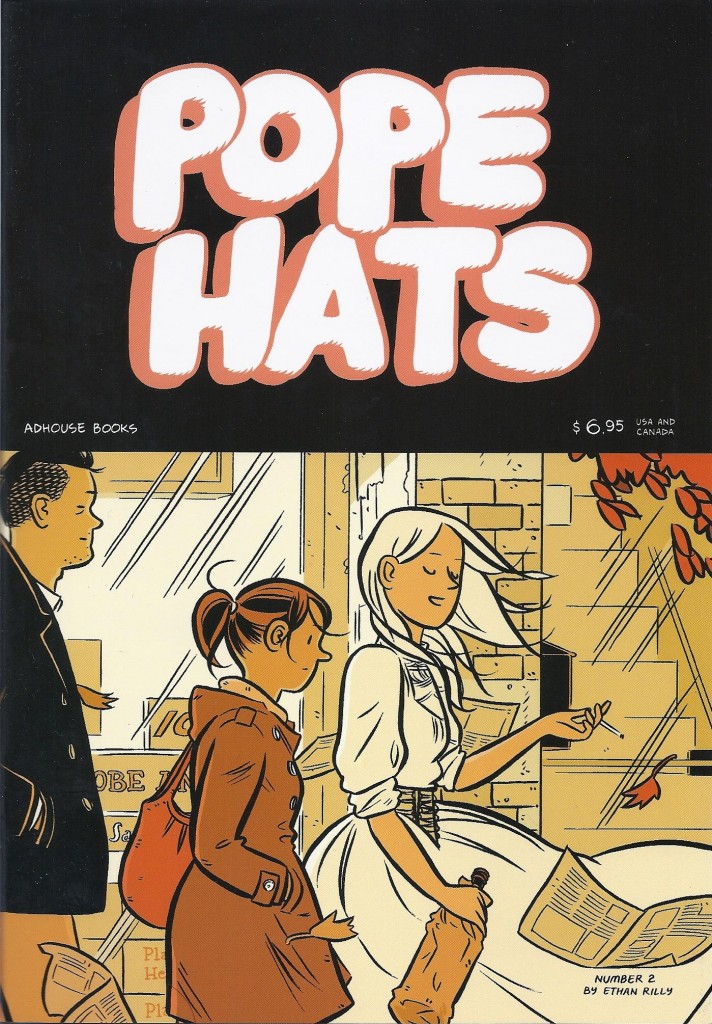
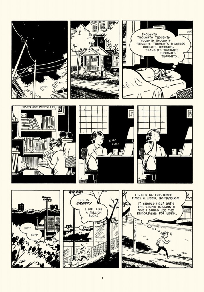
You know, I was gonna be harder on these before I started flipping through them again in preparation for actually writing this review? I have no objection to slice-of-lifers, obviously, even stylized ones like these — the kind where everyone’s dialogue is constantly “on” (“Don’t you want to say goodbye to Peter?” “If by Peter you mean ‘my bed’ and by goodbye you mean ‘pass out in,’ then yes. Yes, I want to say goodbye to Peter immediately.”), and where the lead occasionally talks to a cartoon ghost, and has a boss who looks like the Kingpin, meditates in the lotus position in his office, dictates all his correspondence (including grocery lists) to three assistants in lieu of owning a computer, and lives in an adjoining hotel so he never has to go outside. What’s more, Rilly’s cartooning is absurdly proficient and elegant. I wish I could remember who I’m stealing this from because it’s the perfect way to describe it, but you really could sit Rilly down next to his fellow (mostly) Canadians in the core Drawn & Quarterly line-up — Seth, Adrian Tomine, Joe Matt, mid-period Chester Brown — or for that matter next to Los Angeles’ classy classicists Jordan Crane and Sammy Harkham, and he wouldn’t look the slightest bit out of place. But speaking of fellow Canadians (and of Los Angelenos, at this point), there’s a healthy dose of Bryan Lee O’Malley’s comparatively contemporary portraits of young urban semi-professionals in there along with the standard Gray/Segar roots, an influence the aforementioned snappy, showy speech and not-quite-magic realism only make clearer by the end of Pope Hats‘ second issue. The problem is that it’s all a bit too dazzling to actually get into, at least for me. Every word uttered, every gesture gestured by studious law-clerk lead character Frances and her drunken whirligig actress roommate Vickie is designed to drive home just how them they are at all times. If the story, such as it is at this point, is one of young people feeling locked into the personae and professions they’ve chosen themselves, then Rilly’s conveying this all too well — I never felt like the characters had been given the freedom to surprise him or me. (You could perhaps say the same for the whole package as comics, if you were feeling less than charitable. The random-ass title, the self-effacing tone of various bits of incidental copy here and there, supplementary short stories in which ironically verbose schmoes wax philosophical about the ineffable joy and dread of modern life — the only way it could be more of a ’90s altcomix solo-anthology throwback is if it had a letter column full of people asking permission to turn it into a student film.)
But that’s all just how I remembered the comics from my initial read; much of it vanished upon that aforementioned flipthrough, which ended up feeling like a tour of Pleasuretown. For all I may object to the flippant patter, Rilly has a terrific eye and ear for the intersection between a person and her job, and how what she does during work hours and off hours alternately aligns and contrasts in revealing ways. Vickie is a manic pixie dream girl for guys and something of an alcoholic trainwreck for her roommate Frances, but she’s also a compelling actress in local productions. Frances is dutiful at work and at home to the point of drudgery/neurosis, but she tells a pair of spooky true stories at the end of issue #1 — in medium-closeup direct-address Brian Bendis fashion, no less — that both showcase how well comics can do that sort of thing and demonstrate how her attention to detail can manifest itself as an engaging facet of her personality during her free time. Issue #2’s backup story “Gould Speaks” hits its “intellectual blowhard actually quietly emotionally wrecked by a breakup” note a little hard for my taste, but watching Rilly fill out the space of the bus on which the title character is taking a cross-country trip by almost constantly shifting angles from panel to panel is a multi-dimensional joy, and when the true meaning of the story’s title is revealed, I laughed out loud. And of course there’s the fact that Rilly is a fucking phenomenal drawer — of hair, of ceiling fans, of city streets, of bar interiors, of beds, of pretty much anything. See the cover of issue #2? The inside’s just as pretty. It’s that kind of comic. In other words it’s a good kind of comic — it could be better, yeah, but isn’t that what issue #3 is for?
Comics Time: Olympic Games
February 27, 2012Olympic Games
Lando, writer/artist
Decadence Comics, 2012
44 pages
£10 including international shipping (cheaper in the UK)
Buy it from Decadence
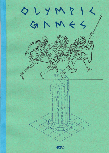
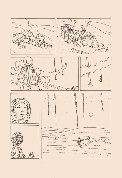
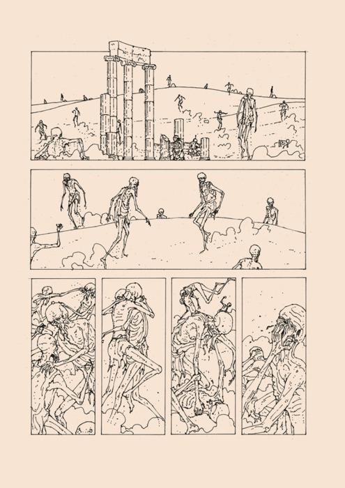
I went back and forth about opening this review with “Whoosh, is this thing good,” but the ayes have it: Whoosh, is this thing good. In fact it’s fair to say that I returned to semi-regular reviewing of comics in large part to have an excuse to read this remarkable-looking self-published small-print-run science-fiction adventure and write about it publicly. The unique, tactile packaging helped draw me in: It’s printed on that rough, cheap paper your third-grade handwriting practice workbooks came on, with a weary-looking blue cardstock/construction-paper cover to boot. But the content is just as fascinating, particularly writer/artist/publisher Lando’s ultrathin, ultraprecise line. It looks as though he took the finest-point rollerball pen available and went about painstakingly constructing each laser-toting astronaut, each toga-wearing revenant, and each weathered Greek column and angular laser beam and grain of sand in their eerie retrofuture wasteland by stopping every few millimeters or so, picking up the pen, putting it back down, and starting the line again, just to make sure he got it right. “Scratchy”‘s the word that keeps presenting itself to me, but it’s not the right one at all. There’s a meticulousness to this roughness that scratchy doesn’t cover, and it elevates the SF story, about a pair of visitors from space attacking their enemies — both living and dead — and defending one another as they make their way toward some maguffiny goal in the center of what looks very much like Greek ruins, but for the desert wasteland surrounding them. That particular irony of setting, and the titular reference to the coming spectacle of sport in the artist’s native country, indicate that this could very well be a scathing metaphorical commentary on kill-or-be-killed austerity economics and its beneficiaries. (Indeed, the artist makes that pretty clear on his website, though I’m loathe to lend too much credence to authorial intent.) Personally, I missed the Hunger Games/Running Man bread-and-circuses nature of the action on first read and instead read it as a savage, though savagely thrilling, war comic of sorts. Either way, Lando’s skill with pacing and action choreography is tough to match among people making these kinds of alt-SFF comics today; his perspectival cross-cutting between embattled areas, and his use of blankly linear lasers to traverse that space and shift our viewpoints, is especially exciting. All told it’s the kind of comic where the main shortcomings are best expressed as matters of personal preference — it’s wordless and soundless, while I tend to feel that silent comics make the most sense when the events depicted involve actual silence; it uses irregular panel layouts, while I believe the elegance of a fixed grid would have been quite complementary to the precision of the linework and character/set design. If this kind of thing sounds at all like your bag, and if you’re reading this blog chances are it does, fire up your currency converter and hope he’s got some copies left.
Comics Time: Demon God Goblin Heaven
February 22, 2012Demon God Goblin Heaven
Jesse Balmer, Jonny Negron, writers/artists
self-published, 2011
52 pages
$10
Read a preview at Jesse Balmer’s website
Watch a preview video on YouTube
Buy it from Secret Headquarters
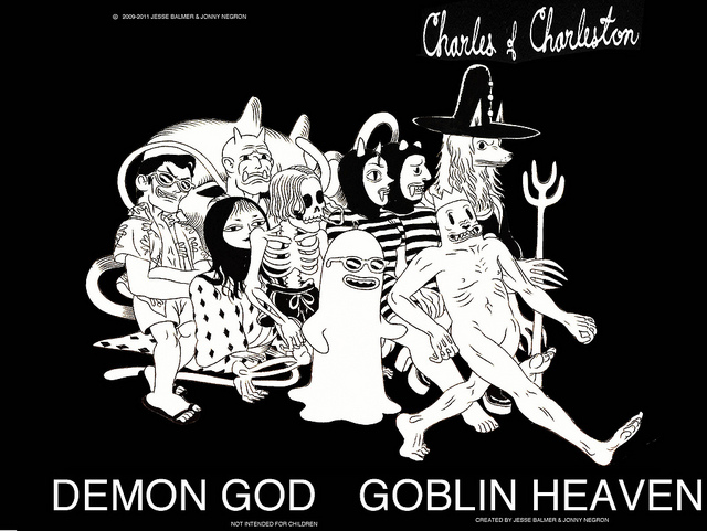
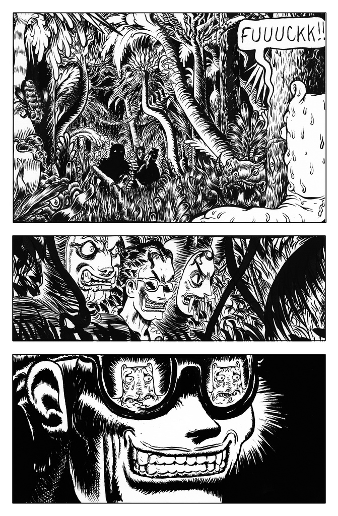
This seamless collaboration between ADDXSTC 2011 Top Tenner Jonny Negron and his Chameleon co-editor Jesse Balmer mines a whole lot of gold from one simple plot vein: the reversal. Every time you get a handle on who’s the biggest shitheel or badass in the book, someone comes along to flip that on its head. Protagonist Charles of Charleston (Balmer’s signature character) is Patient Zero for this technique. The four-page preview sequence linked above was my first exposure to the book, and in the events it depicts the dividing line between victim and victimizer seemed almost painfully clear: Balmer’s goggle-eyed, fleshy, flabby, furrowed, nude, cat-like Charles — a character that seemingly sprung fully formed from the head of one of those grotesque John Kricfalusi close-ups of a smiling or grimacing Stimpy — was undoubtedly at the mercy of Negron’s leering, Wayfarer-sporting, brylcreem-coiffed, switchblade-toting antagonist and his thugs. (Thugs wearing old-timey one-piece swimming costumes and Balinese masks, no less.) But reading the comic itself reveals that Charles was the victimizer up until this point, a rampaging id that consumed or assaulted nearly everyone or everything in his path, including himself, until fate intervened in the form of larger, tougher hombres. The reversal gives the story juice, and reveals a versatility in Charles’ character design to boot: What seems vulnerable and tender in one set of circumstances comes across as priapistic and grotesque in another. The shades-sporting creep, as it turns out, is merely avenging the Casper-like ghost surfer Charles assaulted after washing up on a nearby beach, and is in turn outgunned and outclassed by a dog dressed like Solomon Kane and powered like Doctor Strange. Balmer and Negron’s art styles don’t seem like a natural fit beyond their mutual penchant for the grotesque — Negron’s eroticized coldness has little in common with Balmer’s thick vibrating inks — but in this book, a series of memorable characters doing memorable things in a blackly psychedelic environment, they make a happy match, and that yo-yo pacing is key.
Comics Time: Onward Towards Our Noble Deaths
February 20, 2012Onward Towards Our Noble Deaths
Shigeru Mizuki, writer/artist
Drawn and Quarterly, 2011
368 pages
$24.95
Buy it and read a preview from D&Q
Buy it from Amazon.com
Here’s a book with a hugely important message to which I am very sympathetic, which is never less than enjoyable to read or look at, which I nevertheless didn’t get a ton out of, in the end. A fictionalized memoir of Mizuki’s participation in the Japanese military’s ill-fated attempt to repel invading American forces from a South Pacific island, Onward Towards Our Noble Deaths alternates between expressively cartooned vignettes among the troops that show off Mizuki’s incongruously cute, oblong/oval-headed character designs — seriously, it’s like an army of Berts from Sesame Street — with powerful, passionately drawn photorealistic depictions of both the tropical island environment and the carnage it comes to house. Mizkuki’s disgust with the who-gives-a-fuck pointlessness of the men’s mission, and the callousness with which the commanding officers order the men into suicide runs when the mission inevitably fails, is palpable; interestingly, it comes through equally well in the black-comic cartoony material, which depict the forces’ slow attrition through disease, accidents, enemy forces, and even animal attacks, and in the astonishingly proficient hatching of the realistic scenes, wordless depictions of the island and the ocean and the spectral American G.I.s who bring death to them both. But the characters are more or less incidental to the book’s agenda — few of them are developed any more than is necessary to convey the idea that it was a waste to send this or that funny or annoying or brave or totally ordinary guy to his death for no reason — and thus the book can only get the emotional hooks required for that idea to connect into you in the abstract. If you already believe that war is hell, I’m not sure this book will enlighten you further, certainly not the way it did when it was initially released in Japan in the ’70s. But there’s one aspect that stuck out to me beyond the basics: The suicide-charge ethic of the Imperial Army comes across as a bizarre ideology simply grafted on top of an army full of regular guys, who complain and help each other out and badmouth the officers and make dirty jokes same as any other army, banzai or no. And in that sense, it makes you wonder what people half a world and half a century away from us will think of the ideologies that drove us to kill and die, too.
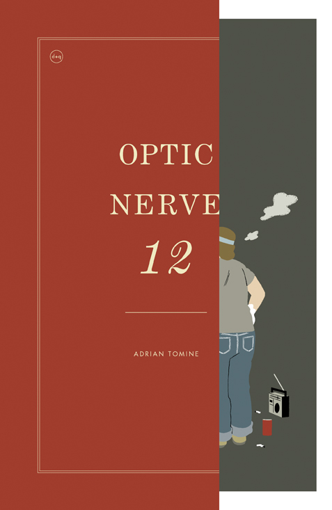
Comics Time: Optic Nerve #12
February 16, 2012Optic Nerve #12
Adrian Tomine, writer/artist
Drawn and Quarterly, 2011
40 pages
$5.95
Buy it from D&Q
Read a preview at Boing Boing
Man, is this thing ever happy to be a comic book.
The format of a comic doesn’t matter to me a whole lot, unless the format in question is notably detrimental to the comic it houses. I like the idea of serial alternative comic book series mostly for the promise of seeing a lot of work from alternative cartoonists on a regular basis, but today that need is met by the web. (Which can’t meet all needs, to be sure — it doesn’t meet the need of retailers to have that kind of material showing up fresh every few months and consequently attracting a different clientele to the shops on Wednesdays, but that’s not my bailiwick.) But in Optic Nerve #12, Adrian Tomine reminded me what can make an alt-comic such an attractive and pleasurable way of packaging material, something not even the most well-stocked RSS reader can provide.
In addition to the usual letters page, its weirdly personal mix of praise and criticism as po-facedly selected as always, the issue consists of three comics. The first, “Hortisculpture,” feels like an homage to the apparently final two issues of the greatest of the alternative comic books, arguably the two best single alternative comic book issues by anyone: Dan Clowes’s Eightball #22 and #23. Like them, the story is constructed from individual self-contained strips, in this case a full “week”‘s worth: six black-and-white four-panel strips plus a full-color “Sunday” page, over and over till the end of the story. Said story recounts a family-man landscaper’s quixotic career detour into the world of contemporary art via his own unique blend of sculpture and horticlture, an unappreciated (arguably unappreciatable) hybrid his pursuit of which upends his life. As a crypto-autobiography it’s a corker — a keyed-up, hyperreal representation of the travails of Tomine’s chosen form of self-imposed artistic marginalization. It’s as engrossing to watch him work his way through as, say, Gabrielle Bell’s similar fictionalizations of her family life. (Plus it allows Tomine’s customary preoccupation with the intersection of race and romance a new, markedly less hostile environment in which to flower.) Things have gone a lot better for the cartoonist than the hortisculptor, to be sure — the former just received some of the best notices of his career for the wide release of the comics he made about his marriage to the mother of his kid, while our last glimpse of the latter is of he and his daughter gleefully smashing his work to smithereens — but the anxieties underlying the worst-case-scenario comic are obviously real, and really funny. And once again like Clowes, in Eightball #22 and later in Wilson, Tomine’s working with a much “cartoonier” style — a curvier line, bulbous noses, dot eyes, doughier physiques — that enjoyably invokes similar work from Sammy Harkham or Chuck Forsman. It feels right, somehow, to look at art like this on a staple-bound page.
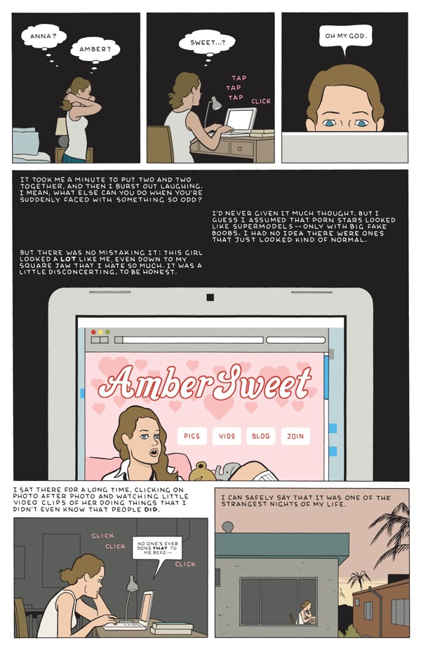
Next up is that staple of one-man anthology series, the reprint from some other anthology. In this case it’s Tomine’s “Amber Sweet” from the broadsheet-sized Kramers Ergot 7, attractively scaled down to the size of the floppy comic, its muted color scheme even more clearly centered around the nutmeg-colored hair of the young woman who discovers she’s the spitting image of the titular porn star. “Sweet” is fascinating to me in that it’s about how unsexy sex can be: our protagonist’s love life, and more besides, is basically destroyed by her resemblance to Amber, a resemblance the men in her life are either daunted by or way too into. Tomine’s perhaps uniquely suited to explore this plight: his cartooning is as sexy as it gets, I’ve always found — his line elegant, his compositions enticingly icy, his character designs very attractive, from Amber and her never-named doppelganger on down — but his work relentlessly cuts against that with the awkwardness and selfishness of his characters. Here we see a beautiful girl who looks like another beautiful girl who makes her living by taking her clothes off and having sex have sex herself as drawn by one of alternative comics’ great unsung sensualists, but the story denies us the pleasure on every possible level. It’s a blast to watch Tomine so successfully negotiate that obstacle course on the way to the story’s knockout ending, a beautiful and satisfying opening-up of the story’s emotional claustrophobia.
The third and final strip — two pages, 20-panel grids — is Tomine’s Lament, pretty much, a self-effacing mock-autobiographical strip about Tomine as “The Last Pamphleteer,” his adherence to the alt-comic format earning him the laughter of his peers and the indifference of his audience. And here, perhaps, he’s trying a little too hard. Throwing “tweet” into sneer quotes as if the term is an affectation instead of just, y’know, email or website; saying things like “I even liked it when the artist was obviously just trying to fill a few extra pages, and you’d get a pointless, dashed-off autobio strip or something!”, as if both he and we didn’t notice that he had to cram this thing onto the inside back cover to get it to fit; using D&Q publicist Peggy Burns as an antagonist, as if he weren’t still core Drawn and Quarterly artist Adrian Tomine; setting up Anders Nilsen and Kate Beaton as models for the new book-driven publishing model, as if they too weren’t primarily collecting work they published in smaller chunks elsewhere…He doth protest too much, and while the result is amusing, who needs it? He’s Adrian Tomine. He writes great and draws great and is as good at using his chosen format as anyone else is at using theirs. That’s all you need.

