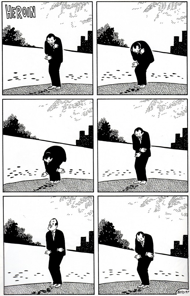
Gilbert and Jaime are both masters of the form of comics. That’s in addition to their character work, their sheer illustrative chops, and so on; indeed it may be the most exciting thing about them. In the case of both brothers I’ve spent a long time chewing over just a few handfuls of panels, unpacking what went into them. Here’s Gilbert’s silent, six-panel comic “Heroin,” one of three one-page shorts he made with that title. It’s just a man against one of Beto’s soon-to-be-trademark dismal nowherescapes, clutching his arm, doubling over, standing back up, hunching over again. We don’t know who he is or where he is or what he’s doing or what its connection is, specifically, to the titular substance — he could be a junkie on the nod, sure, but then why is he also Richard Nixon (or maybe it’s Bob Hope)? Whether it’s about the drug specifically or addictive, destructive influences generally (as are the other two “Heroin” strips) doesn’t really matter, since the effect stems almost entirely from the building blocks of the comic itself: the man, the background, the grid layout, the lack of any text save the title, the rhythm that builds up as we watch his body contort, the three big blocks of black in each panel (trees, man, buildings), the hands pointing in opposite directions, the diagonal hill line bisecting each panel. Every element combines to convey discomfort and unease, the sense of being at the mercy of something that lets you straighten out just long enough for it to be crushing when it knocks you back down. Long before I’d actually read any comics by Los Bros I saw this page reproduced in an issue of The Comics Journal and it has worked its way into the fabric of my comics brain ever since. It occurred to me just the other day that I’ve even done a homage to it without realizing it. I think it’s a perfect comic.
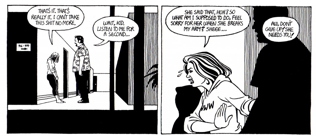
And here’s two panels from “In the Valley of the Polar Bears” by Jaime. Maggie’s been working as the kayfabe “accountant” for her wrestling-champ aunt Vicki, something of a terror in and out of the ring, but the two are barely speaking. Vicki has just confided in her wrestler boyfriend Cash that the reason she’s been treating Maggie so badly is because she cares about her a lot and is hurt by Maggie’s seeming indifference in return. So here, Cash approaches Maggie to tell her about her aunt’s secret soft spot — and then blam, next panel, it’s already been told. Jaime doesn’t show us the conversation. He doesn’t slap a big “Five minutes later…” caption up there. He doesn’t alter the size of the panels or the gutters to imply the passage of time. He doesn’t cut to another scene in between. He doesn’t show Maggie and Cash in another location so that we’d know time must have passed for them to get from place to place. He zooms in a bit but other than that they’re even in the same basic spatial configuration. He pretty much breaks every rule of how jumps in time are conveyed in comics, and yet it’s still crystal clear what happened. Talk about no-fat storytelling. Why belabor the re-presentation of information we readers already have? And why monkey with shit to explain what you’re not showing us when you can simply not show it to us and assume we’re smart enough to follow? These two panels are so bold, so full of lessons in how to tell a story with comics. I think about them all the time.
Love and Rockets, the great serial comic by Gilbert, Jaime, and sometimes Mario Hernandez, is celebrating its 30th anniversary at the San Diego Comic-Con International this week. Inspired by Tom Spurgeon, this week-long, daily series of posts will highlight some of my favorite things about Los Bros Hernandez and their comics. For more information, click here.
Tags: #losbros30, comics, comics reviews, Fantagraphics, Gilbert Hernandez, Jaime Hernandez, Love and Rockets, LOVE AND ROCKTOBER, reviews


4 Responses to Your Love and Rockets 30th Anniversary thought of the day