
Posts Tagged ‘reviews’
Comics Time: Pim & Francie
November 2, 2009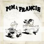
Pim & Francie: The Golden Bear Days
Al Columbia, writer/artist
Fantagraphics, 2009
240 pages, hardcover
$28.99
At SPX this year, a friend of mine approached Al Columbia for a sketch in his themed sketchbook. Columbia started drawing, didn’t like it, tore out the page, crumpled it up. Started drawing again, didn’t like that one either, tore out the page, crumpled it up. Told my friend he couldn’t do it with all the noise and distractions in the room. Stopped drawing sketches for anyone for the rest of the day, except for a tiny circle-dot-dot-curve smiley face next to his signature for anyone who purchased a copy of this book. After I heard this story I told it to a couple of friends. One remarked that if he’d been forced to concoct a story about what trying to get a sketch from Al Columbia would be like, this would have been it. Another said he’d agree with that assessment, but only if Columbia had been paid for the work first.
Al Columbia may be the closest alternative comics has come to producing a Syd Barrett, an Axl Rose, a Sly Stone, a Kevin Shields, a sandbox-era Brian Wilson, or heck, a Steve Ditko–a prodigious, world-beating talent chased off stage by his own…ugh, I don’t want to say demons, but even if you ascribe Columbia’s Big Numbers flameout and lack of published work post-Biologic Show to perfectionism, surely perfectionism that total and unforgiving is a demon of a kind.
The genius of Pim & Francie is harnessing the power of that demon–whatever it is or was that led Columbia to abandon his impossibly immaculate conceptions of monstrousness and murder half-drawn on the page time and time again–and deploying it as a conscious aesthetic decision. Reproducing unfinished roughs, penciled-in and scribbled-out dialogue, half-inked panels, torn-up and taped-together pages, even cropping what look like finished comics so that you can’t see the whole thing, Columbia and his partners in the production of this book, Paul Baresh and Adam Grano, have produced a fractured masterpiece, a glimpse of the forbidden, an objet d’art noir. As I wrote on Robot 6 the other day:
my favorite thing about Columbia’s comics–many of which can now be found in his new Fantagraphics hardcover Pim and Francie–is how they look like the product of some doomed and demented animation studio. It’s as though a team of expert craftsmen became trapped in their office sometime during the Depression and were forgotten about for decades, reduced to inbreeding, feeding on their own dead, and making human sacrifices to the mimeograph machine, and when the authorities finally stumbled across their charnel-house lair, this stuff is what they were working on in the darkness.
The horror of Columbia’s sickly-cute Pim & Francie vignettes–a zombie story, a serial-killer story, a witch-in-the-woods story, a haunted-forest story, a trio of chase sequences–is extraordinarily effective. And the stand-alone images both inside and outside those stories–the Beast of the Apocalypse as story-book fawn, a field of horrid man-things staring right at you, a broken-down theme park and the phrase “there’s something wrong with grandpa,” a forest of crying trees, some dreadful being of black flame running full-tilt down the basement stairs, zombie Grandma stopping her dishwashing and glancing up toward where the children sleep–are as close as comics have come (hate to keep using that formulation, but there you have it) to the girls at the end of the hall in The Shining, the chalk-white face of the demon flashing at us in Father Karras’s dream in The Exorcist, the inscrutable motionlessness of characters in The Blair Witch Project and Paranormal Activity. The craft involved in their creation is simply remarkable, with Columbia’s assuredness of line, faux-vintage aesthetic, and near-peerless use of blacks all actually gaining from his panels’ frequent extreme-close-up enlargement throughout the collection.
But moreover, these scary stories and disturbing images are all so gorgeously awful that they appear to have corrupted the book itself. They look like they’ve emerged from the ether, seared or stained themselves partly onto the pages, then burned out, or been extinguished when the nominal author shut his sketchbook and hurled it across the room or tore up the pages in terror. It’s comic book as Samara’s video from The Ring, Lemarchand’s box from Hellraiser, Abdul Alhazred’s Necronomicon from Lovecraft, the titular toy from Stephen King’s “The Monkey”–an inherently horrific object. Bravo.
Not Comics Time: Portable Grindhouse: The Lost Art of the VHS Box
October 30, 2009
Portable Grindhouse: The Lost Art of the VHS Box
Jacques Boyreau, editor
Fantagraphics, 2009
200 pages, slipcover
$19.99
Buy it from Fantagraphics, eventually
Buy it from Amazon.com eventually too
My entire circle of friends has been clamoring for this long-delayed collection of video box art for over a year–and could this be any more in my wheelhouse right now? If you made a Venn diagram out of the New Action, the Manly Movie Mamajama, and everything I talk about it that Dark Knight Strikes Again review, you’d find this right in the sweet spot. Even if this book didn’t exist, it would be necessary for me to invent it.
So let’s start by talking about what I didn’t like about it. Well, “didn’t like” is probably too strong–it’s fine, just not what I was looking for–but I couldn’t help but be let down by editor and compiler Jacques Boyreau’s introduction. You get a brief sketch of his personal history with home video, a lengthy technical history of the format, and a diatribe about the evils of digital. Actual discussion of “the lost art of the VHS box” is reserved for an interesting but meager two-paragraph rumination on the way their display in video stores made them the iconic equivalent of the films they contained, but this quickly gives way to one last swipe at DVDs, downloads, and digital projection. Nothing about any of the artists or designers involved, nothing about the evolving aesthetics of box art as home video went became a megabusiness, nothing about any of the covers on the pages that follow. If you’re looking for information about the business and creative decisions that led to the creation of this childhood-memory art form, you’ll come away disappointed.
But if you’re simply looking for a gallery of those memories and beyond, Boyreau did you right. He and designer Jacob Covery wisely chose to present the front cover of every box in the context of a product shot, rather than simply scanning the art and running it full-bleed–he’s absolutely right to argue that these images are inseparable from their status as objects. The box shots of the front cover (and spine) occupy the right-hand side of every spread, while the left-hand side reproduces the back cover. And here they do scan it and run it full-bleed, which actually just makes it funnier. Why? Well, it was clear from the start that what you needed to do with the front of your VHS box was make the image as lurid and eye-catching as possible, so there are surprisingly few variations in that regard beyond obvious budget and talent limitations in some cases. But what to do with the back cover? For a long time, no one seemed to know. The familiar tagline/teaser blurb/stills/credits framework was far from universal, and in its place were long lists of other movies released on home video by the studio (on the back of Vanishing Point, Magnetic Video Corporation listed fully fifty-eight), terse flat-affect plot summaries (The Chamber of Fear‘s blurb begins “The crevice of the volcano is very deep. Scientists are searching for a form of underground life that according to theory still exists.”), poorly written catalogues of the depraved behavior contained inside (Blood Spattered Bride notes “Although not rated this film contains nudity and scenes of graphic violence”), and in one memorable case (The Best of Burlesque–somehow I doubt it!) just a flipped and blown-up segment of the front cover’s airbrushed T&A illustration. Seeing all this proto-professional weirdness on the page normally reserved for placing the image next to it in some sort of factual context is hilarious.
But let’s face it, you’re here for the front covers, and they don’t disappoint. You’ve got titles like Drive-In Massacre, Don’t Go In the House, and Slave Girls from Beyond Infinity. You’ve got taglines like Video Violence‘s “…When renting is not enough!!”, Slashdance‘s “SAVE THE LAST DANCE…FOR HELL!” and The Lift‘s “TAKE THE STAIRS, TAKE THE STAIRS. FOR GOD’S SAKE TAKE THE STAIRS!!!” You’ve got images you likely remember from the scary sections of your local mom-and-pop video shop–the girl-gun of Master Blaster, the knife-through-the mask of Friday the 13th: The Final Chapter (the back-cover blurb appends a question mark to that increasingly inaccurate adjective, by the way), and the genuinely striking redneck cheesecake of ‘Gator Bait. You’ve got bloody knives, Giger knock-offs, urban warriors, and underboob.
As is probably clear by now (if it wasn’t already from the book’s title), the bulk of these boxes are for B-movie genre pictures. The exceptions are therefore often all the more interesting. Go Hog Wild is a glorious example of a truly lost art, the cartooned/painted high-school sex comedy poster. Barbie and the Rockers: Out of this World, with a 1987 copyright date, demonstrates the by-then astonishing moneymaking potential of the medium–a full rental fee for one 25-minute cartoon! The box-art design for Sidney Lumet’s Network, though crude by today’s standards, provides a representative look at the far classier approach to A-list studio affairs.
Most anomalous of all are the non-fiction efforts. A Johnny Bench documentary stands out for its blandness, while the Unknown Comic’s bag-clad noggin and overall awfulness could, with a little tweaking, fit right in with the various monsters and slashers. There’s a Gulf War I cash-in from ABC News, simply repackaging a military briefing from Norman Schwarzkopf. Grossest of all is an obliviously bloodthirsty hunting documentary called Bowhunting Whitetails: Just for Fun!: A grinning hunter holds a dead deer’s head by the antlers on the front, the back-cover copy revels in the hunter’s triumph over the poor stupid unarmed animal he slaughters, and there’s a tagline advertising “5 Vivid Arrow Impacts!” Even more than hilariously inept stuff like the Lon Chaney/John Carradine vehicle Alien Massacre and its crosseyed cover babe, it’s these documentaries and hobbyist videos that show just how widely the doors were thrown open to media producers and consumers of all stripes by the home video revolution.
And believe it or not, a couple of the covers even succeed as art! Boyreau smartly puts the two that do best right next to each other–the jagged ’80s splash-of-paint surrealism for the euro-slasher Eyeball (featuring an extremely rare artist credit, for illustrator Dick Bouchard) and the striking still of a loincloth-clad Cornel Wilde running from his life from spear-chucking African natives that bedecked the colonialist adventure The Naked Pray. Elsewhere, the bold two-color art for Walter Hill’s rock’n’roll fantasia Streets of Fire is ripe for reinterpretation today, I’d say; it’s easy to picture a Scott Pilgrim promotional piece riffing on its look and pose. And did I mention ‘Gator Bait? Step it up, Terry Richardson!
Now here’s the thing: A little Google Fu and you could probably come up with jpgs of nearly all the titles I’ve mentioned, and more besides. Boyreau laments how digital phased out analog when it comes to our movie viewing; has the Internet done the same with his book commemorating the losing side of that battle? I say no. It’s not just because of the tremendous job Boyreau and Covey did with the cover reproductions, or the lovely, solid paper stock, or the cutesy slipcase. It’s because Boyreau is right: the aura of the object is irreplaceable. A book collection of VHS box art contains preserves what was special about them in a way a Flickr gallery just can’t. Next time you have a trashy movie marathon, pass this around between movies–unlike your laptop, you won’t even need to worry that much about spilling beer on it.
Comics Time: The Dark Knight Strikes Again
October 29, 2009
The Dark Knight Strikes Again
Frank Miller, writer
Frank Miller & Lynn Varley, artists
DC, 2003
256 pages
$19.99
For today’s Comics Time review, please visit The Savage Critic(s).
Comics Time: Dark Reign: The List #7–Wolverine
October 28, 2009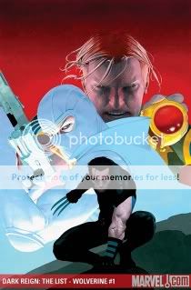
Dark Reign: The List #7–Wolverine
Jason Aaron, writer
Esad Ribic, artist
Marvel, October 2009
48 pages
$3.99
Well well well, looks like Marvel decided maybe they should have strained that Grant Morrison bathwater for babies before they threw it all out. Yeah, Joss Whedon (and, in those nobly intentioned but ill-conceived Phoenix minis, Greg Pak) got to nod in New X-Men‘s direction now and then–Cassandra Nova, a one-line reference to Magneto’s trashing of Manhattan, even the Bug Room. But other than wiping out Genosha, killing Jean Grey, and establishing Emma Frost as the X-Men’s new HBIC, Marvel basically ran, not walked, away from Morrison’s ideas and tone alike. (Exhibit A: that Xorn arc from New Avengers.) So writer Jason Aaron’s full-fledged Morrison Marvel Team-Up in this very very central event title, pitting Wolverine, Marvel Boy (!), and Fantomex (!!!) against Norman Osborn for the fate of The World (i.e. the Morrison-created birthplace of the Weapon Plus program that spawned everyone from Captain America to the ol’ Canucklehead), is something of a turning point. Certainly I didn’t expect to see a French-accented international man of mystery playing a role in Dark Reign, except perhaps as someone for Ares to chop in half in a throwaway sequence in Dark Avengers.
What’s impressive about this is that rather than try to ape high Morrisonian “mad ideas” (except for a played-for-laughs viral-religion thing), Aaron riffs on an entirely different Morrison tone: cheeky high-concept comedy. Instead of writing Marvel Boy as some sort of brooding military brat, Aaron returns him to the quasi-Clockwork Orange blend of arrogance, ultraviolence, and killer good looks that made his original Morrison miniseries such a hoot. He’s like Chuck Bass with insect DNA. (Okay, more insect DNA.) Similarly, Fantomex is treated as a charming rogue with a cool white uniform rather than Aaron simply waving his hands in the face of his weird power set and Frenchness and giving up or phoning in some black-ops boilerplate. Wolverine actually plays a supporting role more than anything else, but when he’s unleashed, it’s in a splatstick fashion consistent with the joli-laid physicality Morrison’s collaborator Frank Quitely imbued him with. Ribic’s art goes a long way in this regard–I’d previously known him only for his admittedly dynamic Alex Ross-indebted painted work, but his pencils have a cartoony zest that would be right at home on some three-issue Vertigo miniseries.
What does it all mean in the context of Dark Reign and The List and so on? As best I can tell, not much. But reintegrating Morrison’s many toys into the mainstream Marvel Universe, as opposed to the province of editorially hands-off limited series, is pretty momentous in and of itself. Fingers crossed we’ll see the Phoenix Corps again when all is said and done.
Comics Time: nothin’
October 26, 2009Today’s Comics Time review has been canceled because I accidentally read and reviewed a book that’s embargoed until Wednesday. I am a doofus. Comics Time will resume on Wednesday, and I may throw in an extra review at some point this week just to make up for this. You never know.
Comics Time: Invincible Iron Man #19
October 23, 2009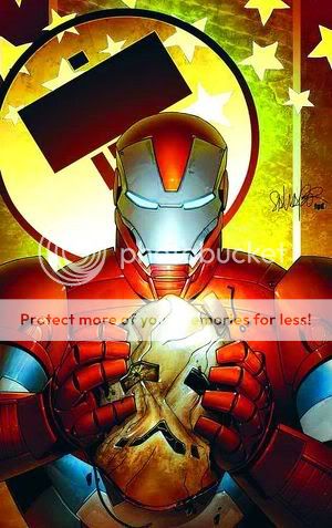
Invincible Iron Man #19
Matt Fraction, writer
Salvador Larroca, artist
Marvel, October 2009
40 pages
$3.99
It’s been a long time since I read superhero comic that wasn’t by Grant Morrison more than once out of enthusiasm rather than confusion. But golly, I enjoyed this one, and I enjoyed it just as much the second time around.
Subtitled (somewhat pretentiously) “Into the White (Einstein on the Beach),” this is the conclusion of the year-long “World’s Most Wanted” arc of Fraction and Larroca’s movie-toned Iron Man book, in which the disgraced and deposed Tony Stark runs around the world trying to destroy both his tech and his own mind lest both fall into the hands of new King Shit of Turd Mountain Norman Osborn. In the past I’ve found this set-up very hard to swallow because of how dependent it is on other, lesser comics like Civil War and Secret Invasion. For example, I don’t care what universe you live in, if Bernard Kerik can go from Homeland Security chief nominee to getting his mugshot taken, it strains credulity that a guy who used to dress up as a goblin and throw pumpkin bombs at people is gonna get put in charge of jack shit.
But Fraction compensates for this inherited conceptual sloppiness simply by making the plot mechanics for this story as tight as he possibly can. He cuts relentlessly back and forth between the protagonists and antagonists: the Charlie’s Angels trio of Black Widow, Maria Hill, and Pepper Potts attempting to escape from Osborn’s lair; Osborn’s second-in-command Victoria Hand trying to prevent this and quaking in terror of what will happen if she doesn’t; Osborn himself cockily closing in on his quarry; the intelligence-officer grunt who’s secretly feeding Osborn bad information and the colleague who smells something fishy about him; and Iron Man himself, experiencing an Algernon-like loss of his faculties as he hurls himself in his dilapidated old armor toward his final destination. If you’ve ever tried to write an action sequence, let alone cross-cut between several of them, you know how hard it is to get what needs to happen to happen for any reason other than your need for it to happen, right? Well, never once do the A-B-C sequencings of Fraction’s various plots feel like they’ve skipped a letter just to get to point Z quicker. From the captured spies moving up and down and in an out of an elevator, to the precise interpersonal dynamics between all the personnel involved in Norman’s pursuit of Tony Stark, each moment proceeds directly from the last, whether physically or emotionally.
How many fight scenes have you read lately where a character will get smacked several dozen yards by some giant powerhouse only to be up and about a few pages later? How many times have creators had to go online to clarify the physical fate of a character whose beating they wrote into incomprehensibility? How many times has a climactic battle been undercut completely by glib banter, almost completely disconnected from the circumstances of that place, that moment, those characters? You’re not gonna get any of that shit here. Each scene and sequence feels like it’s taking place in a physical space you and the characters could navigate, with physical maneuvers having readily understandable physical consequences. Each move toward and away from the characters’ goals comes with a sense of the stakes involved–the grand illusion of serialized shared-universe superhero storytelling, that there really can be winners and losers, has rarely been so astutely conveyed.
This is all the result of what feels like a real partnership. This issue’s success is equally due to Fraction’s just-right dialogue and direction and Larroca’s deft work with body language and fight choreography. (His days as a Greg Land-style spot-the-photoref novelty act are loooooong behind him.) Both shine brightest in the climax, making Osborn’s slide from glee to rage to frustration to confusion to defeat snatched from the jaws of victory as clear as day and almost frightening. It’s capped off with a one-liner in which the totality of Tony’s pwnage of Norma is made hilariously clear (provided you’re a Marvel nerd), and a one-page coda that manages to set up the coming mega-crossover without losing a sense of beatific victory and loss.
Did I mention that they managed to rehabilitate Iron Man’s badly damaged character in my head, despite the fact that even now none of his actions during Civil War have turned out to make any kind of practical or moral sense within the world of the story in any way? And that they managed to establish Spider-Man villain the Green Goblin as a for-the-ages Iron Man enemy as surely as Frank Miller made Kingpin the archnemesis for Daredevil? I dunno, man, this is some mightily effective work in this genre. I feel like it should be taken apart and studied at story summits for a long, long time: If this is what you want to do, this is how you want to do it. Aw, hell, I’m gonna read it again.
Comics Time: Slow Storm
October 21, 2009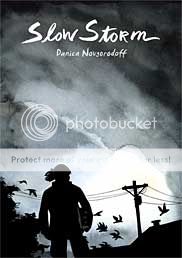
Slow Storm
Danica Novgorodoff, writer/artist
First Second, 2008
176 pages
$17.95
This is like half of a good book. The visual half, for the most part. Danica Novgorodoff’s story of a Kentucky firefighter and the undocumented Mexican worker she kinda sorta befriends after a fire claims the stable he tended is a stunning-looking thing. She has a wiry line that often suggests handwriting, with all its idiosyncracies, so that the occasional wonky scale or perspective seems like (or can be passed off as) a deliberate choice. Individual moments beam out a little Taiyo Matsumoto, a little Ralph Steadman, a little Gerald Scarfe, only with the dial turned from savage to lilting. And her watercolor coloring takes a limited palette of greens, browns, grays, and oranges and fleshes out the artwork so lushly I barely even realized just how few colors she limited herself to in the first place. It’s in the moments where she really draws with the colors–a creek, a tornado, the omnipresent cloud and fire motifs–that the book comes alive.
But its in moments where the dialogue takes the lead where it sputters. Frequently too portentous–every conversation creaks under the weight of capital-M Meaning–it fails to convince us of firefighter Ursa’s shattered psyche, so that when she perform’s the book’s central act it feels like a horrifying, selfish overreaction. Which, granted, it’s supposed to feel like, but you’re also supposed to think “okay, I could see where that came from,” whereas I just thought “Christ, what a fucking maniac.” Ditto her behavior during the event’s fallout, which adds “asshole” to the equation. Meanwhile, Rafi, the Mexican immigrant, is laden with poetic visions of saints and white horses–it’s just laid on too thick. The key for Novgorodoff (an Isotope winner and Eisner nominee who clearly doesn’t need any advice from me but what the hey) will be to scale back her swing as a writer and tell a story as understated as her art is sweeping.
Comics Time: Driven by Lemons
October 19, 2009
Driven by Lemons
Joshua W. Cotter, writer/artist
AdHouse, September 2009
104 pages, hardcover
$19.95
Buy it from AdHouse, eventually
So yeah, this is pretty much the ideal Josh Cotter comic for me. Didja like the bizarre, symbol-laden wordless reveries of Skyscrapers of the Midwest? Here’s a whole book full of them! This shit makes the locust/migraine sequence from Skyscrapers #2 look like Dilbert! What’s it about? In large part, who cares? Like (in my experience) most great comics, it’s about how, and what, it makes you feel. It makes me feel like one of those ’80s special-effects sequence where some being’s exterior shell is chipping away and beneath each chunk that falls off a blindingly bright white light shines out like a beam–like that’s basically what Cotter did to his own brain to produce this thing, and like that’s what you run the risk of if you stare too long.
That’s essentially what Cotter does, visually, over and over again throughout the book: Something will cause one of Cotter’s nominal protagonists (anthropomorphized Life in Hell bunnies, pretty much) to spew forth from his person an amount of visual information that totally overwhelms them and the page itself, scribbled and scribed like a Charles Crumb notebook, and at one memorable point caked/painted with watercolors squeezed straight from the tube. In that light, and considering the first section’s apparent Chicago setting and slow evolution into comics from a straightforward-ish stream-of-consciousness prose-plus-doodles diary format, it’s tempting to read the book as some sort of autobiography: a story of the onset of, treatment of, and recovery from mental illness. For what it’s worth, I interviewed Cotter about his life and work at length for The Comics Journal and such an incident never came up, though I could have just whiffed on it. If I’m wrong, so much the better for Cotter, because having dealt with the mental-health institutionalization of two people very very close to me, this is about as accurate a representation of what I always pictured going on in their heads as you’re gonna find. Noise, blotting out signals and forming its own.
Glorious noise, too. For all of the books insular inscrutability, several passages here stand out with an effect as awe-inspiring as a great visual effects sequence in a blockbuster by some genuine Hollywood visionary. The paint explosion. The great cloud of scribble, with sensuously tangled lines looking like they’ve somehow been carved through other lines. The marvelously reproduced, bright reds and blues representing warring states of mind, popping off the off-white pages like 3-D. (The whole book, a facsimile of Cotter’s sketchbook, is really an astonishing work of design by Cotter and Chris Pitzer.) The forward momentum of the chase sequence, with two bunnies battling for supremacy in frame after Haring/Muybridge mash-up frame. An eruption of a column of red that rockets into the sky so powerfully you can practically hear the noise. And a creepy cameo by the mad god Dionysus, quoting the soundtrack from the animated Transformers movie, rings out as a reminder of madness after all is said and done like that dissonant shot of the cab’s rear view mirror at the end of Taxi Driver.
Outstanding work. Where the hell does he go from here?
Comics Time: Abstract Comics
October 16, 2009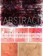
Abstract Comics
Andrei Molotiu, editor
R. Crumb, Victor Moscoso, Spyros Horemis, Jeff Zenick, Bill Shutt, Patrick McDonnell, Mark Badger, Benoit Joly, Bill Boichel, Gary Panter, Damien Jay, Ibn al Rabin, Lewis Trondheim, Andy Bleck, Mark Staff Brandl, Andrei Molotiu, Anders Pearson, Derik Badman, Grant Thomas, Casey Camp, Henrik Rehr, James Kochalka, John Hankiewciz, Mike Gestiv, J.R. Williams, Blaise Larmee, Warren Craghead III, Janusz Jaworski, Richard Hahn, Geoff Grogan, Panayiotis Terzis, Mark Gonyea, Greg Shaw, Alexey Sokolin, Jason Overby, Bruno Schaub, Draw, Jason T. Miles, Elijah Brubaker, Noah Berlatsky, Tim Gaze, Troylloyd, Billy Mavreas, writers/artists
Fantagraphics, 2009
232 pages, hardcover
$39.99
Visit the Abstract Comics blog
One of the pleasures inherent in anthologies is the way proximity draws out the contrast between successful and unsuccessful work. One of the unique pleasures of this anthology is how that success or lack thereof can be determined not just by the subjective standards of the reader but also by the ostensibly objective standards of the anthology itself. In his introduction, editor Andrei Molotiu defines abstract comics thusly:
What does not fit under this definition are comics that tell straightforward stories in captions and speech balloons while abstracting their imagery either into vaguely human shapes, or even into triangles and squares. In such cases, the images are not different in kind, but only in degree, from the cartoony simplification of, say, Carl Barks’ ducks….While in painting the term [“abstract”] applies to the lack of represented objects in favor of an emphasis on form, we can say that in comics it additionally applies to the lack of a narrative excuse to string panels together, in favor of an increased emphasis on the formal elements of comics that, even in the absence of a (verbal) story, can create a feeling of sequential drive, the sheer rhythm of narrative, or the rise and fall of a story arc.
True, none of the comics featured here use (legible) captions or speech balloons. But as Molotiu’s subsequent emphasis on “images” implies, the lack of text is incidental to the more fundamental lack of narrative or story. It’s by that petard that several of the strips Molotiu selects are hoisted. The contributions from Ibn Al Rabin, Lewis Trondheim, Andy Bleck, and to an extent Mike Gestiv and Bill Shut all rely precisely the sort of “difference in degree” Molotiu warns about–in their comics, abstracted shapes perform actions based on recognizable, and in some cases quite clearly depicted, physical motivations and even emotions, just like the “triangles and squares” we’re told may as well be Uncle Scrooge. These strips are cute, but not exactly challenging, and far from abstract.
But the successful strips in Abstract Comics prove that comics need not depict emotions to pack an emotional wallop. Indeed, part of my long-held enthusiasm for this project stemmed from my suspicion, based on steps (small and giant alike) in the direction of abstraction during this decade by such alternative comics artists as Kevin Huizenga, John Hankiewicz, Anders Nilsen, Josh Cotter, and Frank Santoro, that abstract comics stripped completely away from their narrative moorings–abstract comics “in the wild,” as it were–had the potential to generate emotional content of enormous power. What I didn’t expect was just how…I don’t know, idiosyncratic my reaction to such comics would be.
For example, I’ve already described how the more openly narrative works contained here elicited a chuckle but not much else. What’s interesting to me is how the sorts of shapes used by those artists–outlined blobs, for the most part–left me cold even in purely abstracted form. The squiggles of Elijah Brubaker, the whorls of James Kochalka, suggest a warmth and an airiness I’m just not tuned into at all. I’m not a curve man, it turns out. Meanwhile, I’m equally unaffected by strips that eschew drawing sharp contrasts from image to image and panel to panel, either by muting the differences between juxtaposed visuals (Warren Craghead, Richard Hahn, Janusa Jaworski) or by weakening or eliminating the parametric framing and structure provided by panels (Noah Berlatsky, Billy Mavreas, Troylloyd, Tim Gaze, Bruno Schaub).
What I am interested in, it appears, are angles. boxes, cold geometry. Jason Overby’s “Apophenia” is perhaps my favorite comic in the whole book: Beginning with a grid of penciled-in panel borders containing nothing at all, it proceeds to flash various sharply carved shapes into panels at random intervals like sudden words emerging from a haze of silent static, or subliminal messages erupting from a blank screen. Mark Goneya’s “Squares in Squares” is just that, panel after panel of brightly colored squares surrounding one another like an infinite regression, their position within the panel shifting slightly to slow our eye’s descent into the abyss. Mutts creator Patrick McDonnell’s untitled, college-vintage contribution uses a repeated bisected-circle motif in black, white, and watercolor-blood red to suggest cold sunrises and magisterial eclipses. And Spyros Horemis black-and-white concentric circles and swirls practically glow off the page with the force of an optical illusion.
I’m also interested in a sense of awe and scale. Molotiu’s own excerpts from The Cave overwhelm with bright colors and massive slopes that dwarf panel borders and seem to escape his control, like a microscopic process blown up to IMAX size or a projected filmstrip set on fire. Henrik Rehr’s “The Storm” is as aptly named as was “Squares in Squares”: Great waves or windgusts toss us to and fro across black backgrounds, sending tiny offset panels scattering like leaves. Alexey Sokolin’s “Life, Interwoven” sees its panels slowly overwhelmed by furious black scribbling, like a diary of a madman, until it not only totally blots out the grid but appears to topple it over.
And sometimes I’m like John Cleese’s pope: I may not know art, but I know what I like. I like the loneliness of Blaise Larmee’s tiny, shaky, frail, incomplete rectangles against their off-white background in his Nilsenesque “I Would Like to Live There.” I like the humor of Geoff Grogan repeating a bullseye motif until the laugh-out-loud punchline photo of a woman’s nipple in “Bullseye.” I like Jason T. Miles creating shapes out of chunky, semi-monstrous black and white lattices–Brinkman Blocks, if you will–then signing it with a great big clumsy JASON T. MILES in “Mainstream Blackout.” I like the implied sequentiality of Mark Badger following up a pencil-sketched “Kung Fu” strip from 1980 with a boldly colored remake of the same strip from 2008. And I like the pure psychedelia–in the information-overload sense–in R. Crumb’s “Abstract Expressionist Ultra Super Modernistic Comics,” drawn, laid out, and even titled as though attempting to get it down on paper winded him.
So. By my count I liked, mmm, about half the book, give or take a couple strips. And there are potentially fruitful paths that remain largely untrodden. For example, I know Molotiu has been doing yeoman’s work on carving out a space for nonnarrative comics for years because I remember jostling with him a bit about on the Comics Journal messageboard following the release of Kramers Ergot 4 in 2003; however, the work of Fort Thunder and its fellow travelers, showcased so memorably in Sammy Harkham’s anthology, isn’t represented here (unless you count their spiritual godfather Gary Panter). Meanwhile, Crumb and Larry Zenick excepted, the use of representative figures in an abstract way is elided here; I wish Molotiu had selected one of John Hankiewicz’s enormously effective strips in this style rather than the comparatively staid and painterly contribution we see here. And for my money, the sequencing peters out toward the end–I’m not sure what I was supposed to take away from the final strips, rather formless black and white affairs. An editorial focus not so much tighter as tweaked, I suppose, is what I’m looking for.
But what I liked! What I liked, I liked for more than just the strips themselves–I liked them for the proof they offer that comics really is still a Wild West medium in which one’s bliss can be followed even beyond the boundaries of what many or even most readers would care to define as “comics.” That an entire deluxe hardcover collection of such comics now exists is, I think, one of the great triumphs for the medium in a decade full to bursting with them. And even if the book’s existence is ultimately more impressive than the sum total of its contents, it strikes me as churlish to complain.
Comics Time: Sulk Vol. 3: The Kind of Strength That Comes from Madness
October 14, 2009
Sulk Vol. 3: The Kind of Strength That Comes from Madness
Jeffrey Brown, writer/artist
Top Shelf, September 2009
64 pages
$6
I still don’t get where this whole “Jeffrey Brown can’t draw” thing comes from. I mean sure, if your standard for artistic excellence is Neal Adams or something, you’re gonna be like WTF, but as always I’m ignoring those people and talking about altcomix fans who should know better. I’ve said this before, but compare the work of Brown (full disclosure: I like him a lot personally) to that of any of the ultra-lo-fi slice-of-life humor/pathos diarists who’ve emerged in his wake and he’s just doing so much more–with how he arranges space in his panels; with how he adds line upon line for shading, depth, and detail; with the expressiveness of his characters; with how even his action pastiches are genuinely dynamic and fun to follow; with how he bounces from genre to genre with the same “here’s something I thought was funny about this topic” good humor. Especially in the outright humor stuff, he’s like your funny friend bullshitting.
That’s not necessarily to say that everything he does is for everyone. As in previous genre-parody works like Incredible Change-Bots, the sci-fi/action/fantasy hodgepodge of Sulk #3 presupposes simultaneous knowledge of, affection for, and skepticism of the kinds of stuff he’s swiping from/at, plus (obviously) an appreciation of Brown’s visual approach to the material. It’s an acquired taste: The ribbing might be too gentle for people who wanna see an indie stalwart get some yuks at the expense of elves and unicorns, while the irony might be tough to stomach for po-faced “new action” fans. Indeed I think the reason why Brown’s Bighead books (including Sulk #1) are the strongest of his work in this area is because this kind of parody is more familiar with superheroes than with any other subgenre; you can “get it” easier than you can when you’re dealing with pirates or D&D or Godzilla or boy geniuses as you are here. Meanwhile the MMA-based Sulk #2’s 80-page fight scene was easy to grok as an exercise in ways drawing combat and writing the combatants’ interior monologues. The anchor point in The Kind of Strength That Comes from Madness is much harder to locate.
I suppose it just comes down to what you think you might want to see in a comic. Do you want to see an adorable, realistically depicted stag smack his antlers against a tree and then stare at the reader, demanding to know “DO YOU STILL WANT TO TANGLE WITH ME?” in giant capital letters? Do you want a ground-eye-view parallel to Brown’s memorably poetic giant-monster rampage comic from Mome in which a couple of moron brothers take the opportunity to make a “looting list” out of their weekly grocery list and then smack the dying reptile around with a baseball bat? Do you want to read lines like “A vampyre! It’s exactly like a vampire, but far more dangerous,” or hear small-city residents thank goodness that the giant monster is attacking their town instead of big important places like New York or L.A.? Do you want the occasional visual digression about boobs or beards or babies? I know my answers at least.
Comics Time: Cold Heat #7/8
October 12, 2009
Cold Heat #7/8
BJ & Frank Santoro, writers
Frank Santoro, artist
PictureBox, September 2009
48 pages
$20 (hey, it’s a limited edition of 100)
Radiohead threw me not when they made their shift into electronic music with Kid A–I’d been listening to Aphex Twin since I was a sophomore in high school, yeah that’s right, I’m an IDM OG, or at least as close as we got to one on L.I.–but with the two albums after that, Amnesiac and Hail to the Thief. I now listen the heck out of those records (okay, more Hail than Amnesiac), but the band’s sudden lack of interest in providing the big, sweeping, soaring moments of catharsis they were still doing as late as “How to Disappear Completely” and “Morning Bell” struck me then and now as a willful avoidance of their own strengths. Now they’re doing that sort of stuff again on In Rainbows and all is well with the world, but I do wish that more people would acknowledge that guitar rock or no guitar rock, that was the big, not-entirely-successful risk they took this decade.
Something similar is going on in Cold Heat #7/8. For about 4/5ths of this limited-edition double-issue installment of Santoro & Jones’s punk-rock sci-fi saga, the psychedelic vistas and geometric reveries that were the series’ aesthetic calling card are largely abandoned. In their place is a comparatively straightforward, albeit tongue-in-cheek, international espionage quasi-parody involving cynical jetsetting journalists, deadpan quip-dropping CIA agents, sinister pharmaceutical conglomerates, crooked conspiring politicians, and Castle, the small-town American fuck-up who’s unwittingly unravelling the plot. Silence is rare, with more voluminous dialogue and lots of those little labels Santoro likes to drop in. It’s the sort of thing some combination of Stephen Soderbergh, George Clooney, and Matt Damon might release in a limited September theatrical run, or what you might see in one of the Coen Brothers’ seriocomic conspiracy-caper flicks if they were given an effects budget and asked to throw something spacey in there now and then. There’s even some broad comedy about the U.K. rock press and a celestial poker game involving not-exactly-dead rock star Joel Cannon being invited to play a hand with Jimi, Janis, Jim, and John. (Jerry opted to kick it in the hot tub.)
This ain’t your father’s Cold Heat, long story short. Honestly it’s so different in tone it feels more like a particularly off-model Cold Heat Special than a Cold Heat proper. And it may not be the droids you’re looking for–at least until the very end, where Castle searches for her kidnapped journalist lover, running through the streets of Rio in a wet bathing suit, fleeing the psychic and physical attacks of the evil Senator Wastmor’s puppetmasters. That’s the sort of dreamlike/nightmarish imagery you’ve come to expect from Cold Heat, and it’ll be interesting to see if there’s more of that in the offing, perhaps wedded to the new potboiler-parody structure we’re seeing here. Here’s hopin’.
Comics Time: Ganges #3
October 9, 2009
Ganges #3
Kevin Huizenga, writer/artist
Fantagraphics/Coconino, September 2009
32 pages
$7.95
Buy it from Fantagraphics, eventually
You wanna talk about a gateway comic? How ’bout handing this sucker to anyone who’s ever had trouble falling asleep? The whole thing is dedicated to nothing more or less than reproducing the mental and physical sensations of insomnia. Ironically it’s Huizenga’s most action-driven comic this side of Fight or Run or the video-game bits in Ganges #2. In order to evoke the insomniac mind’s uncontrollable wanderings, Huizenga takes Glenn Ganges’s mental avatar and sends him on a series of Cave-In-like explorations–dipping him into water, sucking him down the drain, walking him up a tree, bouncing him off thought balloons, floating him along on sleep bubbles. At one point he mentally fends off invisible burglars; at another he’s armed with a bow and arrow, or a machine gun, taking aim at his own wiredness. Combine it with one of the most effective uses yet of the Ignatz series’ two-tone color palette–here a cool small-hours blue–and the experience is almost tactile, as though you’re physically tunneling through the mysteries of your own mind. It’s only when Glenn finally gives up and gets out of bed that the gutters switch from black to white and everything instantly feels less dense, less close; naturally, removed from the million-miles-a-second flow of his Glenn’s thoughts and reset in the real world, the action switches from complex reverie to straightforward cutesy business involving playing music late at night and freaking out when the cops show up about the noise. The mastery of tone is deeply impressive.
Look, I’m always gonna be up front about how I think the “Gloriana” issue of Or Else, #2, is the best thing Huizenga’s ever done. That thing hit me with the force of a revelation, and so I tend to be deaf to the claim that he keeps getting better and better. (Particularly regarding Ganges #1 and its disastrously wrong take on the Beatles’ “She’s Leaving Home”!!!!!!1!!111!) That’s as good as he’s gotten. But it’s obviously true that each new release proves just how much he’s mastered the stuff of comics, and how thoroughly he’s staked his claim on chronicling areas of contemporary American human experience few if any other cartoonists are going anywhere near. It’s pretty darned exciting.
Comics Time: The Mourning Star #1 & 2
October 7, 2009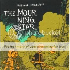
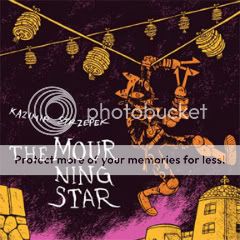
The Mourning Star #1 & 2
Kazimir Strzepek, writer/artist
Bodega, 2006 & 2009
Vol. 1: 220 pages
Vol. 2: 256 pages
$13 each
Of all the alternative action-adventure comics I’ve been lumping together in discussions for the past couple years, Kaz Strzepek’s The Mourning Star is the ripest candidate for crossover success. His cartooning is clear and appealing, with endearing, often adorable character designs and well-choreographed action sequences, reminiscent of the work of Brian Ralph without Ralph’s ars gratia artis, printmaking-derived design sense. Strzepek’s world-building–in the sense of both “backstory” and “readily understandable physical environment”–is top drawer, recalling everything from Dungeons & Dragons to Tolkien to The Road Warrior to The Dark Tower without coming across like a rehash of any of them. While its blend of an obviously personal vision with universally accessible ideas and visuals puts it more in line with Scott Pilgrim than Powr Mastrs, the involvement of Highwater vets Randy Chang and Jordan Crane in its production leaves little doubt as to its altcomix cred. It’s like a post-Fort Thunder Bone.
In reading The Mourning Star‘s first two volumes back-to-back recently, what struck me hardest wasn’t the admittedly rock-solid introduction to the characters and world provided by book #1, but the time we spend with its villains in book #2. It’s very easy and tempting for one’s grown-up, self-aware genre art to willfully return to a black-and-white conception of protagonist and antagonist. And I don’t blame anyone for doing it! The point of escapism is to escape, and giving your villains big black hats is a welcome relief from the shades-of-gray nightmare we live in day to day. But taking the time to depict villainy as the result of relatable choices is rewarding in its own way. In Volume 2, we discover through Strzepek’s seamlessly natural dialogue that the Rule aren’t just sinister, unfeeling killers–although they’re that, too. They’re people who banded together in The Mourning Star‘s postapocalyptic world for security and safety and who believe their brutality is what can continue to ensure this. They have leaders whose approval they sometimes crave and whose orders they sometimes resent. They have medics to heal them when they get hurt, and equipment that breaks down. They’ve got seasoned veterans and wet-behind-the-ears rookies. They tell each other urban myths. They jockey for position and remember their lives before they became the barbaric rulers of the cities and wastelands. In short they’re just like anyone who’s ever shored up an evil regime–potentially normal guys and girls who at some point lost or deactivated their ability to empathize, who don’t mind ordering or supporting the murder of people they don’t know. Maybe that’s why I’m rooting even harder than ever for the good guys to beat them in the end.
Comics Time: Cold Heat Special #7
October 5, 2009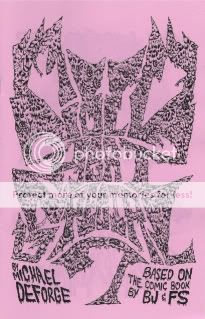
Cold Heat Special #7
Michael DeForge, writer/artist
PictureBox, September 2009
12 pages
I don’t remember how much it cost
Browse the Cold Heat shop, where it’ll probably end up eventually
Band logos are an interesting thing, and when they succeed at visually representing a band’s musical and aesthetic project, a pretty awesome thing. Which makes a lot of old-school heavy metal logos a baffling thing–instead of offering a clear, brandable distillation of the band, they’re often illegible to the point of incomprehensibility. (Spend some time on Obsidian Obelisk and you’ll see what I mean.) I suppose this is a tip of the hat to the uncommercial, underground nature of much of that music–it’s so not for you that the masses can’t even make out the band name. (“Songs for the deaf–you can’t even hear ’em!”) My favorite recent example of this aesthetic cropping up in comics is Rinzen’s title design for Paul Pope’s Batman Year 100, which combines past stabs at shaping the word “BATMAN” into a logo with an unmistakable and acknowledged metal vibe.
Michael DeForge’s Cold Heat Special combines this with a project that stretches the boundaries of “comics” in much the same way as Kevin Huizenga’s minicomic Untitled. That book was little more than page after page of scribbled, rejected names for Huizenga’s then-upcoming solo series Or Else. And though its contents were almost entirely text, it was at least as much intended to be viewed as read; like any comic, its contents accrued meaning through sequential juxtaposition, building into a memorable exploration of the creative process and the by-definition arbitrary nature of assigning signifiers to the signified.
DeForge’s work here is different, to be sure. For starters, it’s very, very metal: His eye-meltingly ornate band-logo versions of the names of various Cold Heat characters (including, of course, the pivotal noise band Chocolate Gun) frequently rely on motifs that evoke thorns, spikes, bodily fluid, scales, horns, lightning, fire, and in one memorable case a fist with the name spelled across the knuckles in spilt blood. It’s a far cry from Huizenga’s no-nonsense all-caps lettering. It’s also a far cry, in a lot of ways, from the aesthetic I tend to associate Cold Heat with: the hazy sensuality of shoegaze. It’s way more Cannibal Corpse than My Bloody Valentine. (There’s also at least one explicit homage that I caught–the lettering for Black Sabbath’s Masters of Reality, not to mention 1000 Homo DJs’ Supernaut EP.) But what this explosive, offensive, savage designwork does get at is the importance of POWER to the Cold Heat project: The violent power wielded by the sinister Senator Wastmor, the emotionally liberating power of Joel Cannon’s music, the self-discovery of internal power by our heroine Castle, and so on. It also reinforces Cold Heat as a sort of samizdata, an attempt to recreate the magic of the “lifeline music” that got us through our teenage years and the handmade, ramshackle media, from zines to mixtapes, that chronicled that community. Logos like these are meant to communicate just how important and immediate and irrepressible the art they’re a stand-in for is to its makers and consumers. In the context of Cold Heat, they make more sense than you’d think.
Comics Time: Cold Heat Special #6
October 2, 2009
Cold Heat Special #6
Chris Cornwell, writer/artist
PictureBox, September 2009
24 pages
I think it was $10
Chris Cornwell is the joker in the Cold Heat deck. The only Cold Heat Specialist who doesn’t create his installments of the spinoff series in collaboration with Cold Heat-proper cocreator Frank Santoro, he’s also the farthest afield from CH‘s usual tone of wistful, sensual menace and transcendence. His first CHS involved an assassin whose dayjob was rock stardom and the evil Senator Wastmor piloting a giant minotaur robot. Similarly, this issue is summed up by that gorgeous, iconic cover, featuring some kind of robed Satan worshipper rocking out; this leads into an opening sequence in which a band comprised of monsters “rehearses” by destroying their own equipment in a montage that reminds me of Yacht Rock’s take on Van Halen in terms of sheer half-parody/half-salute comedic rockitude.
Indeed the whole comic feels a bit like a montage. There’s that opening Monsters of Rock sequence’ a credits-spread scene of a nude Senator Wastmor getting drunk and drowning in an ocean of his own puke’ a “secret history of Cold Heat” story (really the core segment) about one of Wastmor’s ancestors attempting to sacrifice a beautiful girl to his demonic masters in colonial days before being thwarted by alien protectors; a near-abstract spacetime-rupturing transition sequence linking that centuries-old adventure to the present-day viewing of a Chocolate Gun videocasette by other aliens; and a glimpse of how the aliens’ power affects CG lead singer Joel Cannon juxtaposed with how Cannon’s music effects Cold Heat heroine Castle. Got all that? It can be tough to follow, particularly toward the end of the book, but following it doesn’t appear to me to be the point. It’s more a case of latching on to isolated images and impressions, meaning that Cornwell in his goofy slapstick way is mimicking the more lyrical approach of Santoro and Ben Jones in Cold Heat itself. And he can do it, too–he’s got the visual chops to bounce back and forth between slick cartooniness (the cover, Wastmor’s bender), rough-edged Fort Thunder/Closed Caption Comics-style monstrousness (the band, the aliens), non-narrative visual-driven psychedelia (the transition sequence), and on the last two pages, a glimpse of Cold Heat‘s trademark music-as-emotional-salvation leitmotif. Plus the book is as lovely an object as the CHS series has seen so far, with that killer, please-make-it-a-poster cover and two gorgeous color pin-ups literally pasted to the inside covers. If only every comic-book franchise had this kind of quality control.
Comics Time: Boy’s Club #3
September 30, 2009Boy’s Club #3
Matt Furie, writer/artist
Buenaventura Press, 2009
40 pages
$4.95
Buy it from Buenaventura Press
For today’s Comics Time review, please visit The Savage Critic(s).

Comics Time: Two Panels from SPX 2009
September 28, 2009In lieu of our regularly scheduled Comics Time review, I’m happy to present mp3 recordings of the two panels I participated in at SPX this past weekend.
First up is the Critics’ Roundtable, featuring moderator Bill Kartalopolous, Rob Clough, Sean T. Collins, Gary Groth, Chris Mautner, Joe McCulloch, Tucker Stone, and Douglas Wolk.
And next is The New Action, featuring moderator Sean T. Collins, Frank Santoro, Benjamin Marra, Kazimir Strzepek, and Shawn Cheng.
Enjoy!
Comics Time: Storeyville
September 25, 2009
Storeyville
Frank Santoro, writer/artist
PictureBox, 2007
48 pages, hardcover
$24.95
Buy it for just $15.95 from PictureBox
As dense and rough-hewn as his more recent comics are spacious and delicate, yet some how retaining an easy, breezy, open feel, Storeyville is an object lesson in how to create and maintain an immersive atmosphere in comics. On giant pages stamped with a gutterless 3-by-5 15-panel grid and colored with admirable restraint by the extremely effective Katie Glicksberg, Santoro traces the progress of his protagonist Will through shantytowns, railways, and harbors as he searches for his old friend and mentor Reverend Rudy in order to make amends for some mysterious past transgression. Nearly every panel-sized vista we receive into Will’s journey is a deep-focus wonder, perspective leading us down roads, over fields, through cities, onboard ships, the characters frequently popping against the background like figures in some sort of altcomix View-Master. Realism and impressionism engage in a constant back-and-forth, leading to subtle shifts in your visual and emotional focus during any particular scene as well as reflecting, one assumes, similar shifts for Will himself. The nearest point of visual comparison is Ben Katchor, but while Katchor’s surround-sound POVs and time-faded inkwashes are used in the service of a surrealist magnification of vanished urbanity in which a slightly deranged objectivity is constantly maintained, Santoro’s subjective use of some of the same tools paradoxically gives Storeyville a WYSIWYG tone to it, as though he’s telling it like it is. The reason for this becomes clear when Will and the Reverend finally meet up, and both Will’s supposed crime against his pal and his ensuing need to atone are shrugged off. Consumed with both guilt and a hope that the act of alleviating it will open up a new path for his future, Will couldn’t possibly be an objective observer of his surroundings; his view of himself really did determine his view of the world and his possible place in it. Highly recommended.
Comics Time: “Superhero comics worth your time today”
September 23, 2009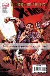

Comics Time: Clive Barker’s Seduth
September 21, 2009
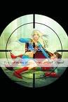
![]() Clive Barker’s Seduth
Clive Barker’s Seduth
Clive Barker, Chris Monfette, writers
Gabriel Rodriguez, artist
Ray Zone, “3-D conversion”
IDW, October 2009
32 pages
$5.99
“Surprise”: I love Clive Barker. Actual surprise: I was not looking forward to reading this Clive Barker comic. Despite its being touted as Barker’s first straight-to-comics work in two decades, the presence of a co-writer dampened my enthusiasm. So too did the 3-D aspect–we’ve all been burned by gimmickry. As for IDW’s involvement, I’d been mightily impressed by Kris Oprisko and Gabriel Hernandez’s lovely, lyrical Thief of Always adaptation, but Seduth artist Gabriel Rodriguez’s cartoony art on the company’s Great and Secret Show–admirable though it may have been for committing a full 12 issues to the effort–struck me as project-deflatingly wrong for the work. In my head, I see Barker as his own adapter, whether as filmmaker or painter or drawer; after that, I cut to the Gothy Hellraiser/Tapping the Vein aesthetic of the Epic Comics days, or to an altcomix style like C.F.’s that has never actually been applied to his stuff. Dude’s transgressive; let’s keep him that way.
Rarely have I been as happy to be wrong as I was about Seduth. Story first: Holy smokes, is this dark. It’s as savagely nihilistic as anything Barker’s done since the Books of Blood, or the story of Hellbound: Hellraiser II, which in its potentially apocalyptic nature and certain specific geometrical and extradimensional imagery is perhaps its closest point of comparsion. Heck, Seduth‘s done-in-one short-story nature makes it feel like an adaptation of a lost BoB outtake. But whereas most adaptations belabor the point, ladling unnecessary prose atop redundant illustrations for an oomph-sapping length of time, then suddenly eliding entire sections, this thing just leaps out of the gate and proceeds at an inexorable pace to its hopeless conclusion. If anything, it’s almost too rapid-fire, rather than the usual tedious legato-staccato juxtaposition you’ll find in comics versions of prose writers’ works. And whatever the division of labor between Barker and Monfette, the transitions are seamless, even to this seasoned observer of Barker’s work. After well over a decade of fantasy from the man, not even of the “dark” variety in many cases, I’d all but forgotten he had this kind of thing in him.
Meanwhile, whatever his deviation from my platonic Barker-adpatation ideal, Rodriguez steps up big-time. Yes, his work is cartoony rather than romantic or abstracted, the directions I’d go in, but its cartooniness is rock solid and reminiscent of some of the form’s most skillful current practitioners–some Tony Moore here, some Philip Bond here. Most of all it relies on a thick, confident line, which turns out to be perfectly suited to 3-D. From what I’ve been told, 3-D effects specialist Zone was involved in the project nearly from its conception, consulting with Barker, Monfette, Rodriguez, and project major domo Robb Humphreys on what kind of effects he’d like to employ in a perfect world. Barker appears to have given him carte blanche, because there’s nary a jump-scare “look out, a hand’s reaching out at you and a knife’s flying at your face!” cliche in sight. Instead, it’s all about layering, playing off the congruences and tangents of Rodriguez’s line to draw the eye in and around the page; the effect is dazzlingly unpleasant in all the right ways. Perhaps it’s just all the Chippendale and Rickheit I’ve been reading talking, but it struck me as an extremely effective and, yes, alternative way of exploring space on the page, to the point where I’m now curious to see what a Fort Thunder alum might do with this particular toolkit. But it can be used for spectacle as well, and it is, particularly in one back-to-back splash-page sequence in which Rodriguez, Zone, and colorist Jay Fotos produce an effect reminiscent of Dr. Manhattan’s line about the light taking him to pieces in Watchmen. Barker, who’s been vocally mainlining the work of Grant Morrison, was surely inspired by Morrison’s Final Crisis tie-in Superman Beyond both in the use of 3-D in the first place and its narrative role as a sign of extradimensionality, but I think the special effect is more nuanced, more effective, here.
So three cheers for Seduth; it made a believer out of this skeptic. Barker has long been thwarted by obstacles in terms of getting his ideas out to the public, from a studio sitting on his movie to a publisher rejecting his photography collection as too explicit to his own overflow of ideas getting the better of him to the point where he advances many projects but completes few. Comics famously has one of the lowest idea-to-finished-product thresholds in the arts; here’s hoping he continues to make such good, focused, no-nonsense use of it as he does in this short, sharp shock.