
Posts Tagged ‘reviews’
Comics Time: Night Business #3
February 3, 2010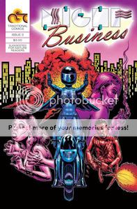
Night Business #3
Benjamin Marra, writer/artist
Traditional, January 2010
24 pages
$3
Buy it from Traditional Comics
About the Author:
Benjamin Marra is an artist who lives in the city. He is utterly and completely passionate about art. “Art … consumes me,” says Marra, “It is a part of my soul. When I look at a painting on the wall and I see a brush stroke, I can see the universe in it. I spend a lot of my time in galleries and museums looking around at the artworks. I like to see what’s going on in the art scene, you know, see what the new concepts are in art, see what my colleagues are up to.”
–from Night Business #3
The above text is pretty much what I love about Night Business in a nutshell. It’s simply a perfect encapsulation of a teenager and/or shut-in’s idea of what the City is. Artists who refer to themselves as such going to galleries and museums to stay on top of the activities of their cutting-edge colleagues. The glamorous, high-paying world of stripping and stripper management. Pimps who squirrel away a small army of thugs in warehouses filled with wooden crates and barrels of gasoline. Cops who thought they’d seen it all learning they haven’t, not by a long shot. One good man, pushed to the limit, taking a stand for what’s right and to hell with the consequences. Streetlight people, oh oh oh.
I don’t have the first two issues in front of me, but my impression is that this is the strongest yet on several levels. The insistent, grandiose stupidity of the writing reaches a delirious pitch here, my favorite example being the no-nonsense gun-toting would-be rapists who accost a pair of women on a thoroughfare broad and bright enough to be 14th Street: “Hey, ladies!! Are you looking for a party?!” “Hah, yeah! Are you looking for a party?! You’re invited to our party!” “We’ve got your official party invites right here! Don’t move.” “Scream and you die.” The pacing’s pretty sweet too, with the climactic fight between Johnny and the aforementioned warehouse full of thugs staged with one beat per panel, like the drum intro to “Big Bottom.” It ends with a glorious pin-up of Johnny flying through the air as he escapes an explosion, with knowingly wonky foreshortening, neatly symmetrical bursts of smoke and flame, and shiny inking showing off Marra’s studiously hidden chops despite himself. I’d kill to hang that page on my wall, let me just tell you. I’m all about seeking pleasure in comics these days, and this comic gets me off but good.
Comics Time: The Winter Men
February 1, 2010
The Winter Men
Brett Lewis, writer
John Paul Leon, artist
DC/WildStorm, 2009
176 pages
$19.99
Whoa ho ho, this is something special, huh?
I was only ever vaguely aware of The Winter Men during what struck me as a very long run for a six-issue miniseries, though I’m pretty sure I was confusing it with Peter Milligan and C.P. Smith’s The Programme for much of that time. I got the sense, just by seeing who was reviewing it, that it was a genuine critics’ darling, and I feel like I also heard that the production process was an unhappy one, with long delays or editorial troubles or something. I knew it was about Russian supersoldiers, drawn by JP Leon, so I mentally located it on a continuum with Sleeper and Gotham Central and Daredevil and other books that filtered superheroes through crime and espionage and drew them in a scratchy, black-heavy naturalist-noir style. That’s a subgenre people will associate with the ’00s like grunge and the ’90s, I think; I’ve still got a soft spot for its past examples even though I don’t know how much more of it I really need, so I figured hey, a limited series of it would be a pleasant way to spend a couple of train rides.
What I didn’t anticipate was Brett Lewis. Jiminy Christmas, this guy. I can’t remember the last time I read a genre comic this in love with language, this thorough and astute at developing and deploying its own. And here’s why it works: The Winter Men is about the bleed between the warriors and enforcers of the fallen Soviet Union and those of the New Russia’s criminal empires, a fluid and yet impenetrable world characterized by byzantine alliances, shades-of-gray legality, and the lack of any kind of centralized authority on either side of the law. The main spider we follow around this web is Kris Kalenov, an ex-spetznaz who was part of, essentially, the USSR’s Iron Man program, and who now works as a crooked cop for Moscow’s mayor, who runs the city like an independent state. He gets caught up in a kidnapping case with roots in an entire alphabet soup of international espionage agencies, military unites, and Russian mafiya outfits–the kidnapping’s the main throughline, finding out whodunit and all that, but it’s the journey, not the destination, that matters. Kalenov and his three comrades from the war–now a soldier, a gangster, and a bodyguard–get drawn through the web to and fro, and we follow him on such diverse enterprises as working undercover for the CIA infiltrating a Russian mob in Brooklyn, grabbing a criminal for a witness ID on behalf of some judge, conducting a hit, organizing a commando raid on a remote super-science outpost, drinking with his friends, fighting back against a new organized crime outfit as it muscles in on his gangster friend’s turf, taking down a couple of major crime kingpins, stealing a table from a McDonald’s, and on and on. In other words, The Winter Men is like The Wire: Moscow. Everything’s connected, but how is almost impossible to determine, and how to get it all to work for you instead of against you is even more remote. You work the angles you can and hope you did something right.
So, as a feat of storytelling, it’s impressive. But the language in which the story is told is directly analogous to the story itself–that’s the real knockout. Lewis develops a rhythm of speech that suggests a work of translation even when all the characters are talking to one another in fluent Russian. It’s not a pidgin English, it’s not a full-fledged Nadsat-style dialect. It’s just a question of where the narration and dialogue leans into you or away from you–unfamiliar slang or jargon whose meaning is nonetheless unmistakable, unexpected formality, disarming directness, repetition, a choice of which words to use, which to emphasize, which to elide. It’s a verbal map of the territory–shifting, shady, inscrutable, yet practical, impactful, something you can use to get what you want. A world with familiar elements, but arranged in a dizzyingly distant fashion, leaving you racing to keep up. In its way it’s as elegant as David Milch’s gutter Shakespeare or David Chase’s corner koans, and as inseparable from the world being depicted, the people populating it, and the message being delivered.
Weak spots? Sure. The super-stuff is superfluous–it brings nothing to the table you haven’t seen before, has no real narrative weight, and as best I can tell the only real purpose it served was “getting this book published through WildStorm.” I wished it wasn’t there, wished this was a straight-up crime book. The way it becomes so much more prominent in the final chapter after entire segments where it wasn’t a factor at all–including a pair of mini-masterpieces in which Kalenov and his gangster pal Nikki transport a suspect and fend off a challenge, the latter utilizing Dave Stewart’s where’s-waldo spot color for the book’s visual highlight–feels rushed and lopsided. I also wanted to see more out of Nina, the bodyguard, who never had much to do other than be beautiful and quietly pissed at Kalenov.
Mostly, though? I just wished it were longer. A nice long run of Winter Men trades could have been one of contemporary comics’ consummate pleasures. But this thing feels so meaty as is, so novelistic in its ins and outs and ups and downs, that I didn’t come away feeling robbed. Thrilled, more like.
Comics Time: Axe Cop
January 29, 2010
Axe Cop
Malachai Nicolle & Ethan Nicolle, writers
Ethan Nicolle, artist
Ongoing webcomic, December 2009-January 2010 and counting
This comic was inevitable. In retrospect, it’s where we were headed all along. The New Action. The Art of Enthusiasm. Attempts to recapture the childhood joy of drawing, the ability of action to form its own narrative logic through sheer visual cohesion, the incorporation of the almost surrealist conventions and tropes of video games and action-figure lines and kung fu films, all of that–Axe Cop does it by having a five-year-old kid come up with characters and storylines and dialogue for a 29-year-old Eisner nominee to lay out and draw. From Bryan Lee O’Malley’s Scott Pilgrim to Benjamin Marra’s Night Business to Geoff Johns’s Green Lantern to C.F.’s Powr Mastrs to Ed Brubaker & Matt Fraction’s Immortal Iron Fist to Brian Chippendale’s Ninja to Kazimir Strzepek’s The Mourning Star to Kevin Huizenga’s Ganges #2 to BJ and Frank Santoro’s Cold Heat to Malachai and Ethan Nicolle’s Axe Cop. There was no other way.
Now, let’s not get crazy here: the elder Nicolle is not inventing new ways of conveying action and physicality and space on a page, or constructing elaborate metaphors for the fate of the artist in a rapaciously capitalist society, or drawing on previously ignored methods of pop-culture storytelling. He’s “merely” an accomplished illustrator, drawing his kid brother’s delightfully crazy ideas for a super-cop with an axe and his partner, who wields a flute as a weapon, then transforms into a dinosaur, then transforms into an avocado. His swanky line is employed to milk humor out of mirrored sunglasses and mustaches, or superheroes made out of socks that fly around like boomerangs, or babies with unicorn horns who you can throw around like a grenade. Ethan uses his older fanboy’s experience to wring specificity and hilarity out of the super-action conventions with which young Malachai is already entertainingly familiar: opposite-number characters (Bad Santa and his newfound enemy Good Bad Santa), secret origins (Axe Cop and Avocado Soldier are secretly brothers whose parents were killed by their time-traveling nemesis, but they bumped heads while walking backwards and have had amnesia about their true relationship and origin ever since), enemy archetypes (rejected heroes, giant robots, elementals) and so on.
I’m not going to say the storytelling style is inimitable, because lots of people imitate it, but there’s no faking the “and then…and then…and then” rhythms of a really excited first grader. The comic’s web interface enhances the flow: Instead of clicking from page to static page, you drag your cursor to scroll around one gigantic mega-page per episode, catching the craziness as it comes. My guess is that this is as much of a reason that this comic went from total obscurity yesterday morning to Internet fame by yesterday afternoon as the don’t-that-beat-all backstory, impressive and accessible cartooning, and overall Looney Tunes “Duck Amok” zaniness level. On every level it’s a pleasure of a sort you haven’t experienced elsewhere. Hernandez, Buscema, Kubert, Nicolle–if you’re going to be online for the next few months, make room in your brother-act pantheon.
Comics Time: The Perry Bible Fellowship Almanack
January 27, 2010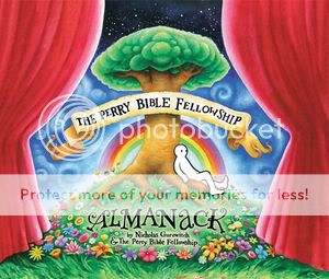
The Perry Bible Fellowship Almanack
Nicholas Gurewitch, writer/artist
Dark Horse, 2009
272 pages, hardcover
$24.95
Read these comics for free at PBFComics.com
Every single Perry Bible Fellowship comic strip ever, plus a bunch of extras that didn’t make the website cut, in a sizable yet reasonably sized hardcover with one of those built-in ribbon bookmark things, for $25 SRP? Pretty glorious. Nick Gurewitch’s webcomics sensation–and that’s exactly what it is/was, a strip that batters past the most well-secured don’t-care-about-webcomics defenses–was already the kind of work you’d stumble across thanks to a friend’s recommendation and almost instantly attempt to consume in its entirety in one sitting. Which isn’t even all that hard, given the one brief shining moment Fawlty Towers/British Office brevity of its run. Moreso than with many other webcomics, a fat book collection serves the material well.
Placing every strip between two covers allows you to easily follow along on several parallel tracks. You can watch the maturation of Gurewitch’s art, for one. His line smooths and strengthens. His designs round out and combine with his increasingly sophisticated and subtle color palette to produce that sickly sweet Stay Puft feel. He becomes increasingly comfortable showing off illustrative chops not usually seen in a campus weekly–his dinosaurs, monsters, and animals would all be at home in Golden Age pulp or an immaculate children’s storybook, while his impersonations of Edward Gorey and Shel Silverstein or his pastiches of Asian and commercial illustration styles are impeccable. His stable of recurring visual tropes–people with inanimate objects for heads, meticulously drawn fantasy- and animal-kingdom characters, those cookie-cutter people–have more of an impact each time.
You can also trace the evolution–maturation’s definitely not the word here–of his sense of humor. The strip starts out as the kind of bawdy, horny humor lots of collegiate wits unleash upon their newly parentless world. A recognition that sex is fun and attractive people are awesome joins hands with the realization that one’s pursuit of the aforementioned is often really stupid and the failure to make it happen is often miserably painful, and off they go, skipping and tra-la-la-ing across your funnybone.The strip also mines a lot of humor out of senseless violence from the get-go. But right around page 82-83, “Mrs. Hammer” and “Gotcha the Clown,” its riffs on that theme, and the whole gestalt of the strip, make a quantum leap. Suddenly the capriciousness of physical violence in the PBF world is joined with a gleefully anarchic sense of comic timing–that much-ballyhooed gap before the final panel, much wider than any other gag strip, leaving much more to the imagination, and making the payoff that much more unexpected and hilarious. Something awful will most likely happen by the end of any given strip; the trick and the genius of it is that you don’t have any more idea of what it’ll be than the poor saps to which it’ll happen.
It’s worth noting that it’s not just that leap of faith Gurewitch forces you to take between the penultimate and final panels that makes his strip such solid gold by the second half of its run. (To be fair, there are three or four head-scratching clunkers in the early going; it took him a while to make that punchline panel work.) It’s the way he sticks that landing, the moment-in-time specificity of the body language he so frequently depicts–freezing battling characters in mid-beatdown, capturing just the right looks of amazement on the faces of cheering crowds, doing the same with characters weeping in devastation or fleeing in terror. There’s also often a perfectly calibrated comedown from the pomposity and grandiosity of the beginning of the strip to the deflated rimshot or sad trombone of the final panel, and Gurewitch uses an array of tools to nail it: ornate, expressive lettering; shifts in illustration style; jumps in time or spatial perspective.
And then like that–poof–he was gone, off to do animation or funny award-acceptance speeches or whatever it is he’s up to. He left behind one of the most visually accomplished and mercilessly funny comics this side of Tales Designed to Thrizzle. If you like to laugh at comic books, this belongs on your bookshelf.
Comics Time: One Model Nation
January 25, 2010
One Model Nation
C. Albritton Taylor, Donovan Leitch, writers
Jim Rugg, Cary Porter, artists
Image, December 2009
144 pages
$17.99
Well, here’s a strange little number. Let’s take it step by step. C. Albritton Taylor is Courtney Taylor-Taylor, lead singer/songwriter for the Dandy Warhols, but the only reason I know that is because artist Jim Rugg said so on his blog months and months ago. Donovan Leitch, scion of “Atlantis” troubadour Donovan and a musician himself, is credited as the book’s “historian” and shares with Taylor the credit for “original concept,” which I assume means he helped concoct the Venn diagram of its plot, in which late-’70s radical West German politics and terrorists overlap with a breed of Cold War art rock, highlighting a very, very specific niche. Rugg’s work here looks nothing like Rugg’s work anywhere else I’ve seen; it’s like he purposefully threw his usual slick and kinetic art out the window, employing a rough, thin, uncertain pen style instead. Riding shotgun for a few-page framing device is artist Cary Porter, working in a mushy all-pencils style that reminds me of Nikolai Maslov’s Siberia. Taylor is billed as “producer” along with Image’s Joe Keatinge and cartoonist Mike Allred; if the incongruously colorful David Bowie who shows up in the middle of the story to chat with the titular band isn’t drawn by Allred himself, then Rugg is doing the world’s best Red Rocket 7 impersonation.
The story: In 1977 or thereabouts, a four-man band called One Model Nation–from what we can gather, a stylistic, sonic, and sartorial melange of Kraftwerk, Einsturzende Neubaten, Joy Division, Gang of Four, and Berlin-era Bowie–appear poised to become West Germany’s, and perhaps the world’s, next big thing. But the peril of being the voice of one’s generation is that sometimes one’s generation is filled with terrorists, as was the case in the Germany of the day, plagued as it was by the nihilistic/Communistic violence of the Red Army Faction, aka the Baader-Meinhof Gang. When people peripheral to OMN’s world–friends, fans, exes, roadies–turn out to be involved in the killings, the intense public, political, and police scrutiny forces the bandmates, particularly sensitive Sebastian, to come to terms with the at-times dueling imperatives of fame and creativity.
It’s tough not to read the book as thinly veiled autobio at times, or at least as a soapbox upon which Taylor can talk about issues he clearly cares about a great deal. It’s easy to imagine the framing conversation between a fellow-traveler of OMN’s and a documentarian investigating their disappearance as a variant of ones that took place between Taylor and Ondi Timonder, director of the excellent Dandy Warhols/Brian Jonestown Massacre doc DiG! Ditto the band’s chat with Bowie–a friend of Taylor’s–and his droll observations about taste, art, and politics. Ditto, almost didactically so, a comparatively long discussion of critics, pundits, the press, and their deficiencies. The very idea of the book, a fictionalized account of a particular era of rock and roll that its makers find fascinating, reminds me of a discussion I had with Taylor when I interviewed him long ago about the film Velvet Goldmine, which, despite his admiration for director Todd Haynes, he dismissed as “jocks dressing up like rockers.” This is sort of like Velvet Goldmine “done right.”
And it is done right, I’d say. I mean, it’s a weird weird beast. I think Rugg’s style here is going to throw a lot of people–it’s so understated, so scratchy, with muted colors, and a really rigid panel grid with wide gutters. The rectangular word balloons and computerized lettering meshes with those big white lines to create a feeling of artificiality and distance. The character designs are at times difficult to distinguish from one another, and they frequently sit on the page as if they’re uncomfortable being there, all awkward elbowy arms and long faces with dull hair hanging limply. The plot kind of weaves in and out and back and forth: Sebastian leaves the band, fed up with the attendant nonsense, comes back, high-tails it after a raid, comes back again… Cameos by the Red Army Faction and the actual, Russian Red Army are given equal weight as cameos by, say, Klaus Nomi. The whole thing ends with a whimper, too. There really aren’t any epiphanies or climaxes. I imagine that if you don’t share my fondness for the creative team or the subject matter, you’ll walk away shrugging.
But I think that’s the idea. Making art, the book seems to argue, is an ongoing process of decision-making rather than a vocation handed down by the gods. Obviously innate gifts and talent are a part of it, but hitting upon the sound and style that rockets you to the top is the product of countless factors beyond your control. A lot goes into being a hero, and if you make it, terrific, but some people are heroes just for one day, for one reason or another. Nomi died of AIDS; One Model Nation peters out in the face of the revelation that the terroristic public image thrust upon them was just that–an image. They make a decision to stop making the decisions necessary to be rock stars. Some of it’s in our control; a lot of it isn’t. What you do may be dramatic, it may be influenced by dramatic events, but whether you do it or not is not a drama. It’s kind of a gray message. It’s kind of a gray book. I’m still mulling it over.
Comics Time: Crossing the Empty Quarter and Other Stories
January 22, 2010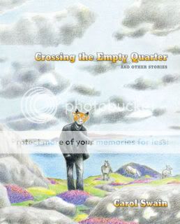
Crossing the Empty Quarter and Other Stories
Carol Swain, writer/artist
Dark Horse, December 2009
200 pages, hardcover
$24.95
Carol Swain’s panels are like prisons. They feel too narrow, too cramped for her dramatic angles, her furiously filled-in blacks and grays, her askew, sometimes even fish-eyed perspective, and her disorienting character close-ups. Thus they root you in this moment, then this one, then this one, force you to confront it head-on–often literally, bringing you right up against the face of the protagonist in each of this anthology’s thirty-plus short stories. Which is fitting, since they too are often rooted or even trapped themselves. Some are hemmed in by the metaphysical constructs of Swain’s daydreams or gentle magic-realist conceits–immovably knee-deep in the mud of the Atlantic, chained in the bedroom by overprotective parents who alternately rattle off the dangers of the outside world and the many knitting projects she could do inside, sealed in the black glass of fused sand created by a bomb blast in the desert, trapped in the middle of nowhere by faulty compasses and starless skies. Others are stuck in more quotidian predicaments–an immigrant’s plight, soft vote suppression, lots and lots of dead-end towns, lots and lots of dull grinding urban grayness, lots and lots of glimpses of a larger world that seem only to reinforce the futility of reaching further and higher. And yet, there’s always that lovely, lush shading and linework, a hint of softness, and with it a suggestion that maybe there’s reason to hope. I think that makes the book harder on you, ultimately. In hopelessness there’s release.
Comics Time: Detective Comics #854-860
January 20, 2010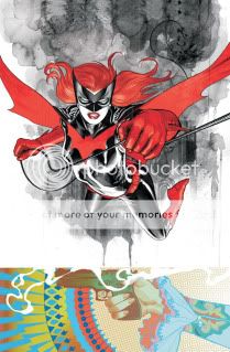
Detective Comics #854-860
Greg Rucka, writer
J.H. Williams III, artist
DC, 2009-2010
24 story pages each
$3.99 each
I’ll admit it, I was too hard on Detective Comics. I always understood, and agreed with, every word of praise offered for J.H. Williams III’s almost comically proficient art, mind you. You don’t need me to go over that, Jog handled it nicely. It’s just that beyond the art…well, I didn’t think there was anything beyond the art.
Maybe it’s that Question back-up that threw me, with the erstwhile Renee Montoya adopting the exact same crimefighting set-up as the lead feature’s star, i.e. beautiful lesbian with military and/or law-enforcement training adopts the mantle of a male superhero while her old-man sidekick sits at a computer back at HQ. And it’s not exactly as if either of them are the only strong-women-also-cry tough gals Rucka’s ever written. Meanwhile, some past Rucka plot points I never really got into come along for the ride, most prominently the convoluted Religion of Crime and its Batwoman-obsessed prophecies. I liked that idea when it was tied directly into Darkseid–the more other stuff that it hooked up with, from Vandal Savage to some old Rucka characters to the actual Bible, the less compelling I found it.
On a more fundamental level I think I’m just a lot less interested in superhero comics as fed through the filter of writers who’ve read, watched, and written a lot of spy and crime fiction over the past decade. What was once a thrilling deviation–seriously, The Ultimates, Sleeper, Gotham Central and the Daredevil/Alias/Powers trifecta blew my mind once upon a time–is now the default. Over at Marvel you’re seeing, or you will be seeing, I think, that noir/black-ops framework give way to a bold new era defined by loosey-goosier writers like Matt Fraction and Jonathan Hickman; Ed Brubaker’s given a pass because that really is the perfect place for a postmillennial Captain America to be. At DC, that kind of stuff doesn’t interest the main moneymakers and ship-steerers, Geoff Johns and Grant Morrison, in the slightest. And though I’m far less militant (heh) about this point than other readers I know, there’s always the suspicion that shoehorning superheroes and their fantastical fiction into exciting but reality-based counterpart activities like law enforcement and espionage and organized crime is a way to strip them of the weirdness and wonder even the worst of them usually contain–to polish them up even while darkening them up, to smooth out the angles and make them action-franchise-friendly. So for all those reasons there’s a degree to which I’ve had my fill of books in which characters nonchalantly drop military argot in conversation and suchlike, and thus I’m a tough nut for Rucka’s writing in ‘Tec to crack.
But after taking the opportunity to read all seven issues of the “Batwoman in Detective Comics” run, I’ve realized just how far short I was selling it. Is the story a game-changer, a brain-melter? No. But it’s a good deal wilder and weirder and, yes, more wondrous than your average spandex-turned-kevlar effort. And shame on me for not seeing how Williams’s art, far from an Avatar-style silk hat on a pig, draws on and enhances Rucka’s strongest stuff while muting the weaker elements. Simply put, how did I miss how very Hot Topic the whole “pale redheaded lesbian dresses up like an S&M vampire and does battle with her pale loligoth Satan-worshipping evil twin sister who dresses like Alice in Wonderland” thing is? It’s a very glam, very goth, very fetishy, very fun set-up, hammered home with Williams’s dark psychedelia, polymorphous mimickry (that extended Mazzucchelli impersonation is really breathtaking) and (you don’t hear much about this, but for real) dazzling good-girl art.
What’s more, this is actually some of my favorite Rucka writing I’ve come across. You know how most superheroes have a two-stage origin? Batman’s parents are killed, and the bat flies through his window; Spider-Man gets bitten by the spider, and his Uncle gets killed; Superman’s home planet blows up, and he’s raised in all-American fashion by his kindly adoptive parents? Batwoman’s mother and sister are killed, and then she gets Don’t Ask Don’t Tell’d out of the military. She’s not just gay–homophobia is a foundational trauma for her. I love it. I also really like the air of doomed glamour, to use a favorite phrase of mine of late, with which Rucka imbues the whole affair. Batwoman’s bright-red trimmings seem like war paint she puts on to power past the sense that this was all a terrible, terrible idea. Rucka knows the power of pointed silences and fade-outs, all of which are painstakingly choreographed by Williams, using disembodied panel boxes to pinpoint moments in the comics equivalent of slow motion. When we suddenly see Alice’s tear-streaked mascara emphasized during her fight with Batwoman’s father, when Alice falls across the top and down the right hand side of a climactic spread with a great gulf of ocean mutely occupying the rest of the pages–it means something. I can already hear the Moore-derived derision that none of this has any echo in any one’s real life, but even if that’s true, who cares? It’s violent, it’s sexy, it’s spectacular–just what I want from my superhero comics.
Comics Time: Forming
January 18, 2010
Forming
Jesse Moynihan, writer/artist
ongoing webcomic, January 2009-January 2010 (and counting)
I was pretty happy with the high concept I came up with for Afrodisiac, so let’s try it again: What if the stars of Anders Nilsen’s Big Questions were the Big Answers? Like Nilsen’s funny-animal epic, Forming tells the tale of characters struggling with the stuff of existence–life, death, fate, their place in a universe that appears fundamentally capricious. Unlike Nilsen’s birds, though, Moynihan’s characters are archangels, cosmically powered alien beings, demigods and titans of legend, founding members of humanity who commune (and copulate) with higher beings on a daily basis. The metaphor scales our human plight up, not down, in other words. The art follows suit. Moynihan’s line is soft, its weight gently fluctuating, shored up by quietly irregular coloring, suggesting the same vulnerabilities as Nilsen’s stippling and figurework. But the design is maximalist: Crazy Kirbyesque costumes, Fletcher Hanks psychedelic action, long sequences of physical combat, extradimensional travel, mental fantasias. The stakes are similarly higher–the central action includes Lucifer’s battle with Michael and the birth of human civilization as conferred upon us by ancient astronauts. The gag, of course, is that these highfalutin’ types are just as messed up as we are, complaining about their jobs and their family and their sex lives and so on.
So yeah, you’ve seen it before. But what makes its use in Forming so appealing is the strip’s rolling, loping, laconic pace. New subplots–a literal clash of the titans, Lucifer & Michael, Adam & Eve, corporate intrigue on the alien homeworld–are slowly folded into the strip, and our lens on the action swings back and forth between them like a pendulum. Moreover, most of the strip’s two-page installments are stacked on top of each other, our eyes slowly cascading downward as the action unfolds over a long vertical plane. The cumulative effect does even more than the specifics of the dialogue in terms of humanizing the cosmic characters and wringing bleak gallows humor from their dilemmas. If this thing ever gets collected in print, I’d love to see it in a super-tall, super-narrow format just for that reason. It’s a very pleasurable reading experience, and it’s easy to see how rewarding a weekly visit could be.
Comics Time: What Had Happened Was…
January 15, 2010
What Had Happened Was…
Domitille Collardey, writer/artist
Weeping Willow, 2009
20 pages
$6
Buy it from Domatille Collardey
You could rough this one up pretty bad if you wanted–like Jog says, it’s an alternative comic of the “here’s some stuff that happened” school that people who dislike alternative comics think all alternative comics attend. Collardey’s stories–actually, that’s too strong a word–reminiscences about her move to Brooklyn, her visit to San Francisco, her interview with Francoise Mouly, her conversation with her Holocaust-survivor grandfather, even her very life story aren’t revelatory, or (with one obvious aforementioned exception) even memorable on their own terms. What they are is a showcase for her art, and she’s got some serious chops. I’m really drawn to her wavy line, the way a series of gentle S-curves both cohere into little people and convey the timidity and uncertainty with which Collardey apparently approaches the world. Against that backdrop her depiction of Mouly really pops: Bigger eyes rimmed with make-up, darker hair, taller body, confidence and competence standing out amid Collardey’s gee-shucks artistic personality. Equally impressive are color sequences that employ brown and gray watercolors to convey warmth rather than desolation or “realism,” most notably in a self-portait that strikes me as both clear-eyed and flattering–which is then surrounded by a colorful panoply of cartoon heads. The paper stock really holds Collardey’s brushwork and colors well, by the way. As a sampler of an artist with a lot of potential, it’s worth a glimpse. Let’s see where she goes from here.
Comics Time: Afrodisiac
January 13, 2010
Afrodisiac
Jim Rugg & Brian Maruca, writers
Jim Rugg, artist
AdHouse, January 2010
96 pages, hardcover
$14.95
What If Pim & Francie Got Bitten by a Radioactive Luke Cage? Afrodisiac, like Al Columbia’s fractured masterpiece, is a comic, an art book, an objet d’art, an assemblage of stories and story fragments and illustrations and pastiches and sketches and ephemera and so on. Yet I’m guess everyone interested in an Afrodisiac book would have been perfectly happy with an anthology of straightforward blaxploitation riffs, showcasing the heavy-lidded, angular action characters, juicy design choices (this thing is like sound-effect lettering porn), and deadpan over-the-topness we saw from the Rugg & Maruca team in Street Angel, maybe with a few ben-day-dot nods in the direction of faux vintage. So why go further? Well, for one thing, if you have the design talent that Rugg and Chris Pitzer do, why not.
But what these moves communicate is the slipperiness of what Afrodisiac really is. The titular hero receives a different origin with each story–he’s a cyborg, an inner-city Billy Batson, a ghetto Captain America or Thor or Spider-Man. He’s marched through a variety of comic-genre parodies–Archie, romance, funny-animal, Bronze Age Marvel magazines, Bronze Age Marvel comics. Sometimes his adventures are made to look like they could have sprung straight from the ’70s, but other times the coloring or the printing or the language (this ain’t Comic Code approved!) tip the project’s hand. And that’s to say nothing of Rugg’s art, which is sly and slick in a fashion that befits a guy who gets into the annual Society of Illustrators show every year rather than a member of the Gerry Conway-era bullpen. And have we ever lived in a world where a character like the Afrodisiac would get a toy line or a Saturday morning cartoon?
It could have simply coasted on the asskicking concept of a superhero pimp called the Afrodisiac, but every choice Rugg, Maruca, and Pitzer make here makes it harder to put your finger on what’s going on. Which, I think, is the point: Afrodisiac is an attempt by modern white nerds to capture and critique the art made by the white nerds of yesteryear’s attempts to capture the art made for that era’s black audiences in response to what that era’s white entertainment industry thought of that era’s black audiences, specifically what they wanted to see from the relationship between black criminals and white women. (Phew.) It is, in other words, about the nature of truth, about different marginal or marginalized subculture’s attempts to understand and interact with one another, how those attempts magnify and distort one another, and in the end produce art as fascinating and fractured and entertaining and incomplete as the cut-up “final issue” that ends the collection. Powerful stuff? You’re damn right.
Comics Time: Sleeper Car
January 11, 2010
Sleeper Car
Theo Ellsworth, writer/artist
Secret Acres, 2009
32 pages
$6
Theo Ellsworth’s Capacity, a monumental work of ferocious interiority combined with irresistible openness, was one of the decade’s best comic debuts. It was a knockout. Sleeper Car is more like a playful tweak of the nose or pat on the buttcheek. Stepping away from the artistic-autobiography subgenre that made Capacity so singular, Ellsworth uses this 32-page pamphlet as an opportunity to deploy the same tools he used there–the endlessly inventive character designs, the googly eyes and rubber lips, the enveloping crosshatched backgrounds, the seemingly infinite fur and feathers and scales and joints and so on–in the service of what I think could best be called flights of fancy. The stories and strips here are funny, though they’re not out and out gag comics; they’re fantastical, though they’re too loose and unconcerned with narrative worldbuilding to qualify as fantasy. What’s interesting to me is seeing the different approaches he takes with each one.
For example, the longest, central story, about two verbosely formal robots who make a bet about the existence of gnomes, uses a staid six-panel grid to heighten its deadpan humor. But the source of that humor shifts throughout–first it revolves around the wordplay of the droids’ creaky way of speaking, then gets goofy showing the second robot passing the time as the first embarks on his search for proof, then there’s a series of very funny “photos” of the victorious robot’s shenanigans with the loser’s forfeited arm, and then there’s a punchline splash page (!) that injects a whole new comical menace into the proceedings. Throughout, it’s all about knowing just what image will nail the required effect. You see this in many of the strips here: A traveler’s wanderlust depicted by showing him distraught and on skis at the top of his staircase, say, or a sleeping behemoth scratching his head in wonderment as an explorer rockets out of his gullet, or a kid’s eyes peering from the distended neckhole of his pajama shirt as he wraps up his knees, feet, and arms in it to form a “pajama tent,” or a drawing of empty bus stop letting us down easy after a strip in which a traveler’s face transformed wildly from panel to panel. None of it’s gonna bowl you over, but none of it’s meant to. It’s expert, effective cartooning–little sketches of where a cartoonist with this visual vocabulary and this set of ideas can go. I’ll follow him there, that’s for sure.
Comics Time: Monsters
January 8, 2010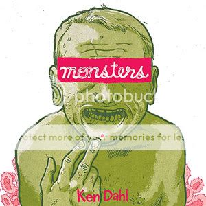
Monsters
Ken Dahl, writer/artist
Secret Acres, 2009
208 pages
$18
Gross-out sex-life autobiography has a storied history in alternative comics, but it’s sort of a St. Olaf story. (Crumb is repeated first as tragedy, than as farce.) Folks with sufficient cartooning chops are afforded ample opportunity to Tex Avery themselves out, which I do appreciate. And of course there’s the thrill we get from coming across someone with no internal censor–to paraphrase Hesh Rabkin, between their brain and their pen, they have no interlocutor. But it’s very, very, very well-trod territory, and you can count me among the people who came across Joe Matt’s Spent and thought “Well, that’s enough of that.”
So it took some persuading for me to give Ken Dahl’s Monsters the story of his life with herpes, a shot. Another comic about some creepy artist type’s loathsome behavior around and toward women? Drawn with confrontationally ugly underground-style depictions of everyone involved and hyperactive exclamation-point-ridden lettering? Coupled with enough grand-guignol lesion close-ups to trigger my skin-growth phobia like wo?
Wrong wrong wrong! I enjoyed the heck out of this book. For starters, I was giving Dahl’s art short shrift. Jeepers this guy is accomplished. I don’t point this out nearly often enough, but as a non-artist, I really get a thrill out of good cartooning because it’s so beyond my ken. To develop a visual vocabulary and deploy it consistently page after page…I mean, man. Anyway, on the most basic level, Dahl’s bobble-headed, adenoidal characters are crafted with an assured, flowing line that trails off into feathering wisps for a hint of vulnerability beneath the slickness. Moreover, they are an instant visual signature, serving both to deflate the angst and self-absorption of his story and satirically skewer the various alt lifestyles of which he is a tangential part. (For what it’s worth, I think the mockery–of everyone from Christians to vegans–is one of the less considered parts of the book, but still, no one comes out of this looking like an angel.) But more importantly for the book, they’re a template from which he can deviate for extravagant, almost Tom Neely-esque sequences, in which Dahl’s emotions and/or his infection literally explode from within and take over in monstrous fashion.
But for me, the most interesting thing about Monsters is Dahl himself. Turns out he’s not a creep at all! He has no idea how he got herpes, had no idea he had it when he gave it to his girlfriend, and commits a grand total of one genuinely douchebaggish actions in the entire course of the book. Instead, he obsesses on his condition to a psychologically debilitating degree, sealing himself off from having a healthy social life or any kind of romantic relationship for years. In fact, while the “educational filmstrip” facts’n’figures sequence about herpes simplex is the book’s ostensible centerpiece, for me the real tour de force was the ending, which in a quick one-two punch upends what I’d thought was going on with both the story’s plot and its moral. Dahl turns out to be far more victim than victimizer, and the deft way in which he teases that reversal out of our expectations for a book of this sort is its best trick.
Comics Time: Giraffes in My Hair: A Rock ‘n’ Roll Life
January 6, 2010
Giraffes in My Hair: A Rock ‘n’ Roll Life
Bruce Paley, writer
Carol Swain, artist
Fantagraphics, 2009
136 pages, hardcover
$19.99
Pencil is not an easy medium to publish in for a cartoonist–just ask the superhero artists whose work looks like the proverbial cake left out in the rain when “digitally inked” or colored right off the original pencils. But Carol Swain makes it look easy, and I think it’s because she’s figured out a way to spot blacks with a pencil. Those sooty shadows and clouds and night skies and manes of wild hair suffuse her work in Giraffes in My Hair with a sort of negative-image glow, popping her foregrounded figures off the page with a barely-there white aura. Couple it with her ever-shifting angles and it’s a damned effective way to create a sense of space and depth, reminiscent of similarly adroit strategies by Jeffrey Brown and Ben Katchor. If Swain’s jarring close-ups make her panels less immersive than theirs, her porous gray shadings make up for it with atmosphere–an inviting softness, tinged with just enough smokiness to remind us that what’s going on here isn’t entirely pleasant. The overall effect works so well that I really had to stop myself and peer at her pages to figure out what made them tick. I was too busy being propelled along by the effortlessness of the art.
So Giraffes, a collection of anecdotes from Bruce Paley’s teens and twenties on America’s countercultural fringe, is a breezy read. But it’s one rooted in an almost unchanging nine-panel grid with sparse, nearly monotone narration. At times this allows the comics to tip over into bluntness, particularly with the ending to some of the stories: The tale of how Paley avoided Vietnam ends with a shot of the Wall; a story of New York City’s ’70s heroin scene ends with Death itself offering us a bag of smack. But in general, the art and the writing are a perfect fit. Swain’s art rarely calls attention to or gets in the way of itself, and in that it meshes seamlessly with Paley’s deadpan “here’s what happened” narrative style, his reluctance to overstate or oversell the import of the anecdote reminiscent of Harvey Pekar’s. (Of course, Pekar’s work rises and falls on the strength of his collaborators–Paley’s got Swain, so there’s not much falling to do here.)
Yet at the same time the presence of that subtitle indicates a unifying theme, which makes Paley’s storytelling choices all the more interesting. The first story shows an 18-year-old Paley ditching college and leaving home to hitchhike cross-country with his girlfriend, but the home life that led him to drop everything and drop out is relegated to a quick line of dialogue and about half a page upon his return from the journey. As hippies give way to punks we suddenly discover that Paley’s a habitual heroin user, but we never see his introduction to the drug. A story about an ill-fated attempt to import drugs from overseas sees Paley casually mention time spent in Tangiers, but up until that point his adventures had been strictly domestic. In some graphic memoirs these lacunae would be maddening; here’s they’re sort of the point.
Paley’s not claiming anything spectacular about the life he lived or the stories he plucked from it. The way he tells it and Swain draws it, living on the edge feels like an interchangeable commodity with Pekar’s life as a civil servant. An interesting conversation with the janitor may be replaced by doing speedballs with Johnny Thunders, but the game’s the same: get by, find a little happiness when you can, and cling to the stories that comprise your life, the recounting of which has a value all its own.
Comics Time: Big Questions #13: A House That Floats
January 4, 2010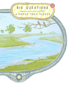
Big Questions #13: A House That Floats
Anders Nilsen, writer/artist
Drawn & Quarterly, 2009
44 pages
$9.95
My sincere hope is that a couple years from now the collected Big Questions will lodge itself at the top of future Best of the Decade lists on the strength of material largely published the previous decade, like Jimmy Corrigan and Black Hole before it. Certainly Nilsen is a capital-M Major Talent, a real world-beater for his generation, but the book by which he will be defined has not yet been released. The two Monologues for… books from Fantagraphics delight me with their weird existentialist stick-figure stand-up comedy, but talk about an aquired taste. Dogs and Water might pick up steam in the post-The Road world, but it’s always gonna read grim, and its strange release pattern–first as the fattest stapled pamphlet you ever saw, then a slightly revamped version in hardcover–threw folks for a loop. Don’t Go Where I Can’t Follow devastates virtually anyone who reads it, but its hodgepodge hybrid format, arising from its tragic origin as a travelogue-turned-eulogy, makes it a tough item to classify. The End could end up topping my personal Best of the Decade list, but it’s a one-shot Ignatz-format pamphlet. I could see his mythological comics for Kramers Ergot clicking but there’s just not enough of them.
But soon, along will come a thick hardcover of this monumental series, tracing its evolution from xeroxed minicomics sold at a table alongside Jeffrey Brown, John Hankiewicz, and Paul Hornschemeier comics, through its adoption by D&Q, into its status as one of the only regularly released alternative serials in North America. It’s as fragile and frightening as any of Nilsen’s many, many comics about the baffling horror of senseless death, but it’s also a funny-animal book stuffed with subplots and side-stories and borderline gag strips about wisecracking birds. It works as a showcase of pure cartooning as well as even Nilsen’s most abstract, “pure comics” stuff from MOME or The End, but in the service of a sad and searing realism whose beauty is apparent to any reader even remotely open to altcomics work–certainly I’d stack this issue’s cockpit sequence against anything else this year for sheer stunning loveliness. It functions as allegory, but then turns around and acknowledges its own allegorical nature, and ads enough detail and twists to hold up as a real-deal semi-adventure. It manages to capture and cry for the world’s cruelty, yet hold alive the hope offered by cooperation and community and small kindnesses, even those arising from bare enlightened self-interest, as well as anything this side of Deadwood. I laughed, I cried, in the space of this issue alone. Big Questions is a great comic.
Comics Time: Pluto: Urasawa x Tezuka Vols. 1-3
January 1, 2010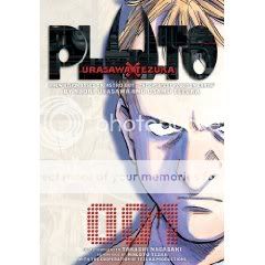
Pluto: Urasawa x Tezuka Vols. 1-3
Naoki Urasawa, writer/artist
Takashi Nagasaki, writer
Based on Astro Boy: The Greatest Robot on Earth by Osamu Tezuka
Viz, 2009
200 pages each
$12.99 each
I take back everything I said about Naoki Urasawa. Well, okay, no I don’t, but everything I said about Naoki Urasawa definitely does not apply here. Finally, one of his series contains visual elements that exist for more than simply conveying the information of the story as clearly and dramatically as possible. And I didn’t think that was in the offing, by the way, since in the first few pages you get a “guy with a gun turns a corner, does a half-turn and whips the gun at the camera” sequence that struck me as an unimaginative, un-comicsy rip from the cinema. But a few pages later our straight-laced, sad robot detective Gesicht informs a robot-maid wife that her robot-cop husband has been killed in the line of duty, and Urasawa gives us a series of close-ups of the grief-stricken robot’s machine face, which, of course, never changes. And blam, I was hooked.
In Pluto, a contemporary-superhero-comics-style “reimagining” of a classic < i>Astro Boy story by Osamu Tezuka, Urasawa uses the presence of robots as embodiments of surrealism. From the bereaved wife’s static expression, to the towering North No. 2 in his judge’s robe, to sinister Brau 1589’s mangled scrap heap of a body, to a revamp of Astro Boy (aka Atom) that makes him less like a jaunty short-pantsed slugger and more like an eerie kid out of The Shining, they’re the flourish of Weird, the touches of visual poetry, that I always wanted from my limited experience with Urasawa’s work. That his line and design sensibility is otherwise such a just-the-facts affair only heightens their “thing that should not be” effect.
And they seem to have unleashed more where that came from. The series of murders that are the series’ central mystery are themselves like staged art installations, sort of like the theory that holds the Black Dahlia’s murder as a macabre Surrealist masterpiece. Elsewhere, jagged black lines emerge from transmission static as a literal representation of despair; a huge black thing slouches half-unseen through the smoke and sand of a war-ravaged Persian town, the sight of it driving a young boy mad; traumatic memories of war are represented by indistinct flurries of the violent clash of robotic limbs, or a decontextualized and repeated offer of money for bodies; a sentient teddy bear sits immobile, a puppet master at the mercy of whoever moves it around; a tiny figure is captured leaping from rooftop to rooftop in the final images recorded by a dying robot, its blurry body silhouetted against the sky.
You add all this to Urasawa’s usual page-turning panache, and suddenly what had felt like mere proficiency gains the power to haunt and to move. There are the usual resonances with and/or swipes from other genre-art touchstones: Brau 1589 is Hannibal Lecter with microprocessors, there’s an Iraq War riff as is custom with science fiction that wants to be taken seriously this decade, and the plot–super detective believes that other super beings of his acquaintance are being hunted by a serial killer so he travels around to warn them with varying degrees of success–is straight-up Watchmen Chapter One. Plus, the whole thing is an adaptation of a story about Japan’s Mickey Mouse/Superman cultural juggernaut. (“Flying boy robot in shorts” is the extent of my knowledge of Astro Boy, so what Urasawa is taking from Tezuka narratively or visually is beyond me.) But instead of coming across like button-pushing, all of this, and all the chases and clue-hunting and races against time and unsuspected reversals that are Urasawa’s thriller trademarks, now feels like ammo in the arsenal of someone taking aim at some big old-fashioned sci-fi questions about war, technology, human rights, friendship, childhood, and that old chestnut, what it means to be human. The thing that fills me with delight here is that when you look at that robot maid just standing and staring, unable to express her emotion, you get the sense that for once, this master penciller and plotter doesn’t have all the answers.
Comics Time: You’ll Never Know Book One: A Good and Decent Man
December 30, 2009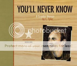
You’ll Never Know Book One: A Good and Decent Man
C. Tyler, writer/artist
Fantagraphics, 2009
104 pages, hardcover
$29.95
You’ll Never Know is a memoir about creating a memoir. In it, the affable but scatterbrained Carol Tyler, buffeted by her separation from her cheating, indecisive husband and by her own memories, finds solace in attempting to construct for her father a scrapbook chronicling his military service during World War II. As becomes clear during a climactic dream sequence in which Hitler proclaims that the trauma inflicted on her father during the War warms his heart from beyond the grave, doing this is much more to Tyler than an attempt to set the historical record straight or satisfy her own curiosity (though it is both of those things as well). It’s the product of a realization that something vital was taken from her father, whom she sees as hard-working, lovably ornery, and an incorrigible cut-up, yet also distant and damaged in a way that suggests a missing puzzle piece she might be able to reconstruct.
Therein lies the problem. So personal is the project to Tyler that in some basic ways it fails to translate to the reader. Her dad, Chuck, is a gruff dude to be sure, but funny and lively. He’s apparently a brilliant handyman, a helluva dancer, he swept the hottest girl in the base’s secretarial pool off her feat, he tears it up at the Pop Hop to which he escorts Carol as a teen, he’s undyingly romantic toward her mother, and most importantly he eventually unloads his previously unspoken military memories for her not once but several times–and yet Tyler insists upon the notion that the horror of his experiences in Italy broke him. It’s just not present in the text. In recounting the plot just now I realized how very similar it is to Art Spiegelman’s experience with his own father in Maus, which is a solid point of comparison–compared to the nightmarish psychological scarring the Holocaust inflicted upon Spiegelman’s parents, and how painfully Spiegelman evokes it, what Tyler’s up to in her depiction of her father remains obtuse.
Tyler’s confidence in the face of this lacuna is reflected in her buoyant but ramshackle art. Her comics’ landscape layout and dashed-off line and lettering (complete with blue-pencil guidelines) evoke a mid-tier slice-of-life webcomic; they’re pleasant and likeable, but they make this very serious and personal project feel slightly airy and inconsequential. They’re not helped in this regard by their presentation as a supplement to the actual scrapbook she’s putting together for her father, nor by her presentation of herself in an always slightly humorous fashion even when literally prostrated by her husband’s infidelity and departure. Transitions and juxtapositions, too, feel under-considered, from the cuts to and from her own life story to this volume’s abrupt cut-off point. I’m not saying her familial war story needs to be the unrelenting legacy of horror that was Maus–their experience was and is different and so should be Tyler’s book about it. But the effect of her writing and drawing serves to cut the tale’s gravitas off at the knees. I know it’s a story she needed to tell; I’m not convinced it’s a story that needed to be told, or perhaps more to the point, that I needed to hear.
Comics Time: The Photographer
December 28, 2009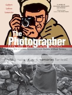
The Photographer
Didier Lefevre, story/photographs
Emmanuel Guibert, writer/artist
Frederic Lemercier, colors/layouts
First Second, 2009
288 pages
$29.95
The high point of The Photographer is literally the geographical high point of The Photographer. After chronicling a Doctors Without Borders mission into the war-torn country–then occupied by the Soviet Union–lensman Didier Lefevre makes the ill-advised decision to leave his more experienced Western colleagues and return through the mountains to Pakistan alone. Abandoned by guides who barely knew the way themselves, Lefevre finds himself stranded at the summit of a mountain pass. In the gloom he desperately tries to make it through by nightfall, and is reduced to beating his exhausted, dying horse until he realizes neither of them can go any further. He bivouacs beneath his horse’s body, melting snow in his mouth in an attempt to stay hydrated, cursing his recklessness and the fecklessness of his escorts. Realizing that he will most likely never make it down the other side of the mountain, he writes a note to his girlfriend and then takes the most beautiful, dramatic, and chilling photographs of his journey, capturing his emaciated horse and the nightmarish wasteland that surrounds them, believing in his heart that they are the last things he will see. In the several pages that chronicle this most dire stretch of Lefevre’s memoir, artist Emmanuel Guibert manages to capture the photographer’s initial panic at being left alone in an unfamiliar place, contrasting his nervous movements and increasingly desperate drive to move on against the cold and motionless stones of the land and small dwelling where he was abandoned. And as Lefevre and his horse reach what he believes to be their final resting place, they are depicted solely in silhouette, black against the icy twilight blues provided by colorist Frederic Lemercier. The effect is a perfect evocation of Lefevre’s Sisyphean plight–frantic effort colliding with unyielding futility and ultimately despair. Gorgeous, frightening, powerful comics.
Alas, it’s one of the only sequences in the whole of The Photographer‘s 288 pages to which any of those four words apply. The story of Lefevre’s trip into and out of Afghanistan is plodding journey through a featureless wash of minutiae about his companions, their hosts, their jobs, and the land. Obviously, the choice to leech the proceedings of nearly any drama–save for Lefevre’s near-death at the mountaintop and a trio of gut-punch accounts of war-wounded children, nothing cuts through the haze of tedious detail–was a conscious one, meant to evoke the reality of life in a desperately poor and brutalized country, and how no grand Orientalist gestures are possible, only the quotidian work of traveling there, setting up shop, and treating those who can be treated. However, a flawless evocation of boredom is still boring.
Meanwhile, memoirists of conflict like Joe Sacco and Art Spiegelman have shown that dull horror can make for compelling comics. But Guibert’s work here is tough to classify as comics at all. Yes, there are panels, word balloons, caption boxes, but his visual contribution is essentially an unending series of stiff minimalist portraits that look like they were produced with a photoshop filter, or one of those dreadful animation projects that take live action footage and boil them down to a “cartooned” style. They demonstrate the story rather than tell it. Even on top of Guibert and layout artist Frederic’s lack of attention to image-to-image flow or to the composition of a page, big blocks of narrative text and the interspersal of Lefevre’s actual photographs all but prevent the effects of accumulative or juxtaposed meaning that are so crucial to the book’s nominal medium of comics. Backgrounds are frequently dropped altogether, replaced with a baffling, uncommunicative palette of pea green and acidic yellow; one rare sequence where backgrounds were present stands out for its wrongheadedness, with rocky terrain all but obliterating the conversation in which Lefevre argues the head of his expedition into letting him return by himself. That Guibert had it in him to produce that knockout climax makes the lack of energy and life in the rest of the book all the more depressing. Nobly intentioned though it may be, bad comics is bad comics.
Comics Time: Naoki Urasawa’s 20th Century Boys Vols. 4 & 5
December 25, 2009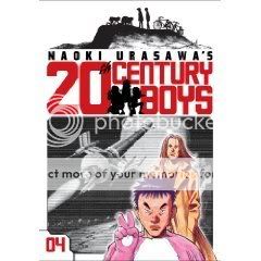
Naoki Urasawa’s 20th Century Boys Vols. 4 & 5
Naoki Urasawa, writer/artist
Viz, 2009
200 pages, Vol. 4
216 pages, Vol. 5
$12.99 each
There are two major developments in these installments of Urasawa’s cult-conspiracy thriller. The first is the introduction as a secondary protagonist of Wolverine. The gruff longhaired badass who plays by his own rules but has a heart of gold and so on–named Shogun, in case you didn’t pick up on his awesomeness–was technically introduced in Vol. 3, but here we find out who he really is, get an origin story involving a wise old sensei, and connect him to the main thread of action. The second major development, which is interesting because it upends the first, is a big honking shift of the whole territory of the story that came waaaaaay quicker than expected. I won’t spoil it beyond the spoilage that is announcing its existence, but it’s what longtime watchers of Lost might call a “game-changer.” And if you opt to look at Shogun as the Sawyer figure instead of the Wolverine figure, that may be even more helpful in terms of establishing just how expertly Urasawa plays with genre tropes, insofar as these same tropes would later be key to the greatest work of American pop/pulp fiction this decade. 20th Century Boys has a lot in common with Lost, a neutral observation that doubles as an endorsement.
PS for readers of the series: The first lyrics in T. Rex’s “20th Century Boys” are “Friends say it’s fine, friends say it’s good.” Ha!
Comics Time: Naoki Urasawa’s 20th Century Boys Vols. 1-3
December 23, 2009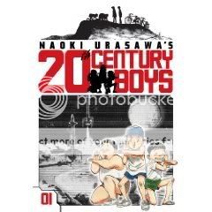
Naoki Urasawa’s 20th Century Boys Vols. 1-3
Naoki Urasawa, writer/artist
Viz, 2009
216 pages, Vols. 1&2
200 pages, Vol. 3
$12.99 each
I don’t like to read manga series until I have the whole thing. It’s not like superhero serials that are ongoing in perpetuity, or TV shows where the same thing is theoretically the case–these stories are serialized but they’re of a finite length, and I find that if I try to read a little here, a little there, I end up forgetting half of what’s going on by the time I catch up with later volumes. This isn’t really the fault of the material, mind you, it’s just because I’m not terribly bright.
Anyway, sometimes needs must, and so I found myself reading the three volumes of 20th Century Boys I have in my possession at the moment. (Without having Vols. 4-6, or god help me, without having finished Monster, since I’m missing about six volumes in the middle of the run and totally can’t remember what happened in the three or four volumes I already read. Like I said, not the sharpest knife in the drawer.) And this probably comes as a surprise to no one, but they’re a lot of fun. The story’s like a cross between Stephen King’s It and the Aum Shinrikyo Tokyo subway attack, with thirtysomething go-nowhere convenience-store franchisee Kenji discovering that the heroes-and-villains game he helped concoct as a kid is being used as a how-to manual for murdering people by a shadowy cult, most likely led by one of his childhood friends. The drill so far is one of watching bodies pile up and the revelations slowly accumulate, often in sublimely unexpected ways. There’s at least one supporting character who gets offed way before I’d have seen it coming, a lot of the secrets are way more out in the open than I’d have expected them to be at this stage in the game (a lot of “so, now you know that I know what you know”), there’s a wooly subplot involving a psychic bum, there’s a very cool t-shirt-ready symbol for the death cult…a thrill a minute, baby, and dammit, I wish I had the other three volumes.
That said, I think what prevents the Urasawa I’ve read from springboarding off its obvious proficiency with genre into the realm of genuinely great art is that his actual art, his drawings, are strictly functional. Actually, that’s not quite the word for it. “Strictly functional” implies “merely adequate,” and it’s more than that. The visual storytelling is crystal-clear, which is a huge help for a mystery translated from a foreign language with its own cultural cues. The character designs are easy to keep track of even as childhood friends are reintroduced at a dizzying pace. The line is as slick as manga gets, retaining energy during quieter scenes like a coiled spring that boings back up during confrontations and action sequences. But it only has style in the sense that, say, your basic Hollywood thriller has: The goal of the art is to stay out of the way of the story. I’m reminded of Pia Guerra’s work on Y: The Last Man–Urasawa would never draw anything that stiff, of course, but that kind of nondescript conveyor-of-information-type art is the sort of thing that works really well for a comic with this kind of broad civilian appeal. Are you here for an art class, or are you here to find out if Kenji can save the world?
Comics Time: You Are There
December 21, 2009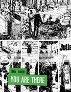
You Are There
Jean-Claude Forest, writer
Jacques Tardi, artist
Fantagraphics, 2009
196 pages, hardcover
$26.99
Wow, what a turnaround I made on this book in the space of a few pages. One of the perils of being so hung up about spoilers that you go into a book without even knowing what it’s about is that oftentimes it turns out you’ve got an idea in your head of what it’s about anyway, and that idea can be wrong. My only experience with Tardi was his adaptation of Jean-Patrick Manchette’s daylight-noir West Coast Blues, so when I saw a guy in a bowler hat standing there in a graveyard on the cover I figured “okay, a period-piece crime novel, like The Black Diamond Detective Agency or something.” Instead, right from the first page, you just get smacked with this torrent of verbiage from this daffy annoying tall skinny guy as he runs around atop the walls of some crazy little village opening gates for people. What the fuck is this?
It’s an absurdist satire, is what it is, and a pretty terrific one. And good God is it French. Once I realized what was up, my dim memories of Jarry and Ionesco and Beckett flickered one by one back to life. Delusions of grandeur, farcical authority figures, goofily symbolic names, talk talk talk that says nothing, all atop a fundamentally ridiculous premise.
Arthur There, the heir of a long-defunct line of aristocrats, has lost his ancestral estate but gained the legal right to erect walls between the properties of all the people who now live on it and control their comings and goings. Only by “control” I mean “run when they ring a bell for him to open the gate.” A Strangelovian element is injected when the president of France, on the verge of losing his bid for reelection, settles upon the unique legal status of There’s labyrinthine fiefdom as the perfect pretext for setting up a rival government-in-exile. He’d heard of the place thanks to Julie Maillard, the squint-eyed and slatternly daughter of the neurotic There’s chief rival–she once had a watersport-heavy affair with the President, though now her sights are set, for reasons obscure even to her, on There. And some other dudes too. It’s easy to picture it as one of those long-form fourth-season Monty Python episodes, with Eric Idle as There, Michael Palin as the President, and Carol Cleveland as Julie, if that helps.
So like I said, once I figured out what was up–once I realized that the dialogue was overwhelming and annoying on purpose, once I realized that the characters were deliberately ridiculous and their motivations purposefully flimsy and absurd–I was all the way on board. Kudos for that must go to Jean-Claude Forest’s full-bore commitment to writing like that. After a while it feels like the most natural thing in the world to watch There talk to himself on the verge of hysteria for paragraph after paragraph. But the real magic is in watching what Tardi does with Forest’s set-up. The fool’s kingdom of Mornemont is an unforgettable comic-book locale, and the riot of walls and fences and gates that crisscross it provide a perfect visual hook on which to hang the similarly profligate dialogue and nonsensical story. Tardi’s lanky design for There; his recurring motif of vertical stripes everywhere from the gates There opens to the wallpaper of his comically tiny house; his use of tall rectangular panels and layouts that emphasize the page’s verticality; truly masterful rainstorms and snowstorms–it’s seriously a master class on creating a sense not just of place but of a claustrophobic, chaotic, unsustainable state of mind. It isn’t hard to see this on your bookshelf next to Brian Chippendale, Mat Brinkman, or Hans Rickheit: environment and emotion are one and the same here as there. What’s more, the main effect is so clear that the contrasts are all the stronger: Mornemont’s white walls with the President’s black curtains; There’s googly eyes, stovepipe limbs, and funereal suit with Julie’s bovine expressionlessness, swooping curves, and frequently nude white body; the sealed-off snowglobe isolation of Mornemont throughout the book with the sudden border-smashing invasion by the outside world at the book’s climax. It’s a parade of comics effects astutely selected and deftly executed. Killer stuff, and more fun than you remember it from French class.