Posts Tagged ‘DC’
Superheroes Onscreen: The Evolution of an American Ideal
July 23, 2018The Dream Machine: ‘Superman: The Movie’ (1978)
Where to watch: Rent it on iTunes, Amazon or YouTube
The machinery of the modern-day blockbuster — kick-started by Steven Spielberg’s “Jaws” and thrown into high gear by George Lucas’s “Star Wars” — never operated in a more chaotic, or mercenary, fashion than it did in this big-budget work of art-by-committee. There was its small army of screenwriters, credited and uncredited (including the author of “Godfather,” Mario Puzo); the decision to shoot the film and its sequel simultaneously in order to increase the return on investment; the fortune thrown at Marlon Brando for just a few minutes of screen time as Superman’s Kryptonian father; the conflicts between director Richard Donner and his producers that led to his ouster before the sequel was completed (Richard Lester stepped in): All in all, the process was as industrial as building a car.
But all that fades away the moment the movie begins. The visual effects, most notably the Zoptic front-projection system that made Superman’s flight convincing, won an Oscar. The star-studded supporting cast, with Margot Kidder as a vivacious Lois Lane, Brando as Jor-El and Gene Hackman as Lex Luthor, gave the thing gravitas. Finally, there’s Superman himself: Christopher Reeve, in a performance so effortlessly charming yet rooted in thoughtful physicality, it forever associated him with the role. His instantaneous change in posture and expression when he switches between Superman and Clark Kent remains a wonder to behold.
The Reaganomicon: ‘RoboCop’ (1987)
Where to watch: Stream it on DirecTV Now or IFC; rent it from iTunes, Amazon or YouTube
Despite the success of “Superman” and its even better sequel, “Superman II,” the standard superhero seemed a little superfluous in the 1980s. With President Ronald Reagan telling tales of good versus evil straight out of a comic book, and action stars like Arnold Schwarzenegger and Bruce Willis sculpting their physiques to cartoon-worthy levels, who needed spandex?
Enter “RoboCop,” the sci-fi satirist Paul Verhoeven’s biting black comedy in ultraviolent action-hero drag. In a dystopian future where hospitals are driven by profit and police departments use military-grade weaponry — imagine all that! — a badly-wounded rookie cop (played by the unlikely action star Peter Weller) is fitted by a creepy corporation with cybernetic enhancements that increase his lethality but wipe out his memory. The story of a super-cop literally fighting against his own programming in order to reclaim his humanity — in a city being stripped for parts by the superrich — is as poignant now as it was in Reagan’s America.
Blockbuster Begins: ‘Batman’ (1989)
Where to watch: Rent it on iTunes, Amazon or YouTube
Almost as soon as the TV show “Batman” went off the air, darker material began to ferment in the comic-book depictions of the Caped Crusader and his peers. “Batman” was the blockbuster that brought this grimmer vision roaring into multiplexes and the mainstream consciousness. Directed with confident neo-noir style by Tim Burton, the movie pivoted off works like the cartoonist Frank Miller’s “The Dark Knight Returns” and employed an array of talent — the composer Danny Elfman; the production designer Anton Furst; and Michael Keaton and Jack Nicholson as Batman and his psychopathic nemesis, the Joker — working at or near their career peaks.
While “Batman” remains one of the genre’s best films (the best, if you want my opinion), its industry innovations sometimes overshadow its aesthetic excellence. The movie’s PG-13 rating became standard for tent-pole movies, while its record-breaking box office enshrined opening-weekend revenue as a key measurement of a film’s success. “Batman” was an inescapable last gasp of Big ’80s monoculture; that summer, the bat symbol was nearly as ubiquitous as Coca-Cola.
I’m really glad my editors at the New York Times talked me into writing a cultural history of superheroes on film and television, touching on changing mores, aesthetics, technology, showbiz, and American society in general. I’m very proud of how this piece turned out, especially of the effort we made to give proper credit to the characters’ original creators. And there’s links to where you can watch every single movie and show on the list online!
Comics Time: 67 monthly comics
October 23, 2012A couple weeks ago I realized I hadn’t read a single monthly comic book series since August 1. That’s the longest I’ve gone without reading a comic from the industry’s serialized backbone since I started reading comics in earnest again in the spring of 2001. Looking back, there were many reasons why I took this unplanned sabbatical, some of which it shares with my deliberate step back from writing about comics at the same time, but “I don’t enjoy these comics anymore” was not one of them. It’s an odd, transitional period for serialized action-adventure pamphlet comics, the kind people call “mainstream”: Marvel’s longest and in some cases best runs are all about to come to an end as they shuffle writers to new projects en masse, DC’s New 52 relaunch appears to have pushed my old favorite Grant Morrison into winding down his titles as well, and the Image-led renaissance in non-corporate non-shared-universe creator-owned comics may not be equal to its hype but certainly provides ample opportunity to read finely crafted action-adventure comics far removed from the line-wide editorial diktats of the Big Two. There’s an end of an era feeling in the air, and depending on how things shake out there may never again be a time when I’m reading and enjoying as many of these comics as I would have been reading and enjoying during those two and a half missing months.
So over the past two weeks or so, I crammed. Here are my impressions of the 67 comic books I read during that time, written in the order I read them. They’re all books I either have an established track record of liking or new titles I thought sounded interesting, so the result probably isn’t a useful portrait of What’s Not Working in Monthly Comics Today. The stuff I knew wasn’t working, I stayed away from. But I definitely didn’t end up liking everything I thought I’d like, and ended up liking some things more than I expected, so there are a few surprises in there.
Before I start, let me note for the record that this is absolutely the way to read these things, if you can help it: binge on them in big chunks. The serialized monthly comic is an almost uniquely inefficient and cost-ineffective art-delivery mechanism, so anything you can do to stack the deck in the favor of a satisfying single-sitting reading experience helps.
Avengers vs. X-Men #10-12, AvX VS #5-6: I liked this thing. It was certainly the best non-Final Crisis major line-wide event comic since Infinite Crisis kicked that era off. Wrapped up a lot of narrative and thematic threads from throughout the nu-Marvel era in fairly organic and enjoyable fashion. The action was engaging and intelligible, aside from a couple of weak spots (Bendis can’t write action and Coipel can’t draw it). The all-fight spinoff comic was a terrific idea–pure fluff, and a million times better than seeing the umpty-umpth splash-page melee with people shooting lasers in all direction that constitutes way too much superhero-comic action these days. I even liked the overall tonal progress of the series, how it went from being very much in line with Bendis’s usual seen-it-before military-superhero stuff to an X-Men mutant dystopia to a war of the gods, with the heroes flying and teleporting around from mystical cities to floating island prisons to Limbo to the moon, conducting their fights literally above the heads of the hoi polloi. Cyclops killing Professor X is a great story beat and I actually think this editorial/creative regime will make it stick for some time. And man, was it an orange book by the end. When I think of this series I’ll think of fire in the sky, which sounds really overdramatic and cheesy now that I’m typing it out, but it’s really not a bad look for an event comic to have a prevailing, lingering mental palette like that, one that overlaps with the overall tone and theme and story. If you’re predisposed to shit on this sort of thing nothing here will make you change your mind, but I’m almost always up for a good time at the movies and that’s what this provided me.
Action Comics #13 & #0: The bloom’s off the Morrison rose and he has no one but himself to blame, between a take on the Superman Year One concept and character that has never quite clicked, a relationship with the artists on this title that also hasn’t clicked, and a series of lame dodges and venal fuck-you-I-got-mine responses to creator’s rights issues either brought up by interviews or offered without prompting in his book Supergods. That said, these two issues contained my favorite aspects of Action Comics so far: the relatively convincing relationships between Clark Kent, Lois Lane, and Jimmy Olsen, here portrayed as young journalists getting a start in the big city by attempting to make uncompromising work, characters of a sort you basically never see; and done-in-one All Star Superman-style run-ins with Kryptonian villains, in this case the first criminal sentenced to the Phantom Zone. The art by Travel Foreman was memorably burned-looking, the take on the Phantom Zone creepy and unpleasant, and I’m a mark for Krypto stuff. It’s hard to take Morrison stories about the unbeatable power of good over evil when he abdicates any and all responsibility to behave ethically toward his peers and forebears IRL, but sometimes artists can lead you to the promised land but not enter themselves and that’s okay. Atheists write lovely hymns sometimes.
The Walking Dead #102, Michonne Special, and #103: One of the nice things about this series is that it can set up a new status quo, like Rick convincing his community of survivors to surrender to a more powerful and dangerous rival community, and you know Kirkman will have the follow-through to stick with this new status quo for, potentially, a year or more, and that when time’s up it won’t just get restored to the status quo ante. You can put up with a lot for that sense that “hey, this matters.” Over in the Michonne Special, which seamlessly edits an origin story written and drawn for Playboy (!) into a reprint of Michonne’s first appearance in the series, it’s striking how much Charlie Adlard’s art has changed from what looks now like an attempt to ape previous artist Tony Moore’s expressive, definitively delineated oblong faces into his own loose moody gray thing.
Uncanny Avengers #1: This is 99% set-up for future storylines, and said set-up is 99% angry superheroes telling each other how disappointed in each other they are, which I’d be happy never to read again. Rick Remender is an entertaining superhero team writer but much more so on certain titles than others, and this is an inauspicious start.
Powers #11: I was all set to say “so much time goes by between issues of Powers that you forget why you’re reading it anymore” but this issue was involving and lovely, with big breathless layouts in the big smackdown of Walker and Triphammer vs. some giant green god-thing and a moment that tied together years of storylines I’m surprised I remember. I see they’re going to relaunch the thing yet again as Powers Bureau, and we’ve seen this movie before: three or four on-time issues, then waiting five months each for the final two installments of the initial arc, then reading that Bendis and Oeming are back with a vengeance for the all-new story arc. I don’t look forward to the waiting or the fingers-crossed promises, but I do look forward to the reading. I wish Bendis would drop the assignments and the TV pilot that prevent him from putting out more of this, at a rate sufficient to help us forget we’ve seen a lot of these story beats before.
Invincible Iron Man #523-526: Not everything works in Matt Fraction and Salvador Larroca’s lengthy Iron Man run—the supporting cast at Tony Stark’s company resilient never distinguished themselves beyond “the people Tony and Pepper Potts banter with at meetings,” the stunt “casting” of, say, Nicole Kidman as Pepper lessened as time went on but was still distracting, and the less said about Tommy Lee Jones The Cussing Dwarf the better. But most of it worked very well indeed. Larroca’s art and Frank D’Armata’s colors look every bit as shiny and candy-coated and slick and future-ish as they ought to; nothing else in superhero comics looked like it in turn, that much I can say. Fraction gets Tony Stark as well as anyone this side of Robert Downey Jr., his intelligence and ego the only things that can get him into the scrapes he gets into AND get him out of them again — a great fit for Fraction as a personality based on what I can gather. Fraction’s Stark is just a pleasant character to spend time with. Plus there’s simply a lot to be said for guys in armor flying around punching each other. Even the Mandarin’s off-brand version of supervillain megalomania is compelling. This is one of the most consistently enjoyable superhero runs of the past decade, and I’ll be glad to see it end in a month or two only in the sense that then I can have a complete run of it.
Winter Soldier #9-11: Speaking of lengthy runs that are about to wrap up, Ed Brubaker’s tenure on Captain America and its assorted spinoffs is nearing the finish line, too. Just a wonderful match of writer to character, even if everything after Steve Rogers’s return from the dead has felt a bit like gilding the lily. The artists on the main title have strayed from the visual template established by Steve Epting and Mike Perkins back in the day, but here, Butch Guice is working right in that “naturalist depictions of superhero antics” sweet spot that made Bru-Cap the perfect blend of black ops, superspy, and Star-Spangled Avenger. Most of the time, at least — other times it looks like he’s just tracing photos to save time. It’s weird, how dramatically it shifts. Nice colors from Bettie Breitweiser, though, working in the teal-and-orange palette of Jimmy Corrigan’s cover and simultaneously muted and garish at the same time. Kind of glo-fi on occasion. Finally, Black Widow fights Bucky while wearing a ballerina costume.
Invincible #94-95: Here Kirkman gives us a sort of My First Sony version of the old sci-fi trope where centuries pass for characters stranded on an alien world while they and the Earth they come from barely age at all. The disconnect between the immensity of that experience and demeanor of the characters involved is so massive it’s all but played for laughs, but given the fact that these are two very much supporting players and yet the book is still spending issue after issue on this story, it’s still an entertaining example of Kirkman’s willingness to both go big and go offroad. Series co-creator Cory Walker draws the alien-world stuff; I think his design for the grown-up Amanda Monster Girl is hella cute. I’m always glad to have read Invincible when I put it down because I never know where it’s headed when I pick it up–I certainly didn’t see this storyline coming. Who could’ve?
B.P.R.D. Hell on Earth: Return of the Master #1-2: Tyler Crook had the thankless task of following the great Guy Davis on this title (literally thankless in the sense that Dark Horse barely said boo about Davis’s departure–I still scratch my head about that) and preceding the tour de force monster on monster combat story arc illustrated by James Harren. So you can hear the collective kvetching when he’s on duty. But his work is just fine — not as creepy as it should be, perhaps, but very expressive, which was always the other big tool in Davis’s arsenal. I’d rather have good acting from the characters than super-scary visuals, frankly — it’s made the relationship between the secretly evil Russian zombie guy and his imprisoned immortal-little-girl predecessor at the top of Russia’s BPRD equivalent a lot of fun to watch, for example. Anyway I feel like the best thing for the Hellboy/BPRD saga would be for it to end in the middle-term future — it’s been a marvelous, unpredictable, evocative ongoing series but it needs a true ragna rok to stick. Hopefully we’re headed there.
Lobster Johnson: The Prayer of Neferu: You could go either way with these Hellboyverse spinoffs and say that their tangential relationship to the main story helps them — they’re looser and freer and less burdened by a sense of building to a climax that never comes — or hurts them –it’s not the character-based Lovecraftian good stuff so who cares. I guess I’m in the former camp for this one. Wilfredo Torres’s faces are a bit too obviously photoreffed but ooftah, that line of his! Loose, thick, luminous, lively. Shades of Dave Stevens, maybe. Meanwhile, Lobster Johnson crashes a party full of gangsters and reincarnated Egyptian occultists and sticks around until he’s managed to kill all of them, then leaves. Ruthlessly efficient.
Uncanny X-Force #29-32: Four issues in two months. This doesn’t bother me like it’s bothered a lot of people, since I haven’t seen any dimunition in the quality of the stories Rick Remender’s telling, and the art, while inconsistent, is always competent and almost always colored by Dean White, one of the best in the biz and the book’s aesthetic lynchpin. Granted, though, he’s less in evidence by the end of this little run, and that’s a loss. Anyway, no, generally I’m fine with lots of Uncanny X-Force. This run made me realize how much Remender is willing to stack the deck against his own theme. The idea behind Uncanny X-Force is that violence poisons the souls of those who commit it, even for the right reasons — and not in the usual, hardass, “down these mean streets a man must go”/”you want me on that wall” way that books starring the Punisher and Wolverine usually approach this stuff. No, all the characters here, their lives are legitimately worse than they were before they signed up, and they know they have only themselves to blame. The interesting thing there, though, is that Remender pursues this theme in the face of antagonists who are just out-and-out monstrous psychopathic villains with “does what it says on the tin” names like Apocalypse, Dark Angel, and the Brotherhood of Evil Mutants. (He’s done the same thing in Secret Avengers, too, resurrecting the Masters of Evil.) X-Force’s opponents either have evil in their name or preside over alternate realities where the consequences of not stopping them are visible everywhere. Yet the message, that engaging these thoroughly awful murderers by murdering them in turn is wrong and destructive, remains. It’s exciting to see someone willing to make extra work for themselves to make their point stick.
Batman Incorporated #3 & #0: Morrison’s still got the fire here, I’ll say that much. Obviously having Chris Burnham and Frazer Irving in your corner goes a long way toward creating that impression — Burnham’s taken Frank Quitely’s pointillist approach to action and made it his own, and Irving can just do so much with so little, from boiling chase sequences down to figures made from little shapes of color to drawing gorgeous Jonny Negron-style hip ladies getting down. But the story itself remains engaging, giving the impression that you’re about five feet away from being able to see the whole picture, but it keeps advancing right along with you to keep the answer to the mystery tantalizingly out of reach. That’s how Morrison’s been handling his conspiracy-based Bat-run for years and years now, and it remains an electric read, even if his concept of a corporation dedicated solely to do-gooding now reads like pure projection. Or perhaps it’s not “even if” but “because,” I don’t know.
Happy #1: We all get it: Morrison’s doing a parody of Mark Millar and Garth Ennis, with Ennis collaborator Darick Robertson riding shotgun. That’s nice, I guess, but as far as this first issue is concerned, it’s all set-up and no subversion. It simply reads like a undistinguished example of what one assumes he’ll be sending up in a more ambitious fashion by series’ end. It’ll be a bit of a slog getting there with these undistinguishable foul-mouthed hardasses vomiting f-bombs at each other. Still, I like Robertson’s art well enough — maybe it’s just reading this and Batman Incorporated back-to-back that did it, but now I can see his influence on Burnham, and that influence is reflected back in a way that makes me appreciate him more.
Secret Avengers #30-32: Compared to writer Rick Remender’s similarly structured Uncanny X-Force, there’s just…not a lot going on here. The closest it gets to a theme is the use of Marvel’s various android characters for a look at what makes us human, an issue I’ve never felt compelled to grapple with, seeing as how the question is basically answered every second of every day you get up in the morning. Nominally this storyline is the payoff to a grand mystical conspiracy introduced by Ed Brubaker in the inaugural arcs of the series before he realized he doesn’t like writing team books and bailed, but the payoff is a dud — literally, pretty much, as nothing happens when the archvillain pulls the trigger on the superweapon he’s spent the entire series to date preparing. The figurework by Matteo Scalera is scratchy and elastic in a way that softens the impact of the black-ops and hand-to-hand combat that drives the story. It’s inoffensive, and occasionally fun, but extremely slight — exactly what I’d worried it would be after that initial preview issue back when, and impossible to overlook now that it’s not being papered over by the lovely cosmic artwork of Renato Guedes and Bettie Breitweiser from the Avengers vs. X-Men tie-in arc.
Lobster Johnson: Caput Mortuum: And this one is super-duper slight, yet its mere presence in the Mignolaverse, the implacability of its lead “character” (Lobster Johnson is something of a deliberate cipher), and some exciting action stagecraft played off of Tonci Zonjic and Dave Stewart’s solid and efficient artwork make it feel like a much more worthwhile affair. It’s weird to read a Hellboy/BPRD-related book without a single hint of the supernatural — this is just a vigilante against Nazis with an advanced chemical weapon — and that may speak to the overextension of the concept generally, but not enough to complain about the particulars.
Captain America #16-18: Well, this is a bummer. After a near-decade run that was arguably the best in the character’s history, Ed Brubaker hits the eject switch from Marvel in favor of TV projects and creator-owned stuff, and in the confusion a co-writer is roped in to handle his final full arc on the title, which seems to mean scripting off of Bru’s plot. So a long-running storyline about Cap’s primary antagonist for the past year or so is basically taken out of Brubaker’s hands, with even his trademark, claustrophobic narrative captions removed, and the result is just unspectacular superhero boilerplate. Doesn’t help that artist Scott Eaton isn’t elevating the material, although the menagerie of three inkers and two colorists he’s saddled with in issue #16 don’t exactly give the impression that this is the thought-through product of a singular vision either. I believe Brubaker’s getting his very own farewell issue, at least, but this is a pretty depressing example of Marvel’s need to move product trumping what had been one of its creative highlights for literally years. If you’re keeping track, it’s much worse a sin than the cast of thousands necessary to make Uncanny X-Force a biweekly title, but way better than Brian Bendis being forced to unceremoniously kill off Ultimate Spider-Man after well over a hundred issues and replace him with an interesting character hamstrung by a gross tribute to union-busting school-“reform” propaganda film Waiting for Superman because Mark Millar tossed out the phrase “Death of Spider-Man” on his way out the door of a creative summit.
Prophet #28-29: This series has been just fantastic, a most welcome addition to the few, the proud, the “who knows what the hell’s going to happen when you open any given issue of this book?” monthly series. Deadly serious yet never humorless — a trick known to its pulp antecedents (it’s very much Space Conan) but hard to pull off in the present day. The scale of this “literature of ideas” take on SF is just phenomenal — all the concepts are just so big! It’s the universe as a massive, rotting body, with each individual alien or warrior or creature or robot the tiniest of molecules in the tiniest of cells in some small organ or digit somewhere, locked into a life-and-death drama with no sense of its own inconsequentiality relative to the grand scheme of things. It’s actually rather breathtaking. The rhetoric surrounding the comics of Brandon Graham, who here is “just” the writer where elsewhere he does the lot, has been messianic enough to make the most ardent Grant Morrison fan blush (I know whereof I speak there), and I personally bristle at his boilerplate Chris Ware disses, but there’s no sign of any of that affecting his work for the worse here. Even his use of puns, perhaps his greatest vice elsewhere, is judicious and illuminating (“mind field” instead of “mine field” is the main one here, and it’s an evocative and informative turn of phrase). Graham has a stable of talented off-model sci-fi artists to work with, though the standout here is the stunning gray-white color work of Joseph Bergin III and Charo Solis in issue #29. Realizing the connecting thread to the series’ done-in-one format was one of my favorite eureka moments in the past couple years of comics, and it continues to be one of the book’s great delights. Simply a pleasure from start to finish.
Fantastic Four #609-611 and FF #21-22: Writer Jonathan Hickman wraps up his long-running, interlocking dual Fantastic Four series with a series of one-shots and two-parters dedicated to individual subplots and supporting characters. That’s a fine note for the series to end on, as I’ve always been much less impressed by its long-game clockwork narrative structure — for all the breathlessness of Hickman’s writing this has always felt like an academic exercise to me, tied neither to a Morrisonian sense of creepy mystery nor a Moore-style autopsy of humanity’s inevitably failed attempts to remake the world in its own image — than by the way it simply places likeable characters with fun powers in close proximity with big cosmic superhero sci-fi ideas. It’s tough to go wrong with that, or at least it should be. I like Hickman FF less than Fraction Iron Man or Brubaker Cap, but I still like it, and as with those other series I’ll be glad to have The Complete Jonathan Hickman Fantastic Four &c on my bookshelf.
Green Lantern #12, Annual #1, #0, and #13: I’ve always thought Geoff Johns’s Green Lantern run works because a) he cracked open the concept and found a whole new world of possibilities inside, and b) those possibilities stem from the childlike simplicity of “what if there were other colored power rings?” which is pure inner-eight-year-old gold. But this recent stretch of GL books (and good luck figuring out what to read in what order, all those new readers attracted to comics for the first time by the New 52, we know you’re out there) makes me realize something else that’s going on here: Green Lantern is a daytime soap opera, but instead of rival families, there are rival lantern corps. There’s that same neverending roundelay of emotionally pitched, for-all-the-marbles confrontations that, miraculously, just seem to break down and reconstitute themselves with a different alignment of the players a few months later down the line. Right now, Hal Jordan and Sinestro are allies against the Guardians, who are using Black Hand in a plot against all the lanterns. A few months ago Hal and Sinestro and the Guardians were united against Black Hand. Before that Hal and the Guardians were united against Sinestro. And so on and so on. I like these characters and concepts, and I like the artists who draw them (particularly Doug Mahnke, who gets a nice glory shot of the Justice League on the final page of #13), so I’m up for watching the kaleidoscope shuffle and realign. As a side note, the last couple issues see the introduction of a new Arab-American, Muslim Green Lantern, who is recruited by Hal and Sinestro’s shared power ring while he’s in the middle of being wrongfully accused of, and tortured for, terrorism by the American government. That’s a super-duper progressive superhero origin, and one that’s likely to be a lot more timeless than Greg Rucka’s Batwoman character becoming a vigilante after getting bounced out of the military under Don’t Ask Don’t Tell. Depending on whether you choose to emphasize the progress of gay rights or the rise of open Islamophobia, this is a real half-full/half-empty situation.
Marvel Now Point One: This is an anthology one-shot featuring various prologue short stories by various creative teams of various upcoming titles. I’ve read around 40, 50 monthly comics in under a week at this point in this little project, and I could make heads or tails out of a grand total of one of these stories. (The Fraction/Allred/Ant-Man one, a teaser for a future Fraction/Allred FF book I won’t be reading because Allred did a variant cover for Before Watchmen, which is the same reason I’ve dropped Mark Waid’s Daredevil now that Before Watchmen cover artist Chris Samnee is the regular artist. Both of these men can get out of Before Watchmen Scab Limbo by donating their proceeds to charity, Paul Pope style!)
B.P.R.D.: 1948 #1: This is the first BPRD comic to spook me in a while, mainly because I find the thunderbird legend deeply unnerving. The idea that even as well-trod a territory as America is big enough to house a relict population of birds the size of a city bus…I don’t know, it’s like staring into the ocean or the night sky in some way. The bird in this BPRD comic isn’t a bird at all, mind you, it’s a cthulhoid monstrosity of the Hellboy/BPRD kind, but it’s playing with thunderbird imagery and it’s creepy. I like it.
Godzilla #4-5 and Godzilla: The Half-Century War #1-3: If you’d told me this time last year that I’d soon be reading not one but two beautiful, rollicking comic book series starring Godzilla and drawn by artists on the alternative-leaning side of indie comics, I never would have believed you, but lo, it has come to pass. I never talk about this for some reason, not even relative to stuff like He-Man or G.I. Joe, but I was a huge, huge Godzilla fan as a little kid, with the stack of VHS tapes featuring three movies taped off Channel 11’s Saturday matinees per tape to prove it. These comics do what those movies did: Create reasonably engaging human characters to provide a worm’s eye view of these giant, magnificently designed and imagined forces of nature as they wreak havoc and attack each other. The main title, written by Duane Swierczynski, is sort of the action-comedy/tween-boy animated-series version of the concept, starring a not-at-all-veiled Jason Statham figure as he and his team fly from place to place, taking down giant monsters for large sums of cash. It features the art of Simon Gane, which looks like it was assembled by tracing the wrinkles on crumpled-up aluminum foil, and I mean that in the best way. The monsters look solid, and they pop off the rubble and explosions. Even more impressive is the James Stokoe written/illustrated Half-Century War, which reads like what it is: An already talented and established cartoonist given the reins of something he loved as a kid and given carte blanche to do his own thing with it. This one’s slightly more serious in tone, in the way that monthly action-adventure comics can be “serious,” but it’s primarily a fun-for-fans Ultimate Godzilla, or maybe Marvels Meets Godzilla, that plays with the timeline established by the Toho movies in a sort of real-time way. There are a couple of spreads — the debut of Godzilla’s trademark sound effect and a giant-monster battle royale — that made my jaw literally drop.
Batwoman #12, #0, #13: An unnecessarily beautiful series, co-written and illustrated by J.H. Williams III with color by the amazing Dave Stewart. I mean, this thing…Batwoman has an enormously overcomplicated history in her few short years thanks to co-creator and original writer Greg Rucka’s fondness for some truly dopey ideas, some of which (the half-animal guys that are the rare thing Williams is bad at drawing) linger to this day, but holy god is it a thing of goth glamour and splendor. The reds in the zero issue are worth buying the damn book for. Twelve and 13 are done almost exclusively in two-page spreads, because why not? There’s a spread where Batwoman and Wonder Woman burst out of the goddess of night’s lair by lighting a match that made me say “Jesus!” out loud, it was so stunning. I’m basically sticking with this book on the off chance my daughter turns out to be a Hot Topic shopper in her teens, because this is really remarkable for that demographic, and purely in visual terms for me as well. They really ought to do whatever it takes to prevent anyone but Williams from drawing it, though. (PS: Regarding something I mentioned earlier, I notice they’ve now begun glossing over the fact that she was drummed out of the military by Don’t Ask Don’t Tell, instead simply saying she was kicked out of West Point.)
Glory #29: Joe Keatinge and Ross Campbell’s contribution to the same Rob Liefeld reboot line that spawned Prophet is goofily beautiful — there’s a panel of the main human character Riley smiling as her hair’s black tendrils blow in the chilly wind that I sat and looked at for a solid minute — and the character designs reveal Campbell to be just as proficient with genre body types as he is with the skinny/chubby/everything-in-between goths in his moody slice-of-lifer Wet Moon. This one actually has a couple of post-coital scenes, which means you get to see his hulkingly muscular version of the title character, who used to be just kind of a Wonder Woman knockoff from what I understand, in all her glory, and it’s a hilariously transgressive image. It’s tough to say where this series is headed because there’s always this disconnect between the calm demeanor of the characters and the inevitable slaughter they’re constantly talking about being headed toward, but it’s a really attractive book in the meantime.
Fatale #7-8: This is the first disappointing Brubaker/Phillips collaboration I’ve read. The combination of supernatural horror and noir just doesn’t work: the past-tense neurotic noir narration smothers any potential to present a super-rational shock in the moment, Phillips isn’t really a natural when it comes to framing horrific imagery, and Brubaker’s giving him basically nothing to work with beyond “spooky guys who sometimes have Cthulhu heads.”
Mars Attacks #3-4: Good clean fun. John Layman and John McCrea take the BEMs from the gruesome old Topps trading card series and let them run amok among various action-movie and alien-invasion cliches. This feels like someone’s action-pastiche comic you picked up at BCGF, only it looks like a book that runs in the front of Previews. That’s a fun feeling! These issues featured giant praying mantises eviscerating a college class, and that made me laugh. Very much in the vein of the Godzilla series also published by IDW. I could stand more books like this, sure. Cheap pulp kicks.
Hawkeye #2-3: I hate to use the term Mary Sue, but suddenly Hawkeye’s a down dude who lives in Brooklyn where he attends rooftop parties with his neighbors, he loves 1970 Dodge Challengers, and he’s as irresistible to women as billionaire playboy Tony Stark and famous lawyer Matt Murdock, so what else do you call it. How any of this squares with the basics of the character — why he suddenly lives in Brooklyn instead of wherever it is that the Avengers live, why he’s a super-cool dude instead of the ex-circus ex-con archer guy…I dunno, it feels like Matt Fraction poured a bunch of unrelated ideas into a Hawkeye-shaped vessel because that’s what was available. I’m not saying there’s some One True Hawkeye out there, I’m saying I don’t think Hawkeye, One True or otherwise, is anything but an extraordinarily flimsy frame on which to hang surface-cool writing like this. At least we’re past the Russian guy who said “bro” all the time from the first issue, Fraction’s worst writing since the cussing dwarf from Iron Man, but these issues also set up the distasteful idea that Hawkeye and the girl who took over for him in the Young Avengers want to fuck but think it’s a bad idea, so it’s hardly a step in the right direction.
Fatima: The Blood Spinners #3-4: Gilbert Hernandez’s heretofore relatively lighthearted zombies-getting-shot-in-the-head epic takes a sharp left turn into Sexual Unpleasantnessville, with a pair of mutant-slug-rape-pregnancy scenes that even in this Prison Pit era have the power to shock and horrify. Yet the series maintains its just-another-day-at-the-office tone, from its flat-affect heroine Fatima on down. The matter-of-factness with which Beto presents violence and depravity in this and pretty much all of his postmillennial comics is as harrowing a vision of the world as any cartoonist has ever had, though I can certainly see why lodging such nihilism in an action-adventure romp starring a beautiful lady in super-cute short shorts sits ill with some readers. Gilbert doesn’t make it easy on anyone.
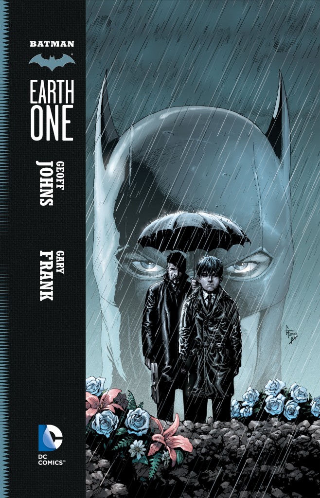
Comics Time: Batman: Earth One
July 19, 2012Geoff Johns, writer
Gary Frank, artist
DC, July 2012
144 pages, hardcover
$22.99
Buy it from Amazon.com
For today’s Comics Time review, please visit The Comics Journal.
Comics Time: The Dark Knight Strikes Again
February 14, 2011The Dark Knight Strikes Again
Frank Miller, writer/artist
Lynn Varley, colorist
DC, 2003
256 pages
$19.99
Buy it from Amazon.com
Originally posted on October 28, 2009 at The Savage Critic(s).
Years ago I came across an eye-opening quote from Jaron Lanier in the liner notes of the reissued Gary Numan album The Pleasure Principle. Google reveals that it was pulled from this Wired essay. Here’s what it said:
“Style used to be, in part, a record of the technological limitations of the media of each period. The sound of The Beatles was the sound of what you could do if you pushed a ’60s-era recording studio absolutely as far as it could go. Artists long for limitations; excessive freedom casts us into a vacuum. We are vulnerable to becoming jittery and aimless, like children with nothing to do. That is why narrow simulations of ‘vintage’ music synthesizers are hotter right now than more flexible and powerful machines. Digital artists also face constraints in their tools, of course, but often these constraints are so distant, scattered, and rapidly changing that they can’t be pushed against in a sustained way.”
Lanier wrote that in 1997. I’m actually not sure which vintage-synth resurgence he was talking about, unless you count the Rentals or something (although everyone and their grandfather was namechecking Gary Numan back then, which was sort of the point of including the quote in the liner notes. Maybe he meant Boards of Canada?).
But golly, it sure seems prescient now, huh? Here we are, in the post-electroclash, post-Neptunes, post-DFA era. The hot indie-rock microgenre is glo-fi, which sounds like playing a cassette of your favorite shiny happy pop song when you were three years old after it’s sat in the sun-cooked tape deck of your mom’s Buick for about 20 years. And my single favorite musical moment of last year, as harrowing as those songs are soothing, was the part of the universally acclaimed Portishead comeback album that sounded exactly like something from a John Carpenter film score. (It’s at the 3:51 mark. It’s awesome, isn’t it?)
And that’s just on the music end. Visually? Take a look at Heavy Light, a show at the Deitch Gallery this summer featuring a murderers’ row of video artist specializing in primary-color overload and technique that doesn’t just accentuate but revels in its own limitations. Foremost among them, at least for us comics folks, is Ben Jones, member of the hugely influential underground collective Paper Rad and recent reinterpreter of the massively mainstream The Simpsons and Where the Wild Things Are. But the ones with the widest cultural import at the moment are Tim Heidecker and Eric Wareheim of the astonishingly funny and bizarre Adult Swim series Tim & Eric Awesome Show, Great Job!. Their color palette is garish, their digital manipulations are knowingly crude, and their analog experiments are even more so. When they combine the three, god help us all. And let’s not forget Wareheim’s unforgettable, magisterially NSFW collaboration with fellow Heavy Light contributor and Gary Panter collaborator Devin Flynn.
Yeah, most of these guys are playing it either for laughs or for sheer mind-melting overload, but I think there’s frequently beauty in there to rival what some of the musicians are doing. (Click again on that first Ben Jones link.) And (thank you Internet God) this amazing video by Peppermelon shows that you can do action, awe, even sensuality with this aesthetic. The rawness, the brightness, the willingness to let the seams show–it all gives you something to push against again.
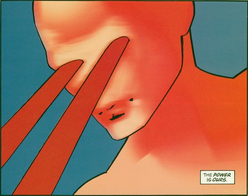
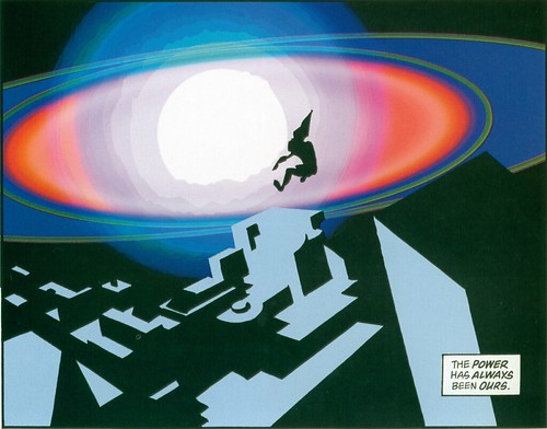
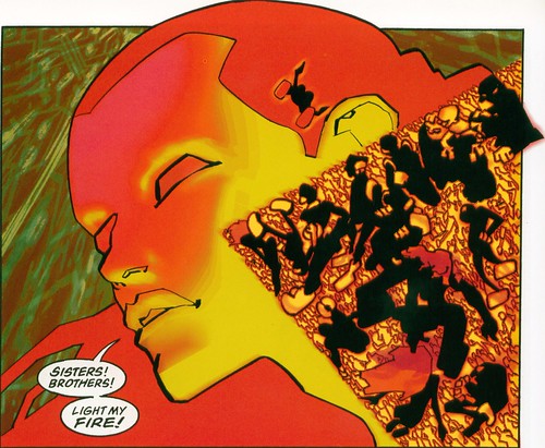
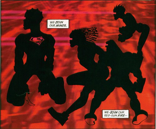
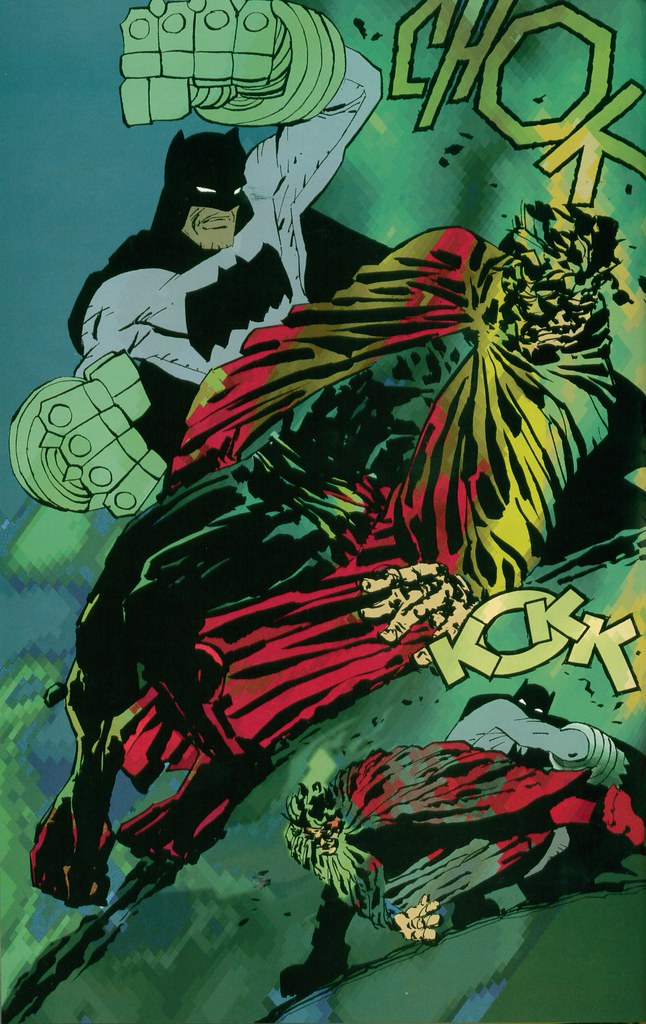
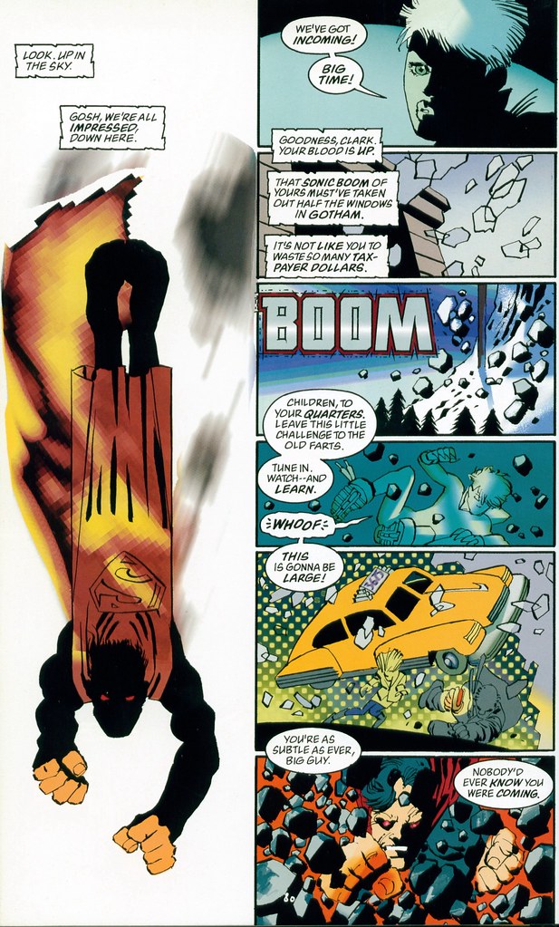
When I’ve written about The Dark Knight Strikes Again I’ve been fond of saying it was years ahead of its time. Sometime in the past week and a half or so, there was a day when I listened to Washed Out, then stumbled across that Deitch show link in an old bookmark, then watched an episode of Tim & Eric, then came across that Ben Jones WTWTA strip–and suddenly I realized I was right! Not that it matters–at all–whether or not Miller and Varley have any real continuity with any of this material. They certainly didn’t get there before Paper Rad, unless I’m wildly mistaken. But then half the fun of DKSA is spotting all the stuff Miller does, from naked newscasters to superheroes ruling the earth rather than just guarding it, seemingly without realizing someone’s done it first. What difference would that make? Meanwhile, in all the off-the-beaten-path references Frank Santoro has cited during the production of his Ben Jones collaboration Cold Heat–essentially a glo-fi comic book–I haven’t heard word one about this book. But I’m not saying Miller & Varley paved the way for anything. I’m saying that when Miller abandoned his chops (and, for the most part, backgrounds!) for the down and dirty styles he (thought he) saw at SPX, and when Varley decided to use photoshop to call attention to itself rather than to create a simulacrum of something else, they were using the same tools, tapping the same vein, seeking the same sense of excitement, discovery, and trailblazing as these newer movements.
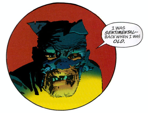
I’ve also been fond of likening DKSA to proto-punk, taking a cue from Tony Millionaire’s jacket-wrap blurb: “Miller has done for comics what the Ramones et al have done for music. This book looks like it was done by a guy with a pen and his girlfriend on an iMac.” The idea is that it’s raw, it’s loud, it’s brash, it doesn’t have time for the usual niceties–it’s getting comics back to their primal pulp roots. I spoke to Miller several times during and following the release of the book, one time for print, and he said as much. (I certainly never would have bought the cockamamie idea that this thing was some sort of corporate cash-grab even if he’d never said word one.) He even mentioned to me his belief that the brightly colored costumes of the early superheroes served mainly the dual purpose of a) telling them apart from one another, and b) proving they weren’t naked, so even his thinking in historical terms had him ready to peel back from realism as a form of reclamation. And of course it’s not exactly like the story was at all subtle in this regard: Batman and his army came back to overthrow the dictators that kept us fat and happy and turned the superheroes into boring wimps. But ultimately the punk comparisons were just a little off. Born less of despair than of delight, filled less with anger than with joy, The Dark Knight Strikes Again anticipated a way of doing things that is not intended to look or sound effortless, that draws attention to its own construction, but which–with every pixelization and artifact, with every crayolafied visual and left-in glitch, with every burbly synth and sky-bright color–pushes against that construction and springs out into something wild and wonderful.
Comics Time: All-Star Superman
February 11, 2011All-Star Superman Vols. 1 & 2
Grant Morrison, writer
Frank Quitely, artist
DC, 2008-2010, believe it or not
160 pages each
$12.99 each
Buy them from Amazon.com
Originally posted on March 11, 2010 at The Savage Critic(s).
The cheeky thing to say about the brand-new out-of-continuity world Grant Morrison constructed to house his idea of the ideal Superman story is that it’s very much like the DC Universe we already know, but without backgrounds. Like John Cassaday, another all-time great superhero artist currently working, Frank Quitely isn’t one for filling in what’s going on behind the action. One wonders what he’d do with a manga-style studio set-up, with a team of young, hungry Glaswegians diligently constructing a photo-ref Metropolis for his brawny, beady-eyed men and leggy, lippy women to inhabit.
But, y’know, whatever. So walls and skyscrapers tend to be flat, featureless rectangles. Why not give colorist/digital inker Jamie Grant big, wide-open canvases for his sullen sunset-reds and bubblegum neon-purples and beatific sky-blues? We’re not quite in Lynn Varley Dark Knight Strikes Again territory here, but the luminous, futuristic rainbow sheen Grant gives so much of the space of each page–not to mention the outfits of Superman, Leo Quintum, Lex Luthor, Samson & Atlas, Krull, the Kryptonians and Kandorians, Super-Lois, and so on–ends up being a huge part of the book’s visual appeal. And thematically resonant to boot! Morrison’s Superman all but radiates positivity and peace, from the covers’ Buddha smiles on down; a glance at the colors on any given page indicates that whatever else is in store, it’s gonna be bright.
Moreover, why not focus on bringing to life the physical business that carries so much of the weight of Morrison’s writing? The relative strengths and deficiencies of his various collaborators in this regard (or, if you prefer, of Morrison, in terms of accommodating said collaborators) has been much discussed, so we can probably take it as read. But when I think of this series, I think of those little physical beats first and foremost. Samson’s little hop-step as he tosses a killer dino-person into space while saying “Yo-ho, Superman!”…Jimmy Olsen’s girlfriend Lucy’s bent leg as she sits on the floor watching TV just before propositioning him…clumsy, oafish Clark Kent bumping into an angry dude just to get him out of the way of falling debris…the Black-K-corrupted Superman quietly crunching the corner of his desk with his bare hands…Doomsday-Jimmy literally lifting himself up off the ground to better pound Evil Superman’s head into the concrete…the way super-powered Lex Luthor shoulders up against a crunching truck as it crashes into him…the sidelong look on Leo Quintum’s face as he warns Superman he could be “the Devil himself”…that wonderful sequence where Superman takes a break to rescue a suicidal goth…Lois Lane’s hair at pretty much every instant…You could go whole runs, good runs, of other superhero comics and be sustained only by only one or two such magical moments. (In Superman terms, I’m a big fan of that climactic “I hate you” in the Johns/Busiek/Woods/Guedes Up, Up & Away!) This series has several per issue.
And the story is a fine one. Again, it’s common knowledge that rather than retelling Superman’s origin (a task it relegates to a single page) or frog-marching us through a souped-up celebration of the Man of Steel’s underrated rogues gallery (the weapon of choice for Geoff Johns’s equally underrated Action Comics run), All-Star Superman pits its title character, directly or indirectly, against an array of Superman manques. The key is that Superman alternately trounces the bad ones and betters the good ones not through his superior but morally neutral brains or brawn, though he has both in spades, but through his noblest qualities: Creativity, cooperation, kindness, selflessness, optimism, love for his family and friends. I suppose it’s no secret that for Morrison, the ultimate superpower of his superheroes is “awesomeness,” but Superman’s awesomeness here is much different than that of, say, Morrison’s Batman. Batman’s the guy you wanna be; Superman’s the guy you know you ought to be, if only you could. The decency fantasy writ large.
Meanwhile, bubbling along in the background are the usual Morrisonian mysteries. Pick this thing apart (mostly by focusing on, again, Quitely’s work with character design and body language) and you can maybe tease out the secret identity of Leo Quintum, the future of both Superman and Lex Luthor, assorted connections to Morrison’s other DC work, and so on. But the nice thing is that you don’t have to do any of that. Morrison’s work tends to reward repeat readings because it doesn’t beat you about the head and neck with everything it has to offer the first time around. You can tune in for the upbeat, exciting adventure comic–a clever, contemporary update on the old puzzle/game/make-believe ’60s mode of Superman storytelling in lieu of today’s ultraviolence, but with enough punching to keep it entertaining (sorry, Bryan Singer). But you can come back to peer at the meticulous construction of the thing, or Morrison’s deft pointillist scripting, or the clues, or any other single element, like the way that when I listen to “Once in a Lifetime” I’ll focus on just the rhythm guitar, or just the drums. Pretty much no matter what you choose to concentrate on, it’s just a wonderfully pleasurable comic to read.
Comic of the Year of the Day: the Batman comics of Grant Morrison
December 10, 2010Every day throughout the month of December, Attentiondeficitdisorderly will spotlight one of the best comics of 2010. Today’s comic is Batman & Robin, Batman: The Return of Bruce Wayne, Batman, Batman: The Return, and Batman Incorporated by Grant Morrison and various artists, published by DC — superhero comics of sparkling wit, impeccable action, and engrossing mystery.
…here is another comic I want to physically force the writers and artists of other action-dependent superhero comics to read, eyeballs propped open A Clockwork Orange-style. Consider if you will the care and attention paid to the page on which Batman and Batwoman pound the stuffing out of Zombie Batman. (Okay, first consider that this comic contains a page on which Batman and Batwoman pound the stuffing out of Zombie Batman. Then move on.)…each [supporting character] seems not just like a different person, but a whole person, not just a one-dimensional reflection of some aspect of the real Batman that the writer wants to have walk around on its own for a while as these things frequently are.
…shuddery stylish Lynchian atmosphere with genuinely horrifying villains, cool action sequences, killer art, and a sense that it’s fun to be a Batman comic…[Frazer Irving turns in] the best-drawn superhero comic of the year, and honestly one of the best-drawn comics of the year period. Bravo.
Click the links for full reviews.

