Posts Tagged ‘Comics Time’
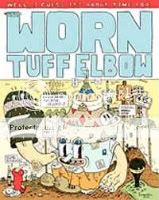
Comics Time: Worn Tuff Elbow #1
June 27, 2008Worn Tuff Elbow #1
Marc Bell, writer/artist
Fantagraphics Books, 2004
40 pages
$4.95
Originally written on January 3, 2005 for publication in The Comics Journal
Marc Bell is commonly associated with the deliberately lo-fi cartoonists centered around institutions like Sammy Harkham’s Kramers Ergot and Tom Devlin’s nigh-irreplaceable Highwater Books (of which the publication of Bell’s great graphic novel Shrimpy & Paul and Friends is arguably the crowning achievement). But like a pre–VH1 Fashion Awards Lenny Kravitz, Marc Bell is a man out of time, and I mean that in the best possible way. (Seriously, have you heard Mama Said?) With its maximalist energy, idiot-savant detail, and high-spirited insanity, Bell’s art is much more at home amid the 1960s undergrounds, right down to the Fleischeresque eyes of many of its characters and the ragtimey shuffles they frequently perform. But Bell’s comics have the added benefit (at least that’s what I think it is) of being largely gratuitous-obscenity-free, which basically means (like if Gary Panter’s Pee-Wee’s Playhouse sets had their own book) they’re the most enthusiastically, wondrously weird kids’ comics ever. You’re just unlikely to relinquish any copies you buy to an actual kid, is all.
Worn Tuff Elbow #1 is Bell’s latest sequential-art effort and the first issue of his new ongoing series at Fantagraphics (Bell being one of the House That RAW Built’s promising outreach efforts to the under-35 generation). The fact that it demonstrates Shrimpy & Paul was not a blow-your-wad burst of brilliance alone makes it notable, even if the comics weren’t so enjoyable on their own terms. Every page is packed with eyeball kicks both visual (a little fellow labeled “Just passin’ thru” appears in one panel, only (sure enough) to be gone by the next) and verbal (an inside-cover preview of book’s contents begins with the rib-ticklingly staccato intro “COMING SOON!!!” “(i.e.: in about 4 pages)” “TO THIS HERE COMIC BOOK” “(THAT IS IN YOUR MITTS RIGHT NOW!)”). Panels lengthen vertically to accentuate the larger-than-life owner of the titular elbow, and flatten out along the pages’ bottoms to depict the ground-level life of the little people whose oppression at the hands of a mad Frenchman (it’s that kinda book) form the core of the story. (Yes, there is a story!) Nonsensical, delightful, restorative comics.
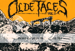
Comics Time: Olde Tales Vol. II
June 25, 2008Olde Tales Vol. II
Lane Milburn, writer/artist
Closed Caption Comics, 2007
38 pages
$5.00
This effective little minicomic draws strength from combining a satisfyingly crude pair of short, silly stories with a surprisingly sophisticated visual approach. There’s no doubt that the CCC collective is indebted to Fort Thunder and related artists, but like the best of that crew, Milburn isn’t just throwing marks on a page, he’s building something out of them, describing an inhabitable physical space. Loose figurework that suggests a rock-solid skeletal structure beneath the surface, deftly chosen camera angles–particularly in the second story, “Wasteland”–and a willingness to fill the panels with information from top to bottom, even if just with thick blacks or hatching (this is the kind of comic that makes you realize how frequently artists waste the top third of a panel) give the book the oomph it needs. The two stories play different gross-out notes, one just cute and goofy and the other sexualized and violent–and god help me, I just realized that the common link is, in a sense, sausage-eating. You can connect the dots, I’m sure. They’re unassuming little things to be sure, but the basic ideas–an old Yoda-like lady-creature telling the younglings about the time she won a competitive eating contest against a bunch of other monsters, and three fratboys whose drunken perambulations lead one into coitus with a hag-thing and the other to be literally skullfucked to death by a minotaur–are rolled out with minimal fuss or pretension and a great deal of self-evident enjoyment. Funny punchlines for both, too. Not for everyone, then, but certainly for me.
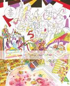
Comics Time: Kramers Ergot 5
June 23, 2008Kramers Ergot 5
Sammy Harkham, Ron Rege Jr., Mat Brinkman & Neil Burke, Souther Salazar, David Heatley, Chris Ware, Elvis Studio, Gabrielle Bell, Kevin Huizenga, Anders Nilsen, Gary Panter, Jordan Crane, Leif Goldberg, Paper Rad, Fabio Viscogliosi, J. Bradley Johnson, C.F., Marc Bell, Dan Zettwoch, Tom Gault, writers/artists
Sammy Harkham, editor
Gingko Press, 2004
320 pages
$34.95
Can anyone here tell a story? You bet your ass. Unlike the preceding, breakout volume of Kramers, where narrative and non-narrative work were on more or less equal footing, the conventional comics hold pride of place in this installment. I mean, that’s a judgment call, obviously. Maybe it’s just me not liking the way a lot of the fine-art-inflected work here–the humor-strip-via-collage by Souther Salazar, Leif Goldberg’s paintings–look on a two-dimensional printed page. Or maybe it’s just me thinking that the more far-out sequential art–J. Bradley Johnson’s non sequitur-laden gag (?) strips, Fabio Viscogliosi’s T. Rex-quoting series of epigrammatic illustrations, even work from the usually reliable and hilarious Paper Rad and Marc Bell–is sort of unfocused and not quite up to snuff. Heck, Gary Panter’s contribution is just thirty seemingly random pages from thirty years’ worth of his sketchbooks–an impressive achievement, to be sure, but the sort of thing that would be just as interesting as a blog post as it is in an avant-garde anthology.
So the spotlight is stolen by the storytellers. Two contributions in particular are real world-beaters, strips that leapt right out at me during my first flip-thru of this book years ago and continue to set a standard for my appreciation of short-story comics. The first is David Heatley’s apocalyptically revealing “My Sexual History,” a complete rundown of every embarrassing/erotic/both detail of Heatley’s sex life from his childhood through his marriage (excepting some stuff with his wife he chose to keep private). I’ve seen this dismissed, by Johnny Ryan’s parody strip for example, as mere exhibitionism, but that ignores the sophistication of Heatley’s approach to designing the strip: the uncomfortable avalanche of intimate details is conveyed through an eye-oppressing 48-panel grid (!) on each page.
The second hall-of-famer here is Kevin Huizenga’s “Jeepers Jacobs,” the story of a preacher grappling with both the concept of Hell–which he’s defending the literal truth of against less orthodox theologians–and how to deal with his new golf buddy, non-believer (and Huizenga’s trademark everyman) Glenn Ganges. Huizenga handles the sort of suburban-fundie character that 99% percent of his audience presumably loathes on sight not just with sympathy, but with intelligence, setting up his arguments and weaving his faith throughout his daily routine in a fashion we’d recognize from our own political or aesthetic pursuits. The ending’s a killer too; I know others had a different experience, but I didn’t see it coming at all.
And there’s more. Jordan Crane starts down the road of violent morality plays he’s still fruitfully pursuing today; Chris Ware’s segment from Building Stories feels a bit too much like a chapter from an ongoing serial but it’s still, you know, Chris Ware’s Building Stories; comparatively linear work from Elvis Studio and Mat Brinkman alternately tickles and horrifies; Tom Gauld has a series of knee-slapper vignettes involving the writing habits of famous authors; Dan Zettwoch’s lengthy story about a church-group field trip that may or may not end in disaster doesn’t hold interest for its duration, but I kind of appreciate its ambition. Overall, the avant garde tag means less for this volume than the more apt description of “very good.”
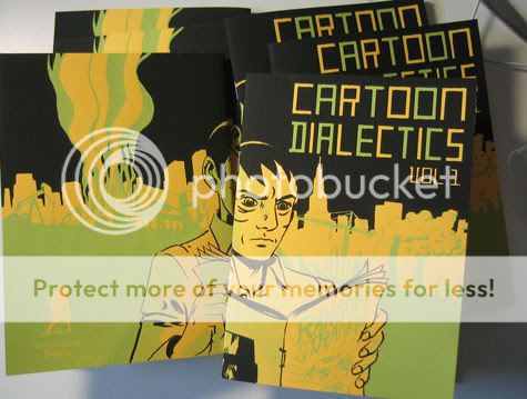
Comics Time: Cartoon Dialectics Vol. 1
June 20, 2008Cartoon Dialectics Vol. 1
Tom Kaczynski, writer/artist
Uncivilized Books, 2007
26 pages
$5
This minicomic collection of strips culled mostly from magazines by MOME contributor Tom Kaczynski is a showcase for both his humanistic critiques of techno-capitalist society and his almost horrifyingly proficient use of color. Seriously, has he done any color work in MOME before? Because this stuff knocked my socks off. Give this man an Eisner for his fruity red-oranges alone!
The comics themselves are a strong selection, packing a lot of variety and value into a five-buck mini. Cartoony cover character Ransom Strange kicks things off by exorcising a corporate Cthulhu knockoff that had been plaguing some poor modern man with credit card debt and body image issues. (If only it were that easy!) It’s a funny, fun little metaphor, one I actually think could be expanded upon.
Next up is a lengthy, luddite comics essay pitting the Web-based post-print world against Kaczynski’s preferred realm of “meatspace,” which here comprises everything from printed books to taking a dump. While I agree with Kaczynski that anti-print evangelism gets tedious, anyone who’s blogged as much (and enjoyed it as much!) as I have should be able to tell you that you can get a lot out of not being an ink-stained wretch and not idealizing the pre-Internet age. (Would something like MOME be as successful as its been without the Internet to pass the word around?) The strip kind of confuses its case by lumping advertorial in print magazines in with the evils of the digital age, as though a) that’s new and b) one has anything to do with the other. If you’re going to create a good-evil dichotomy between analog and digital, you can’t have it both ways. Still, though not quite successful on a philosophical level, it’s a lovely-looking strip, with judiciously chosen images representing the various ideas and idea-spouters and Kaczynski’s precise use of thicker blacks creating a memorable Easter Island sequence.
The collection is rounded out by five one-page strips that really showcase Kaczynski’s color palette to a range of affect. There’s a pair almost Julius Knipl-style anecdotes about a just-shy-of-believable quirks of our commoditized ideas and emotions–a resort community designed to provoke existential ennui called Taedium Plains, and “Boris Lecture, the famous architecture critic,” who can’t quite bring himself to completely purge his book collection Zizek-style every couple of months. A third strip preserves Kaczynski’s trademark linkage of phsyical and mental artchitecture in depicting how the male member of a couple compartmentalizes his memories according to the bedrooms in which they took place. A fourth recounts the domestication of the cat with adorable clarity, and the fifth and final strip is a tale of excessive consumption of gross junk food on a road trip familiar to anyone who’s ever grabbed a bag of Combos in a rest stop on the New Jersey Turnpike. Lovely, enjoyable, occasionally provocative stuff, all in color for five bucks.
Comics Time: Julius Knipl, Real Estate Photographer
June 18, 2008Julius Knipl, Real Estate Photographer
Ben Katchor, writer/artist
Little, Brown & Company, 1996
106 pages
$12.95
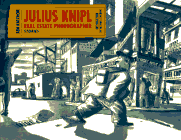
Glimpses of lost New York City are both thrilling and sad. The times I’ve encountered them–the absurdly ornate urinals in the Marvel Comics lobby a few office buildings ago, an elaborate and unused pneumatic tube system in an office I once visited while working as a production assistant on a short-lived David Milch cop show, tiny mom and pop repair shops with Eastern European names on small streets buried beneath bridges or behind the entrances of tunnels–have left me wondering how wonderful these things must have seemed in their heyday, and how futile the enterprises must seem now.
What a stroke of genius, then, to create an entire comic strip about lost New York–the lost past of anyplace really; no need to be chauvinistic about it. Double-genius to make it about an imaginary lost New York–eerily, surreally plausible business that never existed but might have. Licensed expectorators with the proper permits to spit in the faces of whoever those who hired them designate. A tripwire system running from the graveyard to the apartments of the bereaved, to alert them if their loved ones have risen from the dead. A bus line-slash-roving theater that strategically places actors along its route for the viewing enjoyment of its riders. A system of cattle ranch-style marks on the collars of laundered work uniforms to stake out the turf of rival commercial laundries. The niche businesses that Katchor’s everyman protagonist Julius Knipl encounters on his perambulations (that’s really the best word for his long-strided journeys through the city) fit neatly in the cracks of our waking life amid the uncountable multitude of sights and sounds in the city, to the point where it’s easy to convince ourselves we really have seen the brand of the Mansoyl Towel and Apron Supply Co. on the sleeve of the busboy at the restaurant where we spent our lunchbreak.
What I’m trying to get at is how well Katchor conjures up the repleteness of the city. In a town conjured from the accrued history of millions of people over decades of time, there is, almost literally, something for everyone. A big part of this is the way he frames his panels, using odd angles halfway between a normal stage view and the cantered frames of Expressionist film, disorienting us, showing us not just businessmen and their stock in trade but suggesting their showrooms’ dusty corners and the chipped paint of their ceilings, the airshafts of their tenements and the shadows cast by their radiators as the afternoon light strikes them through a lead-painted windowframe. It’s a tactile environment, one you can dive right into with no sense that beyond the panel border, there’s a calm cool nothingness.
But the best way to get across what I’m saying, I think, is by pointing out one of the strip’s recurring devices: Experts who can interpret minute variations of everyday human behavior to further their business ends. There’s one who can predict the turns of the economy based on the frequency and severity of brassiere-strap slippage. Another has set up a rooftop observatory to pinpoint the degree to which everyone limps. In the collection’s climactic, longer piece, “The Evening Combinator,” a newspaper publishes accounts of people’s dreams, the details of which are gleaned from studying the grooves in their mattresses, the cadence of their snoring, how their eyes look as they wake up.
What comes across from these strips is the sort of dizzying impression that the city is big enough and full enough for someone to have devoted a lifetime to the refined research of this sort of arcana, and that there’s enough demand for it to make a living. For me it triggers memories of the first time I realized that everything that gets done on planet Earth gets done because someone does it–a trip to Disney World, when it occurred to me that it’s someone’s job to clean one specific bathroom at one specific ride in one specific section of one specific park…and so on and so on and so on…To conceive of a world, an environment large enough to accommodate the minutiae we see in Julius Knipl is exhilarating, and a little frightening, like looking at an ocean made of rumpled men in shirtsleeves, men offering a handshake, men you can do business with.
Comics Time: Alex Robinson’s Lower Regions
June 16, 2008Alex Robinson’s Lower Regions
Alex Robinson, writer/artist
Top Shelf, October 2007
56 pages
$6.95
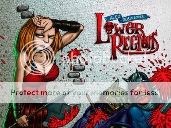
The kind of comic for which the phrase “your mileage may vary” was invented, Lower Regions (its official title; I went with the long version above to preserve the obvious pun) is Alex Robinson’s loving tribute to the pulp-Tolkien fantasy hodgepodge of the Dungeons & Dragons games of his youth. As such I really enjoyed it. I didn’t play D&D as a kid, mind you–not until after my freshman year in college, and then only for one glorious, Sam Adams-soaked summer–but as an avid Tolkien reader since kindergarten and a He-Man action-figure fan extraordinaire, I kind of get the D&D aesthetic through osmosis via its antecedent and offspring. Robinson develops an impressive assortment of monsters and thugs for his pneumatic barbarian heroine to bloodily dispatch, throwing in the buckets of gore and hint of gratuitous, seedy sex/nudity that was a big unspoken part of the attraction of the earthier brands of heroic fantasy for nerdy adolescents. (What’s up, Xanth?) The comic is wordless, as these kinds of things tend to be, and if that means that the action choreography and (particularly) the attempts at conveying thought or speech are occasionally muddled, well, you really only have to get through a page or two max before you come to the next axe getting lobbed at an ogre’s head. Robinson’s goofy character designs, which have kept me away from his straightforward comics, obviously work quite well here. I’d say that the opening image of a band of goons and creatures led by some kind of sexy topless demon-priestess will tell you all you need to know about whether you’ll enjoy the rest of the book.
Comics Time: Paradise Kiss Vols. 1-5
June 13, 2008Paradise Kiss Vols. 1-5
Ai Yazawa, writer/artist
Tokyopop, 2002-2004
Approx. 180 pages each
$9.99 each
Originally written on September 28th, 2004 for publication in The Comics Journal
I never really understood the notion of style (as opposed to fashion) until the lead singer of the Dandy Warhols explained it to me. Courtney Taylor-Taylor, the ectomorphic frontman for the Portland-based purveyors of retro-decadent glam pop, told me during an interview that style is merely the outward manifestation of a person’s insides. “How should my clothes fit and how should my hair look [is determined by] which look for me will better represent, at first glance, what I am about,” he said. (A fringe benefit, he later added, was that this acted as a filter against meeting people who don’t already like you, so you end up involved in fewer dead-end conversations.)
Coming as it did at a point in my life where I was in the throes of an obsession with David Bowie, Roxy Music, Velvet Goldmine, and the entire glitter aesthetic (one which continues to this day), Taylor-Taylor’s words were a revelation to me. Though a combination of poverty and laziness has kept me from perfecting the type of personality-in-wardrobe-form the rock star was advocating, I continue to applaud those with the creativity and willpower to make a go of it.
It’s undoubtedly this reverence for style, combined with a comics fan’s appreciation for a unique story well told, a singular artistic sensibility, and stories about and for teenagers that condescend to neither character nor reader, that leads me to dig Paradise Kiss. Published by manga giant Tokyopop and prepared for the English-language audience by a bevy of translators and adaptors, Parakiss (to crib a familiar abbreviation the characters themselves use when referring to both the clothing design studio around which the comic centers and, in regular breakings of the fourth wall, the comic itself) is a pip of a series, five volumes of angst, lust, and fabulous, fabulous clothes.
Yazawa’s art serves as a wonderful descriptor of all three. Fans of the McCloudian notion that art and story are indistinguishable in comics will find much to love here, since (to these relatively inexperienced eyes) the graphic conventions of shoujo manga (the razor-thin line against acres of white backgrounds, the effete, wire-thin figures, even the riot of pseudo-dialogue and untranslated sound effects peppered throughout translated works) are for once harnessed to a story that makes sense out of them. When studious and beautiful prep-schooler Yukari gets drawn into the world of four students at a high school for the arts, Yazawa’s intricate and ornate draftsmanship does effective double duty, skillfully capturing not only the sensuous and emotional confusion our heroine feels as her world changes, but the gorgeous, Velvet Goldmine-quoting boy (George) who seduces her, and the exquisite, anachronistic clothes he designs.
Those clothes are a highlight, undoubtedly; I found myself looking forward to each chapter’s title page, since those pages boast pin-up images of Yukari (“Caroline,” to her Anglophilic new friends) and the rest of the crew in painstakingly drawn couture. Such moments also pop up in the narrative as well, as during the climactic fashion show, which is lovely enough from both a graphic and storytelling point of view that it ably bears the four volumes’ worth of weight placed upon it. In all cases it’s evidence that the apparent frivolity of Yazawa’s art is icing on a cake that’s not just substantive, but no less delicious for it.
The same can be said of her writing. We’re largely in teen soap territory here, but that’s undercut with a surprising deftness in characterization, brutal at times (George’s attention-starved ex-model mother, George himself in his egocentricity and sexual predation) and unexpectedly warm at others (gruff punk Arashi’s unechoed concern at the way Yukari is ditching her previous life more or less on a whim, young George’s gift to his budding drag-queen friend Isabella). There’s also a sexual frankness that’s quite refreshing: Sex is treated neither as an idealized pathway to spiritual perfection nor as a sweaty and sordid means of disease transmission, but as something that can be a great deal of fun and, therefore, a great deal of trouble. When Yukari walks in on her new friends Miwako and Arashi fucking on a pool table because neither of them has any privacy in their bedrooms, early in the first volume, I’m sure I’m not the only reader who thought “yep, that’s about right.” (The fact that the scenes are so opulently drawn reminds us, to paraphrase Trainspotting, that if it weren’t so pleasurable we wouldn’t do it.)
If anything, it’s this fidelity to the actual experience of teenage sexuality and gender issues that can be off-putting. At no point does Yukari (or Miwako), seem to think of her own pleasure as paramount when it comes to sex; the act is typically initiated either through pressure (in one alluded-to incident, physical) or as a surefire way to change a painful subject, and is always seen through the lens of the boy involved–how it makes him feel, about the relationship, about her; how she feels about the relationship, about him. Of course, I’ve seen little evidence that this unfortunate state of sexual affairs for Yukari is not indicative of how nearly all teenage girls are conditioned to view sex, so perhaps Yazawa is to be applauded for telling it like it is rather than chided for not setting a better example. Ditto her portrayal of Yukari’s entrée into the world of professional modeling–the poor girl is chided on several occasions to stop eating so much, a scene that will make the eating disordered in the book’s audience either cringe in horror or chuckle in recognition. (Speaking of that audience, how cool is it to read a comic book that assumes its reader is a girl? And one in which beautiful male characters are paraded around as eye candy and objects of the gaze?) Moreover, high school may suck, and we all wanted to escape from it, but if you’re a girl looking for freedom from conformity, stricture and misogyny, the fashion industry is not exactly a place I’d advise you to run to. Then again, all the characters seem to gain some awareness of this art-cum-industry’s faults, particularly in the book’s unusually nuanced epilogue, so it’s not like Parakiss is peddling the same line of bullshit as Cosmopolitan.
In other words, Paradise Kiss is about style, not fashion, despite its industry trappings (and despite appearing in serialized format in a Japanese fashion magazine). For George, Yukari, and the rest of the Paradise Kiss studio, the clothes are never about riding the crest of a trend or obeying external expectations–despite the fact that their success as designers (and as people) would be far more likely if that were the case. The clothes are about representing, at first glance, what they as young men and women (and drag queens) are all about. A bunch of precocious, horny, fucked-up 17-year-olds may not know what they’re all about, of course, but maybe that’s what makes their sense of style, and this manga, so enthralling.
Comics Time: Fox Bunny Funny
June 11, 2008Fox Bunny Funny
Andy Hartzell, writer/artist
Top Shelf, June 2007
106 pages
$10
This very good funny-animal comic stands out from the anthropomorphized pack because its visual metaphor strengthens the impact of its more outrageous moments rather than diluting it. Anyone can get some mawkish sentimentality out of casting a cuddly critter in their tale of modern urban ennui, or flip the script and go for some guffaws by doing the umpteenth Fritz the Cat mammals-with-mammaries sex farce. Hartzell aims elsewhere in Fox Bunny Funny.
The first highlight is the violence. We meet our fox protagonist as an awkward adolescent in a broadly drawn conformist suburbia of sitcom vintage, where his fellow foxes kill and consume bunnies with gusto. When our hero is discovered hopping around behind closed doors wearing a bunny costume (I’ve gotten caught doing worse), he’s shipped off to a fox-scout camp where he’s trained to use an impressively horrible beartrap-shooting weapon on bunny-shaped bullseyes. When he proves an excellent marksman, his scoutmaster drags him along on a bona-fide hunt…to the town where the bunnies live with all the same civilizational niceities as the foxes. Hartzell depicts their rampage with disturbing imaginativeness–the foxes run bunnies in cars off bridges, plow through restaurants in their SUV, then smash their way into a bunny family’s home, burst in on their Anne Frank attic hideout, and slaughter them. Eventually the hero flees to a bunny church (the suffering of the bunnies analogized to the suffering of Christ), but when he’s discovered frolicking with the congregation by his fellow scouts, he can’t take the pressure and leads the slaughter himself. Obviously, making both predators and prey into human-style civilizations heightens the savagery of the foxes’ attacks on the bunnies. It may be a metaphor for war or racism or meat-eating or all three at once; mostly it comes across as a refreshingly harsh indictment of human brutality and stupidity in all its forms.
The second strong point is the depiction of a shared fox-bunny counterculture. After the murder in the church, we join our hero years later, where he’s a perfectly normal member of the bunny-eating masses. When a bunny prankster attacks his house, he’s led on a chase through the proverbial and literal rabbit hole into a West-Village-meets-Haight/Ashbury urban freak mecca, where bunnies and rabbits of all genders mix and mingle enthusiastically. Hartzell saves some of his most exciting cartooning for this sequence, including a Where’s Waldo/Hard Boiled-style two-page spread of the scene. What’s special here is that comics, particularly alternative comics, takes the existence of a counterculture for granted. Hartzell sets up the structure of Fox Bunny Funny in such a way that the discovery of this counterculture feels like a legitimate revelation. Do you remember when you were younger, and you first started pursuing countercultural interests and hanging out with the freaks or ‘bangers or emo kids or skaters or whatever they were where you grew up, or first journeyed to a big city and saw that people could be weird or gay and not be looked at like zoo animals for it, and this simple fact felt like both an explosion of self-liberation and a massive “fuck you” rebuke to society at large? Hartzell nails that. And then he goes one step weirder and more asseritve with the conclusion. All with impeccable, wordless kids’-book cartooning. I think I love this comic.
Comics Time: Aqua Leung Vol. 1
June 9, 2008Aqua Leung Vol. 1
Mark Smith, writer
Paul Maybury, artist
Image, April 2008
208 pages
$17.99
Here’s a book you can’t help but compare to other, similar projects that are mining this same vein of ad-hoc epic and homegrown myth(os)-making. Consider it the “A Star Wars of One’s Own” school. (I’ve dabbled in it myself.) The book I kept thinking of when reading it is Mouse Guard. This one comes out on top in virtually every way.
First of all it’s the rare independent comic that comes equipped with not one but two editors, including one seemingly solely dedicated to copyediting. And man, does it help! The story is a coming-of-age hero quest that frequently indulges in knowingly arcane dialogue, and it’s really easy to aim for “fancy” and end up hitting “gibberish.” This doesn’t happen here, which is a blessing right there.
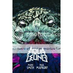
Second, there’s Paul Maybury’s art. Don’t get me wrong, I think Mouse Guard‘s Mark Peterson is obviously a gifted illustrator, and also a better sequential artist than he perhaps might get credit for. But Maybury is something of a revelation here, his thick brush line (apparently this is his first-ever brush art!) at different times approximating the Paul Pope-Becky Cloonan art-blob vibe, the more manga-inflected Vasilis Lolos punk-action thing, some Bryan Lee O’Malley-isms in the character designs, and–out of left field–almost Fort Thunder-ish use of images-as-texture (a wall of “STOMP” sound effects, a two-page spread of arrows, a splash page consisting solely of clashing colors, and an opening map that looks like Ron Rege drew it), occasionally peeling back to an effectively crude, almost childlike minimalism. Colorist Russ Lowery is a break-out star here too, combining Lolos’s candy-coated palette with Dave Stewart’s subtlety and lushness. Smith’s script gives the pair plenty of room to play, with almost abstract combat scenes and bravura sequences like the Spaceball One-sized sea-monster whose jaws take fully four pages to traverse our viewpoint.
Speaking of Smith, he brings a most welcome sense of humor about the grandiose nature of this project to the table, something Mouse Guard lacks entirely. Will you wish he hadn’t kept The Hero with a Thousand Faces next to his laptop as he wrote this story? Sometimes, yeah. (Enough with the fucking absent father figures already, genre writers of America!) At first the epic saga-osity of the material gets the better of him–he burdens the story with something like four introductory sequences, and lets an omniscient narrator tell things that should be shown early on. But the structure smoothes out as the book goes on. Meanwhile he frequently undercuts any portentousness with a wink and a nod to his diverse sources, from the inclusion of a little octopus sidekick that feels like something out of a Japan-only video game to shots of the titular young hero peeking up girls’ skirts, flashback-sequence from Splash-style. And the approach to the violence is more Indiana Jones than Star Wars, if that makes sense–while it does move the plot and is supposed to inspire the awe of any good action sequence, it also unfolds like a choreographed routine and draws attention to that fact. What’s more, he sticks the landing with a climactic battle that feels climactic yet also naturally subservient to whatever will happen in the subsequent volumes.
Overall there’s really nothing here that leaves you feeling like everyone involve needs to get out of their parents’ basement in some fundamental way–it feels like grown-ups knowingly playing with their old action figures more than grown-ups trying to pretend that those action figures are for grown-ups. Nor does it mistake the modest aim of telling the story of its creators dreams for the delusional grandeur of Telling The Story Of Our Collective Unconscious. And oh yeah, the lettering and logo by Fonografiks is really kinda perfectly METAL. I even like the paper and cover stock. It’s a good time.
Comics Time: The Aviary
June 6, 2008The Aviary
Jamie Tanner, writer/artist
AdHouse, June 2007
312 pages
$12.95
I was challenged and intrigued by the idea of, and the ideas in, this debut graphic novel, comprising various interlocking minicomic and anthology strips. “The Aviary,” as we slowly come to realize, is a term for a strange, insular city peopled by various subconsciously resonant weirdos: an art-porn impresario who is also an anthropomorphized monkey, a sexy but viciously nasty receptionist, a limbless stand-up comedian, and so on. Popping up throughout is a blinking bird-headed doll/automaton called the Silent Bird-Man, alternately a symbol of reproachful authority and libidinous secrecy. Some clever shifts in the temporal order of the events being presented lead to a mobius-strip vibe reminiscent of one of David Lynch’s psychogenic fugue films; yes, it’s a shorthand way to connote depth and weirdness, but it’s an effective shorthand way to do that. On a script and story level, the project falls somewhere between Ed the Happy Clown and Asthma, not nearly as assured as either (easy anachronism is a sure-fire way to lose me, comics writers of America), but promising for how it plays with those tools.
The problem is the visuals. Tanner’s pen-and-ink line is reminiscent in some ways of Rick Geary’s–not least because of its old-timey affectations–but his overall sense of page design and panel framing lacks Geary’s inventiveness and storytelling brio. I think literally every single shot of every single character in the book is either head-on or in three-quarter profile, like they’re spending the whole book cheating to the audience. And they’re almost always shown in close-up or medium-shot–seriously, you’re as likely to see feet here as you are in a Michael Turner comic. The combined effect simultaneously makes the comic feel artificial and saps it of its energy. This is all compounded by an overuse of word balloons and figures that break the panel walls for no discernible reason, again making the images feel stagey. Meanwhile, the character designs blended together for me, making the already byzantine plot even more difficult to follow.
Overall, this is what you’d call a promising debut, but not in the blandly complimentary way that’s usually said–I really mean it’s noteworthy for the promise it demonstrates with regard to potential future works. What I’d like to see is Tanner throw this against the wall hard, to see what sticks, to see what’s broken, and to see how he can put something new, different, and better together with the pieces.
Comics time: Final Crisis #1
June 4, 2008Final Crisis #1
Grant Morrison, writer
J.G. Jones, artist
DC, May 2008
40 pages
$3.99
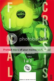
I first read this while standing in Jim Hanley’s Universe during my lunchbreak the day it came out. My first impression was basically flat. Brief, largely undramatic scene after brief, largely undramatic scene featuring a myriad of unconnected characters from across the sprawling DC Universe–a product of hundreds or thousands of writers and artists over going on eight decades, cobbled together by corporate fiat…there was certainly a lot going on. It’s got to be the most continuity-heavy Major Event launch…well, ever. Or at least since Crisis on Infinite Earths #1.
That said, I don’t really care about whether it fails as a launchpad, jumping-on point, blockbuster, next chapter in the DCU, whatever. I just wonder if it succeeds as a Grant Morrison comic, because I don’t care about “The DCU” in the slightest, but I do care about the writing of Grant Morrison. And after that first read, I felt that I really didn’t have enough to go on. I did enjoy seeing Martian Manhunter get punked out, though. As I always say, kill ’em all. I also thought it was hilarious that Morrison was writing this mega-massive-major tentpole summer blockbuster comic the same way he wrote his weird opus Seven Soldiers–super-dense, chock full of elided dialogue and action, and necessitating multiple reads to make heads or tails of it.
Then I got a copy of it in the mail from DC, so I was actually able to sit down with it, re-read the whole thing, and flip around and re-read certain parts. And you know what? Now I kind of love this comic. It’s creepy, weird, totally jam-packed with ideas, paced in a very daring way for what’s supposed to be a popcorn comic (no big reveals, no shocking moments, no wish-fulfillment–compare it to the entertaining but comparatively straightforward “shocking season premiere” feel of Secret Invasion), it has a kind of nauseatingly blasé death for one of the DCU’s oldest mainstays, I love the Dark Side idea (Jack Kirby’s evil demigods falling to earth and taking human form), major plot points are conveyed simply through panel transitions and body language…I keep coming back to the Martian Manhunter’s death, which has more impact precisely BECAUSE it’s neither a big hero moment or a failed attempt at a big hero moment (“Not like this! NOT LIKE THIS!”). The pacing of it conveys the lack of regard for human life that these douchebag villains have. And certainly the shittiness of evil, as opposed to its grandiose awesomeness, has been a running theme of Morrison’s superhero work for a long time now.
Sometimes the art is rushed-looking–Superman looks like he’s stupid, and the table at which the Secret Society of Super-Villains parlay with mysterious asshole villain Libra changes sizes from panel to panel. But there’s a lot of great facial-expression stuff in there too, as in the Anthro vs. Vandal Savage fight, the confrontation between Boss Dark Side and Terrible Turpin, the Anti-Life kids…
Even the deadweight Monitors from Countdown seem like they have a weird society instead of just running around proclaiming shit like they used to. And who cares whether it ignores what happened to the New Gods in previous would-be event miniseries over the past year? Ignoring stuff you don’t care about is done every time a superhero writer working on a decades-old character hits a key on his laptop–so what if the thing he’s ignoring happened three months ago instead of in 1957? It’s a very good comic for me.
Comics Time: Kramers Ergot 4
June 2, 2008Kramers Ergot 4
Anders Nilsen, David Lasky & Frank M. Young, Renee French, Lauren Weinstein, Marc Bell, John Hankiewicz, Mat Brinkman, Ron Rege Jr, Sammy Harkham, Jim Drain, Ben Jones, Dave Kiersh, C.F., Stepan Gruber, Joe Grillo, Josh Simmons, David Heatley, Souther Salazar, Genevieve Castree, Allison Cole, Leif Goldberg, Tobias Schalken, Jeffrey Brown, Billy & Laura Grant, Jason T. Miles, Kenny, Andrew Brandou, writers/artists
Sammy Harkham, editor
Avodah Books, June 2003
Pre-order a fancy-sounding hardcover re-release from Amazon.com
For me at least it’s difficult to separate Kramers Ergot 4 from how it came into my life. The book made its debut at the first MoCCA festival, joining Craig Thompson’s Blankets in the “big giant powder-blue books that knocked everyone out” sweepstakes; all three events–Kramers, Blankets, and MoCCA itself–turned out to be milestones in my comics-reading life. In terms of Kramers, even for someone weaned on Highwater and NON such as myself, this was heady stuff. I seem to remember there being passionate, even angry debates on my then-stomping grounds of the Comics Journal message board over whether it should have “wasted” pages on non-comics content like collages, and then other debates about whether those non-comics pages are, in fact, comics. It all seems pretty meaningless now–I don’t even remember what side(s) I was on–but I suppose the point is that the book really introduced me to completely non-narrative comics, a strategy I don’t think I’d given much thought to until then. I feel as though in a very real way it introduced comics to non-narrative comics, at least by virtue of becoming the most high-profile and influential release of that nature to date in the then-young decade. If you look at that contributor list and compare it to people’s 2007 Best Of lists, you can probably see the power it had.
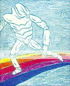
In my defense, it is a powerful book. I would say it is in fact a book designed to overwhelm, from the sheer size of the thing to its small-army contributor list to the “yes, but is it art?” nature of so many of its contents. I mean, the textless Mat Brinkman “monsters clash on the Rainbow Bridge” cover is a statement practically begs comparison to the great Hypgnosis album covers for Led Zeppelin and Pink Floyd, even sharing a rainbow with The Dark Side of the Moon. Now that I think of it–and I promise I hadn’t, not even before my initial pass at this review–Dark Side is a great point of comparison in terms of how KE4 functions as a unit rather than as a collection of individual pieces. (There was little question in my mind as to whether I could approach talking about this anthology the same way I’ve done with MOME.)
See, one thing that struck me in giving the book a cover-to-cover read-through (the first time I’d ever done so) is that there are a surprising number of straightforward narrative strips given the book’s outré reputation. There are humor strips (Cole and Jones), autobio/slice of life (Brown), biography (Lasky & Young), underground-type sex’n’violence (Simmons), ruminative mythology-based storytelling of the kind that’s proven so popular (Nilsen), and just plain storytellin’ (Harkham). Even John Hankiewicz’s contribution has a discernible plot. Sure, they’re sprinkled throughout multimedia collages and Fort Thunder joy-of-markmaking exercises and multiple title pages and so on, but they’re there–sort of like how between the cut-up studio banter and looped analog samples and proto-ambient keyboards and psychedelic freak-outs, you can find unindictable masterpieces of rock-single construction like “Time,” “Money,” and “Us and Them” on Dark Side. Similarly, even these more easily graspable bits are, for the most part, pretty challenging in tone and content. Simmons’ contribution had me ready to put the goddamn book away the second he had a character take scissors to a puppy’s eye, Brown’s series of vignettes about dealing with the homeless, dangerous, or mentally ill is the most socially- and self-critical strip he’s ever done all at once, and Harkham and Nilsen’s contributions, “Poor Sailor” and a pair of Sisyphus strips, will no doubt make their creators’ all-time highlight reel. It’s kind of like creating a pop concept album about the pressures of late 20th-century capitalist society driving you insane until you die.
I’m not making this comparison because it’s cute. (I’m certainly not arguing that they sync up together, Wizard of Oz style.) I’m saying that Kramers Ergot 4 is put together the way it is on purpose, for the disorienting, overwhelming effect it has on the reader, how the narrative work lowers your guard for the nonnarrative, how the nonnarrative gooses your synapses and prepares you to focus on things you’re unaccustomed to focusing on in the narrative–how marks are arranged on the page, figures as symbols rather than as characters, design, the emotional impact of the strips rather than the plot-intellectual one. Instead of being a concept album, it’s a concept anthology. Hence the Dark Side comparison: In both cases there’s a sense of sprawl, of a thing you can’t possibly take in on the first pass and must return to and grab bits of meaning here and there, discovering new things each time. In both cases the material rewards repeat visits (I’m not sure I ever even read the Simmons strip before / I only figured out that the guy was saying “I certainly was in the right” a couple months ago). In both cases, as I’ve gotten older, I’ve grown to appreciate them more.
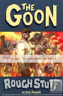
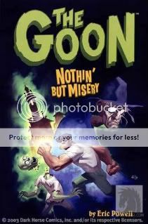
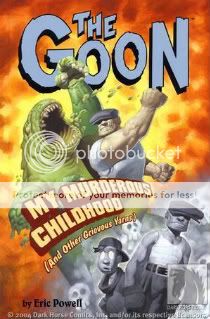
Comics Time: The Goon Vols. 0-2
May 30, 2008The Goon Vol. 0: Rough Stuff
Eric Powell, writer/artist
Dark Horse, April 2004
96 pages
$12.95
The Goon Vol. 1: Nothin’ But Misery
Eric Powell, writer/artist
Dark Horse, July 2003
136 pages
$15.95
The Goon Vol. 2: My Murderous Childhood (And Other Greivous Yarns)
Eric Powell, writer/artist
Dark Horse, May 2004
128 pages
$13.95
Originally written on July 26, 2004 for publication in The Comics Journal
‘Tis a strange fate that the breakout success story of Dark Horse’s recent attempt to craft a line of horror comics around its flagship title Hellboy turns out to be not so much Hellboy as Hellboy Junior. But such is The Goon, Eric Powell’s ongoing riot of hard-boiled noir tough guys, zombie splatstick, and Warren Comics pastiche. It’s unsurprising that its similarity to Mike Mignola’s endlessly fascinating tales of paranormal fisticuffs are both The Goon’s great strength and, by comparison, its great weakness.
The Goon takes place in what’s becoming a fairly common type of indie-genre-comic city, one that’s a melange of trash conventions thrown into a blender and poured onto the page. This one encompasses down-home hillbilly thugs, Edward G. Robinson-style gangsters, haunted houses of EC vintage, and so forth. (See also Street Angel‘s combination of mad scientists, b-boying ninjas, pirate conquistadors, and skateboarding female teen martial-arts experts.) The titular strongman (think Hellboy with a hat instead of horns, Sin City‘s Marv with a wifebeater instead of a trenchcoat, The Thing as a Tennessee redneck instead of a New York Jew) is the terror of the city’s underworld, serving as a brutal enforcer for the reclusive mob boss Labrazio. But a raging gang war against “the nameless man, the zombie priest” and his undead crime family has made the Goon and his Little Orphan Annie–eyed sidekick Frankie into the city’s unlikely saviors. As they’re all that stands between the city and uncontested zombie dominance, the Goon and his pal are forgiven their (ahem) enthusiasm for their work of roughing up lowlifes, werewolves, evil elves, giant fish people, et cetera, usually conducted with knives, Magnums, shotguns, huge monkeywrenches, talking chainsaws, et cetera.
Et cetera and ad nauseum, I’m afraid. Perhaps I’m simply armchair-editing the book, angling for it to become the type of genre fiction I personally enjoy, but the endless game of can-you-top-this splatter and silliness overpowers what could be a very interesting crime-horror concept. Now, I’m certainly not asking for the humor to be excised completely. There are moments that work hilariously–Frankie’s repeated “KNIFE IN YOUR EYE!” gag is in gloriously bad taste, and the reactions of the people of the Goon’s burned-out burg to his rampages are terrific in that “aieeeeeee!” sort of way. (“Look out!” says one bum in Volume One as the Goon gives the business to an arachnid poker cheat named (you guessed it) Spider. “He’s gone strangle crazy!”)
The problem is that when Powell gets serious, or seriously creepy, he’s clearly at his best. The Goon’s origin story, besides containing a pretty brilliant twist that alters our perception of his present-day behavior, packs a surprisingly emotional wallop. (I’m guessing Vito Andolini Corleone’s start in The Godfather Part II was the inspiration, and in this case the imitation is indeed flattering.) “What have I got to live for?” asks the Goon of his new friend Frankie as they embark on their first (and what seems at the time to be likely their last) gang-enforcer outing. At this point you’ve seen the Goon beat up, chewed up, and thrown up by nearly every monster known to man, and yet this clear-eyed (literally, for this panel only) expression of nihilism makes you feel the characters’ risk. Similar hints at a larger emotional tapestry are intriguing (a gorgeous dame whose romantic overtures the Goon thinks are too good to be true, the long and sordid history of the zombie priest), as is the fact that the hero of this story is himself a brutal criminal who looks good only in comparison to the cannibal zombies that fight with him for territory. Often these flashbacks are drawn in an evocative pencil-heavy style with far greater depth than the increasingly slick Saturday-morning cartoonisms that comprise the remainder of the series, to the flashbacks’ great benefit. But all this is inevitably drowned out by the next beheading, the next disemboweling, the next appearance of a spontaneously combusting orangutan. No, I didn’t make that last one up. Such is The Goon.
Comics Time: The ACME Novelty Library #18
May 28, 2008The ACME Novelty Library #18
Chris Ware, writer/artist
ACME Novelty Library/Drawn & Quarterly, December 2007
56 pages, hardcover
$17.95
Cruelly overlooked by many year-end best-of lists (my own included) due to its late-in-the-game arrival (now a perennial occurrence) and, perhaps, a level of quality we’ve come to take for granted, the latest installment of The ACME Novelty Library is a tough book to review by virtue of the fact that it belongs at or near the top of any such list worth a damn. In trying to express what is so compelling to me about Ware’s work in general or this book in particularly I am, to quote Stephen King on Clive Barker, almost literally tongue-tied. Instead I’m rambling on about year-end best-of lists, and eventually I’ll be enthusing vapidly. (Hey, it could be worse–I could be complaining about the people who find his work cold, emotionless, and boring. Specifically I could be calling those people morons. How lucky for you, then!)
In this particular case I’m kind of floored by how Ware assembles a panoply of snippets of a lonely young woman’s life–some are lengthy flashbacks, others are day-in-the-life moments, still others are seen from the perspective of the old building she lives in–into this sort of long seamless tapestry of ache. Like the tiny diagrammatic panels Ware foisted on an unsuspecting comics world, these narrative building blocks give the material an engaging ebb and flow, and simultaneously ape the way the protagonist’s own life flows without pause one dreary day into the next, occasionally enlivened by reverie or some small humiliation. Now that I think of it, she herself looks back on her life’s more exciting or rewarding times as dreams–temporary and illusory. And in a real way this book could go on forever, or at least as long as our heroine remains stuck in this (seemingly lifelong) rut, this cycle going on and on the same way some of Ware’s pages (the knockout front endpapers, for example) are all but cyclical. This chapter itself doesn’t really end, it just stops, which is perfect.
I don’t know, what should I say? He’s the best colorist, the best letterer? Those things are both true. His line is superhuman, like a machine made it, which is why people think it’s cold, but they’re wrong because he’s using that precision to nail specific and devastating emotions and sense-memories–my god, that moment where the heartbroken heroine sinks into her dormroom bed! “I lay there, facing the fake wood wall shelf…but it might as well have been the blackness of space…” The image has the pull of a black hole. And as it turns out Ware is also quite good at cartooning sex, particularly that delirious brand of first-flush collegiate sex, daily coupling and mutual masturbation and the raw, almost manic hunger to have and give and demonstrate pleasure. Cold schmold! All with the best chops in terms of line and layout of anyone in comics. The funny thing is I don’t really think of comics when I read this, I think of my life and my wife’s life and my friends’ lives and complete strangers’ lives, which of course is what makes it the very best kind of comics there is.
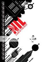
Comics Time: Nil: A Land Beyond Belief
May 26, 2008Nil: A Land Beyond Belief
James Turner, writer/artist
SLG, April 2005
236 pages
$12.95
When I was in middle school and first got into Monty Python, I assumed that most grown-ups knew all about philosophers, because Python had so many jokes about them. As it turns out the kinds of grown-ups who know all about philosophers first learn about them as kids in middle school who get into Monty Python, so it’s a bit of a self-perpetuating system. Anyway, Nil sort of takes this premise for granted–it’s like the looooooooooooooongest Monty Python philosopher sketch ever, with liberal doses of Brazil thrown in for good measure. Unfortunately it’s not funny, let alone as funny as Python or Gilliam solo. The basic idea is that there exists a dystopian land called Nil that embodies nihilism in its many conflicting forms, where people pilot big wrecking ships that destroy literal outgrowths of belief, and which is at war with a similar antithetical nation called Optima. The people of Nil spend almost all their time one-upping each other as to who best embodies the principles of nihilism, such as they are–except for our hero, Proun Nul, who yearns for something more. Or maybe he just yearns to have sex with the lovely Miss Void, I don’t know. The problem is that the concept never quite seems sure what it wants to be. Is Nilean nihilism a matter of literal, physical warfare against belief as a living thing, or is it the usual matter of debate and argument? If Nil is resolutely anti-capitalist, why is every page covered in ad parodies? If Nil is resolutely anti-totalitarian, why is it such an ersatz Oceania? Is it a model of efficiency, or of incompetence? Maybe some kind of point is being made here of the nonsensical nature of nihilism to begin with, but it feels more like an attempt to cram in every kind of joke available than a coherent choice of satire. It’s kind of baffling and it leaves the jokes without any solid ground to pivot off of, and it’s not as though any of the characters are developed in any sense but the most broad and parodic since they have no constants to play against. By the end of its 236 pages, which seemed a lot longer, I really didn’t care anymore. All told, the five or six minutes of total screen time given to the Nihilists in The Big Lebowski are a more effective satire of that anti-belief system and the excesses of the life of the mind in general.
All of this is compounded by Turner’s art, which is designy and iconic in the extreme. I’m sure there’s a perfect point of comparison out there that I’m totally missing, but what it calls to mind for me is flash animation, or some very old computer program, or Legos…it’s resolutely cold, flat, and artificial. This can occasionally lead to startling images–generally speaking, the bigger the weapon of war, apartment complex, or Nihilist temple, the cooler Turner makes it look through accrued geometric patterns. (Remember those flying bomb ships in Super Mario Bros. 3, with all the propellers and cannons and things? Kinda like that.) But for the most part it’s deliberately unlovely, making empathy or even awe impossible. It kind of substitutes cleverness for the usual kinds of qualities that make art compelling–of which cleverness is one, of course, but not the only one.
In some ways I think it’s exciting that a book like this can get made and published, but it wasn’t for me.
Comics Time: Thor: Ages of Thunder
May 23, 2008Thor: Ages of Thunder
Matt Fraction, writer
Patrick Zircher, Khari Evans, artists
Marvel, April 2008
36 pages
$3.99
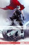
A while ago I linked to a video of crudely animated Thors performing Slayer’s “Raining Blood” and, in a post that got some attention here and there around the Internet, said basically that Thor comics should be at least that metal. If your Thor comic doesn’t evoke Led Zeppelin’s “Immigrant Song,” there is something wrong with your Thor comic. Needless to say, there’s been a lot wrong with a lot of Thor comics by that standard.
In Thor: Ages of Thunder, writer Matt Fraction takes a big step in the right direction. The action primarily consists of Thor attacking and beheading enormous frost giants, then dragging their heads into Asgard as trophies; between these feats he has sex. With the exception of the two included stories’ introductory pages, everything is done in big two-page spreads. There are shots of Thor’s war hammer Mjolnir dripping with gore. The chorus of the one Zeppelin song that explicitly references Thor, “No Quarter,” is paraphrased. The coming attraction page for the book’s sequel reveals its title to be Thor: Reign of Blood.
But in much the same way that it doesn’t quite get the “No Quarter” chorus right and didn’t quite name its follow-up after the Slayer album, it doesn’t quite gel overall. Mostly this is because of the narration captions in virtually every panel. It’s not that they’re knowingly overwrought–that’s as it should be–it’s just that there are way too many of them and there are way too many words in each. A action comic about gods warring with giants and constructed solely of two-page spreads should flow effortlessly, but the constant jibber-jabber stops both the eye and the brain short when they should be on cruise control. Show us how awesome your Thor is, don’t tell us. Moreover, I just happened to have read a whole lot of mythology-based comics recently, whether we’re talking about short stories in Mome or minicomics by Eleanor Davis and Matt Wiegle or flashbacks in Incredible Hercules, and the captions make this one feel comparatively belabored.
There’s also a disparity between the art in the two stories. Patrick Zircher’s detail-driven art packs genuine power, and the witty coloring by June Chung (dig the red noses she gives everyone–after all, it’s chilly in the realm of the Norse gods!) puts it over the top; Khari Evans’s figures, particularly his women, seem awkwardly proportioned and inconsistently constructed by comparison. (Though his Thor itself is quite strong, and he’s one of the first artists I’ve come across who truly conveys that Thor flies because he throws his hammer so hard the thing pulls him up off the ground with it.)
That being said, it’s all enormously more appropriate to a character based on gods worshipped by the priests who gave us the term “berserkers” than a leisurely rumination on the cyclical nature of existence set within the rural farms and diners of Oklahoma. It’s also entirely possible, perhaps even likely, that a collection of stories of this type (which is surely in the offing given the announced second issue) will make for a satisfyingly loud read, and be priced more efficiently to boot. In much the same way that I’m comforted that most kids’ first exposure to the potentially awesome character of Iron Man will be from Jon Favreau’s movie rather than Mark Millar and J. Michael Straczynski’s comics, I take great solace in the hope that somewhere, some kid is reading this while listening to the copy of Black Sabbath Volume 4 he stole from his older brother rather than reading something that will lead him to form the opinion that “Thor is boring.”
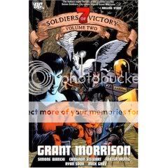
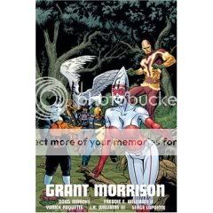
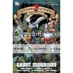
Comics Time: JLA Classified: Ultramarine Corps and Seven Soldiers of Victory Vols. 1-4
May 21, 2008JLA Classified: Ultramarine Corps and Seven Soldiers of Victory Vols. 1-4
Grant Morrison, writer
Ed McGuinness, J.H. Williams III, Cameron Stewart, Frazer Irving, Ryan Sook, Pasqual Ferry, Billy Dallas Patton, Freddie E. Williams II, Yanick Paquette, Doug Mahnke, artists
DC Comics, 2002-2007
JLA: 144 pages
Vols. 1 & 4: 224 pages
Vol. 2 & 3: 176 pages
$14.99
Buy Seven Soldiers from Amazon.com
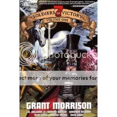
Inspired by the delightful reading experience of working through the bulk of Grant Morrison’s recent, weird Batman run in one go, I decided to revisit his most ambitious project to date: The interlocking miniseries Klarion the Witch-Boy, Frankenstein, Zatanna, Mister Miracle, The Manhattan Guardian, The Bulleteer, Shining Knight, and Seven Soldiers—known collectively as Seven Soldiers of Victory. I started with the epic’s unofficial prequel, the three-issue JLA Classified miniseries Ultramarine Corps. In a way that earlier title is emblematic of all of Morrison’s output for DC. While nominally it revolves around a StormWatch/Authority-style take-no-prisoners super-team he introduced during his late-’90s JLA tenure and now updated for the Ultimates era, its villain is a revamped golden-age baddie (Nebula Man/Neb-U-Loh) who is now set up to be the ultimate weapon of eventual Seven Soldiers villains the Sheeda; themini also directly references characters and concepts (the Sheeda queen) that Morrison wouldn’t be using for another couple of years, and others that would pop up not just in Seven Soldiers but also in seemingly disconnected books like Batman (the Club of Heroes) and even the non-continuity All Star Superman (the Infant Universe of Qwewq). In other words–and this is fitting given Morrison’s view of spacetime as a single, physical living organism–what looks like a three-issue slushpile Justice League story is in fact simultaneously drawing from Morrison’s past, present, and future at the company. It’s all one big mega-story.
In this day and age of decodable genre entertainments, it’s tempting to spend this review of a re-read making connections and unearthing clues. I certainly did some of this during the re-read itself (one of my pet projects was pinpointing all four elemental golems mentioned by Baby Brain Stargard in the first Guardian issue.) It was also inevitable that I spent much of the re-read just blocking the plot out in my head in a more accurate way than I did the first time around. For example, I now think I have a pretty firm grasp on the exact roles played by the four main villains–Gloriana Tenebrae, Melmoth, Zachary Zor, and “Dark Side,” whereas if you’d asked me a couple days ago I’d have gotten the middle two conflated and had no idea how the first was connected to the fourth. Finally, given how directly the plot of the Mister Miracle mini–Darkseid’s forces win the eternal war of the New Gods and descend to Earth in the form of outwardly normal humans–mirrors what we’re told to expect from Morrison’s Final Crisis, it’s hard to resist trying to puzzle out where that mini fits in with the rest, or where the whole thing fits in with the flow of the DC Universe in general.
But I think the thing that I most want to convey about this re-read is just how affecting it is to read a superhero comic this dense. Everything I just talked about–the scattered Easter eggs, the continuity tweaks, the riot of opposing forces–are really just the tip of the iceberg in terms of the disparate elements the project comprises.In what almost seems like a self-satirical move, Morrison deliberately tapped an army of artists to illustrate the project (including one, J.H. Williams, who at various points draws in the style of every single other one) rather than allow this to happen through the vagaries of scheduling like it seems to do on all his projects. The effect is dizzying and sensuous, in no small part because this is the strongest set of collaborators he’s ever assembled, even given a hiccup in the production of Mister Miracle. Williams’ mimickry is a tour de force performance, Bianchi is a true otherworldly discovery, Sook and inker Mick Gray’s spotted blacks are sexy as heck, and Irving is a comic genius with color and facial expressions, just to name a few high points. Meanwhile Morrison himself discusses in his intro how he deliberately bounced between genres in the book, to encompass science fiction, fantasy, horror, action, comedy, soap opera, satire and more. So too does he vary up the raison d’etre of his “heroes”–none of them are in it as an exploration of What It Means To Be A Hero, which is an immediately disorienting difference from the norm as it recalibrates our expectations of what the characters will do at any given juncture. All in all it’s a bit like a supercompressed Twin Peaks or Lost–there’s just so much going on and the fun is in not knowing and trying to grok it anyway as you take succor in the crackerjack genre aspects.
The most pleasurable aspect of the project, ultimately, is that it is the challenge that the characters within face. It’s a huge story that’s just slightly too big for us to grasp from our frame of reference, but it gives off the sense that the picture is there to see if you know where and how to look at it–perhaps from the kind of vantage point that enables you to seed story points from a vast span of years into everything you write–rather than the nagging suspicion that the author has deliberately made vital information inaccessible. Trying to absorb and understand what’s going on is like standing on your tippy-toes to grab something on a top shelf, a delicious challenge to exceed your station just a bit and hold on to something outside your usual grasp, and if you don’t succeed this time, no big deal, there are any number of other angles you can come at it from. In that way the final page, one of my favorite endings to any comic ever, is a fittingly euphoric image: one of reaching.
Comics Time: How We Sleep
May 19, 2008How We Sleep
Eleanor Davis, writer/artist
self-published, February 2006
16 pages
price unremembered
Maybe the Little House shop will have copies available when it reopens in June
Created as a Valentine’s Day gift for her cartoonist husband Drew Weing, Eleanor Davis’s How We Sleep consists simply of 7 drawings of the two of them, and sometimes their cats, asleep in bed. It’s a remarkably sexy comic, and sweet too, succeeding because of the way those two qualities intertwine. Davis’s finely observed drawings of her and Weing’s undressed bodies convey intimacy about as well as you could hope for in illustrations, with their unidealized figures suggesting great mutual affection, attraction, and vulnerability. Their cats and their kind of goofy underwear remind us that these are just folks, albeit folks in love. This must have made a heckuva Valentine’s Day present.
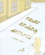
Comics time: Never Ending Summer
May 16, 2008Never Ending Summer
Allison Cole, writer/artist
Alternative Comics, April 2004
96 pages
$11.95
Originally written on July 25, 2004 for publication in The Comics Journal
Never Ending Summer blazes no new trails. In fact, what trails it treads are familiar almost to the point of predictability: I think that by now we’ve all read enough auotbio comics to know that young, hip people drink cheap beer, complain about their jobs, obsess over their relationships, fetishize vinyl records, make mix tapes, and make out. If adolescent power fantasies are this medium’s overheated yin, post-adolescent disempowered realities such as this are its underheated yang.
But there’s a lot to be said for charm, and that’s why there’s a lot to be said for the very charming Never Ending Summer. The story, such as it is, follows author Allison Cole through a summer of minor upheavals in Providence, Rhode Island. Allison wakes up one day at the beginning of June with an enormous injury of an unspecified nature upon her lip. “So this is how summer begins,” she thinks as a friend drives her to the hospital in another friend’s borrowed car. It’s a fitting beginning to the story as it introduces several prominent themes: The power of Cole’s minimalist cartooning (her nightmare image of the injury consuming her entire face works perfectly), the unexpected difficulties that beset her throughout the season, and the support and succor she gains from her community of friends.
Cole’s debut graphic novel finds her confident in her use of her unique vocabulary of character, which is to say she draws adorable little people who look sort of like the ghosts from Pac-Man, but with arms and legs. Each is given a unique adornment for distinguishability–a ponytail here, an ironic moustache there, Descendents-style eyeglasses everywhere–and while that trick doesn’t always work, what does is the simultaneous sense of universality and idiosyncrasy the overall device lends to the characters and the story. It’s a lot harder to get tired of the misadventures of hipsters who hang out in kitschy dive bars when they look like stuffed animals. (It’s also interesting to compare this technique to the almost manic self-scrutiny of a Jeffrey Brown, say. Where Brown makes his seemingly uneventful autobio stories work through the intense navel-gazing reflected in his restless, sketchy inks, Cole takes the opposite tack and breaks the action down to a bare minimum of lines on a page. In the former, the reader is moved along by the sweaty work of the artist; in the latter, the artist encourages the reader to move the breezy work along.)
The clear influence overall is John Porcellino. Cole does not have the minicomics god’s assuredness of line, nor the ability to pull off the transcendental moments of liberation that marked Porcellino’s similar autobio novel Perfect Example. I was actually all the way through such a moment in Never Ending Summer before I realized, “hey, that was the big climax, wasn’t it?” But Cole’s learned that simplicity suits a simple story, There’s never a moment that feels forced, pretentious, or overblown, and the quiet moments are quiet without being maudlin or tedious. Some of my favorite images are simply Allison kneeling on her roof next to her chimney, or curled up with her cat. Clearly these are some of Cole’s favorite images, too.
Cole’s piece in Kramer’s Ergot 4 was a bit of inspired comedy, terrifically lampooning the oh-so-sensitivity of emo boys by casting them as the world’s wimpiest pirates; I’d have liked to see more of that wit in use here. I’m also not sure that the ending is earned by the events that come before: The idea is that Allison’s newfound creative outlet as a DJ enables her to be happy with and by herself rather than fixate on emotionally unavailable men, but wasn’t she already a cartoonist? Perhaps the nature of her cartooning–writing about her fixation on emotionally unavailable men–precludes that kind of fulfillment. Makin’ people boogie is probably a much better way to forget about that sort of thing. But unwittingly she’s done that here, crafting a delightful book that I’ll happily read again. It’s a promising start until she begins blazing trails of her own.
Comics Time: Batman #664-669, 672-675
May 14, 2008Batman #664-669, 672-675
Grant Morrison, writer
Andy Kubert, J.H. Williams III, Tony Daniel, Ryan Benjamin, artists
DC Comics, April 2007-April 2008 or so
22 pages each
$2.99 each
Grant Morrison is my favorite superhero comics writer, one of the very few writers in comics I’ll read anything by. Batman is my favorite superhero, the only character I feel an attachment to as an entity rather than as a character in a story that may or may not be good by artists and writers who may or may not be good. Put Morrison and Batman together and you should have a recipe for Sean T. Collins Nirvana, but for some reason that hasn’t been the case. What I seem to recall being the standard Kubert Bros.-related scheduling difficulties early on; Morrison working in a deliberately choppy, almost disjointed narrative style both within individual issues and from issue to issue and short arc to short arc; sketchy, sloppy art from Kubert and unremarkable ’90s-style art from Daniel and Benjamin jarringly interrupted by a bona-fide star turn from the great J.H. Williams III; that awkwardly inserted Ra’s al-Ghul-centric crossover with all the other Bat-titles; my job at Wizard coming to an end and with it my weekly free access to superhero comics…put it all together and you have a book tailor-made for me that I wasn’t even following.
I was recently loaned a more or less complete run of Morrison’s tenure on the title–sans the initial “Batman & Son” arc that introduced Batman and Talia al-Ghul’s enfant terrible son Damian and the issues pertaining to the Ra’s al-Ghul crossover in which the old villain attempts rebirth in the body of his grandson–and I was pleased to discover I liked the whole thing a lot.
Like so many of Morrison’s long runs it’s badly hampered by the art he’s saddled with, perhaps moreso here than in other cases since so much of Morrison’s staccato scripting depends on nuances of body language, facial expression, and mise en scène. Meanwhile, that pow-pow-pow pacing and those brief, three- or two- or even one-issue story arcs give the illusion of a lack of continuity within the run overall. But taken in one sitting these problems are easily smoothed over, and what reveals itself is a dual project.
First, and credit here goes to my friend Kiel Phegley for pointing this out, Morrison foregrounding Batman as the main point of interest in every story. Whereas normally the character plays a particularly badass brand of straightman to the more glamorous villains and horrifying murder-mysteries he’s up against, Morrison’s emphasis is on the hero himself, and on establishing him as every bit as weird, exciting, scary, and memorable as his antagonists. This is reflected in Morrison’s choice of antagonists itself: as with All Star Superman, he’s trotting out a parade of baddies who in one way or another serve as his flawed doppelgangers. The peak-human-specimen al-Ghul family, the crimefighting Batmen of Many Nations and their billionaire benefactor, three crazed Batman-impersonating policemen, even Bat-Mite–they all throw what makes Batman Batman into sharper relief via contrast, demonstrating that while he is indeed weird, exciting, scary, and memorable, he’s also a fundamentally good person who never loses sight of the values that matter to him and by which he’s chosen to define himself.
Second, Morrison is slowly advancing a novel and vastly more enjoyable take on the shopworn “shadowy villain manipulating things behind the scenes” mega-storyline in the person of the Black Glove, a figure of unknown provenance behind many of the story’s events. Morrison has basically avoided those annoying scenes where the shadowy figure literally appears as a figure in shadows once or twice per issue, making ominous statements and showing us just enough of his silhouette that we can start guessing whether he’s Mysterio or Hush or whoever. Instead, Batman arranges his recent cases into a pattern at the center of which is a hole in the shape of something that’s more of an idea rather than a person–a “king of crime” figure so brilliantly evil that even Batman had no idea he existed and had been pulling strings for nearly Batman’s entirely career. It’s all coming out in this kind of slow, unnerving fashion, more identifiable as something feeling weird about the stories rather than as a story element in and of itself. Hopefully the central revelation will be as satisfying as that of, say, New X-Men. At any rate, while I can see why people (myself included) may have gotten a bit lost in the shuffle, I’m now reading some of the book’s more oblique storytelling choices as just that–choices–rather than lapses, and I’m firmly back on board.

