Posts Tagged ‘Comics Time’
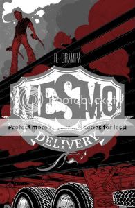
Comics Time: Mesmo Delivery
August 13, 2008Mesmo Delivery
Rafael Grampa, writer/artist
AdHouse, 2008
60 pages
$12.50
Normally saying something like “his art is varyingly reminiscent of Geof Darrow, Al Columbia, John Kricfalusi, and Dave Cooper” would be hyperbolic to the point of absurdity or even insanity, but hoo boy, Rafael Grampa. Visually he may be the most accomplished new cartoonist of the past two or three years. Best of all, he’s no slouch as a storyteller, either. I don’t mean in terms of legibility, because there are plenty of talented illustrators whose beautiful comics are easy to follow. I mean in terms of having a story worth telling, a spectacle but not an empty spectacle. On the surface it’s just a gorgeous, ultraviolent fight comic, the kind of thing you see plenty of anymore, but it’s different. For one thing, it’s creepy and uncomfortable, as much so as the similar opening sequence in Natural Born Killers. It’s as raw and blackly humorous and confrontational, and at times edgily sexual, a work of gore as Darrow and Frank Miller’s Hard Boiled. It subverts expecations, creating a “hey look at that big guy, I bet he’s usually pretty calm until you rile him at which point he’s invincible and badass” brick-type figure and then flipping your premature belief in his competence on its ear. It contains out-of-nowhere visual flourishes: A smartly laid-out “commercial break,” a slavering devil lurking underground like something out of a medieval engraving. The lettering–Rafa Coutinho gets this credit, though sometimes the words are so integral to a particular panel that it’s tough to see how someone other than Grampa did it–addresses music and whimpering with inventive, tactile flair. The colors, selected by Grampa and deployed by Marcus Penna, somehow take that green/brown Vertigo palette and makes it gooey rather than acidic. Everything looks dirty. The narrative flashes back unexpectedly and intelligently. The English-language dialogue, provided by Ivan Brandon, is tight. (“Be very discreet.” “When have I not been?” “No time I know of, but I’m in charge and if I don’t tell you how things are, I have nothing else to do.”) This is some comic book.
Comics Time: Watchmen
August 11, 2008Watchmen
Alan Moore, writer
Dave Gibbons, artist
DC Comics, 1987
416 pages
$19.99
Like half the nerds in America, I recently re-read this graphic novel, inspired to do so by the trailer for Zack Snyder’s upcoming movie adaptation. I feel much older than I did when I first read the book during my sophomore year in college, and much of what I appreciated about it then fails to impress me now…or perhaps “fails to impress itself upon me” is the better way to put it. Moore’s scripting, for example, seemed wildly sophisticated compared to the house-style comics of the ’90s with which I could then compare it, but comes across shopworn, even hokey to me now. All those panel transitions where what someone is saying in one place is placed in a dramatically/ironically appropriate caption box over something unrelated yet thematically linked in some other place! There’s one groanworthy bit in the Owlcave where Nite Owl says something about a reflection while we’re shown his reflection, and I liked the failed sex scene juxtaposed against the commentary for Ozymandias’s gymnastics routine better when it was Phil Rizzuto doing play-by-play for Meat Loaf in “Paradise by the Dashboard Light.” I mean, maybe it’s just that I’m sick of the fact that people like J. Michael Straczynski are still doing stuff like this 20-odd years later, maybe it was a total revelation then, but to me, this sort of neat thematic coincidence requires far more suspension of disbelief than just having guys run around in costumes. It feels emotionally artificial, which of course is the problem I tend to have the most with Moore’s rigorously, ostentatiously authored work.
Instead, what strikes me hardest here, what I don’t think I ever thought about all that much before, is how much power the story draws from its uniformly engaging sad-sack main characters. I think it’s here that Dave Gibbons’s contribution is at its most valuable, with his all but countless shots of heroes and do-gooders worrying, frowning, furrowing their brows, being uncertain. It must be noted that this is worlds away from the Identity Crisis-style vogue for angst and selfish over-emoting. All the characters in those “you’ll believe a man can cry”-type supercomics are just as 100% sure of their emotional experience as their relentlessly upbeat Silver Age counterparts used to be. Not so in Watchmen, where the primary mode of emotional interaction with the world is confused dismay. The mileage Moore can get out of this is almost inexhaustible. These aren’t emo Batmen, they’re Tony Sopranos and Seth Bullocks, idiosyncratic and troubling portraits of great physical strength and moral violence juxtaposed against tremendous emotional and psychological weakness. Their failures–and they spend pretty much the whole book failing–are hard to stomach, especially giving the truly impressive air of impending doom Moore creates out of snippets of current-events and vox-pop cutaways; we hope for their success even though the art and the script both do everything they can to show us without coming out and saying it that their failure is inevitable. I’ll tell you, reading the book this time around, when Rorschach takes off his mask at the end and yells “Do it!” at Dr. Manhattan, tears streaming down his face, I nearly started to cry. To me now, it’s almost as devastating as that line “I did it thirty-five minutes ago” and the subsequent reaction shot were 11 years ago.
I noticed a lot more than that this time around, too. For example, everyone remembers the symmetrical Rorschach issue and the Dr. Manhattan flashback/flashforward issue, but the rest of the individual chapters were all quite structurally different from one another as well. Issue #1 is a pretty straightforward superhero whodunnit. Issue #2 does the classic-flashback thing that the creators of Lost borrowed so effectively. Issue #3 is moved along by those transitions I mentioned earlier. The penultimate issue is driven at least as much by the “normal” characters as the superheroes, and the final issue is as straightforward as the first one. It’s a restlessly creative book, uncomfortable with being this thing or that thing exclusively.
It’s also much funnier than I gave it credit for, especially early on, before the final failures. Rorschach, for example, is kind of a scream, constantly making mental notes to investigate whether this or that character is gay or a Communist or having an affair, obliviously wondering why so many superheroes have personality disorders. There’s also the running rivalry between the left-leaning Nova Express and the right-leaning New Frontiersman. I always thought Moore rather stacked the deck against the more or less nakedly racist and anti-Semitic conservative publication, compared to the smooth Rolling Stone-isms of the magazine that (one assumes) more closely aligned with Moore’s own outlook. This time, however, it suddenly jumped out that while their culprits (Russian and Chinese Reds) were off, pretty much everything the New Frontiersman alleged about what was going on in the world was accurate, while Nova Express was literally a bought and paid dupe of crazy old Ozymandias. That’s pretty funny, actually. So is the fact that at least four of the main characters are crazier than shithouse rats and, if one wants to be literal about it, serial killers. And the more I think about the ending, the more convinced I become that it’s perfect as-is and the kvetchers should zip it. I mean, if you stick with the Comedian/sick joke leitmotif, this very serious book about nuclear war, sociopathy, sexual dysfunction, the intractability of human suffering and so on needed a punchline in the worst way; if you run with Ozymandias and slicing the Gordian knot, this rigorously realistic take on superheroes needed an outside-the-box climax; and for either one, how can you top teleporting a brain-squid-thing into a metal concert at Madison Square Garden?
The ending, and the book overall, are more problematic when viewed as a serious hypothetical response to real-world political problems. Moore’s diegetic voice-of-reason when it comes to geopolitics, Dr. Milton Glass’s “Super Powers and the Super-Powers” prose piece, posits a Soviet Union every bit as undeterrable and ultimately suicidal as the current neoconservative conception of Iran; granted, Moore/Glass’s policy prescription for what do do in the face of such an opponent is 180 degrees away from your Podhoretzes and Kagans, but clearly the validity of the underlying viewpoint was not borne out by events. In that light, there’s something faintly ridiculous about watching Ozymandias go through all this trouble to end the Cold War when boring old military expenditures, international negotiations, and internal politics pretty much took care of it here in the real world. Moreover, I can’t be the only person soured enough by recent years on the idea of the ends justifying the means to completely, 100% side with Rorschach’s doomed decision to reveal Ozymandias’s malfeasance to the rest of the world, right? A faint over-willingness to forgive bad shit done in the name of Moore-ish beliefs can be detected in Moore’s work from V for Vendetta to The League of Extraordinary Gentlemen, and while it’s perhaps fainter here than ever, it’s there, and to the extent that it is there it rankles.
But that’s fine. Great art should encompass enough ideas that you can find at least one that makes you a little uncomfortable. And Watchmen encompasses tons and tons and tons of ideas–the clockwork clues, the extensive Tolkien-style barely-glimpsed backstories, the alternate history, the intricate panel layouts, the emotional texturing, the Charlton riffery, and everything else I just ran down. It’s simply full of ideas, which makes it rich and exciting and thrilling and fun. It’s not someone’s movie pitch or someone’s attempt to write comics like a summer blockbuster, or like anything else, for that matter. It’s a great comic book.
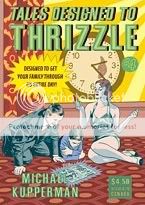
Comics Time: Tales Designed to Thrizzle #4
August 8, 2008Tales Designed to Thrizzle #4
Michael Kupperman, writer/artist
Fantagraphics, 2008
32 pages
$4.50
If God didn’t hate us all, we’d live in a world where there’d be some way for Michael Kupperman, Johnny Ryan, and Matt Furie to do a world tour in every way the humor comics equivalent of that Guns n’ Roses/Metallica/Faith No More tour my parents wouldn’t let me go to back in ’91–selling out stadiums, inspiring bootleg T-shirts sold in parking lots filled with drunk drivers, and causing riots when Ryan gets in a fistfight with Stephanie Seymour and blows off a show in Toronto out of frustration. But here we are, and the best we can do is get a new issue of Tales Designed to Thrizzle and laugh ourselves stupid.
I think the key to Kupperman’s humor, aside from the mechanical precision of his artwork (watching him contribute to my Bowie sketchbook was fairly astonishing in how painstaking the process was), is how his jokes don’t so much wander as trail off into platonic simplicity. My guess is that his non sequitur structuring puts a lot of people in mind of Monty Python, but Python tended to go from one full-fledged idea into another, even if that other was totally random and disconnected from the original. Kupperman, by contrast, kind of whittles away at his opening gambits until they reveal purer and purer strands of nonsense. The best example here is a parody of an old educational filmstrip about harbors–the set-up goes after how boring filmstrips are, the first set of gags riffs on the kinds of information presented in filmstrips through exaggeration, the second set spoofs the Statue of Liberty through absurdity, the third set entails physical impossibilities, and by the end he’s just repeating the word “Harbors!” over and over and over eight times in a row. It’s a can-you-top-this game pitting Kupperman against logic in a battle to the death. Kupperman wins.
That incredibly boring explanation of comedy will hopefully not discourage you from buying a comic that features…
* Indian Spirit Chewing Gum – Haunted with Dead Indian Flavor (“The tribes of my people used to cover the land, as numberless as the buffalo. Now we are dead and inside your sticks of chewing gum.” – Big Chief Running Commentary)
* Loose-cannon TV-show cops Mark Twain and Albert Einstein (Twain: “Sometimes I get fed up with these Fourth-Amendment punks and their ‘rights’!” Einstein: “Scum disgusts me”)
* N’Sync in “Pirate Scum Are We” (“Pirate scum are we / Sailing o’er the sea / We’ll die with our mates / For pieces of eight / Baby I love youuu…”)
* Pottie’s – For the best of today’s toilet comedians (“Don’t you hate it when it won’t go down?” – Larry Ronco, February 11th)
* “Hell Is for Monkees” (“‘Buried alive!’ Mike Nesmith whispered softly. The words had a terrible finality.”)
I don’t know what it is about actually funny humor comics that turns me into such a bald-faced salesman, but for real, I urge you to purchase this comic book.
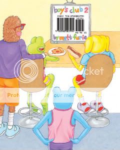
Comics Time: Boy’s Club 2
August 6, 2008Boy’s Club 2
Matt Furie, writer/artist
Buenaventura Press, July 2008
40 pages
$4.95
Buy it from Buenaventura at some point
Goddammit this is a funny comic book. In the time it took me to pick it up from one corner of Buenaventura Press’s table at the San Diego Comic-Con and walk it over to the end where I could pay for it, I honestly think I’d laughed out loud four times, and we’re talking maybe six feet total. As gleefully stupid as Bluto Blutarsky yelling “Food fight!” or Ogre Palowakski yelling “Nerds!” or Matthew McConaghey’s line in “Dazed & Confused” about high school girls, it’s a pitch-perfect encapsulation of college-age male idiocy. Furie’s quartet of monster dudes run roughshod over decorum like the Four Horseman of Rad Dumbness: Andy’s the prankster, Brett’s the dancin’ fool, Pepe’s the chowhound, and Landwolf’s the party animal. Into their mouths Furie stuffs the catchphrase detritus of a million public service campaigns, Oxy commercials, and NBC sitcoms: “Let’s do this,” “fierce,” “awkward,” “any questions?”, “that’s what I’m talkin’ about,” and my favorite one-two punch of the book, “and I care because?…” and “that would be a yes.” Gags about sharts, peeing with your pants pulled down, and crawling hungover into a shower with your socks still on are all too real, and really just funny as shit. I like it even better than the first issue. Everyone who ever laughed at a Judd Apatow or National Lampoon movie needs to be issued this comic in the mail, courtesy of Uncle Sam. It’s go time!
Comics Time: Love & Rockets: New Stories #1
August 4, 2008Love and Rockets: New Stories #1
Gilbert and Jaime Hernandez, writer/artists
Mario Hernandez, writer
Fantagraphics, July 2008
100 pages
$14.99
Buy it from Fantagraphics
Buy it from Amazon.com
This handsome new book-sized version of Los Bros’ hallowed series continues both Fantagraphics’ TPB hot streak – Mome and the Love & Rockets digests are also doozies of an argument for this format – and the Brothers’ almost absurd mastery of the art form.
Jaime’s contribution is your proverbial superhero epic, in which Maggie’s friend Angel joins forces with several different teams of female superheroes to help subdue Penny Century, who’s gone and pulled a Parallax (nerd points!) after her fulfilling her long-standing dream of gaining super-powers proves disastrous. It’s fun to see Jaime shift this seamlessly back into the sort of revisionist-genre storytelling he practiced in L&R‘s earliest issues. The trick to it is delivering everything you want in a superhero story – action, suspense, tight costumes – while maintaining his characters’ neuroses and having the events of the tale spring directly from them just like they would in a normal “Locas” story. Also, I don’t know if you’ve heard about this, but he’s pretty okay at drawing women, spotting blacks, and pacing panel transitions. I know, I hope you were sitting down.
For me, though, it’s Gilbert who’s killing the game here. Sandwiched between his brothers’ two superhero installments, Gilbert’s comics are mostly short, largely abstract, and completely devastating. Two subtly interlocking strips set in completely different milieux , “Papa” and “Victory Dance,” muse on love and restlessness, using disease and solitary travel to nail that feeling of wanting to drop it all and go somewhere, anywhere, as long as it’s somewhere else. Another strip flips this idea around, recasting Dean Martin and Jerry Lewis as jovial space barbarians who slaughter their way back together across a hostile world after their duo has been forcibly disbanded by aliens. Both “Victory Dance” and “?” showcase Beto’s skill at “choreographing” the images in each panel into a rhythm, the former literally through depiction of a dance, the latter with Woodring-esque surrealism. “Never Say Never” is also on the surreal side, invoking Freud and Dali with slightly blue gags about sex and money among funny animals. “Chiro El Indio,” written by Mario, reads like an out-of-continuity “Palomar” excerpt. “The Funny Papers” serves up three newspaper-size strips, any one of which would be the best strip I read all year. This is a guy who makes you want to push away from your table and give up.
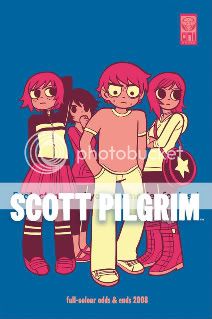
Comics Time: Scott Pilgrim Full-Colour Odds & Ends 2008
August 1, 2008Scott Pilgrim Full-Colour Odds & Ends 2008
Bryan Lee O’Malley, writer/artist
Oni, July 2008
32 pages
I forget what I paid for it
Buy it at the Oni Press table at a convention
There’s really no reason a Scott Pilgrim fan shouldn’t get this. Colorful, fun, and well designed, it’s like a Scott Pilgrim T-shirt in comic book form. It consists of various (mostly) color SP comics, pin-ups, promotional pieces, and assorted ephemera–a good place to track down things like the Free Comic Book Day prequel to Scott Pilgrim Gets It Together, that awesome Super Mario Bros. 3 ad pastiche, the Kim Pine comic strip, and (reproduced at too small a size for my pervy tastes, to be perfectly frank) sexy colored sketches of Ramona and Kim in their bathing suits. O’Malley’s snappy dialogue and “video-game realism” are as on as ever, his paint palette is surprisingly gentle rather than poppy, and you know what? I’ve heard enough people say that SP Vol. 1 isn’t the greatest introduction to the series (which has gotten funnier, more ambitious, more insightful, and more delightfully complicated as it’s gone on) that I wonder if this colorful, less expensive, more immediately appealing book isn’t a better one. I recommend someone give it a try.
Comics Time: Pixu I
July 30, 2008Pixu I
Gabriel Bá, Becky Cloonan, Vasilis Lolos, Fåbio Moon, writers/artists
self-published, July 2008
48 pages
$8
The second group effort from partners Becky Cloonan & Vasilis Lolos and brothers Fábio Moon and Gabriel Bá following their anthology with Rafael Grampa, 5, Pixu is more of a true collaboration. Though each artist is telling a separate story, they’re all telling interlocking horror stories about people living in an apartment house where, apparently, sinister forces are afoot. It’s kind of like Uzumaki with a scribble instead of a spiral, crossed with Four Rooms, only not crappy.
Good, in fact. While I think the inkier half of the group, Lolos and Cloonan, will ultimately produce more disconcerting images – Cloonan already served up shots of vomit, the eating of human hair, and a Stephen Gammell-esque screaming skull that have me on edge – all four seem on track to yield solid, creepy short horror stories, effective work in a genre Western comics touch all too infrequently and ineffectively.
Comics Time: Cold Heat Special #5
July 28, 2008Cold Heat Special #5
Frank Santoro and Ryan Cecil Smith, writers/artists
PictureBox Inc., 2008
20 pages
$8
As if in response to my questioning if there’s steak beneath Cold Heat‘s sizzle, along comes CHS #5, which reads like Cormac McCarthy’s The Road as filtered through Dave Kiersh’s after-school special aesthetic. Set after some unspecified “bomb” has made refugees of regular CH heroine Castle and her aging father, it concerns Castle’s search for food for her starving dad, and how far she and others are willing to go for it. The centerpiece sequences are harrowing depictions of the killing and attempted killing of dogs for sustenance; the horror and heartbreak of gaining an animal’s trust for the express purpose of betraying it, the core of all human carnivorousness, is laid bare in unflinching detail. As always when I come across depictions of animal cruelty in altcomix I have to wonder if the point is shock value or a genuine consideration of the issues at stake, but the mournful tone Smith lends to his figurework coupled with the comparatively simple and straightforward layouts provided by Santoro give me the sense that we may well be dealing with the latter rather than the former here. That’s kind of a hefty price point, though, so make sure you’re up for it.
Comics Time: Cold Heat Special #3
July 25, 2008Cold Heat Special #3
Frank Santoro & Dash Shaw, writers/artists
PictureBox Inc., 2008
16 pages
$3
I was an enthusiastic early supporter of Cold Heat–you may know me as the guy who wrote about it for Wizard, which is certainly how its creators know me. Perhaps it’s the associations raised by that experience that make me think there’s something fitting about co-creator Frank Santoro spinning off a Cold Heat-verse, complete with guest artists, kinda like what Mike Mignola is doing with Hellboy and the B.P.R.D. This particular one-shot guest stars rising star Dash Shaw, who seems to do handsomer work every time I look at a new thing from him. In this case, though, he surely owes a lot to the layouts provided by Frank Santoro, who makes excellent use of the pages’ landscape format by providing plenty of images that lend themselves to that type of framing–protagonist Castle sneering out a bus window at a cop passing by on horseback in the foreground, a cavalry of knights galloping through a forest or charging directly at the reader, Dark Knight Returns-style. For his part, Shaw draws faces like no one else in comics (as usual), effectively conveys the cacophony of mass-transit public address systems, and crafts an striking fold-out cover.
Until we see the conclusion of Cold Heat it’s difficult to tell whether this alt-genre romp will amount to more than the sum of its parts or less, and I could see that being a point in the minus column for potential buyers of such books as these, but for now I’m enjoying the ride.
Comics Time: Core of Caligula
July 23, 2008Core of Caligula
C.F., writer/artist
PictureBox Inc., June 2008
8 pages
$2
I gather this short but effective minicomic is compiled from even shorter minis, each of which contained one two-page chapter. Removed from their usual overt sci-fi/fantasy setting, C.F.’s slight line and dreamlike narrative can here be seen as either a straightforward story of a man adrift amid forces that seek to monitor, control, and disorient him, or the delusions of a mentally ill man who believes this to be true. It’s funny how simply removing the fancy costumes and creatures from a C.F. comic yields this subtle and troubling a (potential) depiction of schizophrenia, yet there you have it. The protagonist’s zoned-out facial expression, the graphic nudity, the temporal lacunae all yield the sense that there’s something a little terrible about what’s going on even though there’s nothing overtly so. I may like this better than Powr Mastrs, though it’s easy to see why even if blown up into that project’s size and scope it might not garner the same level of attention and acclaim.
Postscript: I’m going to choose to believe that the main character getting thrown from a helicopter naked and surviving is an Ultimates homage.
Comics Time: Ganges #2
July 21, 2008Ganges #2
Kevin Huizenga, writer/artist
Fantagraphics/Coconino, 2008
32 pages
$7.95
I seem to remember not being as impressed by Ganges #1 as everyone else was. Mostly this was because I really, really, really loved Huizenga’s other ongoing (?) series Or Else, and thought the best material there set a standard for depicting transcendent moments in everyday life that this new stuff, keenly observed and gutsily drawn though it was, failed to live up to. No such quibbles about Ganges #2. Huizenga makes it look easy in this tale of dot-com-boom-era follies. Along with “Jeepers Jacobs” it’s one of his most straightforward stories, yet it still employs the techniques of elision and conflation that make his more abstract stuff so powerful.
It actually does start out abstract, with a pair of dueling creatures (boasting almost Marc Bell-ish designs) expanding and colliding in baroquely geometrical ways. No sooner do you realize that their conflict is working almost like a video game would, complete with life meters at the bottom of each image, than you discover it is a video game being played by Huizenga’s everyman Glenn Ganges. This sets him off in a reverie about his old job at an overcapitalized dot-com start-up, one where his actual job consists almost solely of utterly meaningless business jargon and a set of company goals so nebulous as to be nonexistent, but where his co-workers’ marathon after-hours first person shooter sessions provide both their most genuine and heartfelt human interaction and, as the company’s spirit heads south with its finances, becomes almost a point of pride.
Kind of like those rare movie comedies that are actually shot well in addition to being funny–your Annie Halls and your Big Lebowskis–what you’re getting here is something that didn’t need to be as beautifully done as it ended up. So while you’re enjoying the astute Office Space-style corporate-culture takedown, you’re also noticing Huizenga’s choice to only ever show Glenn’s wife Wendy, who was largely ignored by Glenn during his time with the company, facing away from us. Or you’re seeing how Glenn and his white-collar information-industries coworkers’ subtle idealization and thus dehumanization of the company’s long-time pink-collar secretary, Fritz, is conveyed simply by giving her the broadest caricature in the book. Or you’re realizing the extra effort Huizenga put into really capturing the appeal of the video games Glenn plays–the beauty and specificity of the environments in the ostensibly stupid shoot-’em-up, say (one is a perpetual winter morning in a mountain monastery), or the crazy dream logic of the all-ages video game he used to be into, which is described in this brilliantly dead-on passage:
He had always preferred games like, say “Yipper Yap World,” controlling science adventurer Grandma Lagrand as she gathers Fruitclumpz in Death Forest (you need the monkey rocket suit), avoiding the roller skating spiders (by double rocket jumping) in order to throw the fruit at a giant caterpillar who had spun a coccoon in the only satellite dish on the Island of Special Thanks, which had messed up cable TV for the native tribe of Rasta-Ostriches, in exchange for which they give you the moon salsa you need to bribe the Volcano Witch Triplets.”
Maybe Huizenga overwrites the ending, where Glenn and his coworkers all assign their in-game avatars the handle of a fired colleague. I’m trying to figure out if there’s a way to have shown that without explaining it. Maybe there’s not. Maybe it’s better with the captions to explain it and thus take the air out of the moment a bit, lest it get too grandiose. However transcendent that moment might have been for the players, there were still pink slips with each of their names on them waiting in the wings. They could be heroes, but just for one game.
Comics Time: Legion of Super-Heroes: The Great Darkness Saga
July 18, 2008Legion of Super-Heroes: The Great Darkness Saga
Paul Levitz, writer
Keith Giffen, Larry Mahlstedt, Richard Bruning, artists
DC Comics, 1991
192 pages
$17.95
Buy it used for an exorbitant amount via Amazon.com
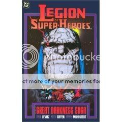
I don’t know how much you’d get out of this book if you weren’t already a superhero comics devotee. It doesn’t have the revisionist sophistication of Alan Moore or Frank Miller, the high-level craft of the modern-day big-name creators whose work you see praised on blogs like this, the easily recognizable wild imagination of Lee/Kirby/Ditko or even Claremont/Byrne. But for someone like me, who can derive pleasure from variations on familiar themes, this was an engaging read and, I’m betting, a pretty important touchstone for today’s superhero mainstream.
Though the cover gives the game away, what’s interesting about this story is that while it relies on the now-traditional–indeed, almost de rigeur these days–“mystery villain” device whereby our heroes are plagued by sinister, shadowy forces whose true nature and intent are learned only after extensive confrontations with his minions and much fretting and wild-goose-chasing by the heroes (and, just as importantly, the readers), this mystery villain doesn’t just lurk in the background, popping up in a panel or two every other issue to remind us that he exists before he finally reveals himself. Instead, he’s the good guys’ main antagonist throughout–his presence is constantly touted by his minions, he directly addressing both them and our heroes, he even physically confronts them from time to time, all while his identity remains hidden from heroes and readers alike. This strikes me as a far more daring narrative strategy than that used in such ’00s-era arcs as Kevin Smith’s Daredevil: Guardian Devil, Jeph Loeb’s Batman: Hush, Grant Morrison’s New X-Men, Brad Meltzer’s Justice League of America and so on: It practically dares the reader to figure it out, get tired of it, or call bullshit, hoping that if it calls their bluff and they stay involved, they’ll be even more excited by the eventual reveal than if it was just a tease here and there. (In terms of current comics it seems like Morrison’s ongoing Black Glove storyline in Batman comes closest.)
I don’t know enough about the historical circumstances regarding the status of Jack Kirby’s Fourth World New Gods within DC fandom at the time these issues were originally published to know if the identity of the villain was as obvious to readers then as it is to readers in this Kirby-worshipping, Final Crisis-reading era. For me it would have all clicked when that “servant of darkness” who rides that recognizably weird little pipe-lattice started talking about the Astro-Force and getting called “my son” by his master. But I enjoyed the mystery element even so as I was slowly shown exactly how Darkseid was putting his plot into action because, in a fashion reminiscent to me of how Geoff Johns has been working with the Green Lantern franchise, Levitz cleverly drew strength for the arc from a hodgepodge of DCU components. What kind of villain has the power to create evil clones of Superman and a Guardian of the Universe, then brainwash the Krypton-like planet of Daxam into a genocidal army of 3 billion Supermen? When you hear a question like that, you either give a shit about the answer or you don’t. I did.
Meanwhile, the book did a solid job of conveying the appeal of the Legion concept, which had been largely elusive to me up until now: It’s its own superhero universe within the larger DCU. Besides the fact that there are, like, forty thousand Legionnaires, each with their own cute code name and baroque power, they live in an era and environment connected enough to the things we recognize from more popular DC franchises to be familiar, yet it has the freedom to take them in weird new directions. (I suppose having a heroic Brainiac with a crush on Supergirl is the most fundamental example of that.) It’s kind of like the way Star Trek: The Next Generation opened up, expanded, and riffed on the original series in the service of a different aesthetic. Moreover, as a friend of mine recently pointed out to me, the team is so big and so stuffed with conflicting personalities that writers need not indulge in either the hoary old “team of best friends” or “reluctant team that comes together in the clutch” cliches–I’m pretty sure some of these people never even set foot in the same room or exchange a single word, and there are obvious cliques and couples and enemies and exes and so on, yet in the end the all kind of do their thing and get the job done, like a particularly big extracurricular activity in high school–the glee club, say. And that’s appropriate enough considering that they all seem to be about college-age by this point in the series. Finally, there are just so goddamn many Legionnaires that figuring out who’s who and starting to recognize and appreciate their names, costumes, powers and so on feels like an achievement, god help me.
Now, is this a great comic book? No. It’s too rooted in house-style artistic aesthetics, expository dialogue, self-referential continuity, corny jokes, and everything else you’d expect from a basic superhero comic of the early ’80s. As in so many comics of the period I have to wonder if the creators ever listened to human speech. But it’s an effective comic of its type, at times quite so–you’ve got to imagine that there’s an endless ocean of inferior junk above which this floats. It certainly goes to great pains to convey the menace of one of Jack Kirby’s great creations as well as any other comic I’ve read. On a personal note, as a superhero fan, I wish today’s writers and editors would display similar care when dealing with the real cream of the villain crop, from Darkseid himself to Lex Luthor and the Joker to Doctor Doom and Magneto and Galactus and the Green Goblin–like, oh crap, when that dude shows up, we’re in trouble. We nerds would be better off for it.
Comics Time: Wormdye
July 16, 2008Wormdye
Eamon Espey, writer/artist
Secret Acres, June 2008
128 pages
$13
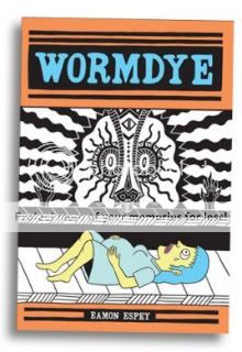
Starting your comic by cooking a live cat in a microwave is a pretty good way to make me say “fuck you, I’m not reading your stupid fucking comic.” I don’t think it’s funny, I don’t think it’s provocative, I don’t think it’s daring, I don’t think it says anything about humankind’s endless reservoir of unthinking cruelty to animals that I haven’t already heard. Mostly it makes me think of the guy on MSNBC’s Lockup who bragged about cooking his murder victim’s cat in the microwave because he didn’t like that it was nibbling on the corpse, or how my high-school biology teacher used to brag about catching stray cats, sticking them in burlap bags, lighting the bags on fire and throwing them off rooftops, and any number of other real, live human beings who think torturing cats to death is really no more unacceptable a misdemeanor than keying someone’s car. I hate them.
I also realize that this is my kryptonite as a critic. Sure, cruelty to animals is an unbelievably easy way to shock–“any idiot can get sympathy from an audience,” George Lucas was once known to say, “just grab a kitten and wring its neck”–and I’d very much like to see cartoonists who deal in the rough stuff try harder, but there’s beyond that there’s probably no principled objection I could make here that I wouldn’t also have to apply to depictions of humankind’s endless reservoir of unthinking cruelty to humans as well. I’m certainly not going to argue that we have to stop doing this because people might imitate it, because those sorts of people are going to be sociopathic monsters anyway and we can’t live our lives that way. I’m simply a vegetarian cat owner who stopped eating meat on cruelty grounds and gets very, very upset about glib depictions of animal cruelty. And I do think it’s pretty glib here, simply playing into the dead-baby joke punchline that closes the opening chapter of Espey’s loosely connected collection of nightmarish short stories and Bosch-like diptychs.
But the book does get better from there, smarter, sharper, more intelligently savage. Espey’s vocabulary as a cartoonist is indeed that one-two punch of cruelty to children and animals coupled with sexualized violence that we’ve seen from Josh Simmons, and to a certain extent Hans Rickheit or even Al Columbia at times. As with Simmons and Rickheit, Espey’s line is a thick thing, deliberately ugly, all hyperthyroidal eyes and short, squat, grotesque figures, occasionally flourishing into what can only be described as bad-acid-trip vistas of depravity. He broadly lampoons every sacred cow in the herd–the Pope, the family farm, childhood, science. He undermines collective-unconscious root storytelling–fairy tales, mythology, primitive religion. to quote The Exorcist, he wants us to see ourselves as animal and ugly, shitting, killing, fucking, torturing, raping, lying, screaming, crying, cowering. His work is effective. Whether it’s an effect you care to experience is perhaps another question.
Comics Time: Mome Vol. 11: Summer 2008
July 14, 2008Mome Vol. 11: Summer 2008
Kurt Wolfgang, Al Columbia, Killoffer, Nate Neal, Ray Fenwick, Eleanor Davis, Dash Shaw, John Hankiewicz, Emile Bravo, Andrice Arp
Conor O’Keefe, Tom Kaczynski, Paul Hornschemeier, writers/artists
Eric Reynolds and Gary Groth, editors
Fantagraphics, March 2008
120 pages
$14.99
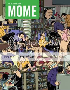
I’ve said it before and I’ll say it again: Mome is a heckuva value on the dollar for fans of alternative comics. Itss range of style, tone, and (yes) quality simply give you a lot to chew on. In this particular volume, for example, some contributors hand in their best stuff yet. Al Columbia essentially creates my ideal horror comic (as my past stabs at the stuff would probably indicate) with the possibly BTK-inspired silent story “5:45 A.M.” Tom Kaczynski produces the knockout he’s clearly had in him for some time with “Million Year Boom,” another one of his psychoeconomic fables, one where his trademark mounting sense of disconnection and dread wind their way through several symbolically engrossing episodes (a beautiful mystery woman, strange stone circles, phantom poopers) toward a legitimately surprising and powerful conclusion. Eleanor Davis metonymizes last-minute life-saving action in a series of still panels soaked in loose watercolor in “The 10,000 Rescues.” Dash Shaw combines his love of science fiction and clever use of color with his art school background to uncomfortable effect in “The Galactic Panels,” a story an artist and his acolyte that demonstrates an astute understanding of how to manipulate time within a story. Paul Hornschemeier’s wordy short prose story “The Guest Speaker” nearly garnered a “tl;dr” from me, but after I bit the bullet I was impressed by the Vonnegutian address he grants the title character and the overall tone of jealous resentment and loss we feel regarding our college-aged selves. (At least I do. Don’t you?) And of course, cover artist Killoffer does his thing with alarming alacrity; it might be nice to see something that doesn’t involve a million Killoffer doppelgangers get translated, if such a thing exists, but I’ll take it.
Yet at the same time a few contributors explore blind alleys. Emile Bravo does another pictogram-heavy political-commentary strip, and at this point I’m kinda like yeah, okay, this is what you do. Newcomer Nate Neal and regular Ray Fenwick do the umpteenth “they’re cute and vulgar, yuk yuk yuk” underground-indebted comics you’ve seen. Neal’s chops are there and his color palette is ambitious but the parts never feel like a whole. I preferred the work of the other new additon, Conor O’Keefe, whose wispy line is reminiscent of Winsor McKay had he exchanged manic whimsy for melancholy, though the dialogue feels forced. I’m a little concerned that the book’s gestalt comes off a little undercooked, but I’ll be back for Vol. 12, duh.
Comics Time: Water Baby
July 11, 2008Water Baby
Ross Campbell, writer/artist
DC/Minx, July 2008
176 pages
$9.99
Ross Campbell is the cartoonist laureate of skanks. For real, when one of the characters in his latest saga of kinda hot, kinda sexy, kinda goth, kinda punk, kinda slow, kinda gross young people uses that term to refer to another, it was a real eureka moment for me. At last, the proper term to describe these beautiful, languid losers! Campbell doesn’t judge them for it, neither do I and neither should you.
The central skank (you’re unlikely to hear her referred to as such in the marketing materials!) here is Brody, a surfer girl whose leg is bitten off in a shark attack. Plagued by recurring nightmares in which shark-creatures consume her, she spends a lazy summer with her best friend and her slutty ex-boyfriend, until she gets fed up enough with the latter to drive him from her Florida home back to his mom’s place in upstate New York. Along the way they pick up a sexy-‘rexy hitchhiker girl and eventually receive a good-samaritan ride from Mario Van Peebles (not kidding)…and that’s basically it. For what it’s worth, the only real difference in tone or style between this project for mighty DC’s young-adult-female imprint Minx and Campbell’s indie series Wet Moon and Tokyopop zombie OEL The Abandoned, both of which are very good, is a lack of bare nipples, as far as I can remember. (BTW the horror material here, as in The Abandoned, is very gory and very effective.)
Mostly, what I take away is a sort of dazed awe over what a demimonde it is that Campbell has chosen to chronicle and the way he’s chosen to chronicle it. From the dawn of my self-identification with fringe culture, I’ve never had what it takes, be it gumption or a near-total lack thereof, to simply drift–to go for weeks without showering, to not for a second worry whether my rattiest most offensive t-shirt is appropriate grocery store attire, to wake up in a vomit-soaked apartment and immediately go on an overnight road trip with no planning and without telling anyone, simply coasting on the waves provided by sketchy friends, horror films, metal, lust, and junk food. That Campbell lets his characters go there is impressive to me. That he does so in such an almost anti-plot fashion–no multi-act structures, no real character arcs, no big climaxes–is the kind of thing that no one would pay any mind to were his art style more firmly in the altcomix tradition as we know it, but drawing in a beautiful, mainstream-accessible, hotsy-totsy style as he does, with each character drawn for maximum realistic sexiness and trashiness, it’s almost a revelation. Like, people really live this way. I really liked living with them.
Comics Time: Neverland
July 9, 2008Neverland
Dave Kiersh, writer/artist
Bodega, 2008
32 pages
$6
Dave Kiersh’s visual representation of our mutual home-area/zeitgeist of Long Island doesn’t match up with my experience of it. He puts together vistas of water towers, telephone poles, stores, and parking lots in an almost map-like fashion, giving the suburbs a depth and dimensionality that I’ve never really felt from them. I see Long Island as flat sets, buildings and houses glimpsed while passing them horizontally in innumerable car rides and Long Island Rail Road commutes. I certainly don’t see the swirling repleteness that Kiersh conveys with his increasingly accomplished linework.
Yet it all still feels true, somehow. His observations of teenage and immediately post-teenage life on Long Island are spot on: convenience stores and driving, “the video store is my culture–Saturday nights in front of the TV,” walking through a parking lot at night and remembering girls you hooked up with. The main theme of Neverland–split up the compound word, as the cover design does, and you’ll see where he’s going–is not the romantic escape from this sensual boredom he yearns for in sexualized Peter Pan fantasies and idealized relationships, but that yearning itself, that desire itself, inextricable as it is from staying right where you are and not actually escaping. A coda likening any future success he and his beloved might have to a forgotten tourist attraction I myself patronized as a little boy adds a further complication of comfort in futility. This is a sophisticated comic that nearly tricks you into thinking it’s twee and easy, which is no mean feat.
Comics time: Batman: The Story of the Dark Knight
July 7, 2008Batman: The Story of the Dark Knight
Ralph Cosentino, writer/artist
Viking, 2008
32 pages, hardcover
$15.99
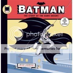
I stumbled across this book purely by accident at my day job, and golly am I glad I did. A for-kids distillation of the sort of ur-Batman mythos–the basic origin, accoutrements, methods, villains and such that everyone recognizes–it boasts sumptuous art from Cosentino that comes off like a cross between the Bruce Timm animated look and high-end commercial illustration. I pretty much love his version of every character he draws–Thomas and Martha Wayne never looked like a better mommy and daddy, just for example, while Batman is square-jawed to the point of iconography rather than portraiture. It’s basically the most sophisticated art you’ll ever see in a potentially throwaway licensed book for ages eight and under. Like Tim Burton’s first Batman film or The Animated Series, the book’s a grab bag drawn from any and all of Batman’s appearances: ’40s-style crooks in fedoras, very very old-school-looking Joker and Catwoman, DeVito-inflected Penguin, non-1966-TV-series baddie Two-Face, a cameo from Killer Croc at his most reptilian, those preserved suits of armor from the Burton Batman‘s Wayne Manor–anything that works and creates a kid-friendly portrait of a guy who works really hard to stop crime by scaring and/or beating the stuffing out of bad guys. Its unusual and notable emphasis on young Bruce Wayne’s years of physical and mental study even impart a valuable lesson about hard work, not to mention not being afraid to pursue your really weird dreams. It’s great. I’m gonna give it to my nephew.
Comics Time: Pizzeria Kamikaze
July 4, 2008Pizzeria Kamikaze
Etgar Keret, writer
Asaf Hanuka, artist
Alternative Comics, 2006
100 pages
$14.95
Now this is kind of weird–here’s a comic I appreciate almost purely on a plot level. Adapted from the short prose story of the same name by Keret, Pizzeria Kamikaze is hamstrung by its bland, depthless characters, the sort of twentysomethings cartoonists use to show how boring and purposeless life is for twentysomethings. The flickers of difference that some of them display frequently just flicker out due to storytelling inconsistency–asshole party-boy Uzi’s sweet fondness for his family, for example, is demonstrated through repeated calls to them during his and main character Mordy’s road trip, until at a later point he apparently forgets about them entirely. Meanwhile, Hanuka’s silvertoned black and white art is easy enough on the eyes but more functional than anything else. And in terms of the high concept–the afterlife for suicides is pretty much like the regular world, except maybe even more aimless and dull–certain aspects took me out of the story as much as pulled me in. (If everyone bears the marks of their method of self-destruction, shouldn’t the suicide bombers be a lot more fucked up? Shouldn’t Uzi’s musician friend Kurt have a giant fucking shotgun hole in his head?) If there’s some sort of “inner meaning or ‘message,'” to quote Tolkien, it’s not a particularly powerful one. (Life can devolve into rote and routine, didn’t you know? Young men can invest all sorts of their own issues into an idealized female who inevitably fails to warrant such objectifying devotion, also.)
But the book’s relentlessly deadpan tone pays off when the story takes a turn into left field during the final act. Within fairly short order the main character relationships are upended (mostly in amusingly vicious ways) and the world-building expands in an unexpected and refreshingly sudden fashion. What seemed like an exercise in seen-it-all-before ennui suddenly perks up, plotwise, and in the process becomes a more judgmental and therefore more punchy (and more entertaining) little tale. It’s still on the slight side–it really does feel more like a short story than a graphic novel–but that ending is a hoot.
Comics Time: Bacter-Area
July 2, 2008
Bacter-Area
Keith Jones, writer/artist
Drawn & Quarterly, 2005
80 pages
$9.95
Mostly a small art book (part of D&Q’s series of such, called Pétits Livres) than a comic, Bacter-Area spotlights Keith Jones’s brightly colored, perspectivally flattened, manically busy drawings and sculpture. Spiritually it’s akin to things you’ve seen from Elvis Studio and Marc Bell–little Where’s Waldo-style depictions of town squares filled with non-sequitur billboards and weird looking monster-people and lots and lots of lines, a satire on the riot of visual information inherent in the modern urban landscape, that kinda thing. Jones’s personal spin involves lots of tubular birdies, people shooting solid beams out of their eyes at other people, the occasional Guernica allusion, rubbery macaroni-like arms, and sometimes bands of shrouded faceless Brinkman-esque figures. With the possible exception of one imposing, almost Pentacostal portrait of a group of that last element, it doesn’t hold together or add up to anything for me. The strung-together over-formal corporate nonsense he uses for dialogue is meaningless without being particularly meaningful about it, the color choice is bold but not particularly pleasant or powerful (a lot of Lee Loughridge-y greens), the character designs seem undercooked, and the big riot-of-detail vistas don’t really have any “ins” for the eye. Ah well, I suppose at some point it was inevitable that even someone with my limited exposure to this sort of work would come across some that was less than impressive to me.
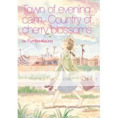
Comics Time: Town of Evening Calm, Country of Cherry Blossoms
June 30, 2008Town of Evening Calm, Country of Cherry Blossoms
Fumiyo Kouno, writer/artist
Last Gasp, 2006
104 pages
$9.99
Town of Evening Calm, Country of Cherry Blossoms is an exercise in addressing a bottomlessly complicated subject in a breezily simple fashion. That complicated subject is the atomic bombing of Hiroshima, and its lingering physical, psychological, and sociocultural side-effects on residents of the town and their families. That simple fashion is Kouno’s writing, which sort of brushes against the topic like a breeze while telling stories of romance, friendship, and family, only to occasionally slam into it with gale-force intensity; and Kouno’s art, the pictorial equivalent of young-adult prose, warm and just so. (And it takes some kind of mental masterstroke to make your characters look like Peanuts when you superdeform them.)
As such it’s perhaps fitting that simple things keep the book from really doing all it might otherwise be capable of doing. For one thing, in both of the stories (one set in the ’50s, the other in the ’80s and ’00s) the main characters simply look like little kids even when they’re supposed to be in their 20s. Since so much of the plot is driven by looking into the past and contrasting children with adults, it’s becomes a major obstacle to understanding just what’s going on–particularly in the second story, which was already too loosely constructed by half. Another flaw, and this is maybe nitpicky, is the typeface used for translated Japanese text. Comic Sans? The cover is lovely so I know someone at Last Gasp makes good design decisions, but that wasn’t one of them, and it knocks me out of the story whenever it shows up.
But those complex moments…they hit hard. The first story, “Town of Evening Calm,” could with minimal tweaking become a first-rate horror story, so powerful is the way its sense of impending, at-any-moment suffering and death sneaks up on the reader. Two moments in particular–I don’t want to spoil them–practically reach out of the book and punch you in the face, a testament as much to Kunuo’s pacing as to the horror of the topic itself. The second, two-part story, “Country of Cherry Blossoms,” relies more heavily on knowledge of the stigma victims of the Bomb (and even their descendants) face in Japan for its power, knowledge I didn’t really have, sad to say; but the way it develops the ticking-time-bomb themes established in “Town” creates a satisfying sense of connectedness that the two otherwise unrelated stories lack. The flaws irk, the strengths stick.

