Posts Tagged ‘Comics Time’
Comics Time: The Umbrella Academy: Apocalypse Suite
July 22, 2009The Umbrella Academy: Apocalypse Suite
Gerard Way, writer
Gabriel Ba, artist
Dark Horse, 2008
184 pages
$17.95
When you think of how many indie superhero titles are abject failures of imagination and innovation, The Umbrella Academy becomes all the more impressive. I’d imagine that as with most creator-owned superbooks it’s the product of a life-long love of Marvel and DC (and by now, ’90s Image). But most creators who are thusly smitten wind up barfing out some dishwater-dull origin story involving types rather than characters and fixated on producing iconic moments for copies of copies of copies of icons. Writer Gerard Way, who as the lead singer of My Chemical Romance can’t even claim that doing comics is all he’s ever wanted to do creatively, is beating such people at their own game. He’s produced a weird, sad comic about superheroes, with sophisticated pacing that trusts in the intelligence of the reader rather than insisting on serving them nothing but what they’ve already seen. Essentially, the seven members of the Umbrella Academy are to their adoptive father Hargreeves what Michael, Janet et al were to Joe Jackson, with similarly dispiriting results in terms of the disconnect between talent, even talent used optimally, and happiness. There’s no happy ending for them, either. It’s superheroing with sharp edges.
He’s done this with the help of Gabriel Ba, whose work here reads like a cross between Mike Mignola (perhaps enhanced by the presence of Mignola’s longtime go-to colorist Dave Stewart) and The Incredibles. He’s produced solid character designs (based on concept sketches by SVA grad Way) that transition well between superhero and soap opera, he frequently draws his panels utilizing zesty, infrequently used angles, and his action is coherent and dynamic. For his part, Stewart is brilliant as always, throwing huge splashes of eye-melting colors (oranges, pinks) into the mix in a way that’s both exciting and slightly alienating–much like the comic itself.
Now, to be sure, the characters themselves are more sketched than fully rendered at this point. And I’ve heard criticism that the thing reads like a Grant Morrison Doom Patrol tribute album, though not having read much early Morrison I can’t comment on that. But from where I’m standing this thoughtful, engaging work all around.
Comics Time: Never Learn Anything from History
July 20, 2009
Never Learn Anything from History
Kate Beaton, writer/artist
self-published, June 2009
68 pages
$18
Read some strips at Kate Beaton’s site
Like Ditko Hands or Kirby Krackle, Kate Beaton Eyes are a signature achievement in cartooning. They widen, they narrow, they leer, they roll, and (god bless Tyra Banks for introducing this concept to the world) they even smile. If it’s possible to make eye contact with a comic, Beaton’s comics are prime candidates–you lock eyes with them and you’re instantly drawn in. If eyes are the window to the soul, then Beaton’s comics, like James Brown, have soul to burn.
Once you’re finished saying jeepers creepers over those peepers, the rest of her cartooning’s elegant gestalt has a chance to make an impression on you. Beaton’s line is loose, even rough at times, yet sinuous and whole–it’s like cursive handwriting. It feels both sketchy and deliberately fancy, really a perfect complement to her subject matter, which more often than not plays history’s great men and women (and the women and men in their lives) for laughs by feeding them through a precocious 14-year-old’s priorities, sense of humor, and keen observation of adult absurdities–the kinds of gags you might find passed back and forth in notes between smart kids during third period history. Fans of Shakesperean actor (and brother of Abraham Lincoln’s assassin) Edwin Booth shriek and moan during Hamlet’s soliloquy like Twilight fans over Robert Pattinson taking his shirt off. Lord Byron is a slut. President James Monroe drops the Constitution, then bends over to pick it up, in order to show off his ass to an appreciative young lady. Rebels, revolutionaries, and rabblerousers from Robespierre to Louis Riel to Tadeusz Kosciuszko to Patrick Pearse to George Washington come across like the kind of bumbling heroes or simpering villains you’d find in a kid’s action-comedy superhero cartoon. She has a real knack for their body language, too, as they proclaim and lounge and get shot in the face by arrows and come onto each other and so forth–their movements and poses are nearly as distinctive as their eyes. (Her self-caricature is a real peach, too.) Meanwhile there’s something about Beaton’s dialogue delivery that really suits the Internet–the strips sort of slowly wind their way up to the joke, at which point lots of punchlines seem banged out in all caps with no punctuation by hysterical messageboard people who are all too aware of their own hysteria, if you follow me.
Not every joke is a winner, and even many of the best gags don’t really make you laugh out loud–I was already familiar with some of these strips from Beaton’s website, so I think that during this read-through, the only bit that made me LOL was this hilarious drawing of a drunken Santa Claus. And I have to assume that the Pythonesque history-major humor is an acquired taste. (I remember when I was a kid and first discovered Monty Python that I assumed all adults knew the ins and outs of the history of philosophy and made jokes about Kant all the time–this was the humor I pictured existing somewhere out of reach.) Some of the slowly accruing jokes never quite seem to accrue. But the gestalt is so good-natured that you don’t even mind the bits that are just semi-funny, and the cartooning is an absolute pleasure. Soak in it.
Comics Time: The Lagoon
July 17, 2009The Lagoon
Lilli Carre, writer/artist
Fantagraphics, 2008
pages
$14.99
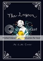
I’m grateful for books like The Lagoon, where things happen without neat resonances with other things that happened, where you can’t always locate the part within the whole. The Lagoon is a horror story, if a low-key one; like much of the best horror it makes the connection between horror and the absurd. Whether you’re talking about a giant gorilla climbing the Empire State Building or a puzzle box that unleashes S&M demons, horror’s iconic images frequently boast a lack of inherent logic that rivals that of video games. Carre gently (and I do mean gently–don’t expect the surrealist nightmares of Tom Neely or Josh Simmons here) applies this throughout her story. The characters don’t appear to know where the creature who lurks in the titular waters came from or why it does the weird thing it does, and neither do we. Nor are we presented enough information to determine the true nature of the creature’s relationship with one member of the family at the center of the story. The context provided points to something illicit, but perhaps that’s just the lingering effect of the story’s eroticized, somnambulist qualities–so much takes place at night, in bedrooms, in still waters, against thick and sticky blacks…and heck, one character is an actual somnambulist. And finally, the story’s coda (more like its final third) doesn’t appear to directly address the preceding events in the way we’d expect. Carre’s sinuous, snaking treatment of sound provides a through-line; there are windows that get opened and shut and lied about; the characters are of course the same; but it still feels disconnected in ways that few writers today are gutsy enough to attempt. The overall effect is like Clive Barker fed through a twee filter. This’ll stick to you.
Comics Time: Wednesday Comics #1
July 15, 2009Wednesday Comics #1
Brian Azzarello, Eduardo Risso, Dave Gibbons, Ryan Sook, John Arcudi, Lee Bermejo, Dave Bullock, Vinton Heuck, Kurt Busiek, Joe Quinones, Neil Gaiman, Mike Allred, Eddie Berganza, Sean Galloway, Paul Pope, Jimmy Palmiotti, Amanda Conner, Dan DiDio, Jose Luis Garcia-Lopez, Kevin Nowlan, Ben Caldwell, Adam Kubert, Joe Kubert, Karl Kerschl, Brendan Fletcher, Walt Simonson, Brian Stelfreeze, Kyle Baker, writers/artists
DC, July 2009
16 pages
$3.99
No sense beating around the bush: I don’t like newsprint. It’s flimsy and icky and doesn’t look nice. It doesn’t hold color well. You get a big fold-out broadsheet made of newsprint like this thing and fold and unfold it a couple of times and it becomes more messed-up and harder to do anything with each time. I don’t like it when newspapers use it, I don’t like it when PictureBox uses it, I don’t like it when Paper Rodeo uses it, I didn’t like it when that Comic Shop News thing they’d stick in the bag with your weekly pull list used it (they still around?). To paraphrase James Murphy, I don’t get the borrowed nostalgia for the unremembered ’30s. I don’t like paying $3.99 for a comic that self-consciously evokes its own disposability with the stuff it’s printed on, either. (Hell, I don’t like paying for a single issue of anything.) Basically this project is designed, aesthetically, to press a lot of buttons I don’t have.
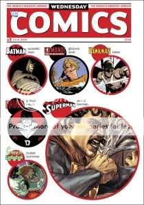
That said, Wednesday Comics #1 works perfectly well as a sort of My First Kramers, an astutely curated experiment in what happens when you tell a bunch of auteurs to do they thing on a gigantic canvas. As with Kramers Ergot 7, you get a few different approaches to how to use all that space. Some of the creative teams, most notably the father-son team of Joe and Adam Kubert, just blow up a regular grid, resulting in an eye-arresting sequence of Nazis playing the captured Sgt. Rock a chin-music symphony and giving you that “Lily Tomlin holding a giant book” sense of the object’s sheer size. Others cram the page with extra information: Ben Caldwell’s Wonder Woman strip, a far less nostalgia-inclined affair than most in the book, is riddled with tiny panels and minute twists and turns, while Karl Kerschl and Ben Fletcher’s Flash effort takes a cue from the likes of Dan Clowes and tells its story through a pair of self-contained but interconnected funnies-style strips. Other creators tip their hats to the newspaper strips of yore as well: Dave Gibbons and Ryan Sook’s Kamandi story is done Prince Valiant-style, while Paul Pope’s Adam Strange effort is a less direct but still recognizable homage to classic adventure strips and sci-fi pulps. Even the modern era earns some tips of the hat: Kurt Busiek and Joe Quinones’s Green Lantern strip references Darwyn Cooke’s New Frontier in era, tone, look, and even a mention of its title, while the awe-inspiring naturalist Kyle Baker Hawkman art that took the internet by storm is employed in the service of a disappointingly direct and unfunny 300 parody. (He’s riffing on that long opening sequence from the comic version–“We march.”–that Zack Snyder didn’t use in the movie, so maybe people will miss it. I’m kind of jealous of those people.)
When you print comics this big you have a lot of space to fill, which draws your attention to coloring even more than normal, and in this case that can be a blessing and a curse. Trish Mulvihill escapes the dreaded Vertigo Brown with some lovely golden hues in the Brian Azzarello/Eduardo Risso Batman piece that opens the issue, Ryan Sook provides some interesting purple-orange sunset scenes for his Kamandi strip, Joe Kubert’s palette on the Sgt. Rock piece is refreshingly and effectively subdued, and Jose Villarubia’s gray skintone for Adam Strange meshes with his purple jumpsuit and bright blue enemies for an effect that looks appropriately aged and weathered. But I think in most other cases, the paper stock betrays the color work. You can practically feel Amanda Conner’s Supergirl wanting to be a bright red, blue, and blonde, Laura Allred’s normally radiant work looks in her husband Mike’s Metamorpho strip like you’re looking at it through sunglasses, Sean Galloway’s Teen Titans art is dialed way down (those graytone or nonexistent backgrounds don’t help)…even the great Dave Stewart is undone with colors for Dave Bullock and Vinton Heuck’s Deadman strip that just don’t quite click.
As for the stories themselves, who can judge at this early stage? I suspect that for the most part, how you react to these meager one-page morsels at this stage in the game depends on your preexisting feelings about the characters and the contributors. (Spoiler alert–I’m excited about the Paul Pope strip!) I think Ben Caldwell’s Wonder Woman strip, which is so different both visually and narratively from what you’re used to seeing from DC with regards to this character–and from everything else in the comic–is the one that’s most likely to surprise in the long run, though for good or ill I don’t know. Also, clever of John Arcudi to open his Superman strip with Supes flying backwards at the audience, no? I do think it’s rather delightful that DC, or at least series editor Mark Chiarello, turned to a bunch of talented creators and told them to write about their respective characters in whichever way they chose rather than hewing to on-model continuity or overall vibe. (Hey, remember when Marvel did that more or less line-wide in 2000-2001 or so?) Of course, the thing about these kinds of non-continuity short-story “tone poems” in honor of this or that superhero character is that it’s hard to get them to stick, and harder still to get a sense of what you’ll get out of them in the end, other than “Hey, Metamorpho’s neat” or whatever.
That, I suppose, is the problem. Four bucks for 15 one-page slivers of story, 12 weeks in a row, is an awful big investment for an uncertain return. (And I’m already let down something awful by the Baker Hawkman thing.) This is why I think it’s fair to spend so much time kvetching about the paper stock, because Wednesday Comics isn’t a series, not really–it’s an object. The size, the format, and most especially the newsprint were selected to stand out, to impress the physicality of the object upon you. Seeing the burst of publicity for the book last week made it clear that this was a smart choice in some ways: Tying a high-profile comic book launch in this day and age to a way of doing comics that’s almost completely outmoded, with bonus points for resonating with the overall death of newspapers, was bound to attract the attention. Meanwhile, within the world of comics, this is the sort of project, and the sort of talent line-up, that’s bound to win plaudits from bloggers and award committees–if this thing doesn’t clean up at next year’s Eisner’s I’ll eat my hat. The point of Wednesday Comics is for you to note how different, how unique, how special it is. Which is well and good, but it’s all undercut if you just don’t like newsprint, you know?
Comics Time: Doom Force #1
July 13, 2009Doom Force #1
Grant Morrison, writer
Keith Giffen, Mike Mignola, Steve Pugh, Ian Montgomery, Brad Vancata, Richard Case, Walt Simonson, Paris Cullins, Ray Kryssing, Duke Mighten, Mark McKenna, Ken Steacy, artists
DC Comics, 1992
64 pages
$2.95
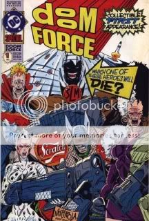
Sometimes you can judge a book by its cover. Obviously, this is an in-the-moment parody of the ever-more-extreme (with a capital “E,” at one point) superhero-team comics of Rob Liefeld and his peers and imitators. The gags are all a lot stronger than you’d think they might be, actually, which is surprising even given the talent of the writer. The Crying Boy’s nebulously defined bad-luck powers and emo demeanor, Flux’s girl-superpower of amorphousness and her sperm-covered form-fitting unitard, The Scratch’s corporate branding and badassness that passes fully into the realm of douchebaggery, etc etc etc.–I chuckled at each, and that’s even before you get to Shasta The Living Mountain or the list of trademarked names for characters who may appear in future volumes, which is really one of the funniest things I’ve ever read in a comic (Gridlock! Campfire! Timesheet!). But I think the most rewarding gags are the ones that tug things in either goofier or weirder directions than necessary. In the former category, there’s Shasta’s transformation into said Living Mountain–complete with not just a ski slope and chairlift, but actual skiers. In the latter category, there’s the way the comic pretty much stops short a couple of times so that the brother/sister villain team can get into uncomfortable shouting matches about proper feminine attire: “Every strong woman must feel free…to express her femininity by wearing exotic lingerie…” (You’ve got two guesses at to which sibling says that and the first guess doesn’t count.) As for the Liefeld-manque art, I never actually read (or even just bought) his comics so I can’t tell you how effective a lampoon it is. I do however remember Mark Millar’s much-repeated insistence that Kids Love Rob Liefeld, and it’s true that the cast of thousands assembled to knock Rob off here do a great job of conveying Liefeldian EXCITEMENT and VOLUME and BARELY CONCEALED NIPPLES AND LABIA at the expense of any vestige of storytelling coherence. Overall it’s a hoot that holds up well. I like it better than Batman: Gothic. PS: Mickey Eye cameo!
Comics Time: Low Moon
July 9, 2009Low Moon
Jason, writer/artist
Fantagraphics, June 2009
216 pages, hardcover
$24.99
Tom Spurgeon’s recent review of this book centered on whether or not it was (apologies to Elaine Benes) spongeworthy. Of all the Jason books released by Fantagraphics, this short story collection is the first one to get the hardcover treatment, obviously due to the titular story’s serialization in The New York Times–but does it really deserve the extra frou-frou and increased price point? Does the format flatter the work? With all due respect to the Spurge, shit yeah. And I say that as someone who casually dislikes hardcovers as a rule. But you could do much, much, much, much, much, much worse than to spend 25 bucks and an inch on your bookshelf on yet agoddamnnother collection of murderously bleak and astonishingly well-executed high-concept existentialism, drawn with an unimpeachable clean line and colored like unto a thing of beauty. Time and time again during these five stories I was almost physically impacted by Jason’s skill as a storyteller: A character spits a mouthful of something spoilery into a sink in “Emily Says Hello,” relationships are established and upended with the tiniest possible handful of panels in “Low Moon,” petty and heinous crimes are paralleled Crimes & Misdemeanors-style with chilling results in “&,” another mouthful of something spoilery is forcibly ejected in “Proto Film Noir,” a strange plant fires spores into the sky indifferent to the plight of an observer in “You Are Here”…his skill and his bravado left me shaking my head with amusement and/or amazement time and time again. He’s one of the best, as is this book.
UPDATE: Spurge corrects my interpretation of his review in the comments.
Comics Time: Uptight #3
June 15, 2009Uptight #3
Jordan Crane, writer/artist
Fantagraphics, May 2009
24 pages, including the covers which you should since they’re comics pages
$2.75
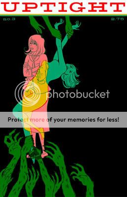
Without Jordan Crane’s The Last Lonely Saturday and NON #5 I wouldn’t have this blog–heck, I wouldn’t have this life, that’s how much of an influence those first tastes of the big wide world of alternative comics had on me. So it’s difficult to be objective when reviewing Crane’s new stuff. Fortunately it’s very very good so that’s not much of an issue. The long-awaited third issue of Crane’s Eightball-style one-man anthology series comes to us with a different cover and contents than we were originally promised–instead of a severed head, we get the kind of ingenue who used to grace NON‘s covers, her soul nude (aren’t they all?) and torn between heaven and hell (aren’t they all?). Instead of another installment of Crane’s loooooooooong-gestating serialized graphic novel of marriage and miscarriage, Keeping Two, we have the debut chapter of a new story, Vicissitude, which itself marks the debut of a new art style for crane: less of an emphasis on delicate, feathery, perfect line, oceans of gray, pointier noses. The plot is a bitter little thing, steeped in infidelity, alcohol, career dissatisfaction, hints of class self-consciousness, and frustration with the path your life has taken–like a Pulp song, almost. The visual shift to the second feature, a direct moments-later sequel to The Clouds Above, couldn’t be more dramatic–the grays disappear, the line transforms, the detail increases tenfold, and blam, we’re in Sam ‘n’ Jack’s world of buoyant, byzantine adventure. Crane’s Sam and Jack stories unfold like the pipes and vents upon which this tale centers: they bend and twist and wind in comically baroque ways, yet Crane’s control of his visuals and the story’s tone are so self-assured that it all seems completely logical, like a mind consciously built it this way and if you have a little faith, it’ll work like it’s supposed to.
The great crime of Uptight is that it barely ever comes out, and given the hostile climate for alternative comic book series these days, I’m not convinced that’s going to improve anytime soon. Best we can do is read the heck out of these bargain-priced gems anytime we get our hot little hands on ’em.
Comics Time: Tussen Vier Muren/Between Four Walls (La Stanza/The Room)
June 12, 2009Tussen Vier Muren/Between Four Walls (La Stanza/The Room)
Lorenzo Mattotti, writer/artist
Oog & Blik, 2003
176 pages
$16 (€12)
What a lovely book. Consisting solely of 86 portraits (well, almost 86–we’ll get to that later) of recumbent couples (at least I think it’s couples, plural–we’ll get to that later too), this reproduction of a Mattotti sketchbook is a master class in how a few sketchy lines on paper can suggest a world of emotion and intimacy. The curve of two bodies on a bed (or at one point, memorably, on a beach); the differences between the ways eyes and mouths look when people are talking, making love, or simply luxuriating in one another’s company; playful POV shifts that transfer us from a voyeuristic fly-on-the-wall to a you-are-there observer under the covers at the foot of the bed; the placement of legs, arms, and hands on another person and what that immediately communicates about this relationship and this moment–Mattotti nails it all, with figurework that suggests calligraphy as much as portraiture. Perhaps I’m more conscious of cost with books that I actually plunked down cash for at MoCCA as opposed to bought with a credit card or received for free, but Tussen Vier Muren was my final purchase at this year’s show, from the Bries table, and I remember wavering: “$16 for a wordless little sketchbook by an artist whose work I’ve appreciated in theory but rarely in practice before today?” Golly am I glad I took the plunge. This is one of my favorite comics in quite some time, and a more romantic comic I think I’d be hard pressed to name.
Ah, but is it comics? I don’t go in much for that kind of debate, most of the time–seems to me that if something has given you enough cause to wonder if it’s comics, it probably is. But the issue is pertinent here, if only to help us understand what we’re looking at from page to page. Comics generally implies sequentiality, which itself frequently means a progression of sorts. So are these sketches meant to be “read,” in order, like a story? There are context clues for and against. If so, certain aspects of the book take on a whole new meaning. The book opens with a series of sketches that are both the roughest/loosest and most evidently erotic/sexual in the whole book–a thick, almost oily pencil line, one that slowly gives way to tighter, finer whorls and cross-hatching as the images lose their overt nudity and sexuality. Meanwhile, the male in these early drawings has a full head of hair, which soon disappears. So perhaps we’re meant to see these initial drawings as a portrait of a young couple in the full heat of infatuation; after a time, their need to prove their attraction to and affection for each other to the viewer diminishes as such things evolve into the shorthand language of a mature relationship. But what are we to make, then, of the drawings that crop up near the book’s midpoint, and again briefly toward the end, where the male figure/character at least appears to be a totally different person? Is the woman cheating? Are they playing the field, taking a break, seeing other people? Or are these sketches just inserted at random, devoid of any kind of narrative implications? Depending on where you fall on that question, the book’s final two images, which I won’t spoil for you, may take on entirely different, and potentially devastating, meanings. It’s all pretty rich for a silent sketchbook, and it will be enough to keep me coming back to this little thing for a long time.
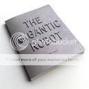
Comics Time: The Gigantic Robot
June 10, 2009The Gigantic Robot
Tom Gauld, writer/artist
Buenaventura Press, June 2009
32 pages, hardcover/cardstock
$16.95
I bet you’ll be able to buy it from Buenaventura at some point
I bet you’ll be able to buy it from Amazon.com at some point, too
At first blush there’s a disconnect between The Gigantic Robot‘s content and its price point. I’m pretty sure that when I bought it at MoCCA, I was charged $20–which, hey, it’s a big hardcover book by Tom Gauld, a bargain at any price! As it turns out, however, it’s more a short story than a book, and the emphasis is on “short.” You get a splash-page single image on the right-hand page of each spread, and a brief (no more than seven words at any point) explanatory caption on the left-hand page. Gauld’s three-pager in Kramers Ergot 7 was heftier.
But look, essentially you’re paying for this like you would for a piece of original art, or at least that’s how I look at it. You’re not going to have many opportunities to buy a board book from a Kramers alum, right? And everything that Gauld’s work usually has to recommend it is present here in spades. The beautiful, densely shaded, cold black-and-white linework suggests Edward Gorey as replaced by a robot, while the story is Gauld’s purest distillation yet of his “Ozymandias”-like juxtaposition of immense man-made structures with the fleeting futility of human ambition. As always it’s reinforced by his unique character design, all massive torso with spindly legs and microcephalic heads, emphasizing raw size over any kind of reliable utility. You may quibble with this little parable’s punchline–having just read Ian Kershaw’s 1,000-page biography of Hitler, the post-war activities of the scientists who worked on the Reich’s “wonder weapons” are fresh in my mind, so the notion that a war machine with the potential for serious megadeaths would be allowed to lie fallow rings false to me. But the moral of the story is sound, and the pleasure of once again watching Gauld’s tiny lines coalesce into these massive monuments to hubris is undeniable.
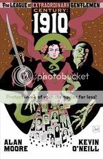
Comics Time: The League of Extraordinary Gentlemen Vol. 3: Century #1: 1910
June 8, 2009The League of Extraordinary Gentlemen Vol. 3: Century #1: 1910
Alan Moore, writer
Kevin O’Neill, artist
Top Shelf/Knockabout, May 2009
80 pages
$7.95
Vastly more straightforward–and more like previous League of Extraordinary Gentlemen volumes–than its predecessor Black Dossier, Century: 1910 is a funny, creepy, nasty piece of work that encapsulates and articulates many of Alan Moore’s most heartfelt themes as explicitly and entertainingly as any book he’s ever done. (And he’s usually pretty explicit about that sort of thing, so that’s really saying something!)
Taking the rejiggering of the League’s line-up that occurred during the centuries-long sweep of Black Dossier‘s meta-story as read, 1910 joins Mina Murray, the rejuvenated Allan Quartermain, and their new teammates–the immortal gender-bender Orlando (currently male and generally going by Lando, making me want to say “Hello, what have we here?”), the gentleman thief Raffles, and the psychic detective Carnacki–as they attempt to thwart…something. They’re not quite clear on what it is, and base their investigation on little more than Carnacki’s ominous visionary nightmares. It could have something to do with the female heir to Captain Nemo, or with Jack the Ripper/Mack the Knife, or with a cult run by the sinister magus Oliver Haddo–they just know it’s gonna be bloody. Given Moore’s frequent depiction of the early 20th Century as the birthing of the proverbial rough beast, you can be pretty sure it’s gonna be bloody too.
What’s neat about this issue is that it’s what we in the blog business refer to as a done-in-one; I assume all of the Century books will interlock to tell one long story, and indeed there are plenty of plot threads to pick up down the line, but this tells a pretty satisfying story all on its own. In a way, the set-up, or I suppose the execution, reminded me a bit of the aspect of Warren Ellis’s early Planetary issues that I liked, or of the ending to Watchmen: the League doesn’t figure out what’s going on until it’s all over but the shooting. Moore obviously doesn’t care much for heroism, and the League’s never really “saved the day” in the traditional sense, but here they almost may as well have not shown up. Meanwhile (here’s the explicit part) Moore uses one of his simplest plotlines in ages to establish a direct link between violent misogynist sexuality and the unbridled bloodlust that ended up consuming the entire world not once but twice in the ensuing decades. Vengeance is sweet for the character involved, and you can’t help but get a kick out of it alongside her, but it’s also pretty fucked up, and if anything the League (the male ones, at least–Mina manages herself okay) just make it worse.
Insofar as the climactic bloodbath is representative of the century to follow, this can be seen as pessimism or resignation–but we’ve read Black Dossier and seen Moore’s efforts to establish the League’s true “heroic” legacy as one of imagination and a way of life freed from the dour, anti-life conservatism of their military minders. The question, I suppose, is whether that hedonistic heroism will win out, or if it will only succeed by carving out a space for itself in the Blazing World beyond and allowing our world to head right down the terlet. I mean, I know how it worked out in reality, I’m just curious as to how Moore will slice it in this alternate one.
If that all sounds like really grim reading, I suppose it is, but like I said, it’s also quite a funny book. The constant foreshadowing of the final massacre is so ominous it actually makes you chuckle from time to time the way a scary movie would–not from comic relief, but just because on some level you know what’s coming and it’s kind of amusing how ugly you already know it’s going to get. On the League end of things, the ongoing “are they or aren’t they” business about the Mina/Quartermain/Orlando menage is a hoot, especially the almost Scott Pilgrim-y way it finally comes out into the open, with some angry words that leave half the group wondering what the hell just happened. Kevin O’Neill, whose work simply looks like nothing else on the racks, gets to cut loose with a dock’s worth of leering scoundrels and ne’er do wells, and later with their comeuppance. Moore even injects some meta right into the mainline, with a cameo character who correctly identifies everyone and everything in the book’s world as fictional–he refers to Haddo, an Aleister Crowley manqué, as “Crowley manqué,” and works in a reference to Harry Potter’s Platform 9 3/4 as the launching pad for “the Franchise Express.” The book ends with a visual gag that’s like a shot from The Birds as covered by Troma. I’ll admit to skipping the prose supplement as always (tl;dr), but for pete’s sake one of the characters in it captured Fletcher Hanks’s Stardust the Super-Wizard! The whole comic is entertaining as all get-out, and even if you suspect that things are ultimately going to end very badly for our heroes, or with them washing their hands of our sordid world and fucking each other in Never-Never Land for all eternity, you’ll want to stick around to see how they get there.
Comics Time: Batman and Robin #1
June 4, 2009Batman and Robin #1
Grant Morrison, writer
Frank Quitely, artist
DC, June 2009
22 pages, $2.99
I wonder how long it will take everyone who complained about Morrison cramming so much information into Final Crisis and Batman R.I.P. that it went all the way back around again into vapidity to complain that nothing happens in this comic? (Answer: not long at all!) I’m a guy who loved how much shit was going on in any given issue of Final Crisis, a guy who very much bought into and enjoyed what Morrison was up to with his supercompressed storytelling techniques and the emotions and ideas they engendered, so on that level this comic’s a bit disappointing. You really can breeze through it in minutes, if you’re the sort of person who feels comfortable glazing over the art of Frank Quitely. But that of course is crazy, and that’s also the point of this comic–it reads to me like Grant Morrison’s reward to Quitely for sticking all the way through All Star Superman and delivering the Oscar-caliber character performances that 12-issue story required to get its point across. Here, Quitely just gets to run wild designing creepy new villains and a younger, fresher Dynamic Duo whose characteristic physical comportment and interactions he gets to invent out of whole cloth–a virtuoso performance of another sort entirely. His line is finer and scratchier than ever, no doubt a result of once again working without an inker enhanced by swapping his usual colorist Jamie Grant for Jim Lee’s go-to guy, Alex Sinclair. For his part, Sinclair gets to execute one of the book’s more amusing visual gags: The flying Batmobile that the megalomaniacal new Robin designed sure has a whole lot of red, doesn’t it?
Meanwhile we’re introduced to a trio of new bad guys: Morrison shifts from Lewis Caroll to another pillar of British children’s fiction about anthropomorphized animals to introduce the villainous Mr. Toad, there’s a new entrant into comics’ grand tradition of Head-On-Fire Guys, and the big bad, Professor Pyg, owes his look to a combo of Leatherface and Hostel with goons straight out of Alan Moore and Brian Bollan’s Killing Joke freakshow. Best of all, since they’re drawn by a stylist like Quitely, they’ve got a chance of sticking. On the hero side, Morrison pulls some neat tricks to show that Dick Grayson and Damian Wayne are on a learning curve–I particularly liked the bit where Damian dismissively refers to Alfred as “Pennyworth,” but then immediately adds a polite “Thank you” in the next word balloon: He may be an enfant terrible, but he’s trying. Elsewhere, under the ostensible cover of training Damian for the field, Morrison manages a dig at all the DC Comics where everyone calls each other by their first names as though every superhero battle is a high school reunion. To cap it off, Morrison and Quitely even crib from Geoff Johns’s delightful recent technique of adding a page or two of decontextualized images from future issues as a teaser for the rest of the run. This isn’t a book I instantly rushed to re-read like I would with each new issue of Final Crisis or R.I.P., but otherwise I think it’s safe to say that I’ve waited all my comics-reading, Batman-loving life for a monthly Batman comic that looks and feels like this.
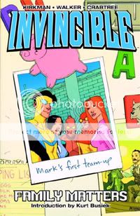
Comics Time: Invincible Vols. 1-9
May 31, 2009Invincible Vols. 1-9
Robert Kirkman, writer
Cory Walker, artist, Vols. 1&2
Ryan Ottley, artist, Vols. 2-9
Image, 2003-2008
in the 120-144 page range each
$14.99 each
I don’t know what it says about me that I viewed my re-read of Robert Kirkman’s creator-owned coming-of-age superhero series Invincible largely through the prism of posts by other comics bloggers–probably nothing that isn’t deeply sad–but there you have it. First off, I thought of Tom Spurgeon’s recent post on Kirkman’s other long-running, unlikely-success indie title, the zombie-apocalypse survival-horror opus The Walking Dead, and how reading a massive chunk of it in one go reveals Kirkman’s studious, in-it-for-the-long-haul pacing. There’s certainly more going on set-piece-wise in Invincible than there is in The Walking Dead, but the principle is the same: For example, the titular superhero, teenager Mark Grayson, doesn’t have his series-defining confrontation with a secretly villainous character until the series’ third volume. Meanwhile, Kirkman takes Paul Levitz’s tried and true A/B/C-plot structure and stretches it out like a slow-motion camera filming a hummingbird–major players can spend a dozen or more issues being introduced in one- or two-page snippets before we even have any idea what they have to do with the book’s main character.
Naturally, reading as much of the series as you can in as short a period as possible flatters these aspects of Kirkman’s writing. But moreover, they help mitigate against Kirkman’s major bad habit: His characters either say exactly what they’re thinking/feeling, or they don’t say anything, or say “it’s nothing” when it clearly isn’t. There’s no in between, no subtext–they either come right out and say it or lie about it. To me, his inability to write convincing human interaction in that regard is the thing keeping him from being not just a really good, entertaining writer, but a great one. Which is frustrating, because his storylines and ideas are so engaging and frequently unusual that he’d really be a top dawg if he could master emotional expression. Now, I think this is already less of a problem in Invincible than it is in The Walking Dead, because Walking Dead is relentlessly bleak and serious book whereas Invincible is a much lighter one (albeit with plenty of serious moments); Kirkman’s inability to handle an emotionally charged conversation the way a great writer can has less impact in an action-adventure romp than it does in a character-driven survival-horror story. But (finally getting around to the point) it has even less of an impact when you’re plowing through 47 issues in a row and really letting the slowly unfolding, meticulously planned plotlines drive your reading experience rather than having the one-issue-a-month format dictate that you dwell over every scene. You can see the whole lovely forest without getting stuck on some of the gnarlier trees.
On to another blogospheric touchpoint: In his long series of posts on Kingdom Come and ’90s superhero comics, Tim O’Neil argued that Mark Waid and Alex Ross’s Kingdom Come marked the rise of the “momentist” school of superhero writing, which is less concerned with soap opera or traditional plots and more driven by attempts to serve up iconic moments for the characters at regular intervals. His best example of this was from a comic that predated the movement but obviously had a lot of influence on it–Alan Moore and Dave Gibbons’s “For the Man Who Has Everything” and the moment where Superman says “BURN.” and uses his heat vision as a weapon against Mongul. I think O’Neil was right in that this has led to an enormous amount of self-indulgent, hero-worshipping crap. It’s also led to some good stuff–I think Geoff Johns, at his best, does this stuff really well. (One moment I often think of in this regard was the bit in Green Lantern: Rebirth where Green Arrow used Green Lantern’s ring for a second and it totally kicked his ass, giving us new respect for GA and GL all at once.)
Kirkman, by contrast, doesn’t do Momentism at all. Maybe it’s just because these are creator-owned characters he just made up and they don’t have a lengthy history to play off of in constructing iconic moments. But, consciously or no, I think he actually hit upon the fact that iconic moments are a mug’s game for non-legendary superheroes, something pretty much every other indie superhero book misses entirely. Instead, he lets the ideas and the storylines drive the book, usually presenting the action in as flat a fashion as possible, so that he doesn’t distract from the loooooooong game he’s playing. In fact, outside the initial “learning to fly”-type stuff, the book’s big “moments” are almost invariably Invincible being stunned or pwned or both. There are plenty of “BURN.”-style moments where Invincible Finally Lashes Out Against His Enemy, but they almost invariably end in moral or physical disaster for the poor kid. It’s very much not a book about how awesome Invincible is, whereas 90% of corporate superhero comics these days are about how awesome Copyright Man or Team Trademark is. (The problem there is that very few characters actually merit such treatment and very few writers and artists can pull it off.)
Which reminds me: Invincible becomes much more interesting as a character the more he gets his ass kicked. I once wrote, back when the book was young, that the difference between Invincible and other teen superheroes like Spider-Man or the original X-Men or most of the Runaways is that while those kids were all geeks or outcasts, Invincible seemed like the kind of kid who’d pull into the high-school parking lot in his SUV blasting Joe Walsh’s “Life’s Been Good.” But that was actually giving the character too much credit–he wasn’t a Popular Kid anymore than he was a freak or a geek. He starts out as just sort of Generic Teen: He’s good-looking but apparently never seriously considered approaching girls and never seriously approached by them, he’s smart but doesn’t seem to be considered a geek by anyone, he’s got a crappy job but only because his dad insists he take one to gain a work ethic, he has no brothers or sisters, he reads comics but probably only because he’s a character in a comic book, he’s got one friend who’s sort of like a more high-strung duplicate of him, etc. Even when he finally starts developing the powers he’s waited most of his young adulthood to have, there’s zero angst about it, and nothing illicit either–he knew it was coming, he doesn’t hide it from his mom and dad, he instantly starts fighting crime. The wildest he gets with them is taking his buddy for a flight or two.
Then that series-defining confrontation occurs, and suddenly the superhero aspect of his life is the source of immense emotional pain, while at the same time he realizes that his name is far from accurate. The rest of the series, which by and large corresponds with Mark’s graduation from high school and entry into college, is basically about how fast he’s forced to grow up, the way the stress and danger of superhero life slowly chips away at his attempts to have a normal life, the high stakes of emotional involvement between godlike super-people, and so on. Oddly enough, Invincible is benefited in this regard by an art switch a lot like the one that happened in The Walking Dead. In that book, the clean cartoon line of co-creator Tony Moore gave way after an arc or two to the scratchier, edgier work of Charlie Adlard, just in time for the series to take a definitive turn for the darker. Here, the comparatively minimal. angular look of co-creator Cory Walker’s art is swapped out for the fuller, livelier stylings of Ryan Ottley. Ottley’s stuff is cartoony in a way you just don’t see from the Big Two and their SERIOUS BUSINESS books anymore, outside of books like The Incredible Hercules that manage to dance between the raindrops of the Momentist events and the realists and Image Seven disciples who draw them. But more importantly, it livened the book up in a big way, just as Invincible developed more of an inner life to display.
I think this change really hit home in that aforementioned series-defining confrontation (no, I’m not going to spoil it even though I can’t imagine anyone reading this deep into this review who hasn’t already read the damn book). What had been the sort of light-hearted “let’s make superheroes FUN again!!!” romp you see so many creators attempt, so many bloggers applaud, and so many readers ignore suddenly got ultraviolent. It was a huge tonal shift, one that the series occasionally reproduces, though it does so infrequently enough for the move to retain its ability to shock. (The book even has some meta-style fun with it in one issue, prudely cutting away from multiple sex scenes only to end the ish by depicting a horrendous beating and dismemberment in full, bloody, intestine-ripping detail.)
In these moments Ottley’s good-natured art suddenly feels like it’s being used as a weapon, while Kirkman demonstrates that he’s ready, willing, and able to completely upend the book’s status quo. Following his mutually unsatisfactory sojourn at Marvel, Kirkman would be the first to tell you it’s his total control over the book and its characters that enables him to pull off stuff like that, that enables him to tell you “anything can happen” and mean it and convince you that it’s true. That’s probably the greatest pleasure of reading nearly 50 issues of Invincible in a row: You’ve watched Kirkman grow as a writer, Ottley grow as an artist, and Invincible grow as a character (though you haven’t watched Bill Crabtree grow as a colorist, because he started off awesome and stayed that way–pastels! Brilliant!), so by the time you get to one of those anything-can-happen moments, you’re so attached to the character and the book he stars in that you just race through the pages hoping that whatever happens isn’t so bad.
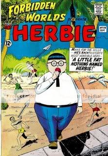
Comics Time: Forbidden Worlds #114: “A Little Fat Nothing Named Herbie!”
May 1, 2009Forbidden Worlds #114: “A Little Fat Nothing Named Herbie!”
Shane O’Shea (Richard E. Hughes), writer
Ogden Whitney, artist
American Comics Group, 1963
14 pages
Read it at Pappy’s Golden Age Comics Blogzine
Buy it (I think) in Dark Horse’s Herbie Archives Vol. 1 from Amazon.com
Not to be a vulgarian, but holy fucking shit, this is what Herbie comics are like? I mean, I knew the basic look and set-up, taciturn fat kid with a lollipop is actually a terrifying war machine with godlike powers of destruction, it’s from the ’60s and it’s a funny in a weird art-out-of-time way. But my God! The comedy in this thing is a solid 40, 45 years ahead of its time. You could animate this thing and it’d feel right at home on Adult Swim between Aqua Teen Hunger Force and Tim and Eric Awesome Show, Great Job!, or make it a webcomic and stick it in your RSS feed along with The Perry Bible Fellowship,, or buy it from Buenaventura Press in a two-pack with the next issue of Boy’s Club. The two-panel tier, six-panel grid pages are really just perfect for a “set-up/punchline” gag structure with zero room for milking the humor out of things by taking too long with them, and for increasing the randomness of the juxtapositions. One panel, Jackie Kennedy is swooning with unrequited ardor for a morbidly obese child as JFK fumes in the background; the next, Herbie is soaring through the air on the back of a giant parrot. You know what I mean? The actual plot-based gags are similarly non sequitur–Herbie defeating an army of ghosts by suddenly being able to call the animals of the jungle to his defense by bellowing like Tarzan is the kind of thing you’d see in one of those two-minute sequences in The Family Guy where Stewie is suddenly reenacting William Shatner’s “Rocket Man” performance or Peter performs “Shipoopi” from The Music Man in its entirety. (I like The Family Guy; let’s not have that debate here.) Then there’s Ogden Whitney’s art, which is about 12 times as strong as it needs to be to make this work and 40,000 times more realistic. But it’s not just the contrast between the visuals and the subject matter that he has to recommend him; it’s also the angles he chooses for the planes of action within his panels, and his choices for the strip’s “actors”–the way the proud dads directly address the audience at the beginning just kills me. So does the visual shorthand he uses to depict Herbie planning his vengeance: a series of blackened thought balloons with bright red question marks in the middle. That’s exactly how I’m going to picture my own rage from here on out. For me it really all comes together in the final four panels, which silently culminate in a panel so deadpan it anticipates the awkward-pause comedy of everything from Space Ghost Coast to Coast to Curb Your Enthusiasm. Hilarious. I want these books now, badly.
(via Tom Spurgeon)
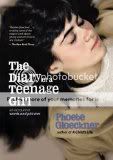
Comics Time: The Diary of a Teenage Girl
April 27, 2009The Diary of a Teenage Girl
Phoebe Gloeckner, writer/artist
Frog, Ltd., 2002
312 pages
$22.95
For today’s Comics Time review, please visit The Savage Critic(s).
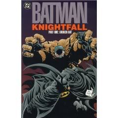
Comics Time: Batman: Knightfall Part One: Broken Bat
April 17, 2009Batman: Knightfall Part One: Broken Bat
Chuck Dixon, Doug Moench, writers
Jim Aparo, Jim Balent, Norm Breyfogle, Graham Nolan, artists
DC, 1993
272 pages
$17.99
For today’s Comics Time review, please visit The Savage Critic(s).
Comics Time: Bonus ? Comics
April 15, 2009Bonus ? Comics
Kevin Huizenga, writer/artist
USS Catastrophe, 2009
4 pages
free with a copy of Rumbling Chapter Two, as far as I can gather
Buy it from the Catastrophe Shop
SPOILER ALERT
This thing’s cute: Two guys (previously seen at the end of Or Else #5, having a conversation told in illegible scrawls of differing lengths) sit across from each other, pondering a big question–or at least a big question mark, which hovers in between them. The man on the left pulls it down onto the table, cuts it into tiny pieces that are the shape of miniature question marks, tries to answer each constituent part with the help of some books, until finally all the little question marks snap right back into the big question mark. The guy on the right just grabs the little dot from the bottom of the question mark and shoves it into the hole formed by the circular part of the question mark. This apparently answers the question, which disappears. The guy on the right smokes a cigarette in celebration. “End.” The formal stuff is fun, the punchline panel made me chuckle, and I think maybe there’s even a lesson to be learned about not making simple problems more complex by way of trying to solve them. I think in an ideal world all our great cartoonists would knock out little unimpeachable one-sheeters like this all the time during their morning coffee.
Comics Time: Rumbling Chapter Two
April 13, 2009Rumbling Chapter Two
Kevin Huizenga, writer/artist
USS Catastrophe, 2009
36 pages
$3
Buy it from the Catastrophe Shop
What impressed me most about Rumbling, Kevin Huizenga’s adaptation of a dystopian/post-apocalyptic short story by Italian writer Giorgio Manganelli, is how effectively it conveys that whole Handmaid’s Tale/The Road things-fall-apart vibe while still residing squarely in Huizenga’s wheelhouse of formal play and finely observed transcendence-through-the-mundane detail. So you get a very effective vignette in which this alternate-future Glenn Ganges, an irreligious foreigner stranded in a country torn apart by a religious civil war, overhears a mother tell her kid it’s impolite to stare at Glenn, that the reason he wasn’t praying when the bells rang is because God doesn’t talk to him like He does to us; or, following that, a sequence where Glenn is picked up by a local to be driven to his boss the ambassador’s safehouse in the country and starts wondering if the man is going to do him harm, but then is slowly lulled to sleep by the rhythm of the passing countryside. Excellent dystopian stuff in both cases, but moreover, they both end up showcasing Huizenga’s preexisting strengths: I loved how the little boy’s confused/fascinated torrent of thoughts upon being introduced to the idea of an irreligious man were conveyed by an explosion of thought balloons cut off by the panel borders, and how Glenn’s long ride into the country was depicted by two panels featuring the pick-up truck’s sideview mirror jutting into the passing scenery, reflecting Glenn’s weary and then sleeping face. Meanwhile the wide array of warring factions gives Huizenga ample opportunity to design more of the kinds of symbols and logos that seem to burst out of his comics like automatic writing, and there’s a funny recurring bit that takes a Chris Ware-style enlargement of key words in a narrative caption to splash-page extremes. In other words it’s a comic that succeeds on a lot of levels all at once.
I actually think this material comes across better in the story’s current delivery mode, a standalone self-published minicomic, than it did in Or Else #5, the final issue of Huizenga’s Drawn & Quarterly one-man anthology, in which Rumbling‘s first chapter appeared. There it was surrounded by short pieces that were in some cases related enough to the main story to feel like a full-fledged part of it but in other cases really had nothing to do with it; the lingering feeling that all this stuff was connected served to mute the first chapter’s impact and hinder its momentum. In Rumbling Chapter Two, Rumbling‘s all you get, and the comic’s the better for it.
Comics Time: Cockbone
April 10, 2009Cockbone
Josh Simmons, writer/artist
self-published, 2009
26 pages
Buy it in Sleazy Slice #3 for $8 from Robin Bougie
There’s just no way to properly talk about this book without explicitly describing some of the things that happen in it so take that as a spoiler alert please
You know how in Martin Scorsese’s GoodFellas, we get introduced to Joe Pesci’s character with that whole hilarious “What do you mean I’m funny?” exchange, but in Casino, we get introduced to Joe Pesci’s character with him stabbing some guy repeatedly in the neck with a pen and then mocking him as he lies on the ground whimpering? You know how that difference kind of gets across the overall variation in tone between the two films? Josh Simmons’s In the Land of Magic has a bright yellow cover and starts with a fantasy parody sequence. Cockbone has a crumpled, grease-stained brown paper bag for a cover and stars like this.
“You pansy little bitch.”
“Kill the dog.”
“Kill the dog, faggot.”
Then–spoiler alert–the faggot kills the dog.
It’s safe to say that this comic contains the most extreme material I’ve ever actually come across in a comic. Imagine if the rape-murder sequence in Poison River were the length of an entire story and depicted with all the graphicness of Phoebe Gloeckner’s diagrammatic blowjob illustrations (where do you think the title comes from?), but with none of the clean, cool reserve of either. Even the blood splatter is angular and angry.
Cockbone is a non-stop litany of incest, animal cruelty, genital mutilation, murder, saturation bombing, homophobia, racism, and sexual depravity designed to make you as uncomfortable as possible, over and over again. The second you get over seeing a howling dog getting shot repeatedly until its ribcage explodes outward in jagged shards, you’ve got the main character’s brothers and mother repeatedly sucking him off to extract his hallucinogenic semen. Get a handle on the sight of a man’s wart-covered penis splitting apart and revealing a fishbone-like spine, and you’ve immediately got to deal with three guys peeling each other’s skin off as the beat each other to death, and then jetplanes bombing a city with little stick-figure people literally exploding from the heat. There’s just no respite, ever. And in the comic’s most memorable, haunting effect, it doesn’t so much end as give up–rather than actually showing what happens in the last two panels, Simmons superimposes simple caption boxes over the visuals that sum up their hidden contents in one or two words, as though the main character, Simmons, the world couldn’t bear to endure the real thing.
Simmons looks into the heart of humanity and what he sees comes wrapped in a grease-stained brown paper bag.
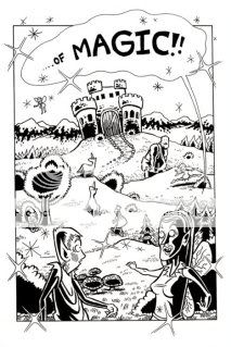
Comics Time: In a Land of Magic
April 8, 2009In a Land of Magic
Josh Simmons, writer/artist
self-published, 2009
20 pages
In my experience most cartoonists trafficking in this kind of material (most filmmakers and writers too) can’t help but convey that as awful as it is, it’s also kinda hilarious. The gore, violence, sexual brutality, humiliation, torture, animal cruelty–there could be some kind of serious point being made somewhere in there, but just as importantly, that shit is kinda cool! It’s fun to scare the straights, it’s a hoot to “go there.” And indeed there are elements in Simmons’s fantasy-world minicomic In the Land of Magic that could, at first glance, make you think that’s what he’s doing as well. His characters have always been on the cartoony, comical side, and when you’re drawing stereotypical elf-folk and wizards straight out of Patton Oswalt’s RPGer parody character on Reno 911, it’s not like they’re going to get less silly. Silliness is in fact the point when it comes to their Stan Lee’s Thor faux-olde fashioned dialogue (“Lothar–What fore dost thou lookest at, my love?”). And when the elf couple Lothar and Hester journey beyond the borders of their magic land to start exploring the Dark Forest beyond, there’s a page consisting almost solely visual double entendres that make it look like they’re 69ing or fisting each other. It’s funny!
SPOILER ALERT
Then Lothar does battle with Arachnad the Terrible, a battle that ends with Lothar saying the following to his fallen foe:
Poor little baby…Baby done got a broken neck, isn’t he? Can’t move, can you? Awww….poor little guy JESUS CHRIST I HAVE THE BIGGEST FUCKING HARD-ON!!
From there, Lothar strips naked, cuts a hole through the underside of Arachnad’s chin, bashes out Arachnad’s teeth, and fucks the wound so that the head of his penis repeatedly thrusts out through Arachnad’s gaping mouth until he ejaculates.
Yeah.
You know, even then, you could probably think that maybe this is all an exercise in seeing just how far we can go with this sort of thing. But I think the end of the book tells the tale, when Lothar forces the horrified Hester to hold his hands and endure his lovey-dovey blandishments, insisting that she have sex with him even as his once-again hardening cock drips Arachnad’s blood. “I-I’ve never seen you like this before,” she stammers before he forces her out of the hiding place she’d retreated to. I think that’s what Simmons’s work is about: terror that this is inside him, and an inability to do anything about it other than put it on display.
What makes Simmons’s brand of taboo-shattering impossible to write off, or shake off, is that behind the transgression there’s no smile. No smile at all.
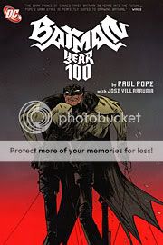
Comics Time: Batman Year 100
April 6, 2009Batman Year 100
Paul Pope, writer/artist
DC Comics, 2007
230 pages
$19.99
Originally written on April 8, 2007 for publication in The Comics Journal
Over the past decade, the most innovative and entertaining examples of action cinema have gone in one of two directions. Some have used a stylized combination of wire work and digital tomfoolery to make it all look easy–wuxia movies, The Matrix (wuxia gone Western), 300 (wuxia‘s Western equivalent), Kill Bill Volume One. Others have gone for a lived-in, beat-down, de-glamorized vibe that makes it look damn hard–Casino Royale, the battle scenes in The Lord of the Rings, Kill Bill Volume Two.
Given Paul Pope’s futurist bent and Japanese influences, you might think his epic science-fiction alternate-future Bat-book would head in the former direction. Not so! From the thrilling opening sequence of Batman Year 100 onward, Pope makes it clear that he’s going to make his hero seem super by making everything he does seem as down-to-earth, and difficult, as possible. Frank Miller’s interior-monologue litanies of broken ribs and paralyzed nerve clusters notwithstanding, there’s never been a better depiction of the extremely physical nature of dressing up like a bat, running around city rooftops and picking fights with people. And in the hands of an action choreographer and stylist like Pope, that alone makes for a hell of a comic.
Pope’s obsession with the man half of the Batman–evident even in the antiquated, hyphenated way he frequently spells “the Bat-Man of Gotham”‘s moniker itself–was apparently a preeminent concern of the writer/artist’s from the get-go. The book’s copious extra features include an initial sketch sent to editor Bob Schreck, accompanied by a laundry list of handwritten questions pertaining not to where the character keeps his kryptonite ring or whether he and Catwoman are still an item, but his height, his build, what material his mask is made of, whether he can wear “square trunks like an Olympic swimmer” and which joints his costume might gather at. In notes written for the collection, Pope explains his fixation:
“My preference is to work on stories where I am free to completely design a fictional world–literally from the ground up. Take Batman’s boots for example. This guy would need a good, sturdy pair of boots…It’s long been a pet peeve of mine when you come across comic book artists who insist on drawing generic, featureless boot-like shapes beneath the ankles of their superheroes, as if boots were just vague, foot-shaped stumps molded out of colorful plastic blobs, resembling something you’d get out of a toy box at a dentist’s office…”
There’s a lot more where that came from–and that’s just the costume design. Perhaps that’s to be expected from Pope, who as an artist has frequently dallied in the world of fashion and is attuned to the dovetailing of form and function, style and substance with any well-dressed individual, superheroes included. But the “concealed human vulnerability” conveyed in his clunky clodhoppers and wrinkly elbows is concealed no longer the second Pope puts him through his action-adventure paces. The book opens with Batman being doggedly pursued by, well, dogs, across the familiar rooftop landscape of Gotham’s vigilante clique. This Batman doesn’t just toss a few Batarangs, launch a grappling hook and swing away to brood atop a gargoyle another day. When he jumps a 25-foot gap between roofs, trailing blood from a wound in his side, he actually has to pause to catch his breath and give his aching bones and muscles a chance to recuperate. (And to smirk at his frustrated canine pursuers, admittedly.) When he hides from a SWAT team in a child’s apartment, it’s with a sense of genuine peril should the kid rat him out–in his weakened state, he’d clearly get his ass handed to him. And when he finally turns the tables on the federal goons by attacking them in a stairwell, it’s clear he’s relying far more on the element of surprise and pure costumed bluster than on flawless martial artistry. This Batman could lose, and that’s what makes his adventures so much fun to follow.
The choice even makes thematic sense. The semi-dystopian setting of Year 100 is one of Pope’s now-trademark libertarian nightmare scenarios, a world where surveillance cameras are surgically grafted into the eyeballs of police dogs and the fact that Batman wears a mask and therefore can’t be identified presents a far more visceral threat to his governmental enemies than the fact that he’s suspected of murdering a federal agent. In the same way that Orwell’s free-thinking Winston is told by his torturers that he is the last human being, Pope’s Batman is memorable not because of any dazzling gadgets or superhuman displays of physical prowess, but because he eats, sleeps, keeps protein bars in his utility belt, wears a shirt that’s a size too small, talks with a speech impediment when he wears scary fake fangs to freak out federal goons, gets his ass thoroughly kicked every time he sees action, and requires a small support team consisting of a doctor, a tech expert and a motorcycle mechanic to help him get anything done at all. With each of the aforementioned acts he reasserts his irreducible humanity in a world classified and documented and categorized and bureaucratized to within an inch of its life. It’s all enhanced by Pope’s familiar stylistic tics–meaty and careworn faces, bee-stung lips, heavy brows, hair that hasn’t seen shampoo for a fortnight, clothes that bulge and bag and buckle, characters who clamber and carom down creaky stairs and through grimy alleys and around telephone wires. He’s not a number, he’s a free man. The physical is political.
And much to this fanboy’s delight, the Bat-portion of “Bat-Man” doesn’t go ignored. I wish I could remember the name of the online wit who pointed out the true ridiculousness of Batman’s outfit: Like an old Star Wars Halloween costume with the character’s picture plastered on the chest, the Bat-costume’s central motif is a freaking drawing of the animal it’s supposed to transform its wearer into. What kind of sissy-ass criminal would be scared of that? But to this Batman of the year 2039, the key to striking terror isn’t the animal itself, but the unfamiliarity it represents. Fighting against platoons of jackbooted federales with animalistic nicknames like the Wolves and the Panthers, Batman takes advantage of his sui generis state–none of these professional ass-kickers have ever seen anything like him–and uses it to scare the crap out of them. His mask is designed to distort his facial features into inhuman unrecognizability. He uses sonic enhancements to emit growls. He wears a set of porcelain vampire teeth. Put it all together and, as captured in a searingly intense panel depicting a motion-captured close-up from a surveillance camera, it’s the scariest Batman has ever looked and acted, even if his sleeves are too short. (Colorist Jose Villarubia nails that Blair Witch by way of One Night in Paris screen; he’s at his best with the neons and glows of the tech-y end of Pope’s world, rather than the Vertigo-style greens that sully the down-and-dirty stuff.)
If I’m lingering on business rather than story, that’s because the story itself doesn’t cohere nearly as well as the ideas and images behind its lead character. In a plot drawing heavily from post-9/11 fears of governmental intrusion and terrorist brutality–Pope being perhaps the only major comics artist (not counting Red-Meat Miller) to give the taboo against taking the latter as seriously as the former the middle finger it deserves–Batman, his little band of helpers, and Capt. Jim Gordon (presented here as a quid pro quo political appointee) uncover a small but serious conspiracy within the federal ranks to hijack a terrorist-developed doomsday virus for their own ends. Or something. To be honest, it’s kind of hard to follow, existing mainly as a platform upon which Pope’s characters declaim didactically about the wisdom of trusting the government, the depths of depravity to which terrorists have no problem sinking, the healing power of open-source information streams, and so on. It makes for a cute ending–one where Batman and crew avert the apocalypse not by kicking the Joker’s ass but by the counterintelligence equivalent of uploading a video to YouTube–and insofar as it relies on fulfilling relatable tasks (climbing up ropes, locating lost computer disks, remembering stuff), it’s refreshing. But in terms of presenting readers with a compelling and solvable mystery, one wishes Pope had taken as much time making it as solid and singular as Batman’s trunks. Toward the end, even the action starts to slip away, with a motorcycle chase that’s tough to parse and too death-defying by half. How about giving the Bat-cycle a flat tire?
But the book is redeemed by its final pages, where Pope makes the seemingly counterintuitive, extremely unorthodox choice to keep Batman’s secret identity a secret from both his enemies–and us. Is he, somehow, the same Bruce Wayne who cooked up the heroic identity way back in 1939? Is he a descendent who took up the mantle? Is he (most likely) just some guy who thinks privacy and decency need a human avatar in this crazy mixed-up world? He’s not telling, and neither is Pope, who leaves us with a final panel that brings us full circle by showing Batman frantically running away from pursuers who will never catch him. The specifics may get a little wonky, but that indelible wish to remain unfettered, unclassifiable and untouchable–even if you get the snot beat out of you from time to time for your troubles–is as good a reason as any to dress up in a costume, or read a book about a guy who does so.


