Posts Tagged ‘Comics Time’
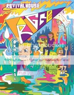
Comics Time: Trigger #1
May 17, 2010Trigger #1
Mike Bertino, writer/artist
Revival House, April 2010
24 pages
$5
They don’t make ’em like this anymore. Time was, a fella could stand in the aisle of one of your better comic book shops and watch one-man staple-spined anthology series like what Mike Bertino’s Trigger #1 augurs roam the countryside in huge horizon-spanning herds, from the halcyon days of Eightball and Optic Nerve to outliers like Rubber Necker and Uptight. Now, Buenaventura Press’s quixotic damn-the-torpedoes efforts aside, the format is the provience of minicomics and micro-publishers. And bless ’em, because as seen here, it’s a useful format.
Bertino puts himself through the paces with three comics done in three different tonal and artistic styles. First up there’s a literary-fiction young-professional thing about a teacher’s first day with a new class. You’ve got your white-guy class’n’race issues, the ominpresence of alcohol, and a sexual politics sideswipe–the material suggests Tomine, while the straightforward, oval-eyed art reads to me like part-Jessica Abel, part-Hope Larson. Then there’s the funny middle section, which seems to use the fact that flannel is in again to tell a very ’90s altcomix-style story about a drunken debacle in a dive bar. Shit jokes, cusswords, crude and emasculating romantic mishaps, an anthropomorphized unicorn named Buttface abound, the story unfolds with a charming well-paced “one bad night” logic, and Bertino flips his style around to a rubbery Johnny Ryan/John Kerschbaum kinda thing. Finally, in a story of the sort that would likely find the most purchase in other alternative-comics anthologies today, a young man comes to terms with his abuse-scarred past via a series of might-be-visions, might-be-hallucinations. Here the art is at its most delicate and loveliest, like a thinner-lined Gabrielle Bell or a sturdier Anders Nilsen; the visions are done in a melty Mat Brinkmany freakout mode, with flame effects that reminded me of Jesse Moynihan. As a bonus, there’s the multicolored art-noise cover and equally messy/melty/monstrous/indecipherably fonted endpages, a sort of Providence-school cameo appearance.
Sandwiched together as they can only be in the solo anthology model, the disparate stories and styles provide a snapshot of Bertino’s range of interests and abilities; moreover, the whole product takes on an invigoratingly restless feel, as reader and artist alike appear not to know which way he’ll head with the next story. I suppose all the name-dropping above indicates that it comes across as a sort of greatest-hits package for the past decade and a half of alternative comics, and that it does, but I’m not complaining! After all, Bertino appears to know exactly which style to employ to achieve each of his desired effects, which is smart cartooning. Besides, the point of one of these one-man shows is to have room to explore, experiment, dabble, pastiche, parody, imitate, whatever, whether in service of a fully formed statement down the road or just for the love of the game.
Comics Time: Wiegle for Tarzan
May 14, 2010Wiegle for Tarzan
Matt Wiegle, writer/artist
Partyka, April 2010
12 pages
$1
Buy it from Partyka, most likely
Today’s installment of Insurmountable Conflict of Interest Theater is brought to you by my friend and collaborator Matt Wiegle’s latest one-dollar humor minicomic. This one’s campaign literature, essentially, as Wiegle announces his intention to run for the neglected but pivotal office of New York’s official State Tarzan. The key image is Matt wearing nothing but a necktie and a leopard-skin loincloth, which is as far as you might expect this gag to go. But his strength as a humor cartoonist has been his off-angle take on his simple concepts–the foodie specificity of the beast-based dishes in Monsters and Condiments, for example. So here, instead of just the basic idea of Tarzan existing alongside Governor and Attorney General and County Executive as a political office, you have the position’s origins following the Hobson Shirt Company’s “Loose Lion Incident” of 1919; you have the career-politician behavior of the incumbent, who “has barely touched a vine in 20 years!”; you have “ill-equipped” first responders like mustachioed firefighters handling “Tarzan-related crises” like an attack by anthropomorphized ant-people; you have “social networking” listed as one of Wiegle’s proposed transformational goals for the office, as depicted by a man tweeting for help as he gets sucked into quicksand, and so on. I’m spoiling gag after gag, I know, but I’ve read this thing a few times now and I’m still chuckling out loud, so you ought to be alright. At any rate, they all click harder thanks to his art, honed at this point through countless panels drawn for adapting literary greats for Barnes & Noble’s SparkNotes to a really sturdy combination of realism and cartoony brio, perhaps best exemplified here by the dead-eyed stare of a necktie-clad giant-cobra lobbyist. Wiegle gets my vote, that’s all I’m saying.
Comics Time: The Numbers of the Beast
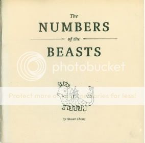
May 12, 2010The Numbers of the Beast
Shawn Cheng, writer/artist
Partyka, April 2010
28pages
$I forget
The challenge of reviewing a shitty comic by a friend is obvious; the challenge of reviewing a good comic by a friend less so and thus perhaps more pernicious. Indeed many people find the whole enterprise suspect and distasteful, and I can hardly blame them. I think that rather than gushing about the gestalt of the project it behooves me to talk about what my pal Shawn Cheng’s The Numbers of the Beast does well as specifically as possible. Scales, for one thing: The reptilian hide of the Hydra, used to illustrate the number 9 in Cheng’s Greek-myth-based take on a child’s counting book, is a gorgeous multiplicity of little semicircular panels; I’m particularly taken with the tangent lines between two of the beast’s overlapping necks. The curly hair of the Chimera (#4), Geryon (#6), and Pan (#7) is handled with similar precision, as are the stippled dots that denote the gray stone of the Basilisk’s victims (#8) or the Colossus’s legs (#10). Cheng takes necessary detail and doubles it as ornamentation. His creature designs, meanwhile, are probably the most accessible in a career filled with critters, nearly all of them seem based on simple circles or ovals, dovetailing with Cheng’s never-smoother line and befitting a book dedicated to Cheng’s toddler daughter. The shiny ivory cover stock alone makes the comic worth a peek. Fans of Fantagraphics’ Beasts! books, here’s one for your SPX shopping list.
Comics Time: Henry & Glenn Forever
May 10, 2010Henry & Glenn Forever
Tom Neely, Scott Nobles, Gin Stevens, [anonymous], writers/artists
Igloo Tornado/Cantankerous Titles, April 2010
64 pages
$5
Buy it from Microcosm Publishing
When I was a teenager, even though I didn’t much care for their music, I was at the very least entertained by Henry Rollins and Glenn Danzig purely on a “who’d win in a fight?” level. This was the early ’90s, and the concept of broadly defined alternative musicians with actual visible muscles was something of a mindblower, to say nothing of the superhero levels to which these two guys took it. Although spitballing which of the two would come out on top in hand-to-hand comeback has since been largely rendered moot, I’d imagine Henry & Glenn remain associated with one another in the minds of many lo these many years later by dint of their toyetic physiques (and their equally genre-art-badass mutual love of black clothing), quite aside from their shared role at the roots of hardcore. In that light it’s no surprise that in one of this book’s sixty or so one-page gags on the idea of Rollins and Danzig as a committed couple, they’re simply drawn as Colossus and Wolverine respectively, without further comment. If either man has spent any time in your ideaspace, no explanation is necessary.
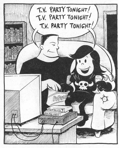
Produced by The Blot‘s Tom Neely and his compatriots in the Igloo Tornado collective (the fourth member of which appears to wish to remain anonymous for the purposes of this project), Henry & Glenn Forever is an email your friends, hey-you-gotta-see-this meme in minicomic form for one simple reason: It takes hardcore’s two most self-consciously self-styled tough guys and casts them as lovers, not fighters. It helps if you’re familiar with some of their music, since there are a handful of gags (particularly Neely’s) based on Black Flag or Misfits lyrics–including the outrageously tumblriffic image I stuck at the top of this review, as well as another that’s both one of the comics’ few gross-out gags and almost completely indecipherable unless you know the line that comes after the line Glenn utters in the panel. But in general, all you need do is, y’know, look at how Glenn Danzig and Henry Rollins look, and then sit back and enjoy how funny it is to think of them as a sweet romantic couple who wish they could spend more time together, hate themselves for arguing, write about their Hot Topic shopping sprees in their diaries, fret about whether their fishnets will still fit them if they go see Rocky Horror at the Nuart, and so on.
Lest you worry it’s a one-note project, a goodly number of the jokes go in different directions. Some preserve Henry & Glenn’s machismo but take it to ridiculous levels: In one panel they’ve replaced their hands with guns and knives, in another they’ve sprouted the black horns of a “unicorn of death.” There’s a subplot involving their nextdoor neighbors Darryl Hall and John Oates, cast here as very polite Satanists. And there are plenty of jokes directly at the expense of werewolf-loving, Hitler-studying, occult-dabbling Danzig that would work whether or not he and Henry Rollins were in love. Rollins, who in my day became something of a poster child for alt-culture elitism, is roasted a couple of times on those grounds, but he’s generally the straight man here. So to speak. In a world where Oates’s mustache is the star of its own animated series, the jokes about those two yachtrockers fall a little flat, but I laughed a lot at pretty much everything. (And okay, seeing the two of them say “Oh, I can’t go for that!” “No can do!” as Henry and Glenn erect an anti-Prop 8 sign on their front yard made me laugh too.)
If you’re looking for a gorgeous art showcase, you’ll probably wanna look elsewhere: Of the four Igloo Tornado guys, Neely’s the only real cartoonist in the bunch. I love the visual shorthand he developed for the pair: Rollins is a towering, barefooted, squint-eyed, unibrowed, flattopped ogre, Danzig a tiny, doughy imp with Annie Warbucks’s eyes and Veronica Lodge’s hair. The rest of the gang cartoons just well enough to get their gags across, and honestly that’s part of the charm–Neely’s chops aside, this thing looks and reads like a book you and your friends could have put together after drunkenly stumbling across the idea, cracking up the whole while. Which, as I understand, is exactly what Neely & Company did. Sometimes, it pays to heed the words of a wise man: “Don’t think about–do it!”
Comics Time: Jumbly Junkery #8-9
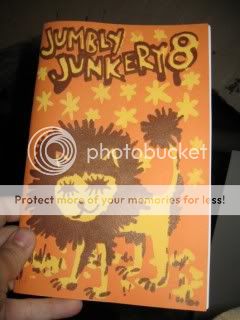
May 7, 2010Jumbly Junkery #8
L. Nichols, writer/artist
self-published, October 2009
44 pages
$5
Jumbly Junkery #9
L. Nichols, writer/artist
self-published, April 2010
36 pages
$5
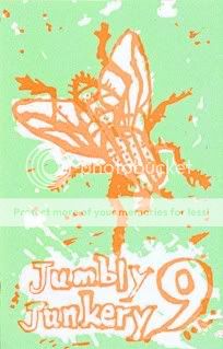
Most of the minicomics I’ve read have one overriding, primary purpose: They’re an art object, they’re a formal exercise, they’re a concise storytelling or visual statement. L. Nichols’s Jumbly Junkery has a purpose, I think, but instead of a well-placed sniper’s bullet, it’s a shotgun blast. The goal of her one-woman anthology minicomics series appears to be nothing more or less than creating a vehicle for the unfiltered self-expression of a cartoonist with a massively prodigious work ethic. It’s a conveyor belt from the artist’s brain to the reader’s.
Most of the strips in these two issues, based on my unscientific survey, are little autobiographical sketches. They’re the sort of comic where
each new phrase
is separated out from the others
and captions each new panel
for an effect that is at once staccato
and ersatz-elegiac.
Which is not my favorite writing style in the world, admittedly. But in Nichols’ case it doesn’t come across like the comics-as-poetry nightmare you might be picturing, because it’s so clearly tied to her compulsion to create. It’s like she can’t help but draw a new panel for every phrase and clause. The two issues are peppered with strips where she either contemplates her constant drawing or perseverates on the worrying feeling that, you know, this is all there is, occasionally combining as she fears that what she’s doing is an insufficient means of transcending both her own inadequacies and those of humanity in general. In all three cases, there’s a sense of obsession that goes a long way toward undercutting any potential cutesiness in the art or execution. Throw in the repeated motif of mathematical formulae, derived from her own studies IRL and serving the same purpose as those spotted mandalas in Blankets, and you can understand what she’s going through even you’re not quite ready to go along with her.
Nichols works primarily in a pleasantly cartoony style best exemplified by her self-caricature as a stuffed doll with x’d-out button eyes and a mohawk. Again, there’s the danger of twee, but it’s undercut by genuinely deft gray shading, the doll’s unsettling featurelessness, and an overall attention to craft. Moreover, issue #9 displays a wide array of styles, from a wiry, scratchy, more recognizably “altcomix” philosophical comic to an abstract comic with Mondrian-style squares to a cleaner, slicker “comic strip” style complete with zipatone to an almost xkcd-ish bit on the white noise of technology to a funny-animal thing that feels like a Matt Furie comic drawn by someone who does kids comics for First Second. And since most of the stories in both issues are just one or two pages long, there’s a pleasant idea churn. Don’t like this strip? Don’t worry, there’s a new one on the next page. All told, Jumbly Junkery is a fine example of a minicomic as a means to an end, a record of and venue for a cartoonist’s progress rather than a discreet declaration.
Comics Time: Wilson
May 5, 2010Wilson
Daniel Clowes, writer/artist
Drawn & Quarterly, April 2010
80 pages, hardcover
$21.95
All apologies to Ken Parille, but I don’t think the kaleidoscopic array of styles in which Daniel Clowes drew Wilson says much of anything. I think that’s the gag. And I mean this aside from the fact that these are all styles you saw Clowes employ (and no duh–as with Ware, it’s almost boring at this point to mention that the guy is an absolute titan of craft) with full shock-of-the-new force in Eightball #22/Ice Haven, where the Sunday-funnies format made their import a lot clearer. Here, it’s like Thirty Two Short Films About Some Dickhead, or that guy who pointed out that all New Yorker cartoons are funny if you caption them with “Christ, what an asshole.” Draw it how you will: Wilson’s always there, in medium close-up more often than not, a wide-eyed and open-mouthed expression of guileless wonder on his face more often than not, saying something fucking horrible almost constantly. No matter how you shake and dance, the last two drops go in your pants; no matter whether he’s detailed or abstracted or realistic or cartoony or full-color or two-tone or black-and-white or whatever the hell, Wilson is a massive, massive tool.
Wilson is sort of like the refined, sharpened, weaponized version of Mister Wonderful. Marshall is self-absorbed, Wilson is self-absorbed and cruel. Each single-page unit of Mister Wonderful is paced like a gag strip; the same is true of Wilson, only there are four times as many of them, and they’re at someone’s expense. There’s hope for Marshall; Wilson ends on a note akin to The Godfather Part II. Mister Wonderful is funny; Wilson is hilarious–I read this on the train and was embarrassingly vocal in my enjoyment of it. The second I got to a computer I made “PROPERTY OF SIR D.A.D.D.Y. BIG-DICK” my Google Chat status, I emailed my friends the entirety of Wilson’s disquisition on The Dark Knight, and even now I can’t think of “Hey, it talks!” without laughing out loud. Marshall is preoccupied with making a connection with someone outside himself, even if he’s constantly hamstringing his attempts to do so; the only times Wilson appears able to take that step is when death has rendered it too little, too late. This book is utterly mean and hilarious, and I loved every page.
Comics Time: Mister Wonderful
May 3, 2010Mister Wonderful
Daniel Clowes, writer/artist
The New York Times, September 2007-February 2008
20 pages
Download it for free from The New York Times
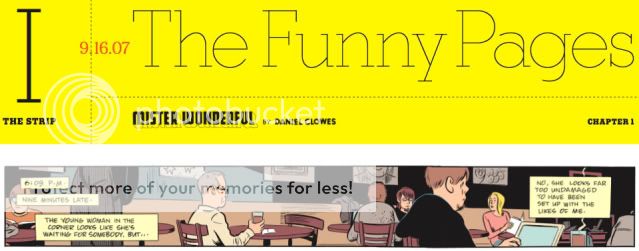
The key sequence in the comic Dan Clowes serialized through The New York Times‘ Funny Pages section a couple years back (!!!) comes in its October 28th. 2007 installment. Up to that point, and afterwards in fact, you could fairly comfortably play the theme song to Curb Your Enthusiasm in the background while reading and get roughly the right effect. The titular character, a graying sad sack named Marshall, is so self-obsessed in a self-deprecating manner that it’s almost a mental illness. In a series of one-page sequences he waits for a blind date he’s increasingly sure will never arrive, mentally lashing out at himself and his fellow coffee-shop patrons in a torrent of caption boxes that superimpose themselves on action and dialogue alike. Clowes’s comedic pacing is drum-tight, his portraiture hilariously scathing, able to capture the pleading vulnerabilites of a human face and then exploit them ruthlessly. You’re left wondering if this will ultimately be as biting a portrait of a pathetic, bitter guy as was The Death-Ray (only, you know, with no ray guns).
Things don’t exactly improve when Marshall’s blind date, a lovely if seemingly scatterbrained woman just shy of 40 named Natalie, actually shows up. Marshall, who at this point is half-drunk, immediately begins constructing elaborate fantasies of their happy life together, basically calling her the most perfect person who ever existed–the better to preemptively excoriate himself for blowing it with every fumbled word or body-language cue. Most of what she says to him is obscured by his interior-monlogue captions: Immediately after thinking to himself, “O.K., Marshall — now’s the perfect time to show what a sympathetic and attentive listener you are — eye contact, Marshall! Concentrate!”, he interrupts a word balloon containing the story of her failed marriage with a giant block of narration beginning “So here’s the basic gist:”. It’s smart cartooning, as you’d expect from Daniel effing Clowes, and it’s nasty and funny, as you’d also expect.
Then something unexpected, and subsequently unremarked-upon, happens. Marshall relates to us the story of Natalie’s common-law marriage, a 15-year relationship that began in grad school and ended when she could no longer forgive her boyfriend’s laughing dismissal of her worry that their lack of an actual marriage or children meant he was ashamed of her. It’s just a four-panel sequence, but it’s done in these lovely glacial blues, and there’s this gut-wrenching effect Clowes uses to convey the idea that “every time she went into that room, the laugh was there”: A large, three dimensional, yellow block-letter “HA HA,” first sitting on the kitchen table, then towering over the whole room like a monument.
It’s not made explicit, but here’s the thing: This isn’t Natalie’s memory of the disintegration of her relationship. This is Marshall’s mental reconstruction of Natalie’s story, pitched to us with the same no-bull neurosis as everything else he’s told us so far. Only it’s beautiful, it’s thoughtful, it’s sad and crushing. For these four panels only, all traces of Marshall’s compulsive self-absorption and solipsism are gone. Whatever he thinks of himself in the moment, we know he really did empathize with Natalie, he really did listen attentively, he really does care about her not as an idealized ticket out of his miserable lonely life, but as a person with a story all her own. For all the Larry David humor and brutal caricature in here, that’s the beating heart of the story, hidden under all the black. I think it’s worth remembering the next time you hear someone dismiss Clowes as a misanthropic self-loathing crank. Mister Wonderful is a story about the need to cling to one another in the face of not just the world’s awfulness but also your own, because what else are you gonna do? It doesn’t skimp on the awfulness, but the clinging’s the point.
Comics Time: Tales Designed to Thrizzle #6
April 30, 2010Tales Designed to Thrizzle #6
Michael Kupperman, writer/artist
Fantagraphics, April 2010
32 pages
$4.95
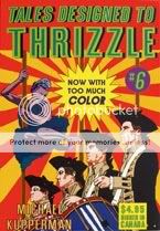
Aw, bummer, this one isn’t that good! I never thought I’d be saying this, but this issue of Michael Kupperman’s heretofore unfailingly, unflaggingly hilarious humor series is kind of flat. That manic twisting-and-turning of his, where each new panel or turn of the page can completely upend the premise of the previous one, is nowhere to be found. You don’t know how disappointing it is for a die-hard Kupperfan to discover that, say, the “Jungle Princess” story begins and ends with the same jungle-heroine premise. Yeah, it’s funny that she dresses the exact same way in her city-dweller “secret identity,” and there are some cute sight gags involving jungle creatures doing unusual things, but that’s as you’d expect it to be. Similarly, a Richie Rich parody in which the little rich kid eats jewels ends with him needing surgery to remove the jewels from his intestines; the story of a has-been Broadway actress in danger of getting upstaged by her new production’s elaborate drainage system ends with her getting upstaged by her new production’s elaborate drainage system; Einstein and Twain in space is basically just Einstein and Twain in space, and though it does end with the out-of-nowhere death of director Tony Scott, it’s your basic “spaceship lands on someone annoying” gag. (I preferred it when Mystery Science Theater 3000: The Movie wished that the crashing spaceship at the end of This Island Earth would land on, of all people, Kenny Loggins.) Kupperman’s unmistakable art is as meticulously constructed as ever–I’ve seen him draw and I still can’t figure out how he does it–and the appealing color work still lets his uncanny linework shine, but beyond that? It’s like half of the ideas fell out someplace, and you keep waiting and waiting for craziness that never comes. 🙁
Comics Time: Death Trap
April 28, 2010Death Trap
Lane Milburn, writer/artist
self-published, April 2010
112 pages
$12
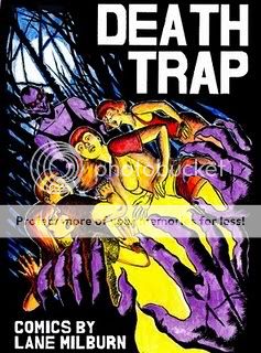
It feels good to see someone win a Xeric Grant whose work you’ve already been following, then to discover that the work they won that Xeric for is their best work to date. In that light, Lane Milburn’s Death Trap is the feel-good comic of the year. Everything he does well, he does as well as he’s ever done it here: Immersive environments, crosshatched and “lit” to look like they were constructed from solid smoke. Weird, ugly monster designs that connote some sort of infectious sickness of reality as much as they do simply somethin’ scary. A real mastery of building the human body out of its constituent parts into something that appears meaty and palpable on the page–from his trademark fireplug goons to a convincingly sexy teenage girl. A flair for the ridiculous that manifests itself both through far more controlled riffing on the over-the-top writing of comics of yore than what you saw in his recent Feeble Minded Funnies and through a series of action beats and sight gags that juxtapose his bizarre creatures with the ’70s redneck-stoner-horror demimonde he squeezes them into. Some truly killer beat-by-beat action sequences of the sort you wish somebody, anybody who isn’t working with Grant Morrison on Batman & Robin would attempt in a contemporary superhero comic. An intelligent combination of the teenagers-preyed-upon-by-maniacs horror of The Texas Chain Saw Massacre with even woolier comics villainy. Off-to-the-side visual flourishes, from the separate full-color science fiction story that opens the book to a Mario Bava/Barbara Steele-style pin-up that kicks off the main titular tale. And perhaps the most finely tuned sense of queasy, bottom-just-dropped-out horror and madness you’ll find in comics this side of Al Columbia. If any of this sounds at all appealing to you, drop the 12 bones, and put some cash aside for whatever he does next.
Comics Time: Keeping Two
April 26, 2010Keeping Two
Jordan Crane, writer/artist
finite webcomic, 2001-?
That question mark up there is doing a lot of work. I remember following Keeping Two in serialized fashion…but I don’t remember where. Were any installments in NON? Were they on Jordan Crane’s old Red Ink website? Did he make minicomics of them? Was maybe some of it in Uptight? The comic’s presentation on Crane’s gorgeous webcomics-anthology site What Things Do bears the date “18 December 2001,” but I have no idea what that means. I think that’s when it started? I don’t know when it ended. Hell, I don’t know if it ended. But I’ll get to that.
Anyway. Comic!
Jordan Crane’s comics are Mary Poppins’ maxim at work. The spoonful of sugar, and actually it’s more like a dumptruck full, is Crane’s art. His characters have the slightly disproportionate and adorable heads of children. They see the world through little dot eyes. They’re drawn with a line so soft you wanna reach out and pet it. His omission of periods at the end of sentences gives even the dialogue a vulnerable, open feel.
Then the medicine comes along, and it’s like one of those giant needles doctors admit in advance will hurt like hell. In the case of Keeping Two, the medicine is death. It’s presented here with shocking directness. When a baby is stillborn, you see his corpse, see his weeping mother hold him and say “Oh my sweetie”. When a dog dies, you see his body lying on the ground, eyes open, his owner’s recounting of her discovery of her dead best friend staggered out over the course of countless word balloons as though every word is an agony. I hadn’t read this stuff in a long time, and seeing it again knocked the wind out of me. It’s brutal and unflinching.
The story itself is a multifaceted look at a young couple on a day when death touches their lives in several ways: Through the book the woman is reading, through the passing of an acquaintance and the death of the man’s mom’s dog, and finally in the head of the man as the woman takes too long to return from the video store. (Video stores: Sign #1 this comic was started up a long time ago.) In a way it reminds me of Richard McGuire’s “Here,” dazzlingly complex but centered on absence rather than presence and stretched out for an entire story. The couple’s story is sequenced out of order, there are flashbacks, there are multiple perspectives on the same conversation, there’s a story within the story, there are multiple daydream sequences, there are scenes imagining what the real scenes must have been like, there are lengthy “Scott McCloud explaining manga”-type sequences of washing dishes, there’s an ending so open I’m not 100% convinced it is an ending…but it all circles around the direct and devastating image of a dotted-line silhouette where a person, a dog, a baby used to be, just like your mind does. That it’s so lovely to look at doesn’t soften the blow so much as aim it.
Comics Time: Skim
April 23, 2010Skim
Mariko Tamaki, writer
Jillian Tamaki, artist
Groundwood, 2008
140 pages, hardcover
$18.95
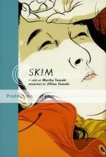
The story of a teenage outcast’s traumatic, illicit first love, Skim impressed me with what it chose to show and what it chose to hide. On the show side of the ledger, first of all, it’s a book about a teenage Wiccan lesbian and about suicide, and it really doesn’t skimp on any of that. There are rituals, there’s a love story, there’s cursing out the wazoo, and teenagers die. It’s an article in a local newspaper about What Our Children Are Reading waiting to happen. In that sense, even though it’s very much a Young Adult book, it felt to me less like something created to be maximally appealing and accessible to a YA readership and more like something created the way we like to imagine all good comics are created: A writer and/or an artist had an idea and committed it to paper, full stop. Ballsy.
Also in the “show” column, there are the stylistic filigrees and flourishes of Jillian Tamaki’s art. Her figurework is really singular and memorable, most prominently: There’s a shot early on of a hallway full of Catholic high school girls, the plaid of their skirts more a suggestion of motion than a pattern on fabric, that is simply swoonworthy if ever you’ve swooned over a hallway full of Catholic high school girls. Main character Kim “Skim” Cameron’s “otherness” is suggested with the clever visual shorthand of making her face look like someone that stepped out of a classical Japanese portrait. Ms. Archer is every bohemian art or English teacher you’ve ever crushed on, swirling around under yards of fabric and hair. Suicide-haunted Katie Matthews’s face is a pinched little scowl, not depressed so much as enraged. Even the cowlick epidemic that plagues the hair of what seems like a solid 50% of the characters comes across as an endearing tic rather than a goof. It’s all very cleverly done.
Then there’s the equally clever “hide” column. I fairly marveled at just how much was left unsaid or performed offstage. Why on earth would Ms. Archer do what she did? Though we get a lot on the damage she did, and can infer how she chooses to deal with that damage, the damage that caused her to do what she did is unexplored. Actually, so is…what she did itself. There are hints, there’s a fleeting glimpse, but we never learn how far things went, what was done, what was said. This is where the wise choice to make Skim such an unreliable narrator comes into play. She’s constantly crossing out and rewriting her narration, and we establish early on that she’s willing and able to skip over major, major events if she doesn’t feel comfortable discussing them. We’re never able to trust that she’s giving us the whole picture, and that lack of trust is the structuring absence around which the story and our understanding of it is built. This in turn is reflected in the rumors and half-truths and lies and gossip that keep buzzing in the background, and in the lack of candor between Skim and her supposed best friend Lisa…it’s really a book about hiding, now that I think of it. The villains of the piece, such as they are, are villains precisely because they make such a show of everything. Even the climactic happy ending is presented to us as obliquely as possible. The moral of the story is that private lives are private, and you offer access to them at both your great pleasure and your great peril.
Comics Time: Young Lions
April 21, 2010Young Lions
Blaise Larmee, writer/artist
self-published, March 2010
96 pages
$10
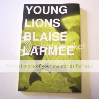
Now here’s an interesting combination: A fairly straightforward “aimless young smart people” graphic novella in the vein of Adrian Tomine or Ghost World-era Dan Clowes, drawn in the wispy, dreamlike style of C.F. Larmee’s take on the CF “tradition”* foregrounds its frequent warm beauty rather than its fetishistic cold transgression. It pushes back the Henry Darger and pulls forward the Nell Brinkley, if you will.
This has a dual effect within the narrative (“story” isn’t quite right), which is about three young “conceputal artists” whose routine is shaken up by the unexpected intrusion of a beautiful young woman whose drunken disruption of one of their performances leads to their most successful gig yet, and a subsequent road trip to determine whether she’s worthy of official inclusion in the group. First, in the hands of Larmee’s delicate pencil line, these people are gorgeous–skinny, babyfaced androgynes constantly hitting effortlessly languid, painfully beautiful poses. If the characters in Young Lions were real, you might not want to talk to them, but you’d sure wanna stare at them, or, you know, dash your heart to pieces on the rocks of their indifference, tossing underappreciated mix CDs in their direction every now and then.
The second effect the beauty of the art, and by extension the characters, has on the narrative is making it immersive and appealing. A lot more so, in fact, than it might otherwise have a right to be. Cody and Alice seem completely oblivious to how easy they have it as (apparently) wealthy, (definitely) gorgeous, (avowedly) artsy young Americans; Wilson is less attractive but makes up for it by sheer force of obnoxious intellectual domineering and is the type you know will always be able to find a scene he can dominate; Holly is a bit harder to get a handle on, but she clearly enjoys the attention inherent in her exploitation by the trio and is thus difficult to sympathize with even as the others condescend to her naivete and poverty. A less charitable documentarian of this particular demimonde might simply stick “Bohemian Like You” by the Dandy Warhols on loop and be done with it. In the hands of a less visually charitable cartoonist–Clowes, say, or even Tomine!–this would read as a pretty merciless satire. Given Larmee’s deeply unfortunate internet persona (the fact that it’s a put-on doesn’t make it any less of a head–scratching headache inducer), you might even say merciless satire is what both characters and creator deserve.
But when I said Larmee is dragging the beauty of this art style forward, I meant that literally: As opposed to CF’s side-scrolling distance, we’re in constant close-up close quarters with this quartet. Their reclining bodies occupy entire panels, their upturned, closed-eye’d faces appear inches away from our own, the background details are all but nonexistent. It’s tough to stand in judgement of people you’re seeing primarily through the POV you’d get if you were about to make out with them, you know?
It’s that intimacy that makes Young Lions successful, that makes the whole greater than the sum of its parts. Yes, these are assholes. But who–especially among artists and arts-interested people of the sort who’d buy a Xeric-winning self-published graphic novel such as this one–hasn’t been an asshole? Who hasn’t been friends with assholes, worked with assholes, been impressed by the creative output of assholes, been disappointed with the creative output of assholes, fallen in and out of love with assholes? Larmee may doom them to an open, down ending, but as Kevin Smith once said, that’s exactly what life is. Beyond that it’s not our place to judge.
* the emergence of which is fascinating to me, by the way, a second generation of the Providence artcomics aesthetic following Fort Thunder and Paper Rad, which are themselves obviously quite distinct but still noise-dominated while I think CF is quiet-dominated, but anyway
Comics Time: The Arrival
April 19, 2010The Arrival
Shaun Tan, writer/artist
Arthur A. Levine, 2006
128 pages, hardcover
$19.99
(Before I begin the review, can you believe this book came out four years ago? I swear I thought I was a year at most behind this particular curve. But comics barrels headlong through its Golden Age and you have to run to keep up sometimes.)
Don’t let the sepiatones fool you. This fine, captivating wordless graphic novel re-strange-ifies the immigrant experience, shaking it free of elementary-school field-trip/filmstrip nostalgia and making it something scary and wonderful again. Taking place in a fantastical, almost Expressionist city filled with incomprehensible writing, bizarre architecture, and creatures that look like they evolved in a world where Jim Woodring’s Frank stories are the central creation myth, it powerfully conveys that traveling far from home, all alone, to a place you’ve never been before, where you know no one and don’t speak the language and aren’t even guaranteed a place to work or sleep, is extremely risky…but also worth the risk. I don’t think it had occurred to me how weighed down by cliche such narratives have become until I read The Arrival, but with each of Tan’s dreamlike or nightmarish twists on the pitfalls and miniature triumphs of his suit-wearing immigrant protagonist, I marveled anew both at his inventiveness, and at how effectively he burrows down through a million PBS documentaries to get to the core of emotion in each vignette.
Me being me, I was hit hardest by Tan’s depictions of the things that caused each character to flee his or her native country: representing persecution as faceless giants in hazmat suits, sucking people up with enormous vacuum cleaners; representing ruinous war as happy men in conical gnome hats happily marching out of a city, their feet crossing ever more harsh landscapes, giving way to a tableau of skeletal remains, and culminating in just one of the me, badly wounded, returning to a city that’s totally destroyed. But there’s cute business too, like our protagonist’s short, ill-fated stint putting up posters; and there’s genuine joy in seeing him slowly form the makings of a new community of friends with his neighbors and co-workers. Tan’s neo(magic)realist art is particularly good at the latter: He puts us in the place of the protagonist as his new friends directly address him, drawing us in with their gaze and gestures, as intimate as his massive splash pages and spreads are intimidating.
Perhaps the nicest thing I can say about what Tan does in The Arrival is that despite its provenance as a children’s book, he keeps the action on the knife’s edge, the danger of failure (or worse) radiating from our worried, harried hero at every turn. I really wondered whether things would work out for him or not. The effect is enveloping. I imagine this will make the eyeballs of little kids and parents who pick it up from the library melt out of their skulls, it’s so lush and lovely and fully conceived an act of visual worldbuilding. Well worth a read, a flip-through, and a read again.
Comics Time: Spider-Man: Fever #1
April 9, 2010Spider-Man: Fever #1
Brendan McCarthy, writer/artist
Marvel, April 2009
21 story pages
$2.99
(UPDATE: Now with fewer hideous mixed metaphors)
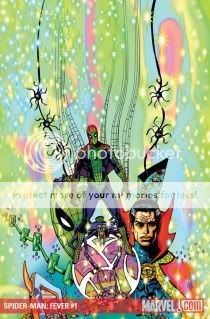
I went into Spider-Man: Fever with absolutely no brief with Brendan McCarthy, not even his Solo issue a few years back. All I knew is I liked the looks of the preview images floating around the Internet–I mean, I would–and wanted to see more. See more I did: McCarthy’s scribbled psychedelia, powerfully augmented by his and Steve Cook’s woozy glowy neon colors is a thing of gooey beauty. He’s even calling the style “glo-fi,” much to my delight!
Would that the surrounding comic were equally delightful, but it’s a pretty perfunctory rehash of Bronze Age rehashes of Silver Age storytelling. An avalanche of knowingly stiff dialogue, which turns out to be as numbing as the unknowing variety, crushes whatever action hasn’t already been flattened by the surprisingly inert physicality McCarthy cooks up for Steve Ditko mainstays Spider-Man and Doctor Strange. (Nice-looking Vulture, though.) There’s even some embarrassingly cringeworthy African-American dialect, for that true late-’70s feel. I’m as happy as anyone to have a Spider-Man comic featuring a mystical poetry-reciting dog-god named Pugly, but when it comes to reading the thing instead of just looking at it, turns out I oughtn’t have gone beyond those preview images for the glo-fi thrill I wanted.
(Interview link via Jog.)
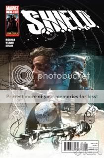
Comics Time: S.H.I.E.L.D. #1
April 7, 2010S.H.I.E.L.D. #1
Jonathan Hickman, writer/artist
Dustin Weaver, artist
Marvel, April 2010
36 story pages
$3.99
Supremely confident superhero comics-making from Jonathan Hickman here. In fact I’d say there hasn’t been a debut issue this sure of itself, this willing simply to throw its audience headlong into what the writer has cooked up, since the Nu-Marvel golden age of Morrison & Quitely’s New X-Men, Bendis & Maleev’s Daredevil, and Milligan & Allred’s X-Force. Who knows where it’ll all end up, who knows if it’ll hold up or make sense or not be really stupid or something. But within the context of these 34 pages of comics and two pages of Hickman designiness, I found it extraordinarily invigorating.
S.H.I.E.L.D. purports to tell the secret history of a Marvel Universe (I’m not comfortable using the definite article for reasons that will become apparent), in which a blend of fantistorical figures like the Pharaoh Imhotep and actual real-world Great Men like da Vinci and Galileo have banded together over the centuries in an ancient secret society called the Shield (I’m not comfortable using the acronym for reasons that are a little nebulous at this point). The Shield has quietly protect the world from assorted apocalyptic threats familiar to us from Marvel’s outer-space material, including Galactus, a Celestial, the Brood, and (I think) the Phoenix. You are perhaps at this point tuning out: Secret histories and secret societies and super-awesome science heroes who protect us both from threats and knowledge of those threats are obviously a pretty shopworn concept at this point, and the influence of Hickman’s mad-idea-mongering predecessors Grant Morrison and Warren Ellis is unmistakable.
But it’s not the size of the boat, it’s the motion of the ocean, and Hickman and artist Dustin Weaver keep things moving at breakneck speed. You get a grand total of one page to ease into the action, with main character Leonid slowly and silently walking toward the viewer, and then BOOM, he’s whisked off by a pair of suited agents in a sweet ’50s car, he’s revealing that his body is made of stars or something, he’s flown to Rome and shown a gigantic underground city–by page four. Most comics today might get that far by issue four. I’m not one to complain about decompression, or at least I didn’t used to be, but obviously the technique has gotten so common as to become predictable; most anyone who’s read enough superhero comics could write a new series’ first story arc in their sleep, knowing exactly where each beat would fall. With Kirkman and S.H.I.E.L.D., I’m kept dancing to a different beat, one where world-ending threats are introduced and thwarted in the space of two to three pages, only for a jump of centuries to bring us to the next one; where a character learns his great destiny and then a three year lacuna reveals him stuck in place, bored and staring at the ceiling; where villains are introduced for the very first time anywhere as if we have the same lengthy history with them that the characters do; where names of great import to Marvel fans are dropped in, precisely calibrated to do that whole “everything you thought you knew was wrong” thing; where Leonardo da Vinci flies into the sun, All-Star Superman-style. In my favorite panel, a council of elders just starts rattling off omgcrazy terminology like they’re reading the specials at the Cheesecake Factory: “The Greater Science.” “The Quiet Math.” “The Silent Truth.” “The Hidden Arts.” “The Secret Alchemy.” Rat-a-tat-tat!
I know he’s being singled out for a lot of praise, but I think Weaver’s the weak link here, to an extent. He’s doing great things with the designs of the Shield’s unique armor and architecture, in a fashion that reminds me of similarly impressive filigrees by the likes of Steve McNiven and Mike Choi. But his characters sit awkwardly among the splendor: Their scale is off at times, and but for a blink-and-you’ll-miss it caption and school bus it’s impossible to tell that this is a period piece and that Leonid’s in high school at the oldest. I’d love to see as much attention paid to the mundane aspects of establishing the story’s world as the mind-blowing ones. But this is sort of small beer. Call it supercompression, call it simply a return to the no-nonsense pacing of the Golden and Silver Age superhero origin stories, but S.H.I.E.L.D. comes across as a book that knows what it wants to do and can’t wait to show you. It’s a delightful feeling.
Comics Time: The Diary of a Teenage Girl
March 30, 2010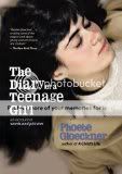 The Diary of a Teenage Girl
Phoebe Gloeckner, writer/artist
Frog, Ltd., 2002
312 pages
$22.95
Buy it from Random House
Buy it from Amazon.com
Originally posted at The Savage Critics on April 27, 2009.
Heartbreak and rage: that’s what I feel when I read this book. It’s the story of one Minnie Goetze, a 15-year-old girl growing up in ’70s San Francisco, doing so in large part by having sex with her alcoholic mother’s adult boyfriend and, as time goes by, through various other increasingly drug-fueled sexual encounters. There are a couple of tricks to the book.
The first is that “Minnie Goetze” is Phoebe Gloeckner. Gloeckner doesn’t so much deny that the book is autobiographical as question the validity of the very notion of autobiography, but I mean, that’s a photo of teenage Phoebe Gloeckner on the cover, what can I say. Does it matter, more than in just a lurid/tabloid way? I think it does a bit, in that you can then see the book not just as a novelistic chronicle of a precocious teenager’s troubled adolescence but as a product of that adolescence, and of the subsequent lived experience of its author. It also goes a long way toward explaining how perfectly Gloeckner is so able to capture teenagedom’s unique combination of acute self-awareness and total cluelessness, its passion for physical pleasure and mental/emotional inability to process that pleasure’s ramifications: Presumably, a lot of this is lifted from an actual diary of an actual teenage girl.
The second trick is that the book is a hybrid, “An Account in Words and Pictures” as the subtitle puts it. The bulk of the book is prose, a series of entries from the titular diary. That material is the voice of 15-year-old Minnie, pure and simple. Though she frequently addresses an imaginary audience in those entries, they really have an audience of one, Minnie herself, and they’re where you get her unfiltered in-the-moment understanding of what is going on in her life. Then there are doodles and full-fledged, underground-style comics created by 15-year-old Minnie (actually 15-year-old Phoebe) interspersed throughout, revealing how Minnie is processing her experiences into art, just like any artist would. (At 15 she could already draw the pants off a lot of underground cartoonists, by the way).
Next there are illustrations by the grown-up Gloeckner (we never have a sense of the presence of a grown-up “Minnie”), sometimes presented as spot illos, other times receiving a full Victorian-style page with a caption beneath it. Here is where the current, adult author inserts herself, crafting psychologically subjective images of whatever is going in the narrative. Sometimes they’re just impeccably drawn portraits of the characters (“Ricky Ricky Ricky Wasserman, that exquisitely handsome boy”) or doodles of the minutiae and marginalia of Minnie’s life and mental environment (“the image of the dinosaur that is travelling through space right now”). Other times they’re stylized for effect, highlighting the venality and ridiculousness of Minnie’s situation with satirical savagery. A favorite weapon in Gloeckner’s artistic arsenal is to exaggerate the size of Minnie and her teenage friends’ heads in proportion to their body, or exaggerating the size and fleshiness of Monroe, Minnie’s adult lover, in proportion to Minnie–emphasizing the fact that for all her intelligence and sexual experience, Minnie is a child, often with a child’s way of relating to the world. (It’s easy to understand the implication of her near-constant crying before and after liaisons with Monroe, or while there’s just as much of a thematic connection between her sexual and pharmacological voraciousness with her sweet-tooth as there is with the alcoholism and drug use of her mother and Monroe himself.)
Finally there are the comics, which is why I’m talking about this book on this site to begin with. This, again, is adult Gloeckner expressing herself, but this time with the dispassionate yet brutally condemnatory eye of reportage–a Joe Sacco of Polk Street, right down to the formidable chops. (Gloeckner worked as a medical illustrator, which helps explain images like these–“exceptionally unsafe for work,” as the site warns.) Using a couple of simple grid templates and relying on few illustrative tricks except exceptional craft, the comic sequences generally focus not on the truly disturbing moments in her life, the statutory rape and the heroin–for that, see Gloeckner’s first book, the collection A Child’s Life–nor on the girly teenage fun stuff that pops up in the illustrations and prose with just as much frequency as the sordid material. Rather they depict the run-of-the-mill not-right-ness of her everyday life. A mother who parties with a lawyer they’ve nicknamed “Michael Cocaine” in front of Minnie and her sister, though he’d never do so in front of his own kids. A married man Minnie’s friend Kimmie babysits for, getting them high and driving to a hotel to have sex with them. Various men, from family friends to upperclassmen, making comments about Minnie that are just this side of uncomfortable and inappropriate. Minnie’s mischievous antics around Monroe, Monroe’s dismissiveness and emotional unavailability and predation toward Minnie. There’s a bravura, wordless sequence where Monroe takes Minnie and Kimmie to the beach, and as we and Minnie watch, Monroe seduces her friend. Another knockout where Minnie and the girl she falls in love with, Tabatha, smoke a joint that Tabatha then tells Minnie was laced with angel dust, the neat grid of the comic giving way with a page-turn to a midnight-black splash page peppered with psychedelic non sequitur images (the dinosaur travelling through space makes a return appearance), evoking the mystery and terror of chemically blowing a mind that isn’t nearly finished growing on its own.
It’s not easy material, that’s for sure. But it’s warm and detail-driven and just so, so smart, even at its most potentially sensationalistic. And it’s rich, extraordinarily so. The main storyline is devastating, no doubt–this time around reading the book, I found myself getting physically nauseated when Minnie’s diary falls into the wrong hands, the same way I felt when I had a similar experience as a teenager; meanwhile my anger and disgust for Monroe and Minnie’s neglectful (or outwardly abusive, depending on how charitable you feel like being) mother were almost physical as well, as was my delight in reaching the book’s final illustration/caption combo (you’ll enjoy it when you get there, too). But you can just as easily spend a read-through focusing on, say, the contrasting qualities of the illustrated material like I did above. Or the development of Chuck and Pascal, the two characters who genuinely appear to have Minnie’s best interests at heart, and their fates as we learn whether or not that is in fact the case. Or the ’70s countercultural touchstones: David Bowie, Donna Summer, Pink Floyd, EST, Rocky Horror, R. Crumb and His Cheap Suit Serenaders. Or how fearlessly Gloeckner addresses teenage sexuality and sex in general. The raw pleasure, the hunger for it…
Oh God, you know, you can really feel it when they come inside of you.
I know Monroe would miss me if I wasn’t around. I know he’d think about me then because he doens’t know anyone else like me. I think of him all the time.
And that hot breath…dreamy.
And when they’re just as hard as rocks and they’re stabbing you and you could just scream you can hardly breathe it is so 78vghjftgj46z35uzsfyubyuib78cx5742q24xr68v680b790[79[v689pc568ozx3463455yw46uc46759v689pvyuiuilv679
…and the barely suppressed disgust at the physicality of it…
The sexual nature of Kimmie Minter is a viscous cervical mucus that always welcomes mating. She was slimy and wet even though she always says she doesn’t like Monroe and she says Marcus’ dick is much bigger and it’s too bad I didn’t see it.
…and the emotional trauma it can cause when people who should know better have made it so that’s all you see yourself as good for…
I hate men. I hate their sexuality unless they are gay or asexual or somehow different from the men I’ve known. I hate men but I fuck them hard hard hard and thoughtlessly because I hate them so much. At least when they’re fucking me, they’re not looking at me. At least I can close my eyes and just hate them. It’s so difficult to explain.The Diary of a Teenage Girl is, in that sense, the diary of a lot more than one teenage girl. It’s the intimate mind-life of a segment of society populated by men, so very very very many men throughout the book, who sense pain and hunger like that radiating off a 15-year-old and swoop in like moths around a flame, like vultures around a carcass. And for every extraordinarily strong and brilliant and talented Minnie who manages to emerge from the swarm intact enough to recount her experiences decades later, how many don’t? It’s a comic from the edge of the abyss, and I love it.
PS: In case you missed the link, here’s a lengthy interview I conducted with Gloeckner back in 2003. It’s one of my favorite interviews I’ve ever done.
Comics Time: The Last Lonely Saturday
March 24, 2010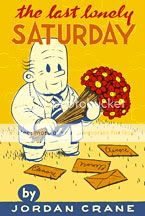
The Last Lonely Saturday
Jordan Crane, writer/artist
Red Ink, 2000
80 pages, hardcover
$8
Buy it from Fantagraphics
Originally published at The Savage Critics on March 16, 2009.
I find it both impossible and undesirable to separate The Last Lonely Saturday from the pivotal role it played in my life as a comics reader, and thus in my life in general. During the year 2001 I took a job as an editor at the A&F Quarterly, Abercrombie & Fitch’s big giant magazine/catalog/softcore porn hybrid publication. My boss there, Savas Abadsidis, was and is a big fanboy, and a chance encounter with a Wizard magazine on his desk, which contained an article teasing an upcoming revamp of the X-Men by Grant Morrison (whom I remembered favorably from my days as a comics reader in high school for Arkham Asylum) and Frank Quitely, led me into Jim Hanley’s Universe on 33rd Street to track down the series. This was the first time I’d entered a comic shop to purchase anything that wasn’t either an isolated Acme Novelty Library, Savage Dragon, or Frank Miller comic in years–the birth of my modern comics readership.
Intrigued by the offerings on hand, and empowered by a complete lack of editorial oversight that enabled us to write about anything we wanted in the Quarterly–not to mention Abercrombie’s expense account–I made a solemn vow to buy something completely unfamiliar to me every week. Jordan Crane’s The Last Lonely Saturday was one of my first such purchases. From there it was a short journey to Crane’s anthology NON, his distributor Highwater Books, the Fort Thunder aesthetic in general, and thence all of alternative comics.
None of that was likely to happen if I didn’t just love The Last Lonely Saturday to pieces. And that itself might seem unlikely. It’s a slight book–many of its 80 pages are endpapers, and the rest contain all of two panels apiece. Dialogue is minimal; the majority of it of it comes from a little boy’s triplet proclamations: “It’s a man,” “Look man run,” “Ha ha! Windy!” It has a simple red, white, and orange color scheme. Although a ghost is involved and a character dies, we’re pretty far from the violent morality plays that make up much of Crane’s recent work.
What The Last Lonely Saturday is is a love story, a romantic fable. To some eyes, it might be a creepy one at that. In the tradition of the Police’s “Every Breath You Take,” albeit in something of a gender reversal from that song, Saturday could be looked at as a depiction of the role fixation and selfishness, even emotional violence, frequently play in love. But just as the sweeping, insistent, intimate, evocative sound of “Every Breath You Take” make it one of the great love songs regardless of the obsessive lyrics, so too the particulars of The Last Lonely Saturday make it pretty much the best love story in comics form I’ve ever come across. Crane’s character designs are at their most adorable here. His jolly little potato-shaped protagonist, with his rumpled suit and charmingly crinkled brow, looks like the grandpa of our collective unconscious made real. His beloved Elenore’s jaunty hairdo, long eyelashes, and high-wattage smile evoke beauty and charm that transcends her cartoony form, while her two lines of flashback dialogue upon receiving flowers from her beau (“Oh sweet heart! They’re just lovely!”) nail me to the floor with sweetness every time. Everything seems airy–leaves and papers float and twirl in the breeze, the little old man’s car jauntily jumps along the road, puffy white clouds are a constant presence in the background–until, at the story’s moment of truth, Crane weighs down his line and crumples his art toward the center of the panel. I’m a huge, huge sucker for emotionally devastated old men, so imagine my utter joy when our hero is granted a reunion with his dear Elenore! (Think the video for Blur’s “Coffee & TV” and you’ve pretty much got it.) At that point, it doesn’t matter to me how it happened–that it did happen is what’s important, and that Elenore understands this is what makes The Last Lonely Saturday a great love story, in that it appreciates that what can seem unpleasant to outsiders is, within that world of two, an act of grace. It’s an intelligent, moving, beautiful, terrific little comic.
Comics Time: Black Hole
March 22, 2010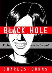
Black Hole
Charles Burns, writer/artist
Pantheon, 2005
368 pages
$18.95, softcover
Originally published at The Savage Critics on February 23, 2009.
You lose a lot of extremely impressive supplemental material if you purchase or read only the collected edition of Black Hole rather than the individual issues from Fantagraphics (and, earlier, Kitchen Sink). The full-color front and back covers for each issue are probably what stand out in most people’s minds, followed perhaps by the almost masochistically detailed endpage spreads, and last but not least those terrific ripped-from-the-hotbox dialogue snippets that accompany Burns’s yearbook-portrait openers. I think everyone is probably partial to the one where a guy asks to be cremated if he dies so that his friends can smoke his ashes, but the one from the first issue isn’t some nugget of stoner wisdom, it’s the premise of the entire book:
It was like a horrible game of tag…It took a while, but they finally figured out it was some kind of new disease that only affected teenagers. They called it the “teen plague” or “the bug” and there were all kinds of unpredictable symptoms…For some it wasn’t too bad – a few bumps, maybe an ugly rash…Others turned into monsters or grew new body parts…But the symptoms didn’t matter…Once you were tagged, you were “it” forever.
That quote made it into the collected edition as the back-cover blurb. This one, from the twelfth and final issue, didn’t:
It’s like tryin’ to explain sex to a nun – there’s no way you’d ever understand it unless you lived it. I was there, okay? Half my fuckin’ friends died out there, man. I never dreamed I’d get out of that shit-hole…but one day I notice the stuff on my face is starting to heal and a couple of months later, I’m totally fuckin’ clean…out walking around with all the normal assholes.
This directly contradicts the quote from the first issue and upends the premise it establishes. Turns out the horror of the teen plague is finite. Turns out everything that happened in the book didn’t need to happen, not the way it did, not based on the assumption that nothing was going to change and they’d never get better. Turns out, in other words, that the teen plague was ultimately like being a teenager itself: It sucks, but you grow out of it.
Rereading Black Hole for the fourth time or so, it’s easy to see the set-up for this punchline. Keith in the woods during the kegger where he finds out Chris has the bug, peeing on a tree and grumbling to himself, “This is it…this is all it’s ever gonna be. It’ll never get better…I’ll always be like this…” Chris’s similarly themed rebuke of her parents: “You don’t understand! You’ll never understand! Never!” The constant hyperbole the kids use to describe virtually everything even potentially enjoyable: “It was going to be the best day of my life”; “Rob had brought along all kinds of incredible things to eat…black olives, an avocado, french bred, salami, cheese…”; “All right! That’s gonna blow your fuckin’ mind!“; “It’s called Monument Valley–you won’t believe how amazing it is!”; and my favorite, “I want to show you how to make the best sandwich in the world.” Chris telling Rob “I’ll love you forever, no matter what,” and Keith and Eliza telling each other the same thing. Chris’s repeated refrain “I’d stay here forever if I could”–in Rob’s arms, in the icy water looking up at the night sky. Everything is either the best it can possibly be or the worst it can possibly be, and it will never change.
Needless to say that’s just about the most accurate depiction of the emotional life of teenagers I’ve ever seen. It’s how I remember high school. It’s not terribly far removed from how I remember college. (And to be perfectly honest, when I think of how I look at the world even now, it’s within spitting distance of how I live today, which is probably a big part of why this is one of my favorite comics.) But of course, things do change. Bad things usually get better, which is why it’s such a goddamn tragedy any time a teenager commits suicide because of a bad grade or a breakup–or when a group of sick kids feels it necessary to drop out of school, run away from home, and in the case of some characters literally throw their lives away. And unfortunately, good things often get worse; parents do understand, at least some of the time, and it’s damn hard to tell someone “I’ll love you forever, no matter what” and mean it, and two stoners driving across country probably won’t be able to find a cozy apartment where he can make an honest living and she can work on her art and they both live happily ever after. That’s a tragedy too.
So why remove the quote that points this out, the quote that completes the metaphor? Maybe–and I’m just guessing here; I’ve interviewed Charles Burns about this book a couple of times but I don’t recall asking him about this–he didn’t want to give us that escape valve. Maybe he doesn’t want us to read this and think, “Silly kids, if only they knew.” Maybe he wants to eliminate anything that lessens the number-one effect of the story and the art here: claustrophobia.
Honestly, the claustrophobia of Black Hole is what struck me the most in this reread. Take the panel gutters, for example. Burns employs a traditional method of delineating between real-time action and dreams or flashbacks–straight gutters for the real stuff, wavy gutters for the reveries. But those wavy gutters still create as uniform a grid as ones drawn with a ruler would. Instead of dreaminess, they evoke haziness, like heat waves radiating up from a road or the room spinning when you’re cataclysmically wasted. Indeed, the few times the grids do deviate from the norm is when the characters are completely blotto, or completely panicked–even there, panels remain locked in tiers, and the effect is like careening from one side to another when you’re too drunk to stand up straight and really, really wish you were suddenly sober again but you’re stuck drunk. There’s no way out.
Then there’s the look of the art itself. Elsewhere I’ve described it as like immersing yourself in a blacklight poster, which is apt not just because of the subject matter (look and you’ll see a few such posters on a few walls, in fact) but because looking at this book can practically give you a contact high. While I read the book this time around, I thought it might be neat to listen to a couple of playlists I recently made of the kind of electronic music I listened to in college, a time when presence of the kind of emotions you find in Black Hole still feels fresh to me, a time when I got stoned pretty frequently listening to that very music. Even though I did this on the commuter train out of New York, I’ll be damned if I didn’t feel the pressure on my eyeballs, the weight in my limbs, a slight throbbing of the vision when staring at Burns’s flawless blacks and the trademark shine effect of his characters’ hair. For the first time in his career, I think, style and substance lined up perfectly. It’s not for nothing, though, that the use of drugs and alcohol in the book almost always reduces the options available to the characters–most of the time they prevent people from doing what needs to be done or saying what needs to be said, and even during the story’s few positive depictions of inebriation, intoxicants are used to push things toward a preordained conclusion rather than open up other possibilities. No minds are expanded.
Maybe the most powerful aspect of the book’s claustrophobic effect is its eroticism. True to adolescent love and lust, the desire these characters have to fuck one another is irresistible and all-consuming–it has to be, or else the story couldn’t have happened, and virtually every major plot development wouldn’t have taken place either. Frequently the very environments where the sex takes place contribute to this feeling. Rob and Chris’s fateful liaison takes place in a graveyard. Keith first sees Eliza, nude from the waist down, under the harsh and unforgiving glare of florescent kitchen lights
. He first becomes aroused by her when her tail struggles against the restraint of her towel. Their romance is kindled in her bedroom, surrounded by hundreds of her bizarre (and very blacklight) drawings. They first have sex while stoned as fuck, a red scarf draped over the lamp and bathing everything in crimson. The atmosphere is oppressive, but so can be the feeling of being very, very turned on. “That’s all it took to get me totally sexed up and crazy,” says Keith of his first kiss with Eliza. “I could hardly catch my breath.” (Is it worth noting I knew a girl who looked a bit like Eliza back in college? Probably.)
One final motif comes to mind when I think of how Black Hole works to confine and oppress: repetition. I’ve already mentioned some of the repeated dialogue, and there are any number of repeated visual cues–shattered glass, snakes, holes–and even repeated scenes–Chris floating in the water, those dream sequences. But there are two instances of repetition that stand out to me the most. The first is when Keith angrily leaves his parents’ house to avoid watching some lame TV movie with them, only to end up tripping on acid and watching the very same movie at his friend’s girlfriend’s place. The second, and the most chilling, is Eliza’s sexual assault, which is an implied echo of never-directly-described abuse she suffered at the hands of her stepfather–and, as her nightmare at the end of the book indicates, will likely continue to haunt her dreaming and waking life. Even her and Keith’s blissful roadtrip escape is just a tour of places she’s already been, trying to recapture the happiness she knew long ago. And maybe this more than anything else is why cutting that final reveal that the bug was temporary was the right move: Bad things usually get better, but that doesn’t mean they never come back–different, perhaps, but the same in all the ways that count. Sometimes you can break free of something only to spin right back around to it, spiraling inward into that gravitational maw until that bad thing might as well be constant, for all you can truly escape from it.
I mean, the book is called Black Hole.
For further discussion of Black Hole by myself and Dick Hyacinth, visit The Savage Critics.
Comics Time: Weird Schmeird #2
March 17, 2010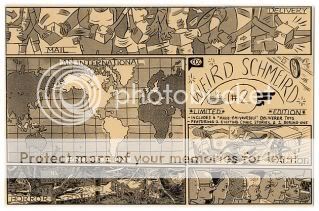
Weird Schmeird #2
Ryan Cecil Smith, writer/artist
self-published, 2010
32 pages plus six lasercut cardboard toys, plastic sleeve
$8
Ambitiously constructed and beautifully packaged, this is another workout in varying styles by CCC member Ryan Cecil Smith. The cover, and the opening vista of suburbia for the minicomic’s first story “Koshien: Impossible,” scan like Kevin Huizenga. The rest of that first story is all dense, explosive, propulsive ninjas-on-bicycles action, with massive rivers of speedlines that cohere like a Brian Ralph environment. There’s a sketchbook section in the grand “cartoonist’s travelogue” tradition. There’s a story set in the world of Two Eyes of the Beautiful, using that same Umezu-derived style to tell a “they had no idea how close they came to death”-type story about two oblivious, bicurious teenage girls who nearly fall into the clutches of the increasingly demented disfigured woman, who’s already transplanted the brain of one girl’s boyfriend into a dog. There’s a one-page cameo from Noel Friebert, with his trademark graphic treatment of text and almost textual treatment of graphics. There’s a little one-page Anders Nilsen monlogue-type thing. There’s a couple more sketchbook pages, making strong use of tones (as does the whole book). And there’s a third story that starts out with a Dan Zettwoch-style diagrammatic depiction of the university mailroom Smith worked in one summer, before telling the very very average tale of his life at that job in the Porcellino/Huizenga tradition. Finally, there are little die-cut cardboard mock-ups of DHL, UPS, FedEx, and Postal Service vehicles, and even a little mailman. Story #1’s the real highlight here–that thing’s a visual knockout, and I for one am dying to see Smith give that style a longer workout on something other than Xerox paper–but frankly it seems he could have stuck with any one part of this hodgepodge and made a strong minicomic out of it. As it stands, he went with all of them and made a strong minicomic out of that, and he could go down a number of rewarding roads from here.
Comics Time: Various (mostly) superhero comics worth your time
March 15, 2010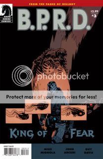
Last week was a strong week for monthly comics from the front-of-Previews publishers. Here are the ones I read and enjoyed.
Action Comics #887 (Greg Rucka, Eric Trautmann, writers; Pere Perez, Cafu, artists; DC): Not only do I like the idea and image of a giant, mad Kryptonian god-clone slowly walking from Iraq to Pakistan and fucking up everything in his path, I also like the “story” filed by Lois Lane about the rampage that serves as the issue’s narration. A lot of times these things sound so phony, but Lois’s piece on this crazy thing, and how Kryptonian heroes Nightwing and Flamebird have been framed by her dear old Dad, has the the breathless feel of a celebrity Huffington Post column, which is probably the sort of thing Lois would be doing in the real world. Solid stuff. Also, Cafu (cover artist and artist on the Captain Atom back-up) is a phenomenon in the making.
Batman & Robin #10 (Grant Morrison, writer; Andy Clarke, artist; DC): I thought Andy Clarke had a couple of storytelling hiccups here, nothing major, but upon a re-read paying closer attention, they mostly evaporated. In this issue he and Morrison turn Wayne Manor into, as Dick Grayson himself puts it, a sort of game of Clue–a three-dimensional puzzle with secret passages, hidden messages, and portraits of long-dead ancestors that contain clues to a centuries-old secret. It’s like that part in Indiana Jones and the Last Crusade where Indy and Elsa roam around that library looking for the entrance to the catacombs–only this has Batman & Robin! Brainwashed, programmed-to-kill Robin at that! Morrison seems to be leaning too hard on the “Oberon Sexton is Bruce Wayne” thing for it to ultimately pan out, but who knows. This thing is inner-eight-year-old gold.
B.P.R.D.: King of Fear #3 (Mike Mignola, John Arcudi, writers; Guy Davis, artist; Dark Horse): My God, this book just keeps getting better and better. I don’t want to spoil what happens in this issue even obliquely, except to say that I’m very very happy that what happened happened, that there’s a character design in this that is among my very favorite character designs of all time (particularly for how it utilizes Guy Davis and Dave Stewart’s blacks), that every page pays off some years-old strand of story, and that the slow downfall of the Bureau–unfurled with laconic dialogue punctuated by bouts of intense violence–is my favorite ongoing storyline of the last decade.
Criminal: The Sinners #5 (Ed Brubaker, writer; Sean Phillips, artist; Marvel/Icon): Sweet revenge! And wow, Val Staples does yeoman’s work on this book, huh? Again, I don’t wanna be a heel and give away the ending, but it ends on a high note for the arc, and I admire the grin-provoking way in which the final pieces click into place.
Powers #3 (Brian Michael Bendis, writer; Michael Avon Oeming, artist; Marvel/Icon): The obnoxious teenage girl Walker and Sunrise are chaperoning in this issue spouts Brian Bendis’s funniest dialogue in recent memory, while it’s fascinating to watch Michael Oeming’s once-slick Timm-isms give way to this rough-hewn, almost abstracted tumult of shouting faces, blasting energy, spurting blood, and flying, tumbling bodies. This whole issue is visceral in a way that only those grand-guignol killings used to be. Very interesting.
Superman: Last Stand of New Krypton #1 (James Robinson, Sterling Gates, writers; Pete Woods, artist; DC): I sort of wish this issue’s “This is a job for Superman!” moment had been the climax of the final issue of World of New Krypton–I think it would have punched up an ending that sort of felt anticlimactic, what with its murder mystery involving characters we barely know and a series of confrontations with rather marginal space-faring DCU denizens. But that aside, I think this is a rollicking payoff to one of the more underrated superhero runs in recent memory. Brainiac and Lex Luthor vs. Superman vs. Zod is a terrific roundelay, Zod’s behavior here re-villains him after he got a little too cuddly during WoNK, it’s fun seeing the rest of the Superman Family (Superboy, Supergirl, Mon-El, the Legion) show up and slug it out with Brainiac bots for the life of New Krypton, Pete Woods draws some good flying and punching…In a weird way I’m almost glad that J. Michael Straczynski will likely make a clean break from this material, because that means at some point in the relatively near future I’ll be able to own a complete set of trade paperbacks of this whole era of interconnected Superman titles, and on some rainy afternoon I can watch the whole conspiracy and war unfold. Should be a pip.
Ultimate Comics Spider-Man #8 (Brian Michael Bendis, writer; Takeshi Miyazawa, artist; Marvel): It’s a shame the Ultimate line seems to be in the same boat as the Superman line, because Ultimate Spidey has rarely been better. In all fairness, it’s almost always been very good, of course. But the whole “Aunt May’s Crazy House of Teenage Superheroes” idea is a deeply satisfying status quo for the book. For starters, it’s a cool way to keep the universe feeling broad without needing to read too many of its other titles (thank goodness–they’re murdering babies out there!). For another, I’ve always thought Bendis writes these teen characters really well, the dramatic ups and downs of their friendships, and David Lafuente’s drawings of them are simply gorgeous. (His Gwen Stacy is out-and-out crushworthy.) Takeshi Miyazawa fills in here, and pretty strongly if not spectacularly, although the way he does Iceman’s head-icicles grosses me out. (I have a personal phobia about that sort of thing.) I got some laughs out of the names suggested for superpowered teen Ultimate Rick Jones, and I got a reminder that I’ve been enjoying this series for, what, 130 issues now, or something? I suppose I’m mostly curious seeing who becomes the real archvillains in a post-Kingpin, post-Green Goblin Ultimate Spidey world, but I don’t mind taking our time getting there.

