Posts Tagged ‘comics reviews’
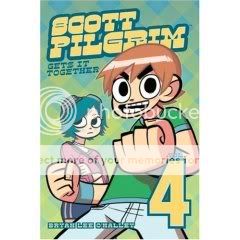
Comics Time: Scott Pilgrim Vol. 4: Scott Pilgrim Gets It Together
March 10, 2008Scott Pilgrim Vol. 4: Scott Pilgrim Gets It Together
Bryan Lee O’Malley, writer/artist
Oni Press, October 2007
216 pages
$11.95
You see a lot of criticism of the movie Juno centering on its stylized hipster-nerd banter. I haven’t seen the film, but I understand it involves the phrases “home skillet” and “honest to blog,” and that does indeed sound unfortunate. I would guess that someone out there could make similar hay out of the Scott Pilgrim series. Everyone is very “on” and clever and buoyant and witty and catty, a little like a stylized version of what you’d like to think you and your friends constantly sound like: “Scott, if your life had a face I would punch it. I would punch your life in the face.” Surely there’s people who’d just as soon light the book on fire as read lines like that.
I’m not one of those people. I find the Scott Pilgrim world so winning, so immersive. Part of it is that dialogue, which makes you feel like you’re entering another, more entertaining world. Part of it is the books’ Nintendo-realism, and the sense-memory of playing video games conjured up every time Scott wins experience points or levels up. Part of it is the tremendously charming art, which gets more stylized and self-assured with each new volume. While at times I wish O’Malley’s characters were a little easier to tell apart, I actually got the hang of it pretty quickly this time because each of them has some little stylistic filigree–bangs or freckles or a ponytail or a beard or somesuch–that economically sets them apart.
And part of it is the characters. They’re admittedly not the deepest or most complex bunch, but I want fun things to happen to them. I want all of Scott’s cute female friends to make out with each other (even though the trendy-lesbian thing is a little easy–I mean, so am I). I want his roommate Wallace to party with his pants off. I want his snotty bandmates to dole out put-downs like Judge Judy and Dr. Phil. Now, do I want Scott really to get it together? I’m not so sure. I’m kind of enjoying him falling bass-ackwards into everything, like the Dude from The Big Lebowski or Kramer from Seinfeld. Still, I really enjoyed the story of his estranged rock-star ex-girlfriend Envy from Vol. 3, and while this installment’s saga of whether he and Ramona will finally say “I love you” isn’t quite as satisfying, it does at least begin to grapple not just with the emotional aspect of post-initial-infatuation relationships, but also with the sexual aspects, which had kind of been elided until now. I like reading Scott Pilgrim comics.
Comics Time: Blankets
March 7, 2008Blankets
Top Shelf, July 2003
Craig Thompson, writer/artist
592 pages
$29.95
Originally written on March 8, 2004 for publication by The Comics Journal
It’s safe to describe Blankets as the year’s most talked-about, most hyped, most divisive graphic novel. It’s also safe to describe it as one of the year’s best. The victim of an emperor’s-new-clothes backlash that in at least some cases had as much to do with the book’s publisher or its author’s previous work or the p.r. campaign surrounding it as with the book itself, Blankets is a marvelously drawn bildungsroman with a heart as big as the Midwestern plains in which it takes place. For that, it has been pilloried, and I wish I could understand why. Actually, scratch that–no, I don’t. If loving this rapturously illustrated and warmly told story of ecstatic pain is wrong, well, you know the rest.
Blankets is the more-or-less straight autobiography that author Craig Thompson’s debut novel, Goodbye, Chunky Rice, hinted at. Indeed, elements of Chunky Rice put in cameo appearances throughout its successor’s 592 pages, hinting at a rich underlying emotional universe in much the same way that The Lord of the Rings provided deeper and sadder echoes of material first found in The Hobbit. It’s a book about long-distance relationships–one with a girl, one with God; how they burn impossibly bright and yet can be extinguished with a phone call (in the former case) or a footnote (in the latter). Refusing to coast on mere audience recognition, Thompson’s art both mines and mimes the riot of emotion such relationships engender, employing sweepingly expressive brushwork–each page seems to swirl like a snowdrift–and a vast–perhaps “dizzying” is a better word–array of formally experimental devices. And yet the art steers clear of the facile: Everyone notices the “blankets” of lush white snow, but a careful scan through the book reveals an almost obsessive use of powerful blacks, the unspoken yang to the wintry yin. Thompson’s narration is believably unreliable, at times appearing to believe every word of its descriptions of sexual or spiritual perfection, at other times imbuing the delivery with that unmistakable you-can’t-go-home-again regret, at all times trusting the reader to make the distinction. What we’re left with is a book about rejecting Christianity that, miraculously, judges not; a book about adolescence that recognizes that term as one describing an age, not a level of complexity, or more specifically a lack thereof. In love and in loss, what happens to our teenaged hearts matters. So does Blankets.
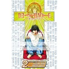
Comics Time: Death Note Vol. 2
March 5, 2008Death Note Vol. 2
Tsugumi Ohba, writer
Takeshi Obata, artist
Pookie Rolf, translator/adapter
Viz, November 2005
200 pages
$7.95
First of all, look at that price point–talk about bang for the buck! No wonder these things are so popular. Second of all I found this volume to be an improvement over its predecessor in virtually every respect. The art is more interesting and individualized in its depiction of the characters: I loved the big bag-rimmed eyes, wiggly bare toes, and thumb-biting neurosis of L the wunderkind investigator, and man oh man I could look at the clothes and hair Obata delivered for the ill-fated Naomi Misora all day. But of course we won’t be seeing much of her anymore, and that’s part and parcel of the improvement in terms of the tension of the cat-and-mouse suspense aspects seen in this issue: We see just how far Light will go to preserve his anonymity by killing off very likeable, very innocent characters, and by having that happen this early in the game, the creators show us that no one is safe and that they’ll be throwing curveballs. I still get a little tired of the constant narration of everyone’s thoughts and deductions–I long for the quiet cogitation of the characters from The Wire, which I’m experiencing for the first time more or less simultaneously to Death Note and which displays a lot more faith in the audience to follow what’s going on–but I’ll admit that it’s an effective way of showing off how byzantine the schemes and counter-schemes get from moment to moment. It’s enjoyable pulp fiction.
Comics Time: Blar
March 3, 2008Blar
Drew Weing, writer/artist
Little House Comics, 2005
20 pages
$3.25
This minicomic about an adorable barbarian killing machine and his gag-strip adventures reminds me of Roger Langridge’s Fred the Clown stuff in three particulars: 1) The bigfoot-style cartooning is absolutely impeccable (I actually prefer this to Langridge–it’s warmer and humbler, if that makes sense); 2) the humor stems primarily from a human shortcoming (in this case stupidity, in Langridge’s case usually a combination of stupidity and venality) being expressed through comic business; 3) the comic business isn’t funny. Seriously, I’d love to see this character in a far more straightforward action-adventure mode, one that’s as ridiculous as this is and just as chock full of crazy enemies (The Berserker Hordes of Nazroth! The Dread Wizard-King! Mecha-King Gilgator!) but stripped of the shallow pratfall-based punchlines.
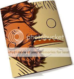
Did I mention the cartooning, though? Christ. Actually the book’s most entertaining aspects stem from the art more than the business–the house-sized sword in the final strip is a laugh-out-loud riff on the Berserk school of big-ass-sword-wielding, and that die-cut blood splatter on the front cover is witty and eye-catching (that cover scan doesn’t do it justice at all), and I love that Blar’s arm is almost always extended perpendicular to his body, with his sword perpendicular to his arm. The jokes could be that good too!
Comics Time: The Chunky Gnars: A Chocolate Gun Tribute
February 29, 2008The Chunky Gnars: A Chocolate Gun Tribute
Chris Cornwell, writer/artist
PictureBox Inc., October 2007
16 pages
$3.00
Like Paul Pope’s cover version of the first issue of Jack Kirby’s OMAC from his issue of Solo and Josh Simmons’s unauthorized Batman-as-psychopath minicomic Batman, Chris Cornwell’s Chunky Gnars mines the fertile vein of another creator’s work, in this case Frank Santoro & Ben Jones’s wondrous drug-teen-rock-action opus Cold Heat. I think these kinds of call-and-response comics can really tease out what works and doesn’t work in the original and be an extremely enlightening exercise for the responder.
In this case, Cornwell doesn’t quite hit the heights that the originators do, but to be fair that doesn’t seem like his intent–his goal is playing up the mixed-genre nature of Cold Heat for humorous effect, like having a rock-star-slash-assassin and an evil senator piloting a giant robot minotaur. Some of those moments are very funny, in fact, if a little catchphrasey–“I don’t start killin’…TILL I’M DONE ROCKIN’!!” shots the hipster assassin when the senator tries to get him to skip the encore and start the massacre. Better still is Cornwell’s funny-because-it’s-true depiction of the senator’s absurd, obliviously prurient fixation on the supposed evil of popular culture: Beads of sweat running down his bald head (which has suddenly been isolated against an oozing abstract background), he kicks off a test run of his latest speech with the immortal opener “We have become a nation that worships the rectum,” before his assistant unceremoniously cuts this reverie off.
While the whole thing doesn’t exactly cohere nor rise to the level of its inspiration, it does contain some gaze-worthy art that is at alternating times reminiscent of Santoro, Brian Chippendale, and in the second of its four title panels Beto Hernandez. Mostly it exists as a testament to how fired up Cold Heat has people, which is valuable in and of itself.
Comics Time: Aline and the Others
February 27, 2008Aline and the Others
Guy Delisle, writer/artist
Drawn & Quarterly, November 2006
72 pages
$9.95
On the one hand this book is an absolutely magnificent display of bravura cartooning–understated, energetic, loose as a goose, full of the joy of imagemaking. In a fashion reminiscent of Bill Plympton’s animated shorts, Delisle creates miniature portraits of various, mostly unpleasant women in wordless-strip form. The uniform layouts–tight grids of 15 tiny square panels per page–provides a static contrast by which we can marvel at Delisle’s effortless line and proficiency with delivering whatever tone he chooses–kinetic action in “Rita,” genuine erotic heat in “Diane” and “Karine,” delightful and unexpected visual puns throughout (my favorite, I think, was “Irene,” where both of the title character’s arms slide out of her left socket as though they were connected through her shoulders like an axle). Delisle chronicles his own sexual neuroses and issues with as much candor and visual cleverness as you’re likely to see this side of John Cuneo’s similar project nEuROTIC.
On the other hand, it’s quite easy to read this book as savagely misogynistic in its repeated reduction of women to their constituent body parts, or its repeated depiction of staid portly women as literally holding the pneumatic sluts within themselves prisoner, or its repeated message that women are materialistic, hypocritical assholes who’d just as soon make men miserable for no reason as look at them, let alone fuck them. Men don’t come off that great either, but that’s usually because they were stupid enough to get involved with women in the first place. The tone gets so strident that it flattens out the sophistication and creativity of Delisle’s ideas–cleavage and vaginas swallowing men whole, a literal vagina dentata, yes yes, we get it. It’s entirely possible that this is all quite self-aware–the existence of the androcentric companion volume Albert and the Others would appear to indicate that, though I haven’t read the book itself–but it’s also entirely possible that that doesn’t matter, and that at a certain point putting your conflicted or outright hostile feelings toward women on display leads to reinforcing them rather than confronting them. I honestly don’t know. It’s a powerful comic book, I’ll give it that.
Comics Time: Daredevil #103 & #104
February 25, 2008Daredevil #103 & #104
Ed Brubaker, writer
Michael Lark, Paul Azaceta, and Stefano Gaudiano, artists, #103
Lark, Azaceta, Tom Palmer, and Gaudiano, artists #104
Marvel Comics, December 2007 & January 2008
32 pages
$2.99
Daredevil is writer Ed Brubaker’s most overlooked book at the moment. It’s not as rollickingly entertaining as his and Matt Fraction’s wild genre mish-mash The Immortal Iron Fist, it’s not as character-defining as his Captain America, it lacks the “book I’ve always dreamed of writing” vibe of Criminal, and it’s not part of a high-profile crossover like Uncanny X-Men. What’s more, unlike Iron Fist or Cap, Daredevil is also up against years-long high-quality runs on the character, by the likes of Frank Miller and Brubaker’s immediate predecessor on the title, Brian Michael Bendis. And one thing that came up repeatedly during my monthly discussions of the series while at Wizard is that it’s one of the least showy superhero titles around: with no stunts, no events, no reboots, it’s simply consistently good issue after issue, which bizarrely works to its detriment in terms of maintaining a high profile with critics and readers. That’s a shame, because man, this is a very satisfying masked-vigilante comic.
Forget Spider-Man/Peter Parker: Matt Murdock is Marvel’s true everyman hero. Not in the sense that he’s a dork who lives in his aunt’s basement, but in the sense that he’s someone who, but for his blindness and super-senses and ninja training and red pajamas, you feel like you could actually meet in New York City: a rich lapsed Catholic pussyhound lawyer who can’t stand losing. That regular-guy vibe is used quite well in Brubaker’s run: The character is constantly shown bouncing between his superheroic activities and his civilian ones, on an almost scene by scene basis, like superheroing is a job he just can’t leave at the office and affects his life accordingly.
More importantly, those superheroic activities consist almost solely of beating criminals until they do what he wants. (Another Wizard colleague once told me that you can always recognize a bad Batman story by whether or not he’s acting like Daredevil, i.e. solving cases with his fists instead of his brain.) Now, it shouldn’t be hard for anyone who’s lived through the past few years to make the connection that what our superheroes do all the time, our government has to ignore international human rights treaties to get away with. In keeping with that Marvel-realist tone, Brubaker tackles the torture aspect of Daredevil’s vigilante activities head-on in this storyline (a blowtorch factors in at one point), and the result leaves us feeling refreshingly uncomfortable with our ostensible hero. He also portrays supervillain-driven gang wars in a convincingly ground-level way, simply replacing the strategic use of an AK-47 or a well-orchestrated hit (or, if you prefer, appearances by Luca Brasi or Omar Little) with the arrival of the Wrecking Crew or the Enforcers.
He gets slightly less mileage out of Murdock’s tortured-as-always romance, this time with his villain-targeted wife Milla–forgivable, considered how well-worn that territory is for the character. I think perhaps he could have tried to ground her slide into dementia by couching it in the emotional language of losing a loved one to depression, alcoholism, Alzheimer’s, or some other more relatable mental disease; perhaps he’ll get there eventually. For now, as aided and abetted by the fits-this-writing-to-a-tee art of the team led by Michael Lark, he’s cranking out a heck of a superhero book anyway.
Comics Time: Teratoid Heights
February 22, 2008Teratoid Heights
Highwater Books, Summer 2003
Mat Brinkman, writer/artist
176 pages
$12.95
Buy it from Bodega Distribution
Originally written on March 8, 2004 for publication by The Comics Journal; a longer alternate version appeared on this blog
Cartoonist Mat Brinkman is the most compelling member of the Fort Thunder art collective, combining the whimsy and chops of a Brian Ralph with the weirdness and choppiness of a Brian Chippendale or a Jim Drain. And in this little book, he’s created a minor sequential-art masterpiece. This nearly wordless, black-and-white collection of short adventure stories, in which a variety of monstrous, faceless creatures explore their respective environments with alternately hilarious and frightening results, recalls Jim Woodring’s Frank stories, in its deft use of scary-funny black humor and unexpected surprises. But it eschews Woodring’s familiar funny-animal tropes for something new, eerie, and original. The art, which simultaneously possesses the starkness of woodcuts and the manic detail of the ’60s undergrounds, quite simply looks like a transmission from Another Place.
Each of Teratoid‘s subsections has its strengths: The wild wanderings of “Oaf” are notable for their emotional range and their visceral description of this fantasy world’s geography; The simply-drawn creatures of “The Micro-Minis” are like cartoon automatons, their actions flowing naturally from their own design as a function of the very mechanics of drawing them; The wordplay of “Cridges,” the book’s only non-silent section, show Brinkman to be as able and witty a manipulator of language for its own sake as he is of art. The book’s real tour-de-force, though, comes in the section called “Flapstack,” which concerns the subterranean realm of little creatures that look a lot like pulled teeth. That section’s story “Sunk” is, I think, the single best comics sequence I read all year. Three of the teeth creatures, each bound to the other by a length of rope, fall into a winding labyrinth. As they try to navigate this complex maze, Brinkman intercuts between them as though multiple cameras are involved. The three creatures are indistinguishable but for the corresponding numeral that appears each time they come back “on screen.” Before long we have a sense of exactly where in the maze each creature is, and it’s the intense concentration required to keep up with Brinkman’s byzantine constructions that attaches us to the creatures as surely as their frustratingly short lengths of rope attach them to each other. As they attempt to overcome the obstacles they encounter, the tension is, almost stunningly, an edge-of-your-seat affair. The powerful end to this thriller–which, again, stars three silent and indistinguishable walking teeth–is testament to the power of the medium when artists deploy it in new and sophisticated ways, and to Brinkman for having the vision to do.
Comics Time: The Would-Be Bridegrooms
February 20, 2008The Would-Be Bridegrooms
Shawn Cheng, writer/artist
Partyka, 2007
36 pages
$4
The most recent minicomic by my friend Shawn Cheng sees him continuing to mine his interest (obsession?) with bestial forms, particularly the almost manic detail found in art representing the mythical monsters of Native and South American cultures. As opposed to the bleakness of his Ignatz-nominated collaboration with Sara Edward-Corbett The Monkey and the Crab, this one is much more playful in nature, despite sharing with that earlier work a plot involving a game of one-upsmanship gone horribly awry. As his coyote and jackrabbit protagonists play their game of dueling transformations to impress the grandma of their prospective bride, the fun is in watching Cheng’s character designs evolve from knowingly lo-fi (dig the coyote’s first-grader triangle for a nose) to hilariously baroque. Quickly running out of ideas, the two would-be bridegrooms start repeating themselves, producing high-level video-game variants on earlier creatures they’ve transformed into (“DEMONIC Ice Giant!” “MUTANT White Bear!”); once they max out their imaginations with their absurdly complex World Serpent and Thunderbird creations, they pause, give up and simply start beating each other up. All this is smartly offset by the constant observing presence of the adorable little round-headed grandma. (Her startled squeal of “Oh!” upon seeing the first transformation tickled me pink.) It’s she who gets to deliver the story’s punchline/moral, which is that showoffs inevitably lessen themselves compared to the woman they intend to impress. It’s an appropriate ending for a neato little mini that uses an understated, perhaps even slight, narrative to, yes, impress.
Comics Time: The Beast Mother
February 18, 2008The Beast Mother
Eleanor Davis, writer/artist
Little House Comics, 2006
19 pages
$5.00
Vainly hope to buy it from Little House
Like The Wicker Man (the original, not the nightmarish Nic Cage version, and God am I tired of having to say that), this beautiful minicomic by the prodigiously talented artist Eleanor Davis smartly plays upon and then reverses the ingrained sympathies of the modern genre reader. What appears to be a simple, perhaps even simplistic fable about a maternal monster, a man with a gun, and how we kill what we don’t understand turns out, in a fairly grim (perhaps even Grimm) fashion, to carry almost precisely the opposite message, albeit with enough ambiguity to keep you uncomfortable long after you’ve finished.
Davis is a thrillingly precise artist. In a slightly different world her art might have drifted into the overly slick style of the Flight school of animation refugees; instead it stops short of their cold cartoonishness thanks to unexpected touches of vulnerability in the character design and figure work (she’s Young Comics’ preeminent poet of breasts and body hair), yet without sacrificing a sense that every line is going exactly where she wants it to. Her use of black is powerful, guiding the eye around her immaculately composed layouts and as strongly delineated as the mini’s ridiculously attractive die-cut cover. Best of all she ends the thing with no fuss or fanfare–nasty, brutish, short, and highly recommended.
Comics Time: Captain America #33 & #34
February 15, 2008Captain America #33 & #34
Ed Brubaker, writer
Steve Epting, artist
Marvel Comics, December 2007 & January 2008
24 pages, $2.99 each
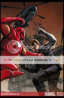
What can you say about a series that in one issue sees a disembodied cybernetic arm spring to life and effect a prison break like the Addams Family’s Thing on steroids, and in the next sees protests over mortgage foreclosures and high gas prices lead to a brainwashed squad of S.H.I.E.L.D. agents opening fire on unarmed civilians outside the White House? Taken together these two scenes illustrate the best thing about Ed Brubaker’s run on Captain America, which itself may well be the best thing ever to be done with the character: It blends all the disparate Captain America flavors—two-fisted World War II hero, star-spangled costumed superhero, Steranko superspy, gritty black-ops badass, American icon, Marvel Universe elder statesman, post-9/11 symbol of Where We Are As A Nation—into a smoothie of pure action-adventure satisfaction.
Of course, since his “death” (sorry, can’t help but put it in quotes) in the series a few months back, Cap himself is nowhere to be found in the book that bears his name, and everyone and their grandmother will tell you it’s a testament to the handle Brubaker has on the cast of supporting quasi-super characters–Sharon Carter/Agent 13, Bucky/The Winter Soldier, the Falcon, Black Widow, Iron Man, Nick Fury, Union Jack, Spitfire, the Red Skull, Doctor Faustus, Arnim Zola–that the book remains eminently readable. Everyone and their grandmother is actually wrong, but only because the way they’re framing the issue is so silly: I understand the expectations inherent in the concept of “title character,” but Brubaker is a skilled craftsman and so are his main artists on this title, Steve Epting and Mike Perkins, so the notion that the death of Steve Rogers–in terms of superhero secret-identity complexity, we’re not talking Peter Parker or Bruce Wayne here–would scotch the whole affair reminds me of that Seinfeld routine where he says that people who get passionate about their local sports teams are essentially rooting for laundry. No, what’s impressive about the continued quality of this series is Brubaker’s grip on the tone–how the absence of Cap has seemed only to intensify Brubaker’s abilities to draw from the strengths of all the aforementioned aspects of the character by extending them to his entire milieu. This sleight of hand is so deft that you’re so caught up with the cloak-and-dagger stuff involving various superpowered people infiltrating AIM and RAID and Kronas and so on that when the entirely organic-feeling results of those organizations’ schemes–the destabilization of the American economy via problems we in the real world are currently facing in slightly less intense forms–come to light, you’re just staggered by how appropriate it feels, even in a book where a major supporting character has the mutant ability to talk to birds. Heck, the guy even gets something interesting out of Mark Millar’s astonishingly stupid Civil War plot by playing the victorious Iron Man as a conqueror with a conscience.
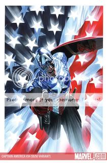
The big hook in issue #34 is that Cap’s old sidekick and current ex-Manchurian Candidate, Bucky, has now assumed the Captain America mantle. I don’t really understand why his new suit is shiny, other than it gives designer Alex Ross an excuse to bathe his paintings of it in even more sourceless white glow than usual, but who cares? He makes an interesting candidate for the position because unlike Rogers, who could only grieve over the horrors of the world, Bucky, like America itself, has actually committed a few. Now he’s trying to make up for it, and hey, we can relate, I think.
The festivities in these issues are underpinned by Epting’s muscular, much-imitated noirish stylings. His action choreography is impeccably intelligible, his punches feel like physical things, and he clearly has a great time with the costumes, uniforms, and tech that give the book its superheroic sheen even as he dirties it up with unidealized faces and blacks galore. His Red Skull is intimidating as heck, too; thanks to the plotline, it’s once again a mask rather than a guy with a skull for a face, and those normal eyes peeking out from behind all that latex or whatever it is are reminiscent of those shots in Texas Chain Saw where you can see Leatherface’s peepers rolling around beneath the mask. He’s creepy, in other words, and makes a great enemy for one of the three or four best superhero titles on the market today.
Comics Time: Goddess Head
February 13, 2008Goddess Head
Dash Shaw, writer/artist
Teenage Dinosaur Press, 2006
100 pages
$11.99
Buy it from the Poopsheet Shop
In theory I should love this book. A collection of various shorts from 2002-2004, it more or less epitomizes the abstract short-form comics that so excite me–an emphasis on repetition and rhythm, a disconnect (syncopation?) between text and image, figures and patterns bearing equal emotional and narrative weight, a pointed lack of “this means this, that means that” allegory or straightforward storytelling, emotionally rather than intellectually intelligible content. And yet it leaves me cold, both on its own terms and when compared to the Kevin Huizenga, Anders Nilsen, and John Hankiewicz comics of this sort that I find myself constantly returning to. Shaw’s line seems uncertain, frequently unattractive but for no discernible purpose, done this way out of lack of craft rather than intentionality. His stream of consciousness flows too frequently into the shallow waters of shock-value sexuality and easy self-reflexivity, neither of which seem to serve much purpose other than announcing themselves. The end result is scattershot, like it’s trying to do too much at once. The best work here is the lyrically minimalist day-in-the-life comic that concludes the volume, “Cheese”–the line shapes up, the visual language is clever (a one-panel shower scene riffs on the familiar breast self exam diagrams found in college dorm bathrooms everywhere) and, in the concluding sequence that uses the arching and flattening of a single line to signify the onset of sleep, quite poetic and beautiful. It displays the focus the rest of the book lacks. I think there’s enormous potential here–that he chose to do this kind of comics at all would indicate that–and obviously he’s got several more years worth of work under his belt at this point. But for now it’s not quite there.
Comics Time: The Complete Persepolis
February 11, 2008The Complete Persepolis
Marjane Satrapi, writer/artist
Pantheon, October 2007
352 pages
$24.95
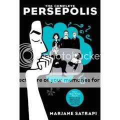
The first two-fifths or so of The Complete Persepolis is a pleasurable, even gripping read, coming across like a ground-level view of a real-world 1984 played as farce instead of tragedy. The euphoria of revolution giving way to factionalism and repression, the first ominous signs that something really bad is on the way, the lack of a coherent “and then this leader did this and this city did this” historical through-line (the Ayatollah Khomeini is never mentioned or even alluded to), the story told instead through only the glimpses of the avalanche of history available to a little girl—all this is reminiscent of Winston Smith’s memories of the dawn of Ingsoc and Big Brother in Orwell’s dystopian masterpiece. In this way Persepolis does those of us on the outside of Oceania Iran a great service as it reveals that this regime’s thought police is a miserable failure: Beneath the veils and behind closed doors, people live the most normal, hopeful, free lives they possibly can. The breezy cartooning and young Marjane’s precociousness leaven the proceedings with the kind of humor you’ve got to figure is anathema to the benighted thugs who’ve forced otherwise regular people into an ongoing nightmare of political prisons, bloody fanaticism, and hypocritical sexual repression.
But when the second chunk of the story rolls around, the seams start to show. Teen Marjane’s misadventures in Europe are a lot less compelling as narrative than li’l Marjane’s Revolutionary childhood–they’re not a whole lot more exciting than any kid you ever knew who smoked weed a lot in high school, in fact. And it’s at that point that you start to really notice the weakness of Satrapi’s cartooning. Her line seems chunky but without purpose, like it’s simply out of shape, while she either has the most limited ability to draw clothes and figures I’ve ever seen or she actually does know more people who dress head to toe in black all the time than you’d find in the audiences shown in Depeche Mode 101. Juxtapose both aspects of her art with the frames of the animated feature based on the book that populate this edition’s cover and the comparison is not flattering to the source material: The cartoon’s line is cleaner, the character designs tighter, and the graytones give the backgrounds (frequently nonexistent in the book itself) a lush life of their own. Satrapi also proves to be an unreliable editor for her own biography, as a lot of the juiciest material (losing her virginity, dealing drugs, the “hours of hallucinations” she suffered after a suicide attempt) are almost completely elided, in favor of countless stories about how tedious she finds her friends. (Hey, I’m with her there!) The book rambles on structurelessly, but not in a way that evokes the randomness of life–it’s all just there, and then it all just stops. The bummer of it is that when it does, you can still remember a time earlier on when you would have wished it didn’t.
Comics Time: Mother, Come Home
February 8, 2008Mother, Come Home
Dark Horse, November 2003
Paul Hornschemeier, writer/artist
128 pages
$14.95
Buy it used through Amazon.com
Originally written on March 3, 2004 for publication by The Comics Journal
2003 saw the release of gargantuan tomes like Palomar, The Frank Book, and Blankets, so it might seem facetious to claim that the year’s most ambitious graphic novel was a 128-page paperback. But how else to describe Mother, Come Home, a book wherein author Paul Hornschemeier’s formidable formal mastery is harnessed to an even more consciously grand personal tragedy? This is the kind of storytelling that’s as likely to fall flat on its face as it is to fly. Hornschemeier’s willingness to throw the full weight of his skill into this task is what ensured the latter outcome.
Originally serialized in the author’s Forlorn Funnies series, a more narrative-minded follow-up to his experimental one-man anthology Sequential, Mother tells the story of Thomas Tennant, a preternaturally conscientious seven-year-old dealing with the death of his mother and his father’s subsequent disappearance into his own broken mind. Interstitial titles set up the conceit that the novel is merely the “introduction” to a larger work, the first “chapter” of which is to be called “We Are All Released.” In this alone–that is, in grafting an unnecessarily complex framing device onto the story in order to deliver the four-word message of hope at the book’s end–Hornschemeier’s artistic fascination with the tension between control and freedom is evident.
It’s a tension that’s at work on every page. The cartoonist’s considerable skill in graphic design manifests itself in a panoply of geometric intra-panel layouts–boxes bisected by a furrowed brow, the edge of a door, the bend of a telephone receiver. It’s not specific images that stand out upon reflecting on Hornschemeier’s art, but unexpected diagonals and rounded corners, a sort of poetry of shape. But when Thomas retreats into his fantasy life, this everything-in-its-right-place precision is forgone for scratchy, simplistic, childlike linework. The escape Thomas plans for his father is made manifest in the boy’s own dreams.
Much has been made about Hornschemeier’s skill as a colorist, and his work in that department is every bit as deft as you’ve heard, but his lettering merits special mention. Throughout the book, the characters’ words are subtly dwarfed by the word balloons that contain them. This simultaneously suggests a certain generosity of spirit, a yearning for something more than what is being expressed, and a recognition of the futility and smallness of language to deal with the immensity of the suffering going on beneath, and on, the surface. (And it does so on the parts of both the characters and the creator, by the way.) Individual moments linger, too: Within the father’s fantasy, it’s the comments that seem the most casual which expand to fill their entire panels, conveying a sort of frantic off-handedness that smacks also of denial; lower-case lettering slips off-line and expands in manic curlicues, perfectly conveying Thomas’s hysteria upon realizing he’s alerted his uncle to his father’s breakdown. Meanwhile, the simplicity of the captions’ lettering offsets the occasionally baroque prose (perhaps bulletproofing the book against the kind of criticism occasionally leveled at Craig Thompson’s similar linguistic stylings in Blankets).
What elevates the book from graphic-designers-gone-wild wankery, though, is the way these devices perfectly complement and convey the values of the narrative. As Thomas and his father’s family falls apart, the two of them adopt a succession of tactics–a lion mask, a retreat into solipsism, a rigorously followed “groundskeeping” routine, a residential treatment facility, methodical escape plans–to exert control over the unbearable chaos of their lives, precisely for the purpose of freeing them from it. The tension-breaking achieved on a formal level by Hornschemeier’s occasional insertion of exhilarating out-of-nowhere experimentation (the floating fantasy introduction; the full-page jacket-cover illustration for another book with a tendentious relationship to the story itself; the nighttime views of the book’s sleeping characters, from the most important to the most obscure) is echoed on the narrative plane by flashes of humor (Thomas’s hilarious smackdown of his teacher makes up for her somewhat unrealistic (and unforgivable) behavior) and immensely warm pathos (the exchanged glances between a smiling Thomas and a scowling nurse are worth the price of admission alone for their heartbreaking directness). It culminates in a climax that by all rights should seem ham-fisted and forced, and yet works, emerging as it does from intensely intimate (and therefore immediately understandable) details of touch and sight and (not) taste–tiny, sensate building blocks of calamitous inevitability. What hints of too-neat tragedy remain are torn to pieces by the book’s final words, and the forward-looking eeriness of the image that accompanies them.
Mother, Come Home is the work of a young cartoonist who, confident in his craft, decided to do something big with it. For his ambition alone–which, thankfully, is far more common amongst his cartoonist peer group then its reputation as a collection of coasting glad-handlers would have it–he is to be respected. For his success–his indelible, beautiful, and heartrending graphic novel, the type of book for which the phrase “auspicious debut” was invented–he is to be celebrated. His book is a joy to read; the fact that this is a feeling forbidden to the characters therein makes it all the sharper, and sweeter, and harder to forget.
Comics Time: Death Note Vol. 1
February 6, 2008Death Note Vol. 1
Viz, September 2005
Tsugumi Ohba, writer
Takeshi Obata, artist
Pookie Rolf, translator/adapter
200 pages
$7.99
It’s hard not to cackle with glee at how neatly Death Note fits into the scary-media pantheon, filling a slot previously occupied by Marilyn Manson, Beavis and Butt-Head, Bart Simpson, Grand Theft Auto, N.W.A., Natural Born Killers, Dungeons & Dragons, and so on all the way back to the days of Elvis Presley and EC Comics. The premise–a straight-A student discovers a death god’s notebook, and anyone whose name he writes in it dies–is practically guaranteed to send authorities into a Chicken Little panic. It’s not the world’s most artful effort: like most translated manga, scene transitions are awkward and dialogue comes out in weird little bursts, while the figurework is sturdy but pretty standard and the characters play comfortably to type.
But it shines in a couple of regards besides that initial, killer high concept. I really enjoy the way Obata spots blacks; they’re pitch dark and almost geometric, as though the page is occasionally partially posessed by a slightly greasier Mike Mignola. And they come together in the form of Ryuk, the death god whose comically lanky larger-than-life presence and googly-eyed, permanently grinning, static shock of a face is a continual source of chuckles for me in its ostentatious weirdness. The other highlight is Light, the model high-schooler who within a few hours of finding the death note has become an archcriminal capable of baffling the combined law enforcement agencies of the entire world with his plot to exterminate the global criminal underclass and force everyone else into good behavior via paranoia. I’ve grown reluctant to harp on sociopolitical messages in genre work, but the idea here seems to be that Japan’s insanely intense educational culture produces miniature sociopaths, and that’s just plain funny. Right now the cat-and-mouse games aren’t engaging in any visceral way–by way of contrast, I’m watching the first season of The Wire for the first time, and there’s just no comparison–but the whole thing just tickles me in much the same way that Light’s plans tickle Ryuk, so I’ll make my way through the whole series, I’m sure.
Comics Time: Dr. Seuss Goes to War: The World War II Editorial Cartoons of Theodor Seuss Geisel
February 4, 2008Dr. Seuss Goes to War: The World War II Editorial Cartoons of Theodor Seuss Geisel
The New Press, September 2001
Dr. Seuss, writer/artist
Richard H. Minear, editor
272 pages
$19.95
I have to admit that I personally find editorial and political cartoons to be a colossal, frequently distasteful waste of time and resources. 99.9 times out of 100 they’re just strident, unimaginative, button-pushing sermons to the choir. They’re intended not to enlighten or persuade but to flatten complex issues into images so reductive that they’re not just simplistic but frequently misleading or even mendacious in their representation of what’s being talked about–which really doesn’t matter, because the right people will applaud and the right people will be outraged. You have to be extraordinarily gifted to make a go of this field, and maybe half a dozen such artists in the history of the English-speaking world have had that knack.
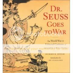
As it turns out, Dr. Seuss was one of them. Prior to his enshrinement as the 20th century’s preeminent author-illustrator of children’s books, the then-struggling Geisel–prompted by a loathing of Fascism–was an editorial cartoonist for PM, a daily New York City newspaper that served as sort of an unofficial spokesorgan for the Leftist coalition called the Popular Front. But as editor Minear points out in his informative and readable text pieces that contextualize the cartoons in this volume, the good Doctor was more populist than Popular Front, and his war-era cartoons reflect a general sense of, if not quite Leftist, then left-leaning fair-play values. As such they are enormously refreshing to look at and read. Seuss passionately attacks the racist Jim Crow policies of the military and industry. He targets the anti-Semitism of Charles Lindbergh and the isolationist movement, including one memorable cartoon where his uniquely Seussian “eagle” (it’s impossible to look at this big-beaked, long-necked American mascot and not put the species in quotes) bears a placard reading “I AM PART JEWISH.” One pre-war cartoon even lumps Communists (with whom PM was basically okay) in with Nazis and Fascists as the joeys in the kangaroo pouch of America Firsters. In fact his earliest post-Pearl Harbor cartoons, of Dec. 8th and 9th 1941, seem to view the onset of war primarily as a rebuke to the benighted domestic forces of isolationism he and the progressives at PM were regularly targeting anyway.
Also exhilarating is his choice of imagery, which is deeply Seussian and totally alien to the usual played-out editorial-cartoon tropes. He makes surprising use of visuals indebted to horror and fantasy: On several occasions he portrays the Axis menace as massive sea serpents (as regular readers of this blog’s horror posts know, I’m a sucker for water monsters), and in his best anti-Japan cartoon a spokesman for the Empire mouthing civilized platitudes is revealed by the downward-drifting eye to be a Lovecraftian monstrosity with lobster claws and dragon’s feet. Similarly, one of his most memorable jabs at Hitler portrays the Fürher as a sword-wielding, horned-helmet and skull-and-swastika-wearing barbarian dictator seated in a shadowy cave lair atop a hill of skulls, sending out his Vichy lackey Pierre Laval to round up forced French labor.
The Japanese monster-man, of course, serves to highlight through contrast Seuss’s big weakness: His depiction of the Japanese enemy as a fungible assortment of slanty-eyed, buck-toothed, pig-nosed, coke-bottle-glasses-wearing stereotypes, even extending to the supposed fifth column of Japanese-Americans who he lampoons as waiting for instructions from home in one cartoon. In this he’s no different than pretty much every other American propagandist of the period, but it’s still a letdown given his sensitive and progressive treatment of American racism generally, and how artistically creative he gets with virtually every other facet of the war. Take his bestiary, for example: his unusual American eagle I’ve already mentioned, while he frequently represents Germany as a put-upon dachshund. Russia almost always pops up as some giant bear, dinosaur, abominable snowman or something else huge. And delightfully, Seuss peppers astonished cats, dogs, and birds throughout his cartoons, reacting to the ridiculousness they encounter. Though it’s true that, as Minear points out, Seuss’s treatment of the Japanese is comparatively gentle compared to some of the really barbaric treatment they received from other artists, it’s still depressing to see his humorous specificity dropped when dealing with Japan, which is almost always depicted as a stereotype Minear, in his text pieces, can’t help but wrap in scare quotes.
But in pretty much every other aspect, these cartoons shine. For example, there are his drawings of the war’s leaders. His Mussolini is a contemptible jut-jawed pot-bellied dolt, portrayed in one laugh-out-loud parody ad for the fatuous charity “Bundles for Benito” as buck-nekkid except for a strategically placed copy of Mein Kampf. Seuss’s Hitler is always blithely unaware of his impending, inevitable defeat, eyes blissfully closed, nose in the air, combover jutting jauntily. (I do wish he’d have taken on the Allied leaders more directly: His infrequently depicted Stalin is pretty pro forma, and Roosevelt and Churchill, two of the most eminently caricaturable world leaders of all time and practically Dr. Seuss characters already, are never drawn at all.) Seuss also draws some wickedly complex Rube Goldberg-esque situations as allegories for bureaucratic red tape, and his occasional forays into military hardware–like the ginormous American warplane with fully 13 giant gun barrels bearing down on Hitler’s pathetically tiny single-propeller affair–are packed with energy and high estimation of American power. He’s a hoot as a wordsmith too, as you might expect. “Food? We Germans don’t eat food! We Germans eat countries!” says a skinny Prussian father to his emaciated son in a cartoon ridiculing Germany’s bad fortunes at home. A pre-war cartoon shows a matronly America Firster reading a storybook called Adolf the Wolf to her alarmed children: “…and the Wolf chewed up the children and spit out their bones…But those were Foreign Children and it really didn’t matter.” The joke hits all-too-familiar targets in this the “Never Again” age.
Which leads to the most chilling cartoon in the collection: Hitler and Laval merrily singing a duet in a forest whose trees are laden with hanged Jews. In his text pieces, Minear argues that Seuss’s goofy, Chaplinesque Hitler and his overall humorous comportment is inadequate to the task of upbraiding the true evil and horror of the war, while standout cartoons like this one and a pair of ominously Orwellian predictions of the fate of the American populace should Germany win do a better job. I’d just say different, not necessarily better. Seuss’s cartoons neither deny the evil of Hitler nor lend to it an air of grandeur–they mock it to within an inch of its lousy life. I think that’s about right.
Comics Time: The Immortal Iron Fist #12
February 1, 2008The Immortal Iron Fist #12
Marvel, January 2008
Ed Brubaker & Matt Fraction, writers
David Aja, Kano, and Javier Pulido, artists
22 pages
$2.99
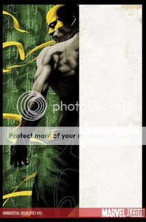
Immortal Iron Fist is my favorite superhero title on the market these days, though I’m not sure issue #12 makes the best case for that preference. As part five (really six, counting a related stand-alone annual issue) of a storyarc centered around a celestial kung-fu tournament, it’s more of an exposition-laden lull than a bonafide step forward. Moreover it’s capped off by a “threat” to Iron Fist’s pals Luke Cage, Misty Knight, and Colleen Wing that you and I and the writers all know won’t be carried out; this is obviously par for the course in franchise superhero comics, but even when we know no one’s gonna die the key is to keep us guessing as to what other consequences there might be, and while Iron Fist’s tournament pulls that off, the Heroes for Hire getting kidnapped by Hydra doesn’t. Artwise, the hugely rewarding structural breakdown the series has heretofore relied on, er, breaks down a bit. Normally, regular artist David Aja handles all the present-day material with his expressive version of the moody-realist modern-day Marvel house style (exemplified elsewhere by Daredevil‘s Alex Maleev, Michael Lark, and Stefano Gaudino and Captain America‘s Steve Epting and Mike Perkins), while a rotating cast of able guest artists tackles flashbacks focusing on previous bearers of the Iron Fist mantle. This time, however, Javier Pulido pinch-hits on a pair of present-day scenes seemingly selected at random, and his art, while pleasant as always, seems oddly loose, almost unfinished, compared to the shadowy stylings we’ve come to expect from Aja.
On the other hand (fist?), the proper guest-star turn by Kano is an absolute killer. His line has a physical presence on the page that imbues his flashback about Wendell Rand (the current Iron Fist’s dad) bailing out of his own date with the dragon who gives the Iron Fists their power, provided he doesn’t kill and eat them first, with real power and grace. As Wendell strides into the snow to face the beast, his body language and position in the frame convey all the date-with-destiny grandeur of “The Immigrant Song,” only to be convincingly transmogrified into absolute panic as he realizes he’s simply not up to the challenge. And man, his brief but fateful fight with ex-friend Davos upon his return is so chock-full of energy that it all but bends the page. This latter scene in particular is enhanced by the witty coloring of Matt Hollingsworth, who along with Dave Stewart is one of the best in the biz–after a decade or two of Vertigo, I never thought earthtones could be this exciting. As for Aja, I’m so used to enjoying his art that I almost find myself speechless about it. Suffice it to say that of all the talented guys I listed above who are doing work similar to his, he’s my favorite, the best able to harness naturalist image-making to super-natural content.
And while, as I said, this isn’t the most dynamic entry in the story so far, the elements that make this such an enjoyable series are all there. It’s quite easy to armchair-quarterback the division of labor between the two writers involved: Fraction injects Brubaker’s melancholy sins-of-the-past obsession with humor and a greater appreciation for this genre’s wild side; Brubaker tempers Fraction’s tendency toward glibness, goofiness, and condescension to his material and his audience with meticulous character work and emotional heft. Both writers are refreshingly, delightfully open to using the things that make the superhero and kung-fu material they’re combining here so much fun: the tournament structure, crazy nicknames and finishing moves straight out of a Wu-Tang Clan sample, the fungible menace of enemy goons (presented by Pulido as a human sea in his finest moment here), an ever-expanding mythos that hews close to what makes the core character concept tick while increasing its possibilities exponentially. If you are open to superheroes at all, this is the one book you should be reading.
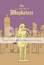
Comics Time: The Last Musketeer
January 30, 2008The Last Musketeer
Fantagraphics, January 2008
Jason, writer/artist
48 pages
$12.95
From a cover reminiscent of the playful pop-culture surrealism of Brandon Bird on down, this is the most straightforwardly funny Jason book since Meow, Baby!, and the most straightforwardly funny of his long-form narrative works this side of You Can’t Get There from Here. It’s still working the same territory of all Jason’s comics–the absurd finality of death, the emotional ravages of time, the use of de rigeur genre tropes to suggest lives at the mercy of going-through-the-motions routine, loneliness loneliness loneliness–only this time the lonely protagonist isn’t some sad sack but the zesty titular character, Athos of the Three Musketeers himself, inexplicably alive some 400 years after his heyday and defending France against Martian invasion. He’s treated like the living embodiment of those thin slivers of joy and hope that gleam briefly before being stamped out by futility and despair in Jason’s other books, here, finally, given a chance to come out on top. His id-like presence seems to spur some of Jason’s funniest-ever gags in the surrounding characters, seemingly through osmosis: the emperor who simply can’t bring himself to believe that his guard could possibly be happy with his job; the emperor’s daughter who’s never more than a second away from physically assaulting her milquetoast general boyfriend; the former royal’s one-liner about the latter’s presumed death–“Life is sad”–and its hilariously self-deprecating demolition of what is essentially Jason’s entire philosophical project. Meanwhile the art edges into “Best Jason Ever” territory: A rocketship chase through the Martian wilderness evokes Winsor McKay, a swordfight practically rings with the clash of steel on steel between its still-life panels, and I could practically bathe in the book’s blue-greens.
Ultimately the potential for a better, freer way of life represented by the Last Musketeer triumphs, at least for a while, and the lesson even appears to have been internalized by at least some of the other characters, perhaps even the larger world itself. Even so, Jason leaves us with a character who, like those in more standard works by this author, can only come to accept the possibility of a life worth living after being ground down by regret. But hey, it’s better than nothing.
Comics Time: I Killed Adolf Hitler
January 28, 2008I Killed Adolf Hitler
Fantagraphics, October 2007
Jason, writer/artist
48 pages
$12.95
There’s a bunch of different ways I could start talking about I Killed Adolf Hitler. For instance, there’s the fact that it opens with a woman pretending to masturbate in explicit detail while her boyfriend murders someone, which is pretty rough trade for a Jason book. Then there’s the fact that when I think about it, many, maybe even most, of Jason’s books are kind of non-stop bloodletting–but I had to stop and think about it because the effect is so muted. There’s the almost outrageously lovely use of color–glacial blues to suggest dawn and twilight, hues used to suggest depth and three-dimensionality as well as I’ve ever seen it done. There’s the fact that this book contains enough great ideas for several different graphic novels: hitman as legal profession; hiring a hitman to kill Hitler; time-traveling to do so; getting stuck back in time and having to age through the intervening decades to get back to the present; all the attendant relationship issues. Ultimately I think the fact that this slim volume contains so many facets shouting at me to be listed first is what makes Jason’s work so powerful: Beneath his taciturn, clean-line, surface-cute animal-people world is just a seething cauldron of repressed anguish and emotion. Up from it bubbles the worldview that even if figures of singular evil like Adolf Hitler were erased from history, life would be just as shitty, if not shittier, than it is now, and that the only way to really make peace with the world and oneself is for one’s hand to be forced by decades of accrued regret. With this unfettered imagination and perversely warm nihilism, Jason comes across like a comic-book Kurt Vonnegut, but more focused, sophisticated, reserved, chilling. Each new book is like a paragraph in humanity’s compulsively readable collective suicide note.
Comics Time: The Black Diamond Detective Agency
January 25, 2008The Black Diamond Detective Agency
First Second, May 2007
Eddie Campbell, writer/artist
Based on a screenplay by C. Gaby Mitchell
144 pages
$16.95
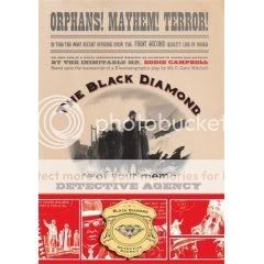
The use of color in this turn-of-the-century (literally) crime caper is perhaps emblematic of the entire enterprise. It’s lovely in its impressionistic greasiness, it looks like if you touched the page you might pull back smeared fingers, there are spots of vivid bright-red brilliance, but mostly it sits on the surface of the page rather than drawing you into it. Eddie Campbell, the preeminent veteran of the graphic-novel terminology wars, brings all his usual panache for evoking sooty old-time sordidness and populating it with warm, likable-looking characters. The problem is that there are just too many swelling the mustachioed, bowler-hatted ranks, and in a heist story that lives and dies with issues of mistaken identity, disguise, and double agency, not being able to tell the players without a scorecard is a major hindrance. That’s also one area in which Campbell’s sketchy figurework works against him: Quite frequently I had no idea who I was looking at, or, in the case of several key action sequences including a bedroom assassination attempt, a shootout in a train station, and the opening terrorist detonation of a train that provides the book’s central mystery, what the heck was going on. Some of the more conspicuously comics-y storytelling devices Campbell employs, like solid red word balloons for a character who can’t speak and Chris Ware-style cutaway boxes highlighting certain details, call attention to themselves but don’t add clarity or meaning to the proceedings; indeed, the cutaways all but disappear after a certain point, as if Campbell’s heart just wasn’t in them. There’s a point about halfway through the book where the story shifts from a wrong-man mystery to a criminal-helping-catch-the-killers thriller, and all of sudden I felt like I was being pulled along for the ride, but before long shaky action choreography, an out-of-nowhere element of supervillainous conspiracy, and a tacked-on From Hell-ish indictment of dawning modernity had me hopping back off. It’s a fun enough read–the period art really is beautiful–but the parts don’t cohere into a satisfactory whole, and in some cases they’re not that satisfactory as parts either.

