Posts Tagged ‘comics reviews’
Comics Time: Bottomless Bellybutton
September 12, 2008Bottomless Bellybutton
Dash Shaw, writer/artist
Fantagraphics, 2008
720 pages
$29.99
I finally got around to reading this Blankets-sized graphic novel over the past weekend. (Doing most of your reading on the commuter railroad disincentivizes taking a crack at really big books. Sorry, Bone. What is it with gigantic graphic novels that begin with the letter “B,” anyway?) It has more in common with Blankets than simply the initial and the size. They’re both works of great ambition from young authors–statements as much as stories–that tackle love, family, and the conflict between the two. They’re also both very, very successful.
The story takes place over the course of an awkward weekend-or-so at the home of the Loony family. The parents of adult children Dennis, Claire, and Peter have summoned their kids and their respective families or lack thereof to inform them of their impending divorce, after forty years of marriage. The set-up itself contains a rich vein to mine; as someone whose parents split up when I was an adult, I’ve never seen that uniquely pleasant situation this convincingly depicted, as once-intimate and effortless family dinners become merely cordial, well-worn anecdotes take on the feel of elegies, and being forced to think of your parents as full-fledged sexual, emotional, and psychological beings whose dreams have in some major way not ben fulfilled takes its toll.
Of course this could all be the territory of standard literary fiction, but to that sturdy framework Shaw harnesses any number of narrative digressions and artistic flights of fancy. A prologue section conveys its general point about the many facets of “family” and its specific expository information about the Loonys in the abstracted fashion of Shaw’s short comics. The book’s only nod to Shaw’s more surface-weird work–drawing youngest son, introverted loser Peter, as an anthropomorphized frog–is basically a multi-hundred-page set-up for a dramatic visual punchline that works so well it literally made me gasp. Meanwhile, each family member is given memorable mini-stories and scenes to play out, from Peter’s meet-cute with local beach bunny Kat to Claire’s drunken night out on the town with Dennis’s wife Aki to Claire’s daughter Jill’s disastrous rendezvous with a friend’s hilariously sleazy soon-to-be-ex-boyfriend (it’s complicated). This also means that Bottomless Bellybutton is several different kinds of comics at once; Peter’s story, for example, is at varying times a romance, a “my first time” erotic work, (briefly) a Christopher Guest-like send-up of indie filmmaking, and in one pulse-pounding sequence toward the end, something approaching Hitchcockian suspense. Yet the book never feels scattershot or random–it all quietly reinforces Shaw’s point that family means many different things to each of the many different people inside that unit, sometimes different things at different times and sometimes different things at once.
Perhaps the best illustration of this concept is the story of Dennis, the beloved eldest child. He takes his parents’ divorce much harder than Claire (herself a divorcée) or Peter (numbed to it by his distant relationship with a father who barely conceals his lack of feeling toward him, not to mention plenty of beer and weed), and begins a pretty literal quest to find the “reason” for the divorce, thereby becoming able to prevent it. This ends up involving secret passages, X-marks-the-spot maps, and notes between his parents’ younger selves, written in elaborate codes. As Dennis grows more and more insistent and angry about the divorce, his conviction that it can be “solved” like a Lost episode mounts as well, with Shaw playfully reinforcing this sense in the reader through those parlor-game clues and boy’s-adventure tropes–and also, though who knows if this is deliberate, making Dennis an insufferable Flat-Earther straight out of a Stephen King story. By the time Dennis’s quest ends in a heatstroke-induced “revelation” that turns out to be anything but the answer he sought, it’s clear that searching for any such answer to why life works the way it does is a mug’s game. That’s not to say that any of the other coping mechanisms adopted by the characters are superior–simply that rambling off into your own directions stands just as much of a chance at finding you what you want.
In pitching Bottomless Bellybutton to some friends who aren’t big alternative comics readers but who recently read and enjoyed Blankets, I said that the biggest difference between the two is the lack of Craig Thompson’s surface-pretty art. Shaw’s, by contrast, is deliberately uglified, particularly with those nothing-else-like-’em character designs. But I added that it’s an ugly that’s easily followed, and more to the point, easily understood. Both Blankets and Bottomless Bellybutton are about what happens when the idealized rapture of romance fades, but Bottomless takes place almost solely after the fade-out has already taken place. In this fallen world, Thompson’s vistas of snow and mandalas wouldn’t make a lot of sense. And while we do see one romance blossom, Shaw is intent on milking the tension between idealization and reality, starlit swims on the beach and premature ejaculation if you will. Impressive in the power of its gestalt, able to make judgments without seeming judgmental, and powerfully moving on more than one occasion, it’s a mature work from a young artist who with it comes fully into his own, and a deeply pleasurable, and rewarding, read.
Comics Time: Don’t Go Where I Can’t Follow
September 10, 2008Don’t Go Where I Can’t Follow
Anders Nilsen, writer/artist
with Cheryl Weaver, writer/artist
Drawn & Quarterly, 2006
86 pages
$14.95
This book beggars review. It’s an account of the great young cartoonist Anders Nilsen’s relationship with his fiancee Cheryl Weaver, through a series of varyingly told vignettes about the trips they took together or apart. Postcards they sent to each other are reproduced; a long letter from Nilsen to his little sister recounting a disastrous camping trip the couple took is printed in its handwritten entirety; there’s a three-page interlude about the couple getting stranded in a New Jersey parking lot on Christmas and, one infers, getting engaged shortly thereafter; there’s a photo essay about their trip to the Angouleme festival in France and a humor comic about their ill-fated first attempt to get there. Then we discover from Nilsen’s illustrated journal that Cheryl has been diagnosed with cancer, and the true meaning of the book’s metaphorical title, cribbed from J.R.R. Tolkien, becomes all too apparent. The comic that concludes the volume, perhaps the loveliest Nilsen has ever drawn, offers the final proof that the titular request has been met in the heartbreaking negative.
On the strictly technical side of things, Nilsen is one of his generation’s finest cartoonists, so part of what is so impressive about the book is how much of his comics’ pointillist emotional power comes through even via mostly non-comics media. By selecting a rigid parameter for the material, “stories about problematic travel experiences” (a theme he reveals in an afterword to have planned to develop even prior to Cheryl’s illness and death), Nilsen paradoxically conveys a sense of the totality of the couple’s relationship: thoughtful, humorous, shot through with both the thrill of adventure and discovery and the longing for the comforts of home, and one another. While Nilsen’s companion Ignatz series The End deals more in the gargantuan, even frightening feeling of grief and desperation engendered by having his and Cheryl’s life together suddenly yanked away, Don’t Go Where I Can’t Follow‘s mood is gentler–more focused on love and how it changes when the loved one is gone–but no less profoundly moving.
Personally, the way I deal with death is to focus on the fact that the life I shared with that person was a good one, a happy one, and that while it is now over, that goodness and happiness remains in my memory. But what happens when that shared life was, by any reasonable standard, far too brief? What to do then? I don’t know. Recent events have forced me to confront this question and I still don’t know. Reading this book has helped, though, and I hope you’ll forgive me if really all I have to say about it is “thank you.”
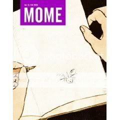
Comics Time: Mome Vol. 12: Fall 2008
September 8, 2008Mome Vol. 12: Fall 2008
Kaela Graham, Sophie Crumb, Nate Neal, Ray Fenwick, Olivier Schrauwen, Dash Shaw, Tom Kaczynski, Al Columbia, Jon Vermilyea, Derek Van Gieson, Killoffer, Sara Edward-Corbett, David B., Paul Hornschemeier, writers/artists
Eric Reynolds and Gary Groth, editors
Fantagraphics, August 2008
120 pages
$14.99
I’m not a big underground comics person, particularly today’s derivatives thereof. Too much of it feels like schtick to me: using “th’ ” instead of “the,” bigfoot characters smiling and waving at you and saying “hiya!”, funny animals fuckin’…I dunno, maybe this is how people who are sick of superheroes feel about capes and masks and punching–that it’s just going through the motions while not really saying anything about anything. It’s mostly not for me, though there are those who can make it work by blowing it out into the ionosphere of savagery (Rory Hayes) or through trailblazing and raw, restless chops (Crumb). Its imitators have an even tougher go of it with me–there aren’t a lot of Marc Bells out there, you know?
Last time out with Mome, I thought I was starting to detect and undergroundward drift, and the recent announcement that Gilbert Shelton seemed to confirm that suspicion. So I was all frowny-faced when I read the first comics contribution to this issue, from Nate Neal, “Whadda grade ‘A’ maroon I been! All that pissin’ and moanin’ I do about the world goin’ to shit…” says title character Tender Henderson. It’s enough to send you screaming for your Big Brother and the Holding Company record. But suddenly Neal shifts gears to a finely observed relationship comic, and even if you’ve seen this sort of thing before, we’re clearly back in the far less hammy, frequently more rewarding territory of contemporary artcomix.
That’s where I’d prefer Mome to stay, and for the most part that’s where it is here. For the first time in a while there are a number of comics included that fail to make much of an impression one way or another, but the winners are real doozies. David B. contributes yet another rhapsodic blend of history and fantasy with his tale of sex, violence, and religious zealotry “The Drum Who Fell in Love.” Olivier Schrauwen, Al Columbia, and Dash Shaw all discomfited me mightily with their astute use of silent, nightmarish strangeness. Kaczynski is really on a roll with his examinations of modern life’s nuisances-cum-perils, focusing this time on the pervasiveness of noise. Killoffer and Jon Vermilyea each serve up a different blend of gross-out humor and disturbing violence, both capping them off with killer, laugh-out-loud final panels. And let’s be honest with ourselves, any place you can get new work from David B. and Killoffer between one set of covers is the kind of place you want to be.
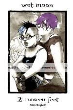
Comics Time: Wet Moon Book 2: Unseen Feet
September 5, 2008Wet Moon Book 2: Unseen Feet
Ross Campbell, writer/artist
Oni Press, June 2006
180 pages
$14.99
College is the time in everyone’s life when maximum personal freedom meets minimum personal responsibility. Classes and grades notwithstanding, there’s really nothing to stop you from doing pretty much whatever you want, whenever you want, in a parentless, highly sexed world where you are generally rewarded for following your bliss. I mean, at least this was how it was when you were a film studies major. It also seems to be how it is for the art students who populate Wet Moon, Ross Campbell’s languid goth soap opera. As is the case with those heady times before you’ve picked a major, or perhaps toward the end of your four years when you’ve basically completed all your requirements and have maybe four hours of classes every seven days, the kids in Wet Moon seem to neither know nor care where they’re going, simply soaking in the atmosphere of aimlessness. I can’t remember the last time I read a comic this visually (and aurally–the dialogue is spot-on) ambitious while having so little an idea of where that ambition was eventually going to take me. I don’t know how you’d feel about it, but I’m loving the experience. For one thing, it allows Campbell’s art to shine almost as an end in itself. It’s not just that his line is lovely or that his character designs are each unique and memorable or that his characters are basically all super-sexy in this delightfully slatternly way, though all these things are true; he also makes very smart choices in terms of choreography, body language, and pacing that really stick. When lead character Chloe accidentally mispronounces a pair of words in the middle of an argument, the look of self-irritation on her face is pricelessly accurate. There’s a great sex scene where the interplay of insecurity and self-confidence among young people is conveyed deftly and appealingly, but Campbell can also deflate his characters’ romantic presentations, as when he transforms Chloe’s memory of getting dumped by her beautiful ex-boyfriend Vincent into an over-the-top parody of goth sentimentality. And then there are random-ass scenes like some sort of reverie/dream sequence/I don’t know what involving a character drinking orange juice out of the carton, wandering into the street, and rolling one eye up into her head. What a weird, addictive series this is.
Comics Time: Clive Barker’s The Thief of Always
September 3, 2008Clive Barker’s The Thief of Always
Kris Oprisko, writer
Gabriel Hernandez, artist
adapted from the novel The Thief of Always by Clive Barker
IDW, 2005
144 pages
$19.99
Given the standard weakness of comics adaptations of non-City of Glass prose material and the standard cheesiness of American horror-comic art, any project that entails adapting a prose horror novel would normally already have two strikes against it. But Clive Barker has gotten lucky on that score a few times during his career, from the impressively atmospheric Books of Blood-based anthology series Tapping the Vein back in the day to this little number based on Barker’s first all-ages book. While you can see the rough edges in the edits quite frequently–most notably during the beginning and ending, which are rushed enough to feel like they happen how they do because they must, not because that’s what springs from the events that befall the characters and emotions they experience as those events take place–it’s a surprisingly evocative, beautifully illustrated little graphic novel about a childhood lost.
The story concerns a schoolkid named Harvey Swick who, bored to tears by a dreary February, is approached by a magical being with a beyond-ear-to-ear grin, named Rictus. (Already a good sign, right?) Rictus offers Harvey a vacation to a place called the Holiday House, whose mysterious proprietor Mister Hood offers “special” children an eternity of carefree carousing, with each day in the place comprising all four seasons of the year. (Every morning is springtime, while it’s Halloween every evening and Christmas every night.) Needless to say things aren’t what they seem, and before long Harvey and the friends he makes at Holiday House try to escape this lotus-eating interval to return to the outside world, which turns out to be tougher than it looks.
While the book tends now to be compared to Harry Potter, it has a lot more in common with other stories of childhood voyage and return to a dangerous land of fantasy: Oz, Wonderland, Never-Never Land, and Barker’s own Abarat. The idea of the haunted house–since that’s obviously what we’re dealing with–also hits notes resonant with everything from Hansel & Gretel to The Shining, not to mention Candyman director Bernard Rose’s Paperhouse, a more-or-less contemporary product of the British dark fantasy scene, iirc. Aside from the obviously truncated start and finish to the story, Oprisko does a solid job of preserving as much of Barker’s weird whimsy as possible, making sure to include moments that stand out from the fairy-tale norm–Harvey’s phone calls home to his parents to make sure they’re okay with his vacation, for example.
The real star of the adaptation, though, is Gabriel Hernandez and his absolutely lovely art. It appears to have been done in pencil, then given a soft bath in muted color washes by Sulaco Studios. The contrast between Hernandez’s off-kilter, frequently angular character designs and Sulaco’s gauzy palette is pretty much perfect for Barker’s kids’ fantasy work, which itself introduces elements of the horrific into a storytelling mode we’re frequently quite cozy with. Hernandez is as attentive to detail as he is to design–for example, quietly filling the Holiday House with everything a boy could wish for, from suits of armor to Egyptian sarcophagi to preserved pterodactyls, despite this never being referred to in the dialogue. It’s the art that will keep me coming back to this one, and makes it worth at least a first look.
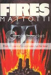
Comics Time: Fires
September 1, 2008Fires
Lorenzo Mattotti, writer/artist
Penguin, 1991
64 pages
I’ve had this book for a long long time, acquiring it through Sequential Swap because hey, Lorenzo Mattotti, right? One of the great comics artists in the world! But I’ve put off reading it for just as long because the great comics art inside it is, if I’m being honest, not for me. I don’t see people in Mattotti’s blocky, quasi-cubist painted figures, I see blocks. With its tactile layers of color covering every inch, I have a hard time finding an “in” to any given panel. My eye just bounces right off the surface.
The funny thing is that the story almost overcomes this. It stars one Lieutenant Absinthe, an officer in the navy of a South American archipelagic country whose battleship is sent on a mission to investigate the mysterious island of Saint Agatha, where ships seem to go missing with alarming regularity. In an arc that should be familiar to fans of everything from The Lord of the Flies to Lost to The Shining, Absinthe–heh, here I was going to say “slowly” out of sheer force of habit, but it happens almost overnight–goes native, and ends up helping the supernatural (?) forces present on the island destroy his comrades. On the back cover, a blurb from Mattotti indicates that his inspiration was the films of Tarkovsky and Herzog and the hypnotic power of their environments; in essence, Mattotti’s project was to craft a story that does what his art fails to do with me, which is suck one in. He works so hard at it that he almost pulls it off–the story’s climax in particular is vividly done–and the countless similar stories you’ve read or seen do some of the work for him, but ultimately I keep running into that wall of visual information over and over again and finding no way to join Lieutenant Absinthe as he’s pulled in.
Comics Time: Brilliantly Ham-fisted
August 29, 2008Brilliantly Ham-fisted
Tom Neely, writer/artist
I Will Destroy You, July 2008
20 pages
$5
They can’t all be winners, but this collection of “19 comic strip poems” originally published on Tom Neely’s blog boasts some very strong work, including among them some of my favorite comics of the year. Constructed by juxtaposing a simple sentence against a four-panel strip’s worth of largely abstract imagery, these comics are a veritable catalogue of Neely’s visual preoccupations: Tall houses with crooked chimneys, Gottfredson-style white gloves, deep-black, viscous blots of ink, lone trees, holes, the severing of heads or hands. At times they’re used to strike a harrowing tone of confusion and despair–“Seething Rage” is a memorable portrait of a literally beaten man, while “House of Cards” plays off one of my personal favorite tropes for utter senselessness, roadkill. Given my own predilections it’s probably no surprise that the book’s more hopeful moments–“New,” touting the power of hope in the form of a newborn; “R.R.I.P.”, a declaration of ars gratia artis inspired by painter Robert Rauschenberg–leave me cold, leaning a little further toward the mushiness that is an occupational hazard of “comic poetry.” Still, “O.K.,” a full-color strip that overwhelms with the beauty of its palm-trees-at-sunset vista while the text celebrates the acceptance of a proposal, proves that Neely has the illustrative chops to give even his most (understandably!) sentimental inclinations real punch.
Comics Time: Your Disease Spread Quick
August 27, 2008Your Disease Spread Quick
Tom Neely, writer/artist
characters and dialogue inspired by the album (A) Senile Animal by the Melvins
Robotic Boot, Summer 2008
22 pages
$6
You don’t need to listen to the Melvins to appreciate Your Disease Spread Work as further evidence, as if any were needed after The Blot, that Tom Neely is working the most fruitful vein of horror-slash-artcomics since Al Columbia. Like Columbia, Neely’s work borrows stylistic elements from masterful old black-and-white kids’ cartoonists like Otto Mesmer and Floyd Gottfredson, then harnesses it to a unique vocabulary of monstrousness and murder. While Columbia tends toward intimate horror in the work of his I’ve seen, Neely’s best stuff is characterized by a tendency to scale upward and outward at breakneck speed, with threats suddenly emerging as colossal if not outright apocalyptic.
YDSQ addresses that tendency head-on, beginning and ending with words of woe from a doomsday prophesier with the head of a horse. In between we encounter decapitations, an infernal saloon populated with infamous tyrants, Neely’s trademark black-ink blots, a sequence reminiscent of that old 7-Up mascot Spot crossed with H.P. Lovecraft, the Big Bad Wolf, a ghoul, a thunderbird, a Fritz Lang-style robot bride, a mummified Baby Herman type, scenes of everyday depravity, and more. At no point does any of this arrive from a predictable direction or feel anything less than profoundly discomfiting. It adds up to a portrait of great unease with the direction of society, coupled with a gallows humor about it all (there’s a Hostess ad parody on the back cover to cleanse the palate). What it has to do with the Melvins I may never know, but it works as both an ad for the band and a statement completely independent of them.
Comics Time: Incanto
August 25, 2008Incanto
Frank Santoro, writer/artist
PictureBox Inc., 2006
44 pages
$5
I have no idea if this is an active reference point for him at all, but I can’t read Frank Santoro comics without thinking of the swirly, sensual, romantic rapture of a good shoegaze song. Both are (generally) more concerned with mood than with any kind of narrative–knowing, perhaps, that emotions can be stories in and of themselves. This particular comic reads a little like a dress rehearsal for the more rhapsodic moments of Santoro and Ben Jones’s teenage-riot series-cum-OGN Cold Heat. Joining his usual minimal line to an equally minimal layout (one or two panels per page), complemented by unbroken fields of blue, orange, and white color, Santoro “tells” the “story” of an emotionally epic romance in the language of metaphor–wild horses, mysterious combat, vampiric antagonists, deserts and mountains, blazing suns, parents that just don’t understand, desperate embraces, taking off a shirt, hands on bodies. Each of these sort of dissolves into the next in a fashion that enables you to make it all the way through the comic in under a minute, or flip back and forth and re-re-re-read like putting “Vapor Trail” on repeat. It’s slight, and not for everyone, but lovely for me. I want to connect with the emotions he’s conveying even though feeling them has become a distant memory for me.
Comics Time: Where Demented Wented: The Art and Comics of Rory Hayes
August 22, 2008Where Demented Wented: The Art and Comics of Rory Hayes
Rory Hayes, writer/artist
Dan Nadel and Glenn Bray, editors
Fantagraphics, August 2008
144 pages
$22.99
I do a lot of reading on a crowded Long Island Rail Road train into and out of New York City. Since I am still a polite, people-pleasing elementary school kid at heart, this made it impossible for me to sit back and enjoy the section of this book that reproduced Cunt Comics #1, you know? So what I ended up doing is skipping that stuff and reading everything else, saving the Cunt material for a time when it wouldn’t be inflicted on unsuspecting commuters. Stripped of that almost indescribably vulgar middle section, the work of the live-fast-die-young underground comix legend Rory Hayes as collected in Where Demented Wented comes across less like that of a knowing, Crumb-style provocateur–or a novelty-act modern primitive, for that matter–and more like that of a wild-eyed innocent who’s seen far too much. I guarantee you I’m the only person who’s going to make this comparison, but do you remember the scene from Stephen King’s science-fiction short story “The Jaunt” where (SPOILER WARNING FOR ANYONE WHO FALLS INTO THE PART OF THE VENN DIAGRAM WHERE “RORY HAYES READERS” AND “READERS INTERESTED IN THE SHORT STORIES OF STEPHEN KING BUT WHO HAVEN’T YET READ THEM” OVERLAP) the kid holds his breath when they dose him with anesthetic prior to teleportation, so he comes through the other side having been driven bugfuck insane by the infinity of time and space his mind experienced during his instantaneous travels? Sort of like that.
It doesn’t necessarily start that way. In the first, comparatively crudely drawn stories from Hayes’s Bogeyman Comics #1, Hayes crafts surprisingly deft and tightly paced homages to the macabre twist-ending horror stories of EC Comics. In addition to those ’50s classics, Hayes’s emphasis on decay recalls the weird work of Lovecraft and Bierce, while his inventive staging and attention to environment anticipates work by far more surface-sophisticated genre artists, from Josh Simmons’s House and Jessica Farm to Clive Barker’s “The Midnight Meat Train.” While the mood here is certainly one of impending doom, it is at least a doom that suggests through contrast the possibility of making it out alive. I can’t decide whether Hayes’s trademark teddy-bear protagonists–whose incongruity and iconicity serve to instantaneously (and rather amusingly) anchor even his most outlandish and savage stories to a dimly remembered time of childhood playfulness–make things seem more hopeful (innocence exists!) or less (innocence is destroyed!).
It seems as though when Hayes’s drug use became dominant enough to start finding its way into his work on an explicit level shortly thereafter, however, a switch flipped. Skip past the Cunt Comics interregnum as I did and all of a sudden you find a Hayes whose work is far more artistically refined–with an almost Drew Friedman-slick stippling effect at times–while his conceptual framework has expanded outward almost infinitely, to far more threatening effect. In between cynical semi-autobiographical accounts of tweaked-out excess and gross-out humor-ish strips with a bitter Country Joe “Whoopee! We’re all gonna die!” tone, Hayes’s protagonists are now more at risk from contact with eternity or the destruction of the entire world than they are from creatures locked behind cellar doors. Perhaps the most memorable of these later strips involves one of the teddy bears traveling to a dead world filled with abandoned towers and forgotten artifacts, its sole surviving inhabitant scrawling the enigmatic, haunting phrase “WE TRIED” on the ground, reducing the doomed explorer to tears. Seen in the light of material this powerful, Cunt‘s onslaught of castration, bodily fluids, and vaginas drawn as though the artist had hardly even a passing familiarity with the form seems like a necessary mental enema, a way of throwing off almost any kind of restraint self or society could impose so as to better access the frightening truth, if that’s what it is.
Towards the end of the book, during an essay of remembrance written by Rory’s brother Geoffrey, a short, early comic by Rory called “Lost at Sea” is discussed and reprinted at a reduced size. Based on an 8mm film Rory made, it features a teddy bear in a tiny boat, adrift in an enormous and storm-tossed sea. Finally, after a particularly frightening tempest, the bear finds himself and his boat safe on the sandy shore. The final image is simply of the bear’s footprints, leading away from the water back home. In a way, this collection is that trail of footprints.
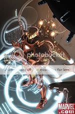
Comics Time: Invincible Iron Man #1-4
August 20, 2008Invincible Iron Man #1-4
Matt Fraction, writer
Salvador Larroca, artist
Marvel, May-August 2008
32 pages each
$2.99 each
The problem with Iron Man in the wildly popular, not good Marvel event series Civil War wasn’t that he was wrong, but simply that he was written wrong. You may recall that the conflict between Iron Man and Captain America was driven by Iron Man’s desire to see all superheroes register with the government, an eminently sensible approach to human weapons of mass destruction no more outlandish than requiring official sanction for police departments and the Marines (or hell, student drivers and barbers). Unfortunately, it fell to the character to bear the metaphorical weight of warantless wiretapping, the abolition of habeas corpus, secret prisons, torture, and all the other actual excesses of the War on Terror. And so the writers of the event, particularly the main series’ Mark Millar and Amazing Spider-Man‘s J. Michael Straczynski, turned the character into an unlikeable, smarmy fascist bastard.
You’ll hear some people say this is perfectly appropriate for a character whose secret(ish) identity was a munitions expert who built his first suit of armor in order to kill his way out of an NVA prison–that he’s the military-industrial complex personified. Me? While I read Civil War in disbelief I was listening to Ghostface Killah’s Supreme Clientele and thinking “there’s another way, dammit!” The most consistently enjoyable member of the Wu-Tang Clan, you see, adopted the alternate personality of “Tony Starks,” basically the smoothest operator ever–going so far as to call his solo debut Ironman and lace Supreme Clientele with samples from the old Iron Man cartoon (including the “cool exec with the heart of steel” bit from the theme song). For Ghostface, it’s not Stark’s armor that makes him invincible, but his raw swagger and hustle, qualities that beat the shit out of having his defining characteristic be proclaiming “I’m a futurist,” then sending jackbooted SHIELD troops to rough up your friendly neighborhood Spider-Man. As for his war-profiteer aspects, I can’t imagine they’re any harder to get away from than, say, the entire Silver Age has been for most heroes. In short, if your Iron Man comic was not made in the spirit of “Nutmeg” or “Apollo Kids,” you failed.
From the moment I heard that Ghostface had a cameo in Jon Favreau’s Robert Downey Jr.-starring Iron Man film I had a hunch that the filmmakers “got it,” and sure enough, they did. The movie showed it was possible to tell the story of a cocky boozed-swilling genius weapons manufacturer-slash-renowned cocksman who dresses up in armor and blows things up and have him be cool and fun. Imagine that! The whole thing was a vindication and I very much hoped that the writers and editors responsible for the character’s direction in the comics over the past few years were roundly shamed.
Matt Fraction’s Invincible Iron Man was clearly created with the same remit as the movie in mind, and so far it succeeds. It does so in large part by simply choosing to ignore elements that get in the way. Character-wise, Fraction jettisons both Iron Man’s recent-vintage neoconservative-bugbear characterization and former writer Warren Ellis’s Web 2.0-triumphalist technophilia. It’s impossible to gloss over the fact that Stark is now Director of SHIELD and therefore Big Brother for the world, but that’s dealt with minimally here, essentially just providing him with another set of toys to play with.
Plotwise the story could, with minimal tweaking, be a direct sequel to the movie, pitting Stark against the nutbag son of his vanquished rival Obadiah Stane. The younger Stane, Ezekiel, is entertainingly sociopathic in the literal sense–a callously murderous guy who’s seemingly incapable of experiencing empathy. The clever bit is giving him these personality traits in the same way your average douchebag Real World contestant has them–making him a sleazy “moral moron” who, instead of cheating on his girlfriend and drinking to violent, misogynistic excess, blows up buildings full of people. Other cinematic strands are also picked up, particularly Stark’s chemistry with his girl friday Pepper Potts. A running subplot in which Stark saves her from wounds incurred during a suicide bombing by implanting one of those magnetic-disc things in her chest and then teaching her how to use it to fly is an intelligent way to keep that wonderfully weird, oddly romantic, freakily Freudian scene from the movie where Gwyneth Paltrow sticks her hand in Downey’s gooey open wound in mind throughout the story’s duration.
Now, it’s not a great comic–some of the nods in the direction of Iron Man As Supercool Cool Guy, like a bit involving a bevy of babes in issue #1, feel a bit pro forma, and nothing we’ve seen so far is wild and transcendent and unpredictable like the best superhero stories, the ones that stick with you, tend to be. (Ones like Fraction’s collaboration with Ed Brubaker, The Immortal Iron Fist, with which Invincible Iron Man has in common a billionaire-crimefighter protagonist and an adjectivally alliterative title.) Larocca’s work is slick and candy coated and avoids his distracting habit of photo-referenced stunt-casting (except for a scene in issue #4 where Stark slips some Iron Man tech onto the black market by giving it to Danny DeVito and Paris Hilton); it’s kind of perfect for the project, but limited in its affect. Zeke Stane lacks the memorable visual design that makes any great villain click. But in terms of making the Iron Man concept readable again. and offering a version of the character who wouldn’t make people who enjoyed his film incarnation run screaming in the opposite direction, so far so good.
Comics Time: Three Shadows
August 18, 2008Three Shadows
Cyril Pedrosa, writer/artist
First Second, April 2008
268 pages
$15.95
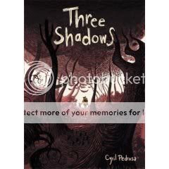
An admirable lack of ambition characterizes this impressive work of fantasy from European Disney-animator-turned-graphic-novelist Cyril Pedrosa. He’s not interested in building a sprawling, intricately ordered alternate world, he’s not aiming to wow us with the scope of his imagination, he’s not serving up a Hero, he’s not attempting to harness his childhood fantasies into coherence. He’s simply, loosely using the genre to tell a story about fear and pain. One of the best aspects of that story is how his surface-beautiful line–a miraculously curvy, ropy thing he can refine or sketchify on cue–never overwhelms with its loveliness the aspects of the plot that count on horror. On the contrary, somehow, seeing the titular entities as they loom like a cross between the Ringwraiths and the Shining sisters on a faraway hill for the first time, and seeing the reaction of the loving nuclear family at the heart of the story to them, are made creepier and more disconcerting by their lush surroundings. Similarly, each time the story does branch out in a more expansive direction (usually, but with one major exception, brought about by the family’s travels), the lack of preexisting expository world-building makes the world seem more mysterious and immense with each new glimpse of a new environment. Ultimately this is a story about the mortality of children in the face of a capriciously cruel world, and the crazed despair this can bring on in their parents. It’s a bitter topic, and makes for one of those rare cases where the adjective “bittersweet” is truly applicable.
Comics Time: The League of Extraordinary Gentlemen: Black Dossier
August 15, 2008The League of Extraordinary Gentlemen: Black Dossier
Alan Moore, writer
Kevin O’Neill, artist
DC/WildStorm/America’s Best Comics, 2007
208 pages, hardcover
$29.99
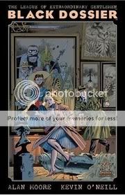
It occurred to me when reading this latest installment of Moore and O’Neill’s journey through the literature of the fantastic that it’s basically Moore’s version of Earth X. Like that Jim Krueger/Alex Ross exercise in continuity farming, Moore’s overarching narrative scheme is to find a way to connect nearly every character in the history of genre storytelling, from Jehovah to James Bond.
This volume goes further than ever in that direction, revealing that all of the world’s extraordinary gentlemen, supernatural creatures, and so one can trace their origin back to two warring (and occasionally miscegenating) tribes of godlike beings: the Bible’s “Elohim,” which either directly or through their offspring account for the Judeo-Christian God, his ancient pagan counterparts, and the pantheons of Greece, Egypt, and Germany/Scandinavia; and (basically) Lovecraft’s Great Old Ones, whose descendants include pretty much every monster known to man.
The “good” gods have made two notable attempts to bridge the gap between mortal and deity. The first was the Greek Age of Heroes, an experiment in interbreeding that the Gods aborted at Troy when it became apparent that these powerful people were pretty much all sociopathic killing machines. The second, as it turns out, was the creation of the original League of Extraordinary Gentlemen in Shakespeare’s time; here, the Elizabethan Age has been recast as the reign of Gloriana, England’s Fairie Queen, whose assemblage of folks like Prospero and Orlando to “guard the Realm” was really just a cover for forming a group that could successfully liaise between the natural and supernatural worlds. (At least I’m pretty sure that’s the gist.) Meanwhile your friend and mine Cthulhu and his chums keep trying to pop in and devour our souls, the prevention of which – along with thwarting mad scientists, guarding against invasions by rival species, and fucking – has been one of the various Leagues’ primary occupations ever since.
All of this information is contained in the titular dossier. The story takes place in the 1950s, where Mina Murray and Allan Quartermain are harried by elements of the rump Party dictatorship (yep, from 1984, though here the regime doesn’t seem to have lasted much longer than 1954) as they attempt to transport this stolen file to a person or persons unknown for reasons unknown. Both the prime mover and his motive turn out to be McGuffins of a sort, though; the main trick of the story is that all this business of constructing a Grand Unifying Theory of Genre Lit is presented in a series of pointedly dis-unified comics and prose pastiches, including faux-Shakespeare, a Beat novel by Sal Paradyse, a Tijuana Bible, a Jeeves vs. Cthulhu story (maybe my favorite), Crowleyana, boys’ adventure comics, and so on. I think it’s one of Moore’s cleverest conceits in ages, and gives O’Neill, letterer Todd Klein at all a chance to go absolutely buckwild. It’s fourth-wall-breaking fun.
It’s also completely impenetrable from time to time unless you come in with the requisite encyclopedic knowledge of Moore’s sources. I’m not saying that it’s impossible to get anything out of the book without recognizing every last reference – the moral of the story, and the reason why our heroes are cool and their enemies are bogus, are all quite clear whether you know who Raffles the Gentleman Thief is or not. But Moore is having just as much fun making connections, hiding Easter Eggs, and crafting hardcore continuity porn as any superhero writer, just with a different set of toys, and it’d be foolish to deny that. I did pretty well anytime Yog Sothoth or Conan or Dr. Caligari were on the scene, but at other times I could literally go for pages without catching a single reference. I don’t even necessarily think that Moore should care about this, since I doubt there’s anyone who did catch every reference whose name doesn’t rhyme with “Schmalan Schmoore” and he’s writing this story for maximum mind-blowage rather than optimal legibility. Moreover, the stuff that I got was an absolute hoot, and since I don’t believe that continuity-based storytelling is automatically shallow, I’m not going to make that argument any more here than I would when discussing The Sinestro Corps War. I suppose my point is that the two are more similar than you might think, and that maybe it’s that that makes LoEG books as entertaining as they are, and let’s be up front about it.
Comics Time: Mesmo Delivery
August 13, 2008Mesmo Delivery
Rafael Grampa, writer/artist
AdHouse, 2008
60 pages
$12.50
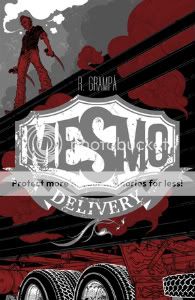
Normally saying something like “his art is varyingly reminiscent of Geof Darrow, Al Columbia, John Kricfalusi, and Dave Cooper” would be hyperbolic to the point of absurdity or even insanity, but hoo boy, Rafael Grampa. Visually he may be the most accomplished new cartoonist of the past two or three years. Best of all, he’s no slouch as a storyteller, either. I don’t mean in terms of legibility, because there are plenty of talented illustrators whose beautiful comics are easy to follow. I mean in terms of having a story worth telling, a spectacle but not an empty spectacle. On the surface it’s just a gorgeous, ultraviolent fight comic, the kind of thing you see plenty of anymore, but it’s different. For one thing, it’s creepy and uncomfortable, as much so as the similar opening sequence in Natural Born Killers. It’s as raw and blackly humorous and confrontational, and at times edgily sexual, a work of gore as Darrow and Frank Miller’s Hard Boiled. It subverts expecations, creating a “hey look at that big guy, I bet he’s usually pretty calm until you rile him at which point he’s invincible and badass” brick-type figure and then flipping your premature belief in his competence on its ear. It contains out-of-nowhere visual flourishes: A smartly laid-out “commercial break,” a slavering devil lurking underground like something out of a medieval engraving. The lettering–Rafa Coutinho gets this credit, though sometimes the words are so integral to a particular panel that it’s tough to see how someone other than Grampa did it–addresses music and whimpering with inventive, tactile flair. The colors, selected by Grampa and deployed by Marcus Penna, somehow take that green/brown Vertigo palette and makes it gooey rather than acidic. Everything looks dirty. The narrative flashes back unexpectedly and intelligently. The English-language dialogue, provided by Ivan Brandon, is tight. (“Be very discreet.” “When have I not been?” “No time I know of, but I’m in charge and if I don’t tell you how things are, I have nothing else to do.”) This is some comic book.
Comics Time: Watchmen
August 11, 2008Watchmen
Alan Moore, writer
Dave Gibbons, artist
DC Comics, 1987
416 pages
$19.99
Like half the nerds in America, I recently re-read this graphic novel, inspired to do so by the trailer for Zack Snyder’s upcoming movie adaptation. I feel much older than I did when I first read the book during my sophomore year in college, and much of what I appreciated about it then fails to impress me now…or perhaps “fails to impress itself upon me” is the better way to put it. Moore’s scripting, for example, seemed wildly sophisticated compared to the house-style comics of the ’90s with which I could then compare it, but comes across shopworn, even hokey to me now. All those panel transitions where what someone is saying in one place is placed in a dramatically/ironically appropriate caption box over something unrelated yet thematically linked in some other place! There’s one groanworthy bit in the Owlcave where Nite Owl says something about a reflection while we’re shown his reflection, and I liked the failed sex scene juxtaposed against the commentary for Ozymandias’s gymnastics routine better when it was Phil Rizzuto doing play-by-play for Meat Loaf in “Paradise by the Dashboard Light.” I mean, maybe it’s just that I’m sick of the fact that people like J. Michael Straczynski are still doing stuff like this 20-odd years later, maybe it was a total revelation then, but to me, this sort of neat thematic coincidence requires far more suspension of disbelief than just having guys run around in costumes. It feels emotionally artificial, which of course is the problem I tend to have the most with Moore’s rigorously, ostentatiously authored work.
Instead, what strikes me hardest here, what I don’t think I ever thought about all that much before, is how much power the story draws from its uniformly engaging sad-sack main characters. I think it’s here that Dave Gibbons’s contribution is at its most valuable, with his all but countless shots of heroes and do-gooders worrying, frowning, furrowing their brows, being uncertain. It must be noted that this is worlds away from the Identity Crisis-style vogue for angst and selfish over-emoting. All the characters in those “you’ll believe a man can cry”-type supercomics are just as 100% sure of their emotional experience as their relentlessly upbeat Silver Age counterparts used to be. Not so in Watchmen, where the primary mode of emotional interaction with the world is confused dismay. The mileage Moore can get out of this is almost inexhaustible. These aren’t emo Batmen, they’re Tony Sopranos and Seth Bullocks, idiosyncratic and troubling portraits of great physical strength and moral violence juxtaposed against tremendous emotional and psychological weakness. Their failures–and they spend pretty much the whole book failing–are hard to stomach, especially giving the truly impressive air of impending doom Moore creates out of snippets of current-events and vox-pop cutaways; we hope for their success even though the art and the script both do everything they can to show us without coming out and saying it that their failure is inevitable. I’ll tell you, reading the book this time around, when Rorschach takes off his mask at the end and yells “Do it!” at Dr. Manhattan, tears streaming down his face, I nearly started to cry. To me now, it’s almost as devastating as that line “I did it thirty-five minutes ago” and the subsequent reaction shot were 11 years ago.
I noticed a lot more than that this time around, too. For example, everyone remembers the symmetrical Rorschach issue and the Dr. Manhattan flashback/flashforward issue, but the rest of the individual chapters were all quite structurally different from one another as well. Issue #1 is a pretty straightforward superhero whodunnit. Issue #2 does the classic-flashback thing that the creators of Lost borrowed so effectively. Issue #3 is moved along by those transitions I mentioned earlier. The penultimate issue is driven at least as much by the “normal” characters as the superheroes, and the final issue is as straightforward as the first one. It’s a restlessly creative book, uncomfortable with being this thing or that thing exclusively.
It’s also much funnier than I gave it credit for, especially early on, before the final failures. Rorschach, for example, is kind of a scream, constantly making mental notes to investigate whether this or that character is gay or a Communist or having an affair, obliviously wondering why so many superheroes have personality disorders. There’s also the running rivalry between the left-leaning Nova Express and the right-leaning New Frontiersman. I always thought Moore rather stacked the deck against the more or less nakedly racist and anti-Semitic conservative publication, compared to the smooth Rolling Stone-isms of the magazine that (one assumes) more closely aligned with Moore’s own outlook. This time, however, it suddenly jumped out that while their culprits (Russian and Chinese Reds) were off, pretty much everything the New Frontiersman alleged about what was going on in the world was accurate, while Nova Express was literally a bought and paid dupe of crazy old Ozymandias. That’s pretty funny, actually. So is the fact that at least four of the main characters are crazier than shithouse rats and, if one wants to be literal about it, serial killers. And the more I think about the ending, the more convinced I become that it’s perfect as-is and the kvetchers should zip it. I mean, if you stick with the Comedian/sick joke leitmotif, this very serious book about nuclear war, sociopathy, sexual dysfunction, the intractability of human suffering and so on needed a punchline in the worst way; if you run with Ozymandias and slicing the Gordian knot, this rigorously realistic take on superheroes needed an outside-the-box climax; and for either one, how can you top teleporting a brain-squid-thing into a metal concert at Madison Square Garden?
The ending, and the book overall, are more problematic when viewed as a serious hypothetical response to real-world political problems. Moore’s diegetic voice-of-reason when it comes to geopolitics, Dr. Milton Glass’s “Super Powers and the Super-Powers” prose piece, posits a Soviet Union every bit as undeterrable and ultimately suicidal as the current neoconservative conception of Iran; granted, Moore/Glass’s policy prescription for what do do in the face of such an opponent is 180 degrees away from your Podhoretzes and Kagans, but clearly the validity of the underlying viewpoint was not borne out by events. In that light, there’s something faintly ridiculous about watching Ozymandias go through all this trouble to end the Cold War when boring old military expenditures, international negotiations, and internal politics pretty much took care of it here in the real world. Moreover, I can’t be the only person soured enough by recent years on the idea of the ends justifying the means to completely, 100% side with Rorschach’s doomed decision to reveal Ozymandias’s malfeasance to the rest of the world, right? A faint over-willingness to forgive bad shit done in the name of Moore-ish beliefs can be detected in Moore’s work from V for Vendetta to The League of Extraordinary Gentlemen, and while it’s perhaps fainter here than ever, it’s there, and to the extent that it is there it rankles.
But that’s fine. Great art should encompass enough ideas that you can find at least one that makes you a little uncomfortable. And Watchmen encompasses tons and tons and tons of ideas–the clockwork clues, the extensive Tolkien-style barely-glimpsed backstories, the alternate history, the intricate panel layouts, the emotional texturing, the Charlton riffery, and everything else I just ran down. It’s simply full of ideas, which makes it rich and exciting and thrilling and fun. It’s not someone’s movie pitch or someone’s attempt to write comics like a summer blockbuster, or like anything else, for that matter. It’s a great comic book.
Comics Time: Tales Designed to Thrizzle #4
August 8, 2008Tales Designed to Thrizzle #4
Michael Kupperman, writer/artist
Fantagraphics, 2008
32 pages
$4.50
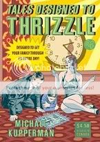
If God didn’t hate us all, we’d live in a world where there’d be some way for Michael Kupperman, Johnny Ryan, and Matt Furie to do a world tour in every way the humor comics equivalent of that Guns n’ Roses/Metallica/Faith No More tour my parents wouldn’t let me go to back in ’91–selling out stadiums, inspiring bootleg T-shirts sold in parking lots filled with drunk drivers, and causing riots when Ryan gets in a fistfight with Stephanie Seymour and blows off a show in Toronto out of frustration. But here we are, and the best we can do is get a new issue of Tales Designed to Thrizzle and laugh ourselves stupid.
I think the key to Kupperman’s humor, aside from the mechanical precision of his artwork (watching him contribute to my Bowie sketchbook was fairly astonishing in how painstaking the process was), is how his jokes don’t so much wander as trail off into platonic simplicity. My guess is that his non sequitur structuring puts a lot of people in mind of Monty Python, but Python tended to go from one full-fledged idea into another, even if that other was totally random and disconnected from the original. Kupperman, by contrast, kind of whittles away at his opening gambits until they reveal purer and purer strands of nonsense. The best example here is a parody of an old educational filmstrip about harbors–the set-up goes after how boring filmstrips are, the first set of gags riffs on the kinds of information presented in filmstrips through exaggeration, the second set spoofs the Statue of Liberty through absurdity, the third set entails physical impossibilities, and by the end he’s just repeating the word “Harbors!” over and over and over eight times in a row. It’s a can-you-top-this game pitting Kupperman against logic in a battle to the death. Kupperman wins.
That incredibly boring explanation of comedy will hopefully not discourage you from buying a comic that features…
* Indian Spirit Chewing Gum – Haunted with Dead Indian Flavor (“The tribes of my people used to cover the land, as numberless as the buffalo. Now we are dead and inside your sticks of chewing gum.” – Big Chief Running Commentary)
* Loose-cannon TV-show cops Mark Twain and Albert Einstein (Twain: “Sometimes I get fed up with these Fourth-Amendment punks and their ‘rights’!” Einstein: “Scum disgusts me”)
* N’Sync in “Pirate Scum Are We” (“Pirate scum are we / Sailing o’er the sea / We’ll die with our mates / For pieces of eight / Baby I love youuu…”)
* Pottie’s – For the best of today’s toilet comedians (“Don’t you hate it when it won’t go down?” – Larry Ronco, February 11th)
* “Hell Is for Monkees” (“‘Buried alive!’ Mike Nesmith whispered softly. The words had a terrible finality.”)
I don’t know what it is about actually funny humor comics that turns me into such a bald-faced salesman, but for real, I urge you to purchase this comic book.
Comics Time: Boy’s Club 2
August 6, 2008Boy’s Club 2
Matt Furie, writer/artist
Buenaventura Press, July 2008
40 pages
$4.95
Buy it from Buenaventura at some point
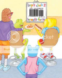
Goddammit this is a funny comic book. In the time it took me to pick it up from one corner of Buenaventura Press’s table at the San Diego Comic-Con and walk it over to the end where I could pay for it, I honestly think I’d laughed out loud four times, and we’re talking maybe six feet total. As gleefully stupid as Bluto Blutarsky yelling “Food fight!” or Ogre Palowakski yelling “Nerds!” or Matthew McConaghey’s line in “Dazed & Confused” about high school girls, it’s a pitch-perfect encapsulation of college-age male idiocy. Furie’s quartet of monster dudes run roughshod over decorum like the Four Horseman of Rad Dumbness: Andy’s the prankster, Brett’s the dancin’ fool, Pepe’s the chowhound, and Landwolf’s the party animal. Into their mouths Furie stuffs the catchphrase detritus of a million public service campaigns, Oxy commercials, and NBC sitcoms: “Let’s do this,” “fierce,” “awkward,” “any questions?”, “that’s what I’m talkin’ about,” and my favorite one-two punch of the book, “and I care because?…” and “that would be a yes.” Gags about sharts, peeing with your pants pulled down, and crawling hungover into a shower with your socks still on are all too real, and really just funny as shit. I like it even better than the first issue. Everyone who ever laughed at a Judd Apatow or National Lampoon movie needs to be issued this comic in the mail, courtesy of Uncle Sam. It’s go time!
Comics Time: Love & Rockets: New Stories #1
August 4, 2008Love and Rockets: New Stories #1
Gilbert and Jaime Hernandez, writer/artists
Mario Hernandez, writer
Fantagraphics, July 2008
100 pages
$14.99
Buy it from Fantagraphics
Buy it from Amazon.com
This handsome new book-sized version of Los Bros’ hallowed series continues both Fantagraphics’ TPB hot streak – Mome and the Love & Rockets digests are also doozies of an argument for this format – and the Brothers’ almost absurd mastery of the art form.
Jaime’s contribution is your proverbial superhero epic, in which Maggie’s friend Angel joins forces with several different teams of female superheroes to help subdue Penny Century, who’s gone and pulled a Parallax (nerd points!) after her fulfilling her long-standing dream of gaining super-powers proves disastrous. It’s fun to see Jaime shift this seamlessly back into the sort of revisionist-genre storytelling he practiced in L&R‘s earliest issues. The trick to it is delivering everything you want in a superhero story – action, suspense, tight costumes – while maintaining his characters’ neuroses and having the events of the tale spring directly from them just like they would in a normal “Locas” story. Also, I don’t know if you’ve heard about this, but he’s pretty okay at drawing women, spotting blacks, and pacing panel transitions. I know, I hope you were sitting down.
For me, though, it’s Gilbert who’s killing the game here. Sandwiched between his brothers’ two superhero installments, Gilbert’s comics are mostly short, largely abstract, and completely devastating. Two subtly interlocking strips set in completely different milieux , “Papa” and “Victory Dance,” muse on love and restlessness, using disease and solitary travel to nail that feeling of wanting to drop it all and go somewhere, anywhere, as long as it’s somewhere else. Another strip flips this idea around, recasting Dean Martin and Jerry Lewis as jovial space barbarians who slaughter their way back together across a hostile world after their duo has been forcibly disbanded by aliens. Both “Victory Dance” and “?” showcase Beto’s skill at “choreographing” the images in each panel into a rhythm, the former literally through depiction of a dance, the latter with Woodring-esque surrealism. “Never Say Never” is also on the surreal side, invoking Freud and Dali with slightly blue gags about sex and money among funny animals. “Chiro El Indio,” written by Mario, reads like an out-of-continuity “Palomar” excerpt. “The Funny Papers” serves up three newspaper-size strips, any one of which would be the best strip I read all year. This is a guy who makes you want to push away from your table and give up.
Comics Time: Scott Pilgrim Full-Colour Odds & Ends 2008
August 1, 2008Scott Pilgrim Full-Colour Odds & Ends 2008
Bryan Lee O’Malley, writer/artist
Oni, July 2008
32 pages
I forget what I paid for it
Buy it at the Oni Press table at a convention
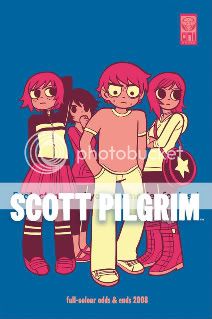
There’s really no reason a Scott Pilgrim fan shouldn’t get this. Colorful, fun, and well designed, it’s like a Scott Pilgrim T-shirt in comic book form. It consists of various (mostly) color SP comics, pin-ups, promotional pieces, and assorted ephemera–a good place to track down things like the Free Comic Book Day prequel to Scott Pilgrim Gets It Together, that awesome Super Mario Bros. 3 ad pastiche, the Kim Pine comic strip, and (reproduced at too small a size for my pervy tastes, to be perfectly frank) sexy colored sketches of Ramona and Kim in their bathing suits. O’Malley’s snappy dialogue and “video-game realism” are as on as ever, his paint palette is surprisingly gentle rather than poppy, and you know what? I’ve heard enough people say that SP Vol. 1 isn’t the greatest introduction to the series (which has gotten funnier, more ambitious, more insightful, and more delightfully complicated as it’s gone on) that I wonder if this colorful, less expensive, more immediately appealing book isn’t a better one. I recommend someone give it a try.
Comics Time: Pixu I
July 30, 2008Pixu I
Gabriel Bá, Becky Cloonan, Vasilis Lolos, Fåbio Moon, writers/artists
self-published, July 2008
48 pages
$8
The second group effort from partners Becky Cloonan & Vasilis Lolos and brothers Fábio Moon and Gabriel Bá following their anthology with Rafael Grampa, 5, Pixu is more of a true collaboration. Though each artist is telling a separate story, they’re all telling interlocking horror stories about people living in an apartment house where, apparently, sinister forces are afoot. It’s kind of like Uzumaki with a scribble instead of a spiral, crossed with Four Rooms, only not crappy.
Good, in fact. While I think the inkier half of the group, Lolos and Cloonan, will ultimately produce more disconcerting images – Cloonan already served up shots of vomit, the eating of human hair, and a Stephen Gammell-esque screaming skull that have me on edge – all four seem on track to yield solid, creepy short horror stories, effective work in a genre Western comics touch all too infrequently and ineffectively.

