Posts Tagged ‘comics reviews’
Comics Time: West Coast Blues
August 21, 2009West Coast Blues
Jacques Tardi, writer/artist
adapted from the novel by Jean-Patrick Manchette
Fantagraphics, 2009
pages, hardcover
$18.99
In a book like this, where a cartoonist is adapting a novel you haven’t read, it’s difficult to say who deserves credit for what. All I know is, someone deserves a lot of credit. As slim, smooth, and hard as its attractive, Adam Grano-designed album-style hardcover format, West Coast Blues is as strong a crime comic as you’re likely to see this year (or until whenever the next Gipi Wish You Were Here Ignatz book comes out). So maybe it’s weird for me to start by talking about the problems I had with it, but let’s get them out of the way: Certain basic character components are things you’ve seen many times before. There are hitmen who banter innocuously between dispassionate murder attempts, a torturer who loves his dog, and a protagonist who doesn’t seem attached to anyone but his own hide. Which is weird, since the protagonist, George, is just an average joe. Maybe there are people out there who, when suddenly targeted by murderers, would be able to ditch their families and entire lives without feeling much of anything about it, but I don’t think I know any, and I’m certainly not one of them. All I do is feel. Sometimes I think crime fiction would be a lot more effective if, as is often the case in real life, the crime really visibly fucked the victims up. (Though to be fair, there are other characters we come across for whom it’s done exactly that.)
What the book does right makes for a much longer list than what it does wrong. For starters, there’s Tardi’s art, a master class in spotted blacks and lines like garrote wire. Tardi juxtaposes cartoony figures against frequently photorealistic backgrounds and objects like a manga-ka, but his characters of a rubbery Rick Geary look that’s at once lighthearted and ugly. This makes them perfect vessels for the story’s sudden bursts of apocalyptic violence, which appear out of nowhere, rain mayhem all over a couple of pages, and then vanish like a summer storm, returning us to our taciturn hero and his quotidian environments. I think everyone will talk about the beach attack, for instance–how well Tardi conveys a Jaws-like seashore scene so sunny and crowded with swimmers that a man could be assaulted and drowned without even those closest to him realizing that anything was going on but horseplay. It was a stroke of genius for this to be the first big setpiece, sending the message that bad shit could go down anytime, anyplace. Just as impressive, and just as well-choreographed from an action perspective, is the book’s central one-two-three punch: a chaotic shootout, an assault by a ghoulish hobo, and the tumble from a train through a seemingly Mirkwood-like forest that’s seen on the book’s cover. After a prolonged period of Godot-like waiting for something to happen, it all seems to happen at once, leaving both George and the viewer dazed and confused amid Tardi’s riot of a woods. George emerges from the other side of this sequence as another person, in a literal sense, and it’s such bravura storytelling we can innately understand why.
The end of the book (and the beginning) seem to want to raise bigger questions than the basic plot–essentially, “no good deed goes unpunished”–would appear to offer. I suppose it’s to Tardi and Manchette’s credit that they try to address my complaint about George’s weird stoicism more or less head on, though I’m not sure I buy their explanation. But it left me thinking, I’ll give them that, and a book that can leave me thinking after keeping me turning the pages as fast as I can is a book that got it done if you ask me. I even liked how people’s howls of pain were simply portrayed as giant letter A’s. This sucker’s good.
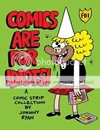
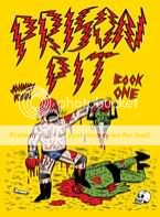
Comics Time: Comics Are for Idiots!: Blecky Yuckerella Vol. 3 and Prison Pit Vol. 1
August 19, 2009Comics Are for Idiots!: Blecky Yuckerella Vol. 3
Johnny Ryan, writer/artist
Fantagraphics, 2008
104 pages
$11.99
Prison Pit Vol. 1
Johnny Ryan, writer/artist
120 pages
$12.99
One of these comics features a giant monster made of semen, a guy who shoots acidic puss out of his body acne, and a slug who sucks cock. The other is a Johnny Ryan gag-strip collection.
Yes, both of these books are like kryptonite to good taste. But there are a couple of big differences between what Johnny Ryan is doing in Comics Are for Idiots!, his latest Blecky Yuckerella strip collection, and what he’s doing in Prison Pit, his ultraviolent action-comic debut. The most obvious is he switched from brush in the former to pen in the latter, stripping himself of his secret weapon: one of the lushest lines in comics. Turns out it was a smart move. With Blecky, the buoyancy of his slick black swooshes and swoops is reflected in his figurework: everyone’s googly-eyed, grinning and chortling like, well, idiots, and if they’re not doing that then they’re gasping or being knocked out of the panel, feet flying in the air, their shock or disgust just as joyous as their glee. That’s how gags about curing brain tumors by exposing them to dogshit or throwing babies in the trash (and to be fair, this is nowhere near as bad as things have been getting in Angry Youth Comix lately) still manage to get you to laugh along with them–they’re just so exuberant! Prison Pit, on the other hand, is all business. Yes, tongue’s in cheek to a certain extent–in addition to the gross-out bits I mentioned above, all the characters look like rejected He-Man concepts, there’s gratuitous swearing and swastikas, the portentous opening chapter heading reads “FUCKED” while the second chapter is called “MEGA-FUCKED,” and Ryan has said he’s swiping liberally from ridonkulous action manga like Berserk. And yet the tone feels as serious as a heart attack, thanks in no small part to a line that’s gone wiry and vicious, able to evoke the doom-laden skies of Gilbert Hernandez’s Chance in Hell, the nightmarish stone wastelands of Mat Brinkman’s Teratoid Heights, the seedy body-horror of Josh Simmons, the painstaking monumentalism of Tom Gauld. At times when the visuals are at their most abstract, you’d be hard pressed to recognize Ryan in them at all.
The second big difference is one of pacing. The four-panel Blecky strips often feel like a breakneck race to the punchline through some kind of bizarre obstacle course requiring the basic premise of the gag to get more ridiculous with each panel. It’s not enough for Blecky to get a pair of x-ray spex–she has to use them to spy on Wedgie’s kidney, and the kidney has to be anthropomorphized, and it has to be going through the personals column, and it has to be circling ads for both men and women, so that the ultimate joke is that Wedgie has a bicurious vital organ. Maybe the best distillation of this kind of set-up features Blecky’s Aunt Jiggles getting her ass caught in a jelly jar, her boobs caught in a coffin lid, and her head caught in a bird’s vagina one panel at a time, for a payoff panel of Blecky saying “You’re the coolest person I’ve ever met.” Rapid-fire ridiculousness is the height of virtue here. Compare that to Prison Pit, which opens with an abstracted, dialogue-free spaceship landing that lasts for four pages. Similar space is given to the protagonist getting wrapped up in someone’s prehensile intestines, or cutting someone’s head off, or falling through the sky, or tumbling down a mountain, or simply losing consciousness. This meticulous rolling-out of physical business is occasionally contrasted with dramatic splash pages–from an x-ray view of the hero’s circulatory system to a disembodied portrait of his penis–but for the most part, this giant fight scene feels disconcertingly quiet, lonely, and loveless, right down to its skin-crawling coda. Ryan’s rep as altcomix’s premier overgrown juvenile delinquent is well deserved–and don’t get me wrong, you can absolutely enjoy Prison Pit on that level–but the poetic savagery he depicts here is the work of a grown-ass man.
Comics Time: Red Riding Hood Redux
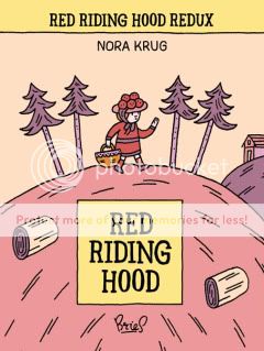
August 17, 2009Red Riding Hood Redux (Red Riding Hood, The Wolf, The Grandmother, The Mother, and The Hunter)
Nora Krug, writer/artist
Bries, 2009
80 pages per volume
$5 individually, $20 for the set, if I recall correctly
I’m going to make Nora Krug’s multifaceted, wordless retelling of the Little Red Riding Hood story sound dreary and depressing if I say that it’s about the ugly business of adult life: Grief, greed, alcoholism, joyless sex, irrevocable mistakes, brutal dominion over animals. The thing is, it’s not not about those things–they’re present in the five interlocking little volumes, each presenting not just the point of view but the literal eye-view (and sometimes mind’s-eye-view) of a different character in the story, that are bundled together with a rubber band to form the overall package. But Red Riding Hood Redux is also about vivid and skillful use of color, clever formal play, astute visual shorthand, baroque and virtuoso storytelling, funny comic business, and the sheer pleasure of telling a shaggy dog tale. Krug deftly reintroduces us to the specifics of the Red Riding Hood story, from the stuff we all remember (“What big ears you have!”) to the stuff we thought we’d forgotten (Grandma and Red filling the sleeping wolf’s belly up with rocks in order to dupe him into still feeling full after the hunter frees them). Oftentimes she presents us with only the half of key sequences and conversations that our current POV character can see, leaving us to fill in the blanks first mentally and then, with great pleasure, through the other side of the story when we get to the other characters’ versions. But just as much fun, if not more, are the aspects of the tale Krug concocts on her own. Maybe there really was a love triangle between Red’s mom, the hunter, and Red’s dad, who by the way was imprisoned for the accidental killing of Grandpa, but I sure never heard it in the versions of the story I was told; Krug imbues this whole bedroom drama with heart, laughs, and real regret. At other times she gets fanciful, creating a bizarre Journey to the Center of the Earth-style world-within-world inside the Wolf’s belly, and continuing the Wolf’s story post-mortem in a fashion that delighted this animal lover to no end. Krug’s simple line and deft coloring are both perfect fits for the project, keeping things childlike while still able to convey all kinds of information and emotional content within the sparse one-frame-per-page set-up she’s using. Heck, just the way she drew Grandma and Red’s views when they get drunk was worth the price of admission. If you can snag this, by all means do so.
Comics Time: Stuffed!
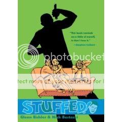
August 14, 2009Stuffed!
Glenn Eichler, writer
Nick Bertozzi, artist
First Second, 2009
128 pages
$17.99
While I can’t say I recommend this book without reservations, I also can’t say I’ve ready very many comics about the moral and ethical issues surrounding the depatriated, taxidermied body of an African. Along with Nick Bertozzi’s always elegant, full-of-life cartooning, it’s that subject matter that will get Stuffed! over with those for whom it’ll get over. In Colbert Report writer/Daria helmer Glenn Eichler’s story, two estranged brothers–happy, if harried, suburbanite Tim and acid casualty Free–come into the possession of the stuffed human remains of a man from Africa, who’d been displayed as a curio in their surly late father’s rinky-dink museum of weird stuff. Tim hooks up with Howard Bright, an African-American anthropologist at the Museum of Natural History, in hopes Bright and the other Museum staffers can help locate “The Savage”‘s country of origin and return him home. The quite contrary Free, who’s not all there, instead argues that the best way to honor the memory of both the African and their father is to keep the former on display. Various didactic contretemps ensue between Tim and Free, Howard and Free, Howard and his wife, Free and Howard’s wife, Howard and his son, Howard and other museum staffers, Tim and diplomats from a pair of African countries where the stuffed guy may have come from, and so on. Yeah, there are a lot of arguments in this book, the kind of arguments where conflicting worldviews are represented and, in the aftermath of one pivotal argument, catharsis is achieved. You may be tired of those kinds of arguments in dramas, and honestly I don’t blame you. But it’s tough to get tired of watching Bertozzi draw them. Despite occasionally acidic coloring by Bertozzi and Chris Sinderson, his figurework and body language looking more than ever like a down-and-dirty Will Eisner, rough-edged and inky where Eisner was smooth and cartoony. His characters seem to move around within their panels with real vitality, breathing breezy readability into what could have been tedious talking-head scenes in lesser hands. (It’s easy to spot the lingering influence of the Modernist painters he chronicled in The Salon, too.) And I have to say it’s rather refreshing to read a graphic novel in which every character is essentially working toward advancing basic human decency, even in misguided ways. And that’s the heart of Stuffed!–a legacy of tragedy and brutality has been reduced to kitsch, so how do we expand it back out of spearchucking stereotypes and past racism and oppression into the full-fledged humanity this person was entitled to? It’s a provocative and engrossing question, and your interest in the answer can get you past Stuffed!‘s shortcomings for the curios to be found inside.
Comics Time: Ultimate Comics Avengers #1 and Ultimate Comics Spider-Man #1
August 12, 2009Ultimate Comics Avengers #1
Mark Millar, writer
Carlos Pacheco, artist
Marvel, August 2009
32 pages
$3.99
Ultimate Comics Spider-Man #1
Brian Michael Bendis, writer
David LaFuente, artist
Marvel, August 2009
32 pages
$3.99
I’m sorry, but there’s simply no way Mark Millar could open his return to the Ultimate Universe with Nick Fury saying “What the %@#&? I disappear for ten minutes and the whole place goes to hell” without intending it as autobiography. After essentially establishing the superheroes-as-paramilitary-unit tone that mainstream comics–certainly Marvel Comics–would have for the decade in The Ultimates, Millar left the franchise in the hands of Jeph Loeb for two arcs, the first of which sold pretty good but made Transformers: Revenge of the Fallen look like Chinatown and had little if anything in common with the vibe and characterizations established by Millar, and the second of which never even came out. Instead, Loeb destroyed Manhattan in the event miniseries Ultimatum, then decamped for more buoyantly awful comic-making in the main Marvel line, leaving Millar and his fellow Ultimate-line pioneer Brian Bendis to pick up the pieces.
Of course, since establishing the Ultimate Universe, Millar and Bendis (who never left, though his Ultimate Spider-Man series has had arguably the lowest profile of any of his books over the past couple years) have been given free rein over the Marvel Universe proper, which as I’ve said before is probably a big reason why the Ultimate books lost their unique luster. So I imagine it’s a matter of pride for the pair to return to their rebooted books guns blazing, proving that what they can do here, they can’t do anyplace else.
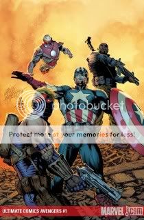
Mission accomplished to an almost alarming degree, if you ask me. Ultimate Comics Avengers #1–retitled to capitalize on the still-stunning-to-me popularity of the main-line Marvel team upon which the book is based, said popularity owing to Bendis’s revamp of it and soon to lead to movie megastardom–reads like Millar is intent on doing everything he does best. So you have some of his irksome tics, like unnecessary commas between adjectives and Tony Stark holding forth while drunk and surrounded by strippers, but you also have the kind of rock-solid widescreen action that you’d think a decade of aping Hollywood blockbusters would have made more superhero writers better at by now. Honestly, Millar is aided immeasurably by the real star of the issue, Carlos Pacheco. I’ve long thought Pacheco could be a truly ideal superhero-slugfest artist–his layouts are dynamic and when he keeps them on-model, his squarejawed superheroes look like they’re just dying to pound the shit out of someone. Here, that’s exactly what they do, as Captain America gets his ass handed to him in midair by the Red Skull in panels so full-bleed they look like the edges were deliberately cropped–like the pages can’t handle combat this two-fisted. Pacheco did yeoman’s work as a Final Crisis fill-in, and he’s looked beautiful colored by Dave Stewart in Kurt Busiek collaborations like Arrowsmith and Superman, but this is so much better than anything I’ve seen from him before. It’s like the detail of Bryan Hitch combined with the oomph of John Romita Jr. It was gonna take a lot to get me back aboard the Ultimates bandwagon after Loeb, not to mention Millar’s own lackluster “second season” of the series, but hey how about this, I’m in. Amid all the superhero comics I’m reading because of their imaginative concepts or clever execution, surely there’s room for the equivalent of Invasion U.S.A..
Bendis didn’t have as tough an act to follow–he’s been writing Ultimate Spider-Man non-stop for, what, nine years, and his recent work with Stuart Immonen has been quite strong. But there’s always a risk of diminishing returns, and those did set in for a while in the late-double-digit issues. Plus, there was all that uncertainty over whether or not Ultimate Spidey would actually live be the star of his own book post-Ultimatum, though in the end his survival ended up revealed in a weird pair of “Requiem” issues that read more like a framing sequence surrounding inventory stories they needed to burn off. And no, this reboot issue isn’t entirely free of residual Ultimatum ickiness–it’s nice that the line has the freedom to kill everyone in Manhattan, but this isn’t the kind of franchise where the characters can adequately process a trauma of that magnitude or where the societal and economic ramifications of destroying the most important city on the planet can even be touched on, not by a longshot.
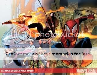
But that aside, this is prime Ultimate Spidey. And again, it’s a new artistic collaborator who really makes it shine. David LaFuente feels like a bionic Stuart Immonen–the character models are similar, particularly Peter Parker’s increasingly preposterous hair, but everything’s slicker, younger, shinier, at times looking like anime (not manga, anime). I’m not sure who’s responsible for the overall look, LaFuente or colorist Justin Ponsor, but I could really get used to it. There’s a moonlit make-out scene with a lovely looking Gwen Stacy that’s absolutely sumptuous. There’s a great opening splash page that twists into some comic business at a fast-food joint, there’s a USM-trademark scene where Spidey shows up late to a fight, and after yet another ludicrous explanation for how well-known murderer the Kingpin can come back to New York and carry on business-as-usual, someone kills him. (I hope it sticks!) I was entertained throughout and surprised at the end. Keep it coming.
Comics Time: Squadron Supreme
August 10, 2009Squadron Supreme
Mark Gruenwald, writer
Bob Hall, Paul Ryan, John Buscema, Paul Neary, artists
Marvel, 1985-1986 (my collected edition is dated 2003)
352 pages
$29.99
For today’s Comics Time review, please visit The Savage Critic(s).
Comics Time: Ho!
August 7, 2009Ho!
Ivan Brunetti, writer/artist
Fantagraphics, 2009
112 pages, hardcover
$19.99
I didn’t laugh once while reading this book. Weird, right? The status of Brunetti’s previous gag-cartoon collections Haw! and Hee! (from which Ho! is largely compiled, though whether as a best-of or a complete collection is unclear to me) as trailblazers in the realm of going-way-too-far comic-book comedy is unquestioned; Brunetti made his bones while Johnny Ryan was picking up cheerleaders. And generally speaking, I’m down for the rough chuckles. In comics terms, I obviously really like Ryan and the astonishingly black comedy (or comic blackness) of Josh Simmons. Meanwhile, my favorite Monty Python movie is the nihilistic Meaning of Life, and among my favorite Tim & Eric sketches are the savagely misogynistic Carol & Mr. Henderson bits, Steve Mahanahan’s Child Clown Outlet, the Lynchian vignette where Casey Tatum gets kidnapped by Mahanahan and vomits in terror, and the “Business Hugs” video in which Leland Palmer instructs us on the best way to comfort a man after his wife suffers her third miscarriage. This shit should be right down my alley.
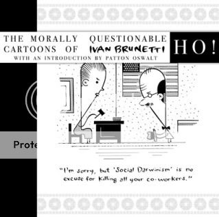
So what happened? It’s difficult to say why something you don’t find funny isn’t funny to you, particularly in a case like this, where Brunetti is intentionally working with material a lot of people would find anything but funny. But I’m not on their wavelength–it’s not the extreme nature of the gags (and they get fucking extreme) that’s turning me off. I suppose it’s the disconnect between the material and the execution? Brunetti’s impeccable line looks like it’d be more at home in the pages of The New Yorker than Sleazy Slice, which I imagine is the point, but for me at least, this just neuters all but the most vicious jokes–otherwise it’s just a litany of beautifully drawn dick/poop/pedo jokes. One that has likely been robbed of much of its power to shock and entertain by the similar work of Johnny Ryan, whose more buoyant, energetic line and use of the more expansive strip form rather than the one-panel cartoon gives his midnight-black gross-out stuff a brio Brunetti lacks.
To be sure, Brunetti occasionally serves up an amusing twist or wrinkle to the calvacade of horrors. I’m particularly smitten with the gag where a man’s wife walks in on him and the dog in flagrante delicto thanks to his strategic use of frosting; the guy’s sidelong glance and pause for thought before attempting to act shocked (“Um…Bad doggie! Bad doggie!”) is a hoot. The new comics Brunetti includes in the back of the book, drawn in his current, even more simplified style, are a fine show case of his geometric character designs, all round heads and curvilinear arms. For my money, the best jokes are barely jokes at all, but rather virtually unfiltered violence and rage: A man waving goodbye to his baby as he fills its bath with acid, another man shooting a woman in the head and barking “NOW you look sexy, whore,” a pair of men sitting in a bathtub filled with the blood of the dead woman hanging from a meathook above them and agreeing that this is better than sex. It’s enough to make you wonder if the gag cartoon’s potential for horror has ever been fully explored.
But in general? Eh!
Comics Time: Whiskey Jack & Kid Coyote Meet the King of Stink and Monsters & Condiments
August 5, 2009Whiskey Jack & Kid Coyote Meet the King of Stink
Shawn Cheng, writer/artist
Partyka, June 2009
44 pages
$3
Monsters & Condiments
Matt Wiegle, writer/artist
Partyka, June 2009
16 pages
$1
I can’t pretend to be an unbiased observer of these comics. Matt and Shawn are friends of mine from my bright college years; I’ve collaborated/am planning to collaborate on comics with both of them; I’ve even worked the Partyka table at conventions (though I’ve far more often freeloaded off of them). But this pair of goofy minicomics is as good an excuse as any to explain what I like about their skills as cartoonists and as packagers of their cartoons.
Whiskey Jack is a prequel of sorts to Shawn’s The Would-Be Bridegrooms, which itself was kind of like Kevin Huizenga’s Fight or Run before Kevin Huizenga’s Fight or Run existed. Instead of fighting each other to win the hand of a fair maiden, this time around the titular pair of shapeshifting braggarts fight a giant skunk to save the fair maiden’s life. They make a hash of it and the fair maiden proves more capable than either of them, as you’d expect. Shawn’s a specialist in combat, as Bridegrooms and his collaborative fight comic On the Road of Knives would indicate, but that’s not really the point here–the goal of Whiskey Jack is pretty much to show a Godzilla-sized skunk running around making fart jokes. The pleasure of the thing stems from how well-drawn the fart jokes are–I could watch Shawn’s intricate use of zipatone and his fine geometric character designs play out all the live-long day. I suppose your mileage may vary with a hand-stitched minicomic that culminates in a gigantic shit explosion, but I got pretty far with it.
 Matt Wiegle puts out one or two quick gag minis a year, and Monsters & Condiments is his latest. It’s a series of seven monster portraits, presented as dishes from the menu of one Hercule Van Helsing: “Nosferatu with dried bonito flakes over mayonnaise,” “Redcap Dwarfs with trio of dipping sauces,” “Eldritch Horror from Beyond with fresh guacamole,” etc. It’s a treat for all you fans of the creepy-cute out there, that’s for sure, and if Matt did webcomics it’d be highly meme-able–but Matt makes exquisite little minicomics with silkscreened covers instead, so it’s presented with po-faced grandiosity that makes the conceit all the funnier. He’s got a real way with monsters, too (which I’ve taken advantage of in my collaborations with him), and in particular his use of black in each portrait creates pleasing and impressive transitions as you flip back and forth. Stop by the Partyka table at any given small-press show and there are any number of similar pleasures to discover.
Comics Time: It’s Sexy When People Know Your Name and Stay Away from Other People
August 3, 2009It’s Sexy When People Know Your Name
Lisa Hannawalt, writer/artist
self-published, 2007
60 tiny pages
$3.50
Stay Away from Other People
Lisa Hannwalt, writer/artist
self-published, 2008
56 pages
$5
There’s a lot to like about Lisa Hannawalt’s comics/doodles/stream of consciousness/what have you as presented in this pair of minicomics. (A third, Mistakes We Made was one of the Ones That Got Away from me at MoCCA 2009). For starters, she can draw like a motherfucker, with a razor-tight line that lends itself perfectly to manically detailed portraits of nattily attired human bodies with animal or insectoid heads. Those things are sort of like if Matt Furie based his similar work on wintertime Macy’s catalogs from the early ’80s, and could easily make her the toast of a hipster-illustration world that, bizarrely, seemingly can’t get enough of weird animal stuff these days. But she’s also got the mind of a sketch comedian, or perhaps more accurately an observational webcomics cartoonist of the sort who’s equally popular in an entirely different segment of the illustration-appreciating population. Her list-based strips, rolling out her thoughts on topics such as “Ideal Wedding Plans,” “A Typical Week,” “12 Things I Think About on My Way to Work,” and the strip on unlikely things that are sexy that gives the first mini its title, progress in a rewardingly and amusingly haphazard fashion, alternating short-and-to-the-point deadpan entries with lengthy and baroque ruminations that you have no doubt plagued her brain for minutes on end. In that “On My Way to Work” strip, for example, entry #9 is “Car Crashes”; entry #6 is this:
What Does the Factory Where Money Is Made Look Like and How Do They Keep Employees From Stealing It. Paper money is printed in large strips which must be cut by giant scissors. All of the little 20s must be furiously stamped by hand onto every $20 bill. Employees must strip naked and place clear packing tape over their genitals and bodily crevices. They receive excellent benefits and are exempt from paying income tax.
Needless to say, that’s all illustrated, in all its packing-tape-covered-buttcrack glory.
 But if the goofiness of the gags conceal Hannawalt’s self-exposure with silliness, other parts of these minis do no such thing. Speaking as someone who suffered through a loooong car commute of his own for several years, I instantly related to her frequently referenced obsession with car crashes, and her unnecessarily detailed drawings of animals and entrails (occasionally combined), all of which I saw and/or thought about way more than was healthy during that time. Her approach to sexuality is similarly infused with a sense of “I just can’t help it”–witness the uncomfortable gag (no pun intended) about how she distracted herself at the dentist by thinking of oral sex, and the shame-tinged images that conjures for her; or the juxtapositions of imagery and text for the strip about things that are sexy, several of them hinging on dominance, submission, or even violence in a disarmingly direct way. (“A healthy appetite is sexy, and so is the act of obediently eating what has been given to you”; “Being patronized or humiliated can be sexy.”) Hannawalt’s skill set is varied and unique; she’s going to be part of Buenaventura’s damn-the-torpedoes alternative-comic-book line, and I’ll be looking forward to it.
Comics Time: Show Off
July 31, 2009Show Off
Mark Burrier, writer/artist
self-published, 2009
20 pages
$3
This is pretty much exactly what the minicomic was invented for: A lovely little object designed as a showcase for an entertaining idea expressed through formal play. It’s a comic book, not a graphic novel or an anthology, and you get the sense that Mark Burrier, a talented illustrator who’s been serving up gorgeous minis like this for some time, wouldn’t have it any other way. Content-wise, it reads like a stand-up comedy version of Anders Nilsen’s Monologues characters–barely-there stick-figure outlines falling apart, only instead of spouting philosophical snippets in order to show the inadequacy of such frameworks in light of their plight, they’re just being dicks to each other. Various legless characters say things like “You think you’re better than me?” or “I don’t feel like getting up today,” while the more fortunate in the leg department either self-deprecate (“You only love me for my leg”) or condescend (“I’m so embarrassed for you”). My favorite gag, however, is a non sequitur: Standing on his single remaining leg and speaking into a microphone, one figure says “This is such a surprise! I don’t want to forget to thank anyone.” Maybe that’s a statement about how even the elite have their inadequacies, or maybe it’s just a funny thing to do with a one-legged stick figure. Who cares when the cardstock covers have such a killer endpage design? This is a slight thing, but it’s the slightness that makes it feel like your 300 pennies were well spent.
Comics Time: Cold Heat Special #9
July 29, 2009Cold Heat Special #9
Frank Santoro & Lane Milburn, writers/artists
PictureBox, June 2009
20 pages
$15
Buy it for the low low price of $12 plus shipping at Copacetic Comics
The most inscrutable of the Cold Heat Specials thus far, which is saying something, this second Santoro/Milburn CHS collaboration in a row is also the least action-oriented thus far. In its 17 story pages (I tend to count minicomic covers for the official page count up top), Cold Heat heroine Castle putters around a castle, appropriately enough. As light from a fireplace, a candle, and eventually dawn illuminates her and her surroundings, she gazes upon a painting and into a mirror, whereupon the figure from the painting appears to come to life…or does he? Whether the sword-wielding horseman is a ghost or just a figment of her imagination is immaterial: The point is to use Castle and her surroundings to evoke the experience we’ve probably all had of being up late at night, alone in the barely staved-off dark, our thoughts running wild in the emptiness.
With each page done in a two-color silkscreen riff on Cold Heat proper’s pink and blue color scheme, the book is a thing of beauty–unsurprising, for comics-makers of Santoro and Milburn’s obvious talents. What is surprising is Milburn’s proficiency for this sort of tone-poem of a story. Most of the Closed Caption Comics veteran’s work that I’ve seen thus far has been geared toward the monstrous, so watching him work off Santoro’s layouts in an experiment to see how best to convey firelight and insomnia is a treat (even if I had to read the thing twice to make sure I understood what was happening–or what wasn’t happening). As is frequently the case with PictureBox products, the price point appears designed to actively punish the casual reader, but to be fair this is about as geared toward someone whose bookshelf’s only graphic novel is Maus as Final Crisis Aftermath: Ink is aimed at someone who bought The Dark Knight off an endcap at Wal-Mart. It’s for we few, we proud, we artcomix aficionados, and lucky for us.
Comics Time: Chrome Fetus Comics #7
July 27, 2009Chrome Fetus Comics #7
Hans Rickheit, writer/artist
self-published, May 2009
36 pages
$3
Maybe you can buy one from Hans Rickheit, I don’t know
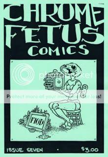
With the release of his Fantagraphics graphic novel The Squirrel Machine slated for this fall, perhaps Hans Rickheit’s days with the most lopsided talent-to-recognition ratio in alternative comics are nearing their end. Or perhaps not. “Alternative” certainly describes what he does but does not do it justice; “underground” comes closer, as it does with Josh Simmons, who in recent years has become the closest thing to a comparable figure to Rickheit that exists. Actually, “somewhere between Josh Simmons and Jim Woodring” wouldn’t be a horrible way to describe Rickheit’s work. Like those artist, Rickheit’s comics are often exploratory in narrative, with guileless naifs–Rickheit’s Cochlea and Eustacea, and his anonymous teddy-bear-headed protagonist; Simmons’s Jessica Farm, Cockbone, and the House guests; Woodring’s Frank, obviously–wandering through a wondrous, slightly nauseating, frequently eroticized, even more frequently horrifying environment seemingly constructed with raw shards of the artist’s own unconscious. In place of Simmons’s squalor and Woodring’s psychedelia, Rickheit has fused together a singular amalgam of Victoriana and body-horror, like Videodrome gone steampunk. His elaborate structures and machines are frequently revealed to be of inscrutable purpose and surrounded by vast expanses of nothing in particular, outposts of a forgotten or unknowable civilization. His line is crisp, perfect for the ornate detail of his machinery or the endless desert of rocks that surround them; his character designs, from Cochlea and Eustacea’s revealing tutus to the teddy-bear man’s natty ascot, gloves, and boots, are rock-solid; his environments and action are always easy to parse; and his central images, from a skull-headed rabbit towering about on giant Cloverfield/The Mist legs to a floating bed tethered to a tower to keep it from soaring away to countless instances of tiny worlds hidden within orifices, are dreamlike in the most direct and impactful sense. He’s one of my favorite cartoonists. If you’re curious about The Squirrel Mother and looking for Hans Rickheit 101, buy this minicomic and your search is over.
Comics Time: Immortal Weapons #1
July 24, 2009Immortal Weapons #1
Jason Aaron, Duane Swierczynski, writers
Mico Suayan, Stefano Gaudiano, Roberto De La Torre, Khari Evans, Victor Olazaba, Michael Lark, Arturo Lozzi, Travel Foreman, artists
Marvel, July 2009
40 pages
$3.99
You don’t have to look around the comics blogosphere too hard to find praise for how Ed Brubaker and Matt Fraction retooled the mythos of the heretofore largely ignored kung-fu superhero Iron Fist into one of the sturdiest and most expansive in the entire Marvel Universe. Like Geoff Johns did with Green Lantern by introducing a rainbow of multicolored Lantern Corps, Brubaker and Fraction took a key component of Iron Fist’s existing backstory–he’s the warrior champion of a mystical city–and simply multiplied it in a couple of different directions–Danny Rand is just the latest in a long line of such champions, and his mystical city is just one of seven such cities, all with long lines of champions of their own. Suddenly, writers had access to a whole new array of allies and antagonists, mentors and successors, settings and story possibilities. It was veritably the birth of the Iron Fist Universe.
Since Frubaker’s departure for greener, better-selling pastures, the book has continued under the direction of pulp writer Duane Swierczynski in much the same rewarding vein. In addition to keeping up the Frubaker traditions of stand-alone issues spotlighting past (and future) Iron Fists and supporting roles played by the Fist’s former Heroes for Hire chums, he’s continued rolling out natural-seeming expansions of the original Iron Fist mythos: For as long as the Iron Fists have existed, so too has a being whose sole purpose is to kill and devour Iron Fists; the Seven Cities have kept an Eighth City as their secret gulag, ruled by the fallen First Iron Fist. The shock of the new may have subsided, but the ideas and execution mesh rather seamlessly with the relaunch.
The one weak spot has been the art. Frubaker’s run was anchored by the great David Aja, perhaps the best exemplar of the naturalistic New Marvel House Style pioneered by Alex Maleev during Brian Michael Bendis’s wonderful Daredevil run back in the day, and sported any number of strong (and schedule-saving) guest artists. Sweirczynski’s counterpart has been Travel Foreman, a bold and distinctive stylist, but one whose angular, inky figures, frequently adrift amid wide empty backgrounds, run counter to the cinematic-pulp feel of the previous run, and can make the action, an all-important component of a kung-fu superhero comic, difficult to parse. It’s not bad art by any means, particularly considering how easy it would have been to saddle the title with something bland and unremarkable, but without the first-round-knockout quality that Aja brought to the book (I vividly remember how impressed Wizard’s weekly review roundtable was with that first issue), I’d imagine it’s been tough to stop Frubaker fans from jumping ship.
Which is why, it seems, The Immortal Iron Fist has been at least temporarily canceled, replaced with Immortal Weapons. This miniseries focuses on each of the Iron Fist’s mystical-champion counterparts, a terrifically named bunch including the Bride of Nine Spiders, Dog Brother No. 1, the Prince of Orphans, Tiger’s Beautiful Daughter, and this issue’s star, Fat Cobra. He’s been the breakout member of the bunch, a sumo-lookin’ dude with a ceaselessly cheery demeanor and insatiable appetite for wine, women, and food. (Not sure about song, though I wouldn’t be surprised.) Guest writer Jason Aaron plays this to the hilt, initially surrounding him with a posse of beautiful masseuses and filling in his backstory with comical imagery: A tubby baby born in a pigsty, the Cobra became an opera singer, then embarked on a decades-long ass-kicking tour of the world and beyond, complete with besting Hercules and Volstagg in a competitive eating contest in Olympus. In one sequence that riffs on a Frubaker trademark and had me laughing out loud as I read it on the train, Cobra and a female sparring partner suddenly switch from exchanging exotically named blows (Elbow of a Thousand Agonies, Giant Squid Spine Squeeze, Hell’s Dentist) to exotically named sexual maneuvers (Tongue of a Thousand Passions, the Peddling Tortoise, the Wheelbarrow of the Gods). But a twist that plays off the Cobra’s womanizing ways, initially for comic effect, suddenly turns deadly serious, complicating our understanding (and that of the amnesiac Cobra himself) of who the Cobra is and what he’s capable of. Aaron is joined on this journey by an array of talented artists, each responsible for a different era in the Cobra’s life: Mico Suyan’s framing sequence gives the Cobra a rounded, lifelike feel, while Daredevil regulars Stefano Gaudiano and Michael Lark each evoke the book’s past artistic glories. There’s even some gorgeous coloring (love those purples!) by the always welcome Matthew Hollingsworth. Compelling one-and-done stories are not easy, but you wouldn’t know it from reading this one.
The book is rounded out by a story from the regular team of Swierczynski and Foreman and starring the Iron Fist himself; this will be continued throughout the miniseries. With ace inker Gaudiano backing him up, Foreman suddenly comes into his own: His art gains in detail and in evocative power, with a memorably bug-eyed, strung-out junkie, an adorable kung-fu urchin, and Danny Rand’s girlfriend and partner Misty Knight looking as real and as beautiful as ever. The action is easy to parse, and the costume choices (from kids in kung-fu training togs to the aforementioned junkie in his tighty whiteys) are memorable. It’s quite an effort, and with any luck, the Immortal Weapons will last, if not forever than for a few more arcs of work of this caliber.
Comics Time: The Umbrella Academy: Apocalypse Suite
July 22, 2009The Umbrella Academy: Apocalypse Suite
Gerard Way, writer
Gabriel Ba, artist
Dark Horse, 2008
184 pages
$17.95
When you think of how many indie superhero titles are abject failures of imagination and innovation, The Umbrella Academy becomes all the more impressive. I’d imagine that as with most creator-owned superbooks it’s the product of a life-long love of Marvel and DC (and by now, ’90s Image). But most creators who are thusly smitten wind up barfing out some dishwater-dull origin story involving types rather than characters and fixated on producing iconic moments for copies of copies of copies of icons. Writer Gerard Way, who as the lead singer of My Chemical Romance can’t even claim that doing comics is all he’s ever wanted to do creatively, is beating such people at their own game. He’s produced a weird, sad comic about superheroes, with sophisticated pacing that trusts in the intelligence of the reader rather than insisting on serving them nothing but what they’ve already seen. Essentially, the seven members of the Umbrella Academy are to their adoptive father Hargreeves what Michael, Janet et al were to Joe Jackson, with similarly dispiriting results in terms of the disconnect between talent, even talent used optimally, and happiness. There’s no happy ending for them, either. It’s superheroing with sharp edges.
He’s done this with the help of Gabriel Ba, whose work here reads like a cross between Mike Mignola (perhaps enhanced by the presence of Mignola’s longtime go-to colorist Dave Stewart) and The Incredibles. He’s produced solid character designs (based on concept sketches by SVA grad Way) that transition well between superhero and soap opera, he frequently draws his panels utilizing zesty, infrequently used angles, and his action is coherent and dynamic. For his part, Stewart is brilliant as always, throwing huge splashes of eye-melting colors (oranges, pinks) into the mix in a way that’s both exciting and slightly alienating–much like the comic itself.
Now, to be sure, the characters themselves are more sketched than fully rendered at this point. And I’ve heard criticism that the thing reads like a Grant Morrison Doom Patrol tribute album, though not having read much early Morrison I can’t comment on that. But from where I’m standing this thoughtful, engaging work all around.
Comics Time: Never Learn Anything from History
July 20, 2009
Never Learn Anything from History
Kate Beaton, writer/artist
self-published, June 2009
68 pages
$18
Read some strips at Kate Beaton’s site
Like Ditko Hands or Kirby Krackle, Kate Beaton Eyes are a signature achievement in cartooning. They widen, they narrow, they leer, they roll, and (god bless Tyra Banks for introducing this concept to the world) they even smile. If it’s possible to make eye contact with a comic, Beaton’s comics are prime candidates–you lock eyes with them and you’re instantly drawn in. If eyes are the window to the soul, then Beaton’s comics, like James Brown, have soul to burn.
Once you’re finished saying jeepers creepers over those peepers, the rest of her cartooning’s elegant gestalt has a chance to make an impression on you. Beaton’s line is loose, even rough at times, yet sinuous and whole–it’s like cursive handwriting. It feels both sketchy and deliberately fancy, really a perfect complement to her subject matter, which more often than not plays history’s great men and women (and the women and men in their lives) for laughs by feeding them through a precocious 14-year-old’s priorities, sense of humor, and keen observation of adult absurdities–the kinds of gags you might find passed back and forth in notes between smart kids during third period history. Fans of Shakesperean actor (and brother of Abraham Lincoln’s assassin) Edwin Booth shriek and moan during Hamlet’s soliloquy like Twilight fans over Robert Pattinson taking his shirt off. Lord Byron is a slut. President James Monroe drops the Constitution, then bends over to pick it up, in order to show off his ass to an appreciative young lady. Rebels, revolutionaries, and rabblerousers from Robespierre to Louis Riel to Tadeusz Kosciuszko to Patrick Pearse to George Washington come across like the kind of bumbling heroes or simpering villains you’d find in a kid’s action-comedy superhero cartoon. She has a real knack for their body language, too, as they proclaim and lounge and get shot in the face by arrows and come onto each other and so forth–their movements and poses are nearly as distinctive as their eyes. (Her self-caricature is a real peach, too.) Meanwhile there’s something about Beaton’s dialogue delivery that really suits the Internet–the strips sort of slowly wind their way up to the joke, at which point lots of punchlines seem banged out in all caps with no punctuation by hysterical messageboard people who are all too aware of their own hysteria, if you follow me.
Not every joke is a winner, and even many of the best gags don’t really make you laugh out loud–I was already familiar with some of these strips from Beaton’s website, so I think that during this read-through, the only bit that made me LOL was this hilarious drawing of a drunken Santa Claus. And I have to assume that the Pythonesque history-major humor is an acquired taste. (I remember when I was a kid and first discovered Monty Python that I assumed all adults knew the ins and outs of the history of philosophy and made jokes about Kant all the time–this was the humor I pictured existing somewhere out of reach.) Some of the slowly accruing jokes never quite seem to accrue. But the gestalt is so good-natured that you don’t even mind the bits that are just semi-funny, and the cartooning is an absolute pleasure. Soak in it.
Comics Time: The Lagoon
July 17, 2009The Lagoon
Lilli Carre, writer/artist
Fantagraphics, 2008
pages
$14.99
I’m grateful for books like The Lagoon, where things happen without neat resonances with other things that happened, where you can’t always locate the part within the whole. The Lagoon is a horror story, if a low-key one; like much of the best horror it makes the connection between horror and the absurd. Whether you’re talking about a giant gorilla climbing the Empire State Building or a puzzle box that unleashes S&M demons, horror’s iconic images frequently boast a lack of inherent logic that rivals that of video games. Carre gently (and I do mean gently–don’t expect the surrealist nightmares of Tom Neely or Josh Simmons here) applies this throughout her story. The characters don’t appear to know where the creature who lurks in the titular waters came from or why it does the weird thing it does, and neither do we. Nor are we presented enough information to determine the true nature of the creature’s relationship with one member of the family at the center of the story. The context provided points to something illicit, but perhaps that’s just the lingering effect of the story’s eroticized, somnambulist qualities–so much takes place at night, in bedrooms, in still waters, against thick and sticky blacks…and heck, one character is an actual somnambulist. And finally, the story’s coda (more like its final third) doesn’t appear to directly address the preceding events in the way we’d expect. Carre’s sinuous, snaking treatment of sound provides a through-line; there are windows that get opened and shut and lied about; the characters are of course the same; but it still feels disconnected in ways that few writers today are gutsy enough to attempt. The overall effect is like Clive Barker fed through a twee filter. This’ll stick to you.
Comics Time: Wednesday Comics #1
July 15, 2009Wednesday Comics #1
Brian Azzarello, Eduardo Risso, Dave Gibbons, Ryan Sook, John Arcudi, Lee Bermejo, Dave Bullock, Vinton Heuck, Kurt Busiek, Joe Quinones, Neil Gaiman, Mike Allred, Eddie Berganza, Sean Galloway, Paul Pope, Jimmy Palmiotti, Amanda Conner, Dan DiDio, Jose Luis Garcia-Lopez, Kevin Nowlan, Ben Caldwell, Adam Kubert, Joe Kubert, Karl Kerschl, Brendan Fletcher, Walt Simonson, Brian Stelfreeze, Kyle Baker, writers/artists
DC, July 2009
16 pages
$3.99
No sense beating around the bush: I don’t like newsprint. It’s flimsy and icky and doesn’t look nice. It doesn’t hold color well. You get a big fold-out broadsheet made of newsprint like this thing and fold and unfold it a couple of times and it becomes more messed-up and harder to do anything with each time. I don’t like it when newspapers use it, I don’t like it when PictureBox uses it, I don’t like it when Paper Rodeo uses it, I didn’t like it when that Comic Shop News thing they’d stick in the bag with your weekly pull list used it (they still around?). To paraphrase James Murphy, I don’t get the borrowed nostalgia for the unremembered ’30s. I don’t like paying $3.99 for a comic that self-consciously evokes its own disposability with the stuff it’s printed on, either. (Hell, I don’t like paying for a single issue of anything.) Basically this project is designed, aesthetically, to press a lot of buttons I don’t have.
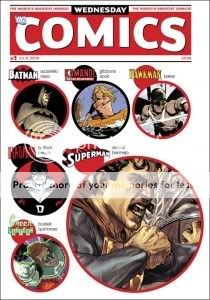
That said, Wednesday Comics #1 works perfectly well as a sort of My First Kramers, an astutely curated experiment in what happens when you tell a bunch of auteurs to do they thing on a gigantic canvas. As with Kramers Ergot 7, you get a few different approaches to how to use all that space. Some of the creative teams, most notably the father-son team of Joe and Adam Kubert, just blow up a regular grid, resulting in an eye-arresting sequence of Nazis playing the captured Sgt. Rock a chin-music symphony and giving you that “Lily Tomlin holding a giant book” sense of the object’s sheer size. Others cram the page with extra information: Ben Caldwell’s Wonder Woman strip, a far less nostalgia-inclined affair than most in the book, is riddled with tiny panels and minute twists and turns, while Karl Kerschl and Ben Fletcher’s Flash effort takes a cue from the likes of Dan Clowes and tells its story through a pair of self-contained but interconnected funnies-style strips. Other creators tip their hats to the newspaper strips of yore as well: Dave Gibbons and Ryan Sook’s Kamandi story is done Prince Valiant-style, while Paul Pope’s Adam Strange effort is a less direct but still recognizable homage to classic adventure strips and sci-fi pulps. Even the modern era earns some tips of the hat: Kurt Busiek and Joe Quinones’s Green Lantern strip references Darwyn Cooke’s New Frontier in era, tone, look, and even a mention of its title, while the awe-inspiring naturalist Kyle Baker Hawkman art that took the internet by storm is employed in the service of a disappointingly direct and unfunny 300 parody. (He’s riffing on that long opening sequence from the comic version–“We march.”–that Zack Snyder didn’t use in the movie, so maybe people will miss it. I’m kind of jealous of those people.)
When you print comics this big you have a lot of space to fill, which draws your attention to coloring even more than normal, and in this case that can be a blessing and a curse. Trish Mulvihill escapes the dreaded Vertigo Brown with some lovely golden hues in the Brian Azzarello/Eduardo Risso Batman piece that opens the issue, Ryan Sook provides some interesting purple-orange sunset scenes for his Kamandi strip, Joe Kubert’s palette on the Sgt. Rock piece is refreshingly and effectively subdued, and Jose Villarubia’s gray skintone for Adam Strange meshes with his purple jumpsuit and bright blue enemies for an effect that looks appropriately aged and weathered. But I think in most other cases, the paper stock betrays the color work. You can practically feel Amanda Conner’s Supergirl wanting to be a bright red, blue, and blonde, Laura Allred’s normally radiant work looks in her husband Mike’s Metamorpho strip like you’re looking at it through sunglasses, Sean Galloway’s Teen Titans art is dialed way down (those graytone or nonexistent backgrounds don’t help)…even the great Dave Stewart is undone with colors for Dave Bullock and Vinton Heuck’s Deadman strip that just don’t quite click.
As for the stories themselves, who can judge at this early stage? I suspect that for the most part, how you react to these meager one-page morsels at this stage in the game depends on your preexisting feelings about the characters and the contributors. (Spoiler alert–I’m excited about the Paul Pope strip!) I think Ben Caldwell’s Wonder Woman strip, which is so different both visually and narratively from what you’re used to seeing from DC with regards to this character–and from everything else in the comic–is the one that’s most likely to surprise in the long run, though for good or ill I don’t know. Also, clever of John Arcudi to open his Superman strip with Supes flying backwards at the audience, no? I do think it’s rather delightful that DC, or at least series editor Mark Chiarello, turned to a bunch of talented creators and told them to write about their respective characters in whichever way they chose rather than hewing to on-model continuity or overall vibe. (Hey, remember when Marvel did that more or less line-wide in 2000-2001 or so?) Of course, the thing about these kinds of non-continuity short-story “tone poems” in honor of this or that superhero character is that it’s hard to get them to stick, and harder still to get a sense of what you’ll get out of them in the end, other than “Hey, Metamorpho’s neat” or whatever.
That, I suppose, is the problem. Four bucks for 15 one-page slivers of story, 12 weeks in a row, is an awful big investment for an uncertain return. (And I’m already let down something awful by the Baker Hawkman thing.) This is why I think it’s fair to spend so much time kvetching about the paper stock, because Wednesday Comics isn’t a series, not really–it’s an object. The size, the format, and most especially the newsprint were selected to stand out, to impress the physicality of the object upon you. Seeing the burst of publicity for the book last week made it clear that this was a smart choice in some ways: Tying a high-profile comic book launch in this day and age to a way of doing comics that’s almost completely outmoded, with bonus points for resonating with the overall death of newspapers, was bound to attract the attention. Meanwhile, within the world of comics, this is the sort of project, and the sort of talent line-up, that’s bound to win plaudits from bloggers and award committees–if this thing doesn’t clean up at next year’s Eisner’s I’ll eat my hat. The point of Wednesday Comics is for you to note how different, how unique, how special it is. Which is well and good, but it’s all undercut if you just don’t like newsprint, you know?
Comics Time: Doom Force #1
July 13, 2009Doom Force #1
Grant Morrison, writer
Keith Giffen, Mike Mignola, Steve Pugh, Ian Montgomery, Brad Vancata, Richard Case, Walt Simonson, Paris Cullins, Ray Kryssing, Duke Mighten, Mark McKenna, Ken Steacy, artists
DC Comics, 1992
64 pages
$2.95
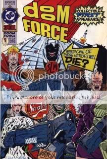
Sometimes you can judge a book by its cover. Obviously, this is an in-the-moment parody of the ever-more-extreme (with a capital “E,” at one point) superhero-team comics of Rob Liefeld and his peers and imitators. The gags are all a lot stronger than you’d think they might be, actually, which is surprising even given the talent of the writer. The Crying Boy’s nebulously defined bad-luck powers and emo demeanor, Flux’s girl-superpower of amorphousness and her sperm-covered form-fitting unitard, The Scratch’s corporate branding and badassness that passes fully into the realm of douchebaggery, etc etc etc.–I chuckled at each, and that’s even before you get to Shasta The Living Mountain or the list of trademarked names for characters who may appear in future volumes, which is really one of the funniest things I’ve ever read in a comic (Gridlock! Campfire! Timesheet!). But I think the most rewarding gags are the ones that tug things in either goofier or weirder directions than necessary. In the former category, there’s Shasta’s transformation into said Living Mountain–complete with not just a ski slope and chairlift, but actual skiers. In the latter category, there’s the way the comic pretty much stops short a couple of times so that the brother/sister villain team can get into uncomfortable shouting matches about proper feminine attire: “Every strong woman must feel free…to express her femininity by wearing exotic lingerie…” (You’ve got two guesses at to which sibling says that and the first guess doesn’t count.) As for the Liefeld-manque art, I never actually read (or even just bought) his comics so I can’t tell you how effective a lampoon it is. I do however remember Mark Millar’s much-repeated insistence that Kids Love Rob Liefeld, and it’s true that the cast of thousands assembled to knock Rob off here do a great job of conveying Liefeldian EXCITEMENT and VOLUME and BARELY CONCEALED NIPPLES AND LABIA at the expense of any vestige of storytelling coherence. Overall it’s a hoot that holds up well. I like it better than Batman: Gothic. PS: Mickey Eye cameo!
Comics Time: Low Moon
July 9, 2009Low Moon
Jason, writer/artist
Fantagraphics, June 2009
216 pages, hardcover
$24.99
Tom Spurgeon’s recent review of this book centered on whether or not it was (apologies to Elaine Benes) spongeworthy. Of all the Jason books released by Fantagraphics, this short story collection is the first one to get the hardcover treatment, obviously due to the titular story’s serialization in The New York Times–but does it really deserve the extra frou-frou and increased price point? Does the format flatter the work? With all due respect to the Spurge, shit yeah. And I say that as someone who casually dislikes hardcovers as a rule. But you could do much, much, much, much, much, much worse than to spend 25 bucks and an inch on your bookshelf on yet agoddamnnother collection of murderously bleak and astonishingly well-executed high-concept existentialism, drawn with an unimpeachable clean line and colored like unto a thing of beauty. Time and time again during these five stories I was almost physically impacted by Jason’s skill as a storyteller: A character spits a mouthful of something spoilery into a sink in “Emily Says Hello,” relationships are established and upended with the tiniest possible handful of panels in “Low Moon,” petty and heinous crimes are paralleled Crimes & Misdemeanors-style with chilling results in “&,” another mouthful of something spoilery is forcibly ejected in “Proto Film Noir,” a strange plant fires spores into the sky indifferent to the plight of an observer in “You Are Here”…his skill and his bravado left me shaking my head with amusement and/or amazement time and time again. He’s one of the best, as is this book.
UPDATE: Spurge corrects my interpretation of his review in the comments.
Comics Time: Uptight #3
June 15, 2009Uptight #3
Jordan Crane, writer/artist
Fantagraphics, May 2009
24 pages, including the covers which you should since they’re comics pages
$2.75
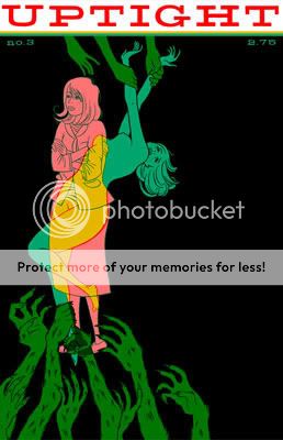
Without Jordan Crane’s The Last Lonely Saturday and NON #5 I wouldn’t have this blog–heck, I wouldn’t have this life, that’s how much of an influence those first tastes of the big wide world of alternative comics had on me. So it’s difficult to be objective when reviewing Crane’s new stuff. Fortunately it’s very very good so that’s not much of an issue. The long-awaited third issue of Crane’s Eightball-style one-man anthology series comes to us with a different cover and contents than we were originally promised–instead of a severed head, we get the kind of ingenue who used to grace NON‘s covers, her soul nude (aren’t they all?) and torn between heaven and hell (aren’t they all?). Instead of another installment of Crane’s loooooooooong-gestating serialized graphic novel of marriage and miscarriage, Keeping Two, we have the debut chapter of a new story, Vicissitude, which itself marks the debut of a new art style for crane: less of an emphasis on delicate, feathery, perfect line, oceans of gray, pointier noses. The plot is a bitter little thing, steeped in infidelity, alcohol, career dissatisfaction, hints of class self-consciousness, and frustration with the path your life has taken–like a Pulp song, almost. The visual shift to the second feature, a direct moments-later sequel to The Clouds Above, couldn’t be more dramatic–the grays disappear, the line transforms, the detail increases tenfold, and blam, we’re in Sam ‘n’ Jack’s world of buoyant, byzantine adventure. Crane’s Sam and Jack stories unfold like the pipes and vents upon which this tale centers: they bend and twist and wind in comically baroque ways, yet Crane’s control of his visuals and the story’s tone are so self-assured that it all seems completely logical, like a mind consciously built it this way and if you have a little faith, it’ll work like it’s supposed to.
The great crime of Uptight is that it barely ever comes out, and given the hostile climate for alternative comic book series these days, I’m not convinced that’s going to improve anytime soon. Best we can do is read the heck out of these bargain-priced gems anytime we get our hot little hands on ’em.

