Posts Tagged ‘comics reviews’
Comics Time: The Mourning Star #1 & 2
October 7, 2009
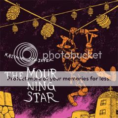
The Mourning Star #1 & 2
Kazimir Strzepek, writer/artist
Bodega, 2006 & 2009
Vol. 1: 220 pages
Vol. 2: 256 pages
$13 each
Of all the alternative action-adventure comics I’ve been lumping together in discussions for the past couple years, Kaz Strzepek’s The Mourning Star is the ripest candidate for crossover success. His cartooning is clear and appealing, with endearing, often adorable character designs and well-choreographed action sequences, reminiscent of the work of Brian Ralph without Ralph’s ars gratia artis, printmaking-derived design sense. Strzepek’s world-building–in the sense of both “backstory” and “readily understandable physical environment”–is top drawer, recalling everything from Dungeons & Dragons to Tolkien to The Road Warrior to The Dark Tower without coming across like a rehash of any of them. While its blend of an obviously personal vision with universally accessible ideas and visuals puts it more in line with Scott Pilgrim than Powr Mastrs, the involvement of Highwater vets Randy Chang and Jordan Crane in its production leaves little doubt as to its altcomix cred. It’s like a post-Fort Thunder Bone.
In reading The Mourning Star‘s first two volumes back-to-back recently, what struck me hardest wasn’t the admittedly rock-solid introduction to the characters and world provided by book #1, but the time we spend with its villains in book #2. It’s very easy and tempting for one’s grown-up, self-aware genre art to willfully return to a black-and-white conception of protagonist and antagonist. And I don’t blame anyone for doing it! The point of escapism is to escape, and giving your villains big black hats is a welcome relief from the shades-of-gray nightmare we live in day to day. But taking the time to depict villainy as the result of relatable choices is rewarding in its own way. In Volume 2, we discover through Strzepek’s seamlessly natural dialogue that the Rule aren’t just sinister, unfeeling killers–although they’re that, too. They’re people who banded together in The Mourning Star‘s postapocalyptic world for security and safety and who believe their brutality is what can continue to ensure this. They have leaders whose approval they sometimes crave and whose orders they sometimes resent. They have medics to heal them when they get hurt, and equipment that breaks down. They’ve got seasoned veterans and wet-behind-the-ears rookies. They tell each other urban myths. They jockey for position and remember their lives before they became the barbaric rulers of the cities and wastelands. In short they’re just like anyone who’s ever shored up an evil regime–potentially normal guys and girls who at some point lost or deactivated their ability to empathize, who don’t mind ordering or supporting the murder of people they don’t know. Maybe that’s why I’m rooting even harder than ever for the good guys to beat them in the end.
Comics Time: Cold Heat Special #7
October 5, 2009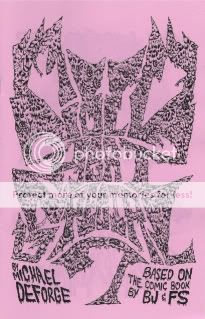
Cold Heat Special #7
Michael DeForge, writer/artist
PictureBox, September 2009
12 pages
I don’t remember how much it cost
Browse the Cold Heat shop, where it’ll probably end up eventually
Band logos are an interesting thing, and when they succeed at visually representing a band’s musical and aesthetic project, a pretty awesome thing. Which makes a lot of old-school heavy metal logos a baffling thing–instead of offering a clear, brandable distillation of the band, they’re often illegible to the point of incomprehensibility. (Spend some time on Obsidian Obelisk and you’ll see what I mean.) I suppose this is a tip of the hat to the uncommercial, underground nature of much of that music–it’s so not for you that the masses can’t even make out the band name. (“Songs for the deaf–you can’t even hear ’em!”) My favorite recent example of this aesthetic cropping up in comics is Rinzen’s title design for Paul Pope’s Batman Year 100, which combines past stabs at shaping the word “BATMAN” into a logo with an unmistakable and acknowledged metal vibe.
Michael DeForge’s Cold Heat Special combines this with a project that stretches the boundaries of “comics” in much the same way as Kevin Huizenga’s minicomic Untitled. That book was little more than page after page of scribbled, rejected names for Huizenga’s then-upcoming solo series Or Else. And though its contents were almost entirely text, it was at least as much intended to be viewed as read; like any comic, its contents accrued meaning through sequential juxtaposition, building into a memorable exploration of the creative process and the by-definition arbitrary nature of assigning signifiers to the signified.
DeForge’s work here is different, to be sure. For starters, it’s very, very metal: His eye-meltingly ornate band-logo versions of the names of various Cold Heat characters (including, of course, the pivotal noise band Chocolate Gun) frequently rely on motifs that evoke thorns, spikes, bodily fluid, scales, horns, lightning, fire, and in one memorable case a fist with the name spelled across the knuckles in spilt blood. It’s a far cry from Huizenga’s no-nonsense all-caps lettering. It’s also a far cry, in a lot of ways, from the aesthetic I tend to associate Cold Heat with: the hazy sensuality of shoegaze. It’s way more Cannibal Corpse than My Bloody Valentine. (There’s also at least one explicit homage that I caught–the lettering for Black Sabbath’s Masters of Reality, not to mention 1000 Homo DJs’ Supernaut EP.) But what this explosive, offensive, savage designwork does get at is the importance of POWER to the Cold Heat project: The violent power wielded by the sinister Senator Wastmor, the emotionally liberating power of Joel Cannon’s music, the self-discovery of internal power by our heroine Castle, and so on. It also reinforces Cold Heat as a sort of samizdata, an attempt to recreate the magic of the “lifeline music” that got us through our teenage years and the handmade, ramshackle media, from zines to mixtapes, that chronicled that community. Logos like these are meant to communicate just how important and immediate and irrepressible the art they’re a stand-in for is to its makers and consumers. In the context of Cold Heat, they make more sense than you’d think.
Comics Time: Cold Heat Special #6
October 2, 2009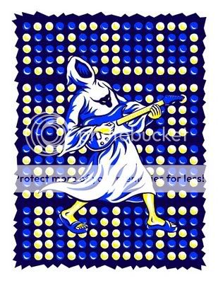
Cold Heat Special #6
Chris Cornwell, writer/artist
PictureBox, September 2009
24 pages
I think it was $10
Chris Cornwell is the joker in the Cold Heat deck. The only Cold Heat Specialist who doesn’t create his installments of the spinoff series in collaboration with Cold Heat-proper cocreator Frank Santoro, he’s also the farthest afield from CH‘s usual tone of wistful, sensual menace and transcendence. His first CHS involved an assassin whose dayjob was rock stardom and the evil Senator Wastmor piloting a giant minotaur robot. Similarly, this issue is summed up by that gorgeous, iconic cover, featuring some kind of robed Satan worshipper rocking out; this leads into an opening sequence in which a band comprised of monsters “rehearses” by destroying their own equipment in a montage that reminds me of Yacht Rock’s take on Van Halen in terms of sheer half-parody/half-salute comedic rockitude.
Indeed the whole comic feels a bit like a montage. There’s that opening Monsters of Rock sequence’ a credits-spread scene of a nude Senator Wastmor getting drunk and drowning in an ocean of his own puke’ a “secret history of Cold Heat” story (really the core segment) about one of Wastmor’s ancestors attempting to sacrifice a beautiful girl to his demonic masters in colonial days before being thwarted by alien protectors; a near-abstract spacetime-rupturing transition sequence linking that centuries-old adventure to the present-day viewing of a Chocolate Gun videocasette by other aliens; and a glimpse of how the aliens’ power affects CG lead singer Joel Cannon juxtaposed with how Cannon’s music effects Cold Heat heroine Castle. Got all that? It can be tough to follow, particularly toward the end of the book, but following it doesn’t appear to me to be the point. It’s more a case of latching on to isolated images and impressions, meaning that Cornwell in his goofy slapstick way is mimicking the more lyrical approach of Santoro and Ben Jones in Cold Heat itself. And he can do it, too–he’s got the visual chops to bounce back and forth between slick cartooniness (the cover, Wastmor’s bender), rough-edged Fort Thunder/Closed Caption Comics-style monstrousness (the band, the aliens), non-narrative visual-driven psychedelia (the transition sequence), and on the last two pages, a glimpse of Cold Heat‘s trademark music-as-emotional-salvation leitmotif. Plus the book is as lovely an object as the CHS series has seen so far, with that killer, please-make-it-a-poster cover and two gorgeous color pin-ups literally pasted to the inside covers. If only every comic-book franchise had this kind of quality control.
Comics Time: Boy’s Club #3
September 30, 2009Boy’s Club #3
Matt Furie, writer/artist
Buenaventura Press, 2009
40 pages
$4.95
Buy it from Buenaventura Press
For today’s Comics Time review, please visit The Savage Critic(s).

Comics Time: Two Panels from SPX 2009
September 28, 2009In lieu of our regularly scheduled Comics Time review, I’m happy to present mp3 recordings of the two panels I participated in at SPX this past weekend.
First up is the Critics’ Roundtable, featuring moderator Bill Kartalopolous, Rob Clough, Sean T. Collins, Gary Groth, Chris Mautner, Joe McCulloch, Tucker Stone, and Douglas Wolk.
And next is The New Action, featuring moderator Sean T. Collins, Frank Santoro, Benjamin Marra, Kazimir Strzepek, and Shawn Cheng.
Enjoy!
Comics Time: Storeyville
September 25, 2009
Storeyville
Frank Santoro, writer/artist
PictureBox, 2007
48 pages, hardcover
$24.95
Buy it for just $15.95 from PictureBox
As dense and rough-hewn as his more recent comics are spacious and delicate, yet some how retaining an easy, breezy, open feel, Storeyville is an object lesson in how to create and maintain an immersive atmosphere in comics. On giant pages stamped with a gutterless 3-by-5 15-panel grid and colored with admirable restraint by the extremely effective Katie Glicksberg, Santoro traces the progress of his protagonist Will through shantytowns, railways, and harbors as he searches for his old friend and mentor Reverend Rudy in order to make amends for some mysterious past transgression. Nearly every panel-sized vista we receive into Will’s journey is a deep-focus wonder, perspective leading us down roads, over fields, through cities, onboard ships, the characters frequently popping against the background like figures in some sort of altcomix View-Master. Realism and impressionism engage in a constant back-and-forth, leading to subtle shifts in your visual and emotional focus during any particular scene as well as reflecting, one assumes, similar shifts for Will himself. The nearest point of visual comparison is Ben Katchor, but while Katchor’s surround-sound POVs and time-faded inkwashes are used in the service of a surrealist magnification of vanished urbanity in which a slightly deranged objectivity is constantly maintained, Santoro’s subjective use of some of the same tools paradoxically gives Storeyville a WYSIWYG tone to it, as though he’s telling it like it is. The reason for this becomes clear when Will and the Reverend finally meet up, and both Will’s supposed crime against his pal and his ensuing need to atone are shrugged off. Consumed with both guilt and a hope that the act of alleviating it will open up a new path for his future, Will couldn’t possibly be an objective observer of his surroundings; his view of himself really did determine his view of the world and his possible place in it. Highly recommended.
Comics Time: “Superhero comics worth your time today”
September 23, 2009Comics Time: Clive Barker’s Seduth
September 21, 2009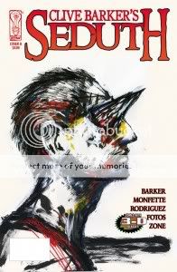
 Clive Barker’s Seduth
Clive Barker, Chris Monfette, writers
Gabriel Rodriguez, artist
Ray Zone, “3-D conversion”
IDW, October 2009
32 pages
$5.99
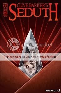
“Surprise”: I love Clive Barker. Actual surprise: I was not looking forward to reading this Clive Barker comic. Despite its being touted as Barker’s first straight-to-comics work in two decades, the presence of a co-writer dampened my enthusiasm. So too did the 3-D aspect–we’ve all been burned by gimmickry. As for IDW’s involvement, I’d been mightily impressed by Kris Oprisko and Gabriel Hernandez’s lovely, lyrical Thief of Always adaptation, but Seduth artist Gabriel Rodriguez’s cartoony art on the company’s Great and Secret Show–admirable though it may have been for committing a full 12 issues to the effort–struck me as project-deflatingly wrong for the work. In my head, I see Barker as his own adapter, whether as filmmaker or painter or drawer; after that, I cut to the Gothy Hellraiser/Tapping the Vein aesthetic of the Epic Comics days, or to an altcomix style like C.F.’s that has never actually been applied to his stuff. Dude’s transgressive; let’s keep him that way.
Rarely have I been as happy to be wrong as I was about Seduth. Story first: Holy smokes, is this dark. It’s as savagely nihilistic as anything Barker’s done since the Books of Blood, or the story of Hellbound: Hellraiser II, which in its potentially apocalyptic nature and certain specific geometrical and extradimensional imagery is perhaps its closest point of comparsion. Heck, Seduth‘s done-in-one short-story nature makes it feel like an adaptation of a lost BoB outtake. But whereas most adaptations belabor the point, ladling unnecessary prose atop redundant illustrations for an oomph-sapping length of time, then suddenly eliding entire sections, this thing just leaps out of the gate and proceeds at an inexorable pace to its hopeless conclusion. If anything, it’s almost too rapid-fire, rather than the usual tedious legato-staccato juxtaposition you’ll find in comics versions of prose writers’ works. And whatever the division of labor between Barker and Monfette, the transitions are seamless, even to this seasoned observer of Barker’s work. After well over a decade of fantasy from the man, not even of the “dark” variety in many cases, I’d all but forgotten he had this kind of thing in him.
Meanwhile, whatever his deviation from my platonic Barker-adpatation ideal, Rodriguez steps up big-time. Yes, his work is cartoony rather than romantic or abstracted, the directions I’d go in, but its cartooniness is rock solid and reminiscent of some of the form’s most skillful current practitioners–some Tony Moore here, some Philip Bond here. Most of all it relies on a thick, confident line, which turns out to be perfectly suited to 3-D. From what I’ve been told, 3-D effects specialist Zone was involved in the project nearly from its conception, consulting with Barker, Monfette, Rodriguez, and project major domo Robb Humphreys on what kind of effects he’d like to employ in a perfect world. Barker appears to have given him carte blanche, because there’s nary a jump-scare “look out, a hand’s reaching out at you and a knife’s flying at your face!” cliche in sight. Instead, it’s all about layering, playing off the congruences and tangents of Rodriguez’s line to draw the eye in and around the page; the effect is dazzlingly unpleasant in all the right ways. Perhaps it’s just all the Chippendale and Rickheit I’ve been reading talking, but it struck me as an extremely effective and, yes, alternative way of exploring space on the page, to the point where I’m now curious to see what a Fort Thunder alum might do with this particular toolkit. But it can be used for spectacle as well, and it is, particularly in one back-to-back splash-page sequence in which Rodriguez, Zone, and colorist Jay Fotos produce an effect reminiscent of Dr. Manhattan’s line about the light taking him to pieces in Watchmen. Barker, who’s been vocally mainlining the work of Grant Morrison, was surely inspired by Morrison’s Final Crisis tie-in Superman Beyond both in the use of 3-D in the first place and its narrative role as a sign of extradimensionality, but I think the special effect is more nuanced, more effective, here.
So three cheers for Seduth; it made a believer out of this skeptic. Barker has long been thwarted by obstacles in terms of getting his ideas out to the public, from a studio sitting on his movie to a publisher rejecting his photography collection as too explicit to his own overflow of ideas getting the better of him to the point where he advances many projects but completes few. Comics famously has one of the lowest idea-to-finished-product thresholds in the arts; here’s hoping he continues to make such good, focused, no-nonsense use of it as he does in this short, sharp shock.
Comics Time: Gangsta Rap Posse #1
September 18, 2009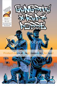
Gangsta Rap Posse #1
Benjamin Marra, writer/artist
American Tradition, 2009
14 pages
$2
Or: “What If N.W.A. Weren’t Making All That Shit Up?” The idea of a Bush I-era hardcore hip-hop outfit who actually are gun-toting, ho-pimping, mass-murdering drug kingpins as outlined in their platinum-selling rap career is so fucking brilliant a high concept I’m stunned I’ve never seen it in action before. It’s difficult to remember now, in an age when Jay-Z has more number-one album debuts than anyone but the Beatles and the President jokingly banters about Kanye West’s antics, but when my generation of white kids was growing up, “rapper” was a career that took on the same sort of quasi-mystical air as “cowboy” or “ninja.” Obviously there really were people who did those things for a living–okay, maybe not ninjas so much anymore–but the word, the concept, had a totemistic quality above and beyond “performer who composes and recites rhymes over beats.” Now, I was never a huge gangsta fan, but the less criminally minded but equally angry Public Enemy were one of my favorite groups of any kind during middle school, and from Flav’s accessories to Chuck D’s barn-burning baritone to the marching, uniformed S1Ws to that crosshairs logo, P.E. came across like a black G.I. Joe squad. The kinds of hip-hop that politicians and parents groups rent their garments over back then were tailor-made for action-hero status, and that’s what Marra delivers here. Watching his N.W.A. manques roll up on a rival MC’s compound and strafe his bodyguards with machine-gun fire fulfills a long deferred desire to see the larger-than-life lyrics of such groups made real, or at least as real as an action comic would make them.
It’s so effective in that regard that it’s tempting to overlook the obviously problematic racial territory we’re in. What we have here is a white guy taking Easy, Cube, Ren, and Dre’s lurid cop-killing, bitch-fucking, crack-pipe-illuminated fantasy world and drawing it, and that’s a bit of a sticky wicket, innit? It’s an ugly portrait, even if you’re just painting by the numbers left by the subjects. Fortunately, aside from the all-too-real hairstyles of that era, the visual stereotyping is kept to a minimum; Robert Crumb’s “When the Niggers Take Over America” this isn’t. But the irony is that while, to me, Crumb’s comic is an obvious parody of white racism, Gangsta Rap Posse‘s lack of Crumb’s corrosive irony and sarcasm might make it tougher for some to take despite its simultaneous lack of Crumb’s most outre visuals. Similarly, the dialogue’s ebonics are a far cry from Crumb’s pidgin dialect, but it’s also never half as clever, say, the lyrics from Straight Outta Compton, which were so wickedly funny that they came across like the group letting you in on the joke. Here, it’s a little tougher to tell if the joke’s on them.
But it seems to me that what Marra’s doing is simply taking vintage gangsta and treating it like any other kind of genre fiction. Perhaps the big clue is the sequence where the GRP’s manager complains that the record label’s been waiting for their new album for two years–how could they possibly have time to maintain their recording career when they’ve got an organized crime empire to run? The Gangsta Rap Posse doesn’t exist in continuity with Malcolm X or the Last Poets, they’re in the tradition of Robert E. Howard or the film library of Golan and Globus, and Marra’s using “Fuck tha Police” here the same way he used exploitation cinema in Night Business, or maybe even the same way Bryan Lee O’Malley uses Mega Man in Scott Pilgrim. He’s working much, much edgier territory here than either of those works–it has a lot more in common with Johnny Ryan than O’Malley–but you get that same thrill of cross-pollination and unexpected magpie influences. So I’m down. And I’m really hoping the GRP come up against a fictionalized black-nationalist paramilitary organization version of Public Enemy in the next issue.
Comics Time: Night Business #1-2
September 16, 2009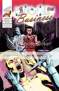
Night Business #1 & 2
Benjamin Marra, writer/artist
American Tradition, 2008-2009
24 pages each
$3 each
Buy them from BenjaminMarra.com
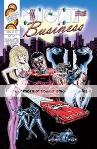
I had a whole long tedious review of these comics written out and five seconds ago I deleted it. Didn’t even copy it to the clipboard first! I think it’s stupid to write a boring review of an exciting comic. (Not that it’s stopped me in the past…) And Night Business is definitely an exciting comic, the kind of thing you want to sneak into the hands of all your teenaged cousins or spill beer and pizza grease on during the Crank 2: High Voltage/Road House/Predator movie marathon you’re having this Friday night.
The point I was trying to make in the scrapped review was that Night Business isn’t a pastiche of ’80s trash-culture thrillers as found in straight-to-video late-night-cable exploitation movies or “adult” independent comics from fly-by-night “publishers” so much as it’s a re-creation of them. Dolly Parton (whom, coincidentally, Marra has drawn) famously said “it costs a lot of money to look this cheap”; while I doubt that Night Business cost anyone a lot of money, its cheapness is clearly hard-earned. Benjamin Marra’s art is studiously amateurish and ugly in a totally consistent fashion–precisely the way that the art of someone whose natural talent is totally outgunned by his boundless enthusiasm and obsession bordering on dedication would be. These blocky, blockheaded, stiff figures–everyone, male and female, looks like their bodies are 85% gristle–seem like the thought-through product of a worldview, like they’re the output of someone who’s drawn page after page after meaty, pulpy page of these people without ever thinking twice about what anyone will think of it (beyond, perhaps, “they’ll fuckin’ love it!”). The layouts are simple, all business, as if to say “enough of all the frou-frou, let’s just see what happens next.” Every outfit is peeled from some hair-metal or porno fantasy world where men are either leather and denim street toughs or sharp-dressed sharks in suits, and where women routinely walk around in lingerie and heels. The City (capitalized like a motherfucker) consists almost solely of strip clubs, alleys, morgues, and the preposterous offices of an exotic-dancer management empire; everything is lit by streetlights or neon. In order to offset some of the icky taste that might be left in your mouth by doing a story about the serial murder of strippers while spending page after page depicting the naked bodies of those strippers (necessarily, I think; look how toothless Robert Rodriguez’s strangely prudish grindhouse homage Planet Terror ended up being without it), the series takes a page from every bard of the urban nightpeople since Steve Perry’s small-town girl took the midnight train going anywhere and builds up the hopes, desires, and dreams of each dancer as she takes it off to the leering crowds. Sure, they’re all pure-dee hokum, but in a world where the men’s emotions can all be expressed by grimacing and never rise above the complexity level of a Blackest Night tie-in issue’s Lantern Corps appearances, they’re the most psychologically fleshed-out characters in the book. The effect isn’t just reminiscent of some bargain-bin Scarface, it’s identical. If it weren’t for the ironic author photo and bio giving the game away at the back of each issue you’d never know that Marra is, on some level at least, kidding. And by that point, who cares? Smoke ’em if you got ’em and bring on issue #3.
Comics Time: The Squirrel Machine
September 14, 2009
The Squirrel Machine
Hans Rickheit, writer/artist
Fantagraphics, 2009
192 pages, hardcover
$18.99
Given what I’ve been reading lately I can’t help but compare Hans Rickheit to Fort Thunder. Like Brian Chippendale, Mat Brinkman, Brian Ralph et al, Rickheit spent the late ’90s and very early ’00s living and working in a combination art gallery/performance space/flophouse in a New England college town–theirs, Fort Thunder, in Providence; his, the Zeitgeist Gallery, in Cambridge. Like them, he saw his one-time shangri-la end before its time–theirs by municipal diktat, his by fire. Like them–and, like them, perhaps unsurprisingly given his years-long conflation of room and board with bristol board–he creates comics centered on the exploration of space, rooms, houses, environments. And like them, he fills that space with marks, so that reading one is almost a tactile, exploratory experience itself.
But the similarities are not complete. Unlike Ralph’s cavemen or Brinkman’s monsters or Chippendale’s warriors, Rickheit’s Edwardians are observers at least as much as explorers. Though they move about in his strange, gristly world, they are not of that world. More often than not they’re limned by a fine white void; it serves the purpose of making them pop against his often overwhelming backgrounds, yes, but it also reinforces their separateness, their otherness. They wander through strange environments constructed by unknown architects, gazing through lenses and orifices at any number of bizarre transmixtures of human, animal, and machine. They are constantly seeing things, to borrow the title of a book by Rickheit’s visual and thematic kindred spirit Jim Woodring. When we see what they see, the effect is reminiscent of catching a glimpse of an older family member as he or she masturbates, or strips to reveal what Rickehit’s friend E. Stephen Frederick refers to in his memorably Kenneth Smithian introduction to The Squirrel Machine as “secondary hair.”
In the comics of the Fort, exploration is, at worst, value-neutral. In Ralph’s comics they lead mostly to mischief and lessons learned (though that changed somewhat in the bleak zombie comic Daybreak), in Chippendale’s they usually lead to freedom or adventure, and in Brinkman’s, for every bleak wordless parable of creatures lost in an endless maze, there’s another LOL-inducing story of a beast barging into a castle to take a dump on the king’s throne. In Rickheit’s comics, though, the explorations and the visions waiting at their conclusions are unmistakably disturbing. They reveal creatures and creations of arcane origin and dubious value, frequently hidden inside a smoothly artificial or warmly organic surface like a grotesque parody of birth, or a Cracker Jack prize. When you end up at the end of one of Rickheit’s wonderings, there’s a sense that, to quote Trent Reznor, “Now I am somewhere I am not supposed to be, and I can see things I know I really shouldn’t see.” That’s no less true for our desire to see them. In this, he has more in common with Josh Simmons than with the Fort, though unlike the House author, up until this point the damage incurred in Rickheit’s characters’ travels is more psychological than physical.
This changes in The Squirrel Machine, Rickheit’s Fantagraphics debut and for all intents and purposes a simultaneous coming-out party and summation of all that has gone before. In the past–his Xeric-winning erotic coming-of-age nightmare Chloe, his dewily sexualized surrealist gag strip Cochlea & Eustacea–Rickheit imbued his character’s journeys into what he refers to as the Underbrain with a sliver of redemptive power. Chloe finds something that replaces what she lost; Cochlea and Eustacea’s antics are as funny and horny as they are freaky. But here, the downbeat direction hinted at by C&E’s fate in the last issue of Rickheit’s self-published anthology Chrome Fetus emerges in full flower, and the result is awesome to behold.
In Rickheit’s story of the brilliant brothers Torpor, William and Edmund, art does not provide the antidote to the encroaching cruelty of the civilized world, as it does in Chippendale’s Ninja. On the contrary, the art of William and Edmund is wholly dependent on the taking of life. Their childhood games aren’t free-spirited enactments of the struggle of good against evil, and they’re not really games, either. They’re attempts to follow their brains as far as they can take them. Other beings–the animals who are their chosen medium, their hapless mother, the angry townsfolk and mocking bullies–factor in only as means rather than ends. Even exploration itself is represented as a frightening loss of control by its most prominent exponent here, Edmund’s sleepwalking. There seems to be no escape from the power structure of oppressor and oppressed.
The one exception to that rule is for those with whom they can form a sexual connection–but even that will only be allowed to take them so far. Visually, Rickheit tips his hand after the book’s first big sex scene. It’s weird, hot stuff as always from Rickheit, rooted in memorable details that serve to knock you off balance and make you vulnerable like the characters themselves. But in the middle of the act we cut to a stunning two-page spread, silent, no people present–simply incredibly byzantine images of the Torpor family home, utterly cluttered with the detritus of their inventions. Pipes and chains and ropes and stairs and beams and wires crisscross the panels, creating along with the gutters a dense thicket of tangents and congruences. The eye is led everywhere and nowhere all at once. The message is clear: Sex offers no escape. And like art, it can, and likely will, destroy and degrade and subjugate. When life and love, of a sort, finally do reassert themselves at the book’s end, it’s horrifying and drawn in a fashion that makes it look less like a natural thing and more like a terrible apparition, or a special effect.
It’s strange, but of all the dizzying details Rickheit deploys in The Squirrel Machine, the one that stood out the most to me came early on in the book: A distant water tower topped not with the usual tank, but with what looks like a giant version of the old-fashioned, grated helmets divers once wore. It sits atop a tower and beside a train trestle that are both as realistic as you please, but there it is, a mute monument to illogic. In Grant Morrison and Dave McKean’s Arkham Asylum, Amadeus Arkham recalls his fateful initiation into his mad mother’s “other world”:
A world of fathomless signs and portents. Of magic and terror. And mysterious symbols.
This has long been the world Rickheit has chronicled. The allure in both cases is that these portents can be scryed, these symbols can be decoded, this world can be mapped. But it’s only in reading this book–a painstaking chronicle of the lack of solace provided by art to the powerless–and thinking back on the diver’s-helmet tower that I realized that in our darkest moments, it’s easy to see that world as our world too–only the symbols can’t be read. When exploration is punished, when everything we see feels like something we oughtn’t, when theoretically life-affirming forces are either nipped in the bud or exposed as brutal frauds, doesn’t it all seem as maddeningly inscrutable as a giant diver’s helmet on top of a water tower? That there’s some reason for it all, something lurking beneath the surface, something we will never, ever get to?
Comics Time: Ninja
September 11, 2009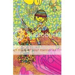
Ninja
Brian Chippendale, writer/artist
PictureBox, 2006
128 pages, hardcover
$34.95
Starting off a review of a Brian Chippendale comic by talking a plot seems like the laziest most wrongheaded way to start off a review of a Brian Chippendale comic, like an unwitting parody of all the lame comics criticism that other comics critics criticize for focusing on writing rather than art. Shouldn’t I be saying something about markmaking or snake-style layouts? Maybe, but much more so than with Chippendale’s Maggots, the creation of which predated and the publication of which followed this book, the plot of Ninja matters. Not just as a driver for the imagery, but to Chippendale, and to me.
The book starts with these silly little comics about a ninja–basically, fighting against Cobra from GI Joe–that Chippendale drew when he was 11. They look like a child artist’s representation of a sidescrolling Nintendo game, like Ninja Gaiden: After breaking into a bad-guy base, the ninja will move forward or up or down and discover a new opponent, and we watch as he figures out a way to defeat or avoid each enemy. Most of these strips end when the ninja, having stolen some valuables from the evildoers, successfully escapes from their lair and returns to his home (complete with its incongruously normal front door). What Chippendale does in this collection is every so often insert a brand-new, recently drawn strip between the stuff he drew as a kid, fleshing out the Ninja’s home life and world at large. Meanwhile, in the world of the kid strips, the bad guys become less involved with…whatever it was they were up to before the Ninja showed up, and more and more fixated on capturing and killing the Ninja in retribution for all the havoc he’s caused them.
The problem for Chippendale is that his younger self was apparently less dedicated to making art than his grown-up incarnation–like many kids who spent their youths creating their own, enthusiastically derivative fantasy worlds to play in, he eventually ran out of steam, and his final Ninja strip from that era is unfinished. The solution? A new penultimate strip, in which the bad guys build a doomsday device that gets out of control and begins absorbing reality as we know it. Now, when 11-year-old Chippendale’s last Ninja strip abruptly cuts off mid-page, leaving rows of blank panels unfilled beneath it, it’s not just a kid losing interest and putting his pencil down to go play Nintendo or skateboard–it’s the end of a world as we know it.
Cut to 18 years later, and to the bulk of the book. Now, in typical Fort Thunder fashion (prefigured to an astonishing degree by the space-based action of the kid stuff) we explore the city of Grain and its surroundings, where the Ninja and his enemies once lived. Only now, with the Ninja gone and his “killing villains for fun and profit” activities curtailed, the city’s gone to hell. Not the openly dictatorial hell that the old Bad Guys might have ushered in–they seem to have been consumed by their own device, unless I missed something–but a quotidian nightmare of corrupt public officials, rapacious corporate raiders, callous resource thieves, brutal cops, and relentless, even violent, gentrification and homogenization. Everyone may still look like refugees from Super Mario or the Masters of the Universe, and the level of violence and dimension-hopping and overall weirdness remains consistent with that, but in essence their concerns are the same as those of an artist who returns home from a tour with his noise-rock band to discover the place he’d lived and worked in for years had chains on the doors so the city could raze it and install a supermarket parking lot.
Of course none of this is super-apparent from the get-go. I spent a decent amount of time waiting for the Ninja to show up again after the 18-year jump, storming back into town to take it back. But as we watch Chippendale’s little groups of characters–good, bad, and ugly alike–go about their zany business, it becomes apparent that there’s a build to the eventual reveal of “What happened to the Ninja?” to rival any slow-burn mystery-villain storyline Marvel or DC have done this decade. And once you find out, the solution is elegantly simple, childlike, charming, and utterly inspiring. I’m not going to spoil it, but suffice it to say I closed this book feeling better about humanity than I’ve felt in quite some time. Maybe there is a solution after all.
Okay, so, the art. The collage material is an eye-candy orgy as you’d expect, one of the purest distillations of that aspect of Chippendale and the whole Providence scene’s output as I’ve seen so far, though for the life of me I couldn’t figure out what role it was playing in the narrative–it didn’t seem to pop up at logical reality-warping breaks, like when the Bad Guys’ machine ran amok and caused a House of M style fade to white–until I read in PictureBox’s synopsis of the book that they’re just chapter breaks. More immediately grokkable and impressive to me were the many, many bravura moments in the comics themselves–painstakingly delineated Dore-style deserts, a city covered completely in OCD stripes, characters becoming aware of a spy camera filming them in a scene simultaneously “shot” from their perspective and that of the camera, two scenes taking place at the same time but on different vibrational planes suddenly smooshed together in strips as though they were pieced together from two separate shredded documents, a brutal torture sequence and hot sex scene both showing up in the book’s final act. And Chippendales back-and-forth panel flow is so addictive (and much more consistent than in Maggots) that I found myself trying to read other comics that way after finishing Ninja. There’s a certain magic to these elements that feeds into and plays off of the narrative even when it doesn’t have any strict narrative cause, like any great spectacle.
But ultimately this is a book about an idea: the need to persevere in your pursuit of fun, which in most of the ways that matter is a synonym for Good with a capital g. Sometimes, compromise may be necessary–after all, the Ninja was slicing up bad guys not just because in the world of the comic it’s the right thing to do, but for their loot; and (still trying to avoid being spoilery, though this may skirt the edge) his ultimate fate does not necessarily provide a happy ending for everyone. But you can reclaim the comics you made when you were a kid and build them up into a statement on where you are as a grown-up without sacrificing the buoyant illogic and unfettered imagination that came through originally. You can hang on to the important things you found in your arts-commune idyll even when the outside world finally smashes down the walls around you. You can still think ninjas are cool.
Comics Time: Sweet Tooth #1
September 9, 2009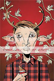
Sweet Tooth #1
Jeff Lemire, writer/artist
DC/Vertigo, September 2009
32 pages
$1.00!
Tim Heidecker and Eric Wareheim of Tim and Eric Awesome Show, Great Job! have a recurring…concept, I guess? called “Brown Town.” Sometimes it’s used as a euphemism for potty humor: “That ‘Poop Tube’ sketch was a little too Brown Town for our parents.” Sometimes it’s just a funny-sounding nonsense phrase, as in their unsolicited candy jingle-cum-Doobie Brothers pastiche “Rolo Tony.” But I like to think it’s meant to describe where we’re often taken by colorists for Vertigo comics.
Jose Villarrubia’s Lee Loughridge impersonation aside, this is a fascinating little comic just because of how different it is from pretty much everything else Vertigo has done this decade. There’s no fabulous and violent rock’n’rollin’, there’s no in-your-face ugliness (except for one shot–pun intended), there’s no modern-mythmaking, no real echoes of Gaiman or Ennis or Ellis or Azzarello or Willigham. And there’s no writer/artist team, either–it’s just Jeff Lemire, author of Top Shelf’s Essex County trilogy and creator of some of the best damn convention sketches you will ever see. It’s tough to imagine a better fit for this story of an isolated deer-boy hybrid left on his own in an unforgiving post-apocalyptic world after the death of his father than Lemire’s shaky, nervous line, which has always had a vulnerable deer-in-the-headlights quality and which isn’t toned down or slicked up a bit for this major-label effort. Even the bloodspatter remains an abstracted splash of red rather than an HBO Original gorefest. The art holds color well, moreover, though as I said, it might be nice if colors other than brown were deployed for that purpose. Instant-classic cover, too, perhaps the best the imprint has seen…I was gonna say since Dave Johnson on 100 Bullets or James Jean on Fables, but this strikes me as potentially iconic in and of itself in a way that those storied cover-art runs only were in toto.
In one of those self-promoting editorial columns Vertigo creators do during a series launch, Lemire suggests that what sets Sweet Tooth apart from your average monthly comic is the quietness of his approach, an approach he’s carrying over from his altcomix, the idea being that when something really fucked up happens, it’ll be that much more startling. I think he’s right, so far, one issue in. Now, there are things I’m not so sure about–the boy’s dialect scans a bit like Claremontian cliche at times, while his bumpkin naivete and the hunters’ gruff bad-guy-ness are a little too high-pitched to maintain that delicate quietness Lemire’s striving for. And this is a bit picayune, but I feel like a lot of shots crop off the characters’ feet for no reason? But regardless, this is a very likeable book, a comic you want to succeed really for all the right reasons: It’s clearly the product of a personal vision rather than an attempt to fill some kind of niche, it has lovely art, it attempts to win you over to its characters rather than bash you over the head with their badassness, and it honestly seems like it could go anyplace at all at this point. I’ll be following it.
Comics Time: Agents of Atlas #10
September 7, 2009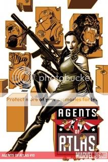
Agents of Atlas #10
Jeff Parker, writer
Gabriel Hardman, Paul Rivoche, artists
Marvel, September 2009
32 pages
$2.99
Credit for this excellent superhero comic must go first and foremost to colorist Elizabeth Dismang. Coloring this nuanced, engaging, and lovely in a superhero comic is a rare treat indeed, and from nighttime parking lots to forgotten mad-science labs to the red hair of the goddess Aphrodite to the sheen of a killer robot, Dismang imbues this issue of Jeff Parker’s strong off-model Marvel super-series with warm, sumptuous, tactile hues. Put it together with the just-so minimal-realism (is there such a thing) of Hardman and Rivoche and you have the best-looking variation on modern Marvel’s noir-naturalism house style since David Aja on The Immortal Iron Fist (or that Ann Nocenti Daredevil story everyone’s talking about). Right now I’m looking at a panel where Venus asks a wistful-looking Namora if she’s thinking about her old comrade and lover Hercules, and the team nails the emotion of it just as well as they handle the machine guns and robots of the action sequence that follows it. It’s really a joy to look at.
And that makes all the difference, doesn’t it? Books like Agents of Atlas, operating at the margins of the mainline superhero universe of which they are nominally a part, live and die on the strength and cleverness of their ideas, or specifically the variation they represent on the usual superhero ideas, if you follow me. But there are a lot of perfectly clever, perfectly nice minor superhero comics out there–you’ve probably read a lot of them–with art that never rises above the functional, and therefore who cares? But you care about the Agents of Atlas after reading a gorgeous-looking, well-constructed issue like this. Parker packs its pages with idea after idea–you get more exposition on this whole “warring Dragon Clans” idea that makes for a nice fit with the kinds of things Iron Fist fans would appreciate; you get a crazy Weapon Plus-style look at the decades-old killer-robot production program Atlas has instituted; you get a big giant battle with souped-up automatons. But more importantly, you also get that great calm-before-the-storm feeling you’ll remember from your favorite action movies, with the characters collecting their thoughts, bonding a bit, but also making damn sure they’re ready for whatever’s about to come through that door. I know that sounds like such a cliche, but here it feels fresh, rooted to this specific motley crew of characters drawn from the various corners of the Marvel Universe and thrown together by the accident of when they were first published. You’ll believe a top-notch, visually and emotionally engaging comic can be made out of an Atlantean queen, a siren, a talking gorilla, a mute robot, a Uranian-Earthling hybrid guy, a dragon, a bunch of knowing yellow-peril/dragon-lady pastiches, a thawed-out secret agent from the ’50s, an Art Bell knockoff, and some warp zones. Like Mike Mignola, John Arcudi, and Guy Davis’s B.P.R.D., it’s an ensemble action book with brains, looks, and heart. Well done all around.
Comics Time: Inkweed
September 4, 2009
Inkweed
Chris Wright, writer/artist
Sparkplug, 2008
152 pages
$16
I didn’t want to like this comic. I didn’t even want to read it. There’s something…off-putting about that cover, a weird combination of Klasky-Csupo/Gary Baseman character design I never found that appealing and just a lot of brown, empty space. The interiors similarly failed to pull me in–lots of crosshatched backgrounds and clothing placed behind and draped around a cast of sub-Muppets. In order to keep myself sane, my usual criteria for whether I’d even read a comic at all is that I at least have to enjoy flipping through it, so I was sorely tempted to leave this on the shelf and would have done so but for the good things I half-remember hearing about it. Plus, it seemed like it’d be a quick read.
What I didn’t count on is the writing. Good Lord. I’m still not 100% sold on his art, but the Chris Wright stories collected here are sharp as a knife, just as incisive, just as likely to leave a wound. Most concern older people coming to terms, or failing to, with their failures: a painter who seems to have traded acclaim for ability, an astronomer who falls in unrequited love with his assistant, a witch who cultivates fine blends of pipe tobacco for an unappreciative Satan, a famous author whose equally gifted but resentful son comes between him and his young wife, another painter whose drinking gives him an outlet for his extravagant self-loathing and a cover for his fear of failure. I suppose these are all fairly well-trodden paths–you don’t have to have read Asterios Polyp recently to feel like you’ve gotten your fair share of stealth-autobio art about the struggles of artists. But Wright is distinguished by the swift and brutal way he deals with the themes. The ends of his stories tend to leave the characters staring down the abyss in matter-of-fact fashion–literally, in the case of the astronomer, who can only gaze once again into his telescope, and in the case of the famous painter, who must trade his blank canvases for the blankest canvas of all. Other stories end with no-nonsense cris de coeur: “What’s wrong with me?” asks the alcoholic painter; “FUCK!” yells a man whose confrontation with God over the heartache he feels has been abruptly cut short mid-sentence when God vanishes with a Nightcrawler-style BAMF. The lead-ups to these grand finales are unsparing as well, particularly the story about the father and son authors and the father’s wife–that one takes a swing-for-the-fences turn for the disturbing that still manages to preserve the humanity and agency of all the characters involved rather than reducing any of them to something for someone else to react to. Wright accomplishes that in part by pushing the most extreme reactions off-panel, just one of any number of extremely shrewd storytelling choices he makes in here.
And you know, the art does have stuff to recommend it after all. Populating his stories with dollar-store Fraggles may be off-putting at first glance, but it can keep the stories from getting too maudlin or too on-the-nose. It also strangely enhances the period feel of the material–watching these creatures roam around in 19th-century garb reminds me of half-remembered cartoons in which anthropomorphized animals acted out human conflicts in old-timey settings. But his strongest visual flourish is the way he can slowly zoom in and out of abstraction in the middle of his stories, focusing only on the patterns created panel to panel by hands, eyes, stars, candles, enabling our minds to make sense of the images as the characters similarly grapple with their thoughts and emotions. Wright eventually lets this get away from him a bit toward the back of the book in a series of abstracted one-page strips and illustrations–the strongest of these, a short and bitter near-poem about alcoholism, is also the most straightforward. But the way he works such sequences into his traditional short stories bespeaks confidence and skill. This is already one of the best-written comics I’ve read in quite some time–goodness knows where a few more years at the drawing table will take him.
Comics Time: Soldier X #1-8
September 2, 2009
Soldier X #1-8
Darko Macan, writer
Igor Kordey, artist
Marvel, 2002-2003
32 pages each
$2.99 each
Comics Time: Flash: Rebirth #4
August 31, 2009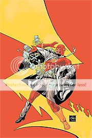
Flash: Rebirth #4
Geoff Johns, writer
Ethan Van Sciver, artist
DC Comics, August 2009
32 pages
$3.99
If you know Geoff Johns, and particularly if you know his work on this project’s thematic predecessor, Green Lantern: Rebirth, you knew this was coming. This is the issue where Johns redefines, organizes, and expands the Flash mythos, tying together various elements and explaining how revived hero Barry Allen is an indispensable part of them all. The following thoughts about this aren’t quite Flash Facts–maybe they’re Allen Opinions?
This was nowhere near as elegantly done as the reveal of the “emotional spectrum” concept in Green Lantern, or even the “Parallax was a separate entity” reveal from GL: Rebirth. I think that’s because the core concepts being utilized here aren’t as easy to instantly grasp. With Green Lantern, if you were gonna bring back mass murderer Hal Jordan you had to come up with a reason why it’s okay for us to like him again, and “he was possessed by a demonic yellow fear elemental at the time he killed all those people” is a pretty easy one to get behind. And once you’ve established that arch-enemy Sinestro’s power ring is fueled by fear in much the same way that GL’s ring is fueled by willpower, it’s a logical leap to other colored rings being fueled by other states of mind.
By contrast, the big revelations here…well, I’ve never quite understood what the heck the Speed Force is supposed to be anyway. For years I labored under the misapprehension that it was some pseudomystical thing, like what J. Michael Straczynski did with that horrible “Spider-Totem” idea in Amazing Spider-Man–so that instead of that accident with the lightning striking Barry Allen while he was holding some chemicals giving him his powers, that just opened up some portal to the Speed Force or something, just like how in JMS’s justly ignored origin revamp the spider was magical and the radioactivity was just a coinicence. I’ve since learned that I was wrong and the Speed Force was just something out there that people who got super-speed through whatever means became able to commune with or tap into or whatever the proper term might be. Either way, this is a much wonkier concept than “rainbow of space armies,” and so rejiggering things so that now Barry Allen’s accident created the Speed Force doesn’t have the same oomph as “the reason Green Lanterns were vulnerable to yellow is because of the giant yellow Fear Monster inside the Power Battery.”
Same with the revelation that there’s a Negative Speed Force embodied or utilized or whatever by Professor Zoom, the Reverse Flash. To convey this idea, Johns and Van Sciver tie it to the fact that the Flash’s speed lightning is yellow while Zoom’s is red. Frankly, I’d never noticed this before–it’s certainly not a famous concept like Green Lantern’s green ring vs. Sinestro’s yellow one, or even just “the Flash wears red while the Reverse Flash wears yellow.” Without that easy-to-envision visual hook, it’s a much tougher sell; all Van Sciver’s little design flourishes and neato ways of showing superspeed Van Sciver can’t quite make up for it.
However, there were quite a few things I liked in this issue. For starters, I appreciate the way Johns has shifted the generative spark for the Flash’s powers back to that lightning/chemicals accident instead of positing some preexisting speedster ether floating around out there. Now it’s all a result of Barry’s accident, ripples from which apparently spread throughout all of time and space–which moreover is as good an answer as any to the question “Why is this Flash different from all other Flashes?” Plus, I feel like we’re closer than ever to a speedster team book called Speed Force, which is far past due, and since I don’t have a dog in the Jay vs. Barry vs. Wally vs. Bart vs. Max Mercury vs. whoever the hell else race (no pun intended), it could star any of these guys and I’d be fine with it. The prospect of the Flash Family being its own little squad centered on one of DC’s coolest superhero concepts, like the Green Lantern Corps or Batman and his Robins or the Super-people, is pretty appealing.
But I suppose the main reason I’m not letting my problems with Johns’s solution to the Flash equation is that I’m not convinced we’ve seen the end of it. For example, I have to assume an explanation is in the offing that ties the new, time-jumping Zoom in with Professor Zoom’s negative Speed Force. Maybe Johns will explain (by which I mean invent, of course) why non-Speed-Force-using Superman is able to keep pace with the Flashes. Maybe that turtle villain who slows things down will be revealed as some sort of Slow Force avatar. Maybe there’s some sort of Superhero String Theory in the offing that connects the Speed Forces to the Emotional Spectrum to Anti-Life to the Purple Healing Ray to New Order’s “Blue Monday,” I dunno. I appreciate the effort of imagination needed to put it all together and await its continued rollout.
Comics Time: Big Questions #12: A Young Crow’s Guide to Hunting
August 28, 2009
Big Questions #12: A Young Crow’s Guide to Hunting
Anders Nilsen, writer/artist
Drawn & Quarterly, 2009
24 pages
I don’t remember what I paid for it–$6.95, maybe?
I’m sure you’ll be able to buy it from Drawn & Quarterly eventually
Of the three action comics I reviewed this week, the most thrilling, best choreographed, most suspenseful, most pulse-pounding was not the Frank Miller/Jim Lee team-up or the Geoff Johns event comic but a little black and white story about birds. In this antepenultimate installment of Anders Nilsen’s long-running magnum opus, things come to a head between our “hero” birds and the big black crows who’ve been harassing them throughout this bleak story about how difficult it is to process tragedy. Because it has been so bleak, the tension here is almost unbearable. As the crows make a mockery of the birds’ noble but feeble attempts to defend themselves, just one big question filled my brain: Just how far will Nilsen take this?
As the action picks up the panel borders disappear, leaving Nilsen’s already feather-delicate images feeling more vulnerable and exposed than ever. Each image is a marvel of composition and clarity as the black and white birds clash, calling to mind everything from yin and yang to that incongruous cover image on the original hardcover versions of Stephen King’s The Stand. Each visual beat is so strong, and complemented so chillingly with the crows’ callous dialogue, that even as I raced to find out what happens, I couldn’t help but linger on every panel, trying to squeeze out every last bit of detail. I refuse to spoil the ending, whether devastating or joyous–frankly, everyone should experience it for themselves–but I will say that it made me more confident than ever that Big Questions is a masterpiece in the making.
Comics Time: All Star Batman & Robin, the Boy Wonder
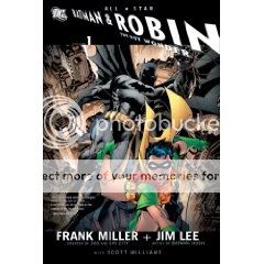
August 26, 2009All Star Batman & Robin, the Boy Wonder Vol. 1
Frank Miller, writer
Jim Lee, artist
DC, 2009
240 pages
$19.99
Now that this first volume of Frank Miller and Jim Lee’s, uh, controversial Bat-book is out in a nice fat trade paperback, I finally sat and read its nine issues’ worth of comics from start to finish for the first time. Then I sat around and tried to figure out what to say about it. One phrase kept leaping to mind no matter how much I tried to come up with an alternate approach, so fuck it: That phrase is “mentally ill.”
But I mean it in the best way!
I understand that Miller’s staccato and repetitive dialogue and narration is enough to give some people aneurysms. Ditto, and more so depending on whether you’re talking about some of my former coworkers at Wizard, his new take on Batman as a cackling, grinning, foul-mouthed, stubble-sporting, child-abusing psychopath. For pete’s sake, former editor Bob Schreck’s introduction to the volume is nothing more or less than an apologetic for what follows. But I know self-parody when I see it–and honestly, even if Miller really isn’t capable of writing in any other way anymore, that doesn’t make it any less of a self-parody–and I have no attachment to some platonic ideal of Batman. In point of fact I actually have long felt Batman would have more fun pounding the bloody bejesus out of criminals than we’ve been led to believe. In the immortal words of J.R. “Bob” Dobbs, fuck ’em if they can’t take a joke.
And you know, the thing really is (to quote Grant Morrison’s Mad Hatter) very much cleverer than its rep as a goddamn-Batman meme generator would indicate. Miller is constantly getting Lee to play around with panel layouts in memorable fashion, from the Bendis-like talking-head array during Batman and Dick Grayson’s conversation in the Batmobile to the gigantic splash-page extreme-closeups of the Robin and Superman logos (the impact of which is muted somewhat by similar treatment of other images to fill up space in the collection, but still) to the outrageously over-the-top barroom banter juxtaposed with an image of a burning fuse during the Black Canary’s introduction. There are even a couple moments that recalled the genuine madcap wit of mid-period Miller (roughly from The Dark Knight Returns through Hard Boiled)–a great jumpcut reveal of Dick’s kidnapping ruse during the Dynamic Duo’s confrontation with poor befuddled Green Lantern, and that massive multi-page fold-out of the Batcave that just keeps unfolding. By the time I got to the fourth fold, I was laughing out loud. Though Jim Lee has aged into his “nicest guy and biggest artist in comics” role very gracefully, he’ll never be the formal innovator (or popularizer of others’ innovations) that Miller has been, but even still, all these moments shine quite aside from his primary selling point of drawing DC’s characters as heroic and awesome and eye-poppingly big-big–BIG as possible. Put it all together and it’s a pleasure to flip through this book.
That’s not to say that the “this goes to 11” tone works all the time. There’s just no way to carry off any kind of emotional nuance if everyone sounds like a manic cross between Raymond Chandler and Matthew Perry’s Chandler. At one point, you’re supposed to infer from Vicki Vale’s speech pattern that she’s in shock, but she just sounds like everyone else (I imagine that was intentional, but it’s still a bit flummoxing). Meanwhile, the selling point of Miller’s Joker, back since DKR, is that he’s unsmiling and quiet, but his internal monologue is as chatty as all the other characters’. It doesn’t help that the Joker has always been one of Lee’s weakest interpretations of DC’s characters, the nose too pointy, the face too demonic. And honestly, Lee’s polished work is the reason that this book, at its best, will always just be really entertaining, whereas I truly think that the raw power Miller’s own The Dark Knight Strikes Again (or his crazy gorgeous alternate covers for ASB&R, reprinted here) is like a message from an alternate future for superhero comics.
But having the first nine issues of the book collected in one place does a lot to clarify what’s going on. For example, no longer does the Batmobile ride seem to go on for weeks (though Miller inserted a joke about that)–it just seems like one more feverish element in a story paced like a series of exclamation points. And tackling those initial, hostile conversations between Batman and Robin just a few minutes before you come to this arc’s comparatively quiet graveside denouement helps you realize that hey, this book just might be about Robin’s buoyant presence dragging Batman back from the brink of lunacy as we were promised after all! It certainly makes a convincing case that running around dressed as a bat and hospitalizing people all night for a year or so would drive you, well, batshit. Maybe that’s the quality, the tone, that Miller’s trying to capture more than anything else. I mean, there’s an issue where Batman and Robin lure Green Lantern into a room painted from floor to ceiling in bright yellow–so are they, though unfortunately we don’t see how that came to be–and Robin steals his power ring and crushes his windpipe so they have to perform an emergency tracheotomy on him. Mentally ill, meant as a compliment.
Comics Time: Blackest Night #0-2
August 24, 2009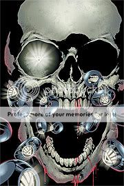
Blackest Night #0-2
Geoff Johns, writer
Ivan Reis, artist
32 pages each
#0: Free
#1-2: #3.99 each
Despite months of “Prelude” issues (whole story arcs, actually), a zero issue, and a “Prologue,” in Green Lantern #43, it’s the official first issue of Geoff Johns’s years-in-the-planning event comic Blackest Night that counts. And to be honest, my first read-through left me cold, largely by way of contrast.
That first Sinestro Corps Special a few years back was a first-round knockout–nutso heavy-metal character designs and all-out ring-on-ring action by Ethan Van Sciver, a Humpty Dumpty Green Lantern getting shot in the head, and a final “holy crap, this is going to blow you away if you’re a giant fucking nerd” secret bad-guy reveal splash page that, since I am a giant fucking nerd, blew me away. By comparison, BN #1 doesn’t have a whole lot going on. The “hey wouldn’t it be neat if…” idea of different-colored Lantern Corps isn’t new anymore. Both the comic’s general premise of dead heroes being brought back to life as killer zombies and the identities of many of the specific heroes to be revived were already common knowledge for most semi-savvy superhero fans. Van Sciver’s career-best art, and Doug Mahnke’s star turn on the tie-in issues of the main Green Lantern title–both of them weirder and harder-edged than mainstream comics need to be, with Mahnke in particular edging upward toward the top mainstream tier of Quitely, Romita Jr., Cassaday, and Frank–are replaced by the stalwart but pretty traditionally superheroey art of Ivan Reis, looking like Jim Lee scaled back toward Neal Adams a bit but somehow muddier and murkier than he’s been on GL in the past. There’s no last-page reveal at all. And the violence is extreme even by dismemberment enthusiast Johns’s standards.
But I think that this was ultimately a case of me expecting something different than what Johns was attempting to deliver. He doesn’t need to launch several years’ worth of future stories here–instead, he needs to tie several years’ worth of past stories by writers across the DC line together. He doesn’t need to kick off a thrilling saga of space-faring combat–he needs to start telling a horror story about dead superheroes coming back to life and murdering their friends. He doesn’t need to redefine and reinvigorate a character and his mythos–he needs to serve up a series of snapshots of multiple characters and the mythos of the entire DC Universe.
So rather than writing a review of BN #1 the second I bought it, I sat on it, keeping it in my backpack and pulling it out every now and then for another flip-through, another read. Now that I knew what to expect, I started to enjoy it, and the following issue, a lot more. I could admire how Reis made the Black Lantern versions of kindly old superheroes like Martian Manhunter and Aquaman into hulking, uruk-hai-style physical and existential menaces. I could get a kick out of his little flourishes, like the impressive Green Lantern hologram display of all the DCU’s dead heroes, or his riff on Rags Morales’s hyperthyroidal Hawkman (now the standard portrayal of the character, much to my amusement and delight). I could chuckle at the “jump scare” of turning a page on a quite rooftop conversation between Commissioner Gordon and his daughter Barbara to suddenly find Hal Jordan’s plummeting body smashing the Batsignal into pieces.
For as long as I’ve been reading it, Johns’s superhero writing has consisted almost solely of finding ways to express through action and dialogue exactly what each of DC’s superheroes means. As they fight, heroes will explain what it is that makes them tick and what iconic qualities they represent in DC’s pantheon, while villains will berate them for failing to live up to those demands. If this sounds boring or precious, most of the time it’s neither, because Johns just happens to be really good at identifying those core components of each character and basing fun action adventures around them. With the exception of the Justice Society of America–there’s just no way to remove the smell of mothballs and Ben-Gay from a team full of septuagenarians, guys in gimp masks, and (oddly) perky teens–his major recent works, lengthy runs on Action Comics and Green Lantern, have been like a carefully curated retrospective of Superman and Green Lantern’s careers, enemies, and milieux. At this point, if my comics-curious best friend from high school asked me to loan him comics that would inform him as to why Supes or GL are awesome, they’re what I’d hand him.
I guess that the idea behind Blackest Night is for Johns to take aim not so much at any particular character or even set of characters but at a basic fact of life for the DC Universe itself, the simultaneous omnipresence and impermanence of death. Everyone’s always getting killed (editorially speaking, Dan DiDio’s tenure at the top has been like a Robespierrian reign of terror for the men and women in tights) yet everyone’s always getting brought back to life (at the same time he’s been reviving more dead people that Jesus and George A. Romero combined). The power of the Black Lanterns reanimates dead heroes as extremely violent and extremely douchey killing machines, who taunt and mock the heroes they target for death, who are then brought back to life in the same fashion to continue the cycle. Depending on how much credit you’re willing to extend Johns, you could argue that this concept makes literal the way the constant death/rebirth cycle makes a metaphorical mockery of whatever import these characters’ adventures are supposed to have with us. If it’s all a wash eventually, what the heck difference does all the blood sweat and tears, all the rage and avarice and fear and will and hope and compassion and love that drive the multicolored Lanterns, even make?
Chances are a lot of you are simply saying “Jimmy crack corn and I don’t care.” Unless you have some basic investment in the idea that these characters can still be used to tell involving stories, this probably won’t mean much to you. Moreover, unlike Grant Morrison, Johns’s evangelical belief in the power of superheroes isn’t accompanied by the experimentalist brio that’ll hook the hipsters. He’s simply trying to make a really good superhero comic book. But here’s the thing: A little faith is all you need. As other people have gone into in great detail, Johns strove to make this thing as new-reader friendly as a comic that culminates in the Elongated Man and his rape-murdered wife rising from the dead and slaughtering the umpteenth incarnation of Hawkman and Hawkgirl can be. Obviously I like superhero comics and have read quite a few, but without having read them as a child, I lack the masters degree in minutiae that many fans, particularly self-identifying DC fans, seem to view as a necessity. Therefore, while I think I’d heard the names of, say, Aquaman’s little posse of Garth and Mera and Tula and Dolphin before, I had no idea who the hell they were when they all showed up to fight over Aquaman’s grave. But because Johns’s writing is always primarily concerned with explaining and exploring each character’s role in the pantheon, I didn’t need to know who they were–it was explained to me between, and during, punches. So then it becomes a scene not about trivia questions, but about characters’ past mistakes and biggest failures literally coming back to destroy them. It’s quite effectively done. It’s not knocking me on my ass the way Final Crisis did, but who says it needs to? It’s a fun, violent superhero comic that has a sense of weight, a sense that within its confines, what’s happening to the characters, despite all the dying and rebirthing, matters to them. Clearly it matters to Johns, and I think his ability to translate that into writing that’s creative and entertaining rather than insular and pathetic is his personal power ring.

