Posts Tagged ‘comics reviews’
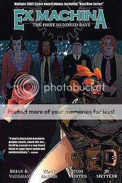
Comics Time: Ex Machina Vols. 1-9
June 16, 2010Ex Machina Vols. 1-9
Brian K. Vaughan, writer
Tony Harris, artist
with John Paul Leon, Chris Sprouse, artists
DC/WildStorm, 2005-2010
various page counts
$12.99 each
There’s something lovably clunky about Ex Machina. Before we get to the lovably, let’s talk about the clunky, from the ripped-from-NPR political factoids that in some cases all but replace actual dialogue to the silent-movie mugging and gesticulating of Tony Harris’s photoref’d art. In my re-read of the series in three or four sittings prior to its imminent conclusion with issue #50, I was struck by just how clunky it is, particularly at first–much more so than I remember it.
Those first few issues get over largely on the strength of Brian K. Vaughan’s unfuckwithable high concept, the most button-pushing such idea in a career already full of them: Main character Mitchell Hundred is a New York City civil engineer whose contact with a mysterious artifact gives him the ability to communicate with machinery, inspiring him to launch a second career as a masked vigilante which culminates in his diversion of the airplane aimed at the second tower on 9/11 and leads to his election as mayor months later. So strong is that final page of the first issue, with one tower standing next to the light beam used to memorialize the second, that it’s easy to forget how Hundred’s politics are a “both sides make good points” centrist-pragmatist-contrarian hodgepodge that’s both unwieldy and unconvincing. Having the aforementioned both sides shout their points at Mitchell and one another via his various advisors, staffers, and constituents doesn’t help matters, especially because they’re usually concocted in such a way as to smack you over the head with “hey look how ideologically diverse this city is, you can’t pigeonhole anyone, we’re here to challenge your preconceptions, it’s not as simple as Left/Right black/white etc etc.” If you meet a priest, you can bet he’ll also be a boxer who takes the Lord’s name in vain; if a gay couple’s gonna get married, you’re damn straight they consist of one of the city’s, like, eight black firefighters and a Log Cabin Republican. Meanwhile they all point and shrug and flail about like they have some sort of neurological condition. It’s quite silly-sounding and silly-looking at times.
And yet! Just because a choice of how to write or draw something isn’t the choice I would have made doesn’t mean those choices can’t work on their own terms. For example, I always preferred Ex Machina to the other BKV book written in this vein, Y: The Last Man, because of Pia Guerra’s stiff art on the latter–even though I think that stiffness, that neither-fish-nor-fowl not quite naturalistic not quite cartoony look that was Vertigo’s house style for so long, is a big part of what makes that book such a hit with people new to comics: It’s simple and clear, yet not “childish.” Rereading Ex Machina this time around, I had a few flashes of suddenly thinking “Guerra Was Right”: Maybe her simplified, styleless figures are the perfect vehicles for Vaughan’s dialogue in his sociopolitically tinged series, where complex ideas are boiled down into streamlined approximations thereof in much the same way. Maybe Harris’s almost fumetti-like fealty to his models is what makes Vaughan’s Trivial Pursuit: Fiorello LaGuardia Edition dialogue feel so weird here and there.
But you know what Harris does have, in spades? Style, even glamour. Compared with the white glare of that other famous photorealist, Alex Ross, Harris’s art is awash in thick blacks that seem to make his figures both shine and swirl, and their eyes light up the room like Ellen DeGeneres’s when your’e watching American Idol in HD. (Seriously, that woman has unbelievable Lord of the Rings eyes.) Their world of constant grinning and shouting may be one uncanny valley removed from our own, but it’s still a world it seems like it’d be fun to hang out in, argue in, get embroiled in a political crisis or hostage situation in. It’s buoyant, it’s bright, and even the recurring grand-guignol violence feels like some sort of pop-art explosion as much as a series of brutal murders.
And in reading all nine of the currently collected volumes back to back, I discovered so much to enjoy about Vaughan’s writing, or more specifically his plotting. I’d never noticed before that each arc features a masked “villain” of some sort, even if it’s more likely to be someone who stole a fireman’s outfit from the set of Third Watch than a genuine “bad guy.” I also never picked up on the fact that while Hundred and his confidants self-consciously refer to Jack Pherson–a super-powered stalker who gained the ability to communicate with animals in an attempt to crack and duplicate Hundred’s power–as his “arch-enemy,” the book also features a real arch-enemy in the sense of a character plotting behind the scenes to take Hundred down for pretty much the series’ entire duration. In other words, like many heroes, Hundred has a “fighter” arch-enemy and a “thinker” arch-enemy. And by contrast with so many serialized genre entertainments of the past decade, the mythology elements are doled out so judiciously I’d forgotten they even existed. Seriously, you can go for twenty issues at a time before a given reference to the mystery of Hundred’s powers is repeated or followed up on; I can think of at least one very major one from the book’s second arc that still hasn’t been mentioned again. Once you get into it, even the speech becomes easy to enjoy. Vaughan clearly has a blast cussing, for one thing. Moreover, behind the didactic dialogue lurks the satirical concept that the only way to power through the avalanche of ossified bullshit that is politics and government is for a superhero to essentially bully people into it.
But it’s important to note that Vaughan in no way thinks this is a good idea. Indeed, the real secret to Ex Machina‘s success for me is that Vaughan announces, from the first page (set after Hundred’s term ends; everything that follows is a glorified flashback), that the story is a tragedy. Hundred’s personal heroism and political maverickiness will all end in unspecified disaster, perhaps for him, perhaps for the whole city–and as the issues go by, it seems possible that it’ll end in disaster for the whole world. All the characters who argue and chuckle and backslap their way through this whole NYC morality play have no idea what kind of story they’re actually in, but we do. Some rough beast is slouching toward Gracie Mansion, and the tension between the zesty surface gestures and the dark heart beneath is what will ultimately make these ten volumes worth returning to.
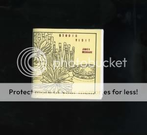
Comics Time: Studio Visit
June 14, 2010Studio Visit
James McShane, writer/artist
self-published, April 2010
48 pages
I don’t know how much it costs
Contact James McShane, I bet he can hook you up with a copy
Like his excellent minicomic Archaeology, James McShane’s Studio Visit explores the intersection of memory and environment. And like the cleverly conceived but ultimately more interesting in practice than in theory log-comic from Kramers Ergot and Ivan Brunetti’s Yale Anthology of Graphic Fiction, it explores the Heisenbergian interaction of lived experience and the recording thereof. It’s not as successful a comic as the former, nor as flat a comic as the latter. What it is is gestural, I think–McShane’s minimal lines, both of art and narration, get across a day in the life, from aspects of his daily routine to memories of past experiences evoked by objects he comes across in his house to his thoughts on process and his past works. That last bit’s maybe the most interesting–I was fascinated to hear that Archaeology was assembled in an almost Burroughsian cut-up fashion, and I also appreciated the quiet confidence in his explanation of how his very formal methods make him a better observer of what’s worth drawing. I think his…taste, maybe? gets away from here a bit–the memories he recounts of fun adventures in nature with friends are a bit on the twee side, the balletic image he chooses to represent “presenting the mundane with elan” is knowingly cheesy but cheesy nonetheless, and his vision of “growing” a story is depicted with too-literal gardening imagery. But the book isn’t intended to be anything more than what the title implies: a visit to the space, mental and physical, McShane inhabits when he works. This is where he was working on that particular day. It’s the recording of a step on a path, not of a destination reached.
Comics Time: New Painting and Drawing
June 11, 2010New Painting and Drawing
Ben Jones, writer/artist
PictureBox, 2008
32 pages, hardcover
$20
See a preview at BenjaminQJones.com
You can’t understand New Painting and Drawing until you have it in your hands. It shimmers, as though the Platonic ideal of the color Orange just gave birth to a bouncing baby book. I actually think the Platonic ideal is a good concept to keep in mind when looking at Paper Rad honcho Ben Jones’s stuff. It’s like, “So be it–if I must draw a dog, then let it be the best of all possible dogs!” So you get a dog that is as wide-eyed and jolly as any dog you’ve ever petted, but he’s also bright orange and pink and yellow and aqua and another shade of orange, and he looks like he just stepped out of some sort of electronic animal shelter run by Shigeru Miyamoto, and he’s placed against a background of white-and-gold diagonal stripes, the better to pop him off the page and into your eyeballs. You get religious-iconography pastiche, but the icon is like Jesus and Mary and a Greek Orthodox saint all rolled into one, and he’s wearing Joseph’s Amazing Technicolor Dream Coat and a Ring Pop, and he’s got a mustache and is pointing almost like Buddy Christ, and he’s placed against a sky that looks like Apocalypse Tron. Jones’s obsessive use of patterns, stripes, brick fields and so on, each tier done in as bright a neon as you please, serves to foreground everything, backgrounding nothing. Every part of every drawing is designed to be as exciting as possible. It is such a thrill looking at this book.
Comics Time: Gags and Sloe Black
June 9, 2010Gags and Sloe Black
Michael DeForge, writer/artist
self-published
Gags – 18 pages, 2007; Sloe Black – 12 pages, 2008
Read them at DeForge’s website
These are sort of more what I anticipated when I got a package full of Michael DeForge comics in the mail–arty, xeroxy, at times consciously illegible transmissions from an alien design aesthetic. That’s almost all there is to Sloe Black, a small zine showcasing a series of vaguely humanoid shapes constructed with twisting, dripping, rope-like lines, and triangles and dots repeated with an almost schizophrenic intensity. These aren’t comics or narrative images, not by a longshot–they’re a visual braindump, they’re what you sort of imagined abstract painting was supposed to be about. It’s sort of like getting a sense of what DeForge’s “sound” is before you hear it applied to a song structure.
You get more of that sort of thing in Gags. Though the art is slightly less far out, it’s still drawing on that same basic melty, drippy, metal-illustration-influenced visual vocabulary, with a series of portraits of monstrous, faceless figures made of goo and teeth. But they’re juxtaposed with a series of well-chosen non sequiturs from everyday dude-life. “You don’t understand–playing drums is my life” reads the all-caps caption for a beast with a mouth growing out the side of its head and a knife with which he’s exposing his own ribcage; “Fuckin’ Carlos man–dude scares off so much pussy” says a beast whose body sits atop its head rather than the other way around. Besides having a flair for the zine-culture grotesque, DeForge has a great comedic ear for what happens in the company of bros.
Comics Time: Lose #1-2
June 7, 2010Lose #1-2
Michael DeForge, writer/artist
Koyama, 2009-2010
24 pages each
$5 each
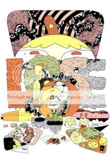
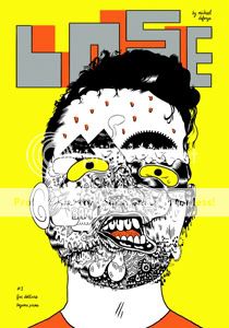
You could be forgiven for thinking Michael DeForge’s solo anthology series would be, and I’m using this word in its value-neutral sense, a mess. In terms of the vibe DeForge’s work gives off in single illustrative images, or in his dense and frequently deliberately illegible all-font/logo-design installment in Frank Santoro’s Cold Heat Special series, or in his xeroxed minicomics, or even on the covers of these very comics, the operative word is “noise.” And it’s a sort of noise that owes more to both the toner-smeared world of zine culture and the fine-arty fine-lined zaniness of Canadian art-toonists like Marc Bell or Keith Jones, than to the chunky, punky, living, breathing environments of the Fort Thunderites. Throw in those noxious, acidic greens on the slick covers, and it might present the kind of surface your eye would bounce right off and move on.
Don’t let it! Because as it turns out, DeForge’s actual comics, as contained in these two issues, are straightforward, funny, and sharp as a knife. Inside, he wields a precise line to create character designs that read like a slightly more avant-garde version of what you might see on a post-millennial Nickelodeon cartoon. The storytelling and punchlines are always crystal-clear even as the material bounces back and forth between long-form, surreal horror stories and laser-precise gag strips. In the latter category, which mostly crops up in the first issue, DeForge uses anthropomorphized dogs and the superheroes of the Justice League to skewer the foibles of college students and their immediately post-graduation counterparts with laser precision. (Dog #1: “Lately, I don’t even know if I enjoy walks.” Dog #2: “You’re overthinking it. Did you finish The Wire yet?”; Green Lantern: “Things have been crazy for me lately”. Batman: “Is that why we’re spending League money on art school?!” Green Lantern: “We all voted on that, Bruce! We all voted!“)
The longer stories fruitfully work that horror-comedy sweet spot a lot of young cartoonists are mining these days, a great thrill to me because the comedy tends to actually be funny, and the horror black as midnight. In issue #1, a cartoon conscience rebels against God after being sent to dissuade yet another comics artist from suicide, only to be sentenced to a Hell inhabited by cartoon characters and their creators. What starts as a lampoon of art-comics culture every bit as successful as the college stuff veers into nightmarish action-horror territory as our hero narrowly, and I mean very narrowly, escapes evisceration and ritual sacrifice at the hands of two former funny-animal characters whose appearances have devolved into monstrous deformation and shadow. In issue #2, virtually all the page space is devoted to a long and no-fucking-around nasty horror story about a little kid who manages to domesticate a large spider whose brethren are simultaneously ushering in a quite lethal and disgusting plague-style demise for his uncaring family and abusive classmates. Imagine Skyscrapers of the Midwest weaponized and you’re almost there.
With these two issues–cogent in conception, confident in execution, and surely just an early step in a promising stylistic evolution–DeForge has landed himself on my must-watch list. Give ’em a shot, see if he lands on yours.
Comics Time: Wally Gropius
June 4, 2010Wally Gropius
Tim Hensley, writer/artist
Fantagraphics, May 2010
64 pages, hardcover
$18.99
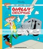
Wally Gropius is more than just the main character of Tim Hensley’s elaborate and arch parody of ’60s teen-comedy and child-billionaire comics–he’s more like the language it’s told in, or better yet the font it uses. Hensley arranges him in poses whose pantomime exaggeration recall the primary mode of body language in any given Archie comic, but always in some bizarrely off-model and angular variation thereof. His pipe-like arms and legs, his clasping, grasping, pointing hands, even his squinting eyes and trapjawed mouth and flattened cranium (his hair color says “Archie Andrews” but his skull says “Dick Briefer’s Frankenstein”) all conspire to make him as much a pictogram as a person. Watching him and his equally gangly, geometric cohorts stretch and sprint and smash their way across Hensley’s brighly colored backgrounds and block-lettered sound effects is like reading your favorite poem–or even, as we see in a panel that became my Rosetta Stone for the book, Wally Gropius itself–as translated into a language with a totally different alphabet. What you know is in there, somewhere, but to use a frequently repeated line from the book, you just can’t quite put your finger on it.
Hensley pulls off a similar switcheroo with the writing itself. Instead of the instantly dated “hip” slang used by the middle-aged men who wrote the comics that Wally Gropius uses as a springboard, he subs in a nonsense patter that apes the self-assured argot of the plutocracy. Whether it’s Wally’s oblique strategies for his beloved Jillian Banks’s recording session (“You really almost had it there, but it’s still kind of teal. Can you sing it with a bit more cadmium?”), Wally and Thaddeus’s simultaneously ratcheted-up and abstracted fight over dating (“But, Dad, I wanna be a lothario speedwagon. Troubadours don’t submit to picture brides. They engage in felching with awestruck camel toe.” “Again with the CAMEL TOE! My own son!”), or the frequent direct references to finance and industry (“Petroleum is the seat of the soul,” “What good is Mammon if one can’t purchase reliable athmosphereic conditions?” “Wally, will you please clean your room? There are far too many denominations about.”), I can’t help but hear echoes of the ouroborosian discourse, cocksure and utterly divorced from reality, that led the economy off a cliff.
And wonder of wonders, the book finds its own way to be really funny amid all these highfalutin hijinks, and often in a direct, even lowbrow way. Obviously anyone who’s read this stuff has gotten a kick out of the sound effects, from the slamming bank-vault door that goes “TRUMP!” to Wally vomiting up a bellyful of money with a “HEAR$T!” The thing is filled with eyeball kicks like that, my favorites being the library bookshelf filled top to bottom with Tom Clancy, the baseball-stadium jumbotron sponsored by Summer’s Eve, and the Buddhist monk lighting himself on fire next to a placard that reads “U.S. OUT OF NORTH AMERICA.” There’s a diarrhea joke, there’s a cameo from an ’80s pop-culture icon, and there’s an incest sequence that is one of the most shocking, hilarious, perfectly paced things you’ll read all year.
“Well, Mom, what does it say?” asks Wally over a memorable shot of a disemboweled bird from whose entrails his mother hopes to divine the future. (Of course, we never get the answer.) I think you can figure out what Wally Gropius is saying, provided you keep in mind the combination of confidence and impenetrability that Hensley hits on so memorably in both writing and art. The tale’s in the telling.
Comics Time: Monstrosity Mini
June 2, 2010Monstrosity Mini
Jorge Diaz, writer/artist
self-published, 2009
12 pages
Free
Read it under the title Special Report at JorgeComics.com
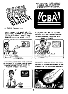
There are pros and cons to be found in this one. Let’s start with the pros. As Alan Moore understood when constructing the punchline for his big shaggy-dog joke at the superhero genre’s expense, the giant-monster horror/sci-fi subgenre is ripe for comedic exploitation, not in the sense of creating funny-looking Mighty Morphin Power Rangers-style creatures, but in the sense of “How the hell does something of that size and disposition appear out of nowhere, anyway?” Cartoonist Jorge Diaz milks the most out of that “no one expects the Spanish Inquisition giant monsters!” idea by piling one on top of another in this brief teaser for his longer Monstrosity anthology: an irradiated meteor creates one giant monster, our military response to that giant monster attracts two more giant monsters from outer space, our military response to those giant monsters unleashes another giant monster from a parallel dimension, and we deliberately unleash still another giant monster to combat the first three. Meanwhile, those giant monsters are, in turn, a “Squirrelzilla,” two massive alien environmentalists, a skeletal fish-god, and a giant hummingbird summoned by two tiny, elderly Japanese former-schoolgirls. It’s all cockamamie, but no more cockamamie than, well, any giant-monster movie or comic you’ve ever seen. Meanwhile, the story is presented in recap by a harried news anchorman in a deadpan recitation that further emphasizes the ridiculousness of it all–as does the material’s presentation in this tiny minicomic, which shrinks each TV-monitor panel down to a meticulous-looking grid and serves as an ideal showcase for Diaz’s tight, cartoony line and design work.
The cons, by now, might be obvious to you–most so, “Squirrelzilla” and two giant alien environmentalists just aren’t that funny a pair of gags. Nor is the plot’s resolution, which involves luring the beasts to a Monster Island-type destination with sonic rhythms that cause them to hump each other. It’s broad stuff, overly so. But by contrast, the design for the giant hummingbird is both funny and strong–its tail twirls off behind it in strands, casting off stars and hearts and other beautiful illustrative super-kawaii filigrees. So too is the design of the diminutive, antennae’d Japanese ladies who summon him, all stooped shoulders and wrinkled, benevolent faces. The image of a giant fish skeleton wreaking havoc manages to be both amusing and genuinely weird. There’s also a great throwaway panel of a herd of elephants dancing in line thanks to that sonic frequency thing. In essence, the more Diaz tries to nail down very specific ideas and images rather than playing to the cheap seats, the better he both looks and reads.
Comics Time: Mr. Cellar’s Attic
May 31, 2010Mr. Cellar’s Attic
Noel Freibert, writer/artist
Extreme Troglodyte, April 2010
12 pages
$6
Buy it from Closed Caption Comics
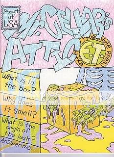
Although that little jpg might get the idea across, you really need to hold the cardstock covers of Closed Caption Comics member Mr. Freibert’s latest horror-comic throwback to see how beautifully screenprinted those colors are. It seriously looks like he sat there and did it by hand with pastel colored pencils. The thinness and shakiness and uniform weight of his linework only further reemphasizes that Mr. Cellar’s Attic was an act of drawing, something that came out of the tip of a pencil or pen held by a person. Which, now that I think of it, is maybe how Freibert is able to reclaim the hoary EC Comics/Edgar Allen Poe/”Colour Out of Space” proto-body-horror tropes he’s working with out of the realm of cliche and make them feel like a force to be reckoned with again. In addition to the cool, clever wordplay of the title, Freibert’s pacing keeps things feeling fresh and lively and present, if you will. There’s an uneasy sense of discovery as Freibert’s guilty-conscienced narrator recounts his ill-fated decision to rent out his attic room to an elderly grotesque, whose personal hygiene and mysterious conduct gets worse and worse until the story culminates with the narrator’s inspection of the room he rented…and the smaller room he built inside it. That’s a great, weird image, and what is found inside that room doesn’t disappoint either. The thing ends with a gorgeously colored shot that all but demands Vincent Price be resurrected to provide his trademark cackle as its soundtrack. If you want a comic that utilizes the tools of today’s artcomix aesthetic to evoke the sensation you got when you were a kid looking at the awesomely hideous masks in the grown-up section of the Halloween store, you know where to look.
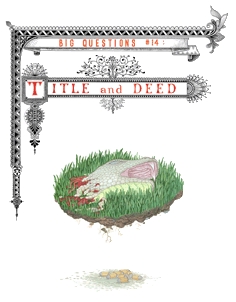
Comics Time: Big Questions #14: Title and Deed
May 28, 2010Big Questions #14: Title and Deed
Anders Nilsen, writer/artist
Drawn & Quarterly, May 2010
50 pages
$7.95
Buy it from Drawn & Quarterly
You know how on The Sopranos, it was always the penultimate episode of the season that had the big climax? This is the penultimate issue of Big Questions.
I know I’ve got Lost on the brain this week, and it’s largely with that show in mind that I re-read all 14 issues of Nilsen’s anthropomorphized allegorical avian opus to date. Much more so than do the Vertigo-type series with which you’ll see the occasional facile comparison, Big Questions serves up a similarly intoxicating, dread-tinged cocktail. Flawed characters are buffeted by forces beyond their comprehension, who in turn have just as little control over their own destinies. Violence is ever-present, shocking and exciting when it erupts, devastating in its aftermath. Story seeds planted years ago (Big Questions has been running since 1998!) suddenly blossom, entangle, and collide, in this issue most of all. Of course the “big questions”–about the limits of our understanding, about the point of being here at all–are asked, if rarely answered. An overall high-quality visual presentation makes it all the more inviting, while individual images, like the one that graces this issue’s cover and the constituent parts of the harrowing sequence that precedes it, burn with the fire of the surreal and stick in the memory, giving your thoughts on the overall series something to coalesce around like coral. You’ll laugh, you’ll cry. Only instead of an attractive multinational cast, this one has birds.
My hunch is that when the fifteenth and final issue arrives, Big Questions will be looked at like Black Hole or the Jimmy Corrigan issues of Acme Novelty Library, both for the magnitude of the undertaking and the magnificence of its execution from top to bottom. I read a lot of good comics; this is a great comic.
Comics Time: Held Sinister
May 26, 2010Held Sinister
Conor Stechschulte, writer/artist
Closed Caption Comics, June 2009(?)
32 pages
I don’t remember what I paid for it
I’m coming up empty, but maybe you can buy it from Closed Caption Comics
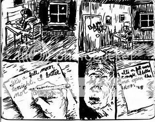
I’ll tell you what, I wish I could find a link at which you could buy this comic, because if you enjoy the rough-edged alt-art-horror comics I talk about on this blog all the time? Dude, run, don’t walk.
Stechschulte’s art is rough in the extreme, a scribbled mess of thick blacks that nonetheless coheres into something palpable and easy to parse. It reminds me a bit of when I was a kid and I’d scribble one continuous line on a page for a long time, and then go back and highlight the figures and shapes I’d unwittingly drawn in the process. It’s not that manic, but that’s the general idea. It’s a great way to convey claustrophobia and barely contained desperation, which is what our main character experiences as he anticipates and then experiences what is apparently a monthly encounter with a sinister, supernatural visitor–a doppelganger carved from shadow itself. It’s a cool little story, a dark fairy tale or a lost piece of Poe, distinguished by a strong fight sequence, complicating details like the place a body gets stuffed, and a convincing air of inevitability and despair. I wish someone would put together an anthology of horror comics like this. I’d read the shit out of it, and if you care about horror in comics, you would too.
Comics Time: Snow Time
May 24, 2010Snow Time
Nora Krug, writer/artist
self-published, 2010
12 pages
I don’t remember what it cost, but I remember it wasn’t cheap
How I love little arty morality plays. Hot-shit illustrator Nora Krug follows up her ambitious Red Riding Hood Redux project–probably my big find for MoCCA 2009–with this short, achingly lovely to look at story of weather and murder. Like Red Riding Hood, Snow Time hides some rough stuff beneath its pretty surface, this time around telling the story of a man whose mother’s suicide has left him with dangerous abandonment issues. None of this is made clear until the middle of the story, after which the man’s apparent delight and attention to the snowman he’s built in his front yard in the middle of a weeks-long spate of snowstorms takes on a new (albeit only implied) punchline quality, and it’s a refreshingly chilling one. (Pun intended, but seriously, the image it implies through one quick panel of the snowman melting is sticking with me.) Snow Time is also an exercise in getting rich, sumptuous green-blues and manila-yellows to not just sit on a page, but radiate off of it, the way you can feel cold coming off of something metal. It ends with a tableau of grim discovery that reminds me of Taxi Driver of all things. It was worth the coin.
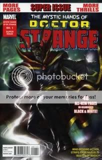
Comics Time: The Mystic Hands of Doctor Strange #1
May 21, 2010The Mystic Hands of Doctor Strange #1
Keiron Gillen, Peter Milligan, Ted McKeever, Mike Carey, writers
Frazer Irving, Frank Brunner, Ted McKeever, Marcos Martin, artists
Marvel, March 2010
48 pages
$3.99
I’ve read enough Hellblazer to understand the appeal of an anthology-style series of self-contained stories about a sorcerer jumping ugly with the dark supernatural and coming out on top, but at a price. John Constantine himself, though, is not for me. The spiked hair and stubble and cigarettes, the rumpled trenchcoat and English curses…obviously that’s cool with a capital C for many people, but it’s just not a set of character descriptors I can get terribly invested in. I think my favorite Hellblazer stuff I’ve ever read was a Jamie Delano thing back when he had longish wavy hair and spent the arc in jeans and a clean white t-shirt.
Doctor Strange, on the other hand? Oh yes indeed. People like NeilAlien and Tom Spurgeon have made much more convincing cases on behalf of the once and (hopefully) future Master of the Mystic Arts than I could ever do, but I’ll simply say that he’s a collection of images and ideas that I really like when they’re all smushed together. I like his big high-collared cloak, the Eye of Agamotto, his goatee/gray-temples combo, his Steve Ditko hands and Steve Ditko psychedelic vistas, his Greenwich Village lair that’s got more mysterious rooms than you’d find in its official floorplan, his pal Wong, his origin as the world’s biggest dickhead who suddenly realizes what a worthless tool he is when his hands get broken in a car wreck and he can no longer be a hot-shit surgeon, his vision quest in the Himalayas, his gorgeously designed enemies like Dormammu and the Mindless Ones, the idea that he’s constantly fighting against so many massive threats that neither the other heroes nor civilians could ever possibly appreciate the magnitude of his gig, all those great gibberish names and epithets Stan Lee cooked up for him to invoke, his highfalutin speech pattern derived from years of study of the most esoteric subjects imaginable, and on and on and on. I understand why the strictures of Marvel’s publishing model with respect to its superheroes probably prevents this, but a largely continuity-free solo Doctor Strange series in the vein of Hellblazer? I bet a small but loyal audience would be there for every issue, in large part because a large and loyal number of writers would love to sweep in for an issue or an arc and tell the one Doctor Strange story they’d always dreamed of telling, and an equal number of artists would wanna give their Ditko chops a major workout. I’d be there with ’em.
And lookee here! One of a series of pulpy ’70s-style black-and-white one-shot anthologies featuring stories about some of Marvel’s rough’n’readier characters (we’ve also seen War Machine and Ares), The Mystic Hands of Doctor Strange is (wait for it) just what the Doctor ordered. I was entertained as the dickens by all four tales contained herein, for all the reasons I enumerated above.
I think my favorite take on Strange here comes from Kieron Gillen in the story that kicks off the book. Sure, it doesn’t hurt that he’s working with the awe-inspiring Frazer Irving, who was born to draw Doctor Strange’s world. (He was also born to work in color, and you can feel him wanting to–for god’s sake it’s a Doctor Strange story set in the hippie era–but I’ll take what I can get.) But I was intrigued by Gillen’s conception of magic as a sort of cosmic whodunit, where when something’s going down, the Doc must figure out who had the means, motive, and opportunity to do it…in an arena where none of the rules of cause and effect, physics, or human behavior with which we are familiar are necessarily operative. In both the Gillen/Irving and Milligan/Brunner stories, there’s a final twist that emphasizes Strange’s self-martyrdom, his willingness, whether through necessity or weakness, to do some bad thing that will hurt him to get the job done. It’s really only he who gets hurt in the process, though, which is what separates him from your run-of-the-mill anti-heroes. When the Sorcerer Supreme crosses a line, he’s the only collateral damage. That’s what makes him the Sorcerer freakin’ Supreme, you know?
While the first two stories are period pieces set in the same timeframe as the publication of Marvel’s original black-and-white magazines, the second two are different. Ted McKeever’s one-man showcase of scratchy, angular blacks and weirdo creature designs–yep, that’s our Ted!–is a timeless tale, in which a devastated Doctor Strange roaming around on an alcoholic bender nevertheless encounters a demon and a benevolent spirit and learns an important lesson about his sorcery…which is exactly the kind of thing that should happen to a Sorcerer Supreme on an alcoholic bender. (I like to believe he’s discovering hidden knowledge when he’s on the shitter, even.) The final story is a short prose piece by Mike Carey in the style of an early 20th century weird adventure, featuring an impressively evocative Frazetta Death Dealer-style antagonist, a simplistic but effective take on mind over matter, a grin-inducing tease of Doc’s archenemy, and a pair of killer spot illos from Marcos Martin, including one that’s almost Paul Pope-ish in its riotous kinetic energy.
All told, it’s as an effective a disquisition on what makes Doctor Strange worth making comics about since Martin and Brian K. Vaughan’s memorable miniseries The Oath–perhaps even moreso, since while that series was clearly an attempt to say “See? Doctor Strange still works!”, this one-shot feels like it was constructed with that basic proposition never once in doubt. I got from it precisely the modest but indubitably pleasurable pleasure I wanted. More like this, please.
Comics Time: Weathercraft
May 19, 2010Weathercraft
Jim Woodring, writer/artist
Fantagraphics, April 2010
104 pages, hardcover
$19.99
Wow. And you thought Wilson was mean-spirited!
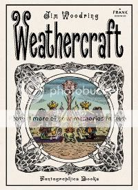
Part theater of cruelty, part joyous liberating revolution, Jim Woodring’s freakishly beautiful Weathercraft is at once the most direct and most elliptical of his Frank comics that I can remember reading. In its pages, Manhog, the half-human half-pig character who’s the Frank-verse’s avatar for the physical side of the id in the same way that funny-animal Frank represents consequences-be-damned curiosity and leisure, is made to physically suffer like you’ve seen few comic-book characters suffer before. Yet due to circumstances just as beyond his control as the passion he’s put through, this trauma leads him to an enlightenment that defies the spacetime continuum as he channels his newfound understanding into righting wrongs small and large. Yes, the cosmic reset button is hit at the end–this is a Frank comic after all, and it needs must remain static just as the Krazy/Ignatz/Offisa Pup triangle does. But until then, you’ve got a comic that’s both so confrontationally visceral and brutal that I almost put it down a couple of times, and one that’s such a visual and narrative strange-geometry dodecahedron that I compulsively read all the jacket copy upon finishing the comic just to make sure I had the first clue what the hell had just happened.
I think perhaps the most underrated weapon in Woodring’s artistic arsenal–certainly the one that had the greatest and most unexpected impact on me in this book–is, of all things, his panel borders. As you picture a Woodring Frank comic in your head, you’re probably seeing those wavy, buzzy lines that comprise his backgrounds, looking like a mosquito in your ear sounds; or perhaps those overripe plant-animal-mushroom-deity hybrid visuals, which explode the narrative at regular intervals. Unless you were paying specific attention to them, my guess is that if you were asked to describe Woodring’s panels, you’d say they were wavy themselves, maybe even prone to the baroque. But lo and behold, they are rigorously ruled rectangles and squares; on any given page, their borders are the thickest line to be found. I know I’ve written in the past that the presence of panel borders makes it difficult for comic horror to infect your nightmares; I still think that’s true, but in the moment, they can have–as they do here–an almost subliminal effect on your reading experience. No matter how woozily psychedelic each image here is, those big thick blocks tell you that something heavy is happening, something scary and indelible. Even in a Frank story; even in a Frank story where the characters’ nemesis Whim–that evil grinning guy who looks like a cross between Old Scratch and the moon-faced guy from those old McDonald’s commercials–reveals his all-powerful true self like the Sentry in Siege #3 and melts the reality of his enemies; hell, even in a Frank story in which a pair of new characters who look like something out of Stephen King’s Dark Tower series play Dark Tower-style games with the very fabric of their fictional world’s reality–even in stories like those, those panel borders communicate “Not a hoax! Not a dream! Not an imaginary story!” It makes Manhog’s torment all the more awful, and his triumph, however fleeting, all the more awesome.
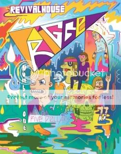
Comics Time: Trigger #1
May 17, 2010Trigger #1
Mike Bertino, writer/artist
Revival House, April 2010
24 pages
$5
They don’t make ’em like this anymore. Time was, a fella could stand in the aisle of one of your better comic book shops and watch one-man staple-spined anthology series like what Mike Bertino’s Trigger #1 augurs roam the countryside in huge horizon-spanning herds, from the halcyon days of Eightball and Optic Nerve to outliers like Rubber Necker and Uptight. Now, Buenaventura Press’s quixotic damn-the-torpedoes efforts aside, the format is the provience of minicomics and micro-publishers. And bless ’em, because as seen here, it’s a useful format.
Bertino puts himself through the paces with three comics done in three different tonal and artistic styles. First up there’s a literary-fiction young-professional thing about a teacher’s first day with a new class. You’ve got your white-guy class’n’race issues, the ominpresence of alcohol, and a sexual politics sideswipe–the material suggests Tomine, while the straightforward, oval-eyed art reads to me like part-Jessica Abel, part-Hope Larson. Then there’s the funny middle section, which seems to use the fact that flannel is in again to tell a very ’90s altcomix-style story about a drunken debacle in a dive bar. Shit jokes, cusswords, crude and emasculating romantic mishaps, an anthropomorphized unicorn named Buttface abound, the story unfolds with a charming well-paced “one bad night” logic, and Bertino flips his style around to a rubbery Johnny Ryan/John Kerschbaum kinda thing. Finally, in a story of the sort that would likely find the most purchase in other alternative-comics anthologies today, a young man comes to terms with his abuse-scarred past via a series of might-be-visions, might-be-hallucinations. Here the art is at its most delicate and loveliest, like a thinner-lined Gabrielle Bell or a sturdier Anders Nilsen; the visions are done in a melty Mat Brinkmany freakout mode, with flame effects that reminded me of Jesse Moynihan. As a bonus, there’s the multicolored art-noise cover and equally messy/melty/monstrous/indecipherably fonted endpages, a sort of Providence-school cameo appearance.
Sandwiched together as they can only be in the solo anthology model, the disparate stories and styles provide a snapshot of Bertino’s range of interests and abilities; moreover, the whole product takes on an invigoratingly restless feel, as reader and artist alike appear not to know which way he’ll head with the next story. I suppose all the name-dropping above indicates that it comes across as a sort of greatest-hits package for the past decade and a half of alternative comics, and that it does, but I’m not complaining! After all, Bertino appears to know exactly which style to employ to achieve each of his desired effects, which is smart cartooning. Besides, the point of one of these one-man shows is to have room to explore, experiment, dabble, pastiche, parody, imitate, whatever, whether in service of a fully formed statement down the road or just for the love of the game.
Comics Time: Wiegle for Tarzan
May 14, 2010Wiegle for Tarzan
Matt Wiegle, writer/artist
Partyka, April 2010
12 pages
$1
Buy it from Partyka, most likely
Today’s installment of Insurmountable Conflict of Interest Theater is brought to you by my friend and collaborator Matt Wiegle’s latest one-dollar humor minicomic. This one’s campaign literature, essentially, as Wiegle announces his intention to run for the neglected but pivotal office of New York’s official State Tarzan. The key image is Matt wearing nothing but a necktie and a leopard-skin loincloth, which is as far as you might expect this gag to go. But his strength as a humor cartoonist has been his off-angle take on his simple concepts–the foodie specificity of the beast-based dishes in Monsters and Condiments, for example. So here, instead of just the basic idea of Tarzan existing alongside Governor and Attorney General and County Executive as a political office, you have the position’s origins following the Hobson Shirt Company’s “Loose Lion Incident” of 1919; you have the career-politician behavior of the incumbent, who “has barely touched a vine in 20 years!”; you have “ill-equipped” first responders like mustachioed firefighters handling “Tarzan-related crises” like an attack by anthropomorphized ant-people; you have “social networking” listed as one of Wiegle’s proposed transformational goals for the office, as depicted by a man tweeting for help as he gets sucked into quicksand, and so on. I’m spoiling gag after gag, I know, but I’ve read this thing a few times now and I’m still chuckling out loud, so you ought to be alright. At any rate, they all click harder thanks to his art, honed at this point through countless panels drawn for adapting literary greats for Barnes & Noble’s SparkNotes to a really sturdy combination of realism and cartoony brio, perhaps best exemplified here by the dead-eyed stare of a necktie-clad giant-cobra lobbyist. Wiegle gets my vote, that’s all I’m saying.
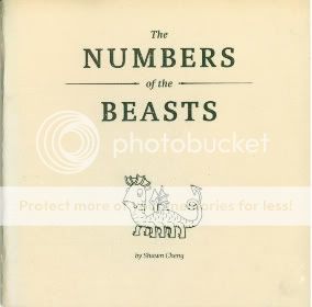
Comics Time: The Numbers of the Beast
May 12, 2010The Numbers of the Beast
Shawn Cheng, writer/artist
Partyka, April 2010
28pages
$I forget
The challenge of reviewing a shitty comic by a friend is obvious; the challenge of reviewing a good comic by a friend less so and thus perhaps more pernicious. Indeed many people find the whole enterprise suspect and distasteful, and I can hardly blame them. I think that rather than gushing about the gestalt of the project it behooves me to talk about what my pal Shawn Cheng’s The Numbers of the Beast does well as specifically as possible. Scales, for one thing: The reptilian hide of the Hydra, used to illustrate the number 9 in Cheng’s Greek-myth-based take on a child’s counting book, is a gorgeous multiplicity of little semicircular panels; I’m particularly taken with the tangent lines between two of the beast’s overlapping necks. The curly hair of the Chimera (#4), Geryon (#6), and Pan (#7) is handled with similar precision, as are the stippled dots that denote the gray stone of the Basilisk’s victims (#8) or the Colossus’s legs (#10). Cheng takes necessary detail and doubles it as ornamentation. His creature designs, meanwhile, are probably the most accessible in a career filled with critters, nearly all of them seem based on simple circles or ovals, dovetailing with Cheng’s never-smoother line and befitting a book dedicated to Cheng’s toddler daughter. The shiny ivory cover stock alone makes the comic worth a peek. Fans of Fantagraphics’ Beasts! books, here’s one for your SPX shopping list.
Comics Time: Henry & Glenn Forever
May 10, 2010Henry & Glenn Forever
Tom Neely, Scott Nobles, Gin Stevens, [anonymous], writers/artists
Igloo Tornado/Cantankerous Titles, April 2010
64 pages
$5
Buy it from Microcosm Publishing
When I was a teenager, even though I didn’t much care for their music, I was at the very least entertained by Henry Rollins and Glenn Danzig purely on a “who’d win in a fight?” level. This was the early ’90s, and the concept of broadly defined alternative musicians with actual visible muscles was something of a mindblower, to say nothing of the superhero levels to which these two guys took it. Although spitballing which of the two would come out on top in hand-to-hand comeback has since been largely rendered moot, I’d imagine Henry & Glenn remain associated with one another in the minds of many lo these many years later by dint of their toyetic physiques (and their equally genre-art-badass mutual love of black clothing), quite aside from their shared role at the roots of hardcore. In that light it’s no surprise that in one of this book’s sixty or so one-page gags on the idea of Rollins and Danzig as a committed couple, they’re simply drawn as Colossus and Wolverine respectively, without further comment. If either man has spent any time in your ideaspace, no explanation is necessary.
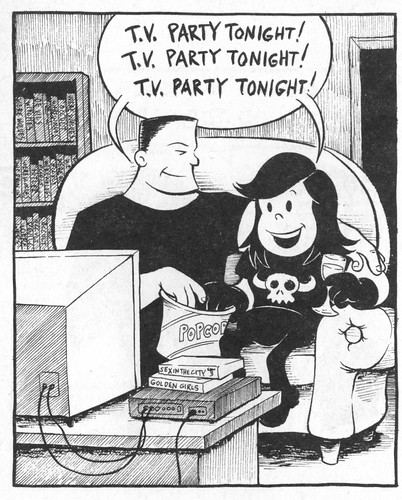
Produced by The Blot‘s Tom Neely and his compatriots in the Igloo Tornado collective (the fourth member of which appears to wish to remain anonymous for the purposes of this project), Henry & Glenn Forever is an email your friends, hey-you-gotta-see-this meme in minicomic form for one simple reason: It takes hardcore’s two most self-consciously self-styled tough guys and casts them as lovers, not fighters. It helps if you’re familiar with some of their music, since there are a handful of gags (particularly Neely’s) based on Black Flag or Misfits lyrics–including the outrageously tumblriffic image I stuck at the top of this review, as well as another that’s both one of the comics’ few gross-out gags and almost completely indecipherable unless you know the line that comes after the line Glenn utters in the panel. But in general, all you need do is, y’know, look at how Glenn Danzig and Henry Rollins look, and then sit back and enjoy how funny it is to think of them as a sweet romantic couple who wish they could spend more time together, hate themselves for arguing, write about their Hot Topic shopping sprees in their diaries, fret about whether their fishnets will still fit them if they go see Rocky Horror at the Nuart, and so on.
Lest you worry it’s a one-note project, a goodly number of the jokes go in different directions. Some preserve Henry & Glenn’s machismo but take it to ridiculous levels: In one panel they’ve replaced their hands with guns and knives, in another they’ve sprouted the black horns of a “unicorn of death.” There’s a subplot involving their nextdoor neighbors Darryl Hall and John Oates, cast here as very polite Satanists. And there are plenty of jokes directly at the expense of werewolf-loving, Hitler-studying, occult-dabbling Danzig that would work whether or not he and Henry Rollins were in love. Rollins, who in my day became something of a poster child for alt-culture elitism, is roasted a couple of times on those grounds, but he’s generally the straight man here. So to speak. In a world where Oates’s mustache is the star of its own animated series, the jokes about those two yachtrockers fall a little flat, but I laughed a lot at pretty much everything. (And okay, seeing the two of them say “Oh, I can’t go for that!” “No can do!” as Henry and Glenn erect an anti-Prop 8 sign on their front yard made me laugh too.)
If you’re looking for a gorgeous art showcase, you’ll probably wanna look elsewhere: Of the four Igloo Tornado guys, Neely’s the only real cartoonist in the bunch. I love the visual shorthand he developed for the pair: Rollins is a towering, barefooted, squint-eyed, unibrowed, flattopped ogre, Danzig a tiny, doughy imp with Annie Warbucks’s eyes and Veronica Lodge’s hair. The rest of the gang cartoons just well enough to get their gags across, and honestly that’s part of the charm–Neely’s chops aside, this thing looks and reads like a book you and your friends could have put together after drunkenly stumbling across the idea, cracking up the whole while. Which, as I understand, is exactly what Neely & Company did. Sometimes, it pays to heed the words of a wise man: “Don’t think about–do it!”
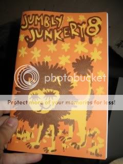
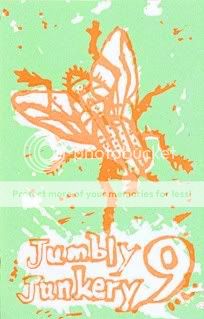
Comics Time: Jumbly Junkery #8-9
May 7, 2010Jumbly Junkery #8
L. Nichols, writer/artist
self-published, October 2009
44 pages
$5
Jumbly Junkery #9
L. Nichols, writer/artist
self-published, April 2010
36 pages
$5
Most of the minicomics I’ve read have one overriding, primary purpose: They’re an art object, they’re a formal exercise, they’re a concise storytelling or visual statement. L. Nichols’s Jumbly Junkery has a purpose, I think, but instead of a well-placed sniper’s bullet, it’s a shotgun blast. The goal of her one-woman anthology minicomics series appears to be nothing more or less than creating a vehicle for the unfiltered self-expression of a cartoonist with a massively prodigious work ethic. It’s a conveyor belt from the artist’s brain to the reader’s.
Most of the strips in these two issues, based on my unscientific survey, are little autobiographical sketches. They’re the sort of comic where
each new phrase
is separated out from the others
and captions each new panel
for an effect that is at once staccato
and ersatz-elegiac.
Which is not my favorite writing style in the world, admittedly. But in Nichols’ case it doesn’t come across like the comics-as-poetry nightmare you might be picturing, because it’s so clearly tied to her compulsion to create. It’s like she can’t help but draw a new panel for every phrase and clause. The two issues are peppered with strips where she either contemplates her constant drawing or perseverates on the worrying feeling that, you know, this is all there is, occasionally combining as she fears that what she’s doing is an insufficient means of transcending both her own inadequacies and those of humanity in general. In all three cases, there’s a sense of obsession that goes a long way toward undercutting any potential cutesiness in the art or execution. Throw in the repeated motif of mathematical formulae, derived from her own studies IRL and serving the same purpose as those spotted mandalas in Blankets, and you can understand what she’s going through even you’re not quite ready to go along with her.
Nichols works primarily in a pleasantly cartoony style best exemplified by her self-caricature as a stuffed doll with x’d-out button eyes and a mohawk. Again, there’s the danger of twee, but it’s undercut by genuinely deft gray shading, the doll’s unsettling featurelessness, and an overall attention to craft. Moreover, issue #9 displays a wide array of styles, from a wiry, scratchy, more recognizably “altcomix” philosophical comic to an abstract comic with Mondrian-style squares to a cleaner, slicker “comic strip” style complete with zipatone to an almost xkcd-ish bit on the white noise of technology to a funny-animal thing that feels like a Matt Furie comic drawn by someone who does kids comics for First Second. And since most of the stories in both issues are just one or two pages long, there’s a pleasant idea churn. Don’t like this strip? Don’t worry, there’s a new one on the next page. All told, Jumbly Junkery is a fine example of a minicomic as a means to an end, a record of and venue for a cartoonist’s progress rather than a discreet declaration.
Comics Time: Wilson
May 5, 2010Wilson
Daniel Clowes, writer/artist
Drawn & Quarterly, April 2010
80 pages, hardcover
$21.95
All apologies to Ken Parille, but I don’t think the kaleidoscopic array of styles in which Daniel Clowes drew Wilson says much of anything. I think that’s the gag. And I mean this aside from the fact that these are all styles you saw Clowes employ (and no duh–as with Ware, it’s almost boring at this point to mention that the guy is an absolute titan of craft) with full shock-of-the-new force in Eightball #22/Ice Haven, where the Sunday-funnies format made their import a lot clearer. Here, it’s like Thirty Two Short Films About Some Dickhead, or that guy who pointed out that all New Yorker cartoons are funny if you caption them with “Christ, what an asshole.” Draw it how you will: Wilson’s always there, in medium close-up more often than not, a wide-eyed and open-mouthed expression of guileless wonder on his face more often than not, saying something fucking horrible almost constantly. No matter how you shake and dance, the last two drops go in your pants; no matter whether he’s detailed or abstracted or realistic or cartoony or full-color or two-tone or black-and-white or whatever the hell, Wilson is a massive, massive tool.
Wilson is sort of like the refined, sharpened, weaponized version of Mister Wonderful. Marshall is self-absorbed, Wilson is self-absorbed and cruel. Each single-page unit of Mister Wonderful is paced like a gag strip; the same is true of Wilson, only there are four times as many of them, and they’re at someone’s expense. There’s hope for Marshall; Wilson ends on a note akin to The Godfather Part II. Mister Wonderful is funny; Wilson is hilarious–I read this on the train and was embarrassingly vocal in my enjoyment of it. The second I got to a computer I made “PROPERTY OF SIR D.A.D.D.Y. BIG-DICK” my Google Chat status, I emailed my friends the entirety of Wilson’s disquisition on The Dark Knight, and even now I can’t think of “Hey, it talks!” without laughing out loud. Marshall is preoccupied with making a connection with someone outside himself, even if he’s constantly hamstringing his attempts to do so; the only times Wilson appears able to take that step is when death has rendered it too little, too late. This book is utterly mean and hilarious, and I loved every page.
Comics Time: Mister Wonderful
May 3, 2010Mister Wonderful
Daniel Clowes, writer/artist
The New York Times, September 2007-February 2008
20 pages
Download it for free from The New York Times
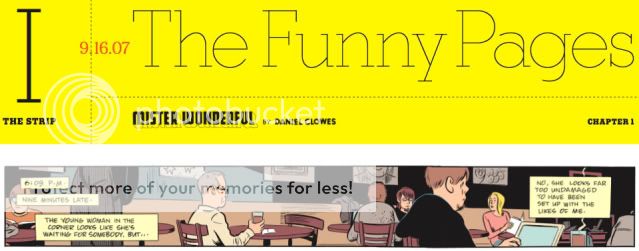
The key sequence in the comic Dan Clowes serialized through The New York Times‘ Funny Pages section a couple years back (!!!) comes in its October 28th. 2007 installment. Up to that point, and afterwards in fact, you could fairly comfortably play the theme song to Curb Your Enthusiasm in the background while reading and get roughly the right effect. The titular character, a graying sad sack named Marshall, is so self-obsessed in a self-deprecating manner that it’s almost a mental illness. In a series of one-page sequences he waits for a blind date he’s increasingly sure will never arrive, mentally lashing out at himself and his fellow coffee-shop patrons in a torrent of caption boxes that superimpose themselves on action and dialogue alike. Clowes’s comedic pacing is drum-tight, his portraiture hilariously scathing, able to capture the pleading vulnerabilites of a human face and then exploit them ruthlessly. You’re left wondering if this will ultimately be as biting a portrait of a pathetic, bitter guy as was The Death-Ray (only, you know, with no ray guns).
Things don’t exactly improve when Marshall’s blind date, a lovely if seemingly scatterbrained woman just shy of 40 named Natalie, actually shows up. Marshall, who at this point is half-drunk, immediately begins constructing elaborate fantasies of their happy life together, basically calling her the most perfect person who ever existed–the better to preemptively excoriate himself for blowing it with every fumbled word or body-language cue. Most of what she says to him is obscured by his interior-monlogue captions: Immediately after thinking to himself, “O.K., Marshall — now’s the perfect time to show what a sympathetic and attentive listener you are — eye contact, Marshall! Concentrate!”, he interrupts a word balloon containing the story of her failed marriage with a giant block of narration beginning “So here’s the basic gist:”. It’s smart cartooning, as you’d expect from Daniel effing Clowes, and it’s nasty and funny, as you’d also expect.
Then something unexpected, and subsequently unremarked-upon, happens. Marshall relates to us the story of Natalie’s common-law marriage, a 15-year relationship that began in grad school and ended when she could no longer forgive her boyfriend’s laughing dismissal of her worry that their lack of an actual marriage or children meant he was ashamed of her. It’s just a four-panel sequence, but it’s done in these lovely glacial blues, and there’s this gut-wrenching effect Clowes uses to convey the idea that “every time she went into that room, the laugh was there”: A large, three dimensional, yellow block-letter “HA HA,” first sitting on the kitchen table, then towering over the whole room like a monument.
It’s not made explicit, but here’s the thing: This isn’t Natalie’s memory of the disintegration of her relationship. This is Marshall’s mental reconstruction of Natalie’s story, pitched to us with the same no-bull neurosis as everything else he’s told us so far. Only it’s beautiful, it’s thoughtful, it’s sad and crushing. For these four panels only, all traces of Marshall’s compulsive self-absorption and solipsism are gone. Whatever he thinks of himself in the moment, we know he really did empathize with Natalie, he really did listen attentively, he really does care about her not as an idealized ticket out of his miserable lonely life, but as a person with a story all her own. For all the Larry David humor and brutal caricature in here, that’s the beating heart of the story, hidden under all the black. I think it’s worth remembering the next time you hear someone dismiss Clowes as a misanthropic self-loathing crank. Mister Wonderful is a story about the need to cling to one another in the face of not just the world’s awfulness but also your own, because what else are you gonna do? It doesn’t skimp on the awfulness, but the clinging’s the point.

