Posts Tagged ‘comics reviews’
Comics Time: Exit Wounds
August 2, 2010Exit Wounds
Rutu Modan, writer/artist
Drawn & Quarterly, 2007
168 pages
$16.95
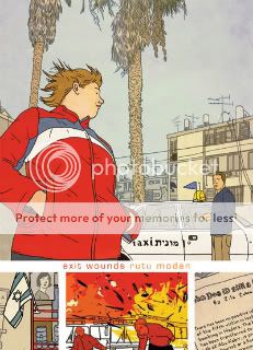
What a lovely-looking book Exit Wounds is. Rutu Modan’s skillful take on the Clear Line style elicits strong “performances” from her characters, creates an inviting depth of field, and holds her frequently sumptuous colors quite well. Her staging is rarely as dynamic as that cover image, but when it is, hoo boy, fabulous stuff. Overall I feel like she’s doing with the Clear Line what Emmanuel Guibert tried but failed to do in an inkier style: Take real life and gradually subtract detail until what remains is paradoxically even livelier.
The story? Eh. It’s your basic alternative-comics “young person’s personal epiphany enabled by unexpected, brief, intense, difficult relationship with other young person” story, a template established by the likes of I Never Liked You, Black Hole, and Ghost World, gone supernova with Blankets, and since utilized to varying degrees of success by Adrian Tomine, Danica Novgorodoff, Blaise Larmee, Paul Hornschemeier, Dash Shaw, Hope Larson, Bryan Lee O’Malley, the Tamaki sisters cousins, Natsume Ono, Inio Asano, and so on and so forth. This particular variation is uninspired and, literally, unsurprising. When their personalities clashed; when they fell into an uneasy rapport that slowly grew into an easy one; when they argued and made up; when they staved off emotional disaster by having ill-advised sex; when they stormily split up; when they capped off the book with a highly symbolic interpersonal act–each of these elicited a “yep, that’s pretty much what I expected” from me.
The affair is sprinkled with light commentary about Israel’s social, economic, ethnic, and denominational stratification. It’s subtle, thoughtful stuff, focusing on the way that both the state’s inherent construction and its predicament vis a vis its neighbors and occupation-ees constantly juts into people’s personal lives in mostly quiet, mostly unpleasant ways. That and the sumptuous art is probably what got the book over with so many readers and critics. But to me, it’s a little like getting a molten chocolate cake with no molten chocolate inside. It’s not quite a hollow experience, like one of those chocolate Easter bunnies where it’s just a thin layer of yummy and then a lot of air–the cake is substantial and sweet. But without the molten chocolate that a less predictable, more alive story would provide, you still feel like something’s missing.
Comics Time: Paper Blog Update Supplemental Postcard Set Sticker Pack
July 30, 2010Paper Blog Update Supplemental Postcard Set Sticker Pack
Anders Nilsen, writer/artist
self-published, November 2009
16 pages, 7 postcards, 1 sticker
$10.95
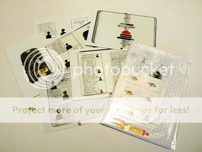
A slice of history here: This minicomic/postcard set/collection of beautiful drawings of bird heads labeled with names like “Beyonce,” “Mister Peanut,” and “Paul Wolfowitz” contains the very first of Nilsen’s “Monloguist” strips. Monologues for the Coming Plauge, Monologues for Calculating the Density of Black Holes, The End, and even Nilsen’s blog itself wouldn’t be here if it weren’t for the first few strips in which blacked-out stick figures spoke dialogue jotted down during Nilsen’s conversations with friends on a trip to Switzerland. (“I think it’s bad, looking at the ass. I don’t mean spiritually, either,” says a figure I’m reasonably sure is Sammy Harkham.) It’s fascinating to see how rapidly all the tics and tropes that have made this style of Nilsen’s so quietly haunting develop: the blacked-out mistakes, the seemingly random distortion or deconstruction of the Monloguist, the sudden shifts from banal observations and list-making to gaze-into-the-abyss despair and back again. But the illustration work included here, including a fascinating postcard image of a deer and some boulders nestled in the strange branches of some bizarre alien-looking tree, offer ample evidence of the raw chops with which Nilsen complements his experimental zeal. I dare say that if you send any of the postcards to anyone, you’re liable either to get married or never hear from them again. A fascinating little package from a serious best-of-his-generation candidate.
Comics Time: The Comics Section from the Panorama
July 28, 2010The Comics Section from the Panorama
(aka The San Francisco Panorama Comics Section)
Keith Knight, Jon Adams, Michael Capozzola, Gabrielle Bell, Daniel Clowes, Ivan Brunetti, Alison Bechdel, Gene Luen Yang, Art Spiegelman, Ian Huebert, Adrian Tomine, Chris Ware, Kim Deitch, Seth, Erik Larsen, Jessica Abel, Heather Brinesh, Katrina Ortiz, Carson Ellis, Jon Klassen, Jon Scieszka, Adam Rex, Mac Barnett, Jenny Traig, Kevin Cornell, writers/artists
McSweeney’s, March 2010
18 pages
$10
Everything’s coming up newsprint! Originally included with McSweeney’s Quarterly Concern #33–the “McSWEENEY’S HEART NEWSPAPERS” project The San Francisco Panorama–and now conveniently sold separately because McSweeney’s knows its audience, The Comics Section hews pretty closely, intentionally or not, to its conception as a newspaper’s funny pages. There’s that same lack of a unifying aesthetic or visible editorial hand, that same variety in tone and quality, and that same presence a strip or two that leave you totally baffled. How does it work as an argument for the preservation of the newspaper as a format? Jimmy crack corn and I don’t care. I’m not here for the Wednesday Comics-style newsprint nostalgia, I’m here for the comics. And the strong ones are strong enough that I don’t mind having spent the necessary scratch.
Look, Ware and Clowes just tower over this thing, let’s get that established right away. Ware’s centerfold spread is a luscious thing, with those bright blue and pink colors he used for the cover of Acme #19 and an inviting assortment of strips about young-brainiac-turned-adult-divorcee Putty Gray and his enamorata Sandy Grains. You can start pretty much anywhere on the spread, flip the thing in pretty much any direction, just letting your eye go where it wants and reading accordingly, and it works. (Compare and contrast with Alison Bechdel’s tribute to the game of “Life,” which forces you to rotate the entire broadsheet with seemingly every panel to little discernible aesthetic effect and much upper-arm exhaustion.) As you might expect, several of the “punchline” panels here are real punches to the gut; I’ll never get enough of Ware’s sense of “humor,” the way he just puts despair where the jokes would go. Ditto Clowes, whose provides the section’s opening salvo, a nasty little science-fiction spoof called “The Christian Astronauts” with as funny and fuck-you of a final panel as anything in Wilson.
There are two other stand-out strips in the section. Kudos to Adrian Tomine for writing a strip about a superhero named Optic Nerve that’s just an out-and-out autobiographical satire of how badly comment threads comparing him to Daniel Clowes get to him and how all things considered he’d probably rather be hanging out with his wife than wasting his time in this thankless field. He doesn’t care if navel-gazing and superhero satire are the two things most likely to get your brand of alternative comics ridiculed on the Internet these days, you know? That’s what he wants to do, and dammit, that’s what he’s doing. And it’s funny! And kudos to the Editors for thinking to include Erik Larsen, of all people: He uses his Savage Dragon character for a light superhero satire at least as effective as Tomine’s, and it’s clear from inking, coloring, and choreography that he simply cares a lot about cartooning, which makes a two-page broadsheet spread arguably an even more effective showcase for what he does well than an ongoing series well into the 100s. And now that I think of it, I liked Seth’s page as well. The more I see of his stuff, the more the disconnect between his in-real-life look, his ruminative pacing, and his slick cartooning intrigues me rather than puts me off.
The rest? Eh, I can take it or leave it. Mostly leave it, I suppose–I don’t know why Kim Deitch laid out his story basically backwards, I don’t know why Jessica Abel’s adventure-strip pastiche selected a relatively inert portion of the adventure to depict, I didn’t think very many of the non-full-page strips (Knight, Adams, Yang, Brunetti) were funny at all. But then, for years, I only read The Far Side.
Comics Time: Neighbourhood Sacrifice
July 26, 2010Neighbourhood Sacrifice
Steph Davidson, Michael DeForge, Jesjit Gill, writers/artists
self-published, 2009
12 pages
$2
See sample images and buy it from Michael DeForge
Bam bam bam bam bam–with each turn of the page, this cheap newsprint zine hits you with a powerful image as big as the trim size will allow. The images–a quick google search for the artists’ homepages reveals I’m out of my element at trying to deduce who did what based on their other work, for the most part, though I think I at least recognize DeForge when I see him–are tailored for maximum impact. Maximum awesomeosity, if you will. You’ve got DeForge’s trademark slimy monsters, seemingly constructed out of bits of thousands of other beasts–like if Shub Niggurth were made of her 1,000 young. You’ve got massive, realistically drawn altars laden with occult and Egyptian kitsch. You’ve got a guy looking into the mirror to see a melted-faced monstrosity staring back at him; turn the page and another guy’s cutting his cubist-looking face in half with a sword. Heck, the thing opens with a pretty hilarious selection of newspaper comic titles given DeForge’s heavy-metal typography treatment. (My favorites are Ziggy, which uses a sword for the “i” in the style of The Legend of Zelda, and Hi and Lois, whose letters are used to form a grinning skull.) It’s a delirious, this-goes-to-eleven experience, over almost as soon as it begins.
Comics Time: Scott Pilgrim Vol. 6: Scott Pilgrim’s Finest Hour
July 23, 2010Scott Pilgrim Vol. 6: Scott Pilgrim’s Finest Hour
Bryan Lee O’Malley, writer/artist
Oni, July 2010
248 pages
$11.99
Or: Scott Will Eat Itself. The gist of this final volume in Bryan Lee O’Malley’s worlds will live/worlds will die/comics will never be the same series is that it’s an extraordinarily bad idea to reduce the people in your life, even the people who used to be in your life, to stock roles in the beat-’em-up videogame or shonen manga you’ve mentally conceived your life to be. Not only is this cruel and reductive to them, not only will it cause them trouble to the extent that you’re still in their lives and forcing them into that role when you interact, it’s cruel and reductive to you yourself, since it traps you in the corresponding role as well.
I mean, I guess that’s the gist. I’ve always had a hard time connecting with Scott Pilgrim on the personal, emotional level a lot of its ardent admirers do, mostly, I think, because I’m a creep. As I put it when discussing Vol. 5:
There’s no doubt that I’m speaking from my own experience with my own emotional life, which for whatever reason I don’t experience as a lot of rock and roll fun with the occasional bummer mixed in, even if that is in fact a more objectively accurate view of what my life has been like. Maybe it’s just a preference thing, maybe I feel like darker material more accurately reflects what is important/lasting in life/art, I don’t know. I do know that I don’t see my life as a rollicking adventure, or more accurately, something that might be a rollicking adventure were the occasional metaphorical robot fight thrown in.
The long and the short of it, especially in a volume such as this, which wraps up an entire series’ worth of emotional arcs in the form a massive, bloody (!) swordfight, is that Scott and his friends are characters whose adventures I can enjoy even if I can’t personally really understand the thought process underneath them. Like, look, O’Malley’s art has never been better than it is in this volume, which is pretty much true every time–the climactic fight scene occupies about two-fifths of the book and has oomph galore, and I think O’Malley deserves some sort of special Eisner Award for the potential Envy Adams cosplay opportunities created here. And it’s difficult to overstate the subspace corridor opened in my head over these past few years by his overall mix-and-match aesthetic, from its non-traditional, designy use of captions and text to tell the story, to its no-explanations mix of romance and action, to his often laugh-out-loud funny dialogue and sense of timing, to most especially his incorporation of videogame tropes–just a vast reservoir of completely underutilized visual vocabulary and storytelling potential. So if, in the end, Scott Pilgrim isn’t my life, I sort of feel like the last thing Scott Pilgrim would want is for me to pretend that’s the role it played.
Comics Time: King-Cat Comics and Stories #69
July 21, 2010King-Cat Comics and Stories #69
John Porcellino, writer/artist
Spit and a Half, September 2008
28 pages
$3
In the right hands, comics don’t depict, they convey. This is the advantage they have over their cousin film. The basic stuff of film (putting aside animation and abstract filmmaking and CGI for the moment) is, on a fundamental level, the recording of things that actually happened in front of the camera recording them. Those recordings can be recordings of a fiction, and they can be used to construct a fiction, and directors and cinematographers and editors and composers and effects technicians can add their interpretive gestures, but film is nevertheless a hegemony of fact. Comics, by contrast, is all middleman. Even an autobiographical comic is by virtue of being a comic not showing you something that happened, but telling you about it, the telling coded directly into the line of the artwork. It’s a gestural art form, a mime medium.
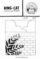
No one gets that better than John Porcellino. Most lo-fi autobio cartoonists, perhaps paradoxically, aim for maximalist effect in terms of presenting the artist’s self-conception: shaky, rough-hewn lines, clumsy character designs, everything designed to get across “I’m self-effacing!” Porcellino stays out of his own way. With his smooth uniform line weight, characterized by elegant curves and semicircles, he presents information on a need-to-know basis, usually emphasizing human figures against a minimally depicted background (like a sky) or foreground (like a car window). He’s not conveying a pose, he’s conveying in-the-moment relationships: Between himself and his wife, between his two cats, between himself and a parking lot, between the grass and the sky. This happened, yes, but he allows you to draw the conclusion yourself–this is how it happened, this is how it felt in that moment. All that empty space allows you to place yourself between those lines. The effect is immediate, immersive, and evocative, so that when the poetic writing really hits–especially those frequently powerfully sad final lines–you can all but feel that world’s weight around you.
Comics Time: Batman R.I.P.
July 19, 2010Batman R.I.P.
Grant Morrison, writer
Tony S. Daniel, Lee Garbett, artists
DC, 2010
224 pages
$14.99
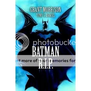
Here’s a quick list of fun things found in this immensely enjoyable comic:
* Opening a story called Batman R.I.P. with a splash page which reads “YOU’RE WRONG! BATMAN AND ROBIN WILL NEVER DIE!”
* A bunch of weird supervillains from around the world sweeping into Gotham City to take it over as a joint venture
* Batman coming home from a long night of crimebusting to bang his gorgeous model/aristocrat girlfriend
* Robin thinking that’s kinda weird
* The Joker drawn as a nightmarish cross between the Thin White Duke, a Cenobite, and bell hooks
* Bruce Wayne’s girlfriend methodically explaining away the majority of the Bat-mythos as signs of debilitating mental illness
* Graffiti shutting down Batman’s brain
* A hunchback and a bunch of guys dressed like gargoyles pounding the snot out of Alfred with clubs
* Batman embedding within himself a back-up personality just in case his regular personality is in some way compromised
* Said back-up personality making a multi-colored costume for itself out of garbage and then running around braining villains with a baseball bat
* The central clue/metaphor being revealed as a pun on the femme fatale’s skin tone and hair color
* Said femme fatale’s leering facial expression when her villainy is revealed
* An impeccably choreographed martial-arts battle between Robin and a killer mime from France
* Villains who are all drawn look like they’re having the time of their lives until the precise moment Batman and his friends arrive to kick their asses, which they in turn are drawn to look like they were born to do
* Doctor Hurt repeatedly referring to himself as Doctor Thomas Wayne and no one believing him
* Jezebel Jet saying “What’s that sound?”–cut to a silent panel of her plane being swarmed by an army of Man-Bats
* Ending with a two-issue Lynchian psychogenic fugue induced by New Gods from Apokalips that simultaneously reincorporates the goofy old Batman adventures from the Silver Age and presents a bunch of shoulda-woulda-coulda alternative realities and ends when a chainsmoking orange person shoots a giant psychic lump of clay repeatedly because Batman has proven too awesome to psychically pirate and clone
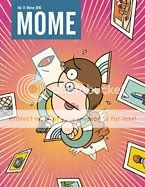
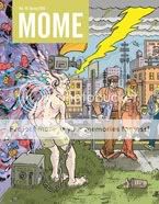
Comics Time: Mome Vols. 17-19
July 16, 2010Mome
Vol. 17: Winter 2010
Kaela Graham, Rick Froberg, Paul Hornschemeier, Tom Kaczynski, Dash Shaw, Laura Park, Olivier Schrauwen, Michael Jada, Derek Van Gieson, Sara Edward-Corbett, Renee French, Ted Stearn, Kurt Wolfgang, T. Edward Bak, Josh Simmons, writers/artists
Vol. 18: Spring 2010
Kaela Graham, Nate Neal, Lilli Carre, Dave Cooper, Gavin McInnes, Ben Jones, Frank Santoro, Jon Vermilyea, Ivan Brun, Joe Daly, Ted Stearn, Nicolas Mahler, Tim Lane, Conor O’Keefe, Michael Jada, Derek Van Gieson, T. Edward Bak, Renee French, Jon Adams, writers/artists
Vol. 19: Summer 2010
Kaela Graham, The Partridge in the Pear Tree, Josh Simmons, Olivier Schrauwen, Gilbert Hernandez, D.J. Bryant, Tim Lane, Conor O’Keefe, Robert Goodin, T. Edward Bak, writers/artists
Eric Reynolds, Gary Groth, editors
Fantagraphics, 2010
Vol. 17: 120 pages
Vols. 18-19: 128 pages each
$14.99 Each
Now that’s more like it!
Last time I checked in with Fantagraphics’ flagship anthology series–well, you could say one of two things about it: 1) That it lacked focus, or 2) that what it was focusing on just wasn’t remotely my cup of tea. Overly familiar underground schtick, humor pieces that didn’t make me laugh, whimsical work that lacked urgency and oomph, an overall identity crisis caused at least in part by high turnover among an ever-expanding line-up…Whatever it was, it bummed me out as someone who’s read the book from the get-go (and submitted to it a couple times!), and often forcefully advocated for it as the best buy in alternative comics not despite but in part because of the varying quality of the contributions, which enables you to directly observe the difference between what works and what doesn’t.
Now, though? It’s back in business. You can mostly credit the newer crop of contributors, a rough and tumble bunch who are bringing some fierce and hard-edged work to the table. Jon Vermilyea’s guest-artist turn in BJ and Frank Santoro’s Cold Heat-verse is brining out the funny, monstrous, horny, creepy side of that franchise more than ever before. Tim Lane’s nasty, Burnsian blend of noir and slice-of-life harkens back to the altcomix material that first made you uncomfortable when you first drifted over to the wrong side of the comics shop a decade and a half ago. Michael Jada is harnessing Derek Van Gieson’s sooty, watery black-and-white images to a tough-as-nails World War II story, of all things. Olivier Schrauwen has submitted his two best contributions thus far: a journey into the colonialist heart of darkness, and a C.F.-evoking tearjerker about the fantasy life of a man in a waking coma. Gilbert freaking Hernandez guest stars with a Roy story that’s good at everything Beto’s ever good at: character designs, dark skies, body language. Josh Simmons continues making a name for himself as one of the best in the biz with the start of “White Rhinoceros,” a cringingly funny cross between Alice in Wonderland and a Mel Gibson phonecall, with some of the best coloring this side of The Dark Knight Strikes Again. Robert Goodin returns with an impeccably drawn story of Carl Jung’s religious awakening, complete with giant god-shit falling from the sky and crushing a cathedral. Newcomer D.J. Bryant submits a story of a crumbling marriage that’s nasty in more ways than when–it’s straight-up porn, and good porn at that. And thanks to some perfectly evoked body language in an illo from Rick Froberg, Bryant’s story isn’t even the first memorable depiction of cunnilingus in these three issues!
I’m not on board with everything, of course. Paul Hornschemeier’s “Life with Mr. Dangerous” concludes as uneventfully as it’s continued; I’m an admirer of Hornschemeier’s work and it’s always lovely to look at, so I’m gonna reserve judgment for the eventual collection, but having that story wrap up feels like a welcome farewell to what Mome used to be. T. Edward Bak’s historical comic about the naturalist Georg Steller showed promise at first, but I’m thrown by the awkward way he breaks sentences mid-phrase from panel to panel or even page to page, and a story like this needs all the smooth-storytelling help it can get. Conor O’Keefe’s work is gently gorgeous to an almost ridiculous degree, but I’ve got no “in” to his whimsical world of boy-men in nightgowns. Nicolas Mahler’s amusing autobiographical anecdotes are the very definition of “nice, nice, not thrilling, but nice.” Much as I love seeing comics from Dave Cooper, his Pip & Norton stuff with Vice co-founder Gavin McInnes has always been his weakest. I’m equally cold on another comic duo, Ted Stearn’s Fuzz and Pluck. And the less said about Nate Neal here, the better–his two-page takedown of “hipsters,” for Christ’s sake, presents itself as though thousands and thousands of people haven’t spent the last decade doing exactly that (did you know they are pretentious? did you know they buy ugly clothes at vintage stores? did you know they live in Williamsburg? good lord) and is easily the most embarrassing thing that’s ever made its way into a Mome. (Which reminds me–it’s an anti-hipster piece in an alternative-comics literary journal. I feel like Elaine Benes shouting at toupee-wearing George Costanza when he refuses to date a balding woman: “You’re bald!”)
But the balance is definitely in favor of the strong stuff, because it is strong stuff–well drawn in a variety of styles, and potentially troubling without cloaking itself in shopworn tropes. Even the work that’s sort of middle-of-the-road in terms of the reaction it got from me has its moments, from the physical mechanics of the swamp creature Sara Edward-Corbett draws to the doll-like character designs and dramatic angles of Ivan Brun’s rather on-the-nose story of gun violence Jon Adams’s weird mash-up of Chris Ware fanfic and Stephen King short story. Once again, you’re getting your bang for your buck.
Comics Time: The Troll King
July 14, 2010The Troll King
Kolbeinn Karlsson, writer/artist
Top Shelf, April 2010
160 pages
$14.95
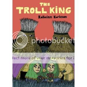
Like the work of some kind of less violent altcomix Clive Barker, Kolbeinn Karlsson’s The Troll King is a defiant, love-it-or-shove it celebration of monstrousness, queerness, and the dreamlike Venn diagram overlap between the two. The burly beasts who inhabit the forest just beyond the glow of the city lights in this suite of interconnected stories have, through “hard work” and because society is “not worthy of [their] presence,” created a world for themselves, a world of their own, a world where their “bodies” and their “pleasure” are their “first priorities.” In this place, the creatures are stocky, broadly designed, miraculously self-perpetuating species, evoked with a wavy, almost furry line and bright, flat colors for an overall effect that wouldn’t look out of place in a Kramers Ergot tribute to Super Mario Bros. 2. Appropriately, events proceed with demented video-game (or dream or drug-trip–both adjectives made literal at points during the book) logic–a man they rescue from the river, for example, is transformed via sexual congress with the titular monarch into a “noble steed” upon which the Troll King flies to the Moon. I’m not saying there’s no horror or loss in this world, because there’s plenty of both: Our two main characters have twins, whose coming-of-age story involves coming to terms with death, yearning for something they can’t get with their cozy family inside the forest’s borders, and eventually turning on the parents who love them so much; there’s also a batshit violent “Wild West” interlude/shamanic vision that demonstrates the way community can break down and tease out the worst aspects of humanity (however broadly construed) as a counterpoint to the way the forest creatures’ world seems to bring out their best. But (and again like Barker) Kolbeinn is giving his gay utopia an edge: It embraces the lived experience warts and all. Freedom, like the panel where the Troll King and his noble steed fly to the moon (itself part of perhaps the most affecting sequence of comics I’ve read all year), is overwhelming and scary, which is part of what makes it so wonderful in the first place.
Comics Time: pood #1
July 12, 2010pood #1
Geoff Grogan, Kevin Mutch, Alex Rader, editors
Sara Edward-Corbett, Kevin Mutch, Fintan Taite, Tobias Tak, Lance Hanson, Henrik Rehr, Adam McGovern, Paolo Leandri, Mark Sunshine, Bishakh Som, Andres Vera Martinez, Chris Capuozzo, Hans Rickheit, Jim Rugg, Brian Maruca, Connor Willumsen, Geoff Grogan, Joe Infurnari, writers/artists
Big If, April 2010
16 big giant newsprint pages
$4
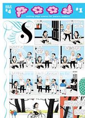
Simply existing is pood‘s greatest victory. It’s one thing for Alvin Buenaventura or Dave Eggers to provide the alternative and art-comics canon a Little Nemo-sized canvas on which to play; it’s quite another for this idiosyncratic, even weird, group to get a shot. (Why, only three contributors have been published by Fantagraphics!) And as I’ve said in the past, I happily rescind my initial doubts about the newsprint/broadsheet format: It’s the only way the project would make economic sense, first of all, and second of all it ends up holding line and color rather impressively–I’m not sure Sara Edward-Corbett’s work has ever looked better on the page, for example, and Tobias Tak and Geoff Grogan sure do turn in some lush purples.
Beyond that? The victories are harder to come by, I think. I mean, I’m generally perfectly happy with the main throughline of artcomix today, so on that level, folks who follow their bliss in other, perhaps more underground-y directions are gonna have a harder time fitting in with me, too? A handful of stories make use of the giant page to tell impressive little done-in-one morality plays–there are not one but two Western-vengeance stories, a muscular black-and-white firecracker by Andres Vera Martinez and a delicate, sinister color piece by Connor Willumsen, and I think they’re the highlights of the collection, while Adam McGovern and Paolo Leandri’s Kirby-indebted slice-of-lifer lingers as well. And I’m a sucker for the “gigantic environment with cutaway spotlight panels” approach to telling a story on a page this size, as utilized by Tobias Tak and Bisakh Som, even if I’m not over the moon for the stories they’re telling with that technique. Finally, Mark Sunshine’s strip–really it looks like a book’s worth of strips smushed into one page–and its world of cartoon characters who believe their very existence could usher some change into the world they inhabit, Heisenberg-style, is baffling to me in a way that suggests it will linger as well. But much of this material is either goofier (Edward-Corbett, Grogan, Rugg & Maruca, Taite, Capuozzo) or surface-uglier (Mutch, Sunshine) than I’m able to get into, undercutting the potential power of making giant-ass comics. Even a couple of personal favorites, Henrik Rehr and Hans Rickheit, offer contributions that are pretty much just what they normally do, only bigger. It reminds me a bit of the early days of Mome, when I would go on about how the uneven quality of the contributions was actually a plus because you could do apples-to-apples comparisons of work that worked with work that didn’t–only here, nothing is quite rising to the level of “there, that’s how it’s done.” Still, pood #2 is on the way, and at that price it’s a no-brainer to take a flyer on coming back to see if the crew fulfills the promise of the format.
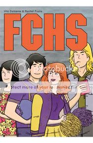
Comics Time: FCHS
July 9, 2010FCHS
Vito Delsante, writer
Rachel Freire, artist
self-published, 2010
128 pages
$15
MTV had this weird, late-night pseudo-telenovela/soap/anthology series called Undressed once. Each episode would feature segments from three separate stories–one was about high schoolers, one was about college kids, one was about young twentysomethings, and all of them were about fucking. You’d follow each story for, I don’t know what it was, half a dozen episodes? And the attractive young actors would have endearingly awkward shenanigans about whether or not to be fisted by their partner or losing their virginity or having a threesome or some such. It was cute and earnest and hot and addictive, and even though it could get pretty explicit it was also really sweet. That’s how I’d describe FCHS, too.
Operating out of the Batcave that is NYC retail mecca Jim Hanely’s Universe, writer Delsante and artist Freire have crafted an adorable, believable high-school soap set circa 1990. It’s got a couple of major things going for it. The first is Delsante’s scripting, a sort of easy-going casual banter that tends toward the economical as most comics writing must but never comes across like the presentation of an array of reactions designed to move the plot from point A to point B. Sex is on the mind of these kids all the time–which is perfectly accurate!. And while they discuss it with realistic cussing and matter-of-factness–and are even occasionally shown nude in the service of the material–it’s neither some porno smutfest nor a depiction of teen sex as some soul-crushing vortex of sordid desire. It’s something young people really like doing–just like playing in a band or playing football or jackassing around or eating tacos. Hooray for that! Indeed, that lighthearted tone carries over into the book’s very pacing: Delsante will skip right past relatively momentous events you’d expect a teen drama to hit hard, content to study the characters as they anticipate them and then react to the fallout instead. I wasn’t sure that would work, but it does.
The second selling point is undoubtedly Freire. The reason I compared the book to that weird MTV sex show is because, as was the case there, I could easily see myself casually watching these characters for months on end. Her kids are cute as buttons, sexy when they need to be and childlike when they need to be. Folks have compared it to the Archie house style, and rightly so, but while it’s just as easy to read and makes its characters just as easy to keep track of, it’s far less strident and played to the cheap seats. If Tim Hensley tweaked ’60s teen comics toward angry angularity in Wally Gropius, Freire dials it down to a sort of lush, gently stoned laid-back wave.
No, it’s not some Black Hole/The Diary of a Teenage Girl-style tear-down-the-sky cri de coeur on adolescence. I can understand how it might feel slight to some people, and I can understand how the laconic pace might make some folks shrug. But by the end I really wanted to see the rest of these characters’ senior year play out. Hopefully I’ll get the chance.
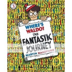
Comics Time: Where’s Waldo? The Fantastic Journey
July 7, 2010Where’s Waldo? The Fantastic Journey
Martin Handford, writer/artist
Candlewick, 2007 (this edition)
32 pages
$7.99
Buy all six Waldo books as a set for like $30
I didn’t give a lot of thought to comic art or illustration as a kid. Which in many ways means “mission accomplished” for the comics artists and illustrators I came across, I suppose. For readers that age, you want form to follow function–an exciting comic should look exciting, a funny comic should look funny. It wasn’t until I was much older that I was able to appreciate the books that had lodged in my head because their art did something more. The Scary Stories to Tell in the Dark series, illustrated by Stephen Gammell, was one example. Those pictures looked like the evil they depicted somehow leaked into the real world and corrupted the art itself.
The other big one, for me, was Where’s Waldo?, particularly this third volume in the series, which when I was a kid was called The Great Waldo Search. This is the one where Waldo travels through “the realms of fantasy,” as the slipcase of the six-volume set of Waldo books I bought for Christmas puts it, so that naturally put it more in my wheelhouse than the other two volumes that were available at the time I first came across it. And obviously Martin Handford’s loose, goofy character designs and slapstick sense of humor aren’t a world apart from the majority of cartoon art kids are offered. But what I found–and continue to find–so mesmerizing about this one is the way Handford conveys, in these eye-meltingly dense two-page spreads, a sense of permanent chaos. Each scene is a virtual (and in one case literal!) sea of jostling, arguing, fighting, laughing, playing, sleeping, eating, jumping, falling, flying, running, sliding, shouting, bodies. Streams of water, billows of smoke, rivers of fire defy gravity and snake around and through half a page. A single action causes a domino effect that brings dozens of warriors low. People celebrate a victory over the characters to their left, completely oblivious to the damage about to be inflicted on them by the characters to their right. Massive schemes to defeat rivals are always just on the verge of coming to fruition or heading for disaster. More than any other artist I can think of, Handford conveys a world of action, decision, coincidence and consequence within each image. You get the feeling that the conflagrations you’re seeing on each spread could last forever, an endless flow of action and reaction. In fact, the only other artist I know of who’s experimented with this sort of thing is Brian Chippendale.
And might there be a message in here, too? Fully half of The Fantastic Journey‘s twelve scenes involve armed conflict between rival groups. You can get lost in the maniacal detail and humorous quasi-violence of their battles for minutes on end, but an even larger part of their visual appeal is that the combatants are basically color-coded: Blue monks of water vs. red monks of fire, ferocious red dwarves vs. vaguely Asian knights who look like a weaponzied deck of Uno cards, evil black knights vs. green-skinned forest women, two enormous armies of dueling pastel knights, a posse of blue-uniformed monster hunters stalking their prey underground. The one exception pits villagers in rainbow-colored clothes against equally gaudy giants. A seventh spread involves four teams of ballplayers–blue, green, peach, and red–whose sport is just about as violent as any of the the actual battles. A state of obviously absurd conflict based on completely arbitrary distinctions? Come for the devilishly difficult puzzle aspect, stay for the impeccable visual satire.
Comics Time: Werewolves of Montpellier
July 5, 2010Werewolves of Montpellier
Jason, writer/artist
Fantagraphics, June 2010
48 pages
$12.99
You have to be a real expert in Jason-character physiognomy to even be able to tell that the lonely expat main character in Werewolves of Montpellier is sometimes wearing a werewolf mask. After all, the guy’s an anthropomorphized dog at the best of times. In the end, that ends up being the gag. You’re not some uniquely unlovable monster, you’re just a guy with problems, like anyone else–like the woman you love, for example, who cultivates a studied air of Audrey Hepburn cool yet still can’t prevent her girlfriend from cheating on and then leaving her. The problem with the book’s titular antagonists, it seems, is that they’ve dedicated their entire lives to their big problem, and are willing to kill and die for it. The violence that results is as random and awful as it always is in Jason comics, but the overall message about how to handle it–get over it and move on–is delivered with uncharacteristic humorous bluntness. There’s no percentage in making yourself more alone than you have to be.
Comics Time: Closed Caption Comics #8
July 2, 2010Closed Caption Comics #8
Erin Womack, Pete Razon, Lane Milburn, Zach Hazard, Mollie Goldstrom, Chris Day, Molly O’Connell, Ryan Cecil Smith, Andrew Neyer, Erin Womack, Eric Stiner, Conor Stechschulte, Noel Freibert, writers/artists
Closed Caption Comics, February 2009
80 pages
$8
Maybe you can buy it at the Closed Caption Comics blog someplace too, beats me man
This is the kind of comic that makes me excited to be into comics. The eighth installment of the Baltimore-based CCC’s flagship anthology resembles nothing so much as a great early Wu-Tang Clan posse cut, with all eleven (!) members contributing powerfully cartooned, hungry-feeling work that’s alternately funny, frightening, and fearless. Me being me, I was particularly struck by the issue’s sometimes dueling, sometimes intertwining apparent themes of horror and sex. In that regard the standout piece was by Conor Stechschulte, who turns in an absolutely brutal story of a circle-jerk gone horribly awry, augmented by his pitch-perfect evocation of a shadow-soaked suburbia. But on the flipside I laughed hard at the dirty jokes from Zach Hazard and Chris Day, the bathroom humor from Hazard and Andrew Neyer, and the monster-comic goofs of Lane Milburn (impeccably, muscularly drawn as always). Noel Freibert serves up maybe his most left-field EC Comics-inspired story to date, with some genuinely unpleasant and painful imagery; its rawness, ugliness, and reliance on bare, ropey line is like some sort of cross-artist call-and-response to the esoteric, almost mystical loveliness of the images concocted by Erin Womack, or the strange…I wanna say floral body-horror of Molly O’Connell. Eric Stiner channels Tom Gauld, Ryan Cecil Smith channels Brian Ralph channeling Tatsuo Yoshida, Mollie Goldstrom comes across like a maximalist John Hankiewicz, and Pete Razon submits some funny scribbles to round out the package. 80 pages, eight bucks, renewed faith.
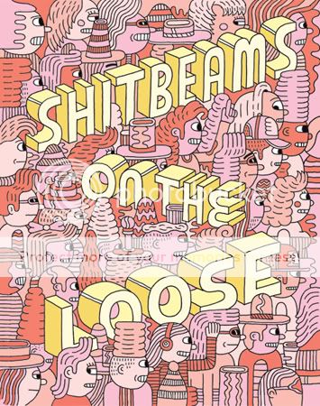
Comics Time: Shitbeams on the Loose #2
June 30, 2010Shitbeams on the Loose #2
Andy Rementer, Ron Rege Jr., Jason Overby, Dave Nuss, Andrew Smith, Hector Serna Jr., Brent Harada, Robyn Jordan, John Hankiewicz, Grant Reynolds, Ryo Kuramoto & Amane Yamamoto, Rusty Jordan, Luke Ramsey, writers/artists
Rusty Jordan, Dave Nuss, editors
Revival House, October 2009
60 pages
$9
I picked this up on the strength of that gorgeous Andy Rementer cover, which at the time I thought was by Ron Rege Jr. That’s actually a pretty appropriate way to have discovered this artcomix anthology, in which there are several pieces strong enough to make you think “hey, this was worth taking a flyer for nine bucks” and several others that you could mistake for the work of other cartoonists and then some stuff that you just move on by. I’m always up for new John Hankiewicz, and thus my favorite piece is his wordless sequence of four full-page images, which paint a quietly creepy portrait of some kind of dark domestic fairy-tale. It’s followed by some bravura inkwork by Grant Reynolds in service of a gruesome underwater flying-saucer sci-fi tale, peppered with non sequitur quotes in big block letters that feel like faintly received transmissions from the strip’s helmeted voyager. And I was tickled by both Dave Nuss’s look at the underpaid centurion who stabbed Christ in the side and the stylized drawing of “tubgirl” (google at your own risk) that Andrew Smith provided for the back cover. Beyond that? There’s some not-his-best stuff from Rege (really, this time), a “comic about comics” from Jason Overby whose visuals fail to live up to insight of the text, and some stuff that’ll remind you of Ben Jones, Matt Furie, Michael DeForge, Bald Eagles, you know, the whole wildandwoolier end of that scene. It’s inessential, but if you like this sort of thing, it’s the sort of thing you’ll like.
Comics Time: not simple
June 28, 2010not simple
Natsume Ono, writer/artist
Viz Signature/Ikki, January 2010
320 pages
$14.99
I’m gonna go so far as to say don’t waste your time with this one. Sure, the cover makes it look like an imported slice-of-lifer of the sort that’s at least surface-level appealing to American altcomix readers like me. But inside is a story so rife with tragedy, maudlin melodrama, and ludicrous implausibility it feels less like, say, Solanin and more like something you’d waste a couple Saturday afternoon hours watching on Lifetime. Its confusing intro at first makes the book seem like it’s going to be about a totally different person and scenario and then gets barely a dozen pages before lobbing the first in an onslaught of absurd coincidences, all of which come in lieu of a plot that emerges organically from character. When we finally do get around to telling the story of our protagonist Ian–a young man recovering from abuse and hoping to reunite with the older sister he suspects was secretly his birth mother–it quickly becomes clear that Ono’s art isn’t up to the task she sets up for herself, in which the characters’ appearances and who looks like whom are a major plot point. She’s not really making up for it with style or layout either: Her angular line and big-eyed emo-haired impossibly slim characters are pleasant enough for a time, but they wouldn’t look out of place in an undistinguished minicomic being sold at a MoCCA table, and her panels feel cramped and at times illogically placed. There’s a comparatively strong, thoughtful, intriguing subplot-cum-A-plot involving a young writer who befriends Ian with the intention of writing a novel about his tragic life but quietly falls in love with him. It nearly rights the ship, but only nearly, especially once it’s capsized once again by the most over-the-top plot twist of the lot. I’ll say this for the book: it reads like a breeze–even if that’s in part because the art is slight and you’re racing through the narrative since it doesn’t reward dwelling.
Comics Time: It Was the War of the Trenches
June 25, 2010It Was the War of the Trenches
Jacques Tardi, writer/artist
Fantagraphics, March 2010
120 pages, hardcover
$24.99
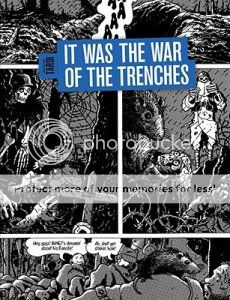
Just a few observations on the art here:
1) With the exception of the introductory story, this entire book features three tiered panels per page. In superhero comics this format is known as “widescreen”; it connotes power. It’s powerful here, too, but it’s a power to oppress and crush rather than soar or punch in action-movie style. They’re like miniature trenches.
2) In one memorable sequence early in the book, soldiers leap up from their trench and charge their opposite numbers. Their charge is depicted against a blank white background in lieu of any kind of detail for the sky or the horizon. You see men cut down by invisible bullets–no speed lines, no blurs, certainly no enemy firing.
3) One particularly strong page in the sequence uses panels of two soldiers leaning forward to sandwich a grisly shot of a soldier being blown backwards–hat flying off and blood streaming out behind him–by a bullet to the head.
4) Tardi’s art frequently piles detail on detail–meticulously researched trenches filled with the detritus of war, huge gatherings of massed soldiers in impeccably drawn uniforms and toting forests of guns and bayonets–but one thing he rarely if ever does is bury his protagonists in the visual cacophony. Flipping through the book, it’s impressive how he uses various tricks to pop them out from their surroundings. Most frequently, he’ll use the device of having people face directly out at the reader in weird little pseudo-portraits of them against their backgrounds. This is where the strength of his portraiture–his signature taciturn squinty-eyed stubbly everymen–comes in.
5) But he also uses a lot of forward motion, characters moving or leaning from the left-hand side of the panel to the right, serving as guideposts for your eyes and thus standing out to you.
6) It’s actually interesting to see the cases where people face right to left instead. I don’t think it’s always used for effect–it’s not like every single time is like that famous sequence from Safe Area Gorazde where Sacco drew people fleeing through a forest from right to left, “against the grain” of the reading experience if you will, to drive home the difficulty of their journey. But flipping through, I see some notable cases–a man seizing a suspected traitor, wounded Englishmen leaving the front, two soldiers from opposite sides of the conflict hiding out in a basement together, a soldier who gets lost in No Man’s Land sitting and trying to figure out which way to head…in most cases it suggests an inability to escape.
7) The whole book seems smeared with zipatone, dingy and dreary, like you’re being rained on. It makes the un-shaded parts–that attack sequence, a series photo-like images of the wounded and disfigured veterans toward the end–practically radiate from the page.
All of which is to say that this is Tardi’s thesis, as articulated in his foreword:
There are no “heroes,” there is no “protagonist” in this awful collective “adventure” that is war. nothing, but a gigantic, anonymous scream of agony.
…and but for my own personal history I’d be tempted to dismiss this as Captain Obvious territory. But the specific and unique awfulness of World War I is that trench warfare by its very nature highlights the pointlessness of the deaths of its participants: Untold thousands upon thousands of men standing up, moving forward a few feet, and being blown to pieces, gaining no ground, rinse, repeat for years on end. Add to this the French experience of many many soldiers being executed by their own side on entirely spurious or totally unfair accusations of dereliction of duty, a duty that was frequently impossible for them to execute. Tardi is brining very specific and very effective weapons to bear in his chillingly successful effort to convey this particular horror.
Comics Time: Peter’s Muscle
June 23, 2010Peter’s Muscle
Michael DeForge, writer/artist
self-published, May 2010
12 pages
no price listed
The second panel in this comic, a view of the buildings lining a city street–here, you can see it yourself–literally made me say “whooo” out loud on the train. Yeah, I’m quite frankly impressed as hell by what I’ve seen from Michael DeForge so far. This minicomic contains two nightmarish short stories, both of which pivot off of characters from popular comics (Spider-Man and freaking Foxtrot respectively) as is DeForge’s apparent wont, and they’re maybe the tightest things I’ve seen from him yet. The first involves Spider-Man recounting to his therapist a sex dream he had about Aunt May and Doctor Octopus; it’s not a “haha look the famous corporate icon is doing something dirty” joke, it’s a way to make this sort of uncomfortable Freudian stuff even more up-close-and-personal by using the familiar visual vocabulary of a hugely popular pop-culture staple to keep everything painfully simple to understand. The second shows a loinclothed character wandering through a wasteland whose geological features seem to consist solely of viscera, killing a phallic animal, and offering its disembowled corpse to the colossal, godlike, bifurcating head of a cute comic-strip kid. Again, this kind of “cute thing doing gross thing” material might read as overly broad in less skilled hands, but DeForge appears in complete control of his line, his figurework, his character designs, his backgrounds, his use of zipatone, his cartoony satirical representations of Spidey and Doc Ock and Aunt May, his pacing, his punchlines, his choice of nightmare imagery (sidewalk-as-thin-membrane is gonna be hard to shake when I walk to the comic shop today)…it’s very, very sharp, it does exactly what it wants to do.
Comics Time: Neely Covers Comics to Give You the Creeps!
June 21, 2010Neely Covers Comics to Give You the Creeps!
Tom Neely, writer/artist
I Will Destroy You, May 2010
24 pages
$6
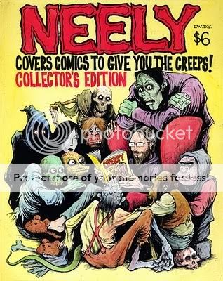
Tom Neely’s “cover versions” of various classic (or in some cases just old) horror comic covers have been a highlight of the Internet ever since he started putting them up on his site and on Robert Goodin’s never-miss-a-day Covered site. So naturally a collection of them is gonna be a treat if you’re into that sort of thing. But I think this minicomic is worth the price admission for more than just horror-hound eyecandy.
For one thing, it’s more like an eye-dessert cart, in large part due to the colors. People ought to be studying that lush midnight blue background in Adventures Into Terror, that sickly purple twilight in Beware the Clutching Hand and Unearthly Spectaculars, the candlelight effect giving way to a rich orange shadow in Creepy #79. That the comic’s paper holds them as well as it does is a testament to Neely’s skill as a self-publisher in addition to his instincts as a colorist.
For another, this collection is a sort of capsule version of the horror gospel according to Tom Neely. Not so much in the selections as in the interpretations, a picture emerges of what it is that Neely finds frightening; put simply, it’s the vulnerability of the body. His figures are both rail-thin and out-of-shape, a brand of body horror not far removed from black-and-white photos of the prisoners of Andersonville or Auschwitz. They grasp and point with arms that look like they could be snapped in half like twigs–honestly, Beware the Clutching Hand could serve as the title for Neely’s whole oeuvre. And there’s a horror of hair here as palpable as anything outside of The Ring. Weedy black locks cascade out from the heads of women like snakes and sprout from the heads and faces of men like anemones, suggesting an intense loathing of the way our bodies behave beyond our control. It’s like a zombie apocalypse perpetrated by sentient armpits and groins. All told, it’s much more than a series of kitschy nostalgic pin-ups. Creepy? You betcha.
Comics Time: Pluto: Urasawa x Tezuka
June 18, 2010
Pluto: Urasawa x Tezuka
Naoki Urasawa, writer/artist
Takashi Nagasaki, writer
Based on Astro Boy: The Greatest Robot on Earth by Osamu Tezuka
Viz, 2009-2010
Eight volumes
200 pages or so each
$12.99 each
I was over the moon for the first three volumes of Pluto, suspense mangaka Naoki Urasawa’s Watchmen-style reimagining of a classic Astro Boy storyline–and for precisely the same reasons lots of other smart critics weren’t. I love stories about emotionally wounded men (or in this case, robots) crying over the death of puppies and children. I love stories about people paralyzed by grief and loss. I love stories about people who lay it all on the line, and lose it all, to save other people, and then how those other people handle being the reluctant beneficiaries of that sacrifice. In a word, I love melodrama. If it involves robots, so much the better. And in Pluto, I felt for the first time that Urasawa was connecting with something more than mere story.
Ultimately the series fails to fully live up to the magical magisterial melodramatic pomp of that first volume. As I found to be the case with Monster (although certainly not to that extent), Urasawa’s technique of drawing out characters’ climactic realizations and confrontations for page after page eventually dilutes their impact. In this particular case, the murder mystery at the story’s heart ends up being solved in a fashion that’s both disappointingly straightforward in terms of motive and unnecessarily, distractingly complicated in terms of execution. And since this is a super-robot story, the climax must come about through combat, ironically the one thing that Urasawa’s visual vocabulary does not enable him to portray in the most thrilling of all possible ways; particularly given the environment in which the final battle takes place, it’s difficult to get a handle on where you are, what’s going on, or what the consequences for each beat might be. Like the characters whose fate will be determined by the battle’s outcome, you just have to take it on faith that the involved parties know what they’re doing and things will come out in the end.
That said, the robots, and their surreally obtrusive appearances in Urasawa’s meticulous blend of realism and slick cartooniness, never ceased to be a joy to look at and never stopped lodging themselves in my brain. The repeated use of flashbacks to horrible events that haunt the main characters had that same effect on me. I came to care about these people/”people”–well, more like I came to be intrigued by them. I wanted to find out what happened to them to make them the way they are, and for things to work out for them, and I was frequently surprised when things went bad way before I thought they would. And in the end I appreciated the book’s blend of deep, unshakable, even scientific pessimism about human nature with an impassioned insistence that we can reject that programming if we try–in a fashion that’s a lot more convincing than the similar moral throughline in Monster, by the way. It may not stick the landing, but it’s a thing of beauty in flight.

