
Without them I would not be here.
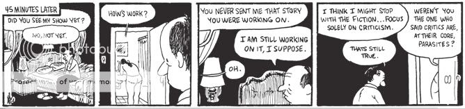
Comics Time: The Photographer
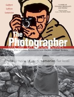
The Photographer
Didier Lefevre, story/photographs
Emmanuel Guibert, writer/artist
Frederic Lemercier, colors/layouts
First Second, 2009
288 pages
$29.95
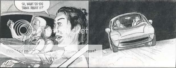
The high point of The Photographer is literally the geographical high point of The Photographer. After chronicling a Doctors Without Borders mission into the war-torn country–then occupied by the Soviet Union–lensman Didier Lefevre makes the ill-advised decision to leave his more experienced Western colleagues and return through the mountains to Pakistan alone. Abandoned by guides who barely knew the way themselves, Lefevre finds himself stranded at the summit of a mountain pass. In the gloom he desperately tries to make it through by nightfall, and is reduced to beating his exhausted, dying horse until he realizes neither of them can go any further. He bivouacs beneath his horse’s body, melting snow in his mouth in an attempt to stay hydrated, cursing his recklessness and the fecklessness of his escorts. Realizing that he will most likely never make it down the other side of the mountain, he writes a note to his girlfriend and then takes the most beautiful, dramatic, and chilling photographs of his journey, capturing his emaciated horse and the nightmarish wasteland that surrounds them, believing in his heart that they are the last things he will see. In the several pages that chronicle this most dire stretch of Lefevre’s memoir, artist Emmanuel Guibert manages to capture the photographer’s initial panic at being left alone in an unfamiliar place, contrasting his nervous movements and increasingly desperate drive to move on against the cold and motionless stones of the land and small dwelling where he was abandoned. And as Lefevre and his horse reach what he believes to be their final resting place, they are depicted solely in silhouette, black against the icy twilight blues provided by colorist Frederic Lemercier. The effect is a perfect evocation of Lefevre’s Sisyphean plight–frantic effort colliding with unyielding futility and ultimately despair. Gorgeous, frightening, powerful comics.
Alas, it’s one of the only sequences in the whole of The Photographer‘s 288 pages to which any of those four words apply. The story of Lefevre’s trip into and out of Afghanistan is plodding journey through a featureless wash of minutiae about his companions, their hosts, their jobs, and the land. Obviously, the choice to leech the proceedings of nearly any drama–save for Lefevre’s near-death at the mountaintop and a trio of gut-punch accounts of war-wounded children, nothing cuts through the haze of tedious detail–was a conscious one, meant to evoke the reality of life in a desperately poor and brutalized country, and how no grand Orientalist gestures are possible, only the quotidian work of traveling there, setting up shop, and treating those who can be treated. However, a flawless evocation of boredom is still boring.
Meanwhile, memoirists of conflict like Joe Sacco and Art Spiegelman have shown that dull horror can make for compelling comics. But Guibert’s work here is tough to classify as comics at all. Yes, there are panels, word balloons, caption boxes, but his visual contribution is essentially an unending series of stiff minimalist portraits that look like they were produced with a photoshop filter, or one of those dreadful animation projects that take live action footage and boil them down to a “cartooned” style. They demonstrate the story rather than tell it. Even on top of Guibert and layout artist Frederic’s lack of attention to image-to-image flow or to the composition of a page, big blocks of narrative text and the interspersal of Lefevre’s actual photographs all but prevent the effects of accumulative or juxtaposed meaning that are so crucial to the book’s nominal medium of comics. Backgrounds are frequently dropped altogether, replaced with a baffling, uncommunicative palette of pea green and acidic yellow; one rare sequence where backgrounds were present stands out for its wrongheadedness, with rocky terrain all but obliterating the conversation in which Lefevre argues the head of his expedition into letting him return by himself. That Guibert had it in him to produce that knockout climax makes the lack of energy and life in the rest of the book all the more depressing. Nobly intentioned though it may be, bad comics is bad comics.
Carnival of souls
* WHOA WHOA WHOA WHOA WHOA Jordan Crane, Sammy Harkham, and Ted May have a new webcomics site up in which pretty much every page of every Jordan Crane comic that isn’t The Clouds Above is available to read for free. HOLY SHIT. (Via Tom Spurgeon.)
* Tom Spurgeon’s interview with Chris Allen about Powers is my favorite installment in that books of the decade series so far. The way Chris unpacks what made that book such a stand-out, its place in Bendis’s oeuvre, the stuff he says about Bendis’s later Marvel work, the line about the three-man superhero-crime subgenre–really phenomenal. Meanwhile I’m saving Shaenon Garrity’s take on Achewood until I get around to a long-planned catch-up session with the strip.
* Jog’s Brooklyn Comics and Graphics Festival con report, part two of which is now up, is sort of like a holiday fruitcake in that there’s all sorts of shit jammed in there. Scans from various manga, an interview with Tucker Stone reviewing various comics, his own reviews of stuff he got at the show, actual con-report material here and there…
* Grant Morrison on Joe the Barbarian and Grant Morrison on Batman & Robin. Sounds like his 12-issue run has expanded to 16, not even counting the separate Return miniseries.
* Let Chris Mautner tell you which R. Crumb books to buy first. This is super-helpful.
* Kevin Huizenga’s “Postcards from Fielder” continues.
* I didn’t know Kate Beaton had this in her.
* When Old Gods create natural resources.
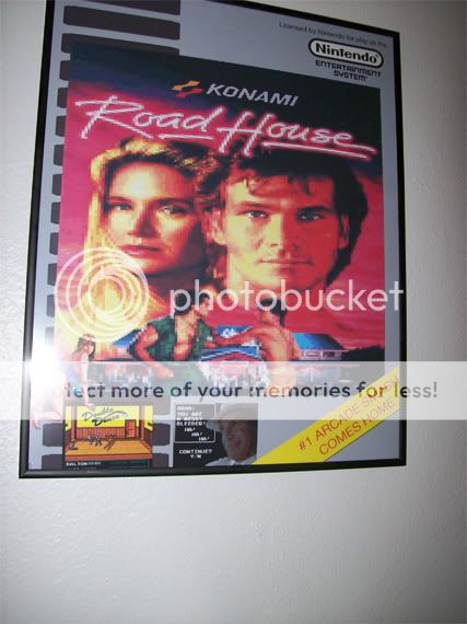
* Road House: the video game? Please tell me it had a “time to not be nice-o-meter.” (Image and link via Chris Ward.)

Comics Time: Naoki Urasawa’s 20th Century Boys Vols. 4 & 5
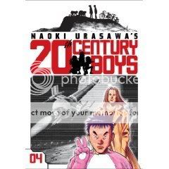
Naoki Urasawa’s 20th Century Boys Vols. 4 & 5
Naoki Urasawa, writer/artist
Viz, 2009
200 pages, Vol. 4
216 pages, Vol. 5
$12.99 each
There are two major developments in these installments of Urasawa’s cult-conspiracy thriller. The first is the introduction as a secondary protagonist of Wolverine. The gruff longhaired badass who plays by his own rules but has a heart of gold and so on–named Shogun, in case you didn’t pick up on his awesomeness–was technically introduced in Vol. 3, but here we find out who he really is, get an origin story involving a wise old sensei, and connect him to the main thread of action. The second major development, which is interesting because it upends the first, is a big honking shift of the whole territory of the story that came waaaaaay quicker than expected. I won’t spoil it beyond the spoilage that is announcing its existence, but it’s what longtime watchers of Lost might call a “game-changer.” And if you opt to look at Shogun as the Sawyer figure instead of the Wolverine figure, that may be even more helpful in terms of establishing just how expertly Urasawa plays with genre tropes, insofar as these same tropes would later be key to the greatest work of American pop/pulp fiction this decade. 20th Century Boys has a lot in common with Lost, a neutral observation that doubles as an endorsement.
PS for readers of the series: The first lyrics in T. Rex’s “20th Century Boys” are “Friends say it’s fine, friends say it’s good.” Ha!
Carnival of souls
* Tom Spurgeon keeps rolling out his holiday interview series on the books of the decade: Here’s Bart Beaty on Marjane Satrapi’s Persepolis, and here’s Kristy Valenti on Peter Maresca’s reprint of Winsor McKay’s Little Nemo in Slumberland strips, So Many Splendid Sundays. In both cases we have critics touting the greatness of works for which there was massive popularity and acclaim but against which there’s been something of a backlash. Of the two I think Valenti does a better job in making the case for Nemo‘s greatness–I would have liked to hear Beaty argue for Satrapi’s art beyond his assertion that the book’s gradually improving draftsmanship mirrors Marjane’s personal growth. But the story of Persepolis‘s reception in France and what it’s meant to L’Association was something I’d never heard, and it’s fascinating.
* Josh Simmons teases “White Rhinoceros,” the graphic novel he and Shaun Partridged will be serializing in MOME. Sounds staid and conservative just like all of his work. [/kidding]
* So does Ron Rege Jr and he’s always posting lovely images like this one on it.
* Aside from strange TCJ.com messageboard-style digression about the evils of assembly-line corporate comics that equates collaboration with corruption, this Ken Parille piece on Daniel Clowes’s Ice Haven–in its original form as Eightball #22, probably the best single issue of any comic ever–is quite good.
* Future time travelers have my permission to revisit me at any point throughout the preceding few years and read this to me aloud, punching me in the face once per word.
Comics Time: Naoki Urasawa’s 20th Century Boys Vols. 1-3
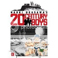
Naoki Urasawa’s 20th Century Boys Vols. 1-3
Naoki Urasawa, writer/artist
Viz, 2009
216 pages, Vols. 1&2
200 pages, Vol. 3
$12.99 each
I don’t like to read manga series until I have the whole thing. It’s not like superhero serials that are ongoing in perpetuity, or TV shows where the same thing is theoretically the case–these stories are serialized but they’re of a finite length, and I find that if I try to read a little here, a little there, I end up forgetting half of what’s going on by the time I catch up with later volumes. This isn’t really the fault of the material, mind you, it’s just because I’m not terribly bright.
Anyway, sometimes needs must, and so I found myself reading the three volumes of 20th Century Boys I have in my possession at the moment. (Without having Vols. 4-6, or god help me, without having finished Monster, since I’m missing about six volumes in the middle of the run and totally can’t remember what happened in the three or four volumes I already read. Like I said, not the sharpest knife in the drawer.) And this probably comes as a surprise to no one, but they’re a lot of fun. The story’s like a cross between Stephen King’s It and the Aum Shinrikyo Tokyo subway attack, with thirtysomething go-nowhere convenience-store franchisee Kenji discovering that the heroes-and-villains game he helped concoct as a kid is being used as a how-to manual for murdering people by a shadowy cult, most likely led by one of his childhood friends. The drill so far is one of watching bodies pile up and the revelations slowly accumulate, often in sublimely unexpected ways. There’s at least one supporting character who gets offed way before I’d have seen it coming, a lot of the secrets are way more out in the open than I’d have expected them to be at this stage in the game (a lot of “so, now you know that I know what you know”), there’s a wooly subplot involving a psychic bum, there’s a very cool t-shirt-ready symbol for the death cult…a thrill a minute, baby, and dammit, I wish I had the other three volumes.
That said, I think what prevents the Urasawa I’ve read from springboarding off its obvious proficiency with genre into the realm of genuinely great art is that his actual art, his drawings, are strictly functional. Actually, that’s not quite the word for it. “Strictly functional” implies “merely adequate,” and it’s more than that. The visual storytelling is crystal-clear, which is a huge help for a mystery translated from a foreign language with its own cultural cues. The character designs are easy to keep track of even as childhood friends are reintroduced at a dizzying pace. The line is as slick as manga gets, retaining energy during quieter scenes like a coiled spring that boings back up during confrontations and action sequences. But it only has style in the sense that, say, your basic Hollywood thriller has: The goal of the art is to stay out of the way of the story. I’m reminded of Pia Guerra’s work on Y: The Last Man–Urasawa would never draw anything that stiff, of course, but that kind of nondescript conveyor-of-information-type art is the sort of thing that works really well for a comic with this kind of broad civilian appeal. Are you here for an art class, or are you here to find out if Kenji can save the world?
Carnival of souls
* Recently on Robot 6: Disney goes Juxtapoz, Chip Zdarsky tells us how to get to Sesame Street, Iron Man 2‘s trailer makes the movie look like a lot of fun, and long may Tom Brevoort reign.
* Tom Spurgeon’s Books of the ’00s holiday interview series continues with Frank Santoro on Mat Brinkman’s Multiforce. His earlier post on the book is worth a revisit too; I like how he differentiated the ways Brinkman and Brian Chippendale depict contiguous space, and how he shares my appreciation for Brinkman’s facility with scale.
* Speaking of Frank–Go, read: “Motorway from Roswell” by Frank Santoro and Bill Boichel. Tell me you don’t want to ride in that car.
* Dig on The Cool Kids Table’s “Our Comics Decade” series, in which Ben, RIckey Purdin, and Kiel Phegley discuss the comics that hit them hardest year by year.
* Here’s a fine Jeet Heer post on fine comics anthologies.
* Noel Freibert link #1: In the comment thread for my review of Freibert’s My Best Pet, he and I hash out the issue of animal cruelty in art.
* Noel Freibert link #2: “Even Death May Die”…Freibert and “the ghost of Howard Phillips Lovecraft” collaborate on a very cool text-comic hybrid.
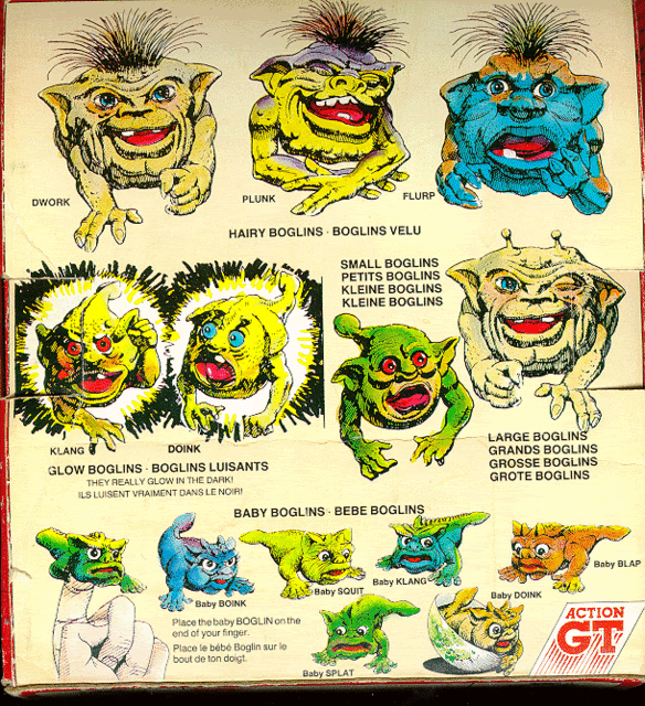
* Noel Freibert link #3: In the comments for this already awesome Monster Brains post about the great ’80s toy/puppet line Boglins, Freibert notes that both the Boglins and the decade’s other great toy/puppet/monster hybrid, the Sectaurs, were created by the same person, Tim Clarke. I can think of a couple people reading this blog who’ll flip out about this.
Comics Time: You Are There
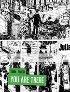
You Are There
Jean-Claude Forest, writer
Jacques Tardi, artist
Fantagraphics, 2009
196 pages, hardcover
$26.99
Wow, what a turnaround I made on this book in the space of a few pages. One of the perils of being so hung up about spoilers that you go into a book without even knowing what it’s about is that oftentimes it turns out you’ve got an idea in your head of what it’s about anyway, and that idea can be wrong. My only experience with Tardi was his adaptation of Jean-Patrick Manchette’s daylight-noir West Coast Blues, so when I saw a guy in a bowler hat standing there in a graveyard on the cover I figured “okay, a period-piece crime novel, like The Black Diamond Detective Agency or something.” Instead, right from the first page, you just get smacked with this torrent of verbiage from this daffy annoying tall skinny guy as he runs around atop the walls of some crazy little village opening gates for people. What the fuck is this?
It’s an absurdist satire, is what it is, and a pretty terrific one. And good God is it French. Once I realized what was up, my dim memories of Jarry and Ionesco and Beckett flickered one by one back to life. Delusions of grandeur, farcical authority figures, goofily symbolic names, talk talk talk that says nothing, all atop a fundamentally ridiculous premise.
Arthur There, the heir of a long-defunct line of aristocrats, has lost his ancestral estate but gained the legal right to erect walls between the properties of all the people who now live on it and control their comings and goings. Only by “control” I mean “run when they ring a bell for him to open the gate.” A Strangelovian element is injected when the president of France, on the verge of losing his bid for reelection, settles upon the unique legal status of There’s labyrinthine fiefdom as the perfect pretext for setting up a rival government-in-exile. He’d heard of the place thanks to Julie Maillard, the squint-eyed and slatternly daughter of the neurotic There’s chief rival–she once had a watersport-heavy affair with the President, though now her sights are set, for reasons obscure even to her, on There. And some other dudes too. It’s easy to picture it as one of those long-form fourth-season Monty Python episodes, with Eric Idle as There, Michael Palin as the President, and Carol Cleveland as Julie, if that helps.
So like I said, once I figured out what was up–once I realized that the dialogue was overwhelming and annoying on purpose, once I realized that the characters were deliberately ridiculous and their motivations purposefully flimsy and absurd–I was all the way on board. Kudos for that must go to Jean-Claude Forest’s full-bore commitment to writing like that. After a while it feels like the most natural thing in the world to watch There talk to himself on the verge of hysteria for paragraph after paragraph. But the real magic is in watching what Tardi does with Forest’s set-up. The fool’s kingdom of Mornemont is an unforgettable comic-book locale, and the riot of walls and fences and gates that crisscross it provide a perfect visual hook on which to hang the similarly profligate dialogue and nonsensical story. Tardi’s lanky design for There; his recurring motif of vertical stripes everywhere from the gates There opens to the wallpaper of his comically tiny house; his use of tall rectangular panels and layouts that emphasize the page’s verticality; truly masterful rainstorms and snowstorms–it’s seriously a master class on creating a sense not just of place but of a claustrophobic, chaotic, unsustainable state of mind. It isn’t hard to see this on your bookshelf next to Brian Chippendale, Mat Brinkman, or Hans Rickheit: environment and emotion are one and the same here as there. What’s more, the main effect is so clear that the contrasts are all the stronger: Mornemont’s white walls with the President’s black curtains; There’s googly eyes, stovepipe limbs, and funereal suit with Julie’s bovine expressionlessness, swooping curves, and frequently nude white body; the sealed-off snowglobe isolation of Mornemont throughout the book with the sudden border-smashing invasion by the outside world at the book’s climax. It’s a parade of comics effects astutely selected and deftly executed. Killer stuff, and more fun than you remember it from French class.
Oh the weather outside is frightful, but falling in love with a girl you met at Bible camp is so delightful
I’m told this is just a fortuitous coincidence, but on this very snowy Sunday Tom Spurgeon has posted an interview with me about Craig Thompson’s Blankets, the very snowy and very good graphic novel. This is part of a whole series of interviews Tom’s doing with various writers and critics, each one focusing on a particular “book of the decade.” I was surprised how much I enjoyed Blankets after several years away from it–if anything I appreciate it even more. It’s really different than most of what’s out there! Anyway I hope you enjoy the interview.
Comics Time: Plague Hero
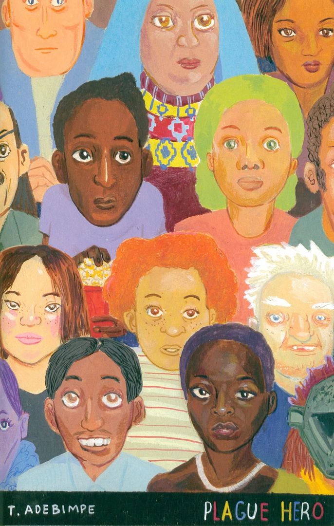
Plague Hero
Tunde Adebimpe, writer/artist
Suciotone, December 2009
28 pages
$4
I can’t find anyplace to buy it–let me know in the comments if you know of one
I’m not going to lie: I checked out the comic Tunde Adebimpe was selling at a table at BKCGF because of his day job. But come for the “Staring at the Sun,” stay for the, bright, fun, and effective painted fight comic. Printed on thick, glossy paper, Adebimpe’s paints really leap off the page as they illustrate his simple set-up, subtitled “A Few Notes on Being and Not Being Myself”: A pink horse guy and a green bird guy (his name’s Myself) square off from the left- and right-hand side of each spread in a boxing match narrated by a strip of playfully metaphorical first-person text running across the bottom. The anthropomorphic fighters are built like characters from an all-ages boxing video game, and indeed the simple two dimensional plane of the action reinforces that feel: Since all they can do is move forward, move back, and punch each other, it’s easy to feel like you’ve got a ringside seat to an all-action button-masher/slobberknocker. When the combatants land a blow, their wounded opponents explode with color at the point of impact; a similarly visually explosive cut to a pair of audience members (“prospective employers, future ex-wives”) manages to convey the roar of the crowd with similar effectiveness. Adebimpe’s writing bounces along with the hardboiled patter of an old-school sports columnist: “That’s when I decided to step in…and Reagan ’84 the poor jerk”; “It was our pan, and we were flashing.” In the end one of the fighters is declared the “WINNAH!” by knockout, which depending on how much you’re willing to play along with the Myself/Not Myself metaphor could Mean Something. But really it’s an exercise in convey action and movement through color and telling a story with a memorable voice–and a successful exercise at that. I hope to see more.
Carnival of souls
* I’m very excited to be a part of this year’s Best of 2009 critics roundtable episode of the venerable Inkstuds podcast. Tim Hodler, Chris Mautner, host Robin McConnell and I discuss Asterios Polyp, You’ll Never Know, The Photographer, You Are There, Multiforce, 20th Century Boys, Pluto, and George Sprott, and man did it fly by. We could have gone on for hours on a dozen more books. This was a real pleasure–thanks to Robin for the gracious invitation, and thanks to Chris and Tim, two of my favorite critics, for the conversation.
* Man, there are a lot of great comics being posted online lately.
* Forgot to link to it the other day, but Noah Berlatsky followed up his post on the problems with the TCJ.com relaunch with one focusing on Gary Groth’s irksome “welcome” essay. It’s funny: Many of the things Gary says about how hard it is to find critics online–and I mean literally find them, like the logistical process of locating critics–and how shitty nearly everything he managed to find was, he said before in the SPX Critics Roundtable in 2007, to widespread dismay on the panel (and in my case, in the audience). I mean, that’s pretty clearly his fault, not the Internet’s fault. I really figured the reaction to his statements of that sort at the panel, and the subsequent move of the Comics Journal from print to web in the first place, meant that he’d educated himself enough to change his mind. Guess not. It’s a bummer, because Gary is usually a rigorous thinker.
* Even a broken clock tells the right time twice a day: John Byrne sees that Wolverine-in-the-Hellfire-Club-sewer shot as the birth of the “momentist” school of superhero storytelling, though he obviously doesn’t use that term–the frantic attempt to capture in a single image everything awesome about a character. Actually I get the sense he’s complaining more about the splash-page-heavy pin-up-style ’90s Image/Marvel stuff, but the idea is the same either way. (Via Kevin Melrose.)
* On Robot 6 yesterday I wrote a post about Manohla Dargis’s recent complaints about the lousy status of women in Hollywood. It’s pretty freaking lousy.
* I was inspired to do this by several recent brouhahas in comics. To wit: This simplifies things to reductio ad absurdum levels, I’m sure, but it seems to me that the vituperative manner in which people are explaining that Marvel’s Girl Comics is a terrible idea is in fact evidence that it’s a great idea. I’m old enough and liberal enough to know that “affirmative action” is not inherently pejorative. All these comment-thread geniuses either deny institutional biases or shrug their shoulders and say whaddayagonnado, and then assert that any effort to redress this–anything other than women just up and writing superhero comics, just like everyone else, right this very moment–is sexism or reverse sexism. But the playing field is not level, and that assertion is ridiculous.
* Also this, from the aforelinked Heidi MacDonald post:
1) We really, really really need to move beyond Power Girl’s breasts, girls. It’s totally a distraction from actual progress. To the point where one prominent female blogger who blogs about those chachas all the time can’t even praise a female cartoonist without comparing her to a female body part. Isn’t it better just to sneak in mentions of female creators as if they were, y’know, NORMAL? Like I just did today elsewhere on this blog?
* Here’s another terrific quote, from Tom Spurgeon:
it looks like Marvel doesn’t know what to do with its Incredible Hercules series. I hate to backseat drive companies because I’ve barely made like sixteen dimes from working in comic books, but at some point it seems that if well-regarded series after well-regarded series is broken on the rocks of a market that won’t respond to them, you should start to look at changing the game board to be more receptive to such series as opposed to picking up a game piece you think might work better.
* And another great quote, from Rob Bricken:
Look, people who get mad at me for ragging on movies based entirely on their trailers and previews (cough Robin Hood cough) — that’s what trailers and previews are for. They’re made so you can see what a movie’s like, and hopefully, make you want to see it. Bottom line, there’s nothing in any of the Avatar promos that have ever made me want to see it — although, as discussed, the movie’s biggest draw is something that can’t be portrayed over a 30-second TV commercial.
Picking on the kind of people who get butthurt by posts at a site called Topless Robot is some low-hanging fruit, but I’m always game for sticking it to nerds whose low self-esteem and sense of entitlement drives them to paroxysms of rage any time anything they read doesn’t perfectly reflect their own preferences.
* This one’s a little too dense to quote, but I greatly enjoyed Charles Reece’s explanation of the role of irony in Ghost World, which I think is my least favorite Dan Clowes book, but I’d still never accuse it of trying to be cool. On the contrary.
* “A loaf of bread, a container of milk, and a stick of butter.” (Via Mike Barthel.)
Comics Time: Feeble Minded Funnies/My Best Pet

Feeble Minded Funnies/My Best Pet
Lane Milburn/Noel Friebert, writers/artists
Closed Caption Comics, December 2009
28 pages
$7
Hey, they can’t all be winners. The overall Closed Caption Comics aesthetic, to the extent that one can be pinpointed, has long appealed to me: handmade, rough-hewn, silkscreened, markmaking shit, the ballyhooed stylistic dead-end of Fort Thunder in action, you know the drill. In particular I’ve become a big fan of Lane Milburn’s mix of muscularly drawn monsters and uncomfortable humor, gags that yuk it up until it’s too late and you realize how black things have gotten. That takes a real precise mind and hand to pull off. That’s not what you get in Feeble Minded Funnies, Milburn’s half of this flipbook minicomic, however. Instead he apes the broad humor and colloquial rhythms of the undergrounds: parodic violence, torrents of obscenities, a hapless protagonist called Pukeball making his way through a disapproving world while narration hammers his satirical plight home, all that sort of thing. It actually got to the point (right around the swipe at an outdated grim’n’gritty superhero stereotype) where I wondered if this isn’t actually a parody of underground comix. You’d have to be a lot meaner to make that sort of thing work, though. Actually, has anyone ever done a really nasty parody of the undergrounds? I could use one. Anyway. Milburn draws the bejesus out of it all–someday I want to sit and just watch how he puts the bodies of one of his goons together on the page–but the stories and jokes his awesome drawings inhabit here fall flat.
On the flipside you have Noel Freibert’s My Best Pet, which is the story of a sociopathic child who tortures his pets to death told in a sort of camp faux-EC mode. Longtime readers of this blog can no doubt imagine my reaction. I really hate being so predictable about animal-cruelty gags–apparently this even came up in the humor-comics panel at SPX when I wasn’t even there–but for real: another cat in the fucking microwave? What is it that people get out of drawing cats being blown up in microwaves? Are there people who enjoy…okay, that’s a loaded term. Are there people who get something out of comics in which cats are blown up in microwaves? These are not rhetorical questions at all, by the way. I’m a person with a very high tolerance, a need even, for nihilistic horror, but this I don’t get. Like I’m fond of saying when I come across this sort of material, I’m okay with it when I feel as though the artist is attempting to elucidate something about cruelty. But the whole point of this comic, and it’s actually quite entertaining in this regard, is that it’s just going through the motions. Friebert depicts the asshole kid’s parents’ discussions about his plight without even bothering to put them on panel–it’s just panel after panel of exposition, like they can barely be arsed to show up and play their role in the strip. That’s very funny. And yet we get the cat’s oblivious mewlings as it’s placed in the microwave and its subsequent screams of pain in painstaking detail. I mean, fuck that, right? I’m not the only one?
Carnival of souls
* Founder of the mighty Fluxblog and friend of ADDTF Matthew Perpetua will be giving a lecture on Wolverine as part of NYC Nerd Nite at Galapagos in Brooklyn this Thursday evening at 8pm. I highly suggest you attend if you are a nerd. Here’s the scoop:
Learn how The X-Men’s Wolverine has evolved over the course of the past four decades and what each version of him says about both the people working with the character and the way audiences respond to variations of the same masculine fantasy. More so than most other superheroes, Wolverine has a particular appeal to insecure young men as demonstrated in overcompensation involved with the character, to subtle aspect such as how large people draw his claws…
If that doesn’t sound like a fine way to spend your Thursday evening then motherfucker I don’t know what to tell you. Buy tickets here.
* Is it just me or are a lot of altcomix heavy hitters doing webcomics lately? After yesterday’s powerhouse Huizenga/Rickheit/Nilsen trifecta, today you’ve got new comics at Vice from Sammy Harkham, Dash Shaw, and Johnny Ryan, plus my favorite installment so far in Nick Bertozzi’s long-running series of bizarre little captioned illustrations.


(Mostly via Spurge.)
* Frank Miller’s working on a graphic-novel prequel to 300 about the Battle of Marathon called Xerxes. Bring it on!
* Tom Neely’s selling those gawjuss horror covers he did. In the words of the Emperor, “You…want…this…don’t you?”
* Ben Jones profiled in The New York Times. That’s just wonderful. (Via everyone.)
* If I were President Lieberman I’d give Gilbert Hernandez a $50,000 grant every day!
* Five years and 2,000 pages of MOME! Congratulations to Eric Reynolds, Gary Groth, and the many contributors–that’s a real accomplishment, and MOME has provided me with a lot of enjoyment and food for thought over those years.
* Brandon at Are You a Serious Comic Book Reader? is right, and actually righter than he admits to being, in the aforelinked piece about how constant cliffhanger endings really fuck up the rhythm of 22-page serialized comics. They look lovely and read well but how I wish Sweet Tooth and Daytripper were graphic novels.
* Another piece of the Frank Santoro puzzle falls into place.
* Look at the bait-and-switch shit Marvel used to pull by hinting Wolverine would be in a comic in the ’90s. (Scroll down to the last cover.) Outrageous! Thank you, Cool Kids Table, the people need to KNOW.
* Meanwhile I screwed up my earlier link to the CKT’s Nova cover gallery so here it is again. And here’s the first installment in what augurs to be a lovely series of posts in which the CKT crew recalls comics that meant a lot to them for each year of the decade.
Carnival of souls
* I don’t care how much Joe Lieberman makes America his Snooki in the Jersey Shore reenactment that is his horrid, horrid life–any day with new webcomics by Kevin Huizenga, Hans Rickheit, and Anders Nilsen is a pretty good day.
* Matt Fraction and John Romita Jr. on Thor sounds pretty great.
* Jog does another one of those picaresque con reports/here are some other books he bought at or near or while thinking about the con reports/here’s a conversation he had with Tucker Stone reports he specializes in, this one loosely centered around the Brooklyn Comics and Graphics Festival.
* Wow, the writer’s bible for Batman: The Animated Series. I think virtually every week I worked at Wizard, when we’d go out to lunch at the Palisades Mall, I’d go into Best Buy and just stand there and covet the DVD box sets for that show. At one point I think I bought them but returned them the next day because I realized I wouldn’t get a lot of re-watching out of them. But for a long time, that was my favorite ongoing interaction with my favorite superhero.
* Matt Maxwell holds grudges against video-game enemies in World of Warcraft. I like that about him.
* Today on Robot 6: Wizard might be relaunching its website, The Comics Journal maybe needs to revamp its relaunch, San Diego tickets go on sale tomorrow, here’s a goofy Alan Moore photoshop, and here are some cool TV posters.

* Seriously, the new TCJ.com is pretty bad. Someone tell Gary Groth he can’t win just by showing up anymore.
Comics Time: City-Hunter Magazine #1
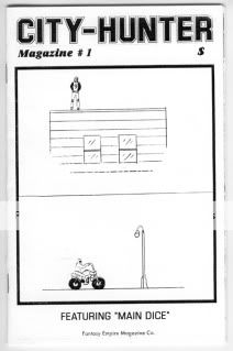
City-Hunter Magazine #1
C.F., writer/artist
Fantasy Empire Magazine Co., December 2009
20 pages
$3, I believe
I have no way of contextualizing this thing. It’s not Powr Mastrs, it’s not even a smaller and stranger but still-quite-obviously-a-minicomic minicomic like Core of Caligula. It’s billed as a “zine,” and there’s a comics sequence, yeah, but it’s mostly illustrations and sketches and doodles and a couple of goofy prose pages and a blown-up xerox of a piece of an issue of USA Today. As such? I still really enjoyed it. C.F. gains more from inscrutability than just about any other working cartoonist; at its best his stuff already has an air of mystery to it, so when stripped even from the relatively loose standards of his “proper” comics, the way he writes out phrases like “MANSION SOFT DRINK” scribbles them out, writes them over again, and follows them up with a stand-alone image of a person walking past a fancy-looking window toward a soda machine, say, takes on a whole new weight. Who the hell is “LUCIO” and why is his name taking up half a page? What does any of it have to do with those rather sexy bondage pin-ups–one of them in full color? Beats me, and that’s quite fine.
The things I could make sense of tickled me, at any rate. The titular strip, set up with a prose introduction by “editor” “Mike Rennet” (does he exist? does it matter?) about the need he felt to discover the big city when he moved to it, follows around a little dude in a memorably C.F.-ian jumpsuit as he walks around the city and just stand around in various places. It’s kind of Pythonesque in its vibe, though I’m finding it difficult to convey. All I know is that I laughed. Same with the second text piece, an editorial from Rennet about how if you live in the city you have to live it up:
Now if you’re reading this thinking I’m standing still in my own poison, mortified by my past and terrified of my future, you’ve got another thing coming. And that thing is my scared, angry fist, smashing through your apartment wall. Your messy, overpriced, uncool, apartment… wall. You’re going to shrivel up; because you don’t know anything about how to work this city, man.
It ends with an exhortation to check out the author’s Facebook page. I got my $3 worth out of this and that’s all the context I need.
Carnival of souls
* Today on Robot 6: Scott Allie talks horror and Tom Brevoort talks trash.
* Tom Spurgeon talks to organizer Gabe Fowler about last weekend’s very awesome Brooklyn Comics and Graphics Festival. Then he reviews Tales Designed to Thrizzle.
* Benjamin Marra tells his side of the Bowie Sketchbook story.
* Matt Maxwell reminisces over WoW, for real.
* Nova connoisseur Ben Morse presents his favorite Nova covers.
* Is this Jim Woodring’s best drawing ever?
Comics Time: A Drifting Life
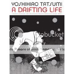
A Drifting Life
Yoshihiro Tatsumi, writer/artist
Drawn & Quarterly, 2009
856 pages
$29.95
I have a friend from college who every time I talk to him we’ll just end up talking about comics and music and movies, and then I’ll hang up and my wife will be like “Did you tell him about our new house?” or “I saw on his girlfriend’s LiveJournal they got a new dog?” and I’ll just have to shrug my shoulders, because there was no way we could fit topics like that into our discussion of Dragon Head or John Romita Jr. or whatever. This massive autobiography is like that: It’s about the joys of pure unabashed obsessive nerdery, the almost physical pleasure of talking and thinking and writing about and working on nothing but the art you enjoy. That makes it an easy book to like. So does Tatsumi’s appealingly simple and direct art, which like a McCloud thesis in action presents Tatsumi and a galaxy of manga-pioneering stars as lovable little caricatures you never get sick of watching and rooting for. And so does the history lesson about the Japanese comics industry that it inevitably teaches. Comics as a mass medium, comics as a legitimate art form, book-format comics, comics in a variety of genres for a variety of age groups and interests–nearly everything the American comics industry is only now achieving, and in some cases may actually never achieve, Japanese comics had already done decades ago. It’s like if we’d fought World War II against Hicksville.
The thing is, much of what makes it such an easy book to like also makes it a hard book to love. Tatsumi’s relentless focus on manga, its omnipresence as the focalizing device for the story, left me scratching my head about whether other aspects of his life really did intrude upon his writing and drawing as perfunctorily as he shows them doing here. I mean, just as an example, was this dude really that uninterested in getting laid throughout his teens and early 20s? There are of course a couple of nods in that direction but they just make the relative absence all the more conspicuous. Early in the book his family plays a larger role, which makes sense because he lives with them. But his brother (and frequent coworker and collaborator)’s illness, his parents’ loveless marriage, his father’s ne’er-do-welling–did they just go away?
What’s more, the book is more about the business of manga, and making a living in it, than it is about the art itself. For every page-long disquisition about the nature of the mature “gekiga” style of comics storytelling Tatsumi helped pioneer, there are dozens about catching a train to drop a manuscript off so that he can collect a paycheck from a publisher before they declare bankruptcy or whatever. That sort of thing is a lot of fun, don’t get me wrong–when I wrote my oral history of Marvel Comics I could have sat in Joe Simon’s apartment and listened to him ramble about him and Jack Kirby fighting with Martin Goodman for hours–but it’s not going to have the impact that really digging into what made young Tatsumi tick as an artist could have had.
Indeed, the book just picks up with li’l Tatsumi already a hardcore manga fan. We never learn what hooked him to begin with, and that’s an absence that’s reflected, in its way, right up until the end: The story cuts off abruptly as Tatsumi, literally swept into a violent protest against the government by a surging crowd, connects the anger of the protesters to the ingredient he’d felt had gone missing from his own work. I assume this was the last moment Tatsumi doubted his career path? Or perhaps it was the last moment he felt blocked as a writer or artist? It’s not clear why after 800-odd pages, this is where it all ends. Like the action kicking off in medias res in terms of Tatsumi’s love of manga, it’s an odd lacuna.
One of the insights we really do get into Tatsumi’s gekiga is that it’s intended as a type of minimalism, a sort of off-kilter spareness traceable to cinema and hardboiled American detective fiction. (Its lack of text made it an easy target for bluenoses, who said that any comics page that was two-thirds wordless or more was automatically immoral.) And the book’s definitely economical in the sense that it’s a no-nonsense flow of images and text smoothly propelling us from one thing to the next as Tatsumi’s career progresses. But the constant narration rarely gives story or reader a moment’s pause. Couple it with the “on this day in history”-type panels featuring highlights from Japan’s cultural and political evolution during this time, and it’s easy to feel like you’re skimming a life rather than drifting through one. (Which reminds me, if this is what passes for A Drifting Life for Tatsumi, whose sole, laser-like focus throughout is drawing manga for a living and who busts his ass day after day and year after year to make it happen, I’d hate to think what he’d make of me!)
I think A Drifting Life is a fine book. (I definitely like it a lot more than the kind of ham-handed violent O. Henry short stories I’ve read by him.) Reading it is a lot like plowing through a long run of a serialized comic in one go: It’s a delicious, I wanna say tactile experience, and the subject matter guarantees it’s time well spent if you love comics enough to read a blog like this one. You’ll recognize a lot of yourself in it. But I suspect that that recognition comes at the expense of revelation.
Who will love a David Bowie sketchbook?
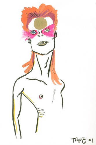
I’ve posted the latest round of David Bowie sketches I snagged at SPX and Brooklyn on Robot 6. You can see the sketches from all 80 artists in my Flickr set too. That’s Tunde Adebimpe above. Enjoy!