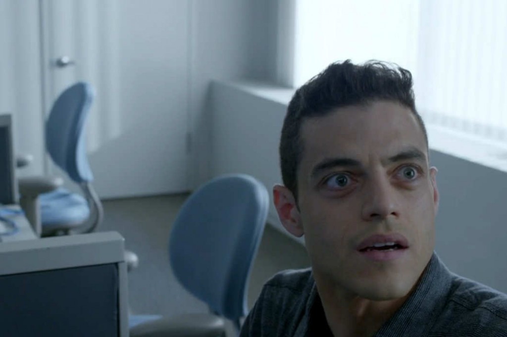
Fitting for a show about those occupying society’s technological substrata,Mr. Robot’s characters are often placed at the very bottom of the frame. This leaves massive amounts of headroom that suggests a great weight hanging over their heads, and echoes their isolation: When they’re talking right to each other, they seem alone. In more conventional filmmaking, conversations are cut with the characters looking at each other from opposite ends of the frame, leaving what’s known as “leading room” between their faces that helps convey the physical space they occupy. Mr. Robot inverses the norm by “shortsighting” the characters, positioning their faces at the edge of the frame closest toward the person to whom they’re speaking.
“Shortsighting is unnerving,” Campbell explains. “It further accentuates how fucked-up Elliot’s world is. The idea was to convey the loneliness. That’s the internal dialogue I had with myself: How do we tell that story? How do you get Elliot across?”
The effect goes a long way in selling audiences on the mounting paranoia and dissociation of the show’s main character, hacker Elliot Alderson (Malek). Without the usual pattern to help us intuit spatial relationships, these scenes create the sense that the characters don’t know where they stand in relation to one another. They also remind us of the picture-in-picture, face-against-flat-surface nature of video chatting, which can’t be overlooked on a show this attuned to the alienating effects of technology.
I spoke with Mr. Robot’s director of photography, Tod Campbell, about the show’s gorgeous shot compositions for Vulture. It felt great to write an article about television that focused on pure form. Woo!
Tags: interviews, mr. robot, reviews, tod campbell, TV, TV reviews, vulture

