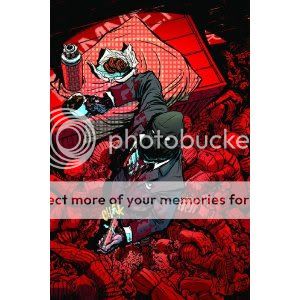
Dark Reign: Zodiac
Joe Casey, writer
Nathan Fox, artist
70 pages
in Dark Reign: The Underside
Marvel, 2010
256 pages
$24.99
Here’s a fun, nasty, wonderful-to-look-at comic about letting your freak flag fly, even or especially if that means murdering people. Yes, writer Joe Casey, who at this point has carved out a career in comics by dancing between other writers’ raindrops–he can afford to, since as a honcho at the studio that created Ben 10, he’s the one making it rain most of the time–is doing one of those “charismatic villain makes vaguely philosophical points about anarchy and society and shit while blowing stuff up” stories. And strangely, it works!
I think that’s because Casey keeps it so rooted in a villain-vs.-villain context, specifically the “Dark Reign” event Marvel did, in which former Green Goblin Norman Osborn assumed control of America’s defense, intelligence, and superhero infrastructure. Zodiac, who as best we can tell is just a guy in a suit with a bag over his head for a mask, sets out to be (in John McClane’s memorable description) “the fly in the ointment, the monkey in the wrench, the pain in the ass.” It’s not just that killing people represents the ultimate act of a free man in an existentialist world or something like that–it’s that seeing a one-time whackjob who rode around on a glider dressed as a goblin with a purple nightcap throwing pumpkin bombs at people suddenly become Donald Rumsfeld offends his sensibilities as a proud supervillain. That’s a way to sidestep the been-there-done-that philosopher-killer thing and bring out the fun of watching different bad guys smack each other around, something superhero comics can always do well.
It also helps that Zodiac’s design and raison d’etre owe so much to Christopher Nolan’s uber-popular Batman movies: He’s basically just Heath Ledger’s Joker dressed up like Cillian Murphy’s Scarecrow. Heck, Zodiac kicks things off by painting a sloppy smiley face on his mask (in blood, of course), and in the final issue all but quotes Ledger’s Joker: “What is being a super villain if not living a life of no rules?!” Why, he even blows up a hospital! (He also has scars, though he doesn’t ask anyone if they’d like to know how he got them.) Casey barely needs to paint in broad strokes, since we’ve already seen this particular painting. We can just revel in the Neveldine/Taylor-style grand guignol mechanics of it.
That’s where Nathan Fox comes in. Casey’s work has its adherents, but as with any writer, his stuff works best when he’s paired with a grade-A stylist. (Cf. Frazer Irving in Iron Man: The Inevitable.) Fox is certainly that. His work owes a great deal to Paul Pope’s, clearly–it takes Pope’s “What if ‘Guernica’ were a science-fiction action spectacular?” approach, dials down Pope’s Romanticism, and dials up the raw, testosterone-packed spectacle of it all. Considering how much ink is being slung around here, it’s really quite impressive how easy it is to parse both the action scenes (the Human Torch’s doomed attack on Zodiac’s goons is every bit as propulsive as a Human Torch attack ought to be) and the pacing (a scene at the Torch’s hospital bed flashes back to the attack and forth to his super hero visitors effortlessly). His character designs are a lot of fun, too: I’d imagine future Zodiac appearances will be made possible simply by Fox’s memorably rumpled take on him here, for example, while the existing heroes and villains we see–Torch, Ronin, the Wasp, Osborn’s Iron Patriot armor–stay on-model just enough for us to be able to appreciate the way Fox coaxes out the weirdness and aggressiveness of their original designs.
I also want to draw special attention to the colors of Jose Villarubia. It’s not just that they’re bright, buoyant, and practically glow off the page, particularly any time fire or explosions are required (which is often). It’s that flipping through the comic once again just now reveals an overall scheme at work: The heroes, represented by the Fantastic Four, usually appear in a world of blue, while Norman Osborn is red–as are the Torch and the giant robot Zodiac uses as a decoy at one point, i.e. the characters who engage in direct physical combat. Against these primary colors stands Zodiac, a dark and dingy brown and gray presence who eventually, for reasons I won’t spoil but which have to do with Marvel continuity minutiae so they’re probably not spoilerable anyway, glows with a sickly green. You don’t have to have read very many Vertigo comics to understand that that palette is supposed to represent edgy, grown-up concerns–it’s a simultaneous salute to and parody of Zodiac’s self-conception as the superior force to the brightly colored heroism and law’n’order ass-kicking represented by the prevailing order of heroes and villains. Which is something we’ve seen before, a lot, to be sure. But it’s fun to see again in this case, and fun is what matters.
Tags: comics, comics reviews, Comics Time, reviews

