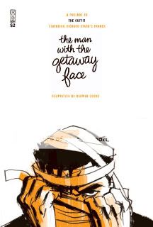
The Man with the Getaway Face
Darwyn Cooke, writer/artist
based on the novel by Richard Stark
IDW, April 2010
24 pages
$2
I never read The Hunter, the first in cartoonist Darwyn Cooke’s series of adaptations of Richard Stark/Donald Westlake’s Parker novels. As I’ve said before, on an aesthetic level I’m just not buying the ring-a-ding-ding Rat Pack nostalgia he’s selling. Moreover, to me the appeal of pulp has always been its deliberate economical unloveliness, so it’s weird to me to read a comic about a brutal killer lifted from the world of dimestore paperbacks that looks like a demo reel from a topflight animation shop. But I do recognize both the appeal of the source material and the pure chops of the adapter, and at just 24 pages and two bucks, The Man with the Getaway Face–an apparently short and sweet adaptation of the novel of the same and a prologue/teaser for the next full-fledged Parker graphic novel, The Outfit, and name–seemed worth a shot.
The result’s pretty much what I expected. It’s easy as pie to get drawn into a heist story, even one as knowingly prosaic as what Stark was up to here: Parker takes a job robbing an armored car during its guards’ regular stop at a roadside diner even though the money is barely worth the effort and despite knowing for a fact that one of his three coconspirators plans to steal his share, simply because he badly needs the cash following reconstructive surgery to hide his identity from the mob. Once the players and the plight are established, you race through Cooke’s panel-crammed pages (the lack of borders helps a bit in that regard, but they’re still pretty cramped given how much space-filling brushwork is going on inside each of them) to see how the scheme unfolds. And there’s certainly something enticingly Conan-like about Parker, a guy who feels no compunction about stealing if he needs money and killing whoever crosses him, but is just sort of steely about it rather than bloodthirsty.
That said, I really don’t get the appeal of populating a story like that with animation archetypes straight out of central casting, from the zaftig, flirty diner waitress to her tiny, balding, pencil-mustachioed patsy. The surgery subplot means that the Parker we see here is a complete redesign of a character Cooke already spent a graphic novel chronicling; an impressive feat with a strong payoff, but I wish the other characters shared his no-nonsense design. And it’s not as though that look and feel bring a ton to the action table, either. Not that there’s much action to speak of (just some guards getting coldcocked and a car crash), but from the angles to the choreography it feels like the goal is to make you say “ooh!” not “ouch,” let alone “Jesus Christ.” And that’s what I wanted, instead of it all being so…oh my god, am I really about to say this?…cartoony. I want pulp to be pulpy, you know? I don’t want it to look like Don Draper channeling Bruce Timm.
Tags: comics, comics reviews, Comics Time, reviews


2 Responses to Comics Time: The Man with the Getaway Face