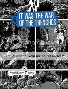
It Was the War of the Trenches
Jacques Tardi, writer/artist
Fantagraphics, March 2010
120 pages, hardcover
$24.99
Just a few observations on the art here:
1) With the exception of the introductory story, this entire book features three tiered panels per page. In superhero comics this format is known as “widescreen”; it connotes power. It’s powerful here, too, but it’s a power to oppress and crush rather than soar or punch in action-movie style. They’re like miniature trenches.
2) In one memorable sequence early in the book, soldiers leap up from their trench and charge their opposite numbers. Their charge is depicted against a blank white background in lieu of any kind of detail for the sky or the horizon. You see men cut down by invisible bullets–no speed lines, no blurs, certainly no enemy firing.
3) One particularly strong page in the sequence uses panels of two soldiers leaning forward to sandwich a grisly shot of a soldier being blown backwards–hat flying off and blood streaming out behind him–by a bullet to the head.
4) Tardi’s art frequently piles detail on detail–meticulously researched trenches filled with the detritus of war, huge gatherings of massed soldiers in impeccably drawn uniforms and toting forests of guns and bayonets–but one thing he rarely if ever does is bury his protagonists in the visual cacophony. Flipping through the book, it’s impressive how he uses various tricks to pop them out from their surroundings. Most frequently, he’ll use the device of having people face directly out at the reader in weird little pseudo-portraits of them against their backgrounds. This is where the strength of his portraiture–his signature taciturn squinty-eyed stubbly everymen–comes in.
5) But he also uses a lot of forward motion, characters moving or leaning from the left-hand side of the panel to the right, serving as guideposts for your eyes and thus standing out to you.
6) It’s actually interesting to see the cases where people face right to left instead. I don’t think it’s always used for effect–it’s not like every single time is like that famous sequence from Safe Area Gorazde where Sacco drew people fleeing through a forest from right to left, “against the grain” of the reading experience if you will, to drive home the difficulty of their journey. But flipping through, I see some notable cases–a man seizing a suspected traitor, wounded Englishmen leaving the front, two soldiers from opposite sides of the conflict hiding out in a basement together, a soldier who gets lost in No Man’s Land sitting and trying to figure out which way to head…in most cases it suggests an inability to escape.
7) The whole book seems smeared with zipatone, dingy and dreary, like you’re being rained on. It makes the un-shaded parts–that attack sequence, a series photo-like images of the wounded and disfigured veterans toward the end–practically radiate from the page.
All of which is to say that this is Tardi’s thesis, as articulated in his foreword:
There are no “heroes,” there is no “protagonist” in this awful collective “adventure” that is war. nothing, but a gigantic, anonymous scream of agony.
…and but for my own personal history I’d be tempted to dismiss this as Captain Obvious territory. But the specific and unique awfulness of World War I is that trench warfare by its very nature highlights the pointlessness of the deaths of its participants: Untold thousands upon thousands of men standing up, moving forward a few feet, and being blown to pieces, gaining no ground, rinse, repeat for years on end. Add to this the French experience of many many soldiers being executed by their own side on entirely spurious or totally unfair accusations of dereliction of duty, a duty that was frequently impossible for them to execute. Tardi is brining very specific and very effective weapons to bear in his chillingly successful effort to convey this particular horror.
Tags: comics, comics reviews, Comics Time, reviews

