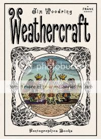
Weathercraft
Jim Woodring, writer/artist
Fantagraphics, April 2010
104 pages, hardcover
$19.99
Wow. And you thought Wilson was mean-spirited!
Part theater of cruelty, part joyous liberating revolution, Jim Woodring’s freakishly beautiful Weathercraft is at once the most direct and most elliptical of his Frank comics that I can remember reading. In its pages, Manhog, the half-human half-pig character who’s the Frank-verse’s avatar for the physical side of the id in the same way that funny-animal Frank represents consequences-be-damned curiosity and leisure, is made to physically suffer like you’ve seen few comic-book characters suffer before. Yet due to circumstances just as beyond his control as the passion he’s put through, this trauma leads him to an enlightenment that defies the spacetime continuum as he channels his newfound understanding into righting wrongs small and large. Yes, the cosmic reset button is hit at the end–this is a Frank comic after all, and it needs must remain static just as the Krazy/Ignatz/Offisa Pup triangle does. But until then, you’ve got a comic that’s both so confrontationally visceral and brutal that I almost put it down a couple of times, and one that’s such a visual and narrative strange-geometry dodecahedron that I compulsively read all the jacket copy upon finishing the comic just to make sure I had the first clue what the hell had just happened.
I think perhaps the most underrated weapon in Woodring’s artistic arsenal–certainly the one that had the greatest and most unexpected impact on me in this book–is, of all things, his panel borders. As you picture a Woodring Frank comic in your head, you’re probably seeing those wavy, buzzy lines that comprise his backgrounds, looking like a mosquito in your ear sounds; or perhaps those overripe plant-animal-mushroom-deity hybrid visuals, which explode the narrative at regular intervals. Unless you were paying specific attention to them, my guess is that if you were asked to describe Woodring’s panels, you’d say they were wavy themselves, maybe even prone to the baroque. But lo and behold, they are rigorously ruled rectangles and squares; on any given page, their borders are the thickest line to be found. I know I’ve written in the past that the presence of panel borders makes it difficult for comic horror to infect your nightmares; I still think that’s true, but in the moment, they can have–as they do here–an almost subliminal effect on your reading experience. No matter how woozily psychedelic each image here is, those big thick blocks tell you that something heavy is happening, something scary and indelible. Even in a Frank story; even in a Frank story where the characters’ nemesis Whim–that evil grinning guy who looks like a cross between Old Scratch and the moon-faced guy from those old McDonald’s commercials–reveals his all-powerful true self like the Sentry in Siege #3 and melts the reality of his enemies; hell, even in a Frank story in which a pair of new characters who look like something out of Stephen King’s Dark Tower series play Dark Tower-style games with the very fabric of their fictional world’s reality–even in stories like those, those panel borders communicate “Not a hoax! Not a dream! Not an imaginary story!” It makes Manhog’s torment all the more awful, and his triumph, however fleeting, all the more awesome.
Tags: comics, comics reviews, Comics Time, reviews

