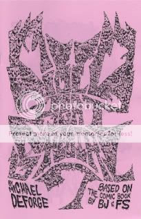
Cold Heat Special #7
Michael DeForge, writer/artist
PictureBox, September 2009
12 pages
I don’t remember how much it cost
Browse the Cold Heat shop, where it’ll probably end up eventually
Band logos are an interesting thing, and when they succeed at visually representing a band’s musical and aesthetic project, a pretty awesome thing. Which makes a lot of old-school heavy metal logos a baffling thing–instead of offering a clear, brandable distillation of the band, they’re often illegible to the point of incomprehensibility. (Spend some time on Obsidian Obelisk and you’ll see what I mean.) I suppose this is a tip of the hat to the uncommercial, underground nature of much of that music–it’s so not for you that the masses can’t even make out the band name. (“Songs for the deaf–you can’t even hear ’em!”) My favorite recent example of this aesthetic cropping up in comics is Rinzen’s title design for Paul Pope’s Batman Year 100, which combines past stabs at shaping the word “BATMAN” into a logo with an unmistakable and acknowledged metal vibe.
Michael DeForge’s Cold Heat Special combines this with a project that stretches the boundaries of “comics” in much the same way as Kevin Huizenga’s minicomic Untitled. That book was little more than page after page of scribbled, rejected names for Huizenga’s then-upcoming solo series Or Else. And though its contents were almost entirely text, it was at least as much intended to be viewed as read; like any comic, its contents accrued meaning through sequential juxtaposition, building into a memorable exploration of the creative process and the by-definition arbitrary nature of assigning signifiers to the signified.
DeForge’s work here is different, to be sure. For starters, it’s very, very metal: His eye-meltingly ornate band-logo versions of the names of various Cold Heat characters (including, of course, the pivotal noise band Chocolate Gun) frequently rely on motifs that evoke thorns, spikes, bodily fluid, scales, horns, lightning, fire, and in one memorable case a fist with the name spelled across the knuckles in spilt blood. It’s a far cry from Huizenga’s no-nonsense all-caps lettering. It’s also a far cry, in a lot of ways, from the aesthetic I tend to associate Cold Heat with: the hazy sensuality of shoegaze. It’s way more Cannibal Corpse than My Bloody Valentine. (There’s also at least one explicit homage that I caught–the lettering for Black Sabbath’s Masters of Reality, not to mention 1000 Homo DJs’ Supernaut EP.) But what this explosive, offensive, savage designwork does get at is the importance of POWER to the Cold Heat project: The violent power wielded by the sinister Senator Wastmor, the emotionally liberating power of Joel Cannon’s music, the self-discovery of internal power by our heroine Castle, and so on. It also reinforces Cold Heat as a sort of samizdata, an attempt to recreate the magic of the “lifeline music” that got us through our teenage years and the handmade, ramshackle media, from zines to mixtapes, that chronicled that community. Logos like these are meant to communicate just how important and immediate and irrepressible the art they’re a stand-in for is to its makers and consumers. In the context of Cold Heat, they make more sense than you’d think.
Tags: comics, comics reviews, Comics Time, reviews
