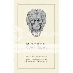
Mother, Come Home
Dark Horse, November 2003
Paul Hornschemeier, writer/artist
128 pages
$14.95
Buy it used through Amazon.com
Originally written on March 3, 2004 for publication by The Comics Journal
2003 saw the release of gargantuan tomes like Palomar, The Frank Book, and Blankets, so it might seem facetious to claim that the year’s most ambitious graphic novel was a 128-page paperback. But how else to describe Mother, Come Home, a book wherein author Paul Hornschemeier’s formidable formal mastery is harnessed to an even more consciously grand personal tragedy? This is the kind of storytelling that’s as likely to fall flat on its face as it is to fly. Hornschemeier’s willingness to throw the full weight of his skill into this task is what ensured the latter outcome.
Originally serialized in the author’s Forlorn Funnies series, a more narrative-minded follow-up to his experimental one-man anthology Sequential, Mother tells the story of Thomas Tennant, a preternaturally conscientious seven-year-old dealing with the death of his mother and his father’s subsequent disappearance into his own broken mind. Interstitial titles set up the conceit that the novel is merely the “introduction” to a larger work, the first “chapter” of which is to be called “We Are All Released.” In this alone–that is, in grafting an unnecessarily complex framing device onto the story in order to deliver the four-word message of hope at the book’s end–Hornschemeier’s artistic fascination with the tension between control and freedom is evident.
It’s a tension that’s at work on every page. The cartoonist’s considerable skill in graphic design manifests itself in a panoply of geometric intra-panel layouts–boxes bisected by a furrowed brow, the edge of a door, the bend of a telephone receiver. It’s not specific images that stand out upon reflecting on Hornschemeier’s art, but unexpected diagonals and rounded corners, a sort of poetry of shape. But when Thomas retreats into his fantasy life, this everything-in-its-right-place precision is forgone for scratchy, simplistic, childlike linework. The escape Thomas plans for his father is made manifest in the boy’s own dreams.
Much has been made about Hornschemeier’s skill as a colorist, and his work in that department is every bit as deft as you’ve heard, but his lettering merits special mention. Throughout the book, the characters’ words are subtly dwarfed by the word balloons that contain them. This simultaneously suggests a certain generosity of spirit, a yearning for something more than what is being expressed, and a recognition of the futility and smallness of language to deal with the immensity of the suffering going on beneath, and on, the surface. (And it does so on the parts of both the characters and the creator, by the way.) Individual moments linger, too: Within the father’s fantasy, it’s the comments that seem the most casual which expand to fill their entire panels, conveying a sort of frantic off-handedness that smacks also of denial; lower-case lettering slips off-line and expands in manic curlicues, perfectly conveying Thomas’s hysteria upon realizing he’s alerted his uncle to his father’s breakdown. Meanwhile, the simplicity of the captions’ lettering offsets the occasionally baroque prose (perhaps bulletproofing the book against the kind of criticism occasionally leveled at Craig Thompson’s similar linguistic stylings in Blankets).
What elevates the book from graphic-designers-gone-wild wankery, though, is the way these devices perfectly complement and convey the values of the narrative. As Thomas and his father’s family falls apart, the two of them adopt a succession of tactics–a lion mask, a retreat into solipsism, a rigorously followed “groundskeeping” routine, a residential treatment facility, methodical escape plans–to exert control over the unbearable chaos of their lives, precisely for the purpose of freeing them from it. The tension-breaking achieved on a formal level by Hornschemeier’s occasional insertion of exhilarating out-of-nowhere experimentation (the floating fantasy introduction; the full-page jacket-cover illustration for another book with a tendentious relationship to the story itself; the nighttime views of the book’s sleeping characters, from the most important to the most obscure) is echoed on the narrative plane by flashes of humor (Thomas’s hilarious smackdown of his teacher makes up for her somewhat unrealistic (and unforgivable) behavior) and immensely warm pathos (the exchanged glances between a smiling Thomas and a scowling nurse are worth the price of admission alone for their heartbreaking directness). It culminates in a climax that by all rights should seem ham-fisted and forced, and yet works, emerging as it does from intensely intimate (and therefore immediately understandable) details of touch and sight and (not) taste–tiny, sensate building blocks of calamitous inevitability. What hints of too-neat tragedy remain are torn to pieces by the book’s final words, and the forward-looking eeriness of the image that accompanies them.
Mother, Come Home is the work of a young cartoonist who, confident in his craft, decided to do something big with it. For his ambition alone–which, thankfully, is far more common amongst his cartoonist peer group then its reputation as a collection of coasting glad-handlers would have it–he is to be respected. For his success–his indelible, beautiful, and heartrending graphic novel, the type of book for which the phrase “auspicious debut” was invented–he is to be celebrated. His book is a joy to read; the fact that this is a feeling forbidden to the characters therein makes it all the sharper, and sweeter, and harder to forget.
Tags: comics, comics reviews, Comics Time, reviews


One Response to Comics Time: Mother, Come Home