
Posts Tagged ‘Koyama’
Comics Time: Baby Bjornstrand
September 3, 2014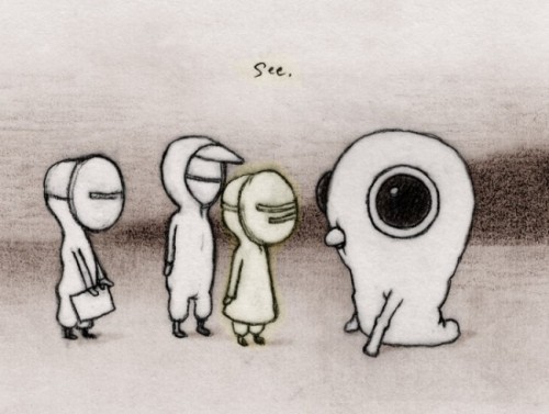
A thing comes into three lives, without warning or explanation. A thing leaves those lives in much the same way. The time between: Baby Bjornstrand, the new Renee French graphic novel completing and collecting the webcomic of the same name. In the past, I’ve written that the hazy, watery wasteland inhabited by Baby Bjornstrand‘s masked, hooded protagonists and monstrous fauna evokes a post-apocalypticism that is, if not belied, then at least transfigured by the comic tone of the proceedings. Now that the series is finished, that’s only true to a point. As the uniform proscenium staging of its panels suggests, Bjornstrand remains much closer to Samuel Beckett than Stephen King, despite French’s astonishing proficiency with painstakingly penciled menace. Yet its morose ending has a bite that doesn’t require the jaws of a monster.
I reviewed Baby Bjornstrand by Renee French for The Comics Journal.
Comics Time: WunderKammer No. 1
June 27, 2011
WunderKammer No. 1
Nicholas Di Genova, writer/artist
Koyama Press, 2009
24 pages
$8
Read about it at Koyama
Theoretically you can buy it at Nicholas Di Genova’s website but I can’t get it to load
Buy it from Atomic Books
Visit Nicholas Di Genova’s blog
In googling for images and purchase links for this compendium of animal drawings by Nicholas Di Genova (of whom I was previously aware as a fellow resident of Partyka‘s periphery), I came across a post on a New York City art blog that took a faint-praise approach to Di Genova’s art but was really impressed by this so-crazy-it-just-might-work innovation he’d had of printing his pieces in a cheap, floppy book. Imagine that! So god knows what the fine art world (I feel like that should be in scare caps — The Fine Art World) makes of this stuff, and this way of presenting it. To me it’s a comic book, and a stunner. Di Genova specializes in drawing braying, barking, growling, blank-pupiled animals of all shapes and sizes and species, including many that don’t actually exist, in a riot of accrued maximalist detail. Each of his dogs, bears, rams, wolves with ram horns, bears with bird heads, two-headed turtles, tyrannosaurus rexes with zebra coloration and manes, three-eyed gorilla/bat hybrids and so on appear to have been constructed by carefully gluing little rectangles and circles and lines together, the way chainmail is constructed one link at a time. Only here the construction doesn’t necessarily seem chained together, so you’re left half tempted to shake the book like a snowglobe to see if the constituent parts resettle in new shapes to create a new bestiary. Di Genova repeats this dizzying effect in macro via pages that consist of massive grids of animal heads, one breed/species after another, one head per borderless panel — dogs, birds, and frogs each get their own page here, but there are plenty of smaller grids featuring turtles, bears, bats, rodents, and god knows what else. I found my eye zipping back and forth from line to line in an S-shape a la Brian Chippendale, the better to take each incredibly detailed head in without missing a beat. The pages featuring the smaller grids often come across like some sort of alternate-universe Chris Ware suffering from Audubon-inspired monomania: A large portrait of an animal will be connected to a grid of tiny ones with a diagrammatic line, or encircled and radiating off smaller drawings like the spokes of a wheel. A relationship, even a narrative, is implied through these devices; the fun is figuring out what the hell they could be. And while we’re on the subject of the visual language of comics, Di Genova comes up with the best technique for depicting the non-verbal vocalizations of animals I’ve seen maybe ever: tiny word balloons completely colored black. Whether it’s a bark, a tweet, a ribbit, or…whatever sound turtles make, it works.
The book’s centerpiece, literally and metaphorically, is the spread where Di Genova’s project is at its most basic and blunt: 702 butterflies, each as unique as a snowflake, in a 27 x 26 butterfly grid bleeding right off the top and bottom of the centerfold spread. The effect is at once overwhelming and inviting: I was dazzled by the variety present in nature and intimidated, almost horrified, by the artificial reproduction of that natural variety. At the same time, I simultaneously resigned myself to never really being able to take in the whole of the image and diving right into the spread to soak up as much as I could…and I distrust pat “as above, so below” interpretations, but what the hey: There you have it.

Comics Time: Lose #3
May 18, 2011 Lose #3
Michael DeForge, writer/artist
Koyama Press, May 2011
pages
$5
Buy it from Michael DeForge
It’s one thing to take a Chris Ware/Daniel Clowes middle-aged sad-sack comedy of discomfort and plop it into a slime-encrusted anthropomorphized-mutant-animal-inhabited post-apocalyptic hellscape that looks like Jon Vermilyea staging a Teenage Mutant Ninja Turtles revival in the middle of Cormac McCarthy’s The Road. It’s quite another thing to do this well. And it’s still another thing to do it so well that while the whole is indeed more than the sum of its parts, the parts work all on their own, too. That’s the achievement of Lose #3, the latest installment in Michael DeForge’s old-school one-man alternative comic series.
In past issues, as well as in his minis and anthology contributions, DeForge has proven adept at crafting razor-sharp embodiments/lampoons of what have been termed “first world problems” and placing them in the mouths of fantastical, outlandishly designed and drawn creatures and monsters and superheroes and giant mecha and what have you. (“I feel like things have been weird between us lately,” reads the image of the shaggy faceless beast rolling around on the ground — that sort of thing.) And he does that here, too, to cringingly devastating effect: The text for the opening one-pager is a letter from a fresh-faced intern high on his first trip to NYC to his mother back home (“I asked if there were any paid positions opening at the magazine in the fall. They said things were still up in the air for now. Fingers crossed, I suppose!”), juxtaposed against the images of a naked man riding a spotted deer through a debris-strewn wasteland in order to pour the coffee he purchases at a still-standing chain coffee house into the maw of the creature that lives in his cave. Toward the end of the collection, ants wax pessimistic about life in these weird, dark times (“But, like — why do we live this way? It’s — it’s nuts that this is the ‘norm’ for us,” says an ant about the potential for human beings to burn them with magnifying glasses) and debate whether or not to move the dead body of a friend when its pheromones start attracting a crowd (“Just leave it. It’s a party”) Even in the main story, there’s a bit where the two teenage sons of our divorced protagonist talk about The Wire that nails the clichés of that particular conversation so accurately even without mentioning it by name (“The show introduces a new part of the city at the beginning of each season, so it’s always, like, BOOM! Bigger picture! BOOM! Bigger picture! You know?”) that I wanted to delete my old blog entries about the show.
The innovation of “Dog 2070,” Lose #3’s centerpiece story, is, well, that it’s a story, a look at a very shitty month in the life of a middle-aged flying-dog-man-thing. He concern-trolls his ex-wife over her current husband, his attempts to connect with his teenage and twentysomething kids are rebuffed with casual cruelty, he fixates on his own problems to the pint where he can’t empathize with cancer patients, his neurosis leaves him equally unable to spend his time at the computer productively writing or unproductively masturbating, he drunkenly confronts his middle-school son’s ex-girlfriend after a cyberbullying website the kid made about her nearly gets him expelled from school, he ends up in the hospital after a freak gliding accident. It’s easy to focus on the yuks here, which are abundant in the same way they are in Wilson or Lint — the sudden reveal of our hero Stephen’s inebriation when talking to his kid’s ex is impeccably timed to elicit an “Oh, Jesus” guffaw, and DeForge nearly always chooses dead-on details to illustrate the guy’s creepy self-absorption, from giving his ex-in-laws gifts on Thanksgiving just to stay in their lives to interrupting a conversation about a co-workers chemo to announce he’s begun therapy as research for his screenplay. (The flying scene, in which a soaring Stephen sums it all up by saying “Sometimes it’s as if I forget we’re able to glide!,” then crashes into a bird, is a bit on the nose, though.) But DeForge reveals the true emotional stakes in a pair of dream sequences as recounted by Stephen to his therapist. In the first, we watch the flesh slowly slough off his daughter, who recently attempted suicide, before she fades away from view; in the second, he and his former family, reduced to four-legged animalistic versions of their anthropomorphized selves, fight over a scrap of meat. “I just feel so ashamed I don’t know why. I’m watching it and I just feel awful.” This, of all the notes he hits, is the one he chooses to leave us with, a nightmare representation of a failing man’s worst fears and shames, to which he has no adequate response and to which no adequate response is provided. That’s when you realize that these emotional stakes have been present all along, hiding in plain sight: In the omnipresent beads of sweat oozing down Stephen’s fleshy body, in the debris-strewn streets and burned-out buildings that form a backdrop for the story, in the walls that seem to sweat and drip and bleed themselves. Something is wrong, the art says, even as the narrative chronicles the banal travails of a relatively normal guy. DeForge doesn’t need to come right out and say it himself. Lose #3 isn’t the bolt-from-the-blue paradigm-shifter I’ve seen some people describe it as, but it’s a confident enough comic that it doesn’t need to be, pushing its author out of his comfort zone only to discover he’s perfectly comfortable here, too.
Comics Time: Spotting Deer and SM
February 4, 2011

Spotting Deer
Michael DeForge, writer/artist
Koyama Press, December 2010
12 pages
$5
Buy it from Michael DeForge
SM
Michael DeForge, writer/artist
self-published, December 2010
12 pages
I forget what it cost
“Although physically similar to a common white-tailed deer (Ocoileus virginianus), the spotting deer (Capreolus vulgaris) is actually a kind of terrestrial slug.” So begins the first of two short, creepy comics debuted by Canadian wunderkind Michael DeForge at this past December’s Brooklyn Comics and Graphics Festival, and so does one get a sense of the type of skin-crawly, dis-ease driven horror DeForge is creating here. In the guise of a nature guide, the cartoonist not only piles discomfiting detail (“Its ‘antlers’ are actually colonies of parasitic polyps that are first attached to the deer during adolescence”) upon discomfiting detail (“biologists nickname this phenomenon the ‘sexual acqueduct'”), but trots out a unique and fully formed full-color palette to do so; he then whisks the comic into unexpected territory by making it just as much about the obsessive in-story writer of the guide, whose face we never see even as evidence quietly accrues that his interest in these strange creatures has more or less ruined his life. The self-published SM is similarly based in the horror of the squicky and gross (a snowman stands mutely smiling as two teenagers take a knife to it, unpleasantly revealing that it’s somehow made out of real flesh) and similarly takes off into unpredictable territory (the flesh is hallucinogenic; the snowman’s nearest neighbor is a Texas Chain Saw Massacre-style old man who doesn’t take kindly to trespassers). As if compensating for the comparative lack of color, DeForge makes the book’s centerpiece as sensual as possible: It’s a full-on psychedelic freak-out laid atop a topless makeout session by an ersatz Maggie and Hopey. It’s enough eye candy to send you into the visual equivalent of diabetic shock, which somehow leaves you even better prepared to picture the unpleasantness that goes on between panels on the subsequent page and is about to go on after that elegant final panel. The best part of all, of course, is that while DeForge’s alt-horror idiom is familiar enough (especially to me, especially lately), his personal drawing style isn’t; DeForge’s comics really do look only like themselves. Give me more.
Comic of the Year of the Day: Lose #2
December 20, 2010
Every day throughout the month of December, Attentiondeficitdisorderly will spotlight one of the best comics of 2010. Today’s comic is Lose #2 by Michael DeForge, published by Koyama — the breakout artist of the year.
DeForge’s actual comics, as contained in these two issues, are straightforward, funny, and sharp as a knife. Inside, he wields a precise line to create character designs that read like a slightly more avant-garde version of what you might see on a post-millennial Nickelodeon cartoon. The storytelling and punchlines are always crystal-clear even as the material bounces back and forth between long-form, surreal horror stories and laser-precise gag strips….In issue #2, virtually all the page space is devoted to a long and no-fucking-around nasty horror story about a little kid who manages to domesticate a large spider whose brethren are simultaneously ushering in a quite lethal and disgusting plague-style demise for his uncaring family and abusive classmates. Imagine Skyscrapers of the Midwest weaponized and you’re almost there….DeForge has landed himself on my must-watch list.
Click here for a full review; unfortunately, this comic is out of print and unavailable.