
Archive for February 28, 2011
BREAKING: I forgot that the video for “Born This Way” by Lady Gaga came out today
February 28, 2011Attentiondeficitdisorderly regrets the delay.
Carnival of souls: Neilalien retires, the complete Kill Bill, the Oscar-winning composer of “Starfuckers, Inc.”, Game of Thrones trailer, more
February 28, 2011* Neilalien, the first comicsblogger, has retired after an astonishing eleven years of blogging. I talk a little bit about what this means, and what it means to me personally, over at Robot 6.
* Quentin Tarantino has apparently finished putting together the long-promised Kill Bill: The Whole Bloody Affair, which will debut theatrically on March 27th with seven new minutes of O-Ren Ishii anime.
* Nine Inch Nails mastermind Trent Reznor, Videodrome/Thriller/The Ring make-up effects demigod Rick Baker, and Velvet Goldmine/Reign of Fire star Christian Bale all won Oscars at the Academy Awards last night. That’s three for the good guys.
* Jinkies, get a load of the new Game of Thrones trailer. This looks pretty much exactly how I’d want it to look. I do feel, however, that I should say I found myself a bit concerned today that it could devolve into a bit of a harridan-off between Catelyn and Cersei. Hopefully it won’t, but after The Walking Dead I think people will certainly be paying attention to this sort of thing, and rightfully so. (Via Westeros.)
* Variety notes that the pending TV show is already boosting book sales in a big way. This link was also via Westeros, which has more.
* Speaking of Westeros, HBO’s official Game of Thrones site interviews Westeros co-founder Elio Garcia. What a delightful story of the impact A Song of Ice and Fire fandom has had on his life.
* Very very pretty A Song of Ice and Fire fanart by Kali Ciesemier: Sansa Stark, Jon Snow, and Brienne of Tarth. (Via Westeros yet again.)

* Finally, they’re a bit pricey, but there are now official Game of Thrones t-shirts featuring the emblems and words of various major Houses. Have we reached Peak Nerd? (Via Winter Is Coming.)

* Zack Soto is relaunching his much-missed alt-superhero/fantasy comic The Secret Voice as a weekly webcomic! Very exciting news.
* FX has greenlit a pilot for an adaptation of Brian Michael Bendis and Michael Avon Oeming’s very good cops-and-capes series Powers. Lots and lots of potential there.
* It’s looking more and more like the upcoming Marvel event Fear Itself will indeed be about giant dudes getting Asgardian warhammers and wrecking shop with them. I fully support this, even given the Tron costume piping.

* Curt Purcell is still working his way through Lost: Here he is on Season Three and Season Four. I have a lot i want to say about all this but I’ll probably wait till he’s finished the series.
* Are these new Cenobite Halloween costumes, designed by Clive Barker himself, the greatest Halloween costumes of all time?

* The Lord of the Rings costume designer Ngila Dickson won’t be working on The Hobbit due to prior commitments. That’s really a shame, and evidence, perhaps, of the potential tolls on talent and experience the films’ endless delays have taken.
* A John Hankiewicz comic I totally missed? Folks, I count on you to prevent things like this from happening.
* Hey, I made Kanye + Comics!

Destructor and the Lady
February 28, 2011
The first page of our brand-new, never-before-seen Destructor story, “Destructor and the Lady,” has been posted. And remember, you can read “Destructor Comes to Croc-Town” and “Prison Break” in their entirety on one continuously scrolling page apiece by clicking those links. We hope you enjoy both the new Destructor tales and the old!
Carnival of souls: Special “another catch-up” edition
February 25, 2011* Brian Chippendale’s Puke Force: the book — due in 2012.
* Solid crop of Eisner Award Hall of Fame selections this year. Good on the judges for increasing the number of inductees to ensure key figures get the recognition they deserve.
* Nick Bertozzi talks process, with ample illustrations. Really looking forward to reading his new Lewis & Clark book.
* The Comics Journal #301 looks pretty good.
* Benjamin Marra is a constant delight.

* Wow, Paul Pope can draw the crap out of tigers. Now I want to see him do a Captain Marvel story just for his Mister Tawky Tawny.

* I can get behind a version of math-rock behemoth Battles with Gary Numan (among others) on vocals instead of the squeaky-voiced muppet guy. I mean, Gary Numan plus Helmet drummer John Stanier on a song called “My Machines”? Sure, I’ll eat it.
* Matthew Perpetua explains why Led Zeppelin were a better band than the Rolling Stones.
* This Game of Thrones promo kit is some serious swag. Apparently every person they sent it to got a different set of stuff.
Destructor update
February 24, 2011
The final page of Destructor’s “Prison Break” has been posted. This concludes our posting of the two previously existing Destructor stories. An all-new story starts this Monday.
Carnival of souls: Special “free-time catch-up” edition
February 23, 2011* First, a quick programming note. I’d prefer not to go into the details of the IRL situation that has kept me away from the blog for the past several days — you can find them on my Twitter account if you’re so inclined — but I would like to thank everyone for their patience, and everyone who’s reached out to me and my family in whatever way for their kindness and support. I have a few minutes here on the train to play catch-up, so that’s what I’m gonna do, but I would expect blogging to remain sporadic, as I must prioritize external commitments during the bulk of what free time remains to me, which is likely to be insufficient to fully fulfill them anyway. Sorry!
* Game of Thrones continues to look very very good. This video is about the first season’s major settings.
* Speaking of, congratulations to George R.R. Martin and his girlfriend of 30-plus years, Parris, for tying the knot.
* Still speaking of, Curt Purcell notes that the book is temporarily out of print as a TV tie-in version is put into production.
* Still still speaking of, here’s an interesting first-hand report on a screening of the show’s first two episodes for European network reps. He says the show doesn’t necessarily really show its stuff in the first couple eps, which is actually a standard HBO thing, in my experience. He also really likes Maisie Williams, the child actress who plays Arya Stark; I’ve heard that a lot.
* I’ve barely read or watched anything by the late Dwayne McDuffie, but from what I can gather he had a model career for a “mainstream” comic-book and animation professional: He created many brand-new things, he made fine use of many old things, and he not only worked ethically, but ethics, in the form of more and better representation of non-white people in superhero comics, were central to his work. It’s rotten that he died so young.
* Great artists drawing monsters part one: Guy Davis draws Pennywise the Dancing Clown. (Via Alex Segura.)

* Great artists drawing monsters part two: Daniel Clowes draws Glenn Beck. (Via DanielClowes.com.)

* I always dig Dennis Culver’s portrait line-ups, like this one of Batman, Inc.

* Oooh, this is good. Curt Purcell, one of my favorite genre-fiction writers of all, is watching and reviewing Lost. Here he is on most of Season One, half of Season Two, the beginning of Season Three, and more Season Three. Curt brings very, very few preconceptions and hang-ups to his reviews, just a sense of what he wants out of art and an ability to explain why a given work does and doesn’t deliver it, which makes him perfect for the critical minefield that is this show.
* CBR has posted a pair of interviews focusing on two of the best superhero comics of the past decade: Grant Morrison talks about All-Star Superman (the best one), while Ed Brubaker and Tom Brevoort talk about Brubaker’s Captain America run (a top tenner, I think; I need to crunch some numbers).
* Congratulations to the latest round of Xeric Grant winners. The Xeric is one of those things that you’d say “man, wouldn’t it be great if…” if it didn’t actually exist, so thank you, Peter Laird, for the fact that it does.
* I don’t want to give it away, but Jeffrey Meyer’s Covered version of the cover for Tim Hensley’s Wally Gropius is really clever if you are a comics nerd, and in the spirit of the original too, I think.
* Diplopia, a series of collaborative, interlocking paintings by Eleanor Davis (one of the great contemporary alt-fantasy cartoonists, when she does alt-fantasy) and Katherine Guillen, is really quite something. (Via Mike Baehr.)

* I guess I had no idea that Alan Sepinwall invented the prevailing mode of TV criticism today — the weekly review/recap, seasoned with fannish advocacy (and/or outrage). I’ve alternately enjoyed Sepinwall’s work a great deal and gotten pretty fed up with it from time to time, and I think both phenomena can be attributed to that fannish quality. His passion and devotion makes him a fine close-reader and strength-susser-outer, but it can also lead him to form ideas about what a show is doing or should do that the actual show can’t ever hope to dislodge. (Via Matthew Zoller Seitz; Sepinwall himself responds to the Slate piece in question here.)
* Weird — to me the apparently controversial idea that Black Swan is a horror movie is utterly uncontroversial. It’s more like the fact that Black Swan is a horror movie. (Just not a very good one!)
* That’s funny: Just today I was listening to Wild Beasts and wondering when their next album would come out, and lo and behold, new Wild Beasts album called Smother due May 10th. God I loved their last record.
* Real Life Horror: In light of recent events, this 2006 New Yorker profile of Muammar Qaddafi’s Libya by Andrew Solomon is morbidly fascinating. The regime he describes reminds me of Ian Kershaw’s argument that the Nazi regime was not one of merciless and uniform top-down control, but an all-encompassing morass of bureaucracies and para/militaries untied in “working toward the Führer” — i.e. moving independently to fulfill the goals expressed and embraced by Adolf Hitler, sometimes issued in direct orders and crystal-clear public statements, often not. Since Hitler’s main goals were few in number and easy to grasp — eliminate the Left; conquer the Soviet Union, extirpate its population, and give its land and resources to Germans; blame the World Wars on Jewry and collectively punish them with death for this imagined crime — it was easy enough for these sometimes complimentary, often conflicting, often wholly redundant agencies to stay moving in the same direction, even after several years of ignominious defeat, merciless attacks on their own soil, and near-total public silence from Hitler. Since Qaddafi’s goals, by contrast, are idiosyncratic, self-contradictory, and downright bizarre enough to make Hitler’s absurd and grandiose schemes look like your local library board of trustees’ eminently sensible plan to refurbish the restroom, his regime appears to have completely disintegrated the first time a large group successfully opted to no longer “work toward the Leader.” And since he cannot imagine a Libya without Qaddafi, he will now do his best to ensure that if Qaddafi must go, there won’t be much of a Libya left. Awful, just awful. (Via Christopher Hayes.)
Comics Time: Angel
February 23, 2011
Angel
L. Nichols, writer/artist
self-published on the web, September 2009-August 2010
129 pages
Read it at DirtBetweenMyToes.com
I worry that I over rely on comparing comics to still other comics when reviewing them, but once this comparison occurred to me there was no way I wasn’t gonna use it: L. Nichols’ Angel is like Benjamin Marra’s Night Business crossed with Megan Kelso’s Artichoke Tales. Like the former, it’s a straight-faced homage to the trash aesthetic of late-’70s/early-’80s black-and-white genre comics and grindhouse/straight-to-video movies — this time it’s not erotic urban slasher thrillers being saluted, but post-apocalyptic gang-warfare stories. And like the latter, it’s using a somewhat disreputable genre as a filter for a story about violent conflict’s disruptive effects on friendships, love, and sex — Angel‘s funneling of queer sexuality through an idiosyncratically Brooklynite (lots of bike-riders!) Warriors-scape replaces Kelso’s multi-generational saga of lovers tossed around an epic anthropomorphized-artichoke fantasy framework by the winds of war
To be sure, it’s not quite as accomplished as either of those works. In a way, the seriousness of the emotional stuff Nichols is working with undercuts one of the great strengths of Marra’s comparable comics, which is how hard he can make you laugh at the sheer go-for-the-gusto-ness of it all. Where Marra’s sex and violence is garish, gaudy, and over-the-top, Nichols’s is a bit subdued and somber, and ironically that makes the pulpy prose (see page one above) harder to swallow. At the same time, though, the romantic entanglements, however far afield they roam in terms of the gender and sexuality of the participants, are much more firmly in the straightforwardly star-crossed lovers mold of traditional genre comics and movies than Kelso’s richly imagined couples and families. Moreover, the action sequences tend to be pretty much one beat per panel, making it difficult to get a sense of where characters are in relation to one another or what the consequences of any given shot or swing or explosion really are. The climactic battle sequence builds up an impressive momentum with its page after page of isolated action incidents, but in smaller doses, this method of pacing can be frustrating.
But that pacing is hers. That’s the important thing here, I think. And that melancholy combination of over-the-top ’80s-action cheese and bodice-ripping (or strap-on-wielding) romantic intensity is hers. Like the best alt-genre/”new action”/fusion comics, Angel isn’t an artist molding her ideas into a preexisting template, it’s her using her ideas as the template, and pouring bits and pieces of the genre art she loves into the mix to fill it up. When it works, it’s really exciting: Those staccato panels, which hardly ever show two people in the same frame and frequently don’t even show entire faces, create a real sense of paranoia and insecurity in that post-apocalyptic landscape. And the romantic material is affectingly personal despite its clichés. It’s not an action comic with heart, it’s a heart comic with an action, if that makes any sense. It’s not intended to be rad or stylish or awesome or sexy or cool or now, it’s intended to be exactly the combination of personal preoccupations and obsessions that it is. If I could say that about all alt-genre comics, whatever their other flaws, I could read them all damn day and still feel like I wasn’t cheating myself of the unfettered personal expression the best of the “alt” side of that equation can offer.
Friends forever
February 22, 2011
Comics Time: “His Face All Red”
February 21, 2011
“His Face All Red”
Emily Carroll, writer/artist
self-published on the web, October 2010
Read it at EmCarroll.com
I’ve said a lot of complimentary things about this comic in the months since it was first posted, but it occurred to me I never actually sat down and reviewed it. So the other night I loaded it up for re-reading with the express purpose of writing a review in mind. And despite having looked at it however many times since it went up on Halloween, I still found myself dreading, literally dreading, the final image. Familiarity bred fear. From the striking title to the matter-of-fact opening line to the final page turn, Emily Carroll’s “His Face All Red” is an engrossing, quietly terrifying horror comic. You could be forgiven for thinking it might not be, by the way. Carroll’s slick-sexy-cute illustration style is very popular on the Internet, the kind of stuff that gets endlessly reblogged and Tumblrd and LJd; it’s easy to picture her earning plaudits for doing realistically cute redesigns of Supergirl’s costume, or a killer suite of Scott Pilgrim or Harry Potter portraits, or a drawing of Mal Reynolds and The Tenth Doctor reenacting Alfred Eisenstaedt’s “V-J Day in Times Square,” or whatever. So yeah, I could stand to see it de-prettified in the future. But here she applies that readily appealing craft in ways above and beyond what she could have easily gotten away with doing. Her use of the web to control pacing is really masterful: She uses the long vertical scroll to create an almost hypnotic feeling of inevitable descent as we watch our narrator explain why and how he killed his brother, and try to figure out why and how someone who looks and acts just like him appeared the next day, acting like nothing had happened; she then breaks this flow in jarring fashion with a pair of pages that contain but a single indelible image, one after the other. All this against a pitch-black background, further enhancing the immersiveness of the story. And that final turn of the page! Really pitch-perfect cartooning and pitch-perfect horror pacing, showing us just enough to let us know that something truly terrible is before us. I don’t want to spoil anything, but I found that in the weeks since I last saw it, my mind had added details to the image — they weren’t really present there, but the tone of utter shattering of reality’s norms conjured them nonetheless. Enormously effective and affecting work, as close to delivering a jump-scare as any comic I’ve read. Shudder.
Death from above; programming note
February 18, 2011
Page ten of Destructor’s “Prison Break” has been posted.
Meanwhile, though Destructor updates will proceed apace and Comics Time posts will go up as planned for a few days, please expect additional posting, tweeting, emailing, tumbling and so forth to be sporadic for a while due to circumstances beyond my control. Thank you for patience.
Comics Time: “2001”
February 18, 2011
“2001”
Blaise Larmee, writer/artist
self-published on the web, January 2011-
Read it at BlaiseLarmee.com
What a thrilling comic. It’s worth noting, I suppose, that the white-on-black presentation of Blaise Larmee’s gorgeous webcomic “2001” largely removes Larmee’s work from the pencil-smudged, fragile-lines-on-white, Darger/CF context in which it’s previously been located. But far more interesting to me than how the comic operates versus Larmee’s other stuff is how it operates in and of itself. The vastness of the full-bleed images, the fact that they occupy the entire page, the way the starfield/snowfall background is a big black nothing that appears to isolate the characters in infinity, is immediately impactful, even awe-inspiring, maybe the most striking use of the webcomic medium I’ve ever seen. Now that enough pages have accrued, however, we discover that Larmee isn’t just tracking bodies in space, but bodies in a particular space. The big geometric planes of white and black that interrupt the snow/stars, we can now tell, are a building or structure of some sort — the white its roof, the black its walls — around which our two heroines twirl and leap and walk and peek. Storywise, there’s not much more to it at the moment, beyond some almost Bendisesque cute dialogue about how “very May ’68” the place is and how they’ve got tea but want coffee instead. But there needn’t be more to it than what there is: An innovative, arresting, and beautiful way to arrange movement on a comics page, and to arrange a comics page, period.
Carnival of souls: Borders, Fear Itself, He-Man, more
February 16, 2011* Borders is bankrupt. That’s pretty bad news for a lot of publishers.
* I’ll tell you what: If Marvel’s upcoming mega-event Fear Itself really does turn out to be about various heroes and villains battling for control of a bunch of magic Thor warhammers, I am on board. Giant muscly dudes smacking each other in the head with hammers is pretty much why I read superhero comics.

* Gabrielle Bell’s comics have really been clicking with me hard lately.


* I quite liked my friend TJ Dietsch’s review of Brian K. Vaugahn and Tony Harris’s recently completed series Ex Machina. TJ had many of the same problems I did with the ending; he makes a why-didn’t-I-think-of-that linkage between the separate ways in which both Vaughan and Harris seemed to run out of steam toward the end; and he uses it as a springboard for musing a bit on the different ways we react to a disappointing ending for a work of long-form fiction in terms of how we might or might not revisit that work. That’s something I think fans of some of the past decade’s great television shows in particular have probably thought a lot about, with the endings of The Sopranos, The Wire, Deadwood, Lost, and Battlestar Galactica all giving varying segments of those shows’ audiences pause.
* Also relevant to my interests: Tom Spurgeon reviews a pair of recent Dark Horse Conan collections, the animating idea of the critique being that character growth is bad for a character of this kind. Food for thought.
Comics Time: “Flash Roughs/In a Hole: Jul-Aug 2010”
February 16, 2011
“Flash Roughs/In a Hole: Jul-Aug 2010”
Matt Seneca, writer/artist
self-published on the web, February 2011
52 pages
Read it at Death to the Universe
Talkin’ ’bout his g-g-g-g-generation. When he’s not making comics, Matt Seneca is best known as a promising new critic of the things, one of the very few who have emerged on the internet over the past few years who engage with alternative and art comics with any regularity. He does this in post-post-post fashion. For starters, he’s part of the first wave of post-Comics Comics critics. Dan Nadel, Tim Hodler, and Frank Santoro could take the work done by Gary Groth and The Comics Journal in carving out a critical space for comics of genuine literary ambition and execution as read, enabling them to eschew the Journal‘s then-necessary ruthless aesthetic elitism and reclaim genre comics as a valid and fecund field for criticism. (At its best, the young comics blogosphere — and its print funnel, Dirk Deppey’s Comics Journal — did some of this work too, especially the inestimable Joe McCulloch, but I think the Nadel braintrust, through its multiple venues (CC, PictureBox, The Ganzfeld, Art Out of Time), really put it over the top.) In turn, Seneca exists in a world where the Journal‘s distinctions are a pretty distant memory, a world where in the wake of the CC crew’s rehabilitation project, genre work of whatever sort can be unhesitatingly and unashamedly examined with all the close-reading intensity and epiphanic emotion anyone ever brought to “The Death of Speedy Ortiz.” Seneca is also probably several years deep into the post-Internet cohort, a group that never saw print as the primary outlet for criticism or goal of its writers, a group that didn’t exist even five years ago. As such, personal critical interests, obsessions, and conundrums can be pursued with a length and an idiosyncratic focus unthinkable to any primarily-print writer (Kent Worcester excepted). Finally, he’s post-Tucker Stone/Mindless Ones/Noah Berlatsky, the performance-art superstars of Internet comics criticism. Though each of these writers (or group of writers in the Mindless Ones’ case) is very different, each embraces a style of writing and an approach to criticism that (for better or worse — which one really isn’t important here, however) makes them the star of the criticism as much as the work in question; I know this is old news in, say, rock crit, but in my experience growing up, comics critics, even the most outspoken ones, basically wanted to get out of the way of what they had to say about the comics they were talking about. The Mindless Ones’ Morrison-under-a-microscope rhapsodies, Stone’s insult-comic/battle-rap smackdowns, and Berlatsky’s indefatigable, Google Alert-enabled contrarianism all require readers to engage not just their analysis of and opinions on the work, but the way that analysis and those opinions are performed.
Not that anyone ever asked, but I’ve got some problems with all of this. I find that the focus on artsy genre stuff, or genre stuff that can be reinterpreted as artsy (Carmine Infantino?), can get monotonous (must every comic deliver thrills and sexy cool explosions?) and myopic (won’t somebody think of John Porcellino?) and lead to the lionization of some pretty middling work (like Brendan McCarthy’s dopey, weirdly racist Spider-Man: Fever). And I think the tendency to wax loquacious, coupled with the use of a given comic to put on a little show about lots of other things besides, can lead to some errors in interpretation and judgment because the error feels more right than what might result from a more rigorous interrogation of the work. Not every comic, and certainly not every cartoonist’s entire career, can be sussed out from a single panel in “as below, so above” fashion, and all the passion in the world can’t make The ACME Novelty Library #20 a work of life-affirming optimism or people’s discomfort with Ebony White in The Spirit comparable to idiots’ discomfort with the use of “nigger” in Huckleberry Finn.
So there’s that. Or maybe I just like shorter, more direct criticism. Maybe I just like reading about contemporary works that don’t feature extraordinary individuals solving problems through violence. Or maybe I would like to have been half the writer Seneca is at his age (my shit was pretty embarrassing) and had (or have! who knows?) half the audience he does, or would like to be able to convincingly make comics myself instead of just writing them and/or writing about them.
Point is, I brought a lot of baggage to “Flash Roughs/In a Hole: Jul-Aug 2010,” Seneca’s breakout work as a comics creator. In comics form, it synthesizes many of the features and factors Seneca brings to the table as a critic into art of its own. In fact, the comic itself is both comic and comics criticism: Interwoven with intensely confessional writing about Seneca’s break-up with his fiancée is astute, self-reflexive, process-based discussion of Seneca’s attempt to create a (bootleg, highly personal) comic starring the Flash, as well as passages about the sensual qualities of the work of Carmine Infantino and Guido Crepax delivered in more-or-less straight (albeit handwritten) prose. It feels like the logical place for Seneca’s criticism to go. Both style and emotional impact are such a big part of his critical writing; what better way to enhance both than making that critical writing into actual art that pleases the eye with its bright reds and yellows and bold hand lettering, that aims straight for the heart and gut with ripped-from-real-life doomed romance? Seneca knows his limits as a draftsman — that’s part of what the comic is about, his earlier self coming to terms with how his Flash comic was likely to look when he “finished” it and realizing that the “rough,” pencil-only version might make for more powerful comics — and compensates for it with eye-grabbing color and a welcome willingness to let words work as pictures. Much of this is done literally atop notes in Seneca’s sketch/notebooks — notes for the Flash comic, notes from the art class he was taking at a time; these bleed through and are pasted over in Brian Chippendale Ninja style. You’ll never feel bored reading this comic, never feel like your eyes or mind are being underfed, and this is one of the great strengths that artcomics, which need not meet any of the obligations of the representational, can bring to the table. Seneca, a voracious reader of comics, knows what he can do with the things.
And the same self-awareness he brings to craft concerns forms the lynchpin of the narrative: Knowing full well that we probably got there pages and pages ago, Seneca self-effacingly walks us through the achingly long time it took him to realize that the super-sexy, super-smart new character he’d introduced for his Flash comic wasn’t just a tribute to Crepax’s Valentina, but quite obviously and painfully to his increasingly estranged girlfriend as well. Once they break up, the comic is lost to him forever. Anyone who’s tried their hand at making art will recognize that feeling, that you’re often the last person to figure out what the art you’re making is about.
Even still, I’ve got my reservations about the comic — not so much what it’s about, but how it goes about it. Any work this profoundly personal and traumatic for the author makes those who find themselves unable to get fully on board feel like churlish heels, but c’est la vie: I think I’m past the point where I can appreciate doomed glamour. I don’t see anything glamourous about doom anymore. So when Seneca scrawls “WHEN LOVE LEFT MY LIFE” in giant block letters that take up nearly an entire page, or writes “SHE LEFT.” in white against a black block background, or fairly casually drops in some drug references, or ends on a lightly scrawled note of uplift centered against a blank spread, these things feel calculated for maximum Tumblarity to me, like a fashion photo of a pretty girl in a Joy Division t-shirt. (I am not immune to such things’ charms, to be sure! But that’s on me.) And the writing gets mighty purple in the big climactic (heh) pre-breakup “tonight’s the night, it’s gonna be alright” sex scene. Again, I’m not about to deny that this is how this felt to him in that moment, but sometimes in art as well as in criticism, you need to remove yourself from the equation. Of course, you could just as easily say that maybe I need to take my own advice.
Carnival of souls: A Dance with Dragons update, The Panelists relocate, more
February 15, 2011* By the sound of it, George R.R. Martin needs to wrap up three chapters in order to complete A Song of Ice and Fire Book Five, A Dance with Dragons. But I feel as though this has been the case since the New York Comic Con this past autumn.
* The promising group comics blog The Panelists has moved from The Comics Journal‘s website to their own site. Change your bookmarks and RSS feeds accordingly.
* The legendary Bay Area comics shop Comics Relief is closing after a precipitous decline resulting from the death of its guiding light, Rory Root, and subsequent management by Root’s family; a new store run by various Root employees and associates will open in the same location (I think) under a new name. I only know Comics Relief and Root from their welcome presence in that retail-anchor area of the San Diego Comic-Con show floor, with Bud Plant and Mile High; I bought many comics there in the first few years of my grown-up comics readership, and think of the store fondly. Best of luck to all involved.
* Not only do I really like the idea of “Graphic Details,” a touring art show featuring the work of Jewish women autobio cartoonists, but I also really like the Miss Lasko-Gross poster image for it.

* Here’s a fun, geeky Tim O’Neil post on the cosmologies of the DC and Marvel Universes and the way they lurk in the back of your mind when you’re reading about any given street-level DC or Marvel character.
* Late to the party link #1: Frank Santoro uses the occasion of hanging out with cartoonists John Pham and Jon Vermilyea to wax digressive on how we follow cartoonists’ careers, which works fall through the cracks, and the way animation work serves the putting-food-on-the-table purpose that assembly-line tasks like inking or coloring once did for alternative and underground cartoonists. Françoise Mouly was a Marvel Comics colorist, don’t let’s forget.
* Late to the party link #2: Gabrielle Bell talks to Bitch about feminism in comics in general and her work in particular. (Via Drawn & Quarterly.)
Deconstructing Destructor
February 15, 2011My good friends Ben Morse (of Marvel.com) and Kiel Phegley (of Comic Book Resources) have posted the conclusion of the interview they conducted with me about me and Matt Wiegle’s comic Destructor for their group blog The Cool Kids Table. Part one is here; part two is here. This is the most in-depth I’ve ever gone into the comic’s past, present, and future, and in the process I reveal a few things about myself I’ve never talked about publicly before, so I hope you put aside the whole “uh, shouldn’t he finish more than one story before he starts droning on and on about influences” thing and enjoy it.
Carnival of souls: Lots and lots of webcomics and illustrations, Morrison & Mignola interviews, Lady Gaga’s “Born This Way” reviewed, more
February 14, 2011* Recently on Robot 6:
* I’ve barely talked about the Egyptian Revolution in public at all; I try to explain why in this piece on Domatille Collardey and Sarah Glidden’s webcomic “Egypt from 5,000 Miles Away”;

* Valentine’s Day comics #1: In the tradition of Henry & Glenn Forever comes Johnny Ryan’s Mark Mothersbaugh/Gary Numan slashfic strip “Mark + Gary Forever”;

* Valentine’s Day comics #2: a great made-up myth by webcomic wunderkind Emily Carroll;

* and hey, did you know a bunch of Ben Katchor’s Metropolis magazine strips are online?

* There’s a pair of new, off-the-beaten-path interviews with the two prime movers behind the very best serialized superhero comics of the past half-decade. First up, Alex Carr of Amazon.com’s Omnivoracious blog interviews Grant Morrison. One thing I like about this interview, and it’s a minor thing but still kind of neat to my mind, is that since it’s for Amazon, it refers to Morrison’s comics exclusively in terms of their collected editions. Anyway, this is part one of a longer interview, and focuses mainly on Dick Grayson and Damian Wayne, The Return of Bruce Wayne, Joe the Barbarian, 18 Days, and Morrison’s desire to one day tackle the Flash and Wonder Woman. There’s a bit that explains an object that shows up in the Stone Age with time-displaced Bruce Wayne that I for one found extremely helpful. (Via Kevin Melrose.)
* Next up, BLDGBLOG interviews B.P.R.D. and Hellboy impresario Mike Mignola, with an unusual and fascinating focus on Mignola’s use of architecture and environment. It’s quite neat to hear that Mignola prefers Lovecraft’s settings to his bestiary. And this passage was wonderful:
Well, once upon a time, when I started all this stuff, the one thing I didn’t want to draw at all was buildings. Because, growing up in California, buildings to me were an exercise in using a ruler and perspective, and shit like that. I just had no interest in drawing that kind of stuff.
It was only after having lived in New York for a while, around really old buildings—where you see that, actually, this building’s kind of sagging and that building’s kind of leaning against the other building next door and this chimney looks like, if those three wires weren’t there, it would all fall over, and that fire escape is at some odd angle—that’s when I really started to love architecture.
(Via Tom Spurgeon.)
* I’m not sold on Austin English’s comics, but I greatly enjoyed his Inkstuds guest post on the artists and cartoonists who influenced him, since it reminded me of the existence of the D’Aulaires, whom I’d completely and shamefully forgotten.

* The cartoonist L. Nichols writes on Joe Sacco’s word balloon and caption box placement, with copious marked-up examples. I’ve talked about all the heavy lifting they do, too. Very much worth your time — and it’s maybe worth reading it and then revisiting that Emily Carroll strip above, too, to see how such techniques work on the web as well as the printed page.

* What does this lovely Justin Green illustration for The New Yorker have to do with Colin Ferguson, the man who shot 25 people on the Long Island Rail Road before it pulled into a station located about five minutes from where I grew up? Let Green explain it to you.

* Jesus Christ, Michael DeForge.

* My friend Matt Rota sure can draw.

* I’m pretty tired of designy Internet-supported minimalist movie posters, but Sam Smith’s take on David Lynch’s Mullholland Dr. maps so neatly onto my personal iconography for the film and Lynch’s work and supernatural horror in general that how could I resist? (Via Shaggy.)

* Allow me to be the 3,892nd person to excitedly inform you that Radiohead are releasing their new album The King of Limbs on Saturday. I really, really enjoyed In Rainbows, thinking it was their best thing since Kid A and digging it hard enough to go back and reevaluate Hail to the Thief (the quicker stuff is really strong, the slow songs aren’t except for “The Gloaming”; still not a big Amnesiac person), so I’m looking forward to this.
* This Rich Juzwiak review of Lady Gaga’s new song “Born This Way” is what finally sold me on it. (Finally being a matter of, like, two days, but whatever.) At first listen I wasn’t crazy about it, because it seems really simple and obvious. I mean, i understand everything she’s doing here — she’s making a gay club anthem for the ages; she’s trying to have the final word on the current UNF UNF UNF UNF four-on-the-floor pop-house revival; she’s trumping earlier, vaguer, far less actually gay “yay empowerment, yay gays” songs by Ke$ha and Katy Perry and Pink; she’s being way more uplifiting and positive, and less sleazy and focused on sex and fame, than all her other hits. So it’s definitely smart on all those counts, and successful on all those counts. It’s just way less interesting to me than the songs from The Fame Monster, especially “Bad Romance,” which was a knockout I’d never heard anything like before, like Britney covering Marilyn Manson. “Born This Way,” by contrast, is just kind of a peppy dance song. And as far as the ubiquitous comparisons to Madonna’s “Express Yourself” goes, “Born This Way” doesn’t really sound like it in any way that matters — except that the melody for “Born This Way”‘s chorus is totally cribbed from the “so if you want it right now, better make him show you how” part from “Express Yourself”. So you get to the big anthemic chorus part for the big anthemic song, and it’s a snatch of someone else’s melody, and therefore it just didn’t click for me the way it was supposed to. And I say this as someone who’s totally fine with the ABBA/Ace of Base riff she did with “Alejandro,” or the “All the Young Dudes” thing she did with “Speechless,” and so on and so forth. The weird thing is that those two songs actually sound more like their inspirations overall than this one sounds like Madonna, but there’s no specific passage in either of them that sounds as much like a specific passage in their inspirations as the chorus for “Born This Way” sounds like that one bit of “Express Yourself.” But where Juzwiak saves the day is by likening the song not primarily to “Express Yourself,” but to Patrick Hernandez’s unbelievably wonderful disco anthem “Born to Be Alive.” “Born to Be Alive” is one of my all-time favorite songs by anyone ever, a massive onslaught of delightful sounds (“Yes we were BAWRN! BAWRN! BAWRN!”), kind of ridiculous lyrics (a lot of it doesn’t really rhyme or even make sense grammatically), and cockeyed optimism. And that’s pretty much what “Born This Way” is. Hearing it with those ears gives me a workaround for the “Hey this sounds like ‘Express Yourself'” bug when it comes up.
* And in case you just saw the big Destructor image and clicked right through it in my early post, here’s part one of my big interview about Destructor with The Cool Kids Table’s Ben Morse and Kiel Phegley.
New Destructor interview, new Destructor page
February 14, 2011Everything you always wanted to know about Destructor (and me!) but were afraid to ask: Ben Morse and Kiel Phegley of The Cool Kids Table have posted part one of a big new interview with me. I talk about some things here I’ve never talked about publicly before, I don’t think, and as you know, I loooooooooove talking about myself, so that’s saying something.
Meanwhile, page nine of Destructor’s “Prison Break” has been posted. There’s a reason they call him The Most Dangerous Man Alive.

Comics Time: The Dark Knight Strikes Again
February 14, 2011
The Dark Knight Strikes Again
Frank Miller, writer/artist
Lynn Varley, colorist
DC, 2003
256 pages
$19.99
Buy it from Amazon.com
Originally posted on October 28, 2009 at The Savage Critic(s).
Years ago I came across an eye-opening quote from Jaron Lanier in the liner notes of the reissued Gary Numan album The Pleasure Principle. Google reveals that it was pulled from this Wired essay. Here’s what it said:
“Style used to be, in part, a record of the technological limitations of the media of each period. The sound of The Beatles was the sound of what you could do if you pushed a ’60s-era recording studio absolutely as far as it could go. Artists long for limitations; excessive freedom casts us into a vacuum. We are vulnerable to becoming jittery and aimless, like children with nothing to do. That is why narrow simulations of ‘vintage’ music synthesizers are hotter right now than more flexible and powerful machines. Digital artists also face constraints in their tools, of course, but often these constraints are so distant, scattered, and rapidly changing that they can’t be pushed against in a sustained way.”
Lanier wrote that in 1997. I’m actually not sure which vintage-synth resurgence he was talking about, unless you count the Rentals or something (although everyone and their grandfather was namechecking Gary Numan back then, which was sort of the point of including the quote in the liner notes. Maybe he meant Boards of Canada?).
But golly, it sure seems prescient now, huh? Here we are, in the post-electroclash, post-Neptunes, post-DFA era. The hot indie-rock microgenre is glo-fi, which sounds like playing a cassette of your favorite shiny happy pop song when you were three years old after it’s sat in the sun-cooked tape deck of your mom’s Buick for about 20 years. And my single favorite musical moment of last year, as harrowing as those songs are soothing, was the part of the universally acclaimed Portishead comeback album that sounded exactly like something from a John Carpenter film score. (It’s at the 3:51 mark. It’s awesome, isn’t it?)
And that’s just on the music end. Visually? Take a look at Heavy Light, a show at the Deitch Gallery this summer featuring a murderers’ row of video artist specializing in primary-color overload and technique that doesn’t just accentuate but revels in its own limitations. Foremost among them, at least for us comics folks, is Ben Jones, member of the hugely influential underground collective Paper Rad and recent reinterpreter of the massively mainstream The Simpsons and Where the Wild Things Are. But the ones with the widest cultural import at the moment are Tim Heidecker and Eric Wareheim of the astonishingly funny and bizarre Adult Swim series Tim & Eric Awesome Show, Great Job!. Their color palette is garish, their digital manipulations are knowingly crude, and their analog experiments are even more so. When they combine the three, god help us all. And let’s not forget Wareheim’s unforgettable, magisterially NSFW collaboration with fellow Heavy Light contributor and Gary Panter collaborator Devin Flynn.
Yeah, most of these guys are playing it either for laughs or for sheer mind-melting overload, but I think there’s frequently beauty in there to rival what some of the musicians are doing. (Click again on that first Ben Jones link.) And (thank you Internet God) this amazing video by Peppermelon shows that you can do action, awe, even sensuality with this aesthetic. The rawness, the brightness, the willingness to let the seams show–it all gives you something to push against again.
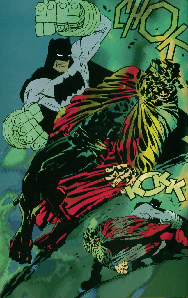
When I’ve written about The Dark Knight Strikes Again I’ve been fond of saying it was years ahead of its time. Sometime in the past week and a half or so, there was a day when I listened to Washed Out, then stumbled across that Deitch show link in an old bookmark, then watched an episode of Tim & Eric, then came across that Ben Jones WTWTA strip–and suddenly I realized I was right! Not that it matters–at all–whether or not Miller and Varley have any real continuity with any of this material. They certainly didn’t get there before Paper Rad, unless I’m wildly mistaken. But then half the fun of DKSA is spotting all the stuff Miller does, from naked newscasters to superheroes ruling the earth rather than just guarding it, seemingly without realizing someone’s done it first. What difference would that make? Meanwhile, in all the off-the-beaten-path references Frank Santoro has cited during the production of his Ben Jones collaboration Cold Heat–essentially a glo-fi comic book–I haven’t heard word one about this book. But I’m not saying Miller & Varley paved the way for anything. I’m saying that when Miller abandoned his chops (and, for the most part, backgrounds!) for the down and dirty styles he (thought he) saw at SPX, and when Varley decided to use photoshop to call attention to itself rather than to create a simulacrum of something else, they were using the same tools, tapping the same vein, seeking the same sense of excitement, discovery, and trailblazing as these newer movements.
I’ve also been fond of likening DKSA to proto-punk, taking a cue from Tony Millionaire’s jacket-wrap blurb: “Miller has done for comics what the Ramones et al have done for music. This book looks like it was done by a guy with a pen and his girlfriend on an iMac.” The idea is that it’s raw, it’s loud, it’s brash, it doesn’t have time for the usual niceties–it’s getting comics back to their primal pulp roots. I spoke to Miller several times during and following the release of the book, one time for print, and he said as much. (I certainly never would have bought the cockamamie idea that this thing was some sort of corporate cash-grab even if he’d never said word one.) He even mentioned to me his belief that the brightly colored costumes of the early superheroes served mainly the dual purpose of a) telling them apart from one another, and b) proving they weren’t naked, so even his thinking in historical terms had him ready to peel back from realism as a form of reclamation. And of course it’s not exactly like the story was at all subtle in this regard: Batman and his army came back to overthrow the dictators that kept us fat and happy and turned the superheroes into boring wimps. But ultimately the punk comparisons were just a little off. Born less of despair than of delight, filled less with anger than with joy, The Dark Knight Strikes Again anticipated a way of doing things that is not intended to look or sound effortless, that draws attention to its own construction, but which–with every pixelization and artifact, with every crayolafied visual and left-in glitch, with every burbly synth and sky-bright color–pushes against that construction and springs out into something wild and wonderful.
Carnival of souls: Strange Tales II cover, Game of Thrones pronunciation guide, more
February 11, 2011* Hot cha, look at the cover for the Strange Tales II hardcover! Art by Kate Beaton, design by Paul Hornschemeier, very silly jacket copy by yours truly.

* Very useful: HBO’s official pronunciation guide for Game of Thrones. The “CAT-lin” thing blows my mind, but I’ve heard George R.R. Martin pronounce it that way, so it’s canon. Westeros notes that one difference between GRRM’s preferred pronunciations and the show’s is that they’ll be pronouncing the honorific “Ser” as “SAIR” rather than “SIR.” This makes sense to me, actually: In the books, the changed spelling was sufficient exotification, but viewers can’t hear a spelling change.
* Oh man, JEEZ, this Kate Beaton panel. JEEZ.

* Another fine, candid CBR interview with Marvel’s Tom Brevoort. This time he reveals that Nick Spencer is taking over Secret Avengers because Ed Brubaker wasn’t having a good time writing it, just for example. And whoa, those are some nice colors on that Thor #620 preview! Is that Pasqual Ferry doing his own colors? I forget. Anyway, you may disagree with some of what Brevoort says, but wouldn’t it be marvelous if all the major figures in the North American comics industry were this vocally opinionated and forthright?

* Real Life Horror, Actual Class Warfare Edition: Republican Governor Scott Walker of Wisconsin is threatening to deploy the National Guard to help him take away the collective bargaining rights of state employees. (Via Atrios.)

Comics Time: All-Star Superman
February 11, 2011
All-Star Superman Vols. 1 & 2
Grant Morrison, writer
Frank Quitely, artist
DC, 2008-2010, believe it or not
160 pages each
$12.99 each
Buy them from Amazon.com
Originally posted on March 11, 2010 at The Savage Critic(s).
The cheeky thing to say about the brand-new out-of-continuity world Grant Morrison constructed to house his idea of the ideal Superman story is that it’s very much like the DC Universe we already know, but without backgrounds. Like John Cassaday, another all-time great superhero artist currently working, Frank Quitely isn’t one for filling in what’s going on behind the action. One wonders what he’d do with a manga-style studio set-up, with a team of young, hungry Glaswegians diligently constructing a photo-ref Metropolis for his brawny, beady-eyed men and leggy, lippy women to inhabit.
But, y’know, whatever. So walls and skyscrapers tend to be flat, featureless rectangles. Why not give colorist/digital inker Jamie Grant big, wide-open canvases for his sullen sunset-reds and bubblegum neon-purples and beatific sky-blues? We’re not quite in Lynn Varley Dark Knight Strikes Again territory here, but the luminous, futuristic rainbow sheen Grant gives so much of the space of each page–not to mention the outfits of Superman, Leo Quintum, Lex Luthor, Samson & Atlas, Krull, the Kryptonians and Kandorians, Super-Lois, and so on–ends up being a huge part of the book’s visual appeal. And thematically resonant to boot! Morrison’s Superman all but radiates positivity and peace, from the covers’ Buddha smiles on down; a glance at the colors on any given page indicates that whatever else is in store, it’s gonna be bright.
Moreover, why not focus on bringing to life the physical business that carries so much of the weight of Morrison’s writing? The relative strengths and deficiencies of his various collaborators in this regard (or, if you prefer, of Morrison, in terms of accommodating said collaborators) has been much discussed, so we can probably take it as read. But when I think of this series, I think of those little physical beats first and foremost. Samson’s little hop-step as he tosses a killer dino-person into space while saying “Yo-ho, Superman!”…Jimmy Olsen’s girlfriend Lucy’s bent leg as she sits on the floor watching TV just before propositioning him…clumsy, oafish Clark Kent bumping into an angry dude just to get him out of the way of falling debris…the Black-K-corrupted Superman quietly crunching the corner of his desk with his bare hands…Doomsday-Jimmy literally lifting himself up off the ground to better pound Evil Superman’s head into the concrete…the way super-powered Lex Luthor shoulders up against a crunching truck as it crashes into him…the sidelong look on Leo Quintum’s face as he warns Superman he could be “the Devil himself”…that wonderful sequence where Superman takes a break to rescue a suicidal goth…Lois Lane’s hair at pretty much every instant…You could go whole runs, good runs, of other superhero comics and be sustained only by only one or two such magical moments. (In Superman terms, I’m a big fan of that climactic “I hate you” in the Johns/Busiek/Woods/Guedes Up, Up & Away!) This series has several per issue.
And the story is a fine one. Again, it’s common knowledge that rather than retelling Superman’s origin (a task it relegates to a single page) or frog-marching us through a souped-up celebration of the Man of Steel’s underrated rogues gallery (the weapon of choice for Geoff Johns’s equally underrated Action Comics run), All-Star Superman pits its title character, directly or indirectly, against an array of Superman manques. The key is that Superman alternately trounces the bad ones and betters the good ones not through his superior but morally neutral brains or brawn, though he has both in spades, but through his noblest qualities: Creativity, cooperation, kindness, selflessness, optimism, love for his family and friends. I suppose it’s no secret that for Morrison, the ultimate superpower of his superheroes is “awesomeness,” but Superman’s awesomeness here is much different than that of, say, Morrison’s Batman. Batman’s the guy you wanna be; Superman’s the guy you know you ought to be, if only you could. The decency fantasy writ large.
Meanwhile, bubbling along in the background are the usual Morrisonian mysteries. Pick this thing apart (mostly by focusing on, again, Quitely’s work with character design and body language) and you can maybe tease out the secret identity of Leo Quintum, the future of both Superman and Lex Luthor, assorted connections to Morrison’s other DC work, and so on. But the nice thing is that you don’t have to do any of that. Morrison’s work tends to reward repeat readings because it doesn’t beat you about the head and neck with everything it has to offer the first time around. You can tune in for the upbeat, exciting adventure comic–a clever, contemporary update on the old puzzle/game/make-believe ’60s mode of Superman storytelling in lieu of today’s ultraviolence, but with enough punching to keep it entertaining (sorry, Bryan Singer). But you can come back to peer at the meticulous construction of the thing, or Morrison’s deft pointillist scripting, or the clues, or any other single element, like the way that when I listen to “Once in a Lifetime” I’ll focus on just the rhythm guitar, or just the drums. Pretty much no matter what you choose to concentrate on, it’s just a wonderfully pleasurable comic to read.
