Batman and Robin #14
Grant Morrison, writer
Frazer Irving, artist
DC, September 2010
24 story pages
$2.99
Despite liking this issue more than any other single-issue Batman comic I’ve ever read–short version: shuddery stylish Lynchian atmosphere with genuinely horrifying villains, cool action sequences, killer art, and a sense that it’s fun to be a Batman comic–I didn’t want to review it, simply because I’ve reviewed like a billion Grant Morrison Bat-books. But a quick check of my left-hand sidebar reveals that I’ve run only five such reviews; that’s a tie for third place in the Attentiondeficitdisorderly Review Sweepstakes with Big Questions, compared to eight separate reviews for MOME and a whopping eleven for King Shit of Comics Time Mountain, Cold Heat. (It’s Frank Santoro’s world–we just live in it.)
So what the hey, let’s talk about artist Frazer Irving and artist Frazer Irving only. Irving emerges here as Morrison’s single best collaborator, I think. This is something of a surprise, not only because of the existence of Frank Quitely, but because this pair’s previous Bat-collabo, Batman: The Return of Bruce Wayne #2, was a murky, hard-to-follow mess, owing largely to Irving’s failure to properly differentiate his Puritan-garbed Bruce Wayne from his similarly attired antagonist. (This has its in-story reasons, as it turns out, but still.) This issue, however, is the kind of thing where you could just go page by page enumerating all the visual high points and let that make your argument for you. To wit!
* Page one: The steely blue color of abandoned Wayne Manor
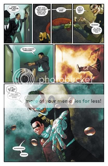
* Page two: The Joker cowering on the floor, turning to face us only after he’s revealed he’s been in control all along
* Page three: The Joker’s awkward positioning of his hands, closed eyes, off-balance body language, and big grin conveying how he’s flailing around without a care in the world, so confident is he that he’ll best his tiny, deadly opponent Robin; the barely visible splash of blood when the Joker scratches Robin’s face with his poisoned fingernails
* Page four: The emergence of aquamarine against he ugly brown background as Robin begins hallucinating; depicting Robin’s spasms by showing him against the floor, propped up only by his heels and the back of his head–his whole body an inverted rictus
* Page five: The sudden shift from blue-green to bright orange as the explosion hits–the door has already been blown clear across the hallway and knocked the cop off his feet, as though we blinked and missed a panel
* Page six: What do you even say about this image of Professor Pyg hanging upside-down, held up by barbed wire, in the womb of his monument to his imaginary mother? It’s an absolute killer, but I will add that the belly-fat rolls are a nice touch.
* Page seven: The choreography of the Senator’s recoiling away from Doctor Hurt’s gunshot; the tangent linking the vomit bucket to the pumpkin with teeth in it (yes, it’s that kind of comic)
* Page eight: The fact that this action sequence is colored pink; the motion of Gordon’s body and trenchcoat in panel three
* Page nine: The color palette’s shift to orange with every gunshot; the cantered frames
* Page ten: The way Batman’s body seems to spin with each panel
* Page eleven: The final three panels leaning forward into one another, pushing Batman and the viewer along to the inevitable explosion
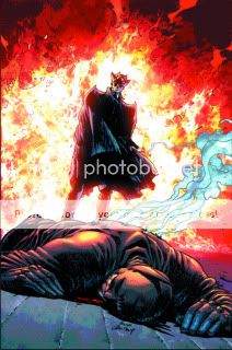
* Page twelve: That top-most silhouetted body flung into the air by the explosion, limbs dangling backwards
* Page thirteen: Professor Pyg’s proclamatory pointer-finger gesture as he announces “Je suis showbiz!”; the quasi-fisheye view of Hurt, Pyg, and their minions walking down the hall, as though they’ll breeze right past us in another second
* Page fourteen: The musculature of Dick Grayson’s bare back
* Page fifteen: The light from the doorway as Batman runs to the Batcopter
* Page sixteen: Conveying Commissioner Gordon’s disorientation when he awakes by drawing the panel upside-down, but in such a way that we can only tell for sure that it is upside-down if we flip it upside-down ourselves
* Page seventeen: The way panel three is lit from below and to the left; the consistency of the profile of Pyg’s mask in panels five and six
* Page eighteen: Pyg’s gut sticking out when he suspects he’s being made fun of for his weight problem
* Page nineteen: Pyg and Hurt, the Diabolical Duo
* Page twenty: Batman’s whirling-dervish fight choreography
* Page twenty-one: The look on Batman’s face as he lands the punch in panel four; Pyg’s pose when he tells Batman “I can’t blame you for finding me attractive”
* Page twenty-two: Batman’s flat boot-sole connecting with Pyg’s flat pig-nose; the fountain-like silhouette of Batman’s cape as he lands
* Page twenty-three: The ungainly way Batman whips around to see who’s behind him, when it turns out it’s no one and he was being tricked by Gordon–the pose conveys that he’s been duped
* Page twenty-four: Joker in the Batcave at last; the smiley face painted on the bound-and-gagged Robin; the final three images of Batman, the Joker, and Doctor Hurt
I’ve read a lot of superhero comics, and this sort of attention to detail is all but nonexistent. To rely this much on subtle shifts of figurework and coloring to convey both vital plot information and to enhance our understanding and appreciation of the physical combat that is superhero comics’ bread and butter, to have the chops to pull it off and the confidence to even try…well, it’s pretty much unheard of outside of some really titanic stuff, Dave Gibbons on Watchmen/Frank Quitely on All Star Superman-type stuff. And while Irving shares with Quitely a genuine, contemporary sense of style and art that allows for neon-bright colors to really pop, his work (perhaps because he does all the color and texture himself) feels fuller. Flipping through the book again before writing this sentence I realized that Irving will drop backgrounds just as often as Quitely does, but with his billowing puffs and swirls giving every panel depth, you’d never know it from memory. Irving took a comic it was apparently a struggle to convince people who needed to be convinced he should even be involved in and handed in the best-drawn superhero comic of the year, and honestly one of the best-drawn comics of the year period. Bravo.
Tags: comics, comics reviews, Comics Time, reviews


I’ve been intrigued by this series, but for some reason haven’t taken the plunge. Is this issue a standalone, or would I need to catchup with the trades/backissues?
Oh brother is it ever NOT a standalone! You kind of need a scorecard to keep track of how best to read Morrison’s Batman run, since it’s bounced back and forth between titles, spilled over into Final Crisis, spawned simultaneous limited series, and so on. If you wanted to read Morrison’s entire currently ongoing run with the character, here’s how to do it:
Batman and Son
[Batman: The Resurrection of Ra’s al Ghul–not at all necessary as it’s a crossover Morrison seems to have been roped into and has mattered not a bit to the rest of what he’s done–he contributed I think two issues to it]
Batman: The Black Glove
Batman R.I.P.
Final Crisis
Batman and Robin: Batman Reborn
Batman and Robin: Batman vs. Robin
Batman: The Return of Bruce Wayne
Batman: Time and the Batman
Batman, Inc.
The last four aren’t available in collected editions yet–hell, the last one hasn’t even come out serially at all yet–but there you have it, based on everything that’s currently either come out or been announced.
But Batman and Robin itself ought to be pretty easy to catch up with as there are only the fourteen issues, the first 6 of which are collected in Batman and Robin Vol. 1: Batman Reborn, and the next six of which will be collected in Batman and Robin Vol. 2: Batman vs. Robin, which I think comes out in late October or November.
As for this issue, it’s part two of a three issue arc.
I hope that helps!
I wouldn’t say that it’s Morrison’s best collaboration – I don’t think Irving would have suited ASS, for example (I’m crazy about Jamie Grant’s colours) – but I do think it’s one of the best, which is really saying something.
Curt, you wouldn’t get anything approaching the full effect without building some history with the characters and plot lines in play, but I urge you to give it a try. Morrison’s work on Batman has, by turns, been wonderfully strange and lynchian, with the last arc being particularly on the money. No-one else in the DC or Marvel stable is capable of writing comics like these, and with Batman and Robin Morrison has had the artistic back-up to make good on his ideas.
Great review, Sean, I just looked back through the comic with you as my guide, and had a ball.
I recently commented that Darwyn Cooke’s PARKER series from IDW so totally suited my taste that I could just about enjoy it for its visual style alone. Now, here you are, digging the hell out of this comic just because the artwork flips your switch. And that’s a beautiful thing about comics: when a creator’s sense of dynamics or visual aesthetic NAILS IT, it’s a lot of fun to just dig in and joygasm at every turn of the page. That thrill of opening a comic and just thinking “Fucking hell, this bastard GETS IT” is something that I’ll never get sick of with comics. Never.
As for your answer to Curt’s question, yes, there is absolutely a bigger story here. I recall Morrison’s run on NEW X-MEN… each arc in and of itself was enjoyable and offered its own tale but, after the entire run was available in TPB format, I went through all of it over the course of a weekend, marathon-style, and all of a sudden it blew my mind in a way that it hadn’t before. The little elments that had leaked out piecemeal kind of coalesced into this bigger, richer tapestry. The entire story was of the war of species and how “Sublime” had been the mutant’s greatest enemy from the start. It was, essentially, a story of the true nature of evolution itself which, despite being what the X-Men are supposed to be about ANYWAY, is surprisingly heady for a Marvel comic.
I love that “big picture” strategy and I’m expecting that from Morrison’s work on the Batman books. When it’s over and we link all of these little stories and fragments of stories together, I think we’re going to stand back and see a larger statement. The concept of Batman’s mythology being part of the lifespan of a single character… the legitimization of multiple Batmen… all these little notions will kind of come together and THAT, I believe, will be greater than the sum of the parts.