
Image United #1
Robert Kirkman, writer
Erik Larsen, Rob Liefeld, Todd McFarlane, Whilce Portacio, Marc Silvestri, Jim Valentino, artists
Image, November 2009
24 pages
$3.99
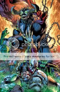
Wowsers. So, uh, this is a jam comic by six of the seven Image founders, though Jim Lee makes a cameo by providing an alternate cover, which made me smile. It’s about some villains running amok and fighting various heroes for no apparent reason–that’s not my characterization of the plot, that’s the heroes’–which is a pretty fantastic encapsulation of the work of the Image founders to begin with, and certainly their work here. It’s all a moment-to-moment festival of sensation, gritted teeth and punching and blasting and charging the camera, without any kind of prologue or follow-through to place each physical action in any kind of spatial or temporal or emotional context, not even so much as a recap page to catch nostalgic readers up on characters they probably haven’t read since Nirvana was a going concern.
Entrusting layouts to Rob Liefeld (of the six they could have picked from, Liefeld!) could be said to be a mistake, in that characters like the narrator-hero Fortress or the uber-antagonist Omega Spawn burst onto the pages out of nowhere, like they teleported, even though they’re supposed to have been down the block or in the same room, but in light of the above it ends up fitting rather perfectly. At one point the big giant strong hero Badrock [sic] angrily threatens the big giant strong villain Overt-Kill [sic] over an attack we never see on a person who’s not even on panel at the time; later, the long-running Erik Larsen character Savage Dragon, whose appearance in a book filled to the brim with Silvestri and Liefeld creations feels like a walk-on by Glenn Ganges by comparison, remarks “I had no clue the girl took such a hit,” and I had to wonder if this wasn’t Kirkman having some deliberate fun. (I doubt having the arrow-based character Shaft repeat a balloon’s worth of dialogue verbatim two pages apart was deliberate, but wouldn’t it be aweome if it were?)
The most interesting thing about the project is that the artists don’t trade off sections, they draw their own characters whenever they appear, so that you can watch a Jim Valentino hero punch a Todd McFarlane villain, say. The problem with that, though, is that they’re simply not a terribly distinct collection of individual visual stylists. I mean, Larsen’s an exception of course, and Valentino doesn’t look like the rest of the gang but he doesn’t look like much of anything really, and McFarlane might stand out a little in terms of how he choreographs his characters’ physicality but there’s not much of that in this issue, so what you’re left with between Liefeld, Silvestri, Portacio, and McFarlane is a lot of squinty-eyed dudes and dudettes comprised of lots of tiny little lines, standing against generic secret base/rooftop/rubble backgrounds. There’s a manic energy to it, that’s undeniable, but it’s like an album-length guitar solo. It’s all extremely harmless and good-natured–it’s not going to upset you or offend you or leave a bad taste in your mouth, which is saying something–but it’s like being asked for your thoughts on a really rad comic drawn during study hall by the five coolest metalheads in the 9th grade, which not coincidentally is the last time I read comics by most of these guys. It’s all printed on paper stock so shiny it looks like a decade’s worth of gold-embossed chromium glow-in-the-dark holofoil covers were ground up and mixed into the pulp, like KISS’s blood or Mark Gruenwald’s ashes. I think everyone involved, from Kirkman to the Founders to the bulk of the book’s audience, got exactly what they wanted out of it.
Tags: comics, comics reviews, Comics Time, reviews
3 Responses to Comics Time: Image United #1