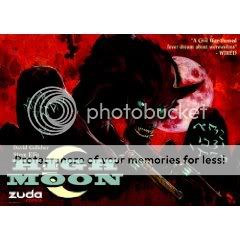
Comics Time: High Moon Vol. 1

High Moon Vol. 1

David Gallaher, writer

Steve Ellis, artist

DC/Zuda, 2009

192 pages

$14.99

Buy it from Amazon.com

Read the strip at ZudaComics.com

Evolution in action? Here’s a case of the constraints of a comic’s production saddling it with weaknesses, only for the comic to come up with compensatory values that all but overcome them. High Moon is a Western-horror hybrid of the sort very much in vogue over the past few years–what hath Ravenous wrought?–which originally ran in DC Comics’ webcomics portal/competition site Zuda. I believe this necessitated a Sunday-strip-style landscape-format rectangular page, longer than it is tall, as well as a daily-installment delivery mechanism. The storytelling suffers for it all. There’s pretty much one plot beat per panel, with very little breathing room, and moreover nearly every panel contains terse pulp dialogue; the resulting rhythm is staccato to the point of incomprehensibility at times. It doesn’t help that writer David Gallaher’s characters are almost all types, making it even tougher to tell the players at times.

But! Sweet Jesus, look at Steve Ellis’s art. His color palette is a real revelation, fiery oranges and glacial blues all but radiating off the page even despite the book’s rough paper stock. The faces of his hardass outlaws and their lovely ladyfriends come off like a cross between fellow horror artists Terry Moore and Guy Davis, their broad-strokes emotions and intentions easy to parse amid the occasional confusion. I was particularly impressed with his creature designs, admirably ambitious and taking full advantage of Gallaher’s unique, expectation-defying brand of horror-on-the-range. I think I even detected a Robert Williams homage! Ellis’s unnecessarily lovely brushwork really shines in splashpage-style illustrative moments, where you can just sit and stare at the flowing hair and shattered glass and monstrous limbs without feeling propelled to the next rapid-fire panel. It enhances the strengths of Gallaher’s scripting–which include at least one dramatic shift in the story’s direction and an entertaining willingness to throw everything from steampunk to The Crow into the mix–and smooths over some of the weaknesses. Provided you don’t mind when action-horror tilts way way over toward the action end of things, this book is well worth checking out.

Tags: , , ,

9 Responses to Comics Time: High Moon Vol. 1

  1. Matt M. says:

    I’ll have you know that I’d written MURDER MOON long before I’d seen RAVENOUS (which is great and everyone should see.) Just, y’know, for the record.

    And ain’t that Ellis art purty?

  2. Dan Arnold says:

    I believe this necessitated a Sunday-strip-style landscape-format rectangular page, longer than it is tall, as well as a daily-installment delivery mechanism. The storytelling suffers for it all.

    So, the writing is bad, but the art is pretty?

  3. No, the writing isn’t BAD–it’s not like I ever cringed or rolled my eyes–but it chafes against the format. The art helps it through this to a certain but by no means total extent in the ways I describe.

  4. Dan Arnold says:

    The art helps it through this to a certain but by no means total extent in the ways I describe.

    I couldn’t tell by your description, so I was seeking clarity. I read the first chapter online – over a year ago – where I found the plot points every panel to be refreshing, especially in the age of decompressed storytelling, but then the comic started updating weekly and I got behind quickly.

    I wonder if it reads differently / better serialized over time then it does as a collected work. I couldn’t imagine that it would have won a Harvey Award otherwise. It would have been sad to see something that started strong-enough venture into early Image territory.

  5. Sean,

    Sorry you didn’t seem to enjoy my writing. I strongly disagree that it chafes against its original long-form serialized webcomics roots – where often fans scour every page looking for details and clues to the latest mystery. As a trade, it will naturally read differently.

    – David

  6. David Gallaher says:

    Huh. I tried posting my response a few different ways – seems like only the one posted from my iPhone worked, odd

  7. David Gallaher says:

    Huh. I tried posting my response a few different ways – seems like only the one posted from my iPhone worked, odd

  8. Dan: Glad I could clarify. I feel you on falling behind on webcomics–I’m miserable with them, though when the lightbulb finally clicked on that I could add them to my RSS feed and read them like “blogs with drawings,” I got a little better. My next big project is to go back and catch up with Achewood, which I dropped out of during its second year sometime.

    David: Ah yes, welcome to alltooflat.com’s comment mechanism, a horror to rival any the Weird West has to offer. Seriously though, it’s not that I didn’t enjoy your writing–as I tried to point out, it takes some refreshing zags where I expected it to zig, and it meshes with the art really well. I do think the format causes it to be a rough ride in places, so maybe you’re right and saying it “chafes against the format” is the wrong way to put it–it’s really the format that forces the things I don’t like about it. Still, it IS the trade I read, so that’s what I had to go by.

  9. David Gallaher says:

    Sean,

    Like I suggested, I think it likely reads differently in trade. Sort of like watching a TV show on DVD, where cliffhangers lose their impact without the interuption of a commercial break, creating a ‘choppy’ feeling – so perhaps that what you are experiencing?

    – David

Comments are closed.