
In the comment thread in the Midnight Meat Train image post below, Bruce Baugh points out the striking and obviously thoughtful composition of the image, leading me to note what a pleasant surprise it is any time I come across an image from a horror film (let alone a promotional image for a horror film) that has any kind of panache. I’ve thought of this the last several times I went to the mall and saw this poster for the werewolf flick Skinwalkers hanging up:
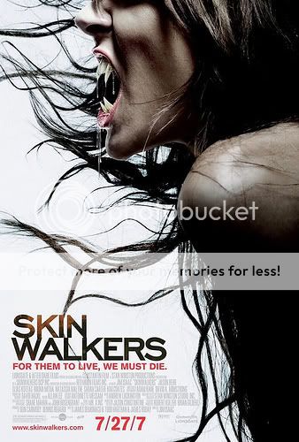
The leading-less font, the white background, the off-center placement of the title, the image composition–gorgeous. I hold out no hopes for the film itself, of course, but man, this was money well spent. Comparisons to the almost confrontationally dull and generic Dark Is Rising The Seeker: The Dark Is Rising poster are most instructive.
I’m certainly not expecting much from the movie either, but yeah, this is a good poster. It’s crisp. Pure white makes for some great framing – particularly where there’s fangs, black hair to highlight their form, and then white behind that – and the typography sure is nice. The Dark is Rising poster has that now-annoying-to-me thing where all images fade at the edges; done right it can suggest layers, memories, distance, all kinds of things, but too often it just makes me think there’s a certain unwillingness to be definite at work.